Upcycled Grey Kitchen By Stoneham
 The story: This kitchen’s story began in 2008, when the clients installed their first Stoneham kitchen with retailer David Haugh – a cream suite from the Scotney traditional kitchen collection. With the room extended on the kitchen’s tenth anniversary, the couple enlisted David Haugh once again to create a contemporary design from the original materials of the existing kitchen, and rework them into a much larger space.
The designer: Andrew Moore of David Haugh (www.davidhaugh.co.uk)
Designer Q&A:
Q) How did you set about answering the brief?
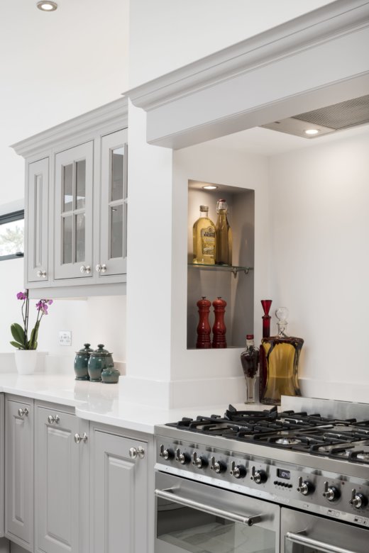
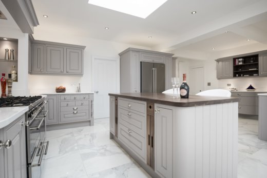
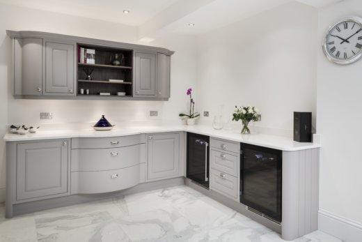
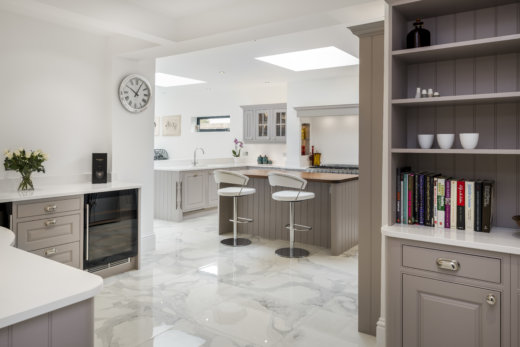
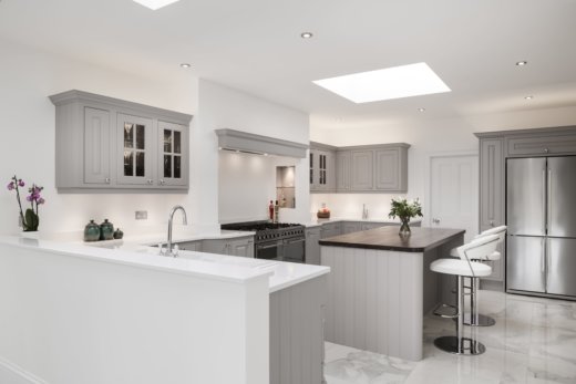
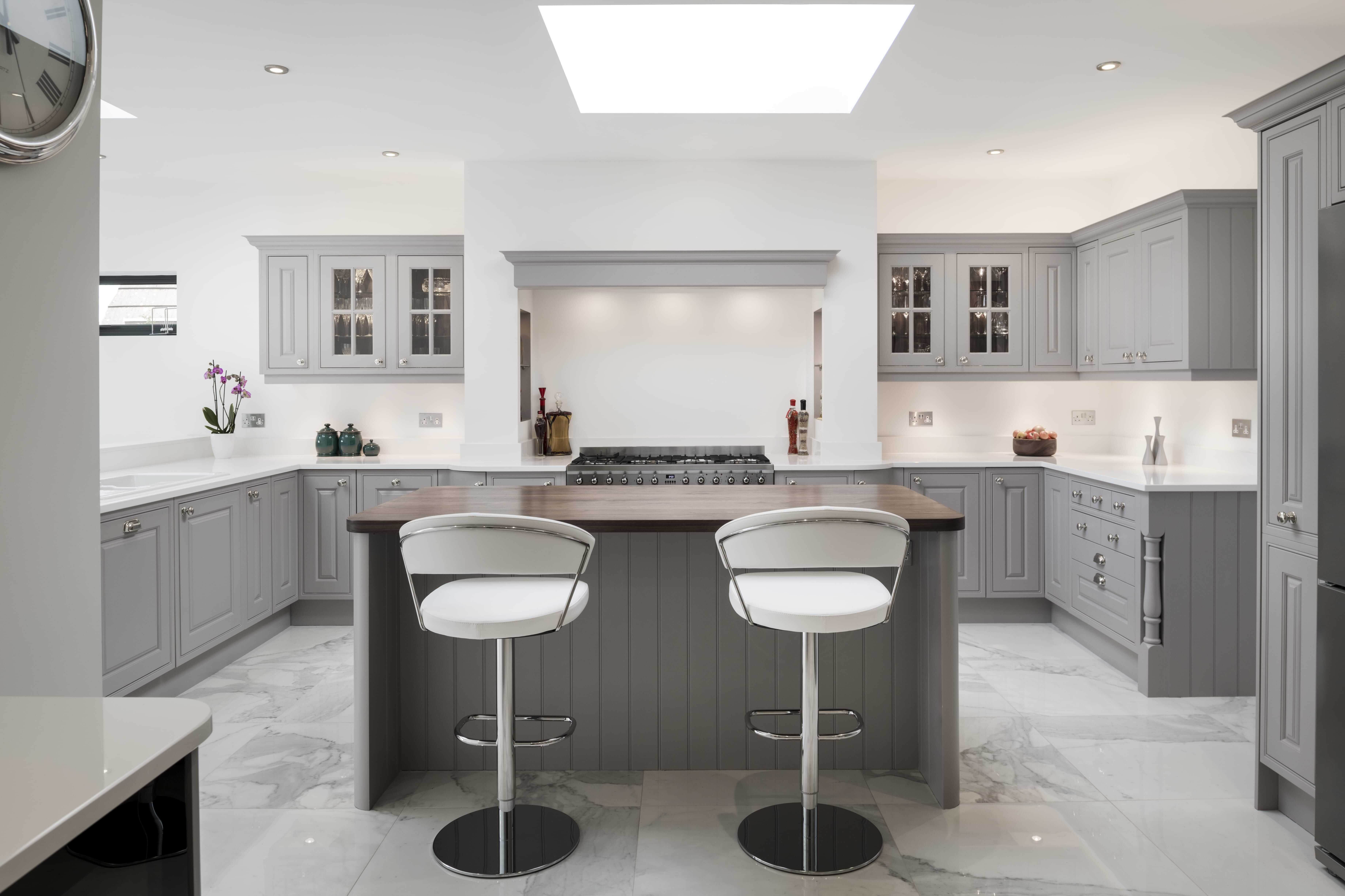
After thorough consideration of all design options, the clients and myself selected an elegant aesthetic with a classic, neutral colour scheme running throughout. The new kitchen design meant that almost all original units could be recycled and enhanced. We cleaned the carcasses, sanded and re-primed the doors and replaced the hinges to soft-close as part of the refurbishment work before they were ready to be installed alongside the brand new units, which were then hand-painted in Farrow and Ball Dove Tale – a gorgeous grey hue with a gentle lilac undertone. The base furniture is crowned with white quartz worksurfaces, wrapping gracefully around the sink and range cooker.
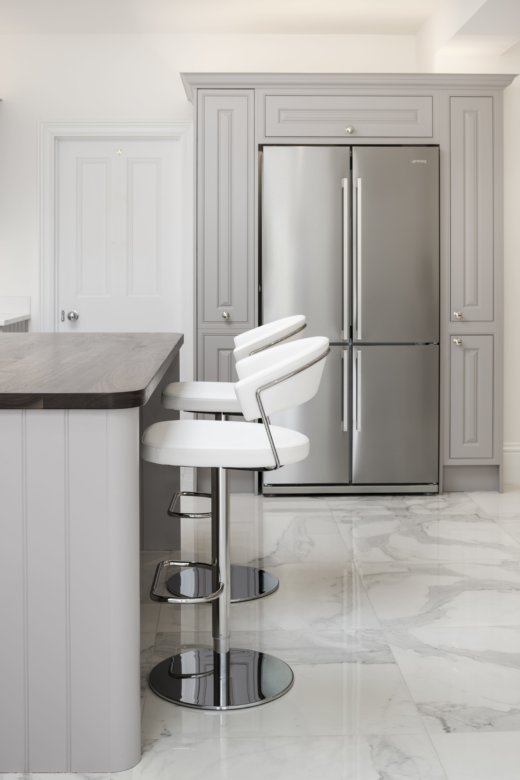
With a fresh extension, the island’s location and look was critical in ensuring the old kitchen and the new space felt like one large room. With a 40mm solid walnut top and quadrant pillars beneath, the island acts as a place for entertaining, food preparation and dining, perfectly situated in front of the Smeg range cooker and adorned with two cream bar stools.
Was there any building/renovation work involved?
Yes, the kitchen underwent a rear extension before we began work on its new design.
Q) Which products did you use and why?
Aside from Stoneham’s furniture, we also integrated some contemporary products into the design including a Smeg fridge freezer, Caple wine coolers and a Westin extractor fan – I only recommend using the most reputable brands. We also embellished the kitchen with some lighting from Sensio, which illuminates the tall, wall, glazed and under wall units, as well as niches in the chimney-breast detail above the cooker.
Q) What elements do you think make the scheme so successful?
This jigsaw puzzle of a kitchen project was the biggest of its kind that I have ever completed… It was great fun taking a ten-year-old kitchen and giving it a new lease of life. I think the classic design and colour scheme works really well in making the most of the room’s new size, with the light grey tones creating an impression of increased space.
Q) Any advice for someone who may be planning a new kitchen?
Practicality always comes first when I’m designing a new kitchen; I always think, “What areas will the owner of the kitchen work in, and how will it function in real life?” Homeowners should always think about what appliances they want to use (induction Vs gas hobs, eye-level ovens Vs a range, kettle Vs boiling tap). Then it’s important to consider how you cook – do you prepare a lot beforehand and therefore need more worktop space? Or is storage more important? Once the fundamentals are sorted, the fun can begin in making your room look amazing, and you’ll see from my designs that symmetry is my secret to a stunning kitchen.
The details:
Appliances from Smeg, Caple and Westin, www.smeguk.com, www.caple.co.uk and www.westin.co.uk
Lighting from Sensio, www.sensio.co.uk
Hayley loves: the idea of reworking a kitchen once it begins to look tired; breathing new life into the space while making use of sturdy carcasses and fittings.



Leave a comment