
The Clay Retreat: A New Low-Carbon Family Home Designed by PAD Studio, with Coral Pink Kitchen by Pluck
By Linda Parker
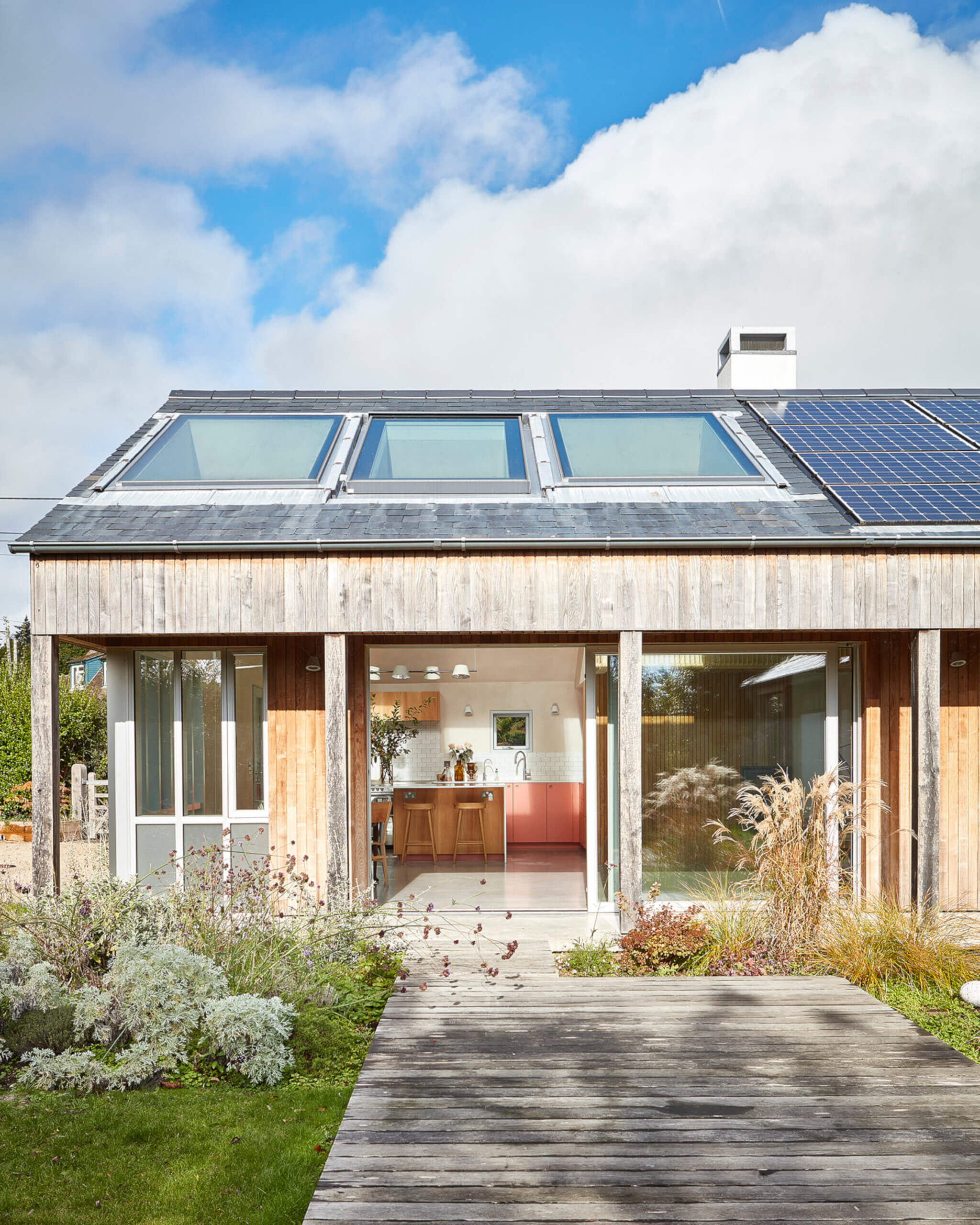
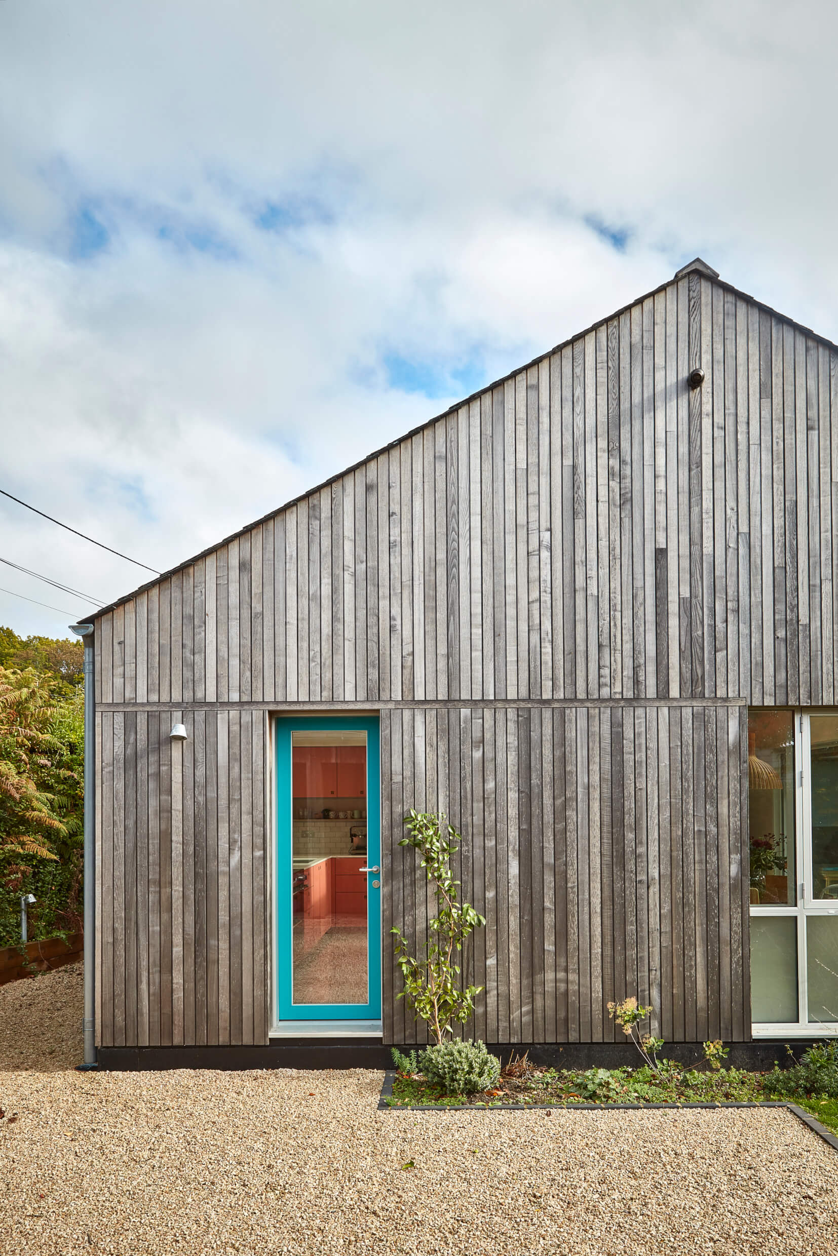
This colourful project was the result of seamless teamwork between George Glasier, Co-Founder of PLUCK , and Collette Raine, Architect & Creative Manager of PAD Studio. The kitchen is within the Clay Retreat, a newly built low-carbon family home designed by PAD Studio. The Clay Retreat replaced a cottage with a sustainable modern house celebrating natural materials and craftsmanship.
Q: What were the stand-out priorities in your brief from the client?
Collette Raine explains … Our client’s priorities were to create a home for the family to gather together, but to also have more secluded places for them to retreat to. They wanted a space which blended into the landscape and that was conscious of its impact on the sensitive environment in which it sits, but which also considered the wider environmental impact. They wanted it to be as sustainable and energy efficient as possible. Initially the brief was looking at creating this project within the limitations of an extension to an inefficient and rundown chalet.
Q: How did you set about answering that brief? Did you have an outline budget to consider?
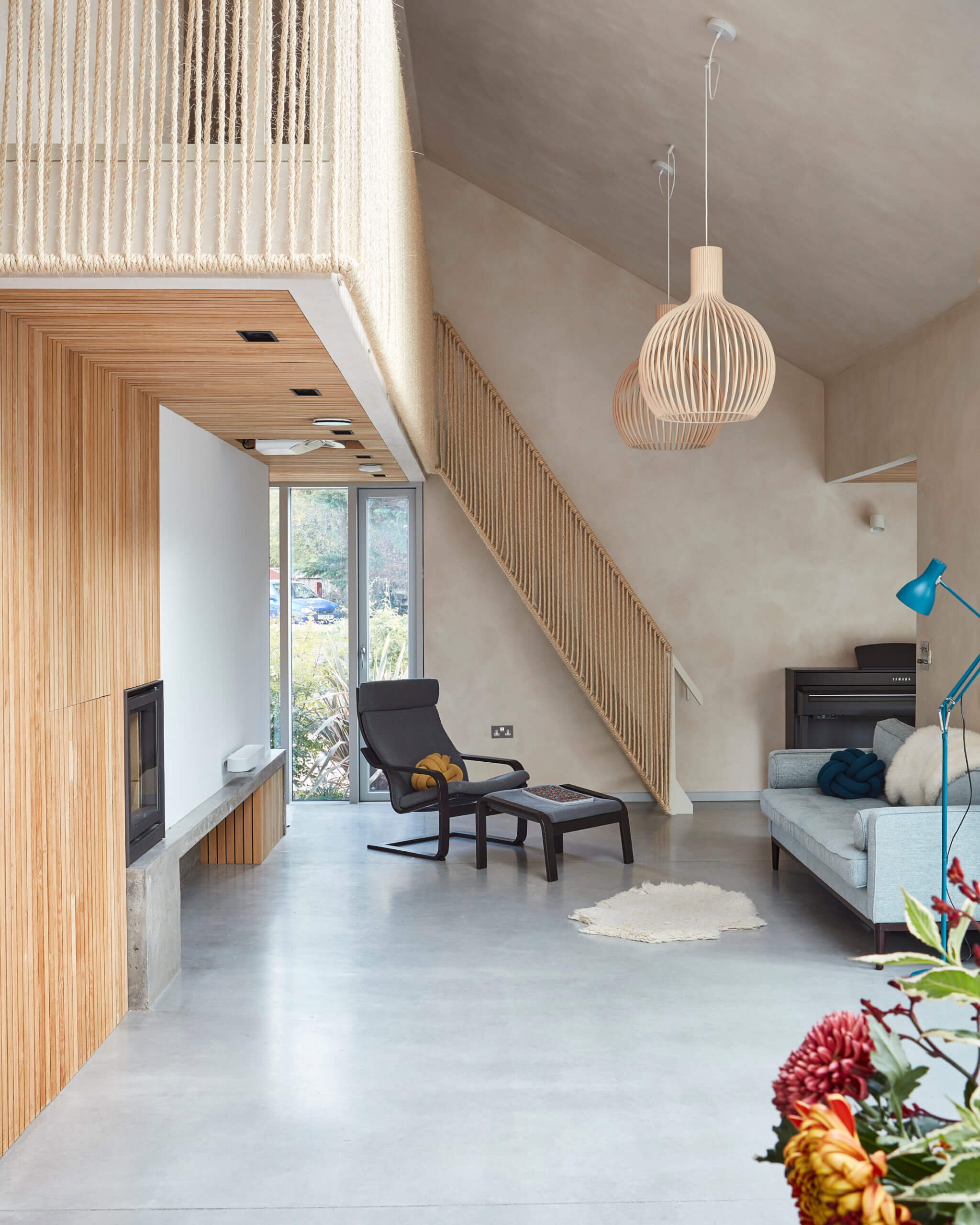
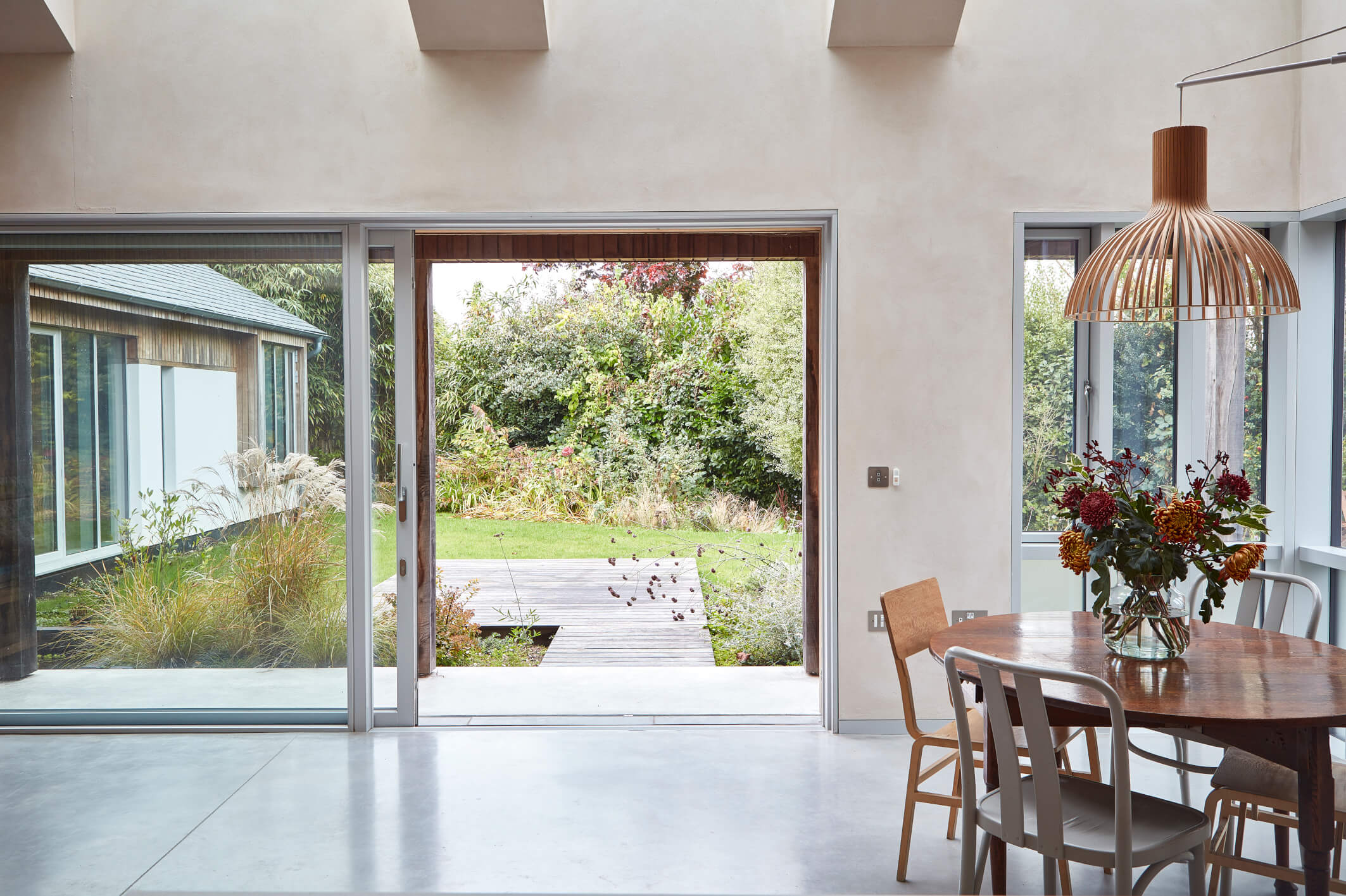
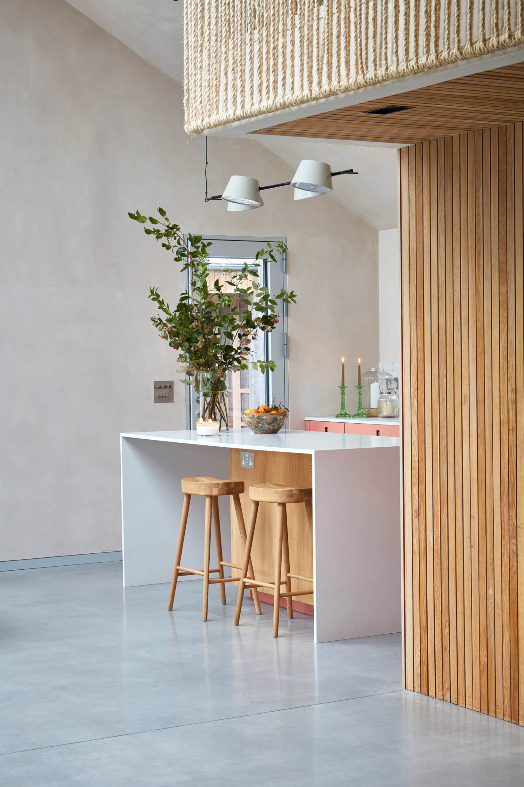
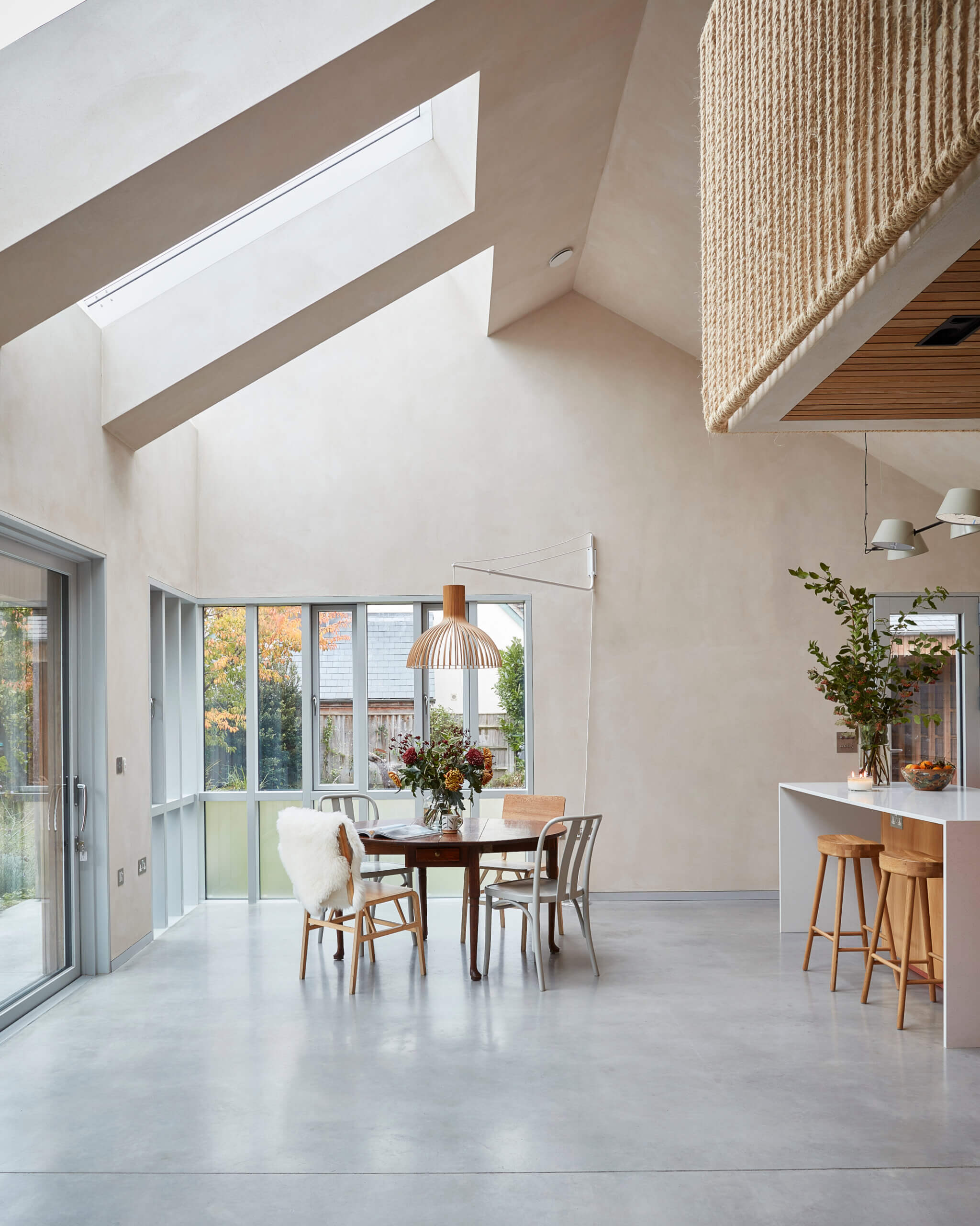
Collette Raine: The clients started with the budget and intention for an extension, with a reasonable contingency available. However, when the local planning authority advised that the best course of action would be to replace the dwelling then the budget became a restraining factor. This meant that the approach to the whole project was stripped back, and where possible the crafted joinery items became the textured wall finishes. Natural clay plasters provided texture, and due to their consistent colour throughout, removed the need for additional labour and materials in final painting and decorating. In replacing the entire dwelling, we were able to alter the flow of the house to offer our clients exactly what they wanted as well as the opportunity to blend inside and outside. Large, shaded openings and a wrap-around terrace emphasised the connection between indoors and out.
Q: So the re-build allowed a complete new start regarding the floor plan and everything else?
Collette Raine: A new scheme allowed the clients to position the kitchen at the heart and create a space that worked for them but also allowed for futureproofing and adaptability. Colour introduction was a later addition stemming from their conversations with Pluck and on seeing the possibilities. Our clients love the whole scheme and are so pleased that it provides them with what they set out to achieve, immersing the family within the landscape and providing a place of calm and retreat.
Q: Tell us the reasons behind the stunning choices of cabinetry finishes and colours, and the work surfaces …
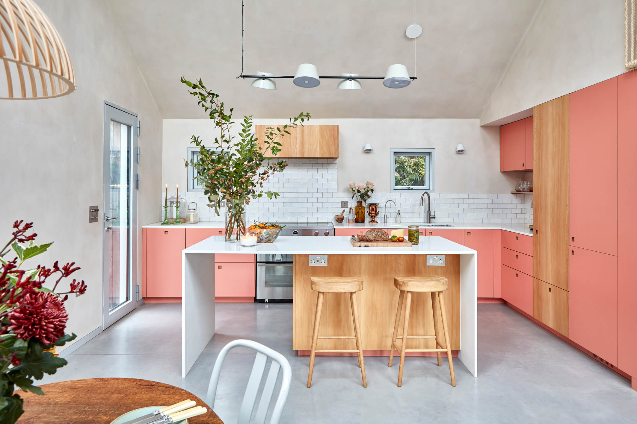
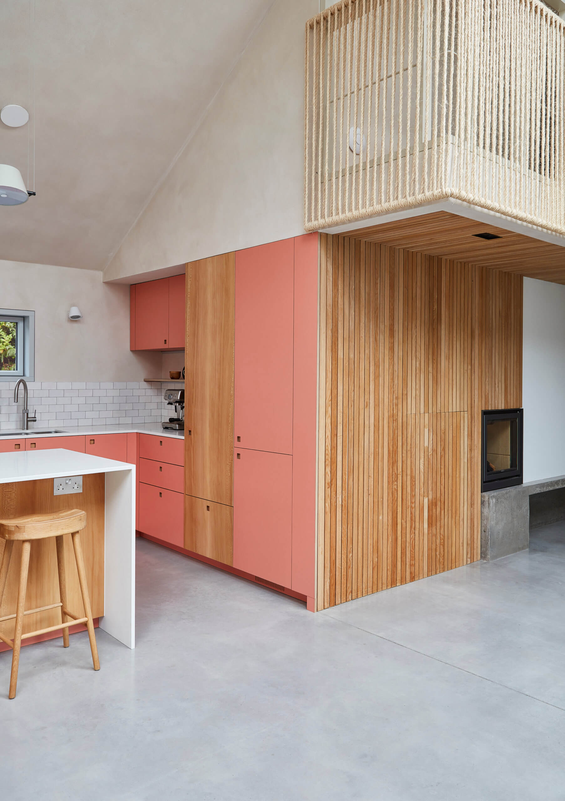
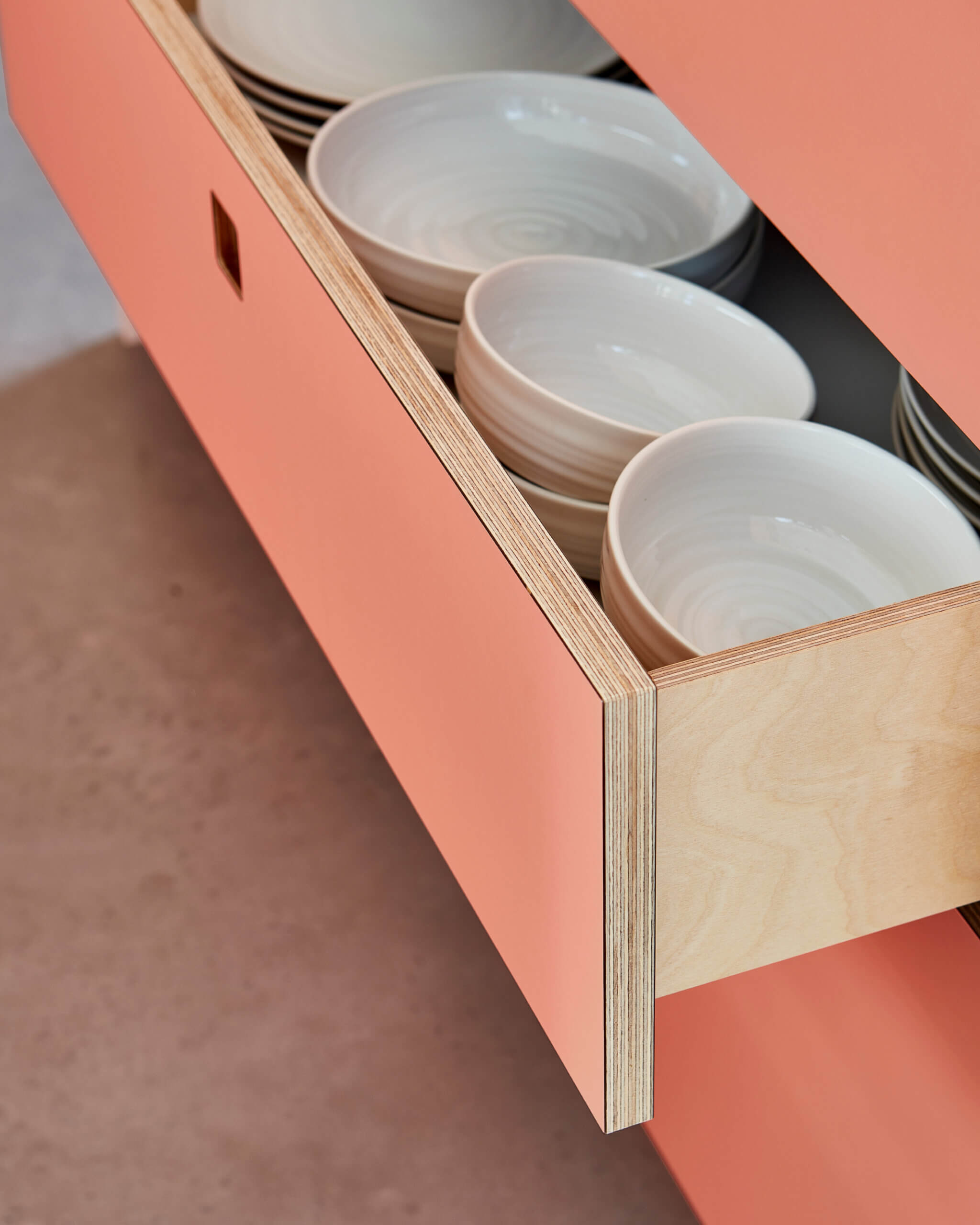
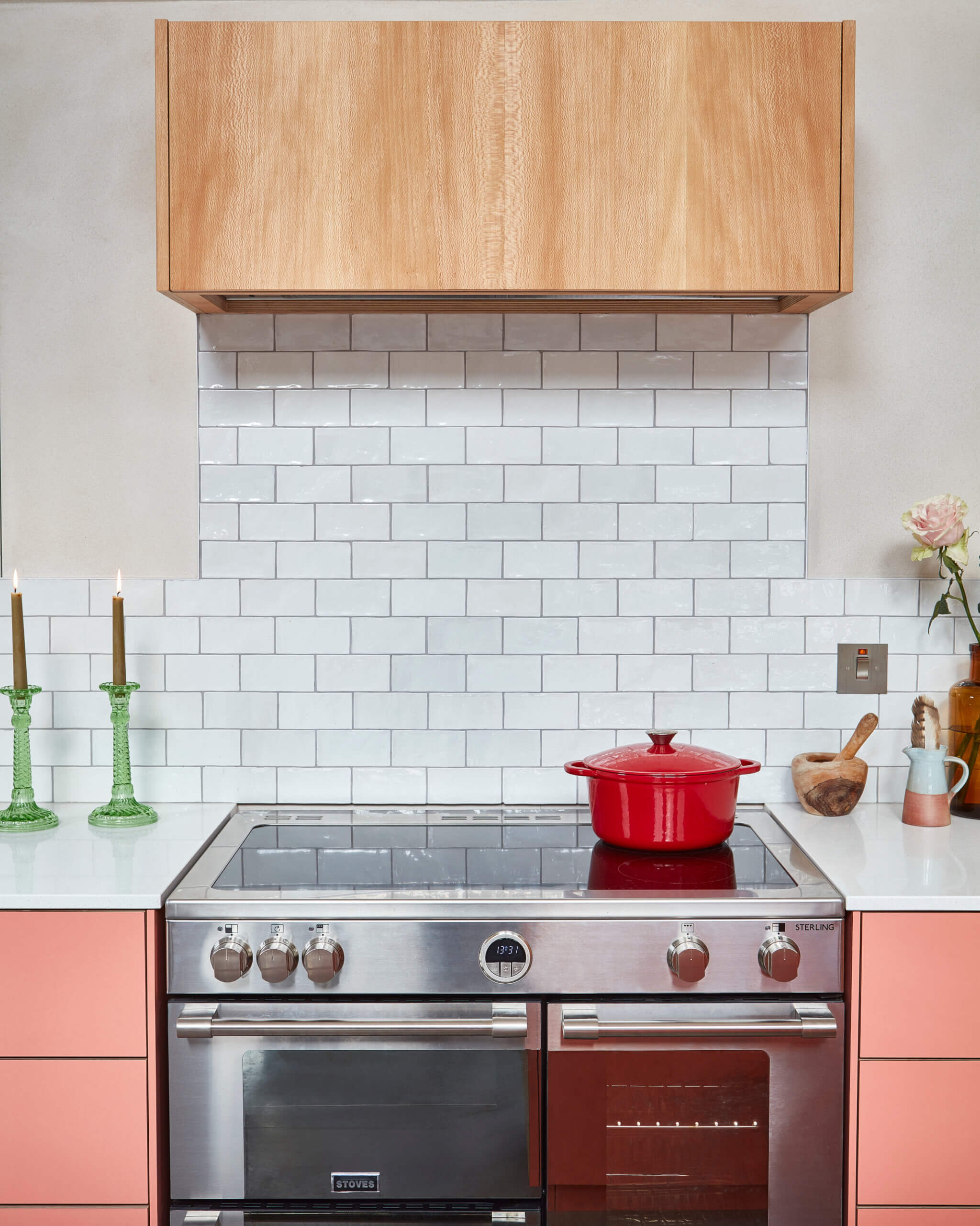
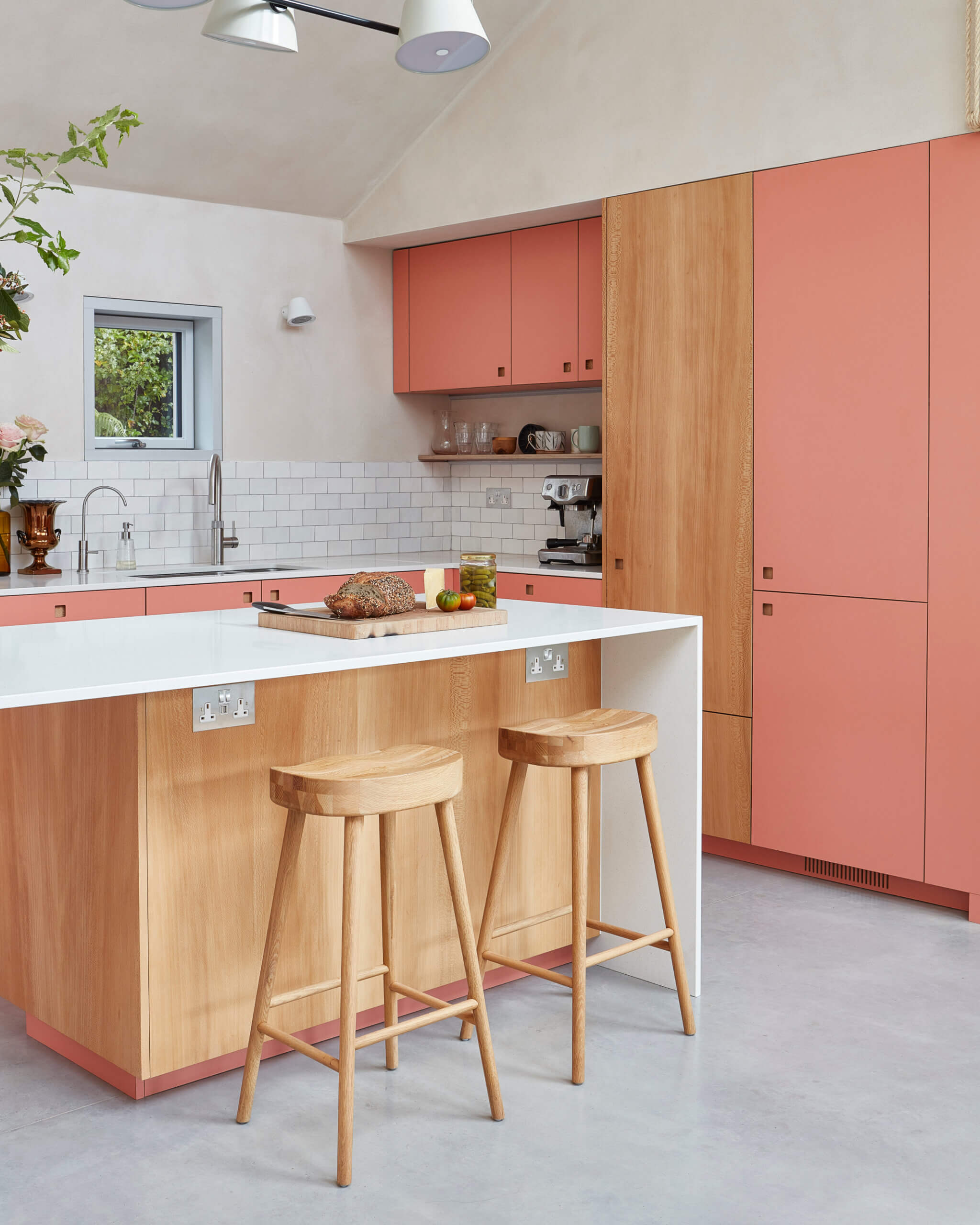
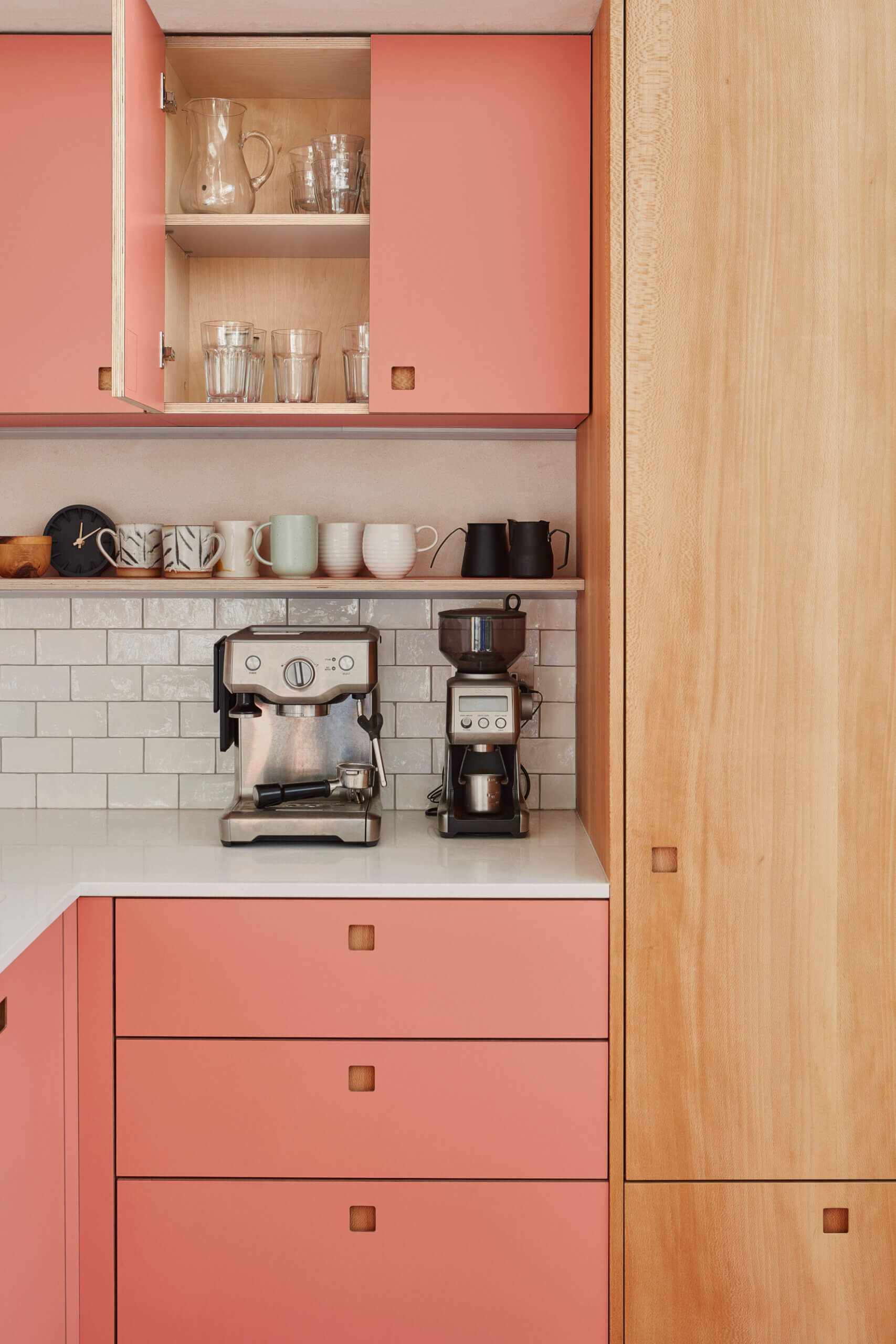
George Glasier: Palette-wise, this space is all about soft, tactile, and natural feeling finishes. PAD’s interior scheme included clay render walls with exposed timber battening, a balustrade hand wrapped in sisal rope and a poured concrete floor – so our cabinetry fits into this vision. We worked closely with the homeowner to select the scheme for the kitchen cabinetry. On paper ‘Ritzy’ seems bold – it is a coral pink – but it’s actually a soft colour too and here it echoes the warm, delicate hue of the walls and complements the green views of the garden. The finish is a high pressure laminate, which has a uniform, matt colour, again in keeping with the finishes elsewhere in the space. The London Plane finish adds a texture thanks to the speckled grain of the wood, veneers that we hand arrange to enhance the stunning pattern (and then press onto birch plywood). The extractor is concealed in a London Plane cupboard, the location of which brings a pleasing visual balance to the wood used in the rest of the design. The island has a Ritzy skirting, which feels playful and is a small detail to unite the scheme.
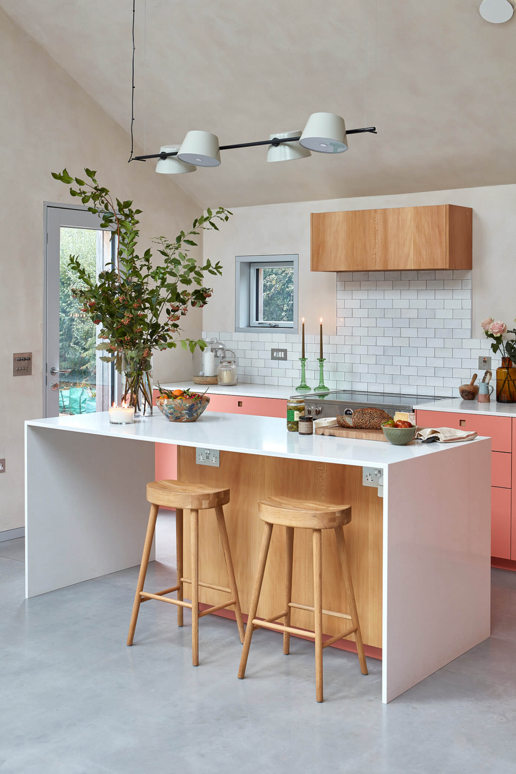
Collette Raine: With a neutral material palette, the clients used the kitchen choices to have a pop of colour accenting and highlighting the kitchen as the heart of the home. The kitchen is often the area where clients choose to show a glimpse of their personality through colour and pattern choices. Of course, the kitchen still has to be functional and hardwearing, whatever the colour choices. We were looking at worktops which were resistant to heat, easy to care for but still were environmentally conscious, hence our thoughts immediately turned to Caesarstone. We knew it’s a high-quality, durable material in a neutral finish that complemented the overall kitchen design and open-plan interior. The material could also achieve the unsupported spans of the island unit we were looking for in a relatively thin profile. The quality of the worktop was also a deciding factor for us – its composition ensures resistance to scratches, stains and heat, making it suitable for everyday use in a busy kitchen. Additionally, its non-porous nature makes it hygienic and easy to clean, requiring only simple care to maintain its pristine appearance.
Q: Can you tell us how the kitchen design evolved from initial conversations with your clients?
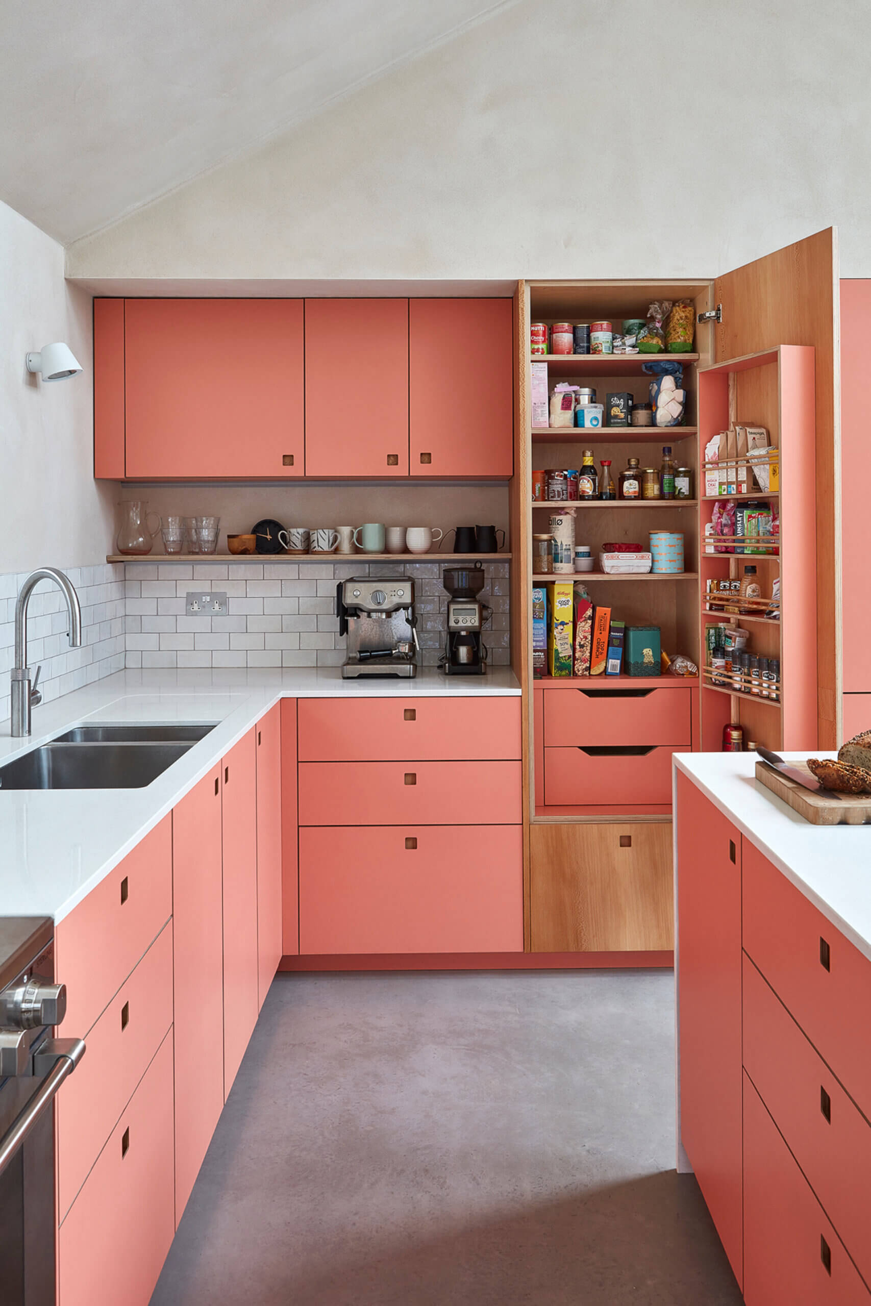
George Glasier: We felt that it was important our cabinetry did not dominate but sits in harmony with PAD’s beautiful design. One of our first challenges was incorporating enough storage for the family, whilst keeping the number of cupboards to a minimum. The homeowners knew they wanted a large island and plenty of space for coffee making, a skill they take seriously! We designed tall cabinetry on one side that incorporates their coffee kit, including a handy shelf for easily accessible cups. A larder houses consumables and the range cooker is the centrepiece of the back run of low cabinets. The sink is here too, located with views through a square (triple glazed) window out to the garden.
With all appliances on the back run we were able to leave the island clear of kit, creating a generous worktop area for food prep. PAD had a vision for this custom piece that includes waterfall edged Caesarstone worktops and the design has a sculptural feel due to the negative spaces created by the open areas underneath. We believe this kitchen is a triumph of cohesive design – it has an understated simplicity, as all elements work together, without competing for attention. In the end, it’s a beautiful and practical communal room for modern family life.
Q: What is your best advice for someone who is planning a new kitchen?
George Glasier: Think about what your priorities are for your kitchen – do you enjoy cooking, baking, hosting, or do you like to be alone and in the zone when you cook! Do you need lots of storage or perhaps shelf space to display a collection of ceramics. What are your ‘must haves’, are there things you want to avoid. Look at your space, you need to work with the room – what can you fit in that space, where is the natural light – it’s the bones of your design. Once you have established answers to this, the layout will flow. And finally you can think about the palette and the decorative bits!!
Collette Raine: We always suggest clients sit with designs for a period. Imagine working and living within those ideas and consider how they feel and what does and doesn’t work for them. It’s important not to just look at trends. We suggest to clients to consider the positioning of hobs and sinks so they are still connected to activity and life in the kitchen space, even whilst prepping and cooking.
Q: Do you consider you have a style signature?
George Glasier: Pluck’s bespoke cabinetry and furniture has a pared back and clutter-free style. This means it works in period and contemporary homes, and in combination with antique and modern furniture, art and all those other objects that make a kitchen feel like home. The majority of our projects include one of our larders, a practical solution for the storage of ingredients and consumables and they can also be designed to house appliances, keeping worktops clear.
They’re designed to be as beautiful on the inside as they are on the outside, with colours and materials customisable throughout. This project includes a single door larder with a Ritzy interior.
Q: What are your trend predictions heading into 2025?
George Glasier: There is a continuing and evolving shift towards interiors that consider their environmental impact. More and more we are discussing and explaining the sustainability of Pluck cabinetry and furniture, whether that be with our clients or other people we speak to about future trends.
We Love: The eye-popping Ritzy colour, which is uplifting and cheerful and adds a gorgeous touch to this calm and beautiful new home
Architects, PAD Studio Architects,
Kitchen, PLUCK, Unit 2, 88a Acre Lane, London SW2 5QN. 020 7095 1795. Follow on Instagram @pluckldn
Work surfaces, Caesarstone 6141 Ocean Foam, Caesarstone
Share this article
Featured Product: LEGRABOX
Win a Blum ORGA-LINE box worth £320!!!
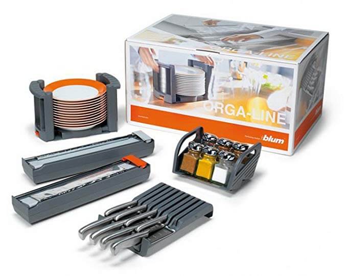
Every month The Kitchen Think is giving away one of these indispensable kitchen organisers worth £320!!


Leave a comment