Statement Red: Colourful Kitchen by Papilo
By Linda Parker

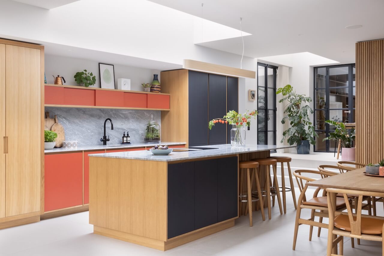
This gorgeous kitchen has exactly the right amount of colour to elevate it above the norm, whilst still feeling balanced and calm.
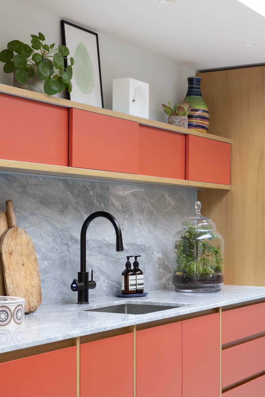
The kitchen is by Papilio, the colour used on the stand-out cabinets is Rebecca’s Red by Francesca’s Paints. Matt Prall, designer and MD of Papilio, tells us the background story of this colourful kitchen project…
Q: What were the design ideas and priorities in the brief from your clients?
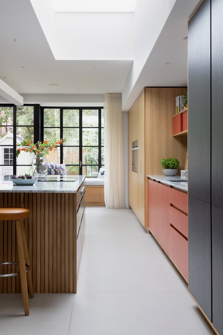
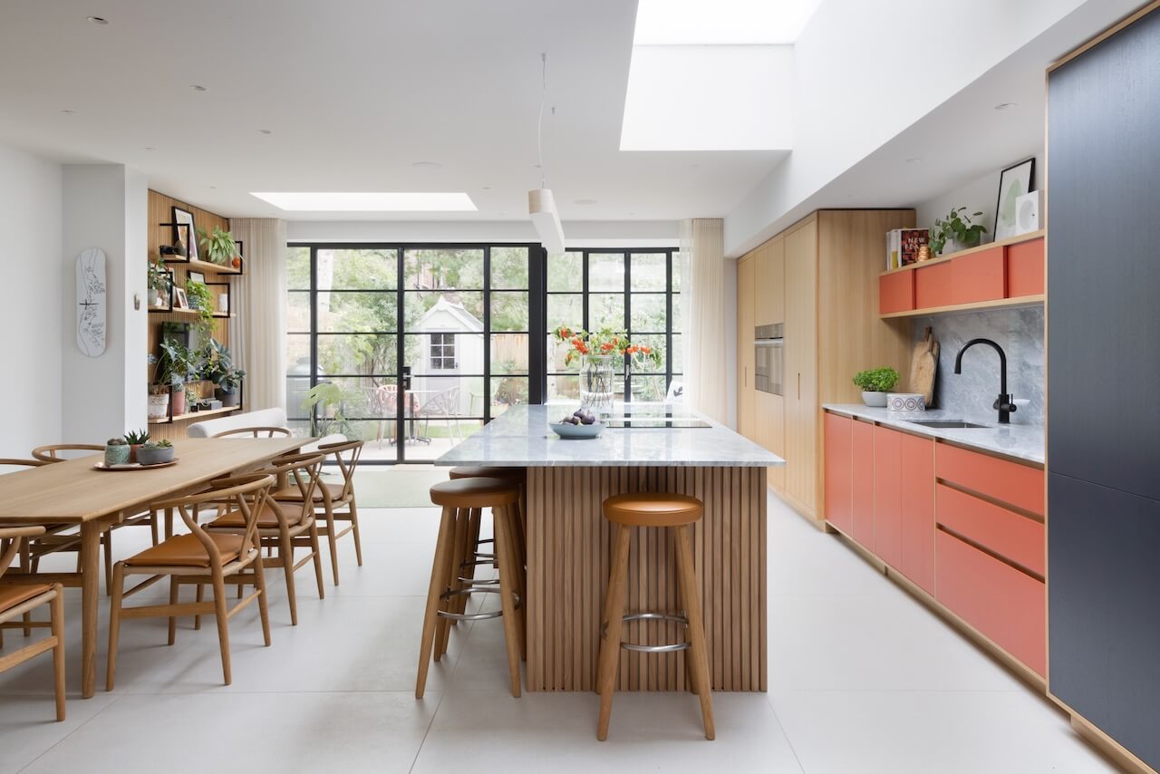
Primarily, to provide a space for the whole family to socialize. They wanted us to design and provide a warm and inviting space with a natural feel that would flow from the garden to the property and vice-versa. We designed the entire space including the TV area, window seat and coat cupboard to ensure that both flow and balance were perfect, and allowed everyone to move around freely and with ease.
Q: How did you set about answering that brief? Were you given a strict budget?
We started by discussing the project with the architect to ensure that there was no compromise between the space provided and the clients requirements. Most importantly we wanted to ensure that the pools of light from the ceiling lanterns worked with the location of the furniture. We looked at various combinations of natural materials and painted finishes in a modelled space to see which combination worked the best.
We were not working to a set budget but as we do with every project we were able to offer different solutions which had different budgetary levels.
Q: Tell us about the choices of colours, finishes and work surfaces …
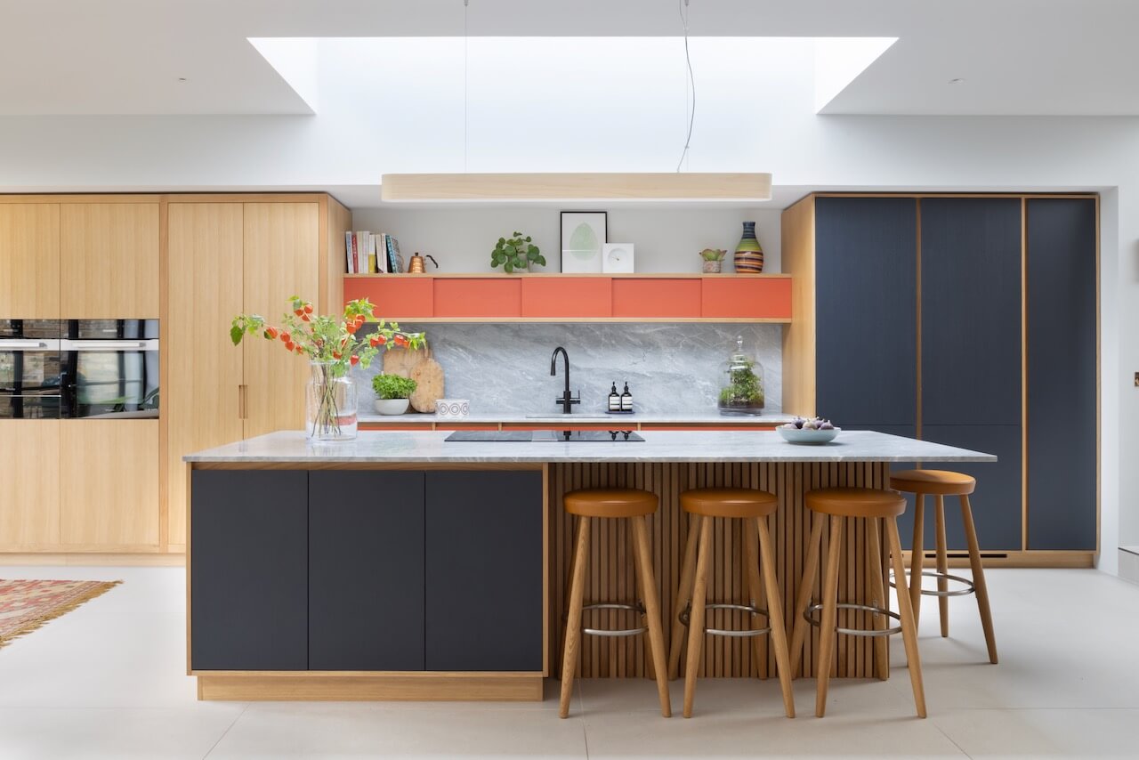
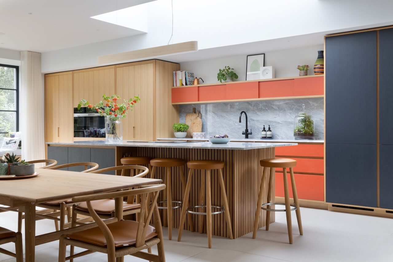
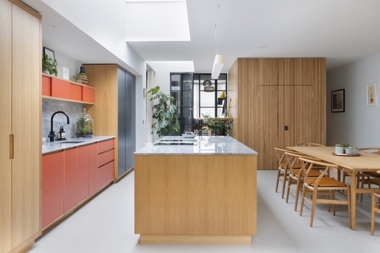
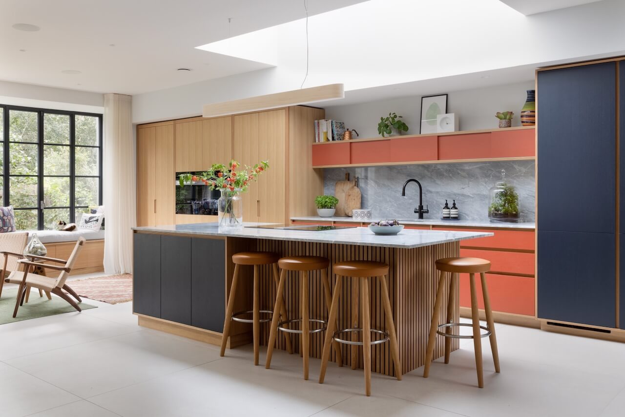
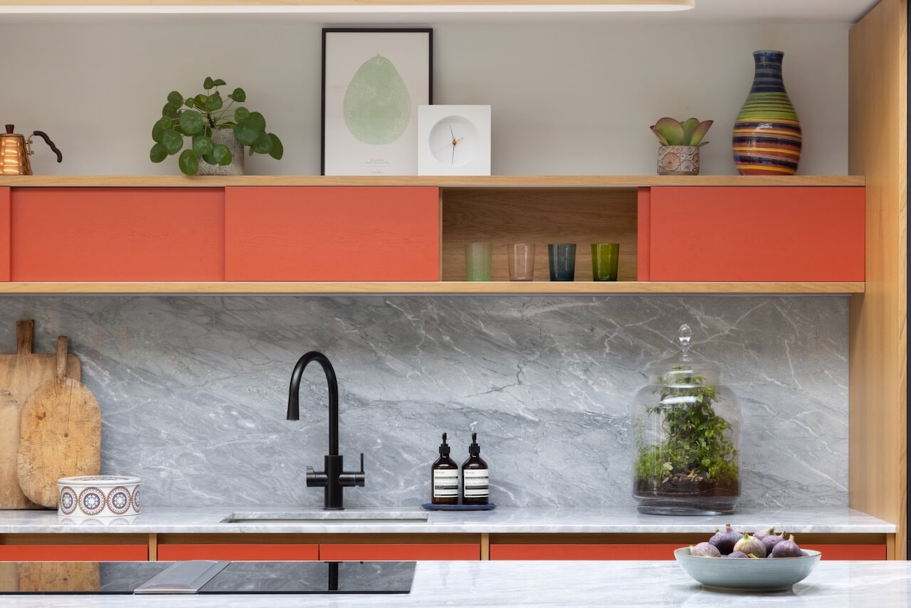
The cabinets were designed with a Scandi – Mid Century feel, which is both contemporary and timeless, and to complement our clients existing furniture and artifacts. The worksurface final choice was Grey Grigio Di Luna. It’s a very unusual marble, which is a breath of fresh air and different to the standard choice, which is generally Carrara! This marble also worked well with the floor tiles. The paint colours used were the vibrant Rebecca’s Red by Francesca’s Paints and a muted grey-blue self-mixed by the Papilio team.
Q: Was there any building/renovation work involved in this project? Did you have any restrictions or limitations that you had to work around?
The whole house was renovated, and two thirds of the kitchen actually sit in the newly built extension. There were a few structural steels that we had to work the furniture around and consequently, and most importantly, we had to ensure that the island sat perfectly below the ceiling lantern. In projects and designs like this, it’s crucial to have good communications with the architectural team so that those aims will be achievable.
Q: What design elements do you think make this scheme so successful?
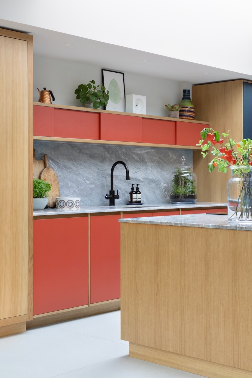
I think the colour palette was the standout success here, the balance of natural materials and vibrant colour give the kitchen life and vibrances that is both playful and welcoming. The cabinetry is made ply with an oak veneer, and the end panels, full-height oak doors and the contrasting paint shades work together in a great mix of natural finishes and bold colours.
Q: Now the project is finished, what aspects are you most pleased with?
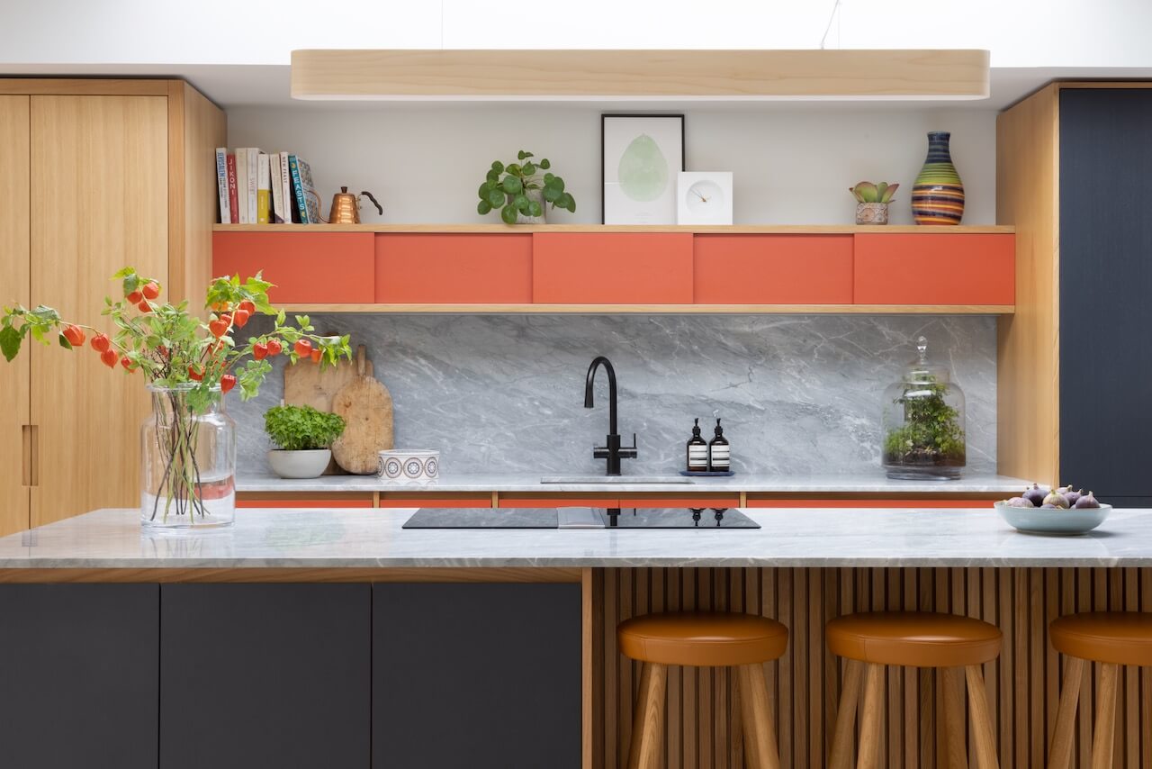
I think the slatted detailing that appears throughout the space is really transformational. It was originally introduced to dampen the sound in such a large room but eventually became a key design aesthetic. We also love the narrow cabinet with sliding door above the sink – it’s extremely practical as well as looking very sleek!
Q: What is your best advice for someone who is planning a new kitchen … what should they look and ask for?
I always think it’s important to get involved with a kitchen designer before signing off the architectural plans. Sometimes a client may have a very definite ‘wish list’ and so it’s important that the architect has a good overview of what is desired for the kitchen. For example, if the client is aiming for a central island that is to accommodate a big hob and an overhead extractor, it’s best if the architect is aware of that. Definitely meet with the kitchen designer before any building work commences so you can make the most of your new kitchen without unexpected restrictions.
Q: Do you have a secret ‘style signature’ that you find you use in most of your kitchen projects?
We have become well known for our slim narrow cabinets as featured in this project along with our sunken drinks/ice trough that you can see in various projects on our website.
Q: Are you seeing more large-scale projects that include other rooms, such as utility and so on?
We often start designing a kitchen for a client and during the process get asked to extend the package to other rooms. It rather depends on the original space – if it’s an existing kitchen then we may get involved with cloakrooms or utility transformations in other rooms. If it’s a new space such as this, we are focusing on the kitchen area and how to design a useable, practical and streamlined space.
Q: Do you have any trend predictions for 2023? Perhaps along the lines of colours, finishes and styles we will be seeing more of in the future ….
Pops of bright colour and interesting natural timbers have been big so far in 2022, and we don’t see this changing for 2023! We are also seeing demand for different materials as an alternative to wood, such as eco-products like resin and recycled paper compounds.
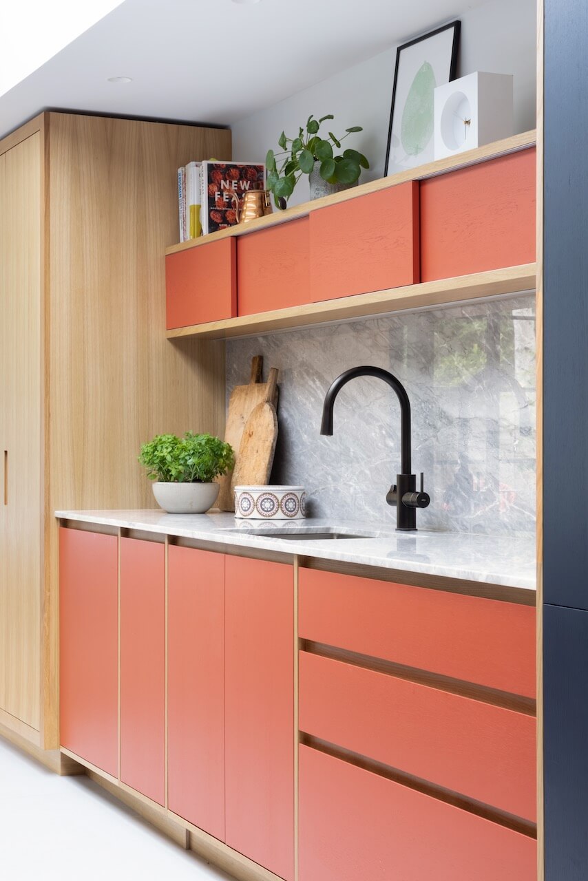
We Love: The colours and textures in this spacious kitchen. The orangey-red is striking, yet balanced by the grey-blue. The natural wood finishes bring all the elements together! Francesca Wezel, founder of Francesca’s Paints, adds ‘I love the use of my Rebecca’s Red with the dark blue-grey and wooden accents by Papilio. It looks balanced, inviting and warm … exactly how a kitchen should feel’.
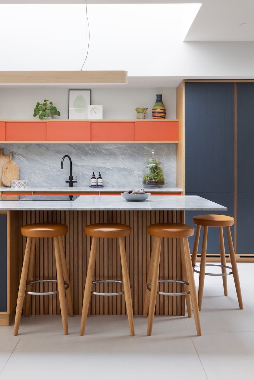
Cabinets: All are bespoke, and are designed and manufactured by Papilio
Ovens, fridge, freezer, dishwasher, all Miele
Hob, Bora Pro
All cabinet fittings, Blum
Tap, Zip
Sink, 1810




Leave a comment