SPACIOUS SIMPLICITY: British Standard Cupboards
By Linda Parker
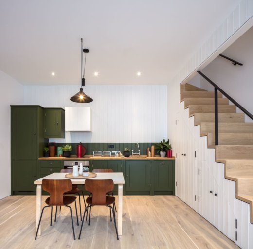
 The British Standard Cupboards collection was launched in 2012 by the team that twenty years earlier had established bespoke design company Plain English. British Standard Cupboards is a simple and streamlined collection of cabinets that are specifically designed to be bought on-line, then collected, fitted and painted by the client. We caught up with Neil Stafferton, BSC’s Sales & Design Manager, who is on hand to provide design and planning advice. We loved this olive-green kitchen, part of a project by Coupdeville Architects.
Q: What were the stand-out priorities in your brief from the client?
Our client was a young developer who had secured a commercial site in West London to convert into a terrace of unique houses. Each house has been designed to a high standard using considered materials and with focused attention to detail. The open plan kitchen and living area meant the cupboards would be on view and therefore needed to work with and compliment future furniture choices. Therefore, we felt that the hand painted finish to the outside of the cupboards and traditional joinery details, such as five-panel doors and four sided, dovetailed drawers would appeal to the prospective buyers. The overall aesthetic need to ‘sing’, as the kitchen was the first thing to catch the eye on entering each of the properties. Additionally, the ability to play around the paint colour and ‘tide line’ offered flexibility to be creative and add personality to each house.
Q: How did you set about answering that brief, what were your first thoughts when you saw this wonderful space?
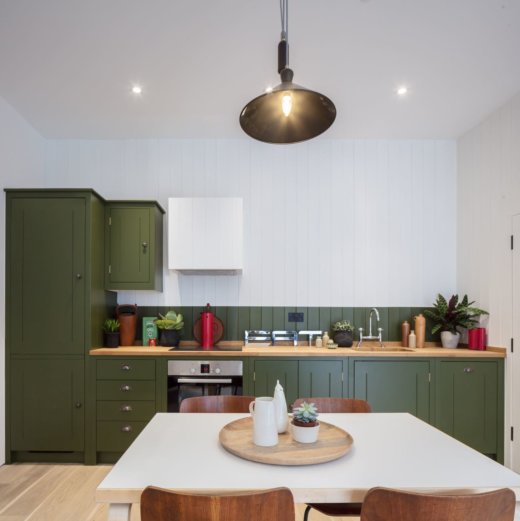
We looked at the room and layout set by the architects and bounced off this for ideas. The stairs were set along one side of the room, so this gave the room some direction. We saw an opportunity to balance this with a tall fridge-freezer and extractor cupboard positioned on the other side of the room, offering visual weight. We knew we had to harmonise the cupboards with the dining and living areas, so didn’t want to make the kitchen too heavy and dominant. Instead, we felt that one simple run would be efficient regarding functionality and storage; in essence referencing to a workbench, long console or kitchen table. We knew that the choice of paint colour gave us control to offer a visual ‘punch’ within the room at a later date if needed.
Q: Explain the reasons behind the size choices of cabinetry, layout and finishes …
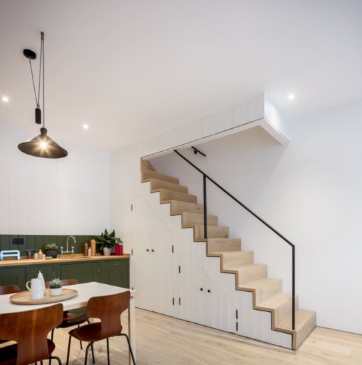
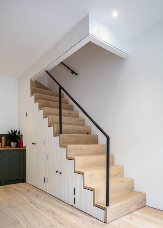
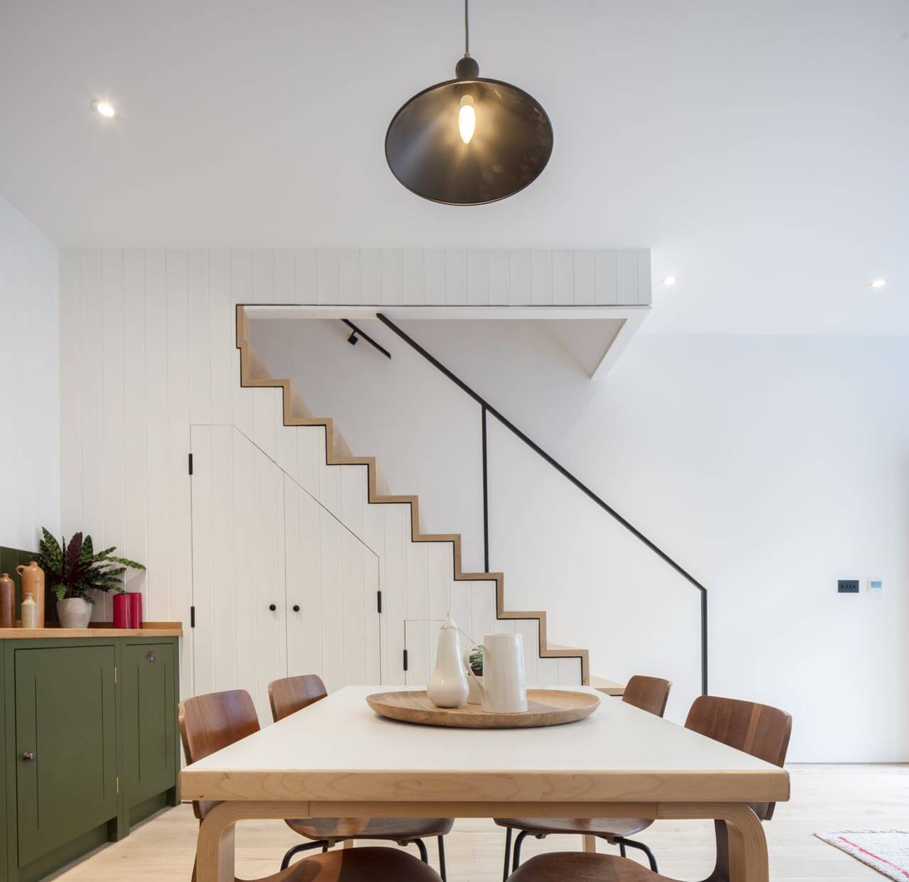
We knew we had a good amount of storage available under the stairs, which would also swallow the washing machine and act as a utility/housekeeper’s cupboard – enabling the kitchen to be more ‘cooking focused’. A set of drawers in ay kitchen is a great addition; spoons, utensils, place mats, table linen and so on can be tucked away and easily accessed as they’re top loaded. Visually they act as a ‘book end’ and work very well on the end of a run; especially once the ironmongery has been fitted, adding visual weight to the look. A small double cupboard is very efficient with usable storage space and a great option for pots and pans. A larger sink working hand in hand with a slimline dishwasher complement each other well. Crockery, cutlery and glasses go in the dishwasher, while larger baking trays and pots can be soaked and washed up by hand. There’s still an option for a loose open shelf above the sink for crockery and a few herb plants, leaving it open for the owner to add their finishing touches. The T&G boarding brought some cabin-style warmth to the overall finish of the room and the rich green colour choice felt like a positive, calming choice, working well with the warm tones of the oak work surface.
Q: What design elements do you think make the scheme so successful?
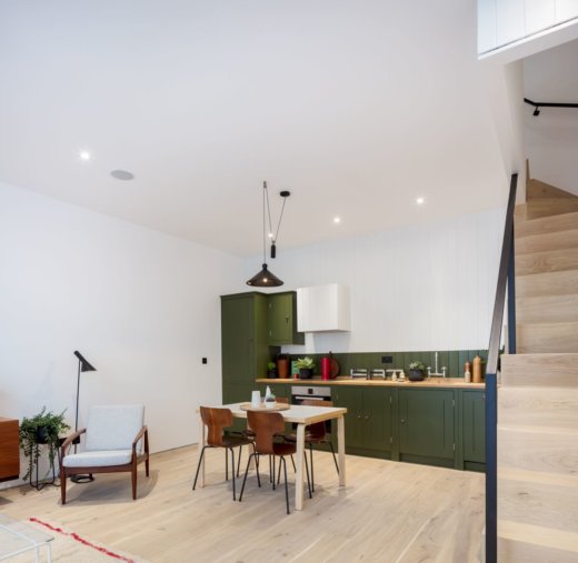
Working with the architecture of the space and going for the simple yet efficient run along the full width of the room was a modest detail that I felt worked well. It’s subtle yet perfectly functional. Using the storage area under the stairs was very effective and connecting these two elements with common use of the T&G was a great detail suggested by the developer. Whilst the joinery isn’t the same, materials, detailing and colour can bridge different zones in a room to communicate a change in rhythm and function.
The rich green and crisp white tide line work well together in the room. The white reflects the cleanness of the timber flooring and stairs, whilst the earthy green grounds the cupboards and adds a focal point feature.

Q: What is your best advice for someone who may be planning a new kitchen?
Take your time in the early stages and plan well, pulling together all the design details that have inspired you along the way, to end up with a considered and successful design. Look to the architecture of the space for hints when thinking about the layout, thinking about the balance, proportion and function of the kitchen. Use materials, details and colour to direct the overall look and feel of the room.
We LOVE: The striking olive green colour choice – for a similar shade, try Calke Green by Farrow & Ball. The under stairs storage concept is both a practical and elegant use of space.
Cupboards by British Standard Cupboards, 41 Hoxton Square, London N1 6PB 020 7870 7688. Also in Stowupland and Stavanger. Cupboards start at £465, an average British Standard kitchen is around £8,000. www.britishstandardcupboards.co.uk
Architect: Coupdeville Architects, www.coupdeville.net
Photography: Simon Kennedy, www.simonkennedy.net



Leave a comment