Simple and Spacious – By Neil Lerner
By Linda Parker
Design Director Eve Turner, of Neil Lerner Kitchen Design was asked to create a symmetrical and glamorous kitchen for a couple and their growing family.
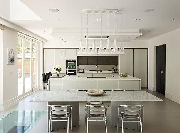
Eve Turner came up with a brand new kitchen scheme that fulfilled a comprehensive brief from the owners; they had originally wanted to renovate the property, but ended up knocking it down and starting again with a clean slate. The kitchen area was very spacious, covering the full width of the rear of the house; this meant Eve was able to create three linked-but-separate areas, for cooking, dining and relaxing.
Q: What were the main things your clients wanted from their new kitchen?
My priorities for this kitchen were to create a modern, uncluttered scheme with good symmetry and plenty of storage. Our clients wanted glamour and of course, a ‘wow’ factor. At the same time, with two young boys chasing around, the kitchen also had to be practical, low maintenance and very easy to keep clean!
Q: Storage was to be a priority; how did you deal with that?
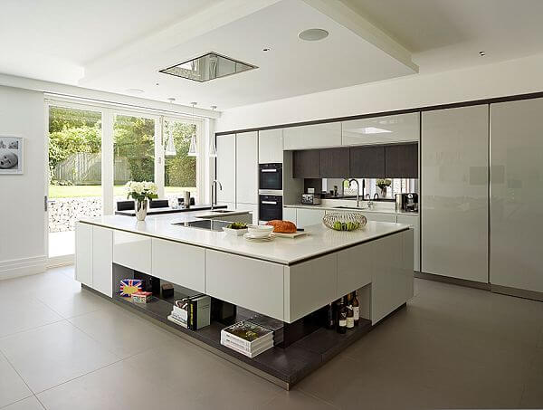
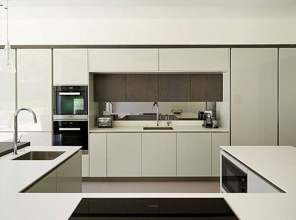
One of the most common requests we get as kitchen designers is for ‘maximum storage within a limited space’. It’s always a challenge to ensure that the kitchen is designed to look minimalistic and elegant, while still building in plenty of storage space. In this case our client was a self-confessed hoarder but it’s a fact that most of our clients have accumulated a lot of ‘stuff’ and need places to store it safely. So the back wall was designed to encompass lots of tall cabinets, as well as all the cooking and cooling appliances. Additionally, there are cupboards under the large island unit. There is also a separate utility room via a secret door to the right of the sink so there is a lot of hidden storage there too.
Q: Can you explain the advantages of the materials you specified for this design?
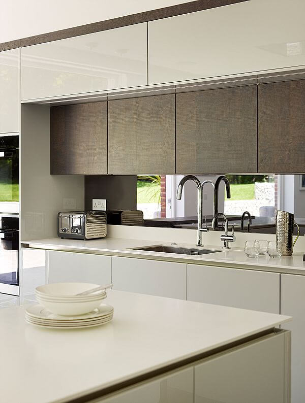
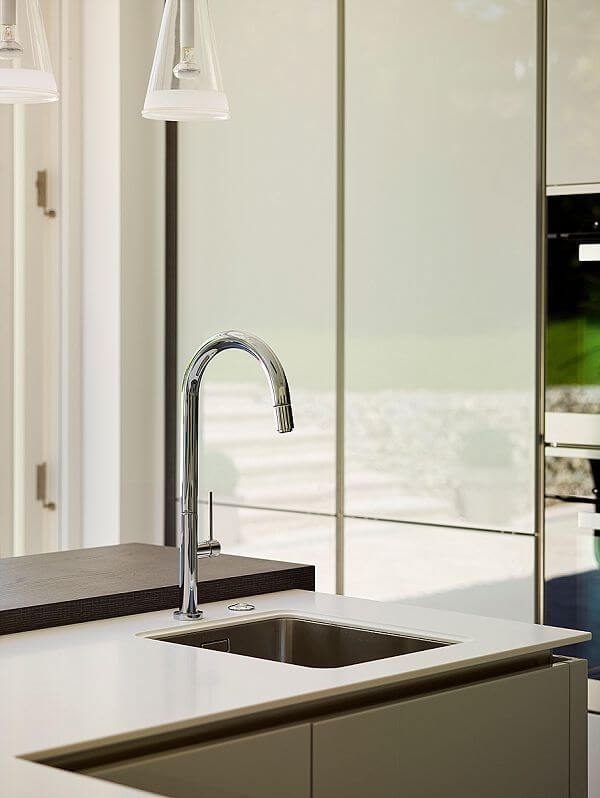
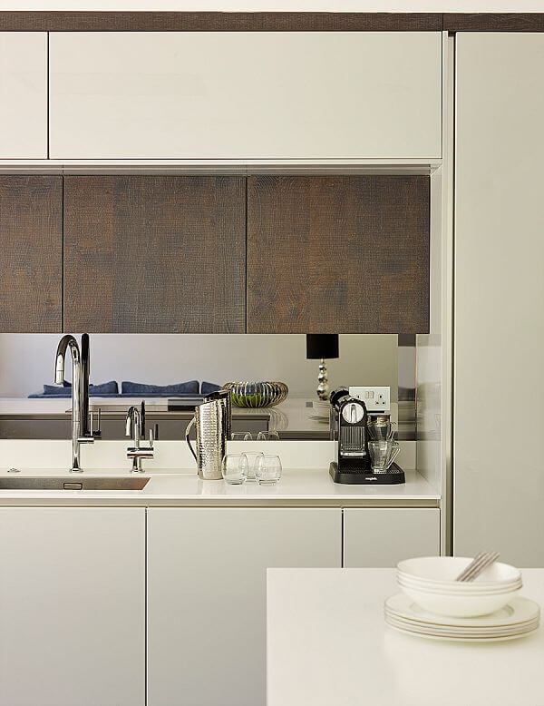
The white composite worktops are made of Corian, which not only looks good but crucially, is also very easy to keep clean. The high gloss lacquered doors are paired with silver oak cabinets, which boasts an unusual rough-sawn effect. The wood is dark but it has a blue tint that goes really well with the light grey lacquer, acting as an excellent contrast. Gloss surfaces have a bad reputation for showing fingerprints but that really only applies to dark colours. The pale option is far more practical. The lacquer is applied in five layers so it doesn’t scratch easily and is very easily and quickly wiped clean.
Q: What are the advantages of the island layout?
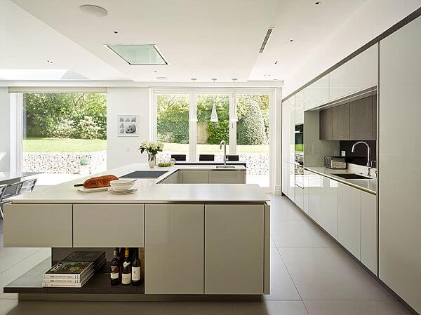
In order to keep the boys safely out of harm’s way in a busy kitchen, I wanted the island to separate the cooking area from the rest of the kitchen. I designed a U-shaped island, which creates a large amount of surface area without looking like a huge and uninteresting blank block. It also stands out as a centrepiece in its own right and has some open shelving below that can be used to showcase personal items.
Q: What elements do you think make the design so successful?
The scheme works well as there is a very clear delineation between the cooking, eating and living areas. Also keeping all the tall units at the back means that there is plenty of natural light coming through the whole space via the vast bi-fold doors leading to the garden area to the side of the kitchen.
Q: What advice would you give to someone planning a new kitchen?
My advice to someone thinking about having a new kitchen is always to employ a professional kitchen designer! There are so many elements that contribute to creating a successful working kitchen, and it should ideally be a team effort between the owner/user of the kitchen and the experienced kitchen designer. I would also emphasise the importance of expert fitters as this is the key to a perfect finish. At Neil Lerner Kitchen Design, we only use our own fitting teams so they know exactly how we want the kitchen to look and are instrumental in bringing the owner’s dream kitchen to life.
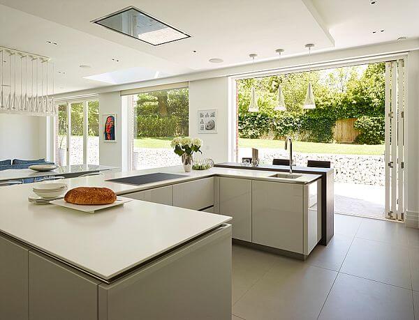
We Love: The symmetry of the whole kitchen, as well as the awesome ‘mission control’ style U-shaped island, which is both practical and elegant
All cabinetry and furniture by Neil Lerner Kitchen Design, 020 7433 0705, www.neillerner.com
Ovens and hob by Miele, www.miele.co.uk
Sink by Blanco, www.blanco.co.uk
Boiling Water Tap by InSinkErator, www.insinkerator.co.uk
Ceiling extractor by Gutmann, www.blanco.co.uk
Work surfaces by Corian, www.corian.co.uk
Paint by Dulux, www.dulux.co.uk



Leave a comment