Signature Bespoke Shaker kitchen and walk-in pantry by Searle & Taylor
 The designer: Darren Taylor at Searle & Taylor
The photographer: Paul Craig
The story: The longest-established premium independent kitchen studio in Winchester, Searle & Taylor has been designing traditional bespoke and contemporary kitchens for clients in Hampshire and beyond since 1991.
The company, owned by Darren Taylor, has a long-held reputation for thoughtful and intelligent design, meticulous planning and precision installation together with award-winning customer service.
Its capacious two-floor showroom in central Winchester features an array of beautiful kitchen displays plus a walk-in pantry and the company has recently added a rear extension to the building with a stunning new open-plan kitchen and living room set that leads directly to the garden.
Designer Q&A:
Q) What was your brief from the client?
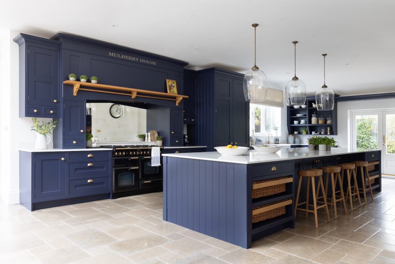
We were briefed to design and make a bespoke Shaker kitchen that was to have a large statement island, together with a spacious walk-in pantry leading off it.
The kitchen, with a separate dining area, comprises a capacious rear extension to our clients’ property, a detached Victorian home on the outskirts of Winchester, Hampshire. Our clients wanted a beautiful, functional kitchen with storage being a key component and they were seeking lovely design details to complement the original architecture of their home.
With a big family, they also wanted the kitchen to be a social hub with informal seating at the island. They also wanted the kitchen to be dark blue and white.
Q) How did you answer the brief?
I started my career as a cabinetmaker. While I purely design kitchens nowadays, I was able to apply a lot of my early training for many of the features in this kitchen.
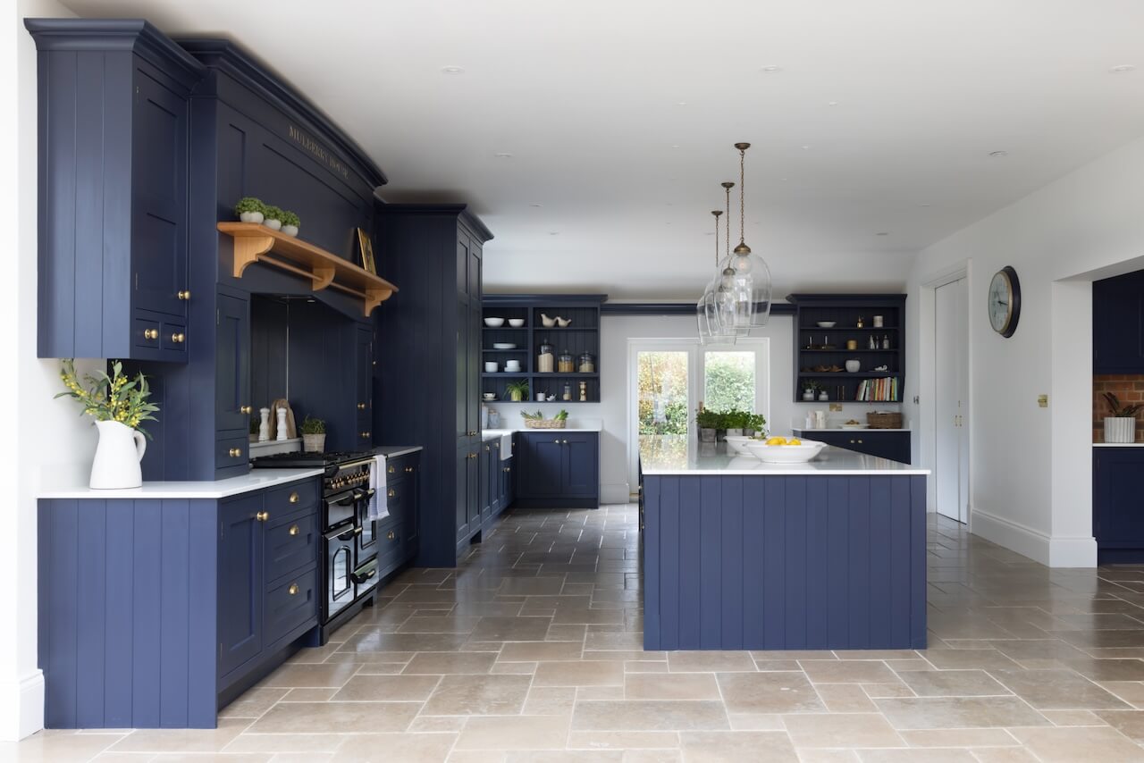
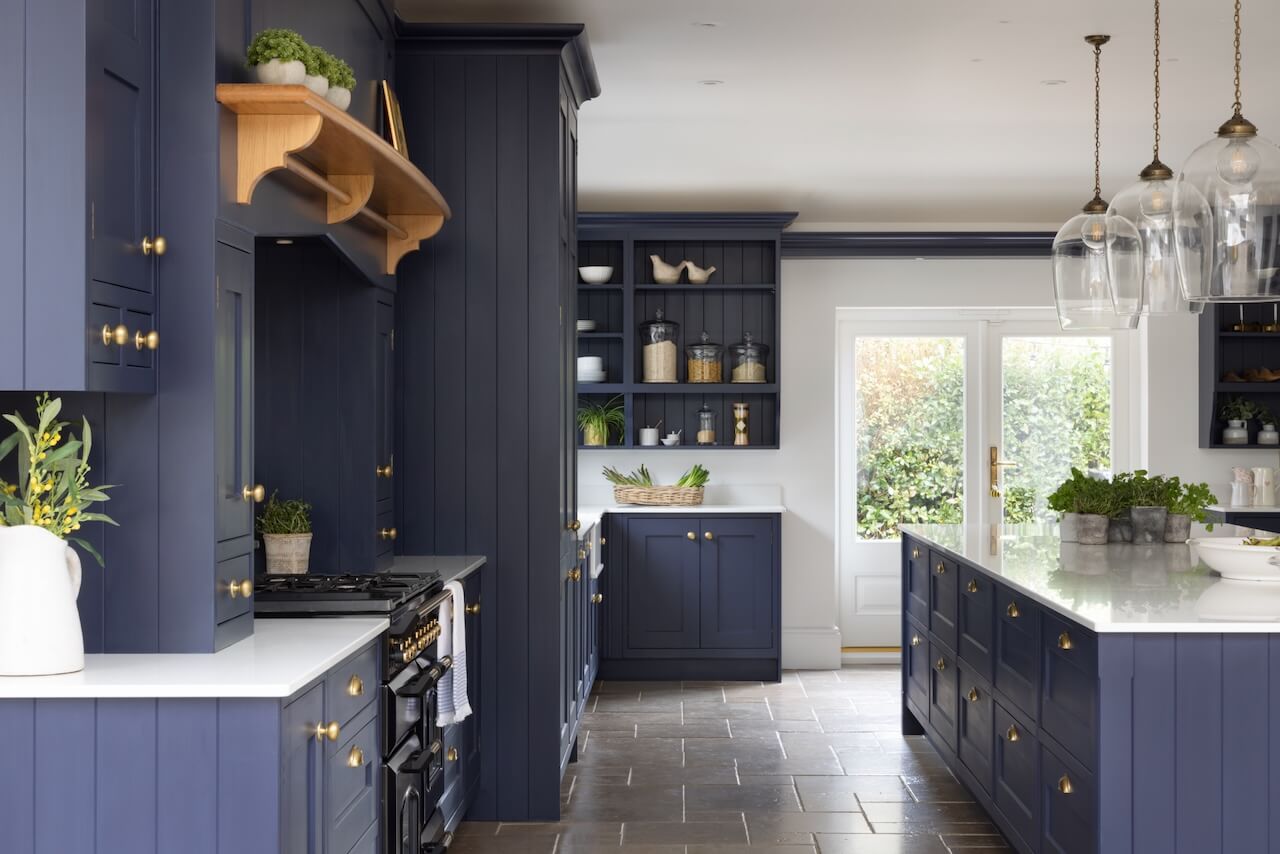
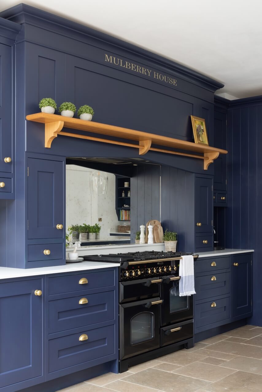
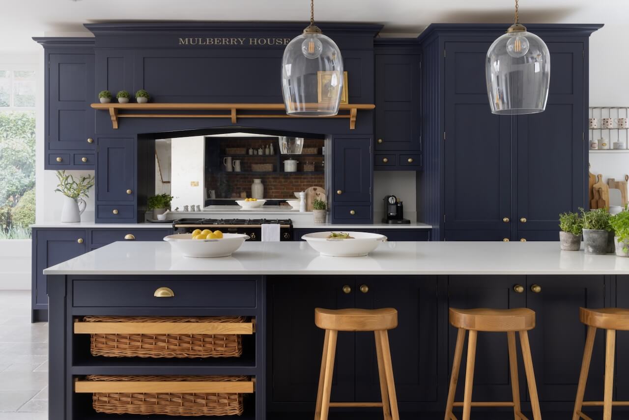
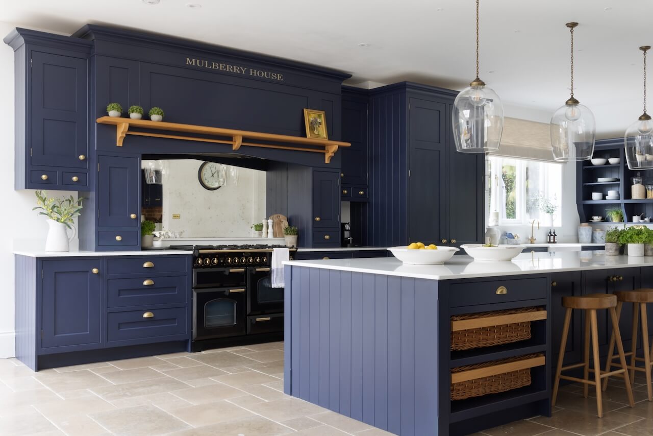
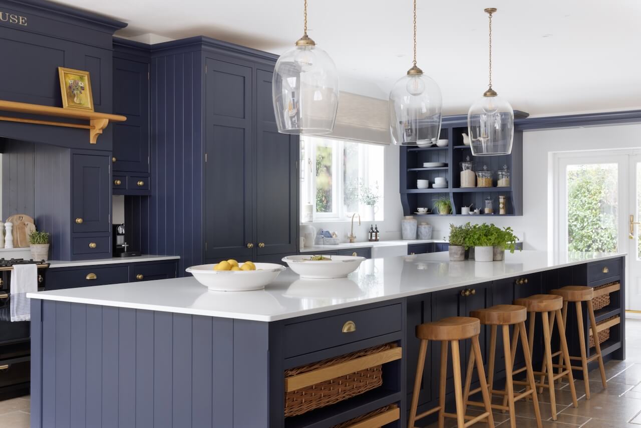
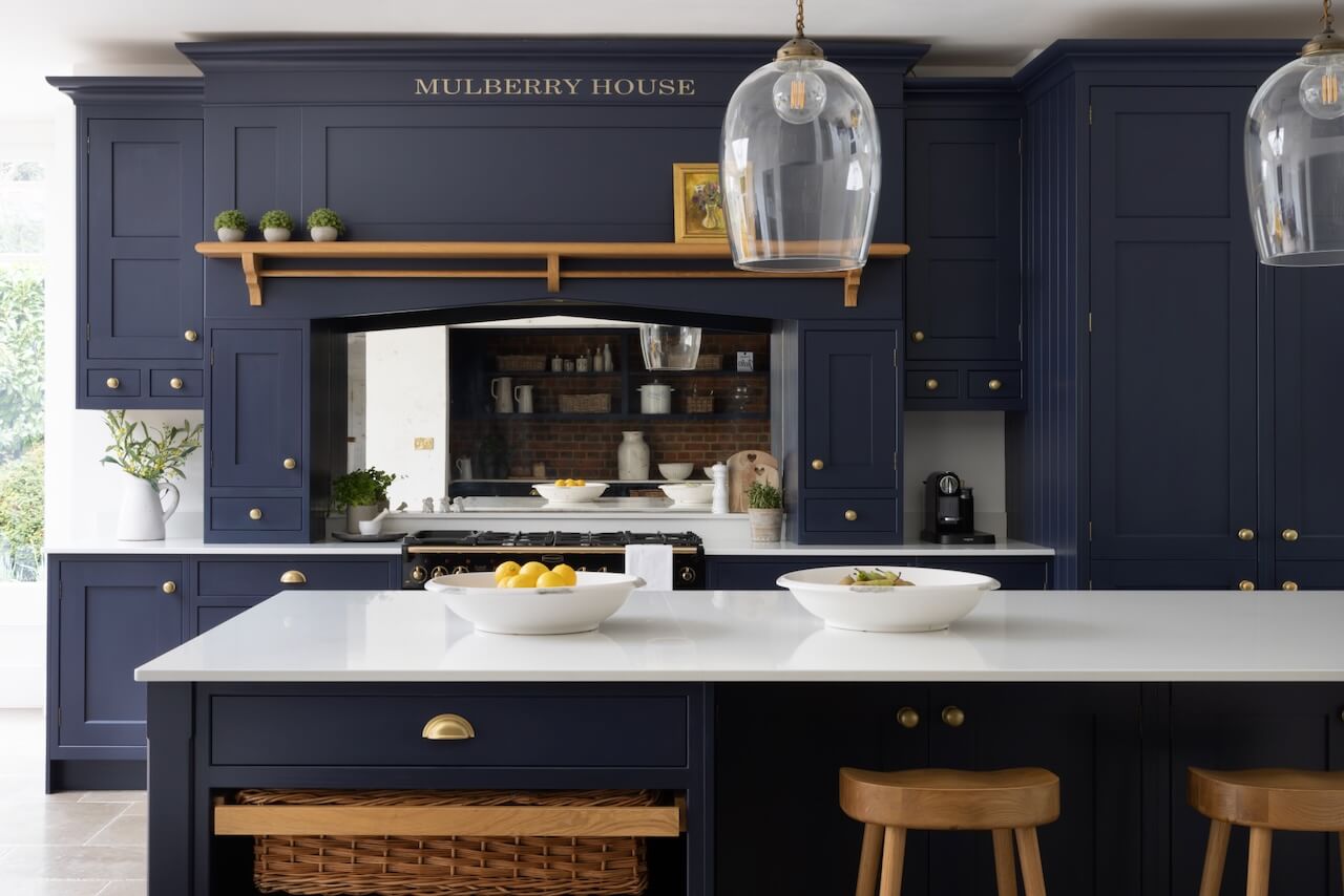
Space was not an issue with this design but use of space was important, as I wanted everything to be symmetrical. Not only was the surface area very large but the ceilings were very high and I wanted to take advantage of this within the design. Because all the cabinetry was bespoke, I designed the breakfront section using a 30mm chamfer frame above the range cooker to the ceiling, with the rest of the tall cabinetry along the cooking run just a few centimetres lower. Because storage was paramount to the brief, I designed the kitchen to include 26 different sized drawers, all with handmade solid oak dovetailed drawer boxes.
Q) How did you choose the colour?
The clients had chosen a stunning midnight blue paint colour for the kitchen called Inkwell and I wanted to contrast that with an Adam-style solid oak canopy as a feature accent piece.
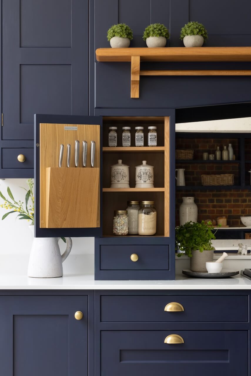
I included recessed floating overhead cupboards with drawers beneath and on either side of the central inglenook are spice cupboards that open to reveal a handmade knife rack in the door, with a drawer beneath each one.
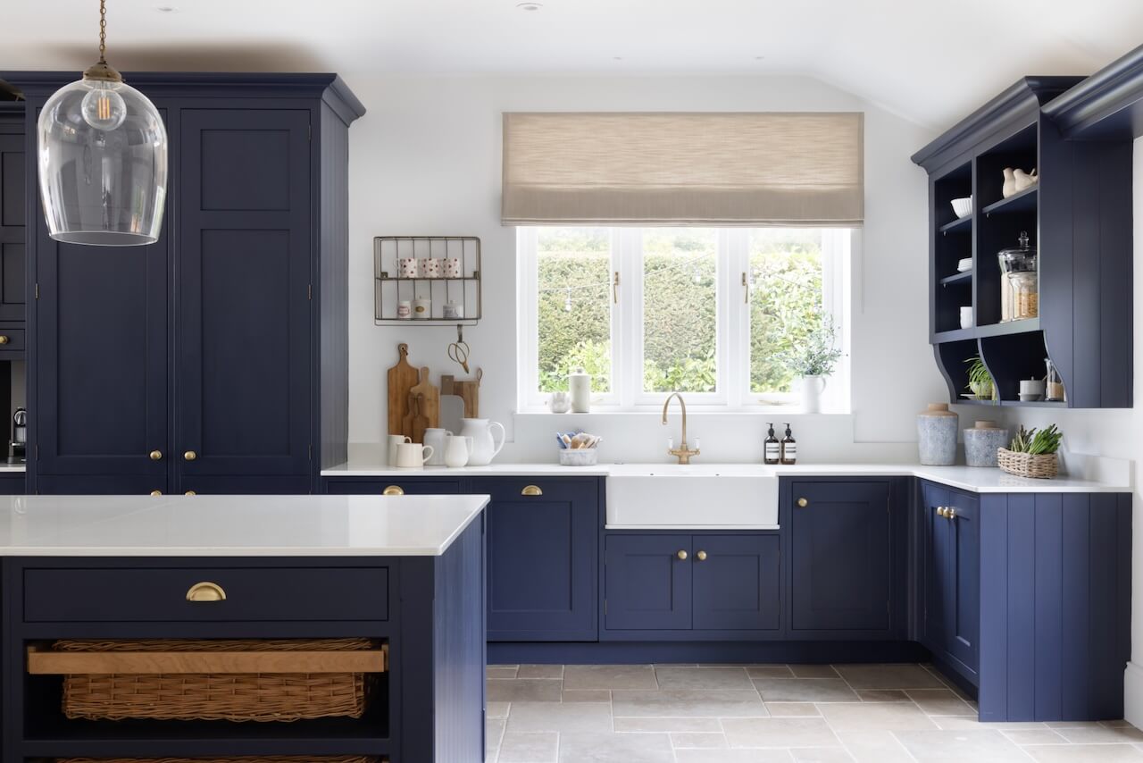
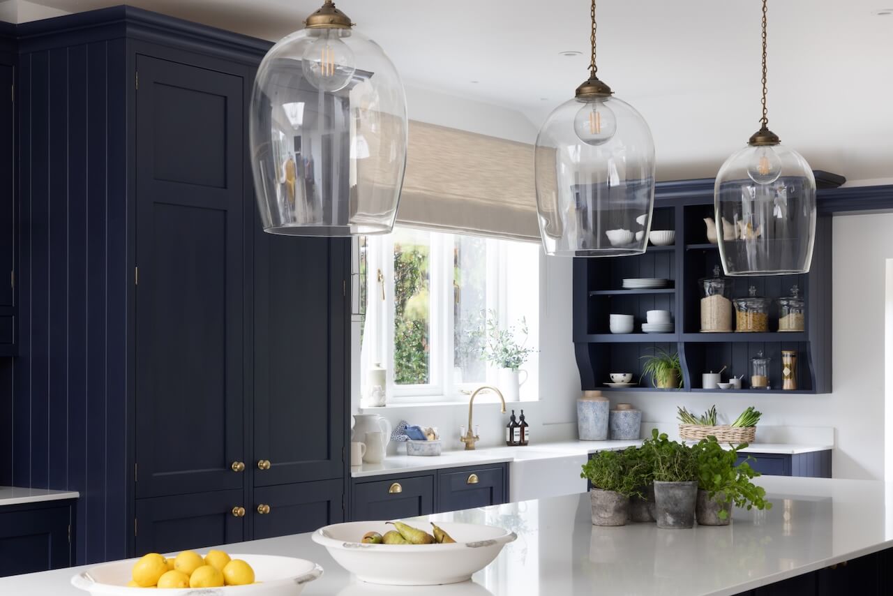
To add to the Shaker aesthetic, all end panels are tongue and grooved. Next to the tall cabinetry is a wet run with a sink directly beneath a window looking out to the garden. This includes a large farmhouse sink sitting on top of a sill made from 20mm-thick quartz, which protects the cupboards beneath from water ingress.
Q) Tell us about the island
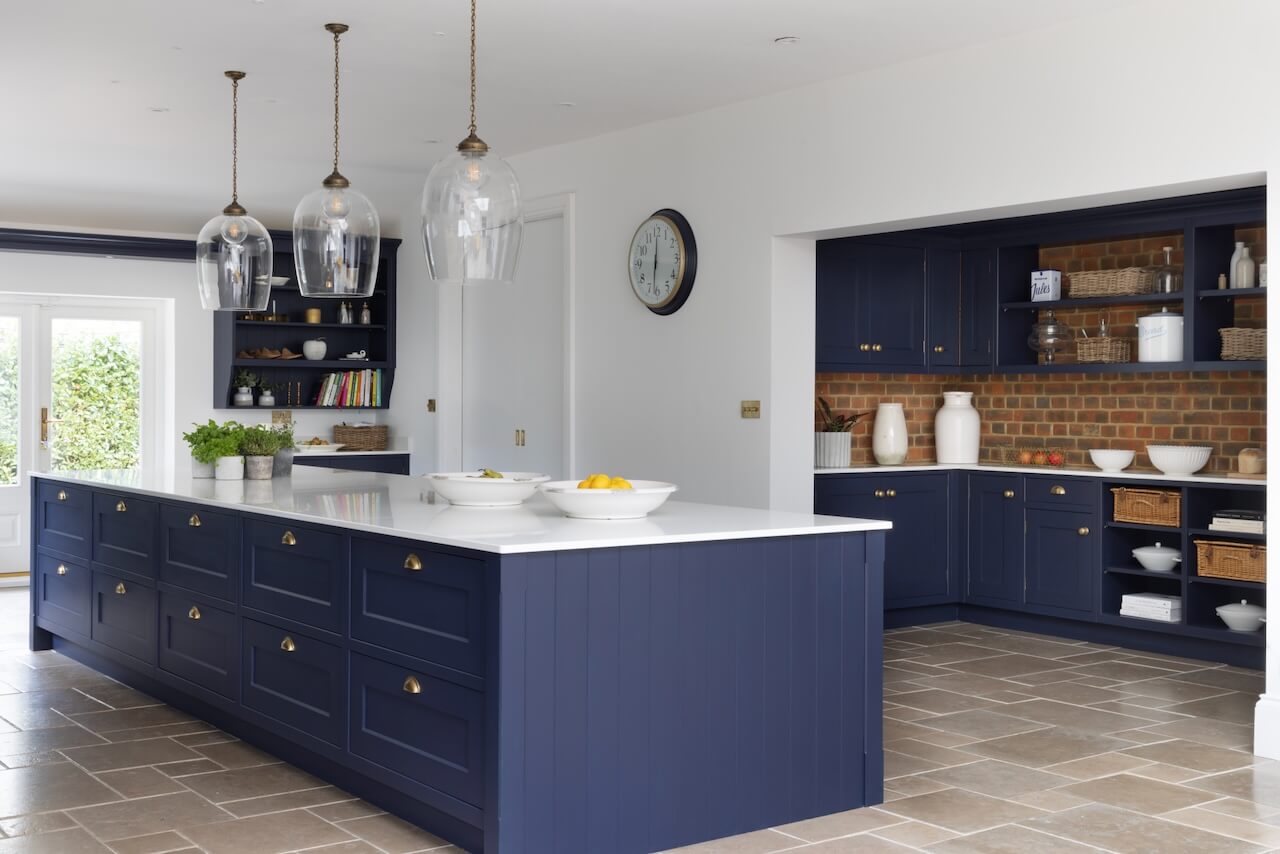
The ‘piece de resistance’ is the island, which is designed to be symmetrical to the double doors leading to the garden. At nearly 5 metres in length, it required two slabs of 20mm-thick Ariel quartz joined together to create the worksurface. On the task side are 10 deep drawers, all with pull cup handles. On the facing side are open wicker vegetable and bread drawers on either side of a recessed space for four counter stools.
Q) And the open shelving?
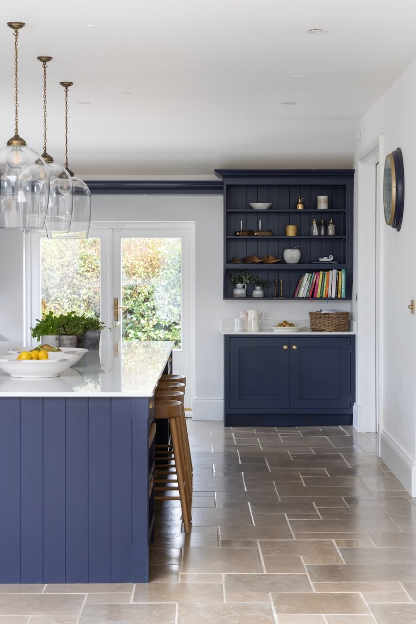
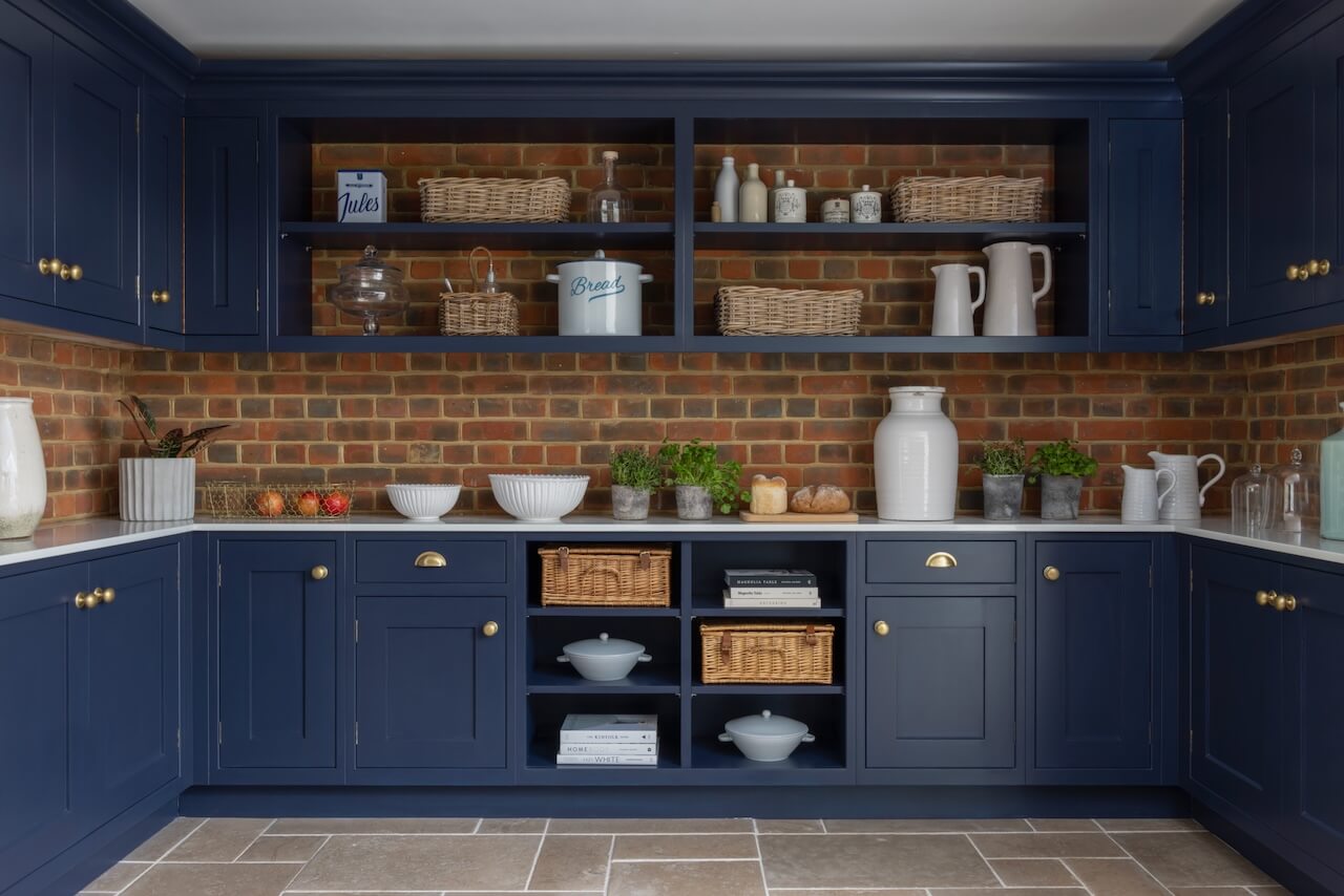
To both sides of the double doors, I designed symmetrical wall-mounted dresser cabinets with open shelving and tongue and groove back panels. These are used to store cookery books and decorative items and they connect with one another via a flyover shelf above the doorway. I wanted to include open shelving in the kitchen to complement the design of the walk-in pantry, which is in a u-shape, with matching base and overhead cabinetry with central open shelving to make a feature of the exposed brick wall behind it.
Q) Which products did you use and why?
For this kitchen, our clients chose the appliances so we designed the cabinetry, which was handmade in Wiltshire. Working with the clients, who wanted white worksurfaces, we chose 20mm thick Ariel quartz by Cosentino with a pencil edge. Our clients chose Inkwell by Colour Trend Paints, which is a rich midnight blue.
We included a farmhouse sink by Villeroy & Boch because it suits the aesthetic of this country kitchen and paired it with a Perrin & Rowe tap in satin aged brass. Brass ball knob and cup pull handles, are all antique brass by Armac Martin and we chose them because they perfectly suit a Shaker look.
The clients also chose the stunning pendant lights from Jim Lawrence, which provide the perfect statement lighting required for a kitchen of this size.
Q) What design elements do you think make the scheme so successful?
The floor-to-ceiling cabinetry works with the dimensions of the room while the open shelving makes it feel cosy and personalised. I particularly love all the drawers, which range in width from 150mm all the way up to 900mm – I have never designed a kitchen with so many drawers. The symmetry really works in this kitchen and I really like the large walk-in pantry, which looks rustic yet sophisticated.
Q) Any advice for someone who may be planning a new kitchen?
Your kitchen should be personalised to your needs, even down to the plug sockets and where they are located. For those reasons, I always recommend that you visit one or more independent kitchen design showrooms to speak with experienced specialists who can advise you. However, be aware that most kitchen designers will not immediately come out to measure your property before they have ascertained your requirements and budget.
At Searle & Taylor we have a thorough client brief, where we ask lots of relevant questions about you, your lifestyle and how many people live in the property before we put pencil to paper to start a design.
The details:
Cabinetry by Searle & Taylor
Worksurfaces by Cosentino
Paint by Colourtrend
Range cooker by Rangemaster
Handles by Armac Martin
Sink, tap and waste disposal by Villeroy & Boch, Perrin & Rowe and InSinkErator
Pendants by Jim Lawrence
Bar stools by Cox & Cox
Hayley loves: all the attention to detail that this stunning kitchen offers. You can tell it’s tailored perfectly to its owners.



Leave a comment