Showroom Style: The Myers Touch, Winchester
By Linda Parker
 As kitchen showrooms start to re-open, we asked Keith and Helena Myers about the background story to their impressive showroom in Winchester.
Q: What concepts took priority when designing the new showroom – how did you whittle the choices down from your amazing array of suppliers?!
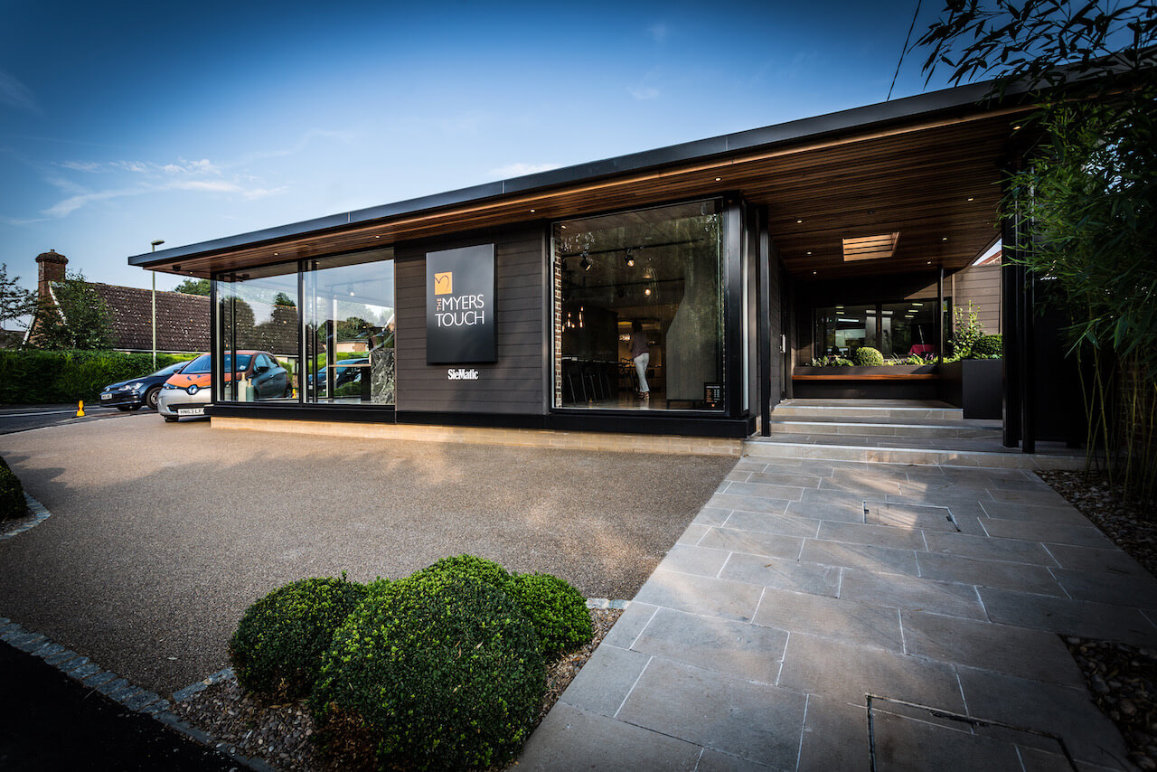
The new internal design concept was for the studio to be more than a SieMatic kitchen show room, having “the kitchen is the heart of the home” as the premise for everything within it. The individual displays reflect our capacity to design living spaces which are relevant to the user and carry both emotional and practical elements. The showroom includes SieMatic cabinetry but also bespoke elements which demonstrate and display our design capabilities.
Several of the displays incorporate seating or living areas to reflect the practicalities of family life. We can also host regular events for up to 80 people, which include cooking demonstrations and dining opportunities. The incorporation of a “garden” with which clients will identify as an important feature of a home is a lovely additional feature. When we selected products for the exterior we collected lots of samples and gradually put a mood-board/palette together. We used a local steel fabricator for the outdoor steel work (support beams and door number) and the internal steel for the table legs and light over the table.
Q: What impresses visitors and clients most when they walk in?
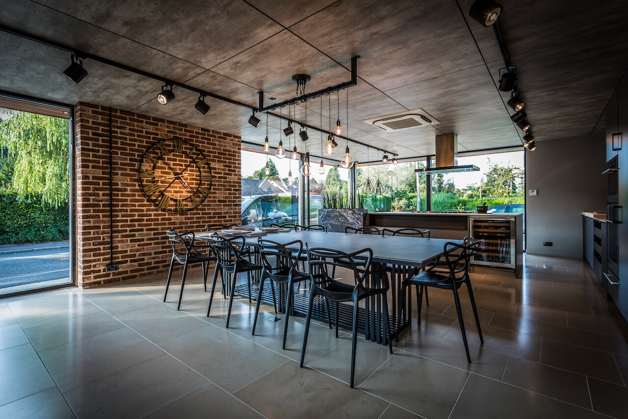
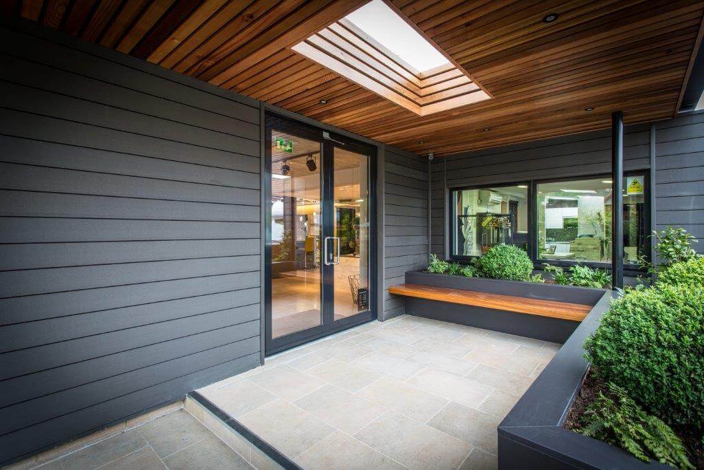
Clients love the entrance through a garden. This is very unusual for a kitchen studio but very natural in a home environment, so we are sure this introduces a homely and welcoming feeling – before entering the showroom itself! Once through the door the front display is a large kitchen- dining display with an Urban feel. Clients love the sense of space and coherence alongside the many textural design elements that draw this space together. Visitors are drawn to the products that interest them most, all of them are striking – for example the Wolf & Sub Zero appliances; the large island; the bespoke table with Dekton top with overhanging individually designed lights. There is also the feeling of alignment with their own future project as we have a large open space with full height glass windows onto the outdoors – similar to what many clients are looking to achieve within their own homes.
Q: What was the most important idea that you wanted to convey with the look of the showroom?
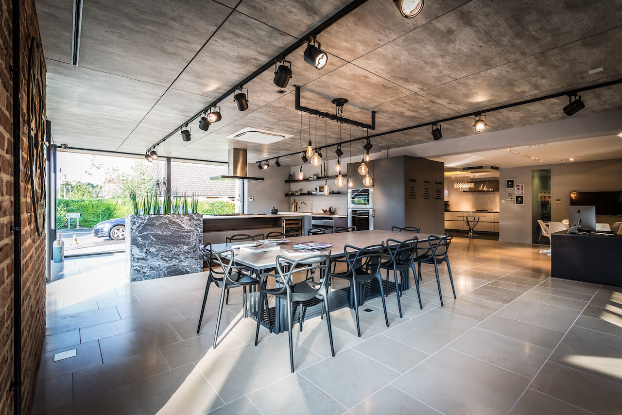
That each living display represents the different and unique design concepts that can be achieved in our clients own homes. We also wanted to showcase the quality of product and installation, which, alongside the interior design features is what makes us stand out from the crowd.
Q: Helena, what are your particular favourite features within the showroom?
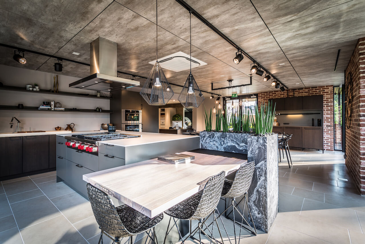
I enjoy the view from outside and up the steps into the garden. I call this our ‘Narnia’ as we are taking visitors from the hustle of the outside world into the safe haven of a home. I also love the view of the Urban display as you open the door. The concrete effect ceiling, low hanging lights and the cladded brick wall with large clock. So many strong textures that all work together beautifully, taking their place in this open room
Q: Keith, and what are your favourite aspects?
I love the architectural interpretation and use of the studio as a whole creating areas of mystery – for example the wooden table with the hidden rising TV at the end, to stand against the succulent planter and the pocket door opening into boot room/utility area. I also like the way each of the ceilings are fashioned to ground and emphasise the kitchen design – particularly the circle ceiling over the curved breakfast bar. As we work with a lot of architects, our examples of architectural features is a favourite part of the showroom – for example the large glass windows and beautiful niched wall in Eternal Calcutta Gold Silestone
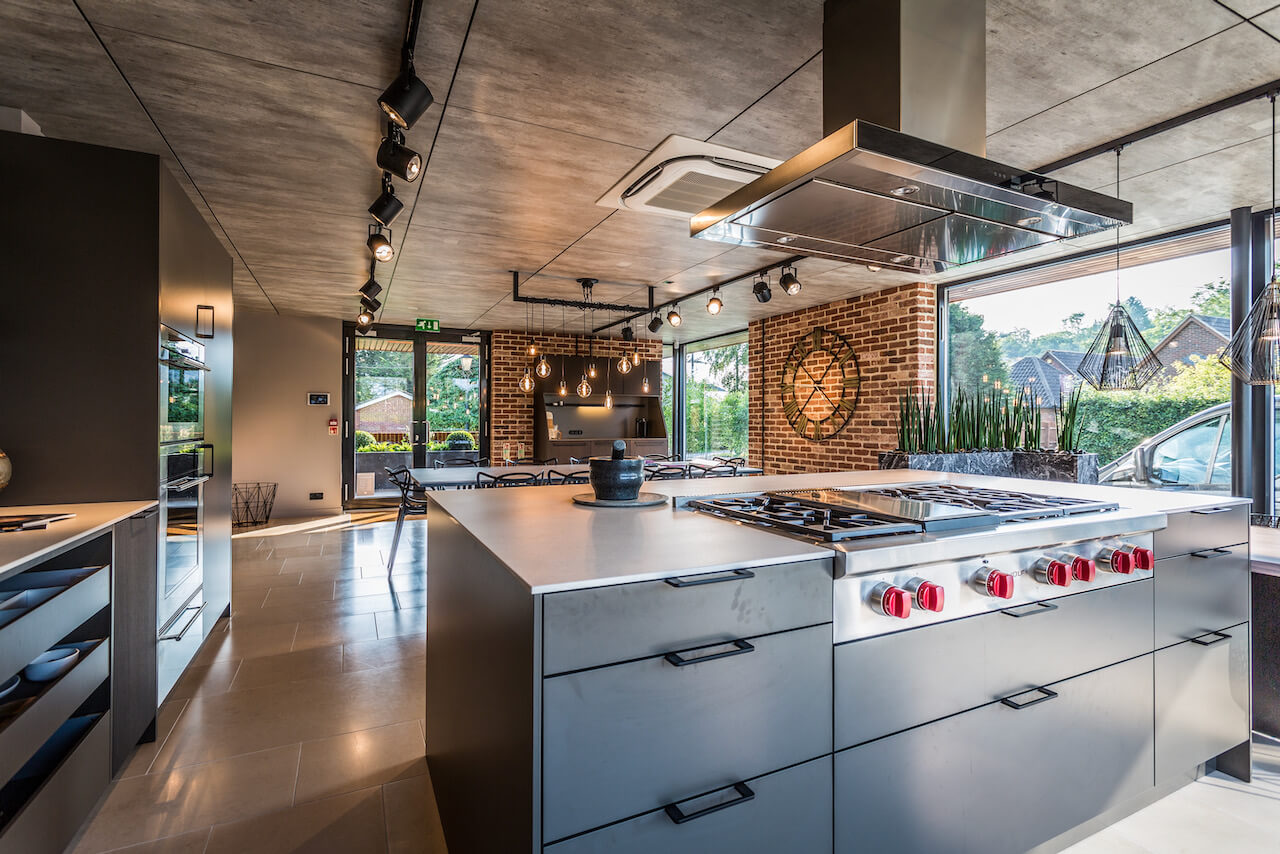
The details: SieMatic Urban range SC10 in Umbra Matt shown within Island and open drawers between the sink and Wolf ovens with SieMatic open shelves in Umbra Matt. 12mm Dekton work surface in Irok for the island and between the sink runs.
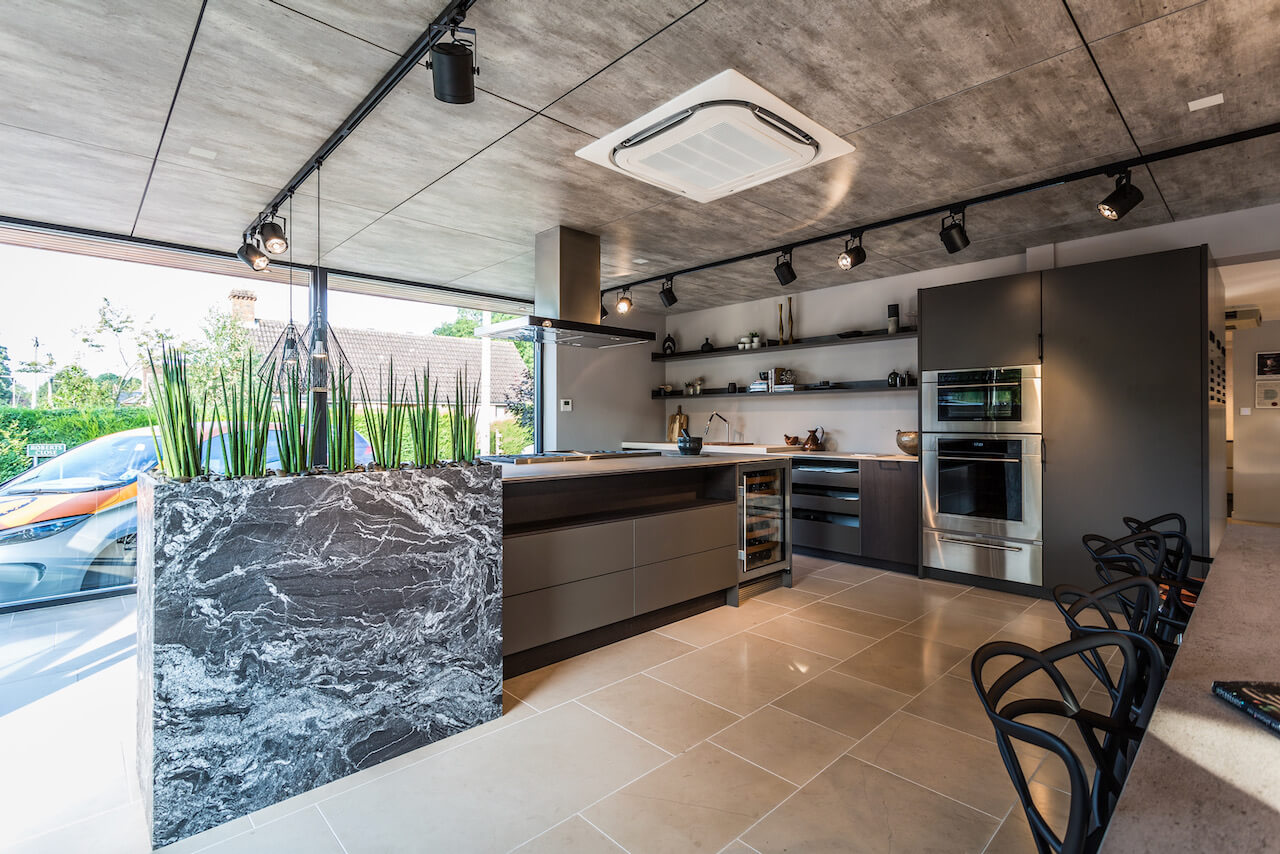
The details: SieMatic Urban SC10 range in Umbra Matt island drawers with built in Wolf appliances and integrated Wolf fridge. Open shelving of island in Veneer Graphite Oak. Planter stand made from granite, Black Beauty Honed.
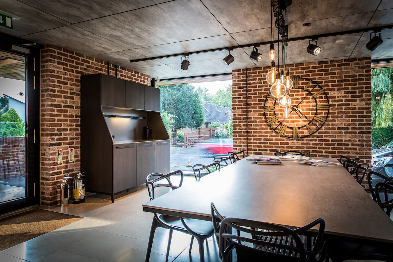
The details: SieMatic 29 buffet cabinet from the SieMatic Urban collection in Umbra Matt finish (bottom front doors, worktop and back panel). Side panels and wall cupboards in Veneer Graphite Oak. The work surface features a Black Zip Hydro tap. The bespoke dining table features a 12mm framed Dekton worktop in Keon. Bauformat furniture panels in Concrete feature as ceiling panels.
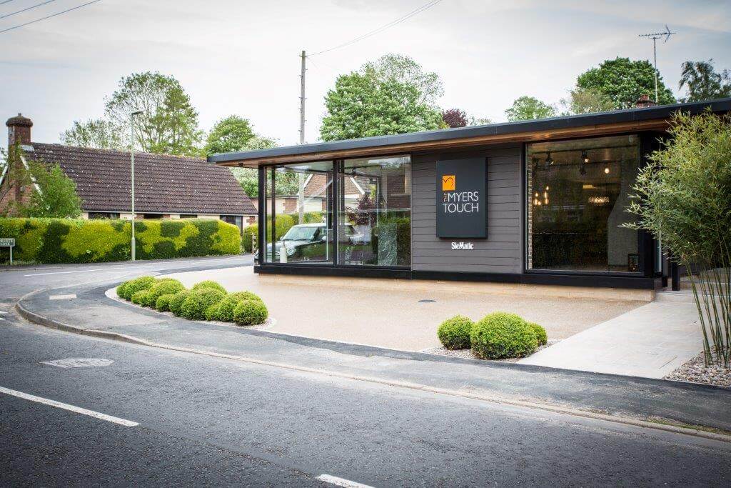
The exterior: Windows, Velfac RAL 9011; Horizontal panelling, Dura RAL 000 2500; Linear bricks, Ibstock Natural; Car park, Clearstone resin bound paving and granite sets; Stone steps, Panoramics natural stone Chateaux Quest flamed; Outdoor garden planter, Dekton 12mm mitred Domos; Outdoor bench, Bordercraft Iroko; Metalwork, BC Metalwork; Planting, Stuart Craine Design




Leave a comment