Showroom Inspiration: The Kitchens International Team on how they managed COVID
By Linda Parker
 Kitchens International had a very successful 25th Anniversary year in 2019, winning awards, a lot of new retail and contracts business, and had a busy and productive sale in January 2020.
The showroom doors closed in March, but Showroom Manager Graeme Kennedy was able to continue with the development of their Online Design Portal, here, he discusses the refurbished showroom.
Q: Welcome back! How has Kitchens International dealt with the events of the last few months?
Kitchens International is not a company to stand still, despite closed doors and most staff on furlough. During this time we were able to continue with the development of a comprehensive Online Design Portal so clients could communicate with designers online. Initially this was aimed to cover the time the showrooms were closed but it proved to be so popular it is now another arm of the company and is particularly useful for those clients who live far from a showroom or who would prefer to communicate from the comfort of their own surroundings. We have also pushed on with pre-lockdown plans to refurbish the Head Office showroom as a Designer Interiors studio. This new business channel will extend the company’s offering into other areas of the home including bedrooms, dressing rooms, and living space. Our staff are now working through reprogrammed installations and also working on a high level of new enquiries.
Q: Do you feel that the business is returning to some kind of ‘new normal’ now, and do you have further plans to put into place?
When we re-opened we put in place comprehensive measures to cope post Covid including deep cleaning all the showrooms, installing sanitisers, marking up social distancing regulatory lines and providing all our staff PPE. We provide all our clients with disposable masks and gloves and are operating with an appointment only service. All our presentation areas are thoroughly sanitized prior and post appointment. Currently, we have a Kitchen Collaboration sale with 25% off all kitchens and we have welcomed many new leads. We will continue with an appointment basis for as long as it is deemed necessary but through our studios and our online design portal we are operating as near to normal service as is possible.
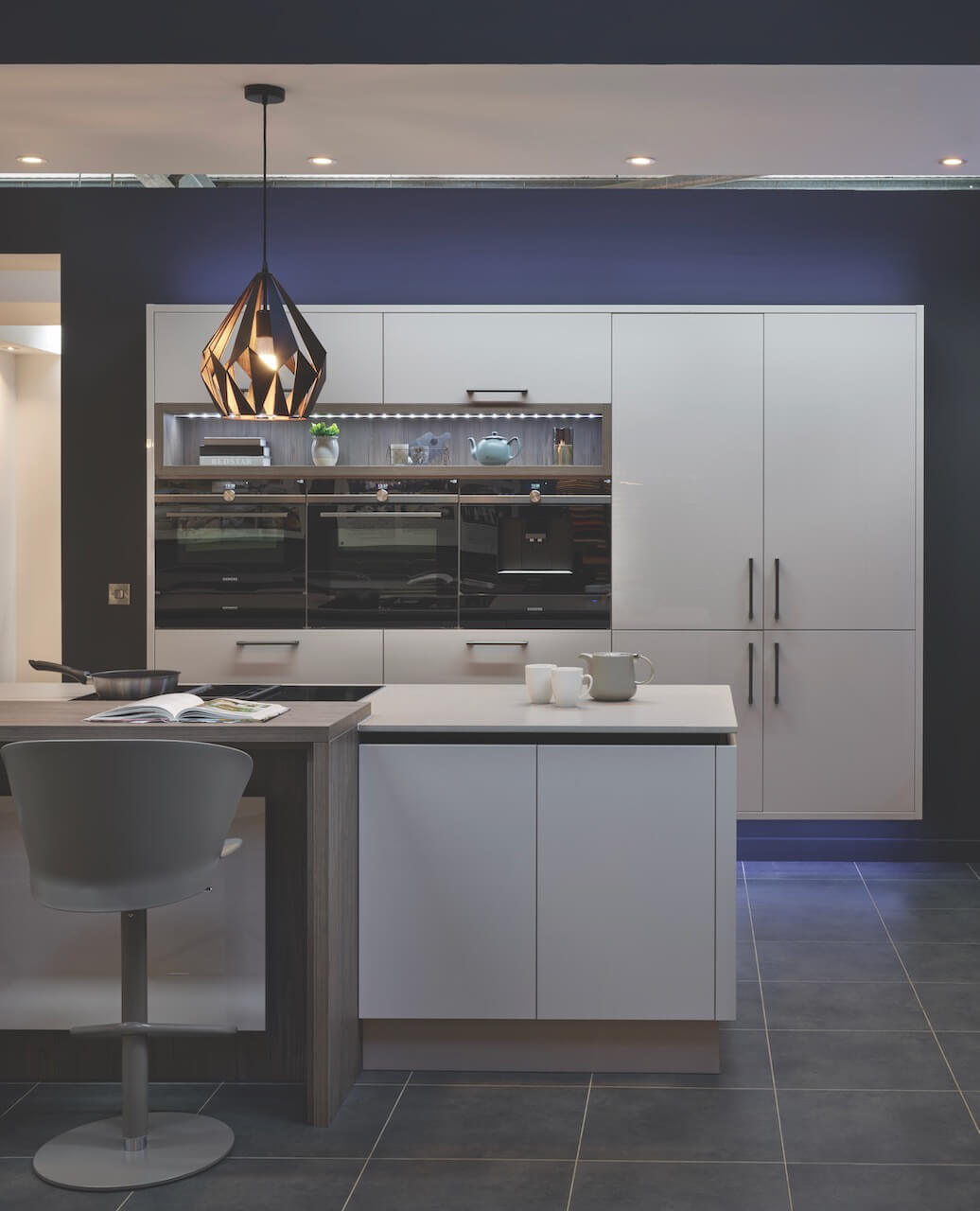
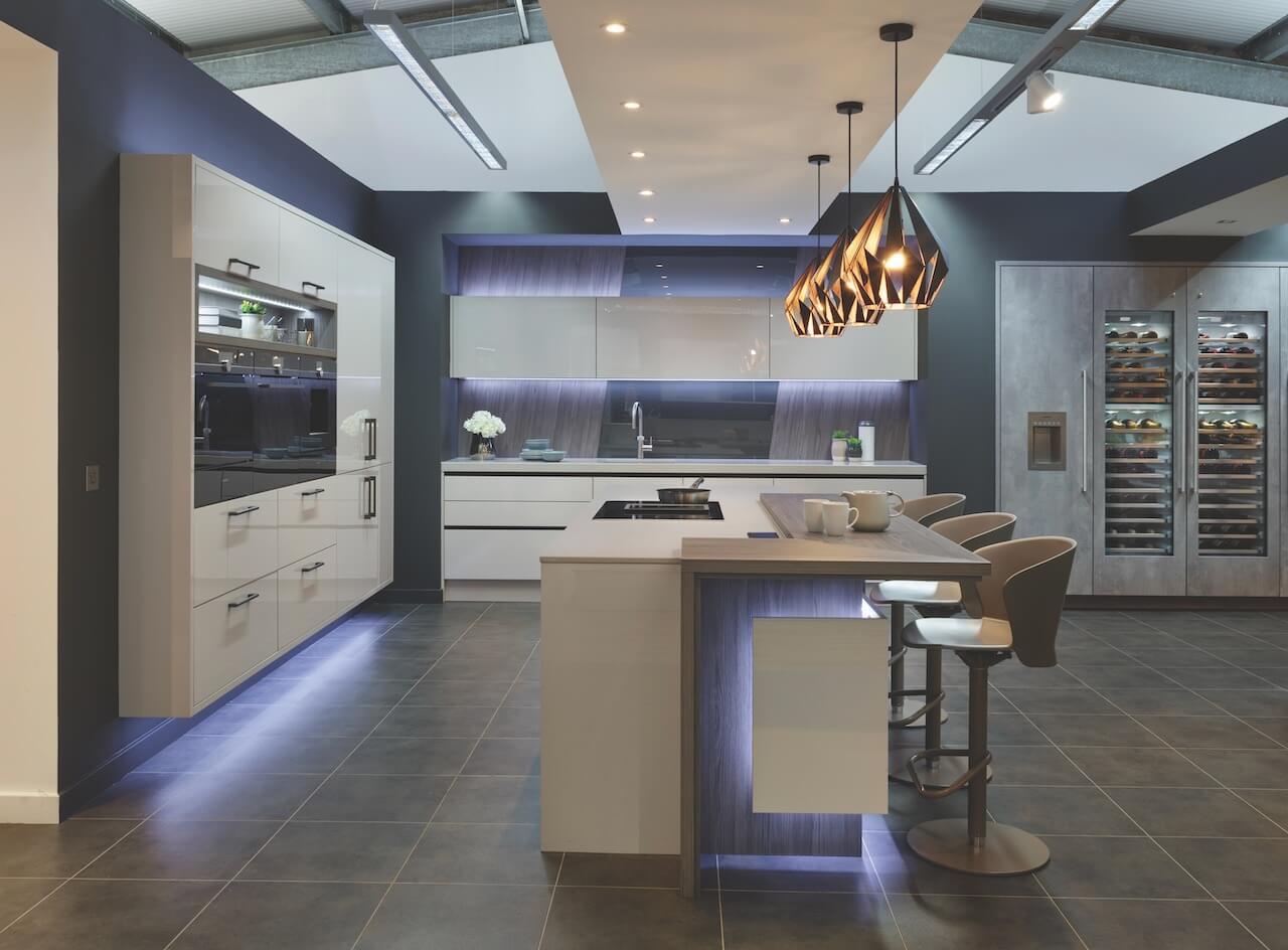
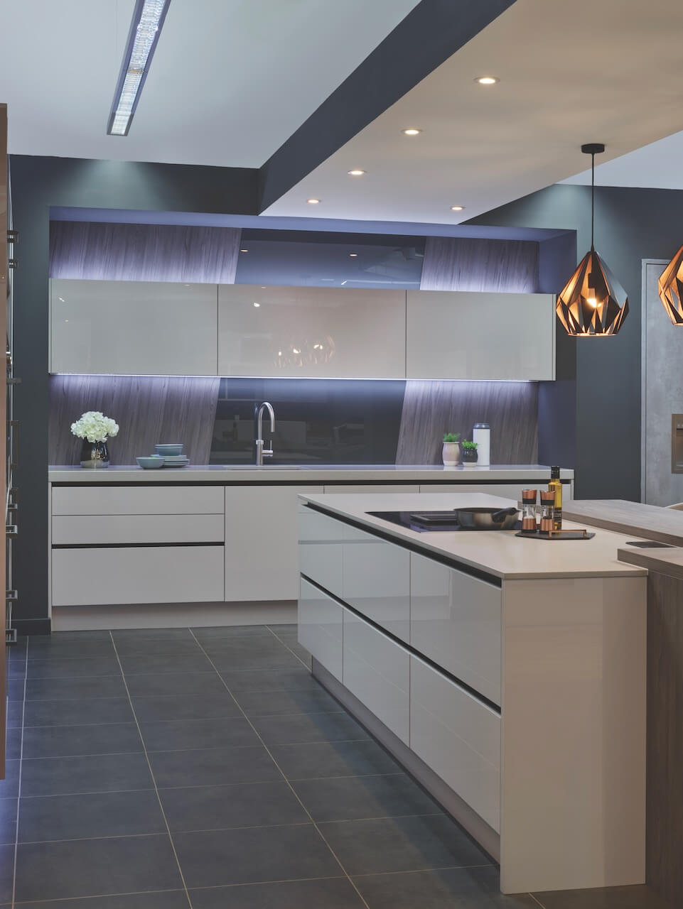
Q: Explain the reasons behind the choices of cabinetry and work surfaces for the area shown in pics 1,2 and 3. The lighting is spectacular, is that your ‘wow factor’ choice?
The furniture and tops were chosen to read as a consistent pallet of colour. The subtle use of graphite grey timber and graphite handle less trim, is supported with the dark grey painted walls of the room set. The angled mirror back panel and the suspended light fittings add dramatic opulent tones of bronze.
Above: Kitchens International Callerton Valencia in Cashmere Gloss with Graphite Grey Fleetwood island. Silestone Royal Reef 60mm and 20mm worktops. Glass Splashback in Umbra Grey, Blanco Subline sink, Quooker boiling water tap, all other appliances, Siemens.
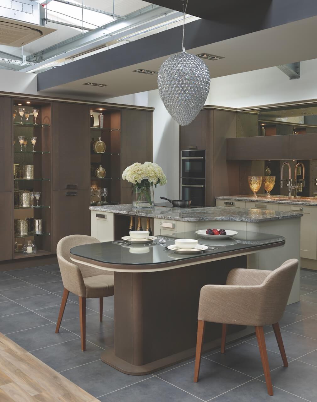
Q: This seems to be a more classic look, what were your reasons behind these choices? The trend for blending living/dining/kitchen areas is here to stay, does this allow you to create more luxurious and glamorous projects?
The design brief behind this display was to create a room set demonstrating how free-standing kitchen modules comprising of a sink run, tall bank and island can be designed specifically to our client’s needs. Softer deco-radius ends, and bespoke dining tables provide a great alternative to linear contemporary lines. The flexibility of this concept allows the client to individually tailor their kitchen in many different ways, and more importantly, integrate the kitchen into the extended surroundings of open plan space design.
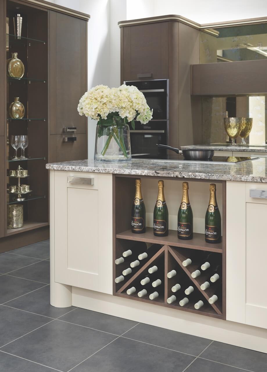
Above: This Callerton at Kitchens International kitchen has Chelsea Trio cabinetry in Mocca Stained Oak, complemented by Glacial Glue Sensa granite worktops. The Bonze Antique Mirror Intaglio glass splashback adds a hint of classic vintage style to the kitchen. All appliances are by NEFF.
Paul Mavor Photography
Q: What design elements make this look successful, and what did you particularly want to showcase here?
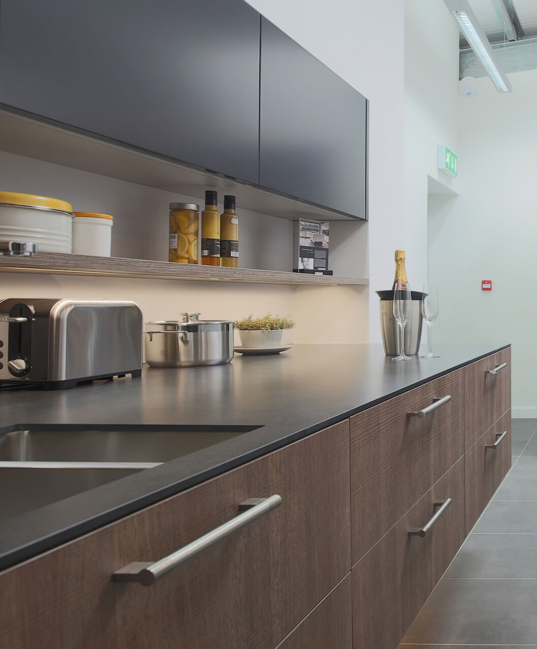
This is a modern equivalent of a galley design. The innovative use of varying depth furniture provides real interest in the design. Base units are extra deep and also cantilevered, wall units are top hinged and opened electronically, and extra thin profile laminate is specified as the worksurface. This sleek look allows for maximum storage in the cabinetry, and the linear look is perfect for a more compact space.
Above: Leicht Ultra Matt Bondi cabinetry with 103 Merino units, and a Leicht high-pressure thin profile laminate 10mm work surfaces in Ouro Preto. All appliances by Siemens.
Paul Mavor Photography
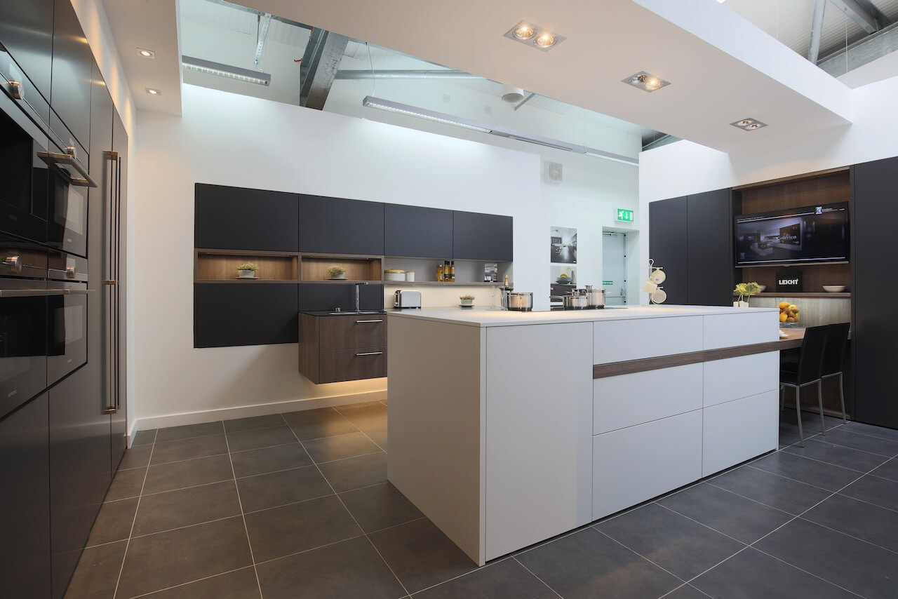
Q: This is a very dramatic space, what were your design priorities here? Do you have a secret ‘style signature’ that you find you use in most of your kitchen projects?
This section of the showroom was designed to show how a tighter space can still be creatively designed. The peninsular worktop is linked to the tall TV wall run by dovetailing the table top, which can comfortably seat four people. The suspended detail of the sink run is contrasted by the peninsular furniture doors going all the way to floor level. Small details can add great impact to the overall design.
Regarding a ‘style signature’, it’s actually no great secret! The thing I enjoy most is the opportunity to bring an element of ‘the unexpected’ to every client project. Key to successful design is the ability to truly grasp the needs of the client, to the extent that you understand their requirements better than they do. This level of understanding provides the opportunity to create a design that surpasses client expectations- it’s a fabulous experience and very rewarding.
Above: Leicht Ultra Matt Bondi cabinetry, as before.
Paul Mavor Photography
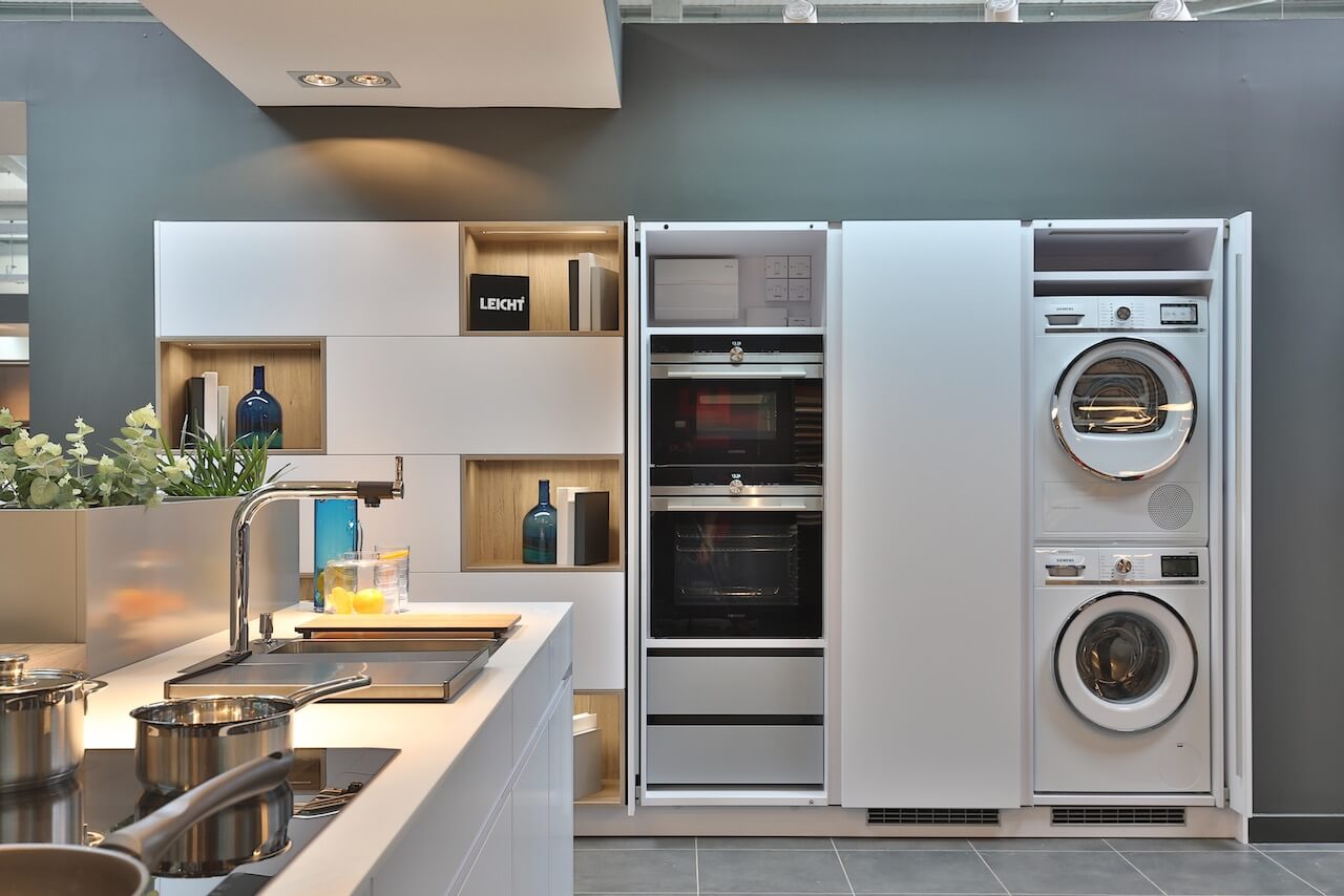
Q: With reference to this layout, with a laundry area, how interested are clients in separating kitchen/utility … what are your top tips or tricks for creating separate spaces?
With the increasing demand for open plan living, it is becoming more and more necessary to find solutions for integrating laundry appliances into the kitchen space. Pocket doors provide a perfect solution, both aesthetically and practically. The mechanism allows the doors to slide back into the cabinetry to hide both washing and drying machines. This concept can also be used to conceal cooking appliances, creating a run of furniture that will compliment any open plan environment. They are one of the most popular features of kitchens that KI designs.
Above: Tocco Kanto by Leicht furniture with Leicht 100 Artic laminate worktops and Siemens appliances
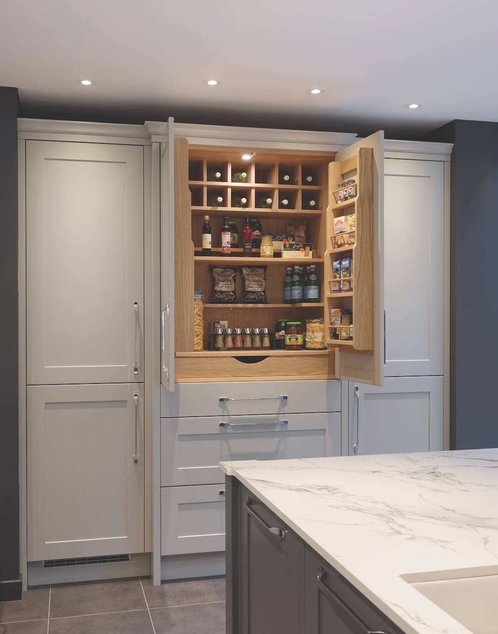
Q: The Larder/Breakfast/Pantry cupboard is a highly desirable storage space these days, don’t you agree?!
Large larder cupboards are ideal for larger open plan kitchens as they can house so many items from wine to dried goods, herbs and spices to kitchen mixers. They are certainly a very practical use of space with designated areas for each item and are then hidden away at the close of the door. We would recommend any open plan kitchen where there is space to consider a larder cupboard.
Above: A Callerton Balham kitchen is given a modern makeover in our showroom. Wilkins grey cabinetry is complemented by Old English White wall cabinetry to add depth and character. 20mm Dekton Auro worktop and splashback and NEFF appliances.



Leave a comment