Second Nature Broadoak Painted Kitchen – by Fearon Bros
 The story: Established in 1979, Fearon Bros are an award-winning family business specialising in creating bespoke kitchen and bedroom furniture.
The designer: Kevin Fearon at Fearon Bros (www.fearonbros.co.uk)
Designer Q&A:
Q) What was the brief from the client?
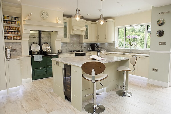
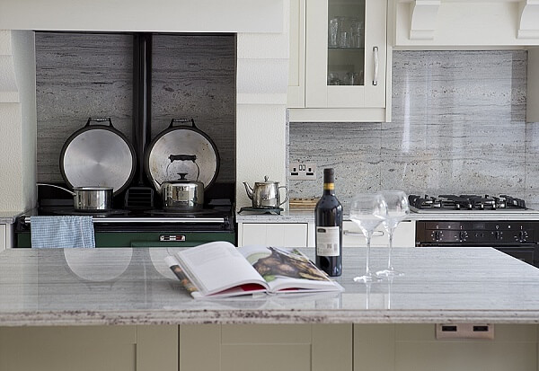
The clients were a middle-aged couple who wanted to renovate their kitchen. The house is set in a wooded area outside Belfast, and was built around 30 years ago. The client wanted to keep the look of the refurb in keeping with the traditional nature of the location and design of the house. They were very keen to keep the existing AGA and they also wished to make the kitchen as bright as possible, whilst maximising storage. An island unit with some seating was also a must.
Q) How did you set about answering that brief?
On my first visit to the house, I noticed that the kitchen had become quite dated and there was a limited amount of natural light coming through. The utility room was adjoining the kitchen but the dividing wall was creating a much narrower space, which felt quite cramped. I decided to come up with a design that incorporated the kitchen and utility room, creating a much more open-plan kitchen and living space. By doing this, I was able to make enough room for a pantry larder with sensored Sensio lighting within the kitchen space. I also created a tall cabinet in the utility area to house the washing machine and tumble dryer in order to hide them from view.
Q) Which products did you use and why?
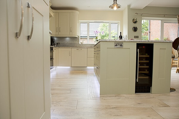
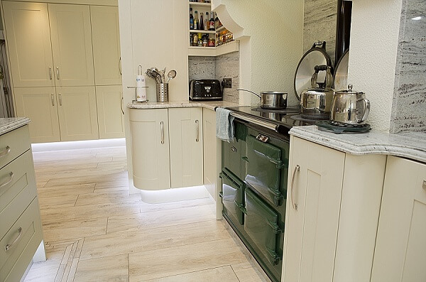
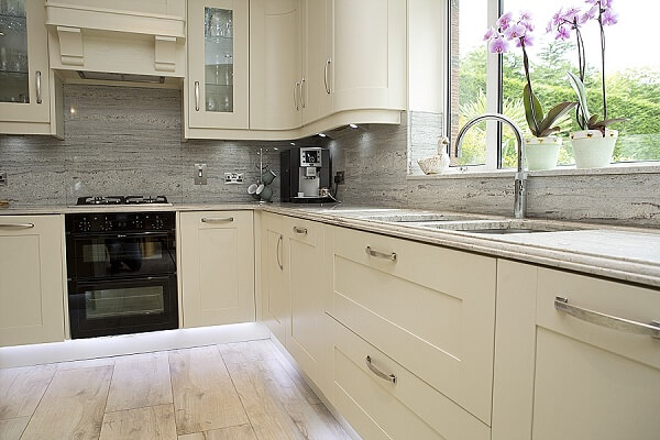
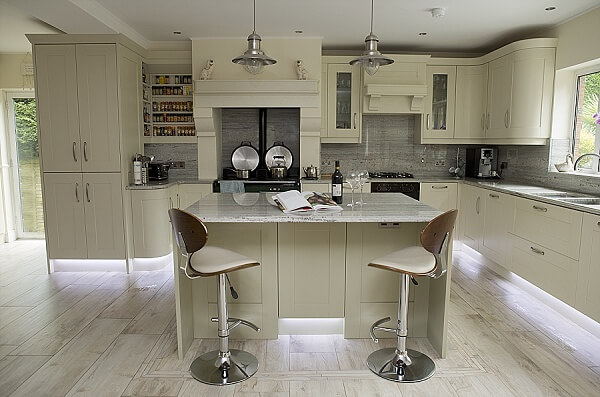
Throughout the kitchen I used a range of different products. The cabinet doors were from Second Nature’s Broadoak range and were painted in Alabaster with Sage Green on the island. The worktops are 30mm River White with a New York edge profile. We also installed a Neff hob, double oven and dishwasher, an AEG integrated full-height fridge and integrated full-height freezer plus a Bosch washing machine and tumble dryer.
Q) Was there any building/renovation work involved?
The main element of the renovation was the removal of the dividing wall between the kitchen and living areas. Consequently, structural steel beams were required to support the upstairs section of the house. Once the design had been agreed, the structural work flowed quite smoothly, as I was able to provide detailed drawings for the builder, electrician and plumber.
Q) What elements do you think make the scheme so successful?
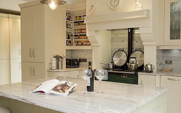
I think the colour scheme works really well. The colours have helped to create a sense of warmth, offering a homely feel to what is now quite a large space. I also believe that by removing the wall there is now a greater amount of natural light flowing through. Finally, hiding the washing machine and tumble dryer worked out very well, as we were tight for space.
Q) Any advice for someone who may be planning a new kitchen?
As a designer, I think it’s very important to take the appropriate time to get the shape and layout of the design right. If your kitchen is well planned with careful consideration given to accessibility, storage, walkway space and services, everything will flow much easier. Once you have this initial part right, you can then enjoy the fun part, which is choosing the colour scheme.
The details:
Cabinetry and lighting from Second Nature, www.sncollection.co.uk
Worktops from Fearon Bros, www.fearonbros.co.uk
Appliances from Neff, Bosch and AEG, http://www.neff.co.uk/, http://www.aeg.co.uk/ and www.bosch-home.co.uk
Sink by Blanco, www.blanco-germany.com
Tap by Quooker, www.quooker.co.uk
Hayley loves: the plinth lighting beneath the base cabinets and furniture, which enhances a feeling of space and will look stunning after dark.



Leave a comment