New Year, New Looks
By Linda Parker
Ok, so let’s get cracking with some new ideas for 2022. If you’ve been putting off improvements perhaps this coming year is the time to start planning afresh, perhaps with renewed enthusiasm, too. Here’s our pick of some concepts to get you into a creative mindset for the new season…
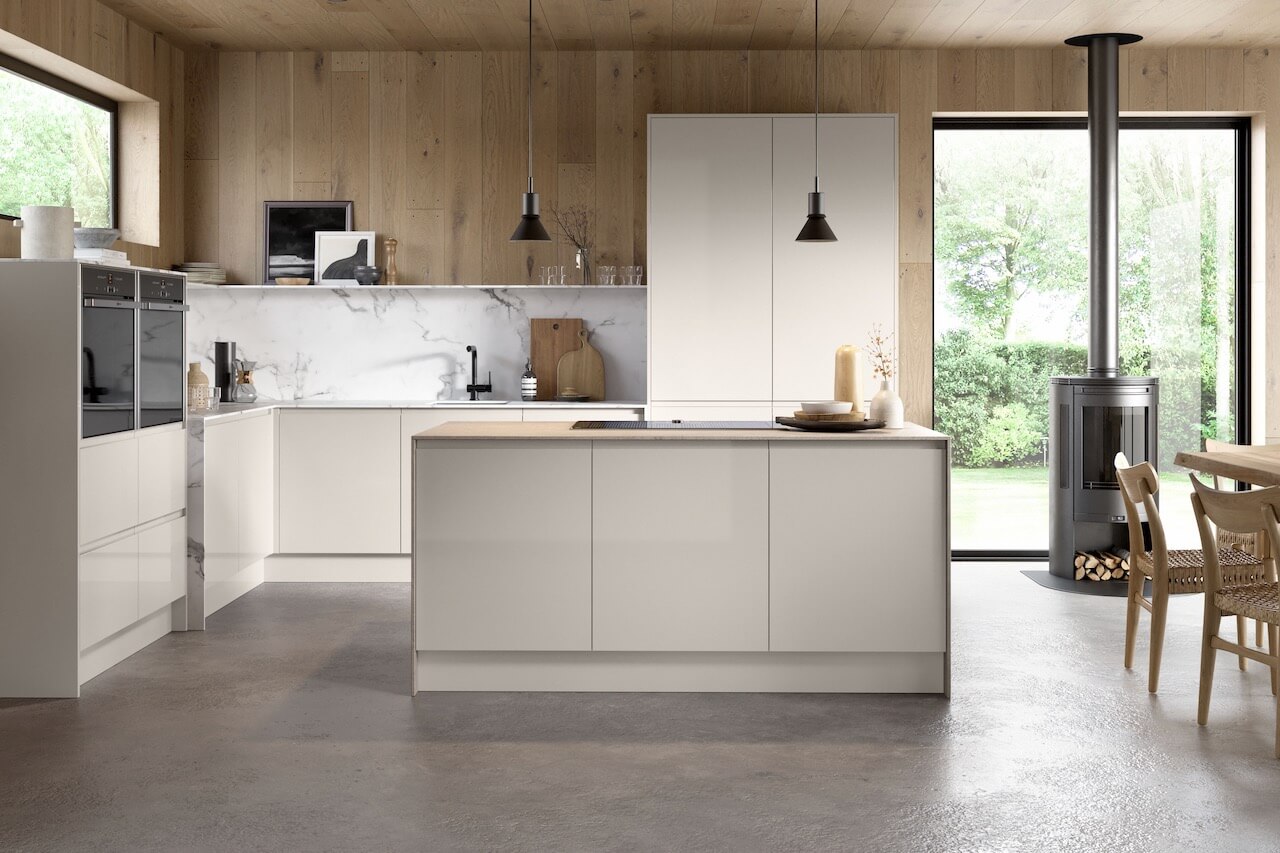
Yes, we have been seeing a lot of colourful kitchen ideas coming through recently, but that isn’t to say that there will always be a special place for light, neutral and understated shades for cabinetry. The latest designs from Mooresincludes the Affinity Collection, and the newest addition is an understated handleless design, Helsinki. It’s available in Gloss White and Gloss Haze, with a J-Pull handles. Neil McDonald, Design Manager at Moores, says ‘In two neutral shades, Helsinki gives homeowners the freedom to put their own stamp on a kitchen through their choice of worksurface, taps, lighting, storage and surfaces. It’s an ultra-stylish choice with an unapologetically contemporary look and feel – yet its minimal, handleless design means it fits seamlessly into homes of many styles and will stand the test of time. With a light-reflecting gloss finish, it’s a great option for maximising the sense of spaciousness, too.”
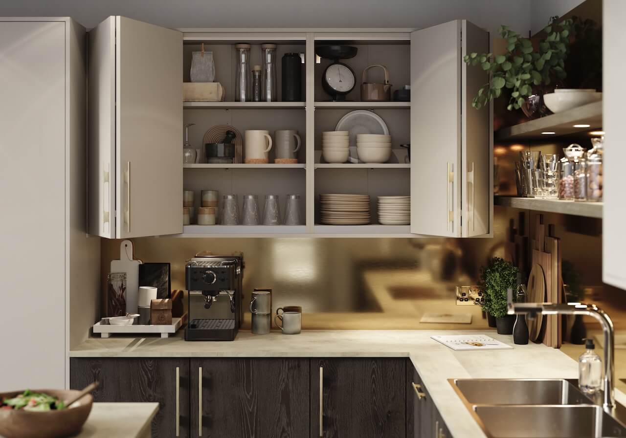
Some new, practical ideas from Masterclass Kitchens, with the addition of Bi-fold and Sliding Systems. The Bi-fold cabinets are available in wall, base and corner options, providing easier access to cabinets, and in many layouts they can be considered to be space-saving, too. Shown above, Sutton Farringdon Grey Bi-fold wall cabinets and Madoc Hoxton Oak base cabinets from Masterclass Kitchens.
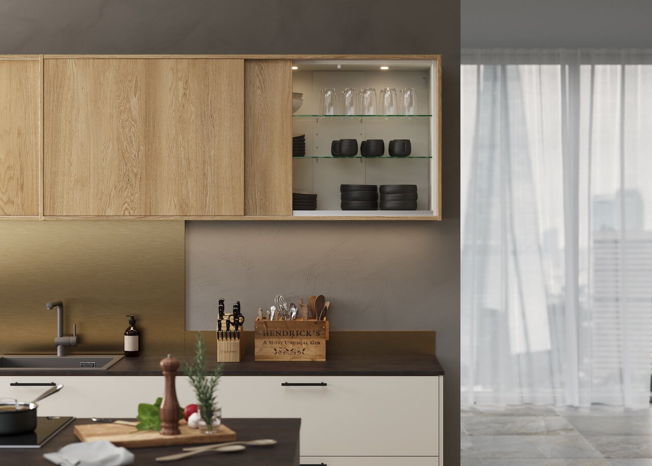
The new Sliding System from Masterclass Kitchens looks simple and elegant, giving a neat finishing touch to wall cabinets – doing away with the need to dodge open cupboard doors if there are too many chefs in the kitchen! The Sliding System is available in five different ranges, including stone, wood, and painted finishes; this is Madoc Henley Oak, from Masterclass Kitchens.
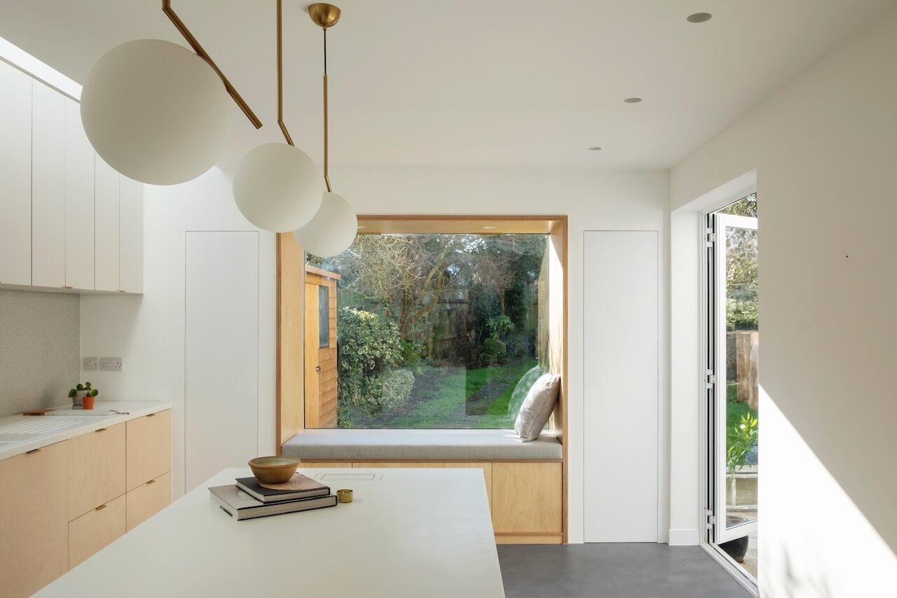
This wonderfully minimalist kitchen is by Studio 163, who were required to transform a small, dark and badly lit kitchen into a large, bright space with a dining area that opened into the garden. The original façade was required to be maintained. Studio 163 extended to the side, added a window in the rear, creating a new multi-functional space for the ground floor area. The window aperture has become a reading nook, with storage and a seat by the breakfast table. The materials used include H HIMACS acrylic stone in Arctic White and Alpine White for the central island and the perimeter work surfaces.
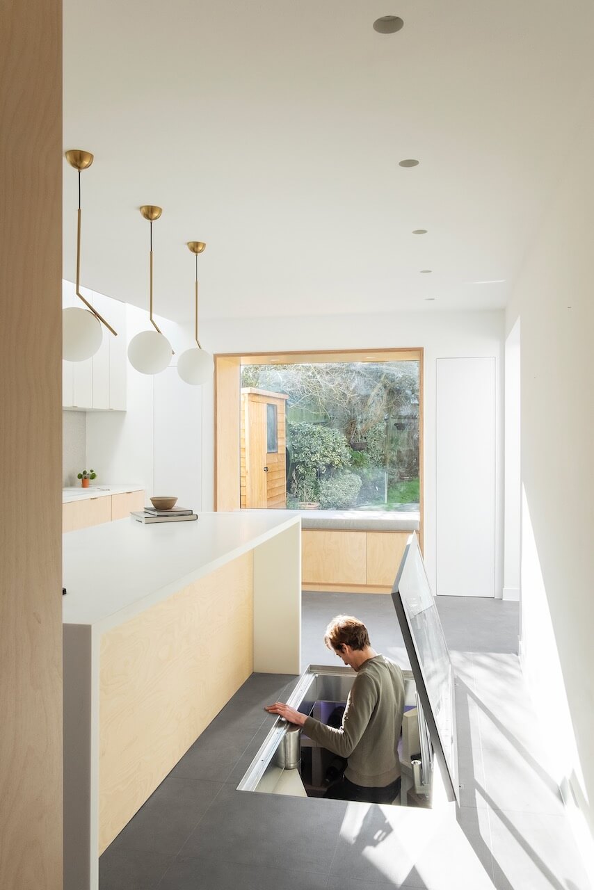
The Nook House brief also included the provision of a wine cellar. Civil & Structural Engineers, Design ID; Kitchen, Ikea and Plykea; Wine cellar, The Stone Cellar Company; Window Joinery SCJ Specialist Commercial Joinery
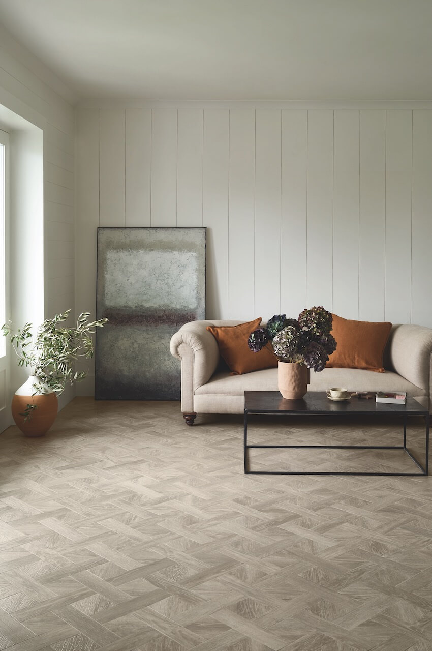
Lorna Williams, Head of Product Design & Visual Creation at Amtico, has been looking at the latest flooring trends for 2022. One is the awareness of Comforting & Nurturing Spaces, and she explains ‘As we’ve been spending more time at home than used to, more of us have been investing in home improvement projects to make our spaces more beautiful and comforting – ultimately making us feel better Creating a homely and cosy environment has become a key focus in home design’. Shown above, Gotland Oak from the Form Collection, installed in a basketweave format.
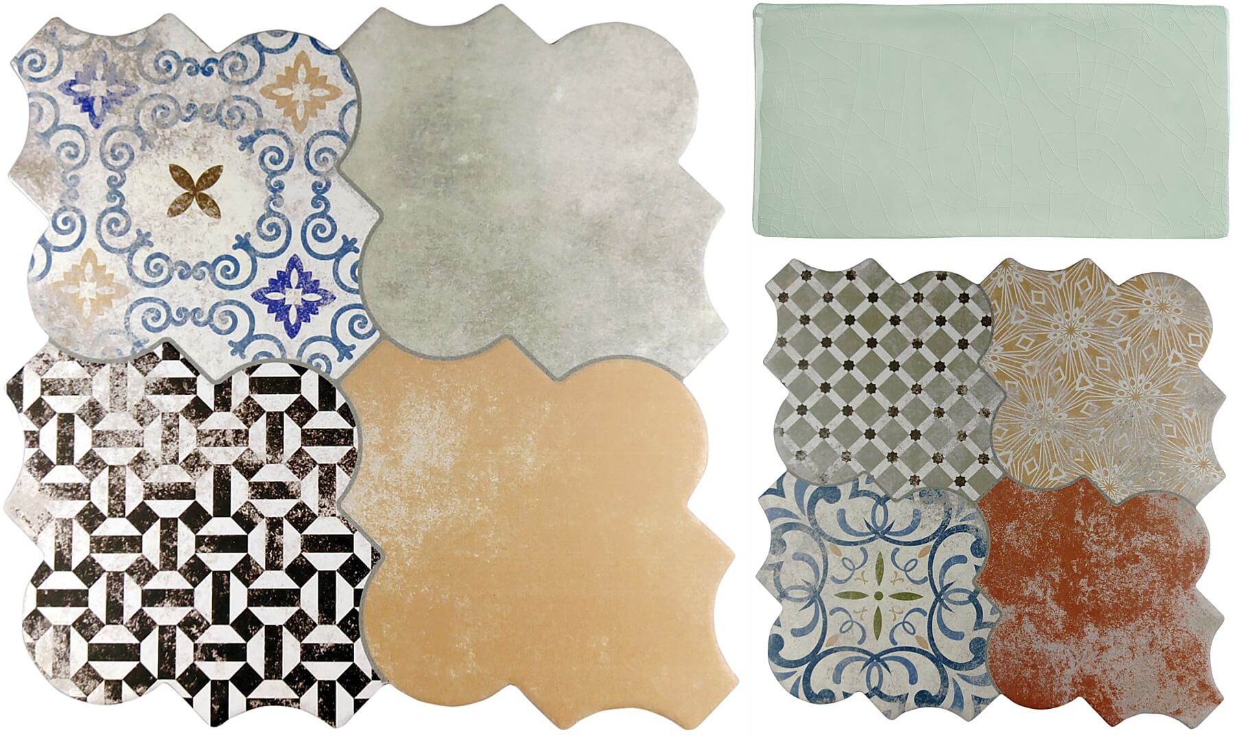
Kitchen cabinetry may be sleek and simple, in light neutral or bold block colours, so as a contrast, tiles can be intricately patterned and in unusual shapes. Crackle glaze finishes and worn, vintage-effect finishes are also very much on-trend. Consider three options from Tile Mountain. Firstly, one of the Riga Patchwork Wall & Floor Tileoptions, then it’s Craquele Mint, also available in Bone, Olive, White and Dove shades, then another Riga Patchwork design.
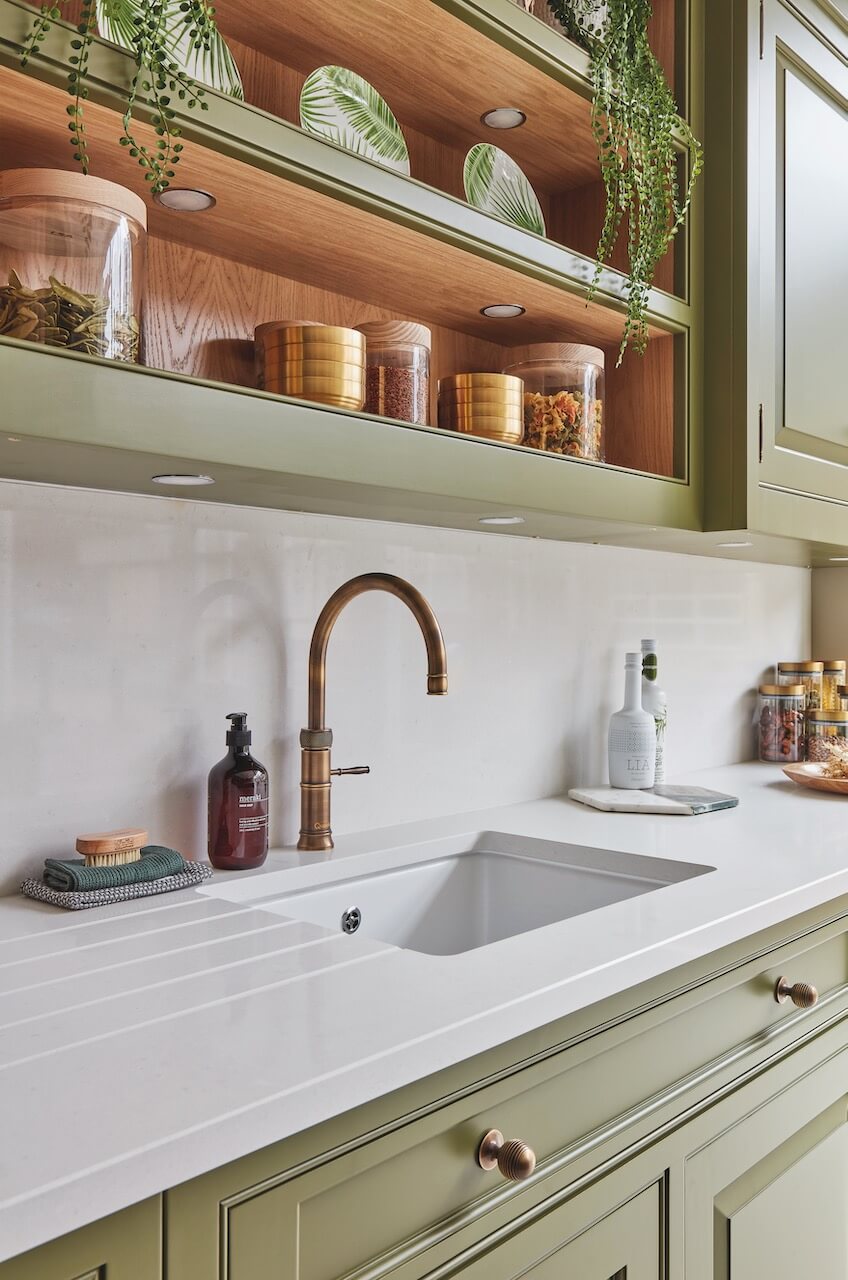
We’re always keen to take a closer look at the gorgeous details of a traditional kitchen. These open shelves with recessed spot lighting are from the Devine Collection, shown in Serpentine, by Tom Howley. Howley says ‘Wellness, sustainability and interiors with a distinct sense of personality have been prominent trends throughout 2021. Whilst we continue to move in this direction, people are becoming increasingly brave with colour, opting for adventurous earthy tones and brilliantly bold hues’.
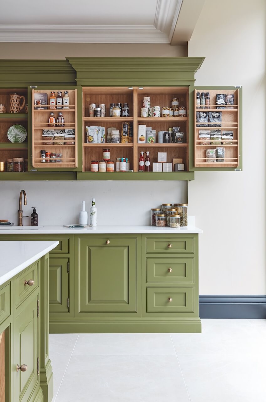
He continues ‘Green is a colour we associate primarily with nature, and this grounding shade has an incredible way of reconnecting us with our surroundings, creating moments of calm and positivity. Serpentine, our striking olive-green shade is used to splendid effect here in our latest Devine design. The shade has earthiness and depth that leaves you feeling nourished and full of life, perfect for kitchen environments. Combine with burnished brass hardware and Caesarstone Organic White work surfaces for a bold scheme’. See more of that fabulous kitchen here.
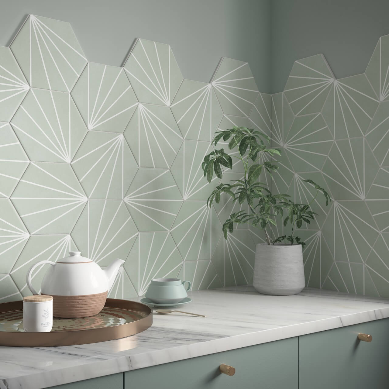
Go for green with these Sunburst Mint Matt Glazed Porcelain tile from Verona. The Verona view is that ‘Green helps evoke a sense of wellbeing, calm and tranquillity. Whether it’s soft sage green or a deep emerald tone, there will be a green shade for every space, teamed with natural textures and wood to complete the look’.
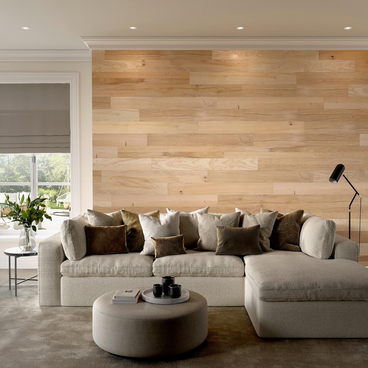
Timber slatted interior wall cladding has enjoyed a lot of popularity in the last year or so, and it’s been interesting to see various ‘DIY’ interpretations on social media channels too. But phew, there’s an easily accessible way of getting the look, using Self Adhesive Oak Planks by Naturewall. Take a look at the beautiful vertical versions too, such as the SlatWall Acoustic Natural Oak.




Leave a comment