Multifunctional and modern kitchen by Onestà
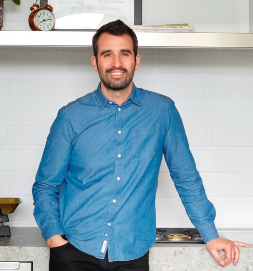 The designer: Daniele Brutto at Onestà
The photographer: Tim Young
The architect: Maro Kallimani
The interior designers: Natalie Forbes + Louisa Rix
The story: Founded in 2007 as a residential kitchen designer, Onestà has evolved into a multi discipline studio delivering spacial design for the whole home. With an emphasis on bringing together function and style, co-founder Daniele Brutto and the in-house design team combine exquisite Italian materials with inventive design solutions to bring clients’ visions to life through meticulously crafted fitted furniture.
Designer Q&A:
Q) What was your brief from the client?
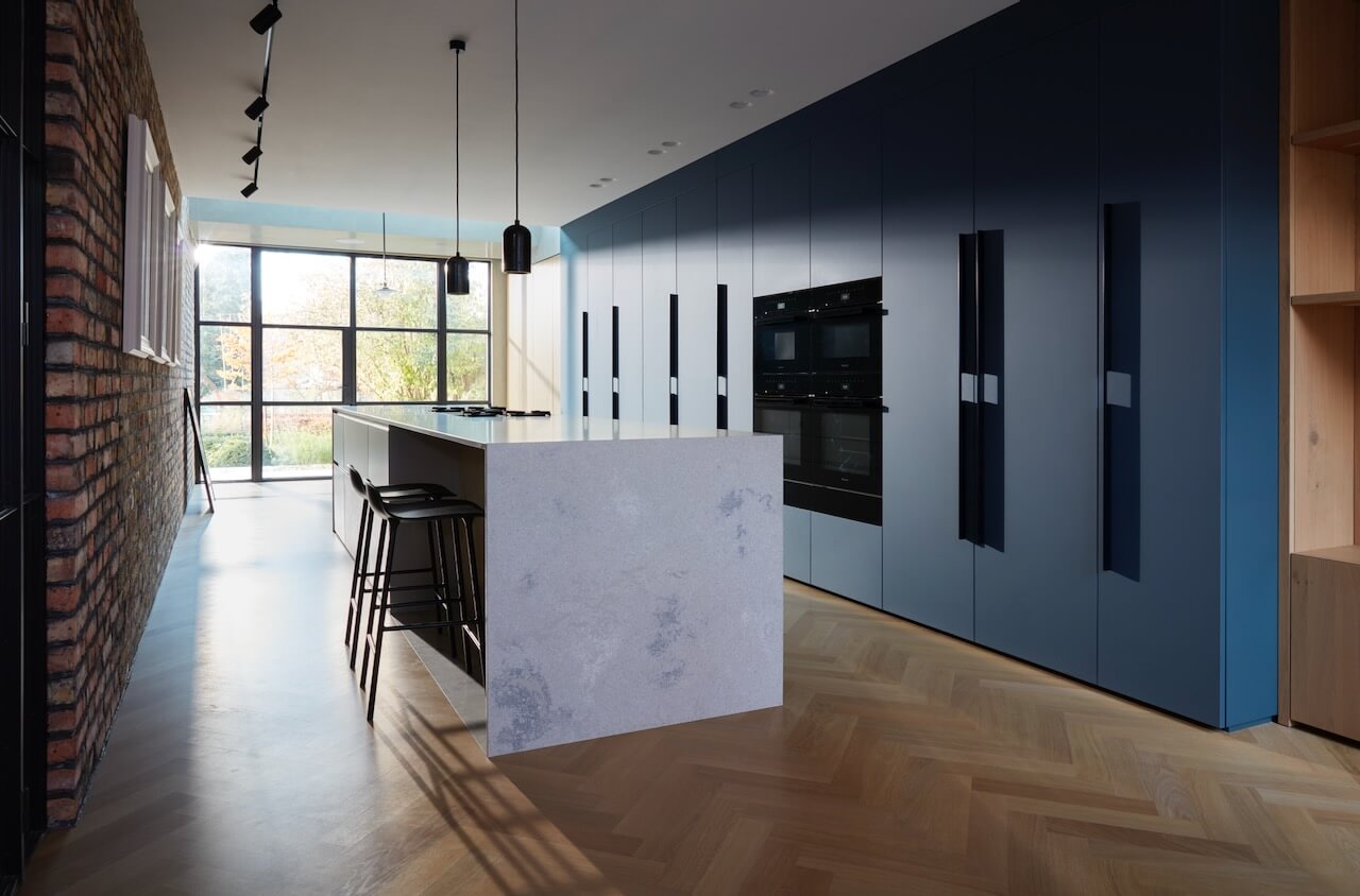
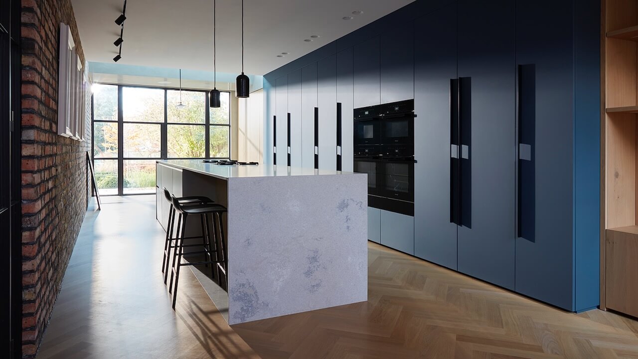
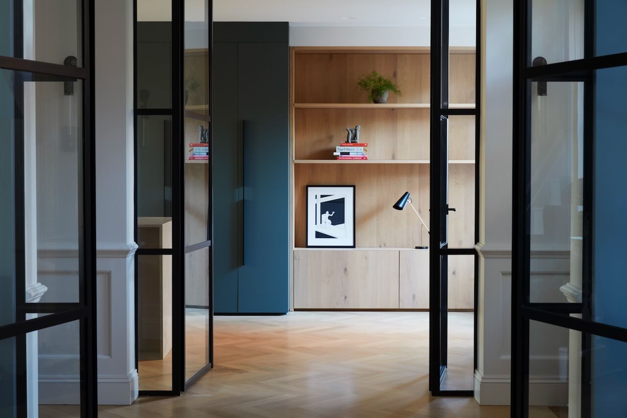
Architect Maro Kallimani recommended us to the client, who had a very narrow and long space to design a kitchen for. The brief was to create a dining space towards the garden, a central fully functioning family kitchen and a reading area at the far end. We needed to combine all three zones into one coherent design.
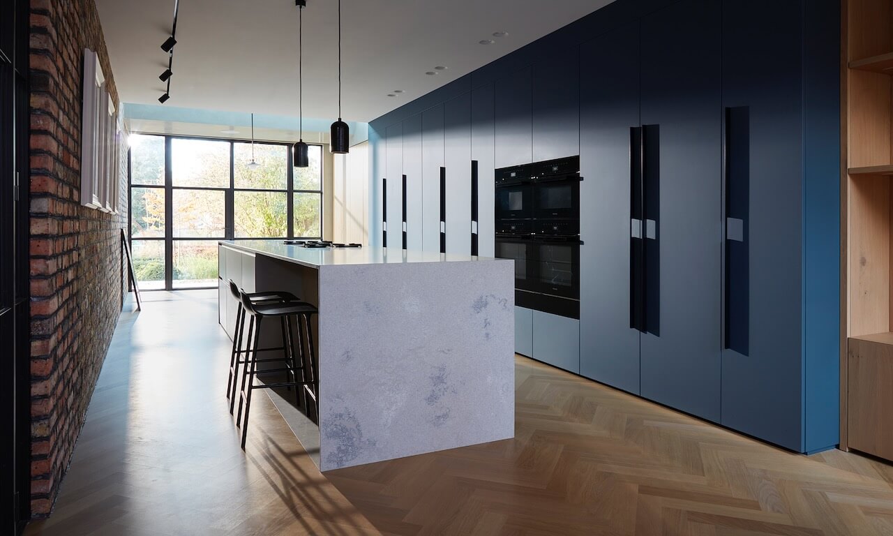
Light was an important consideration, as the central kitchen space received very little natural light. We worked hard with the architect to get the scheme right with our unit design – note the many different lighting styles, from pendants to ceiling recessed downlights.
Q) How did you answer the brief?
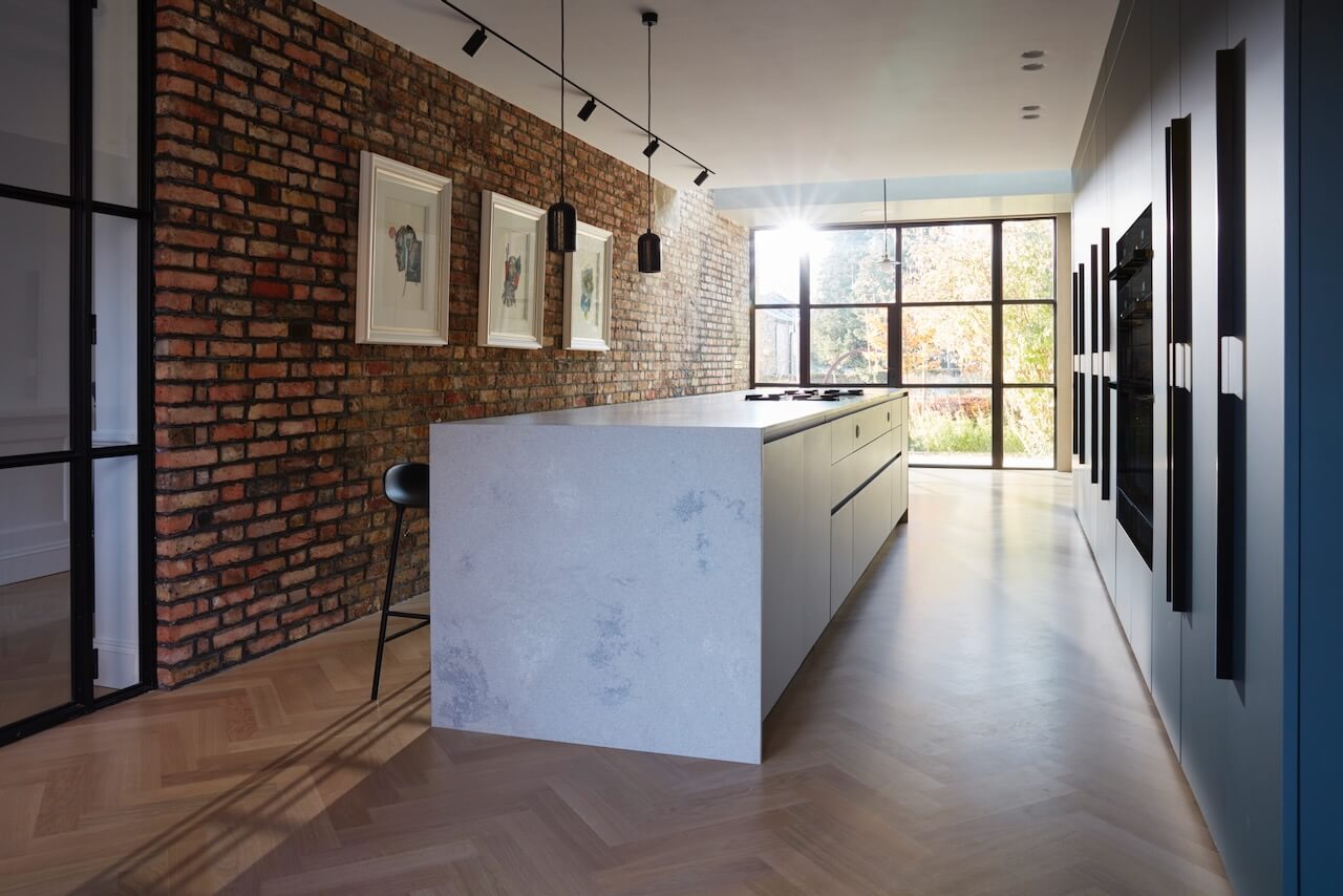
This area was going to be the heart of the home where most of the client’s time was spent, so we had to really nail down how each area was going to be used. For example, we made sure we designed in the correct amount of book storage for the reading and relaxing area that the client needed so as not to impede on the amount of storage we had for the kitchen itself. Each area was a delicate balance with much conferring with the client.
We also made sure all three zones were clearly defined by keeping a simple but clear material palette for each – a warmer natural wooden veneer for the living areas with an easier to maintain fingerprint-proof Fenix door for the kitchen area. Lighting was also zoned and controllable from one panel, allowing the client to set the mood for her use.
Q) Which products did you use and why?
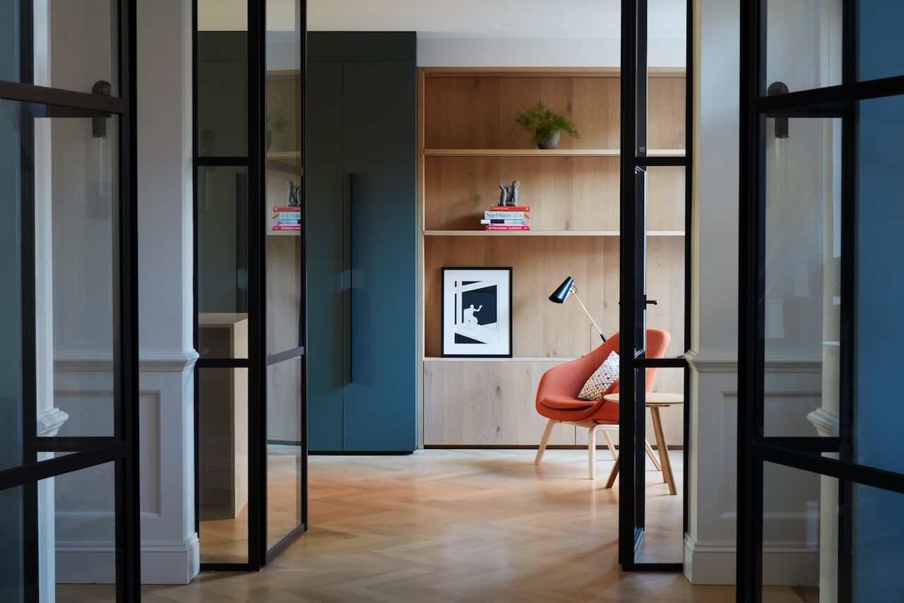
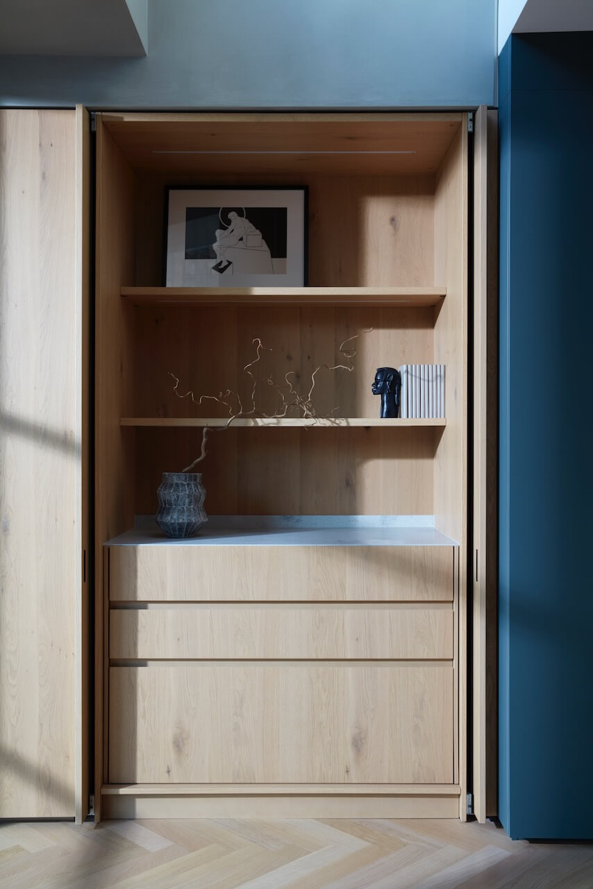
We used a Verde Comodoro Fenix door for the kitchen area, which is very easy to clean and maintain, and a Rovere Nodato timber veneer for the living zones, which enhances the more relaxed feel of the zone.
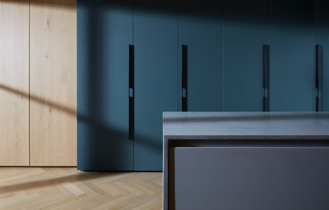
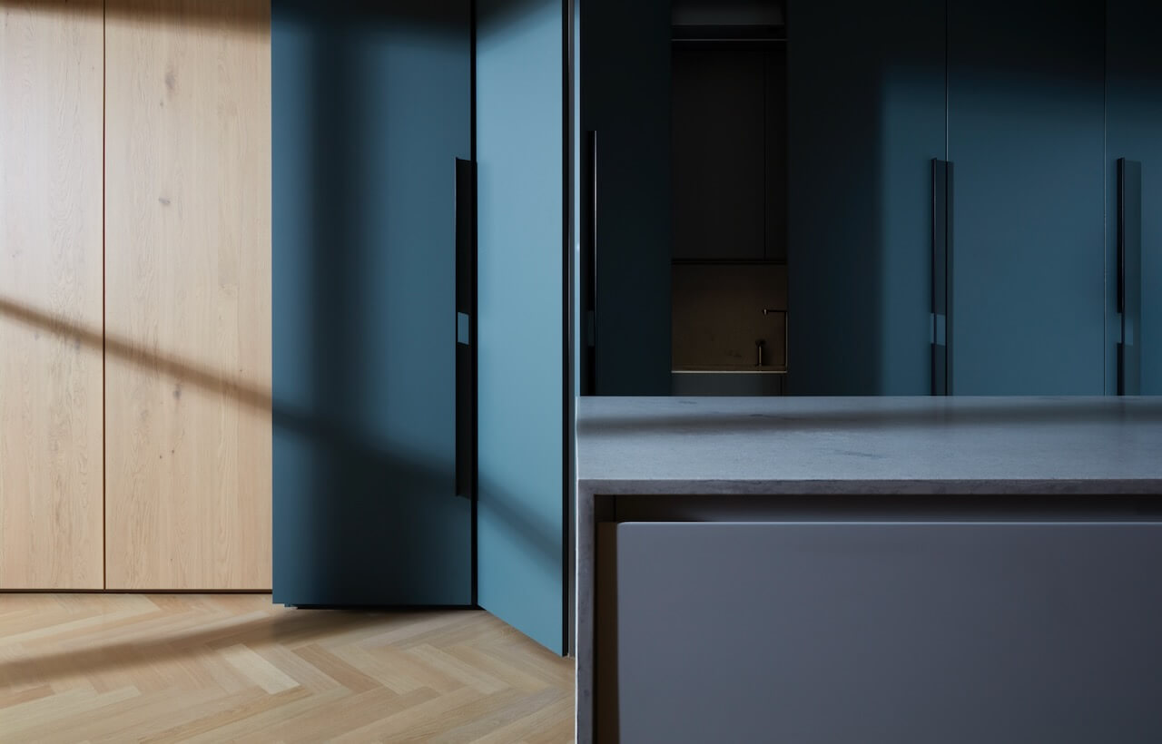
A quartz composite worktop was used for the kitchen surfaces to reflect the harder use it would be subjected to. We also used bi-fold pocket doors to conceal the sink area. This allows the client to conceal the kitchen when using other zones.
Bora’s Classic range of hobs and downdrafts were used in the island so the view from one side of the room to the other was not impeded by an extractor fan.
Q) Which design elements make the scheme so successful?
I think this is a perfect example of how well bi-fold pocket doors can work for a very specific space and requirement. It’s a small part of the design that has a very big impact on how the kitchen and the rest of the space is used.
I also really like how we recessed the worktop stone into the floor below the breakfast bar area on the kitchen island, again a very clever way to subtly zone a space. This kitchen is full of small design details that add up to have a bigger overall impact to achieve the end goal.
Q) Any advice for someone who may be planning a new kitchen?
With this particular project in mind, I felt we had a client who had a very clear brief who knew how she wanted the space to work. If a client can define that themselves and stick to it, then the end result will always be more successful.
Q) Any trend predictions for 2024?
Softer edges are certainly making a big comeback. We are now working on many projects with curves and more flowing furniture design details.
The details:
Furniture by The Cut
Interior fittings by Blum and Kessemböhmer
Tap by Barazza
Worksurfaces by Königstone
Hayley loves: the sleek simplicity of the aesthetics, which belies the function and practicality that lies within.




Leave a comment