Mayfair Penthouse by Simon Taylor Furniture
 The designer: Tony Lister at Simon Taylor Furniture (www.simon-taylor.co.uk)
The story: Since 1985, Simon Taylor Furniture has been handcrafting fine bespoke furniture for discerning clients and is a specialist in designing and making luxury fitted kitchens, bedrooms and bathrooms with freestanding furniture to complement.
As a renovation specialist Simon Taylor Furniture offers full interior project management solutions for every room in the home. Its showroom and workshop is based just outside Aylesbury in Buckinghamshire and it works on projects throughout the UK with a focus on London and the Home Counties.
Designer Q&A:
Q) What was your brief from the client?
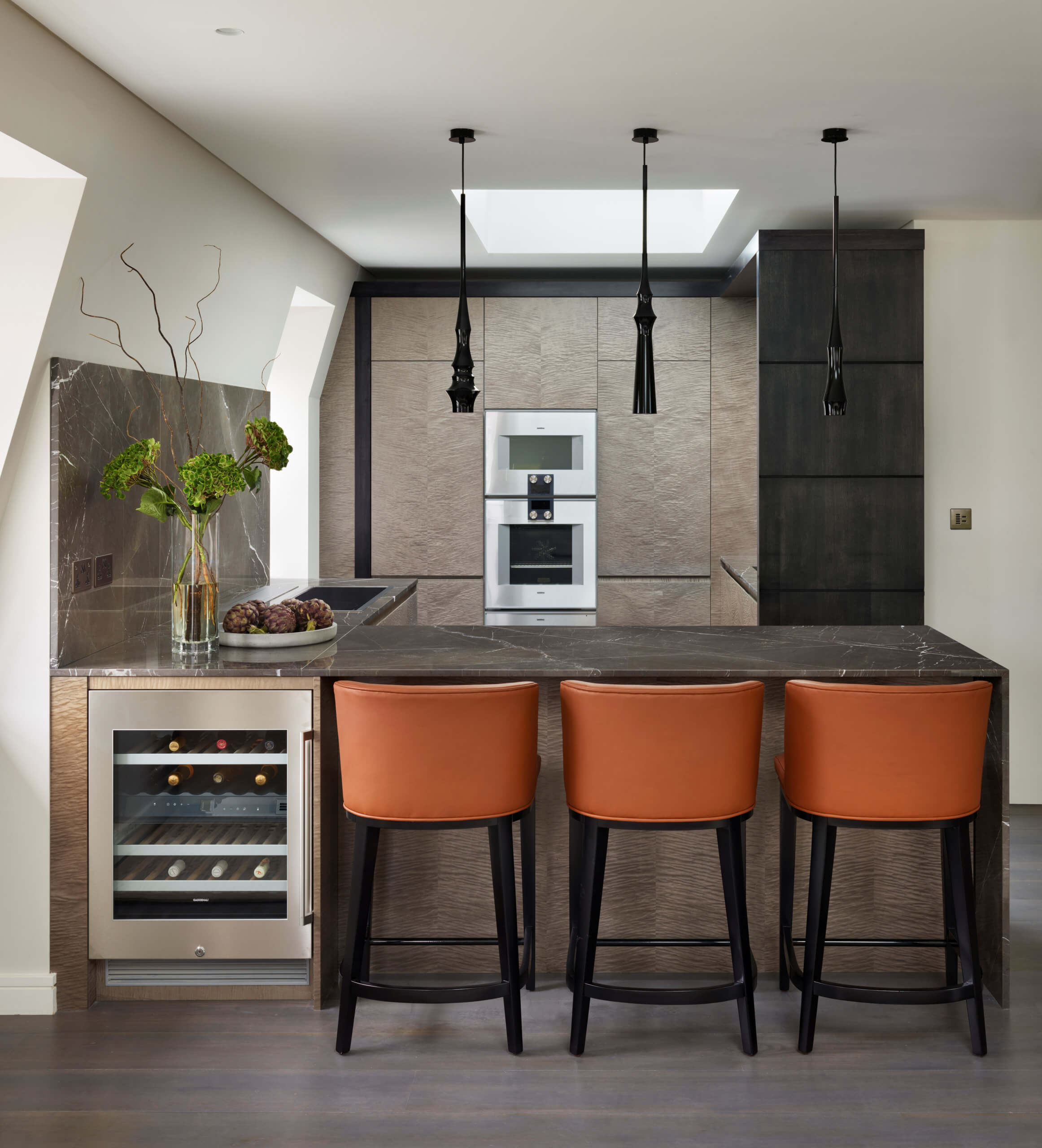
This open-plan galley-style kitchen was designed and made for a client with a duplex penthouse apartment in a Listed Victorian property in Mayfair, London W1. While the kitchen layout was compact, the specification was to be of the highest order, using fine textured materials and premium appliances. Simon Taylor Furniture was commissioned to design and make all the handmade and hand-finished bespoke furniture for the project with custom-built floor to ceiling cabinetry to perfectly fit within the space, which includes a part-vaulted wall and original features including windows on three elevations. The client was keen for a sophisticated neutral look for the kitchen to complement the rest of the open-plan living area, which features a lot of natural light, pale walls and dark accents.
Q) How did you answer the brief?
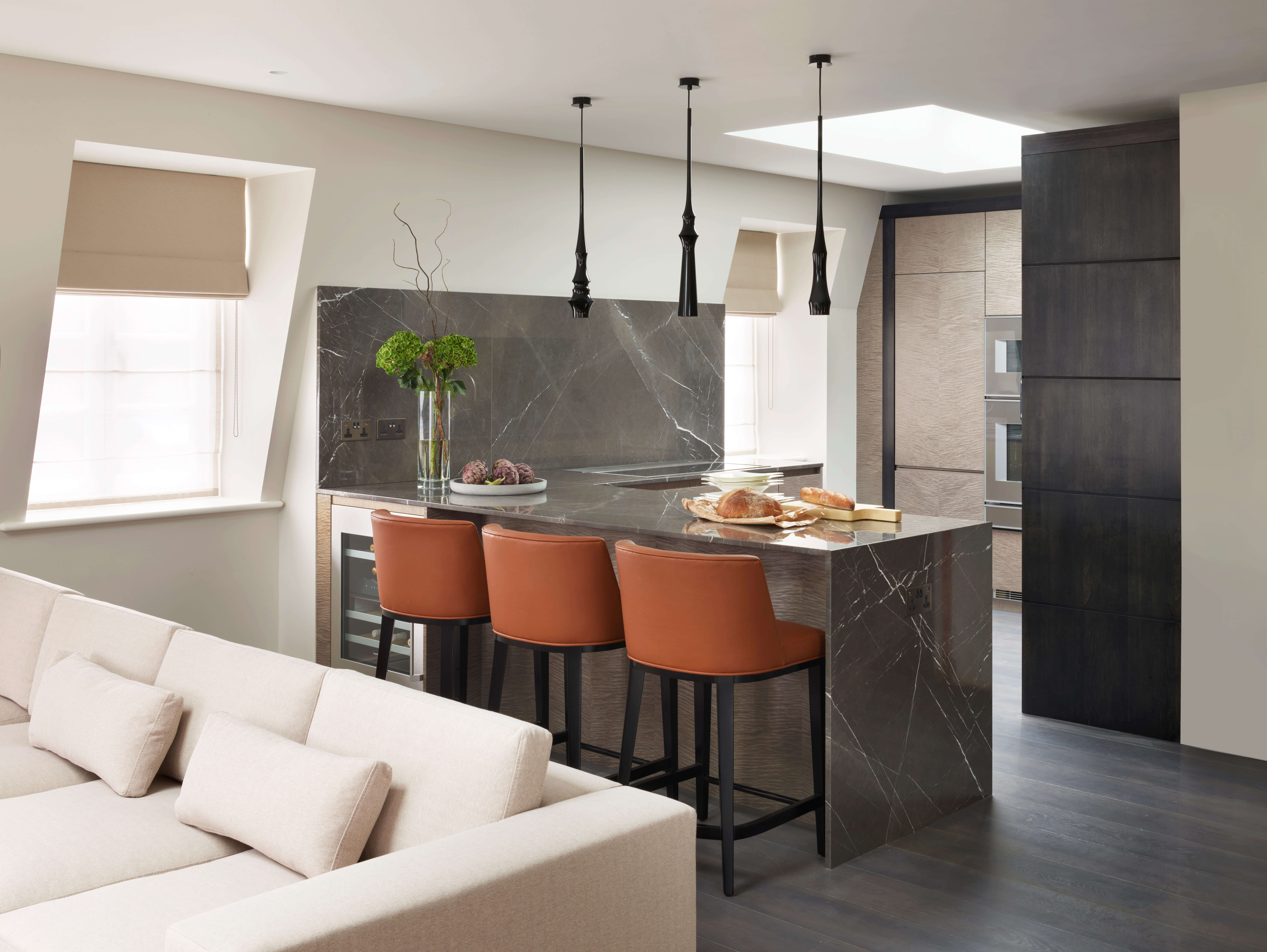
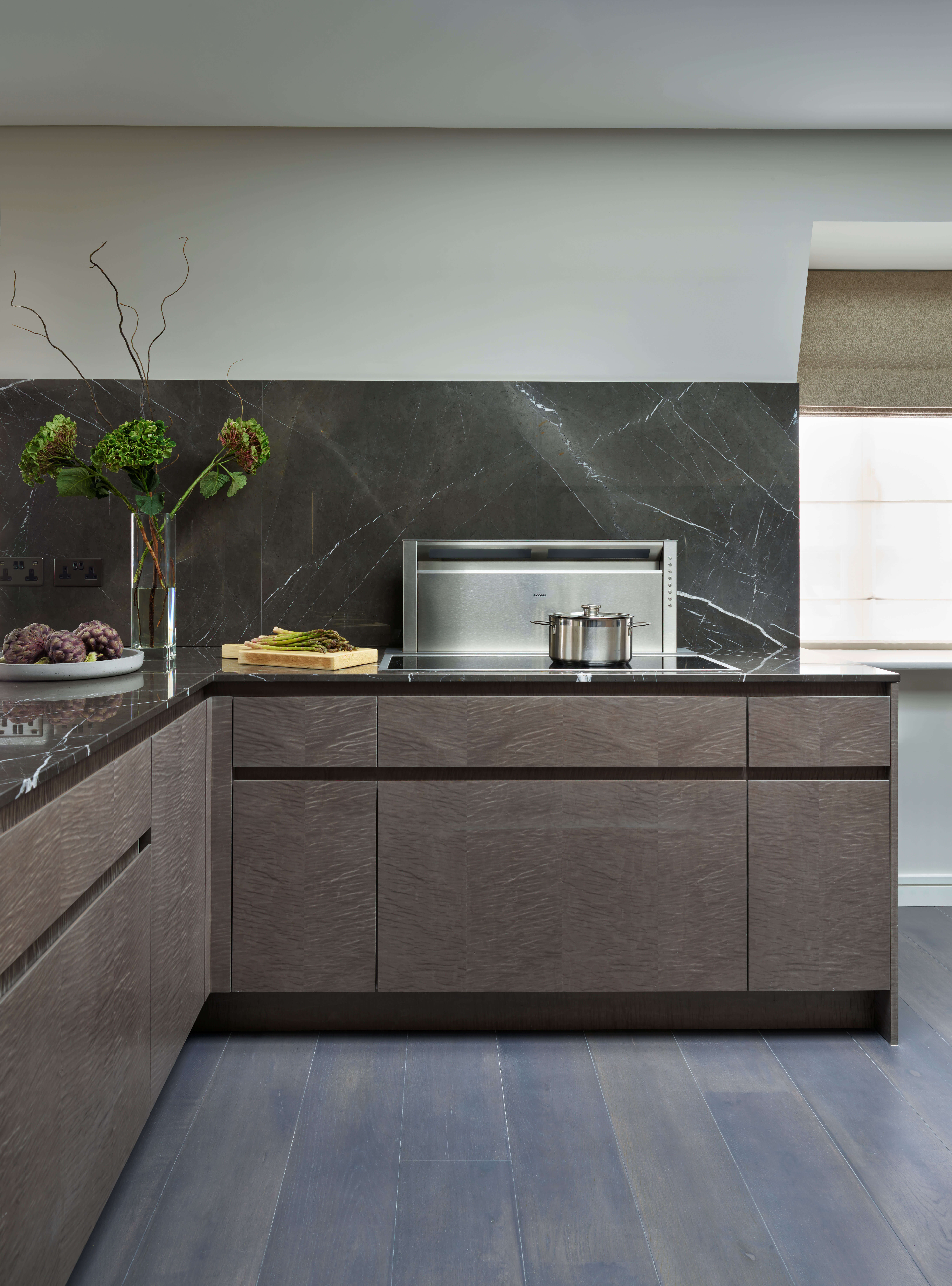
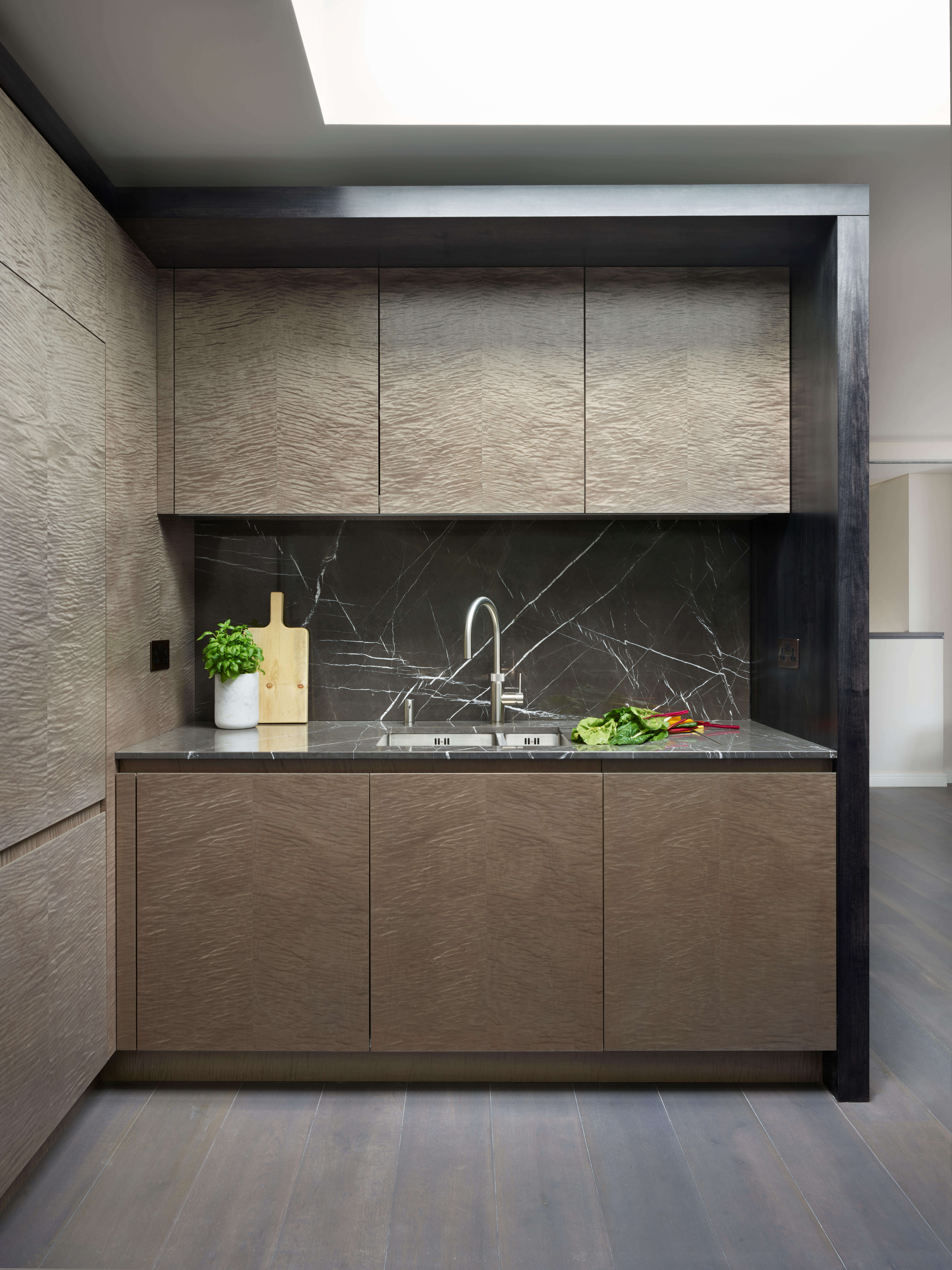
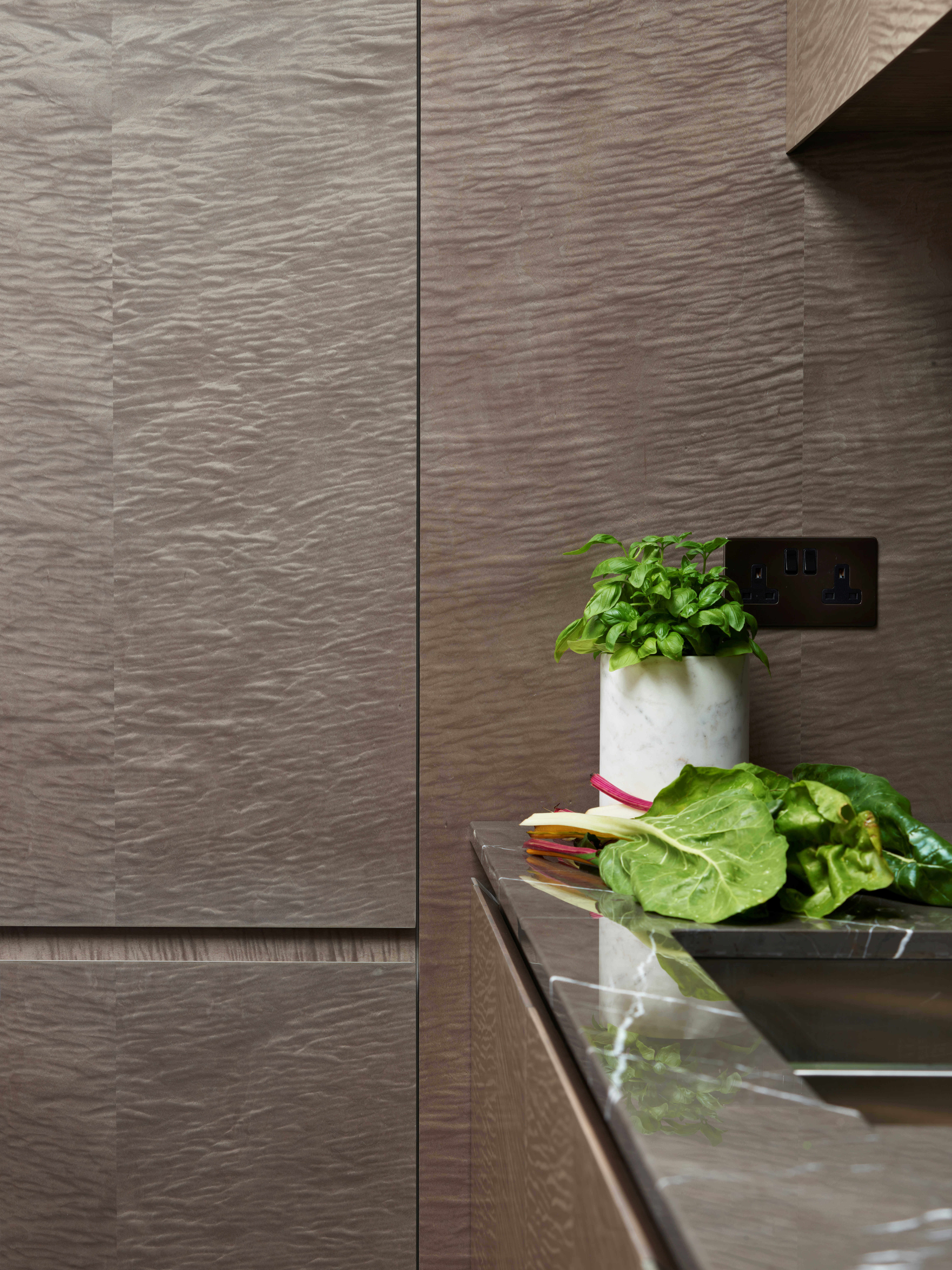
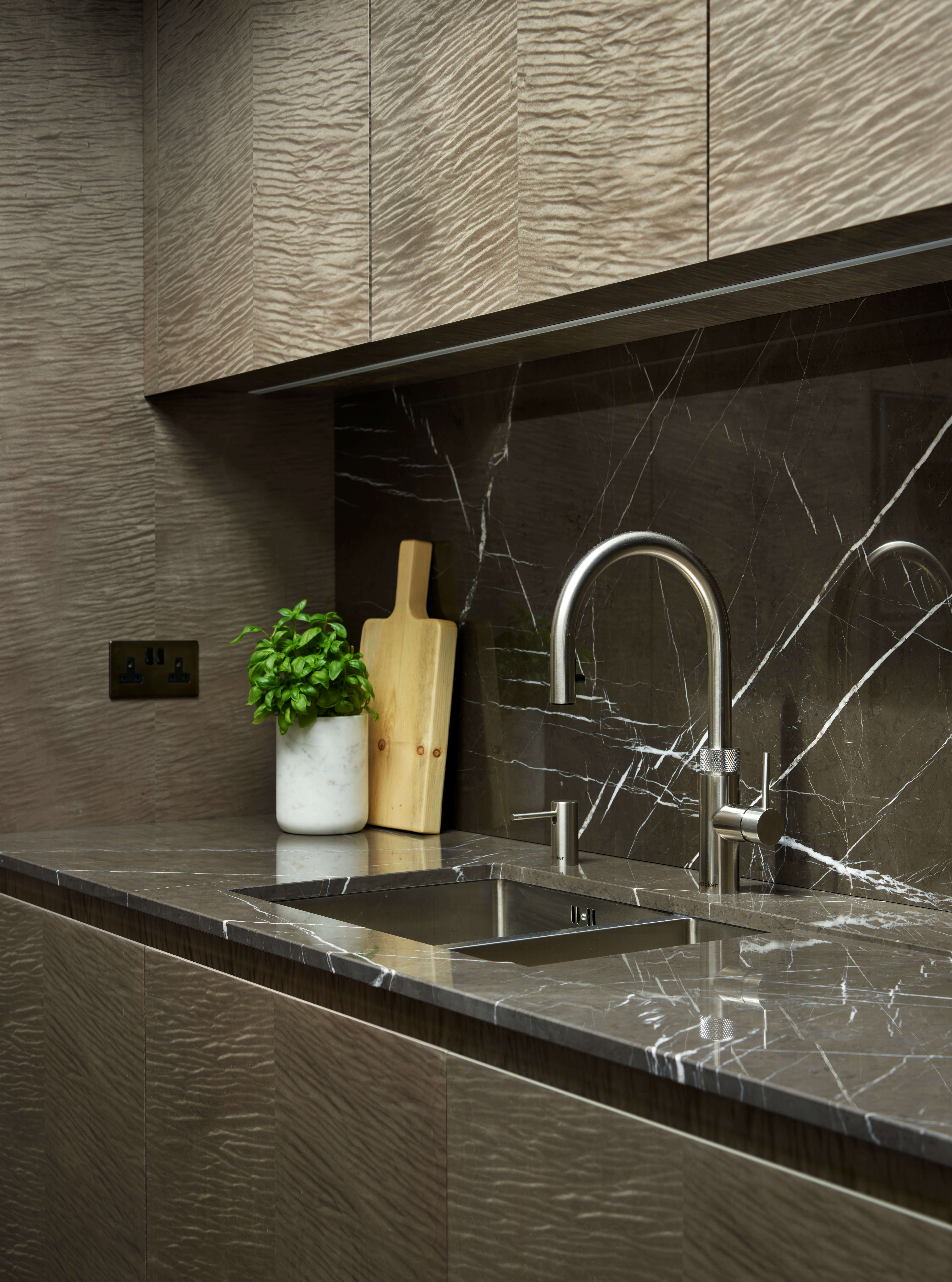
Because the brief was to feature textured finishes, we suggested that the cabinetry should be created using unusual woodgrain veneers. We chose Fiddleback Sycamore with a grey stain, which has a feathered effect and a shimmering aesthetic in daylight. We then suggested that the surrounds should be in a dramatic contrasting finish so we chose Black Maple, which ties in with the original blackened timber floorboards in the kitchen. The worktop and splashback is 20mm thick Nero Marquina marble, which has a pale grey vein running through the dark surface that perfectly complements the other textured finishes.
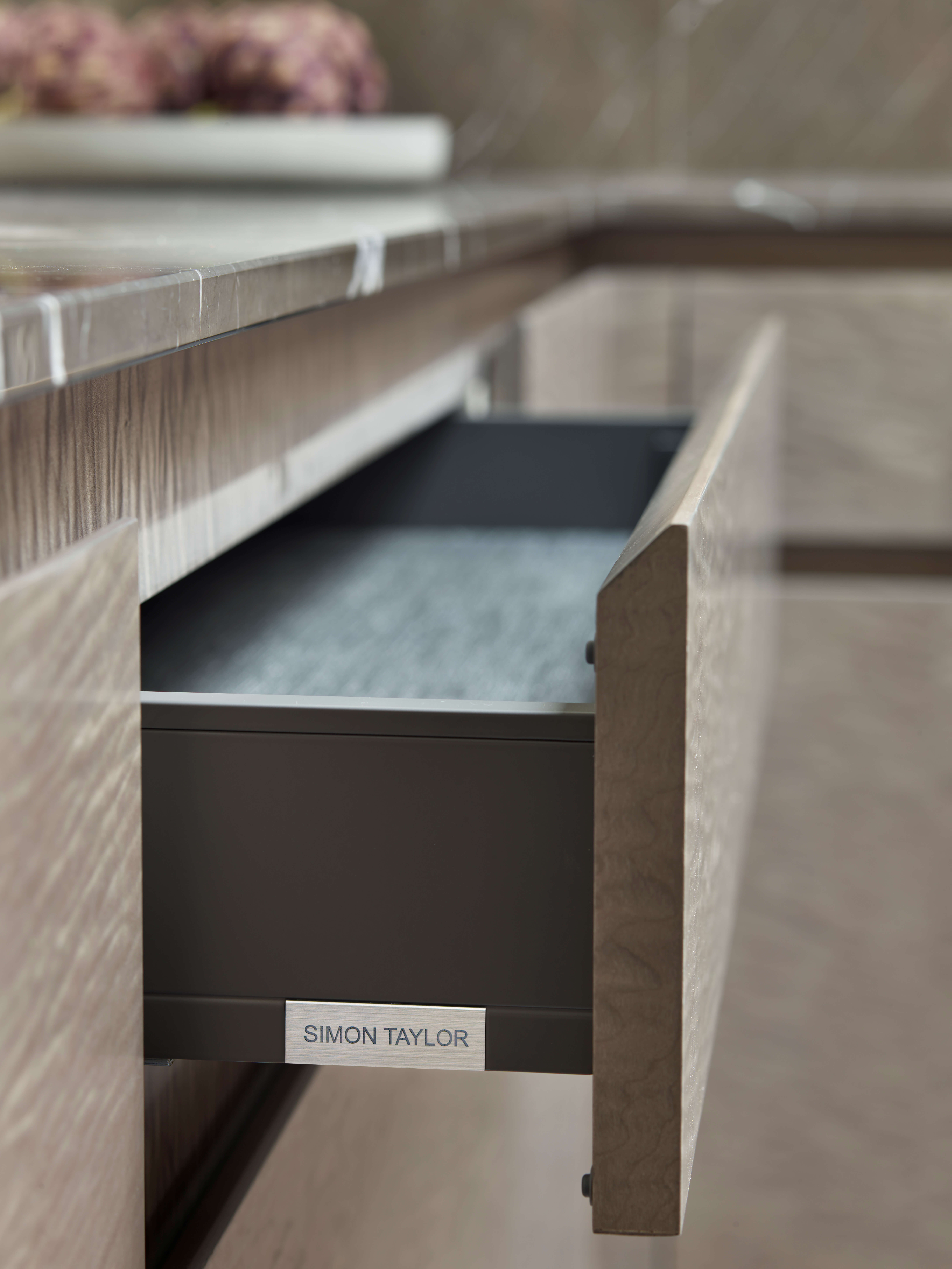
The kitchen is positioned in the corner of the top floor in the duplex apartment, which opens out to a large living and dining area. To create a demarcation between the kitchen and the rest of the space we designed a peninsula with the marble worksurface and waterfall end panel. Installed within is an undercounter wine cabinet and the cabinetry is recessed to accommodate three bar stools facing into the kitchen, while above are three irregular pendant lights purchased by the client. Deep drawers and storage cupboards are incorporated within the task side of the peninsula, which continues on the return to the food preparation and surface cooking run with a linear induction hob and separate downdraft extractor behind.
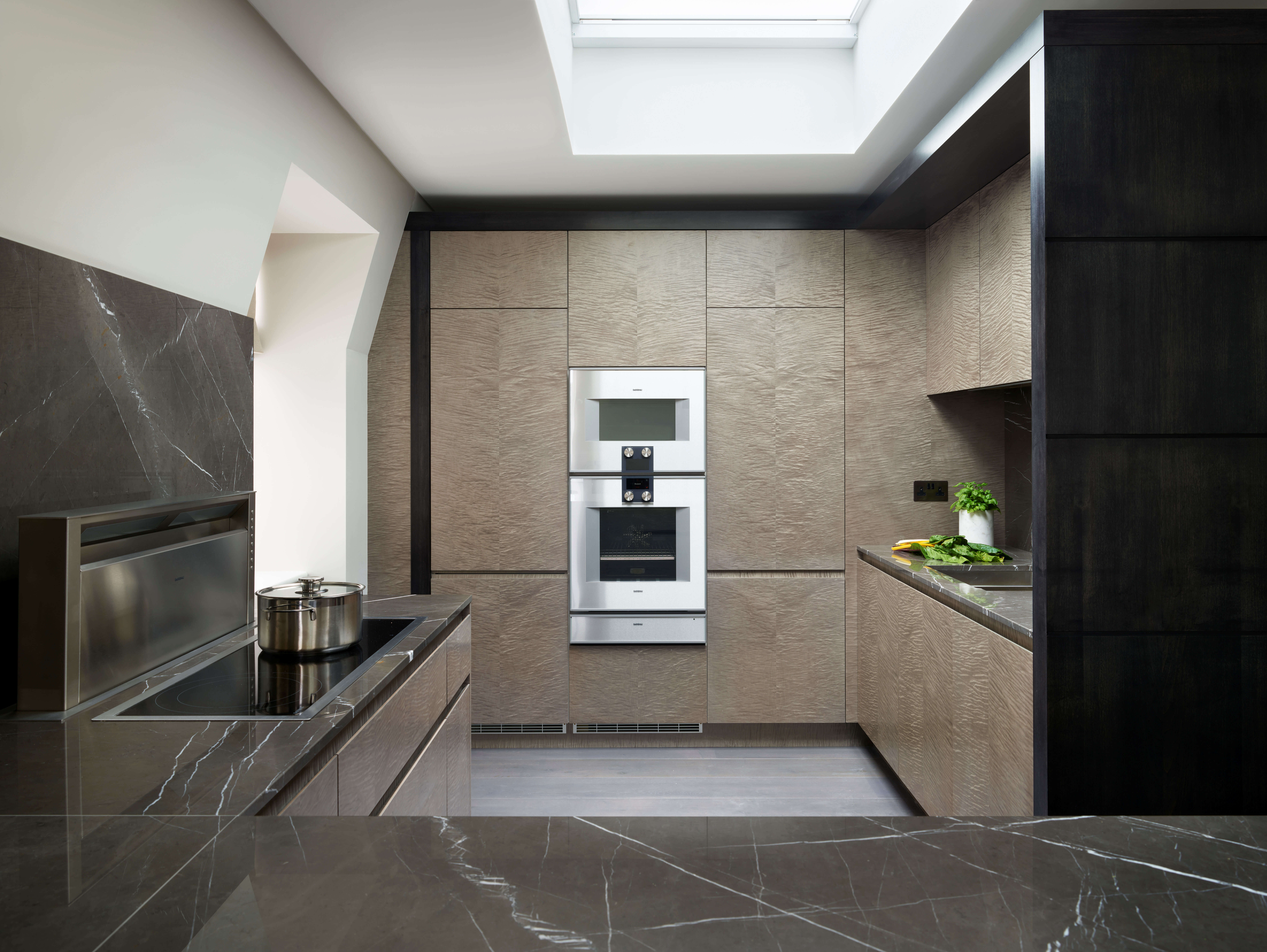
The central run facing the room houses a bank of ovens and integrated fridge freezer concealed behind handleless cabinetry doors to make the compact space seem as spacious as possible. To the other side of the surface cooking area within the kitchen itself is the wet area, with a sink and tap above utility storage and an integrated dishwasher.
Q) Which products did you use and why?
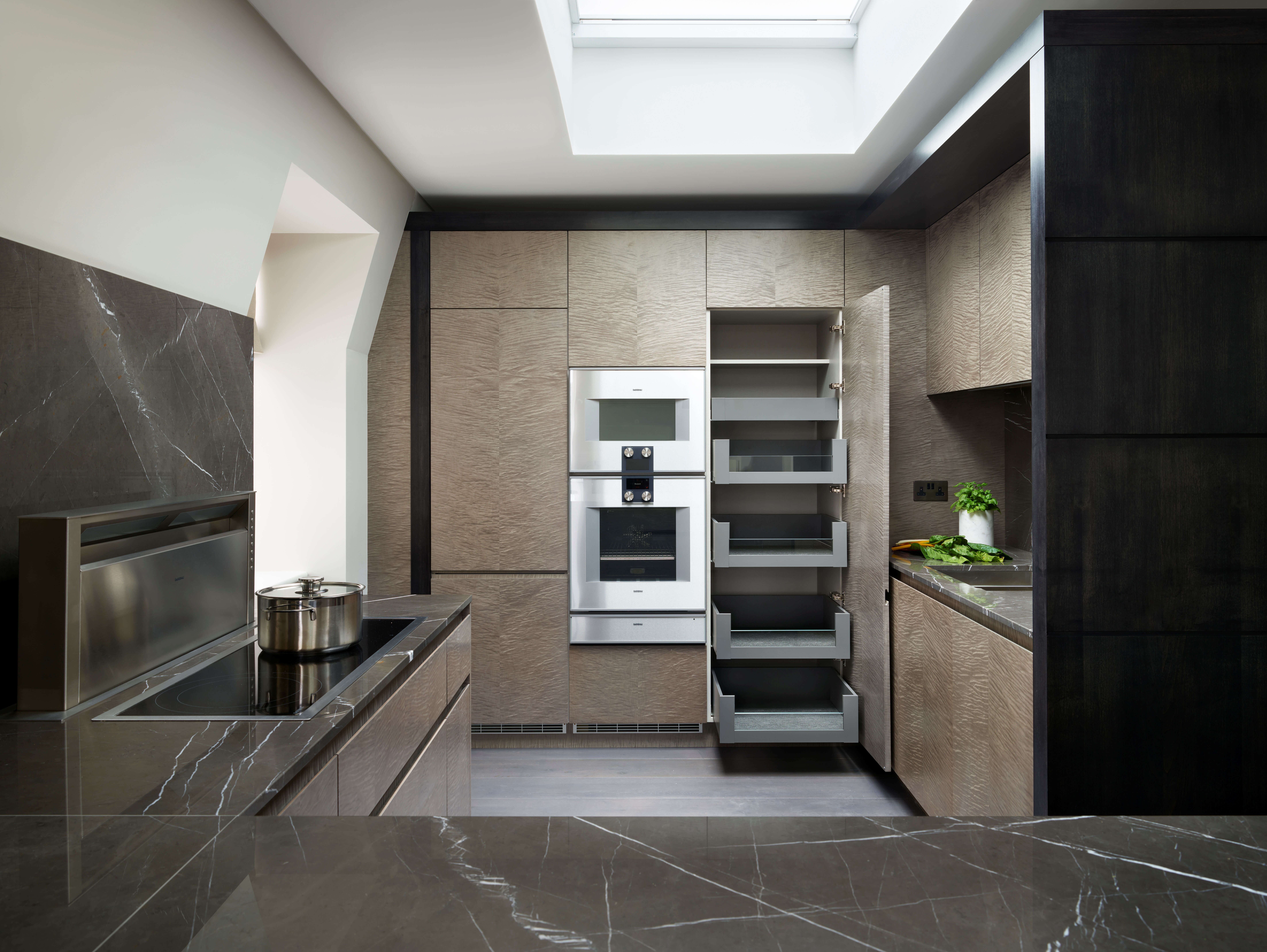
We specified Gaggenau cooking appliances throughout the kitchen and included ovens and a warming drawer from the Vario 400 Series because of their stylish good looks and advanced technologies. Together with an induction hob, we chose to include a downdraft extractor which disappears into the worktop because overhead extraction options would have been difficult due to the vaulted wall. In addition, we included a built-in Vario 200 Series fridge freezer, a 60cm integrated dishwasher and a built-under wine cabinet.
Our brief included one qualification from the client – there were to be no chrome nor shiny finishes in this kitchen. With that in mind, we specified a brushed steel undermount sink by Kohler together with a Quooker Flex 3-in-1 Boiling Water Tap in stainless steel, which has a matt finish.
Q) Was there any building work?
Yes, but this was not handled by Simon Taylor Furniture. The Victorian building in Mayfair was formerly a gentleman’s club, which had been sold into private ownership. This was then converted into six Mayfair apartments, each with a completely different look and layout.
Q) What elements do you think make the scheme so successful?
The beautiful and contrasting tones and textures that flow seamlessly to create a feeling of space in this compact kitchen.
Q) Any advice for someone who may be planning a new kitchen?
Bring as many ideas as you can when having your initial consultation. Look at magazines and online kitchen sites and keep the inspirations you like so that your kitchen designer will then translate those into your perfect design
The details:
Space Tower by Blum, www.blum.com
Appliances by Gaggenau, www.gaggenau.com
Sink and tap by Kohler and Quooker, www.kohler.co.uk and www.quooker.co.uk
Hayley loves: how much storage is packed into this compact space, which is ultra-practical while still appearing sleek and sophisticated.




Leave a comment