Martin Moore: A timeless kitchen for a beautiful forever home
By Linda Parker
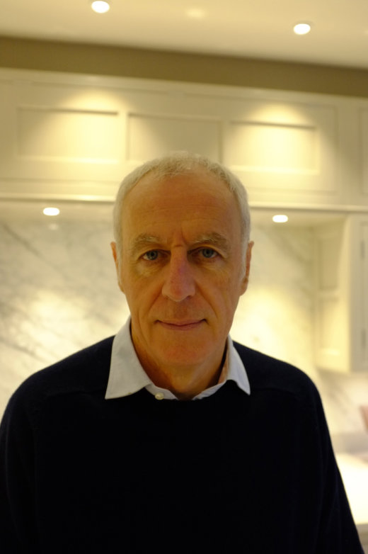 Alex Hughes, designer at the Amersham showroom of bespoke kitchen makers Martin Moore describes his idyllic pre-Covid visit to clients that resulted in this beautiful and timeless kitchen.
Q: Tell us the story of this kitchen journey …
It was over three years ago when I first met Guy and Louisa. I had driven to their home in the Cotswolds on a warm day at the end of the summer. They were so welcoming, it was a delight to meet with them. We sat in the shade of an old oak tree in their garden. Louisa brought tea and homemade biscuits. We sat together and chatted about family life, and which of our children were at which university, and sailing and dogs. There is a lot to be learned about a client’s kitchen needs without ever talking about kitchens.
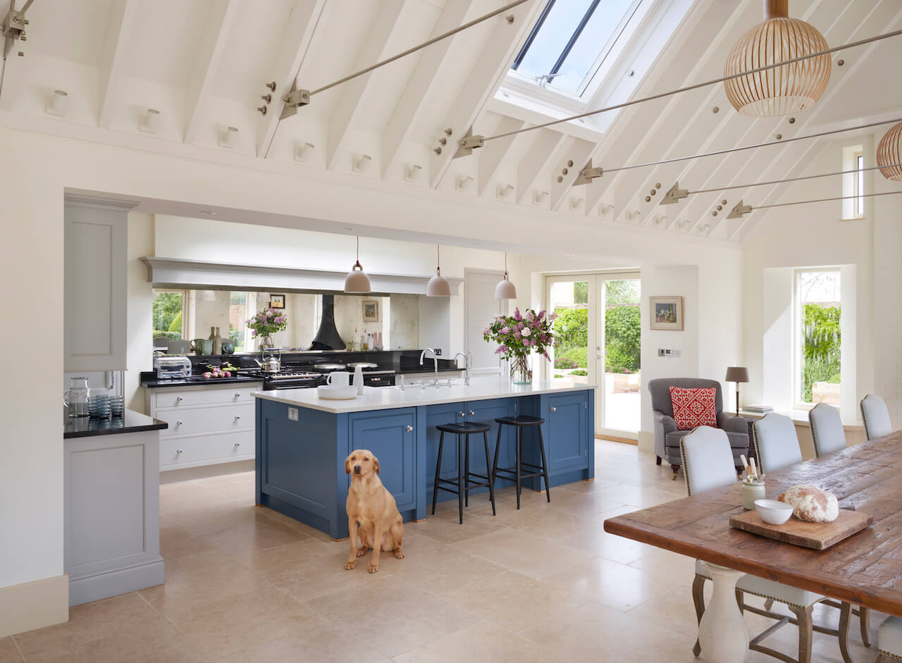
Then we talked about recipes, and cooking, and shopping. Shopping for food, shopping for pans, shopping for kitchens. And when we talked about feeding a family, and cooking for guests, and entertaining friends it was clear to me that this would be a kitchen in which the main ingredient would be love. Love for family, and friends, and life.
It turned out that many years before Louisa had promised herself a Martin Moore kitchen. I often hear this, and eventually we went into the house to look at the soon to be condemned existing kitchen. The Aga would stay in reconditioned form. The fridge was not big enough. There was a pantry, a bit old fashioned and home-spun but serviceable. Some utility rooms at the side were not big enough. They had already commissioned an architects plan. The house was to have an extension, there was to be a social bar, the roof would soar above the dining table. Louisa had already earmarked beautiful wall hangings. These works were to be on a grand scale, and the kitchen had to match!
Q: How did you set about designing this project?
For me, the design process is a conversation between myself and the client. A person may only commission one new kitchen in their whole life, and my job is to give them information which will help them understand their options and make the decisions which are right for them. Alongside that, I offer my own experience not just as a kitchen designer with many years’ experience but also as a husband and father and a keen cook.
My first goal is to design a working proposition based on the discussions we have had. If it does not work as an ergonomic kitchen it is a waste of money. I imagined Louisa in the kitchen not just cooking the main meal of the day, but making a coffee, unloading a dishwasher, packing away the shopping… the myriad of small tasks which amount to so much more that that simple work triangle. It’s essential to have room to work. It’s essential to have good storage in the correct area for the task. A design should rise to the challenge of the last five minutes of preparing a roast dinner for twelve, and it should allow you to sit and breathe, with a glass of wine, when it is all done. Louisa had given me an insight into her life, I responded with a vision of the movement within the room.
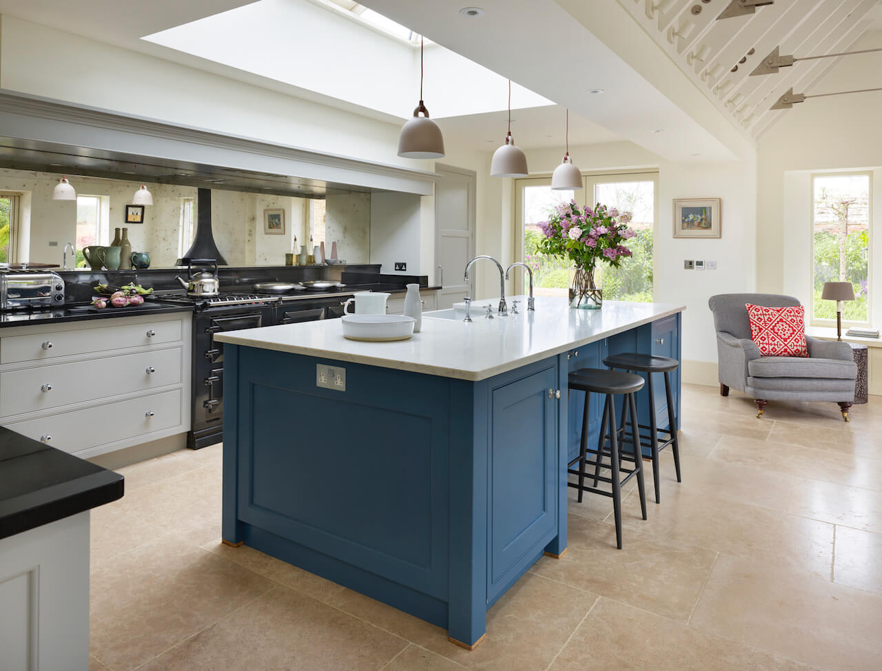
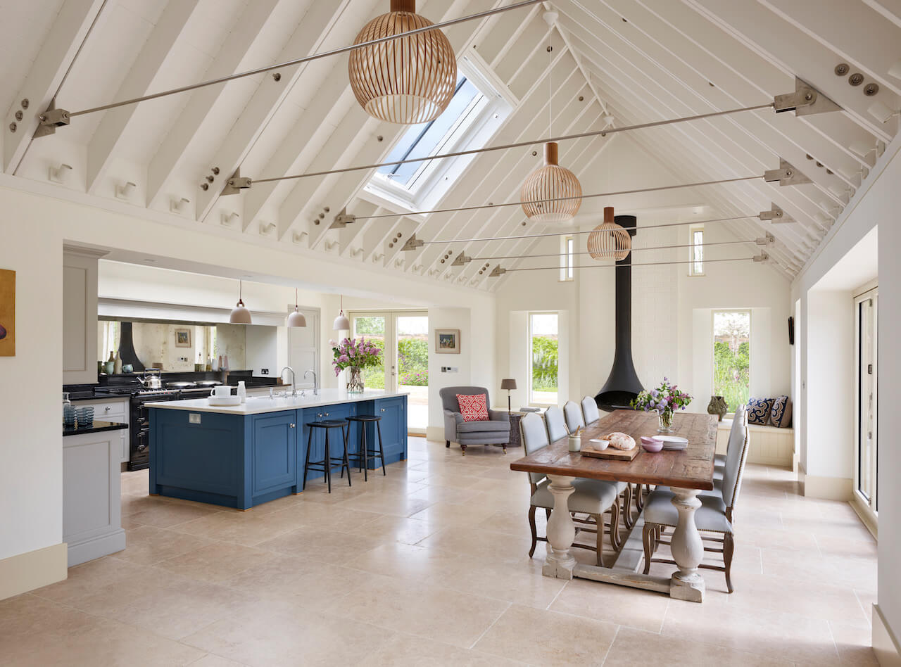
Then, I added balance and proportion. This is the second goal of the design process. The room is big, so the individual components needed to match. The width of the mantel. The size of the island. The fridge. All in XL! I have enough experience to get it right first time for a lot of my clients. And so it was with this kitchen. I did the design and I knew it was right. Guy and Louisa both agreed, the first was the best and we went with it.
Q: Explain the reasons behind the choices of cabinetry and work surfaces
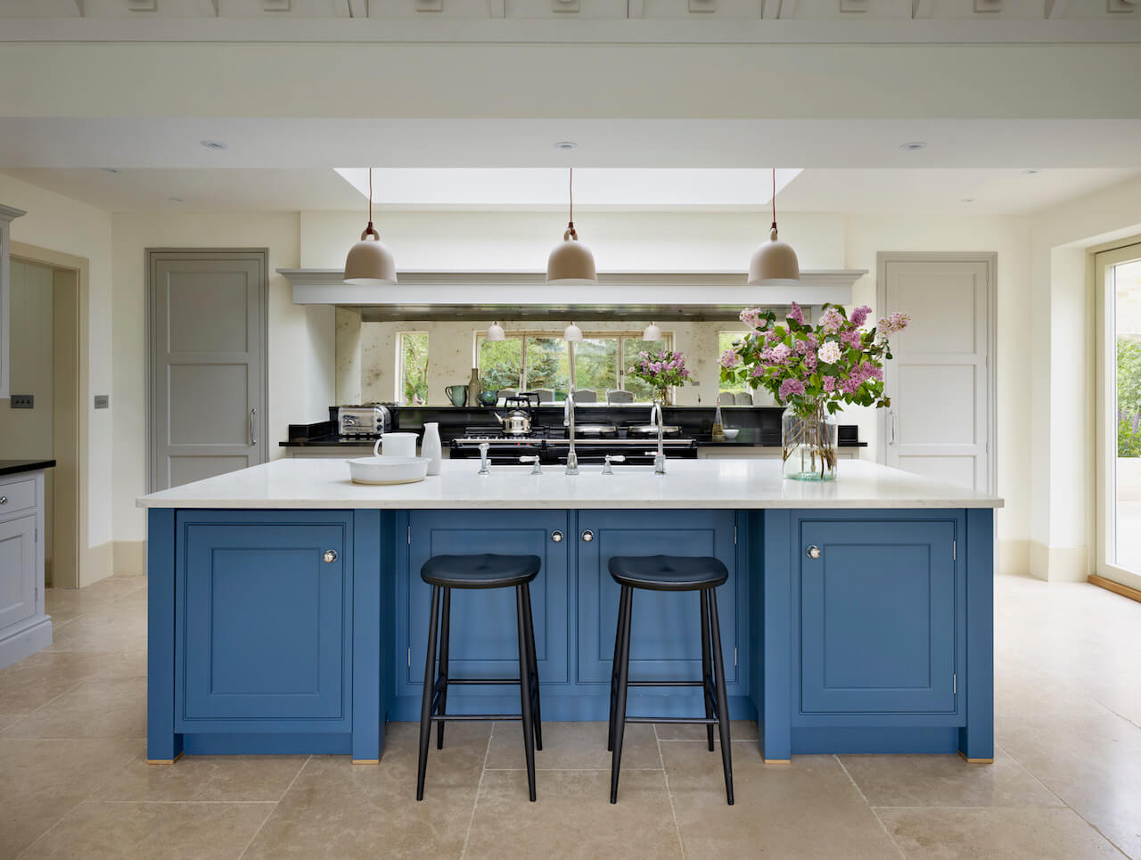
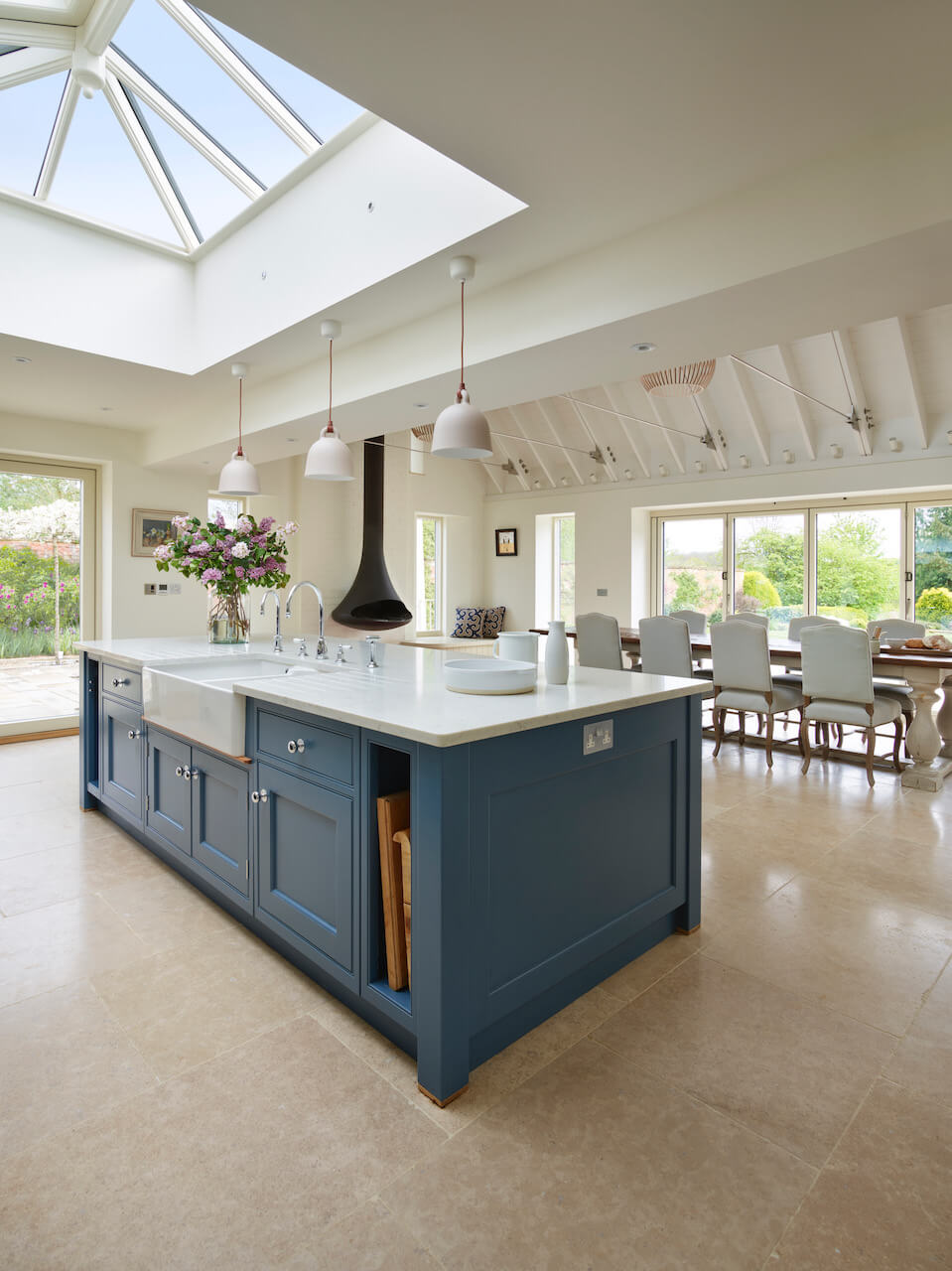
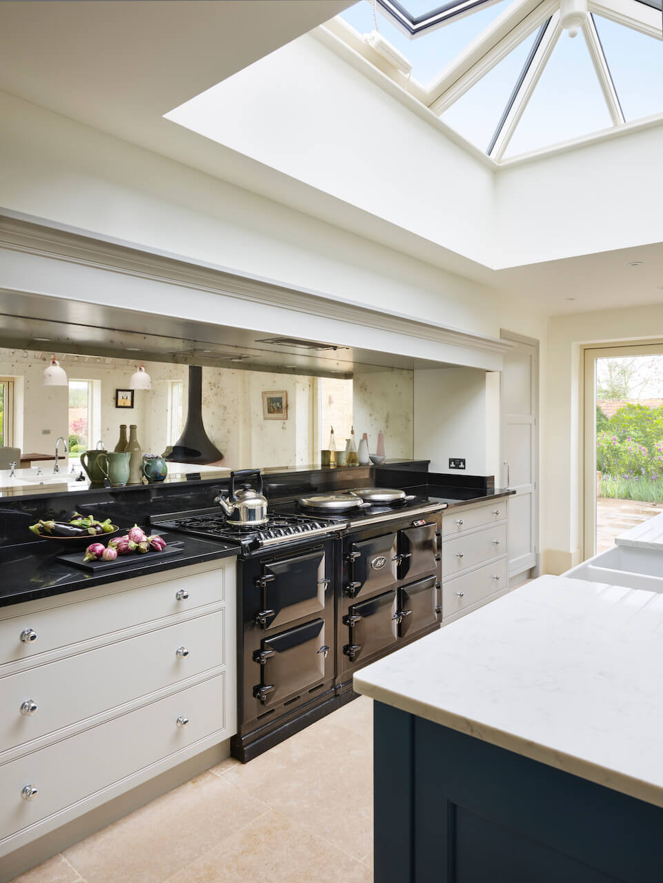
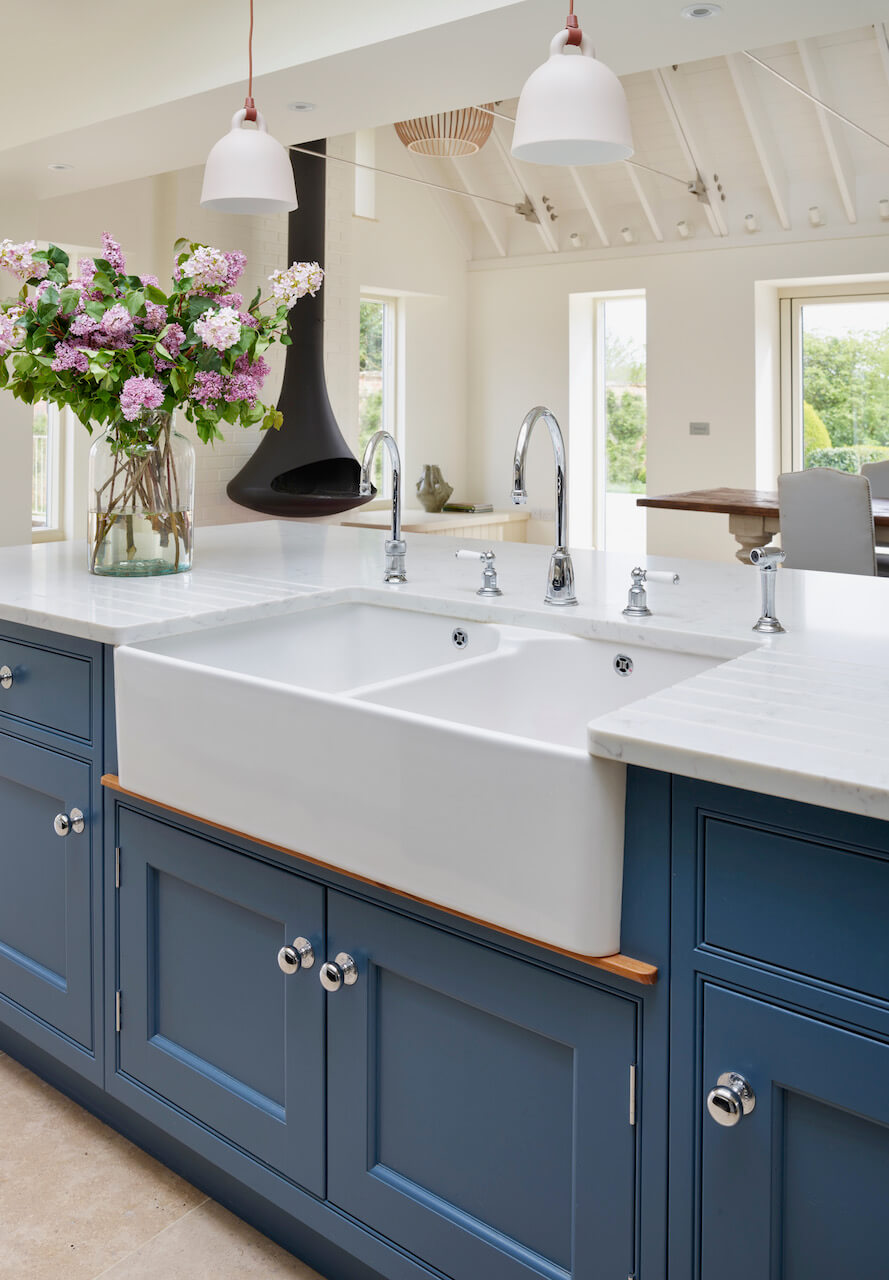
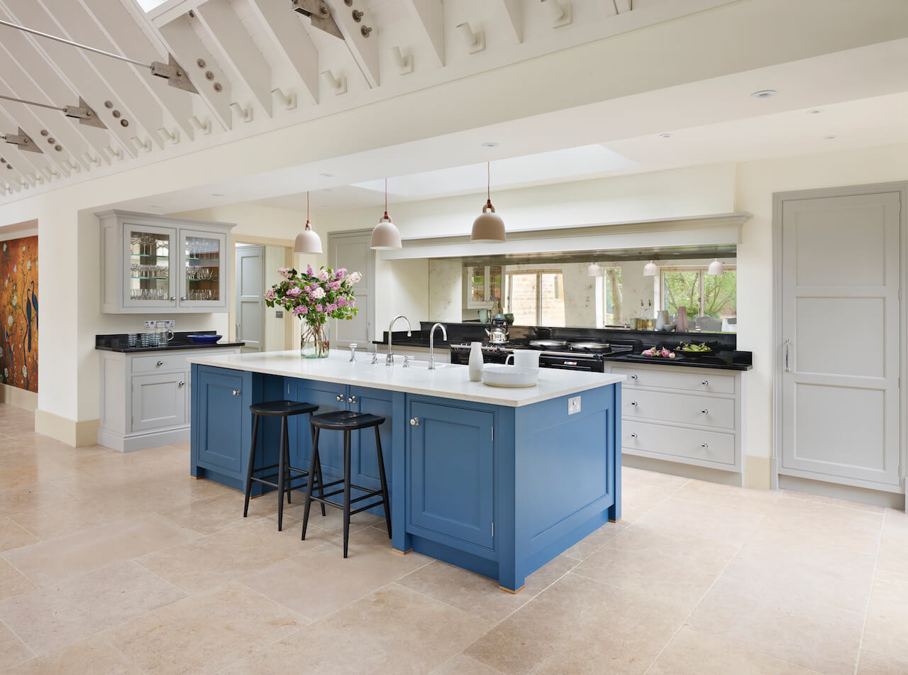
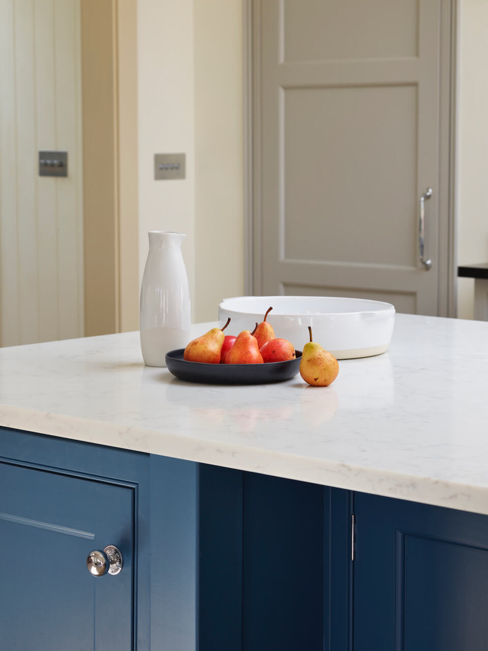
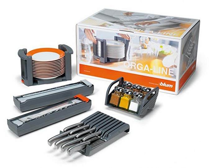
Guy and Louisa visited the showroom to see a Martin Moore kitchen in real life. We talked through the many choices starting with the cabinet door style and ending with paint colours. I had already suggested respecting the existing architecture and woodwork of their Victorian home. So, as well as choosing the door styles we also selected handles and skirtings and architraves. The choice of worktop was simple. Black either side of the Aga because the Aga has a black top. Light grey marbled Quartzite for the island. We also used the time to choose internal accessories such as knife blocks and door racks.
I wanted the kitchen to look like it belonged to the house, yet also be completely personal to them. So there’s a balance of static elements – the door choices and so on, with the space and dynamic elements for them as a family.
Q: Was there any building and renovation work involved? Did you have any restrictions or limitations that you had to work around?
The architectural design was done when I arrived onto the project. The extension was yet to be built, and because of strict planning controls it had to be built to the plan. It was useful to know exactly how much space we had to work with!
Q: What design elements do you think make the scheme so successful?
The third goal of the design process is to add colour and texture. Louisa has a great eye for interior design, she had in mind an eclectic mix of objects and paintings to occupy the space. We chose colours which were harmonious, almost-neutrals with a calming effect. Louisa teamed this with vibrant works of art. The architect created an amazing space, Louisa filled it with beauty.
Q: Now the project is finished, what aspects are you most pleased with?
With all projects, I invest my time and energy so that they can have a kitchen which enhances their life. Guy and Louisa invited me back when all was finished to say how pleased they are with it, and that they have no disappointments. This, to me, is the best reward and the most pleasing aspect.
Q: What are your five top tips for someone who is planning a new kitchen?
- Be realistic about what you want to spend. If you can’t afford what you like then re-assess your budget or your wish list because one isn’t right.
- Find a designer who you feel you can work with, someone you can get along with and also someone who can listen to you and understand your needs. They will be in your life for a short period but their advice will live with you for a long time.
- If you don’t like a design, layout or idea, try to explain to the designer why you don’t like it, it will help them work out something different.
- Start with the big picture but make sure you get a designer who can get down to the detail. Great design is often created by the extra 5% of effort.
- Don’t forget lighting, it is not just all about task lighting. Ambient and feature lighting creates mood and atmosphere if done with thought.
Q: Do you have a secret ‘style signature’ that you find you use in most of your kitchen projects?
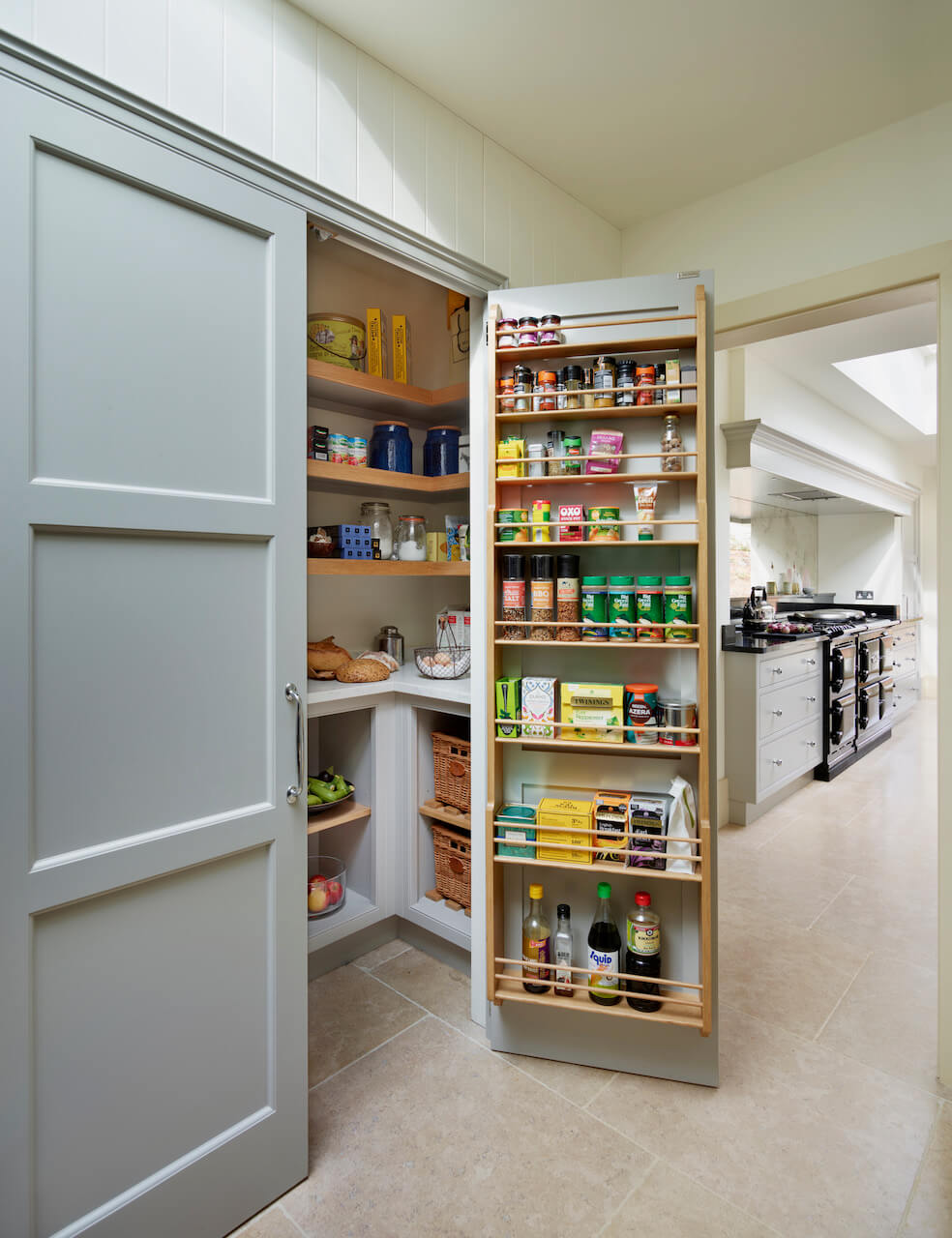
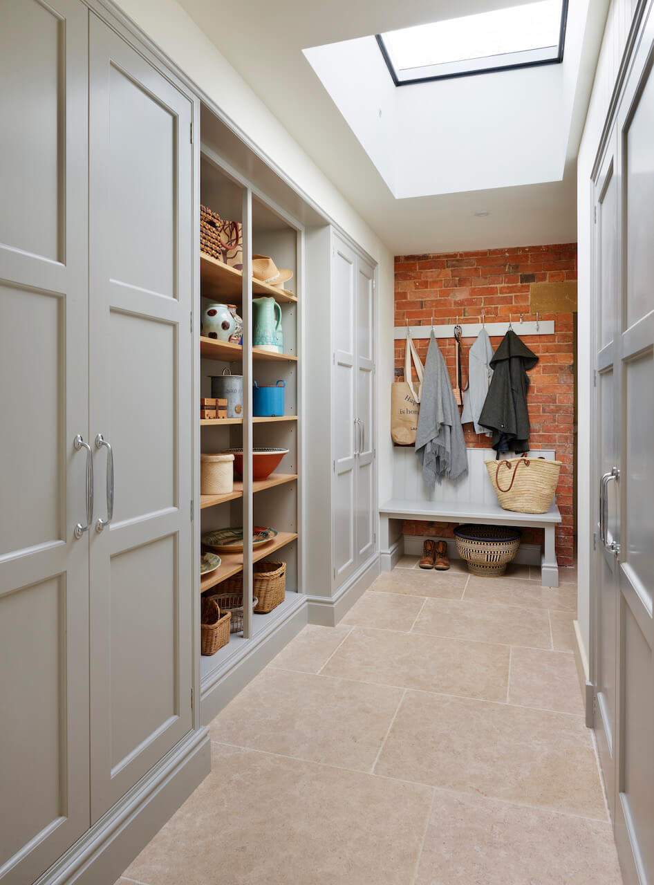
All of my kitchens start with planning the spaces people need to work and move in. It’s the invisible part of the design, but you know it is there when you are working. This large project also included a boot room and walk-in larder, and it’s always interesting to create these areas too – hugely important to the overall smooth running of the household!
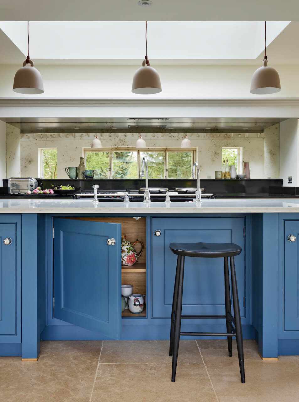
We Love: The ‘been there forever’ feel about this kitchen, plus the amazing practicality of the boot room and walk-in larder. Sheer genius.
Kitchens by Martin Moore are from £35,000, with showrooms in Notting Hill, Fulham, Muswell Hill, Esher, Amersham, Tunbridge Wells, Altrincham and Elland.
Cabinetry, from the New Classic Collection painted in Soft Grey and Nantucket Blue. Work surfaces, CRL Verona Quartzite and 30mm polished Nero Assoluto.



Leave a comment