Making A Statement – By The Caulfield Company
By Linda Parker
Mark Caulfield, founder and MD, The Caulfield Company took charge of a huge project to open up the back of this stunning house. He designed an ambitious glazed extension with the aim of allowing the garden and living spaces to flow together.
Q: What were the stand-out priorities in your brief from the client, and how did you incorporate the kitchen into the plans?
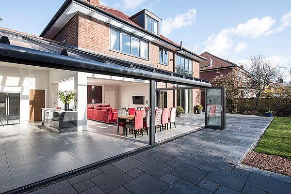
The house has a large garden but it had limited access, making both the garden and kitchen spaces feel separate and under-used. As part of a total refurbishment, The Caulfield Company was asked to open up the back of the house with a large glass extension creating room for a new, airy, open plan kitchen, dining and living room – all flowing directly into the garden. At the heart of the extension, the clients wanted a kitchen with a modern, streamlined design. They saw it as a strong and focussed hub of the home, capable of welcoming large gatherings of friends and family in a relaxed and inviting setting
Q: How did you set about answering that brief, what were your first thoughts?
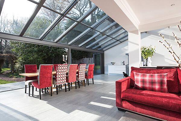
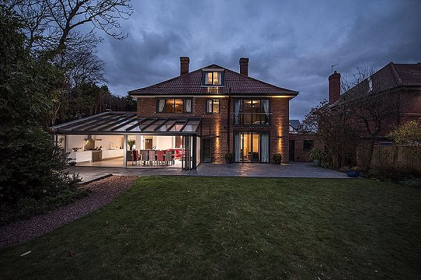
The first thought was how important it would be to create architectural cohesion, so that the new glass extension flowed naturally out from the original building. To achieve this one corner of the house was totally removed – and replaced with a dramatic L-shaped glass building. To complete the look, we then carried the style of the new glass building through the whole rear elevation, replacing the windows on three storeys and creating an additional set of new large bi-fold doors to the right of the extension. This answered the client’s wish to complete the renovation by opening up the original living room onto the new terrace, unifying house and garden across the entire back of the house
Q: Explain the reasons behind the choices of cabinetry and work surfaces – did you have to consider the exposure to sunlight, heat, UV and so on?
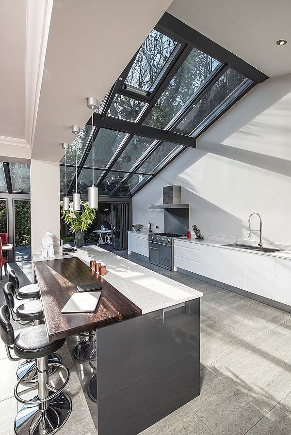
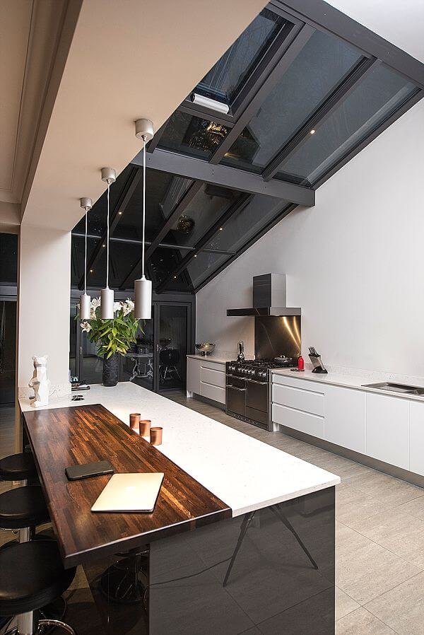
The kitchen designer was Dominic Hurley of Second Nature kitchens. His choice of cabinetry was influenced by the clients’ love of simple, contemporary design so the Remo handleless design was the obvious choice to anchor the scheme. To accentuate the clean lines, he suggested white worktops and, mindful of the amount of glass in the space and exposure to sunlight, he specified Silestone quartz. To introduce contrast to the colour palette, the island is clad in graphite and similarly, to inject some warmth rich walnut timber is used as a focal point around the seating area of the island.
Q: What were the most difficult aspects of this project?
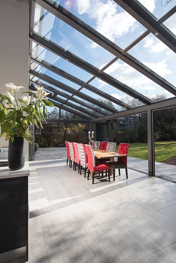
Visually and technically, the greatest challenge was to achieve a perfect fusion between the original house and the spectacular new glass building, particularly because it wraps around the whole corner in an L-shape. This can only be achieved because the glass structure is custom built and engineered to the highest possible degree to offer strength and millimetre perfect accuracy. Alongside these factors, the advanced roof and door technologies we use mean that this glass building also offers high thermal values, noise cancelling and automatic climate control. This means we are able to overcome all the traditional problems that have previously been inherent in living with such large areas of glass.
Q: What design elements do you think make the scheme so successful?
The light and space afforded by the new building is truly spectacular and has transformed the house, in both in the way it looks and the way that it works. It’s light, bright and comfortable to be in whatever the weather outside. Perhaps this project’s greatest triumph is its total connection with the outdoors. It can be completely opened up whenever the weather allows, creating one single multi-purpose living space flowing through the house and the garden. The additional works, replacing the windows and doors across the whole rear elevation, have also been very successful in creating a coherent architectural finish.
Q: What is your best advice for someone who may be planning a new kitchen and glazed extension?
There are many different considerations. One is that glazing one or more walls of a kitchen extension removes them from the design equation in terms of where furniture, cabinetry and appliances can be positioned. The upside of replacing solid walls with glass is the additional light you gain and the potential to create seamless access to outdoors. It’s important to work with a kitchen designer who appreciates both factors. Climate control issues are particularly crucial in kitchens, where heat and steam are generated. Make sure your designer is familiar with the technical details of climate control. The two key factors in achieving a perfect climate with large areas of glass are insulating and shading. Double or treble glazing will insulate against cold whilst good shading will minimise glare and prevent uncomfortable heat build-up on hot days, ensuring the extension is comfortable all year-round.
We Love: The absolute drama of this extension – the vast spaces, soaring glass ceilings and the sleek, subtle and sophisticated dream kitchen
Bespoke glass building by The Caulfield Company, 0113 387 3118 www.caulfieldcompany.co.uk
Kitchen by Second Nature, Designer: Dominic Hurley of Second Nature kitchens www.sncollection.co.uk
Remo White handleless kitchen by Second Nature www.sncollection.co.uk
Neff fridge/freezer and dishwasher www.neff.co.uk
Mercury range and extractor www.mercuryappliances.co.uk
Abode tap and sink www.abodedesigns.co.uk/
Silestone worktops www.silestone.com



Leave a comment