Lincolnshire Hall by DeVOL Kitchens
By Linda Parker
DeVOL kitchens are unique, with a very individual quirky charm. The cabinetry itself is often very classic or traditional, but the resulting kitchen always has a vibrant, charming feel. Designer Helen Robson gives us the background on this outstanding project …
By Linda Parker
Q: What were the stand-out priorities in this particular brief?
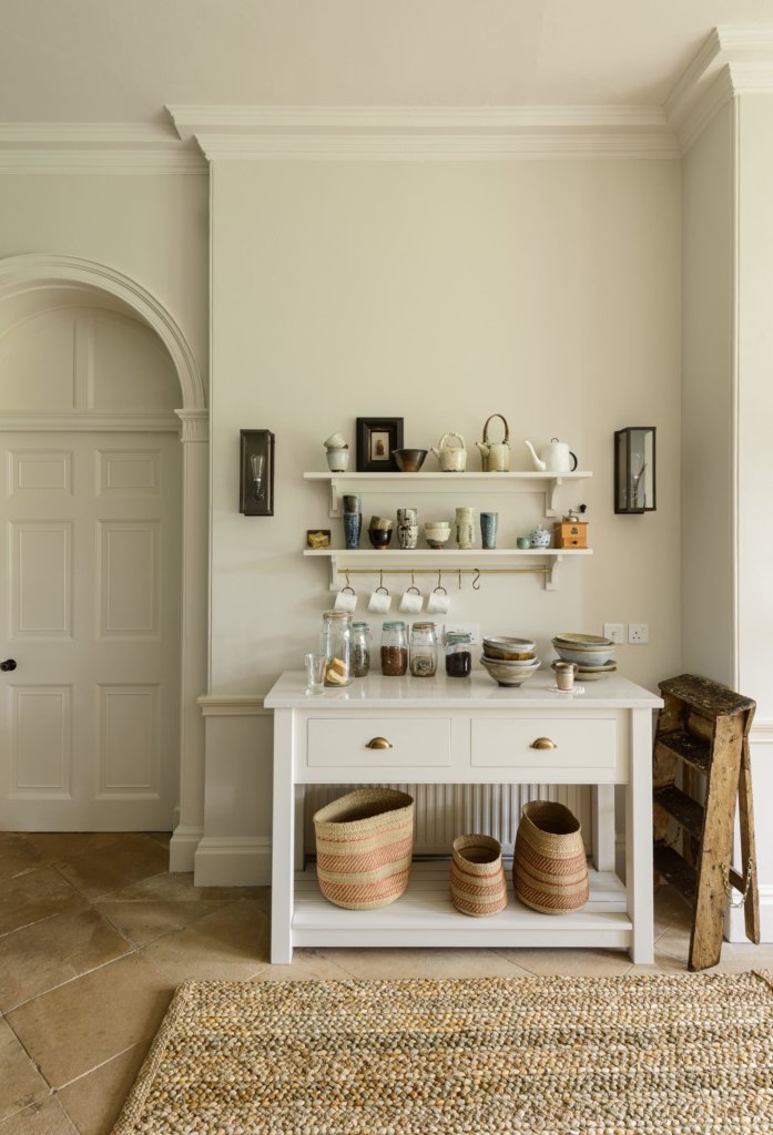
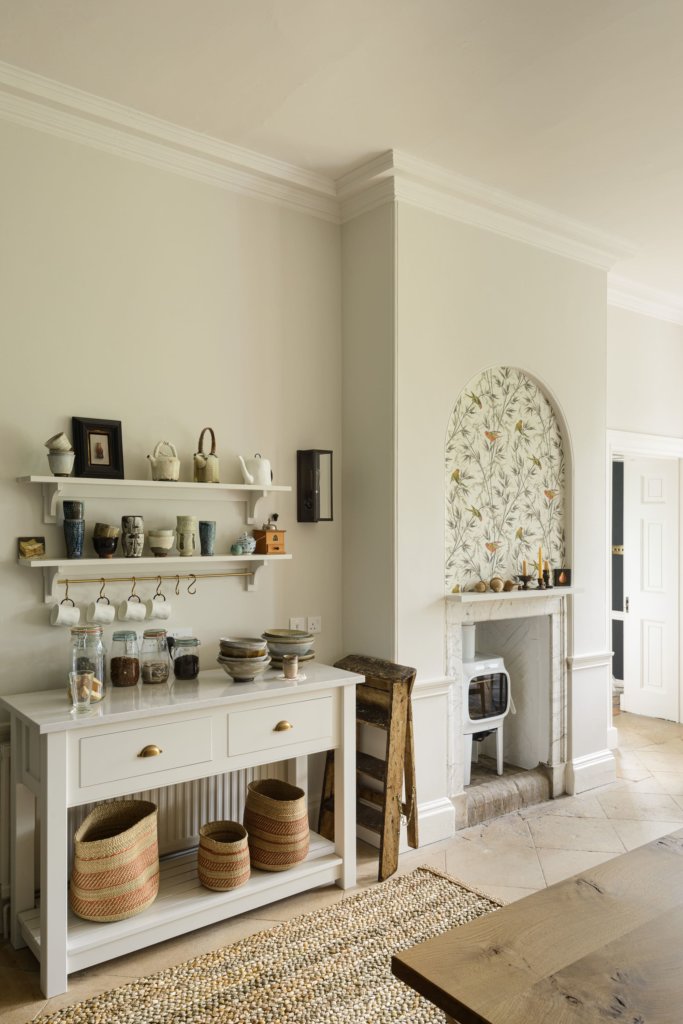
The owner was really keen on having a little tea and coffee making station. Our simple butcher’s block was the perfect addition, just a couple of shelves and a hanging rail above was all it needed to make a really beautiful and practical area.
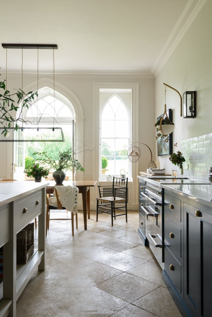
We decided to go for a prep table rather than a fixed island as the owner didn’t want to conceal the fantastic old stone floor. It had been there for hundreds of years and had developed a fantastic patina and was a lovely reminder of the property’s rich history. The kitchen design had to work in harmony with all the incredible original features of the house as well as our clients iconic furniture and lighting.
Q: How did you set about answering that brief? Were you given a strict budget?
The budget was fairly open as the kitchen is the most important room to the owner so she wanted to get it right. She already had a very clear idea of how she wanted the kitchen to be so I just had to draw it up and work out how it would best fit in the room.
Q: Explain the reasons behind the choices of cabinetry and work surfaces.
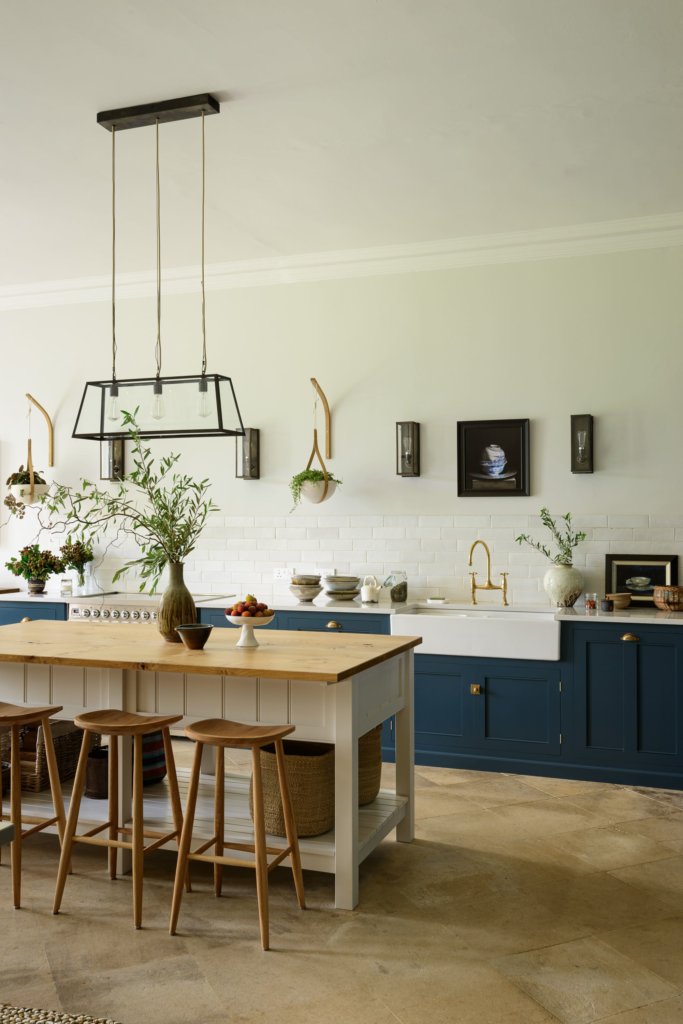
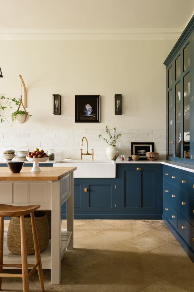
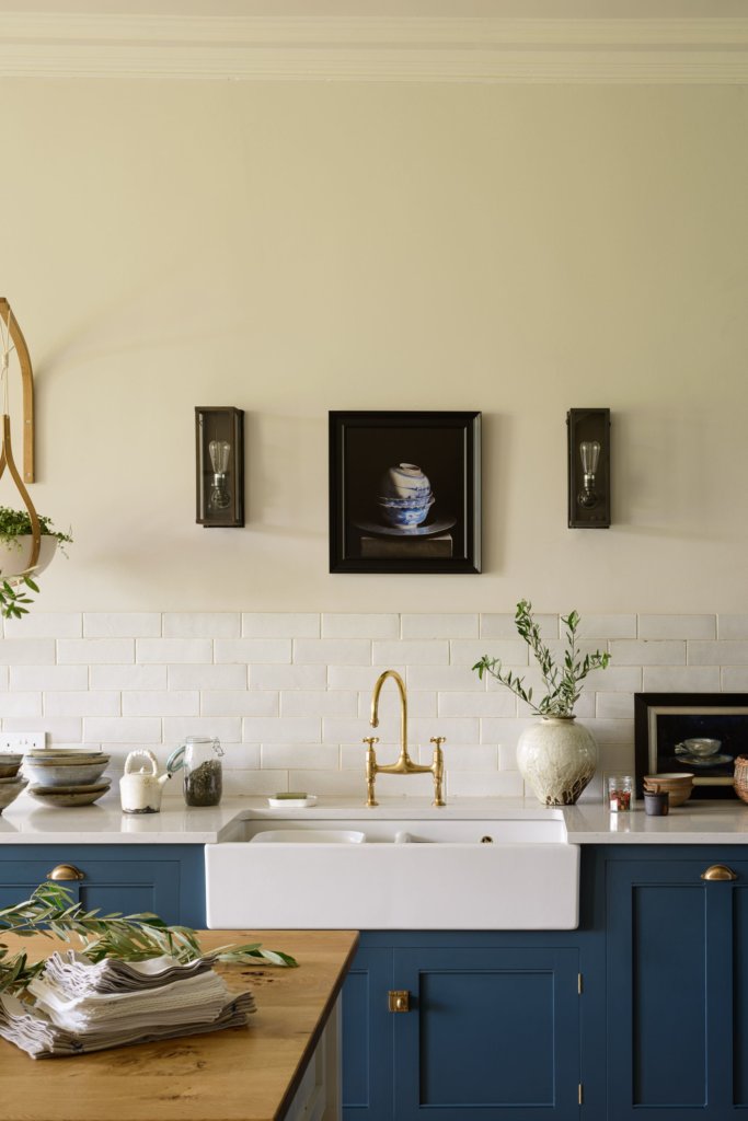
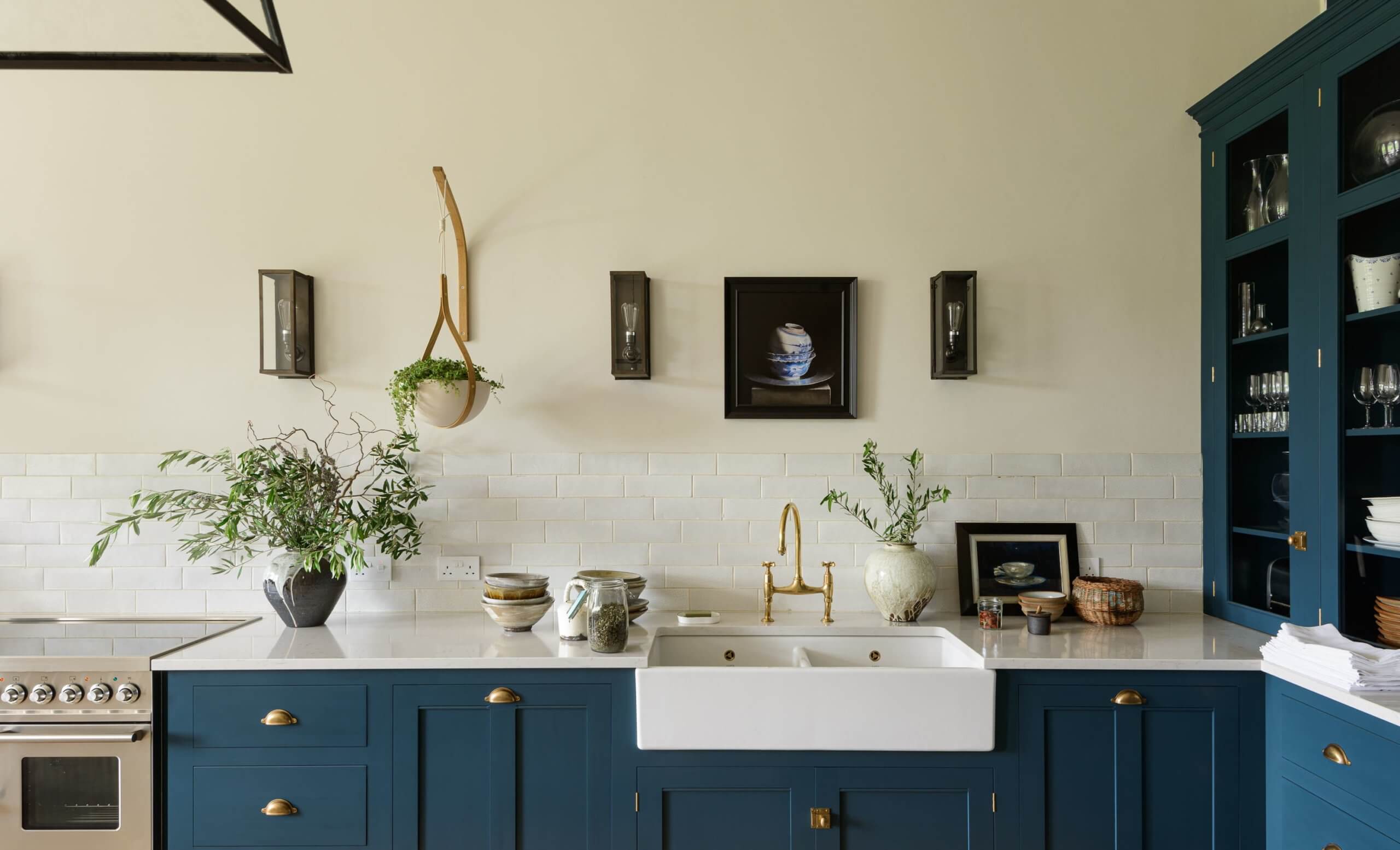
The owner chose a Silestone worktop for the majority of the kitchen. It’s practical, hardwearing and light coloured so it achieved the calm and bright appearance she wanted. As a contrast, she opted for a wooden worktop on island for a traditional feel and to add warmth and texture.

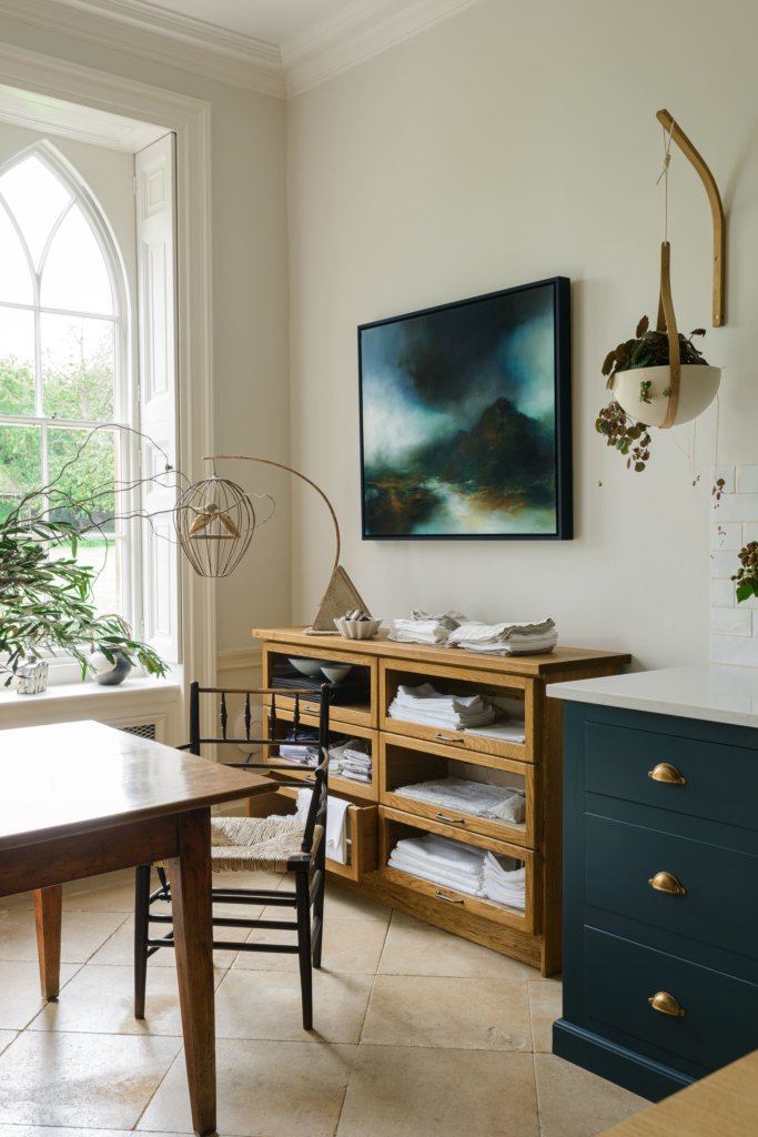
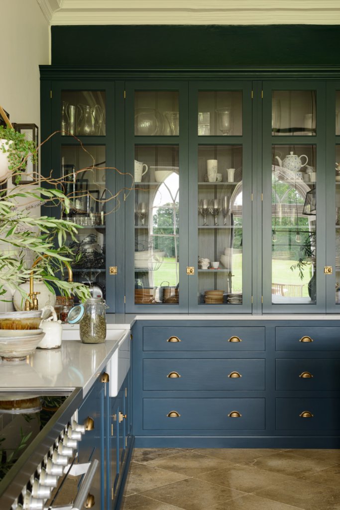
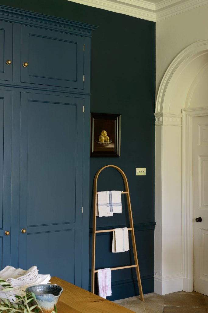
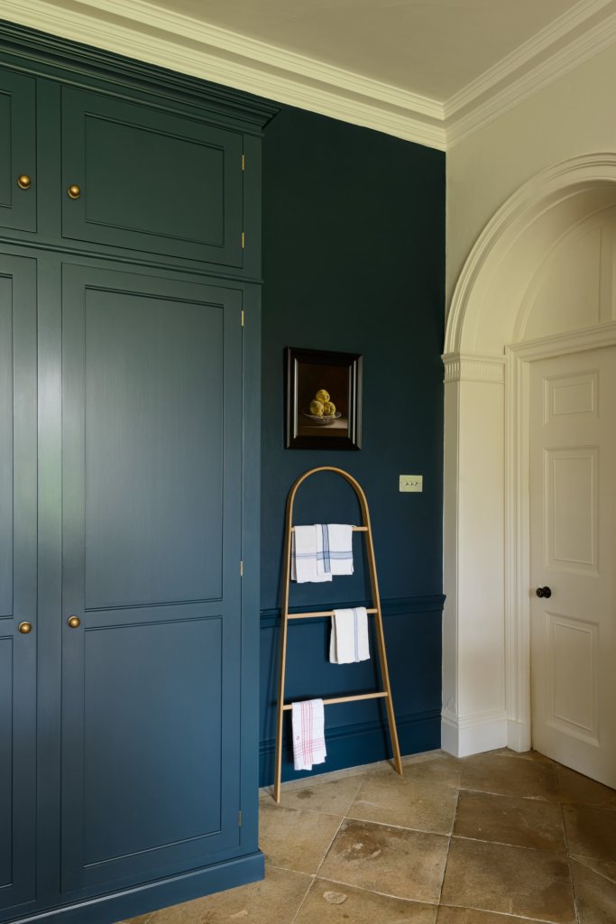
She also wanted to include a set of glazed drawers from our new Haberdasher’s Kitchen collection to display linens as they went perfectly with her mid-century modern chairs. The rest of the furniture was from our bespoke Classic English range. A bank of tall cupboards hid a full height fridge freezer and provided plenty of storage space. The glazed cupboards were chosen to reflect light and display beautiful crockery.
The tea and coffee station had to be freestanding to allow for a radiator behind, so we included a couple of shelves and a hanging rail above to display mugs.
Q: Was there any building/renovation work involved? Did you have any restrictions or limitations that you had to work around?
The limitations were simply that of the room – existing windows and doors and a big chimney breast. There wasn’t any building work taking place as it is a very historic building. As it was a lovely, large, open and rectangular room, it was fairly straightforward to design.
Q: What design elements do you think make the scheme so successful?
I love how this design has a wonderful balance of grandness and simplicity. Grandness in terms of the large scale and the quality of each and every finishing detail – from the handmade tiles and cupboards to the iconic pieces of design and lighting. Apart from all of this, there is nothing over the top or overly ornate, which makes it feel very peaceful. There’s also scope for more items to be added over time …
Q: Now the project is finished, what aspects are you most pleased with?
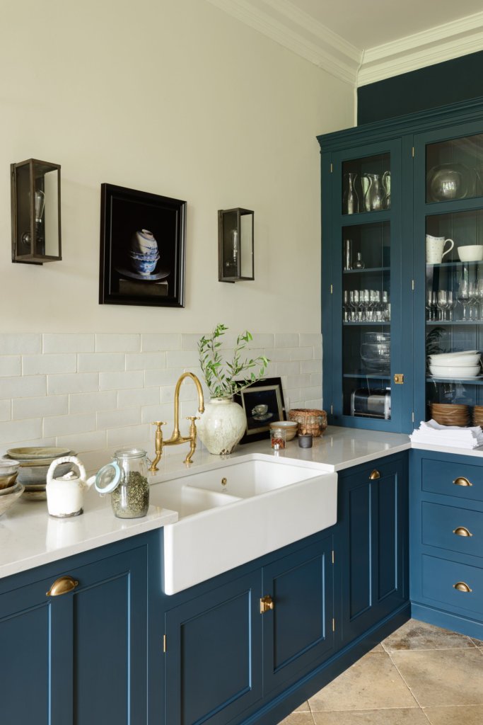
It’s very hard to pick as I love all of it; the combination of all the details carefully chosen by the owner work in harmony so well. I love how the simple, low-level sink and oven area runs into the tall cupboards. I adore our handmade Crackle Metro tiles and the choice to add a set of Haberdasher’s glass drawers.
Q: What is your best advice for someone who is planning a new kitchen, what should they look for or ask for?
Just think about what you really need, and about what will bring you the most joy. Think about what is fitting for your room, not for someone else’s room which is another size or another style – get rid of stuff you don’t use rather than just asking for more cupboards! Keep it simple and allow the scope to add personal details and to update over time. If you aren’t sure, chat to your designer – it’s their job to help you figure it out!
Q: Do you have a secret ‘style signature’ that comes to the fore in your kitchen projects?
For me, the most important thing is to listen really carefully to what the customer wants, help them to work out what is important to them and then help them to find a way to make that work in their home. Sometimes that means figuring out what doesn’t need to be there, so I suppose in that sense simplicity might be my style! I like to include lots of scope for the client to show a bit of their own personality but that usually comes in the form of openness, areas to display art or cherished possessions. Most of my designs allow for some sort of display space, I think that is quite important if you want your kitchen to feel less ‘kitcheny’ and more like a proper room.
We Love: Well of course, the whole kitchen is fabulous but a stand-out feature is the central table with natural wood top, teamed with the Bum stools. Also the practical tea and coffee station Perfection.
The Classic English Kitchen by DeVOL, prices start from £25,000. The glazed drawer cabinet is from the Haberdasher’s Kitchen collection, also by deVOL. Work surfaces are polished Lagoon by Silestone and Rustic Oak. Taps are Aged Brass Ionian, stools are The Bum Stool, tiles are Crackle Metro, all by deVOL.
Wall colour: Slate II, Woodwork and ceiling, Slate I, Paint & Paper Library
Wallpaper: Great Ormond Street in Signature by Little Greene
Lighting: All Original BTC



Leave a comment