Kitchen Ideas: Professional Perfection
By Linda Parker
BY LINDA PARKER
This time, we decided to have a closer look at some stunning kitchens – and to pass on some inspirational and creative ideas. There is so much advice available for new interior projects that it’s become a minefield just picking through everything. We’re still very much in favour of keeping it simple and streamlined, add your own personal details as you go along. Remember that in a kitchen, pops of colour and texture, from bar stools to artworks and painted feature walls are a lot easier to change than cabinets.
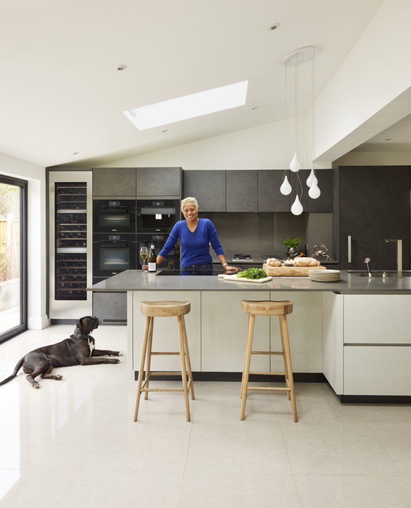
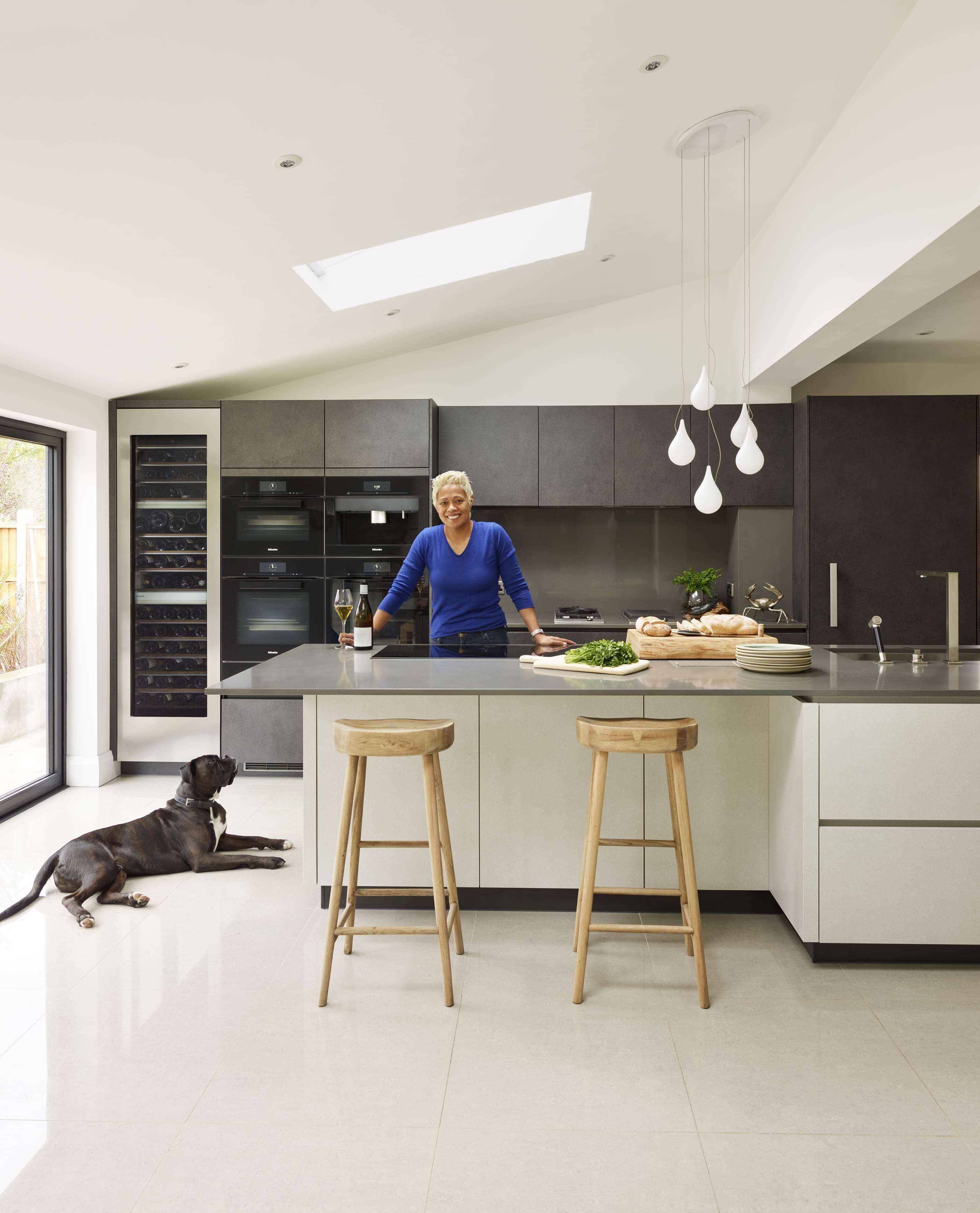
Monica Galetti, Chef Proprietor of Fitzrovia’s Mere restaurant, has a beautiful, spacious and super-practical kitchen by Alno, which was designed, supplied and installed by Halcyon Interiors. The cabinetry is Alno Star Dur in lava grey and sand grey stone, the doors are textured laminate; see further details here. This is definitely a kitchen where the chef and the cooking are allowed to stand out against a subdued, yet still beautiful, background. The bank of ovens and appliances are mostly from Miele’s M Touch collection, and include a combi steam oven, a vacuum drawer, warming drawer and two main ovens.
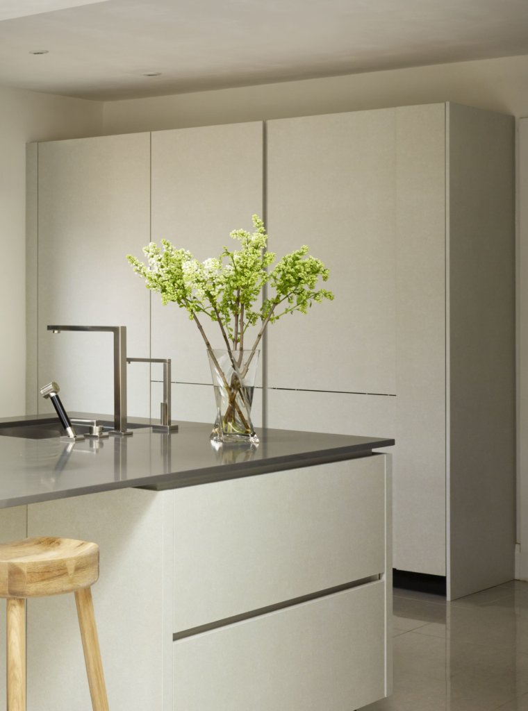
This area of the kitchen is a fabulous storage space and holds masses of equipment and ingredients … the taps are by Dornbracht, and the slender work surface is Silestone Quartz which is extremely durable and has high stain and scratch resistance.
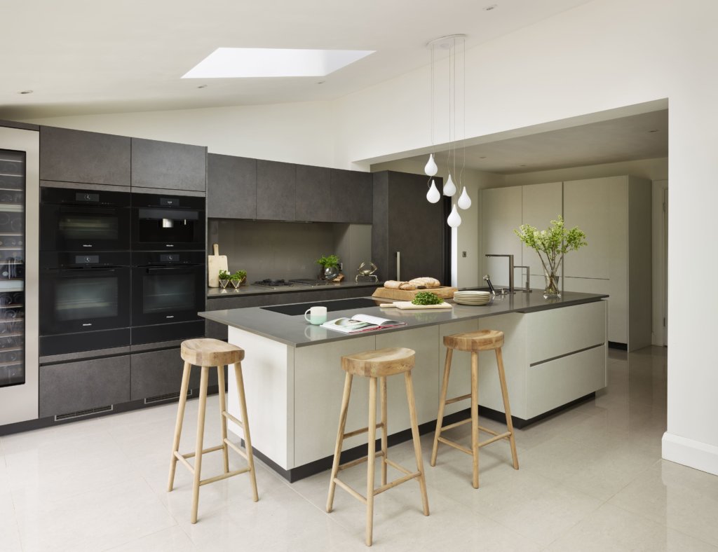
The striking lava grey cabinets give a monolithic look to the action side of the kitchen, with all cooking and chilling appliances grouped together in a perfectly logical and accessible manner. We love the way that run is bookended by a glossy wine-chiller at one end and integrated fridge and freezer drawer at the other.
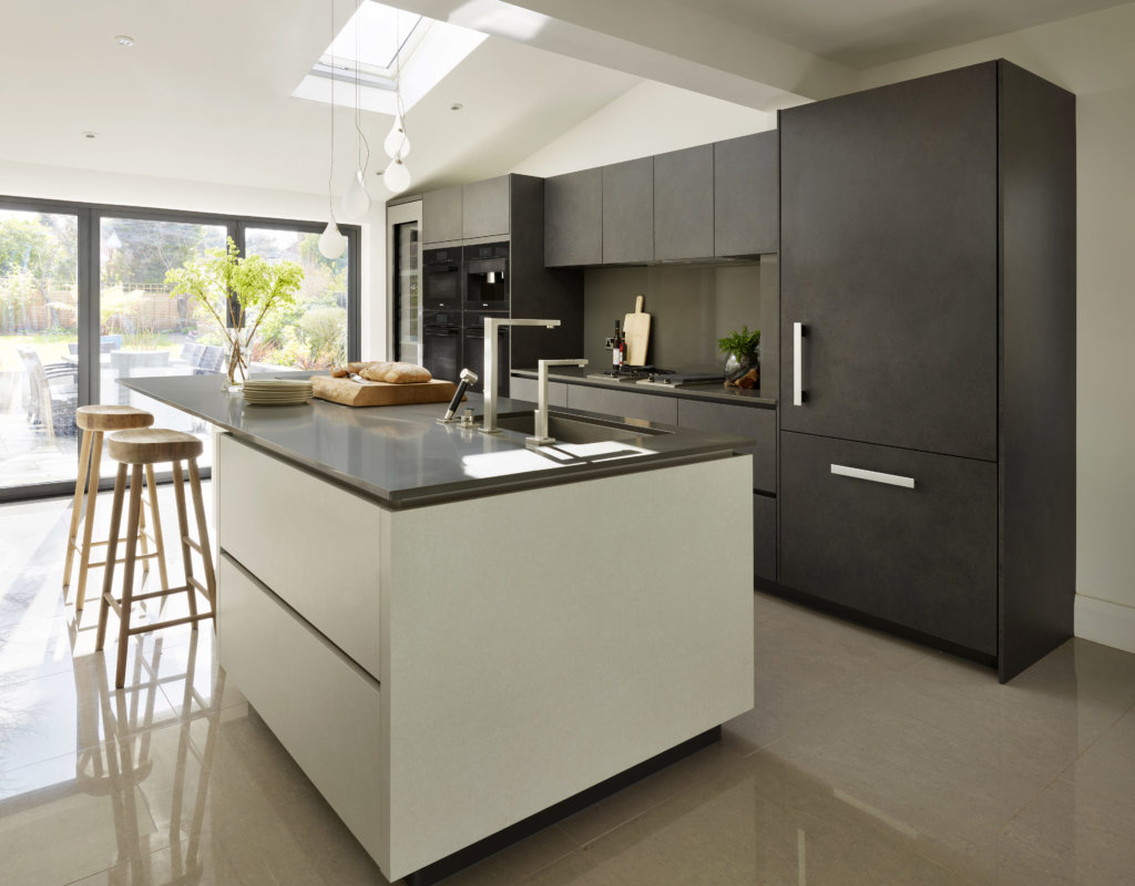
The view through the expanse of glass doors into the garden and terrace continues the streamlined concept, and glossy ivory floor tiles keep the look light and airy. If seeing Galetti’s home kitchen has piqued your interest, have a quick look here for some recipe suggestions, and for a special treat if you’re in London, do try Mere too, the décor in the cocktail / drinks bar is stunning, and needless to say, the food is faultless.
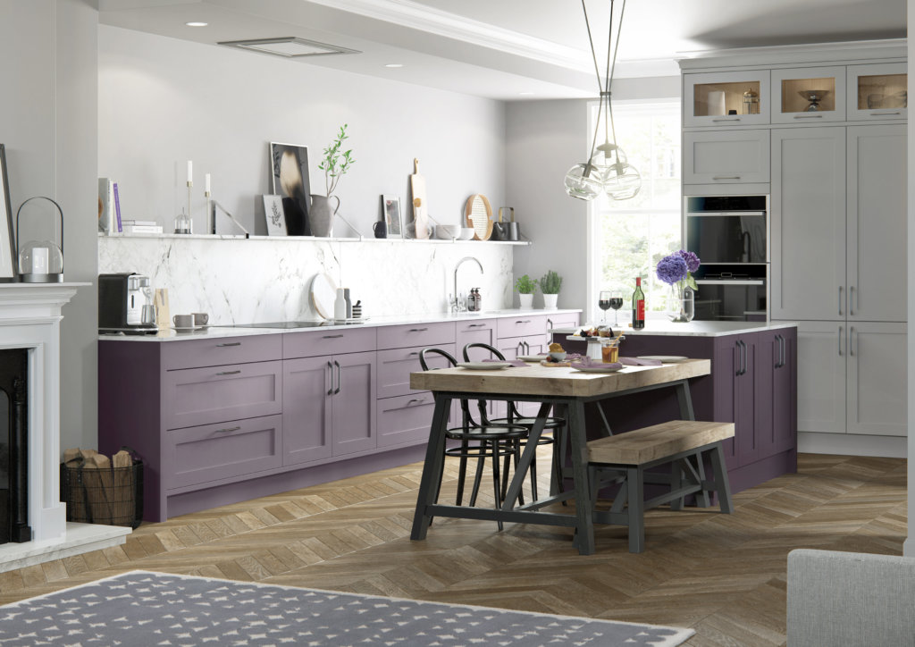
If your kitchen design plans are turning towards a bit of colourful input, (and remember, a proportion of colourful cabinetry can be balanced out by choosing neutrals for the remaining cabinetry, floors and walls), take a look at the latest shade from Masterclass Kitchens, from their Vibrant palette, Wisteria. Other new shades are Hunter Green and Inkwell, both of which are also perfect as a statement colour. We think that Wisteria is the way to go if you want to keep to a subtle scheme, and as much as we love a jolt of orange or lime, it has to be said that this delicate purple shade is likely to have a little more shelf-life. Here, Wisteria is the lighter shade, Mulberry is used for the island, and the big bank of cabinets are in Light Grey.
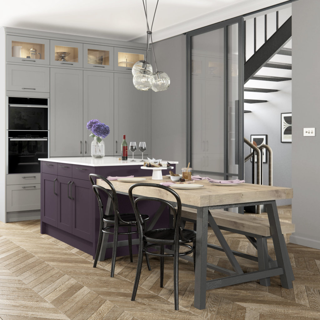
We adore the combination of ideas shown in this additional view of the Mulberry and Light Grey kitchen by Masterclass Kitchens. Traditional wood parquet flooring and bistro chairs look perfect with an industrial-style breakfast bar/table, and then of course, the classic cabinetry. Definitely food for thought and interesting use of colour.
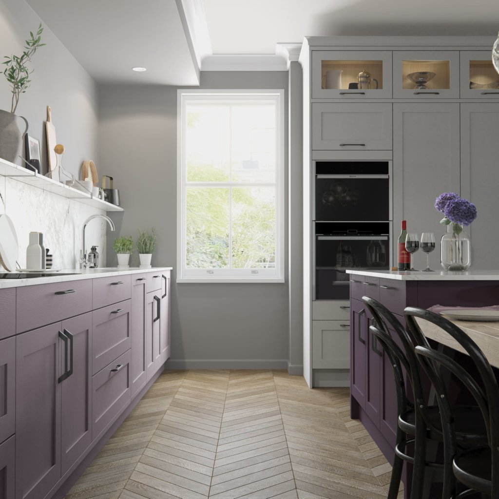
Another aspect of this Masterclass Kitchen – showing that you don’t have to have an enormous space to keep everything within reach. This is a straightforward L-shaped layout, with the island nestled into the angle. It’s also a great example of how three colours of cabinetry can work together in a calming and relaxing way – because of the addition of the neutral elements.
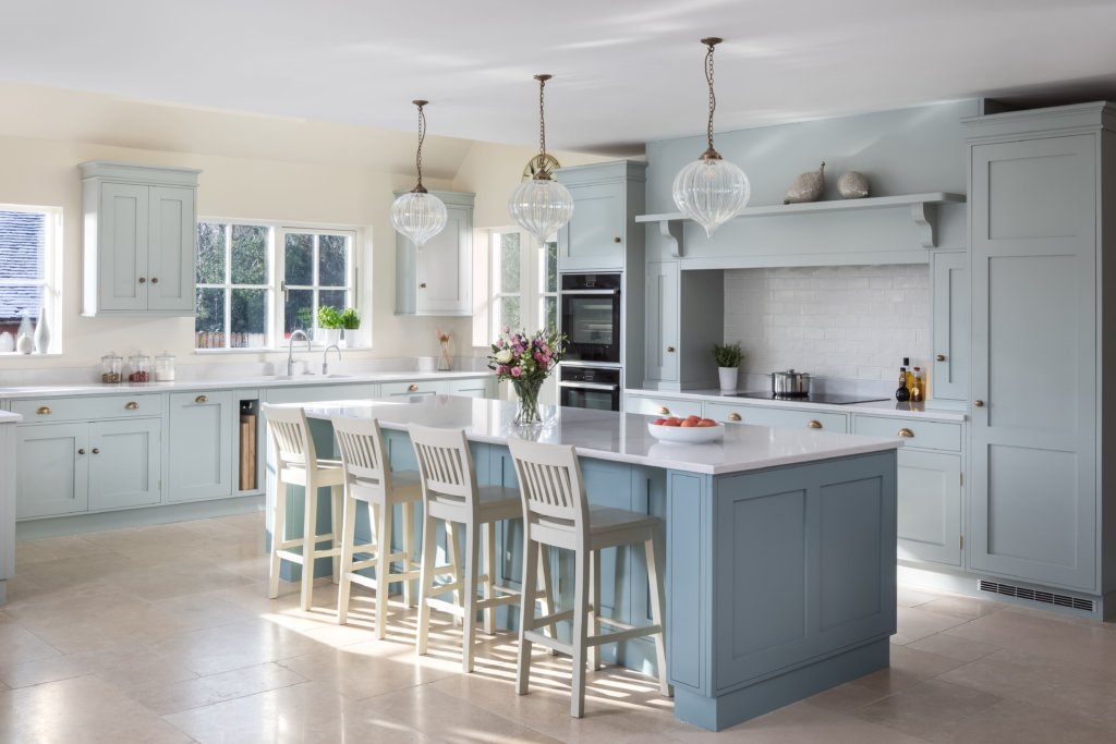
If your preference is for a cooler colour scheme, have a look at this Beautiful Blue project from Rencraft. This in-frame, hand-made and hand-painted design embraces two shades of blue, and quartz work surfaces. We think this is a rather perfect example of a brand new kitchen embracing all mod-cons but absolutely nailing the classic look, with a beautifully proportioned over-mantel and a tiled splashback.
Photo credit: Ryan Wicks.
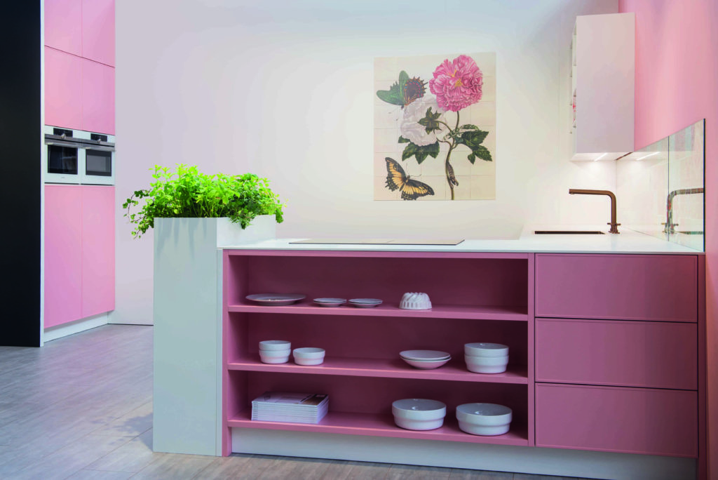
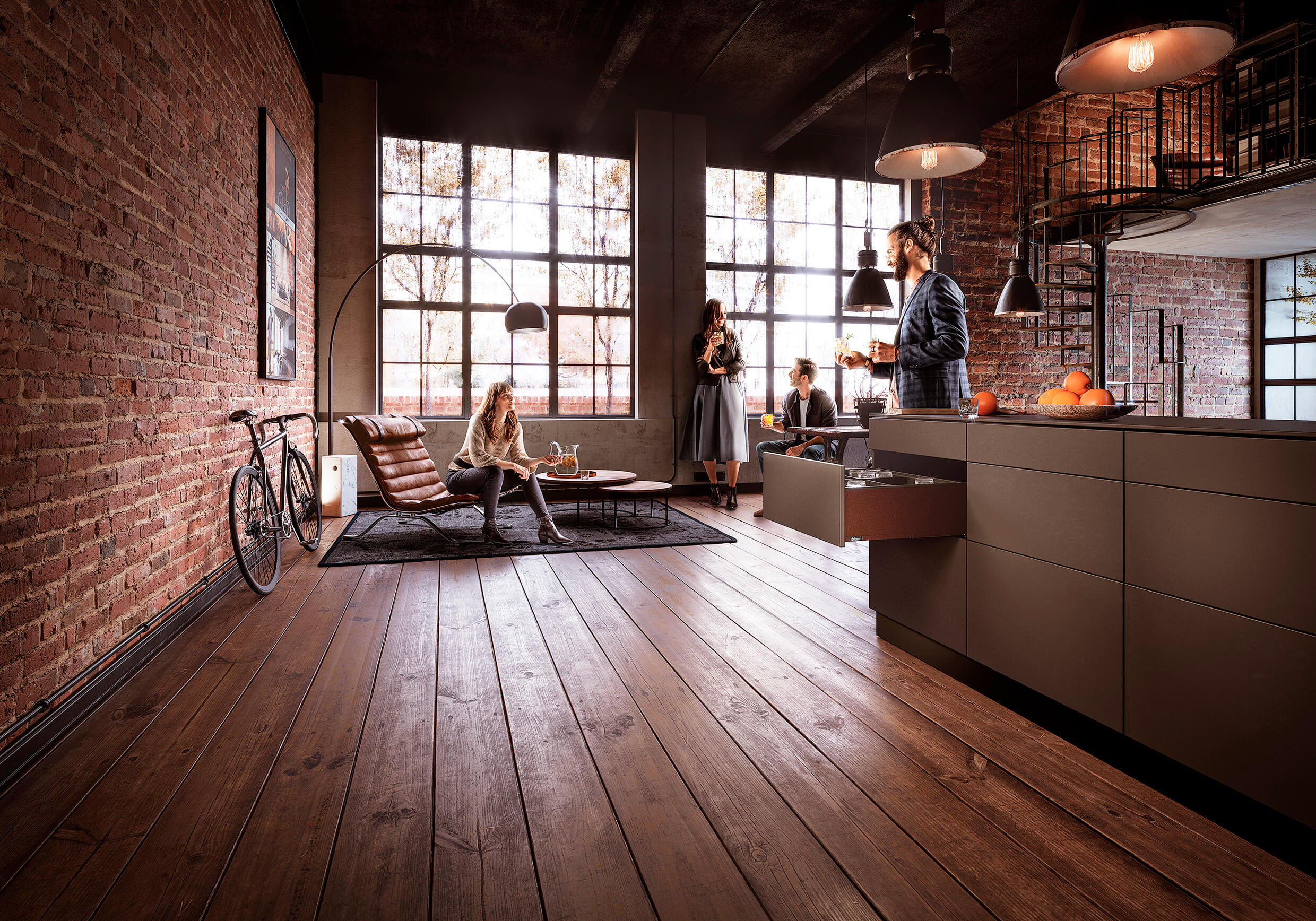
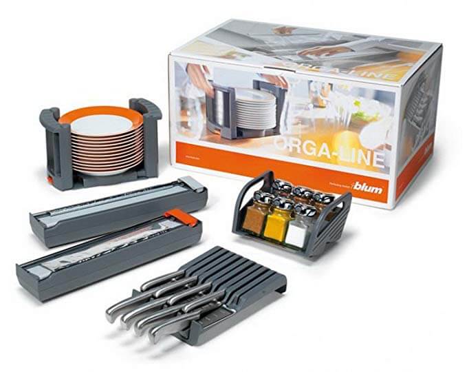
I’ve realised that I’m never going to have a pink kitchen or bathroom, but it’s a colour I’m drawn to, and who knows, one day I might replace my orange splashbacks and stools and other accessories for blush pink versions! In the meantime, take a look at the new Chelsea kitchen from Keller Kitchens, shown here in Powder Pink. This range features handleless drawers, which open and close using Blum’s TIP-ON BLUMOTION mechanical opening and effortless closing. Silk-gloss lacquered cabinets are low-maintenance, look elegant and box-shelf configurations are hugely practical whilst still being decorative.
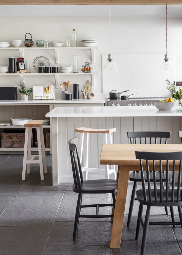
Once the kitchen is done, the search begins for suitable a suitable table and chairs; it’s sometimes difficult to visualise the space available, and it doesn’t matter how many times you get the tape measure out it’s often best to leave the choice of table and chairs as long as possible so you can physically experience the moving around space once the cabinets are permanently in position. In my own kitchen, I was absolutely positive I could fit in a small sofa, and technically, yes, there was enough room, but it would have all been rather squashed – and that was despite getting the tape measure out and making paper templates too! Anyway, I digress. I would just like to point you in the direction of Garden Trading, where there is a super selection of tables, chairs and stools that will compliment a brand new kitchen.
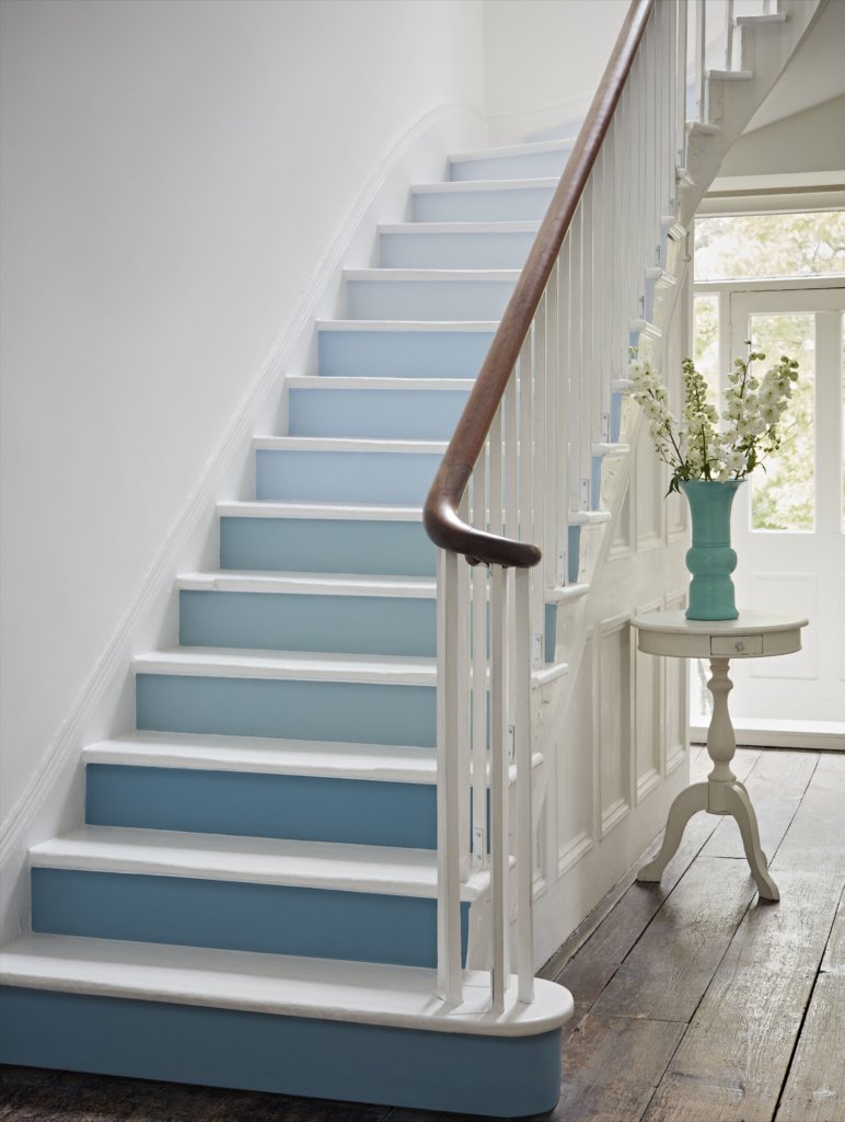
And if you’re still undecided about colours, what about keeping main rooms neutral and adding pops of colour on the staircase. I’ve actually seen this done in various ways on Pinterest – just put ‘colourful stairs’ into the search box! It can be done with paint, as shown here in shades of blue from Crown, or even luxury vinyl tiles, plain carpets or patterned ceramic/porcelain tiles for the risers.
Getting Ready for the Sunshine
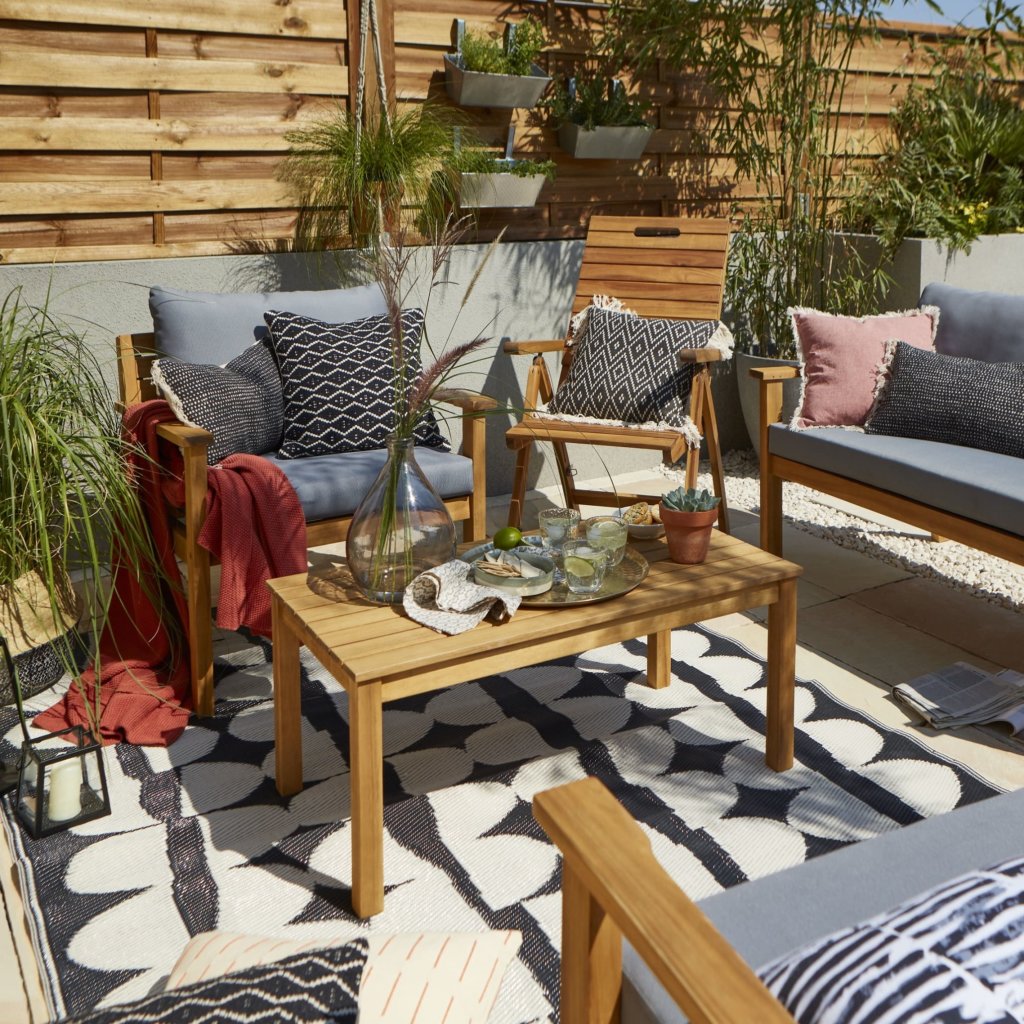
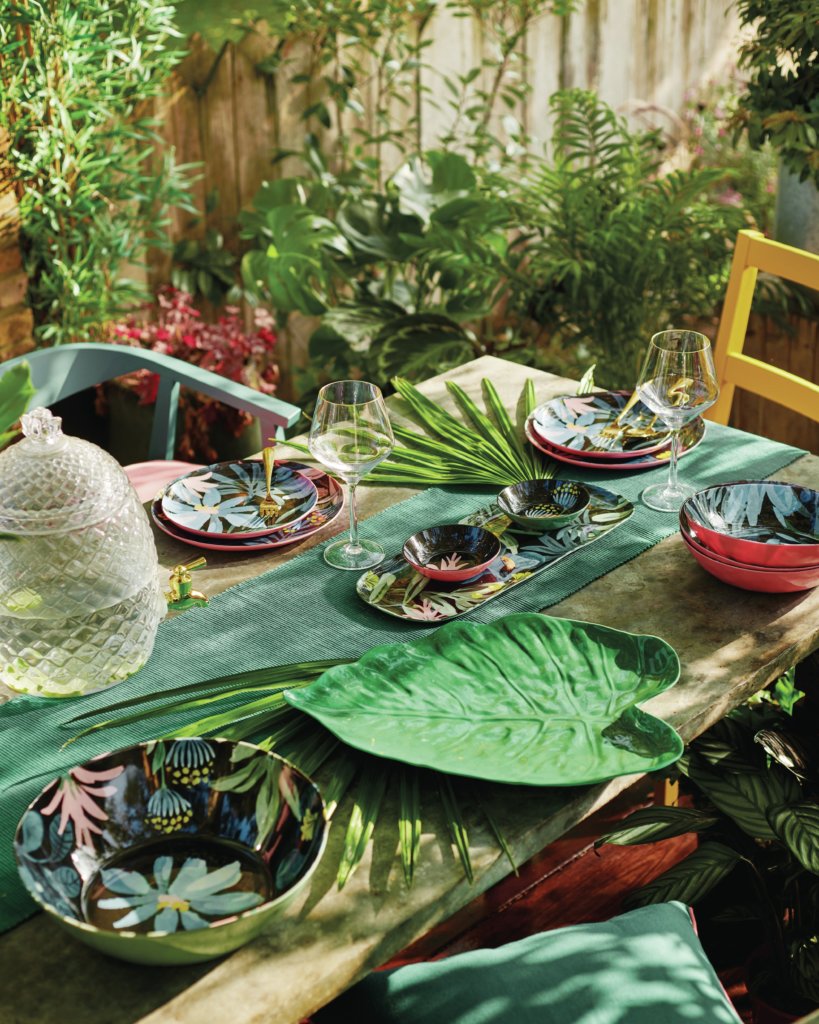
We’ve just had a lovely bank holiday, of course, and for myself, less than 20 minutes of it was spent in a garden centre, picking up a picnic table kit. It was constructed in half-an-hour, and in use that very afternoon. Just the addition of a nice table on the lawn has made me want to rush out again and buy more accessories though! So I’ve had a browse, and thought it was only fair to share some ideas with you! Left; the Denia set in acacia wood from B&Q; And right, a colourful collection of outdoor tableware from Sainsbury’s Home



Leave a comment