Kitchen Case Study: Clever Angles
By Linda Parker
The designer: Martin Smith, designer at Holloways of Ludlow Bespoke Kitchens (020 7371 1787, www.hollowayskitchens.com)
Martin graduated top of his class in 2004 with a 1st class (Hons) in ‘3D design’ from the University of Hertfordshire. He joined Holloways of Ludlow in 2006 as a ‘Bespoke kitchen & Cabinetmaker Designer’, working closely with Head of Design, Robert Burnett. As there is no pre-designed kitchen or bathroom ‘range’ that Holloways of Ludlow manufacture, Martin is challenged to make each client’s design unique by initially generating realistic 3D images to show a clear visual of how a space will look upon completion of the project. He has transferred the same 3D skills and acquired design knowledge into wider ranging projects with sister company Holloways Build, which often includes extending spaces and a focusing on a complete reworking of an overall layout.
The story: The owners required a new, bright and spacious kitchen with clean, contemporary lines.
Q: What was your brief from the client?
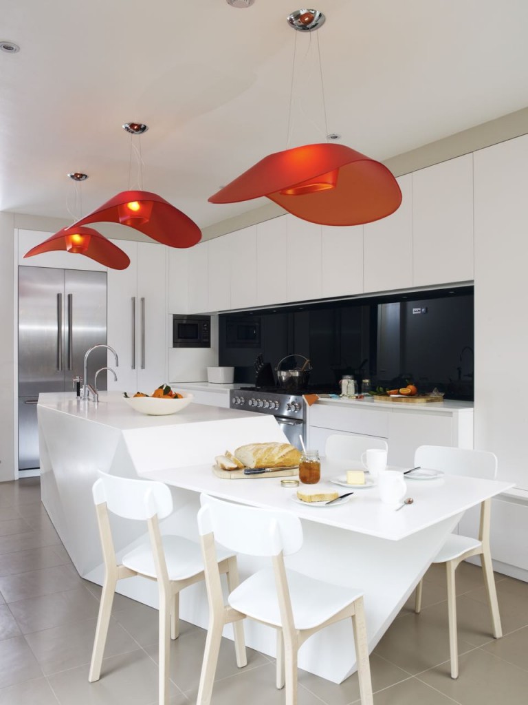
Holloways of Ludlow were commissioned to re-design the original kitchen from a non-functional, restricted space into a welcoming, contemporary kitchen where their family could cook, eat and relax together.
Q: How did you set about answering that brief?
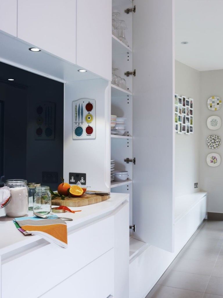
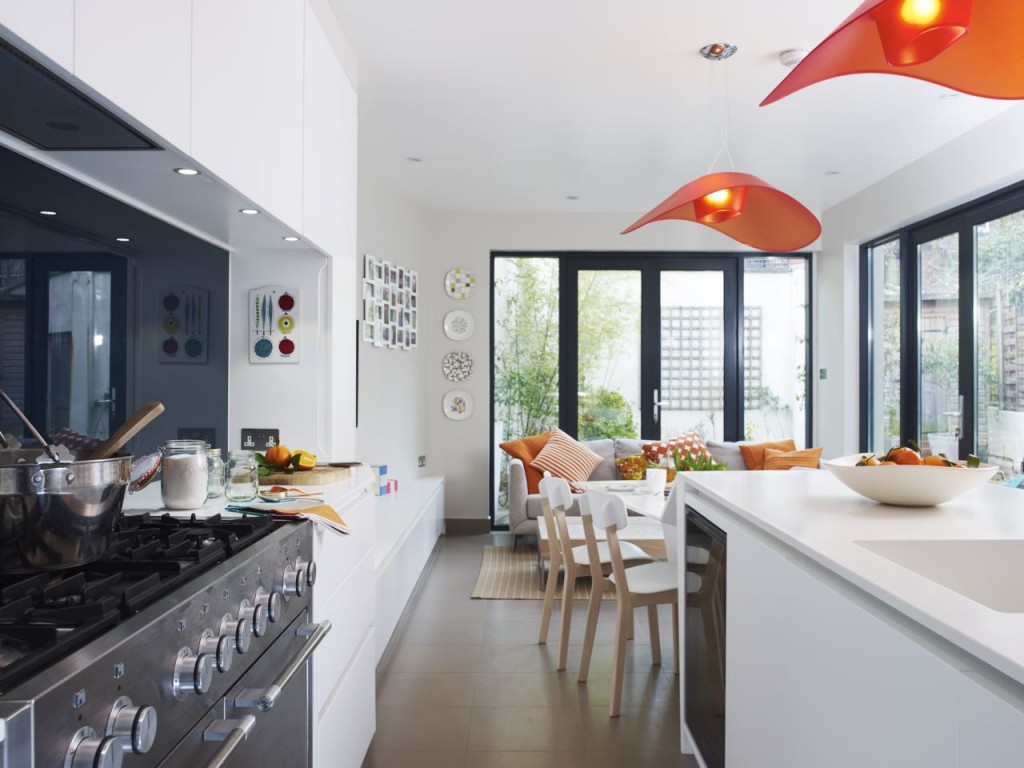
The kitchen was an awkward shape as it was long and narrow, with an angled wall that tapered sharply. It was within this area that I created a relaxing TV area complete with shelving by building a mirror image of the angled wall. Although a somewhat counterintuitive design solution in a narrow space, the angled wall helped to break up the length of the room and become a focal point for the seating area.
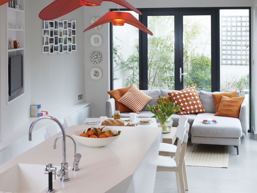
To ensure a seating and relaxing area was included in the design, I made the most of the glass doors and designed a corner configuration of low-level seating.
Q: Which products did you use and why?
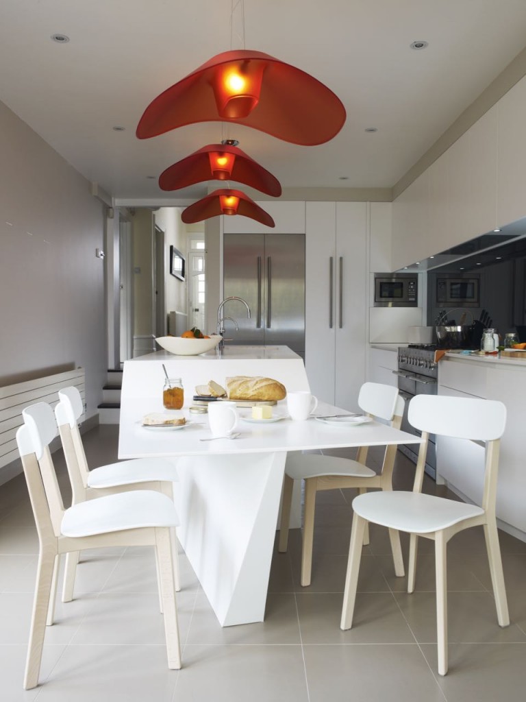
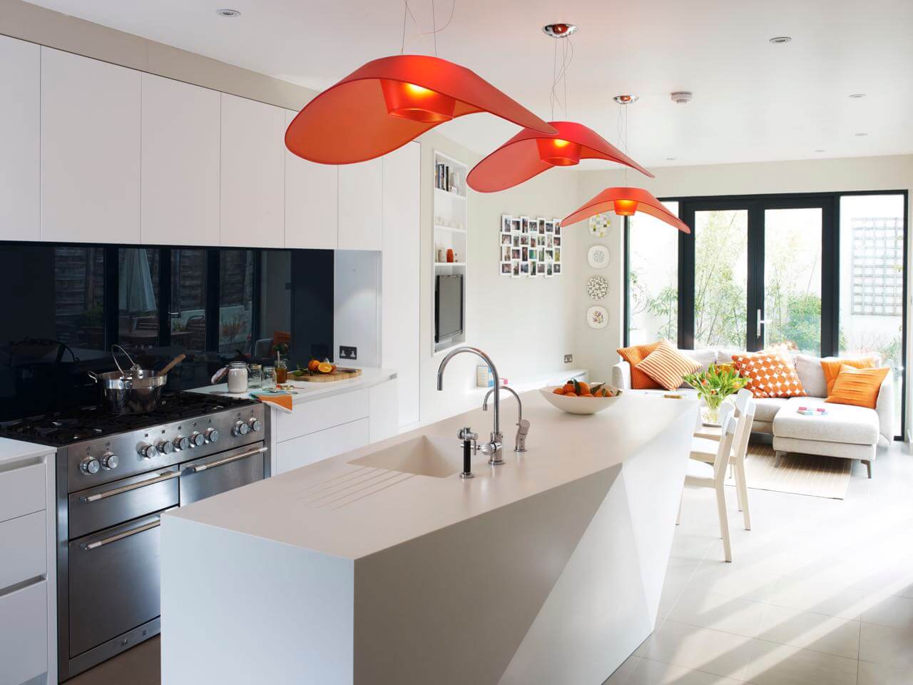
The location, shape and orientation of the sculptured island, made from Corian in Glacier White, was essential to enabling the room to serve the three functions of cooking, eating and relaxing. The island design was one of my first challenges. I used a 3D poly modeling computer programme to create an accurate model of the island’s triangulated faceted shape … then I wanted to maximise the island top and minimise the base profile, whilst allowing the resulting structure to be stable and strong. The outcome is that the side panels taper slightly to the floor, whist the underside of the table tapers sharply inwards to allow for leg space, then outwards again to form a wider base for support. As a Corian fabricator we knew it was the best material we could use to achieve such unusual angles and the split-level top. The island is made up of 26 individually cut pieces, from a mixture of 12 and 9mm-thick Corian sheets, all seamlessly joined. The result is a self-supporting structure that’s bespoke in every angle.
The room was too small to accommodate a dining table as well as TV seating area, so I designed a seamless connection of the table to the island. By angling the table to match the angle of the new wall, the table relates strongly to the ‘living’ area of the room and creates greater space.
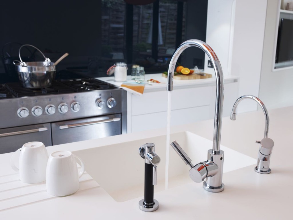
Within the kitchen, an island was situated parallel to the Mercury range-cooker, with the large sink located directly opposite. The island accommodates pull out bins, a wine cooler, dishwasher and a Quooker boiling water tap. Long clear worktops for food preparation situated on each side of the range-cooker are only a step away from a Siemens A-Cool fridge-freezer and adjacent larder storage.
We sprayed the cabinets white to match the Corian, and extend into the TV area. The panels at the back of the island were sculpted to connect the table with the kitchen island making a feature of their different orientations and levels. The surfaces were also angled inwards from the worktop, so that stools could be used at the back of the island. The splashback is made from toughened glass and was spray painted in a jet black finish our own workshop to match the cooktop.
Q: Was there any building/renovation work involved?
No, we didn’t extend any further as this would have impacted on the garden space and the main staircase at the front of the property prevented us from any internal expansion.
Q: What elements do you think make the scheme so successful?
The application of the design required very specific skills with a close focus on the coordination of the plan. I had every confidence in the design, as I knew I could trust our workshop team to realise my vision.
Q: Any advice for someone who may be planning a new kitchen?
When you buy a bespoke kitchen, your kitchen gets designed and built to make the best of all the available space a customer has. There is no limit to the sizes and shapes of the cabinet, to the colour, the finishes, or the type of material. You will simply end up with a much finer, practical kitchen with greater storage capacity.
All made to measure cabinetry and splashbacks by Holloways of Ludlow Kitchens, www.hollowaysofludlow.co.uk
Glacier White Corian work surfaces from Holloways of Ludlow Kitchens, www.hollowaysofludlow.co.uk
Range cooker by Mercury, www.mercuryappliances.co.uk
Taps by Dornbracht, www.dornbracht.com
Boiling water tap, Quooker, www.quooker.co.uk
Extractor, Blanco by Gutmann, www.blanco.co.uk
Fly Fly Light pendants, from a selection at Holloways of Ludlow, www.hollowaysofludlow.co.uk




Leave a comment