Kensington Scott: Dramatic Kitchen with Stunning Storage Features, designed by Jamie Cutts
By Linda Parker
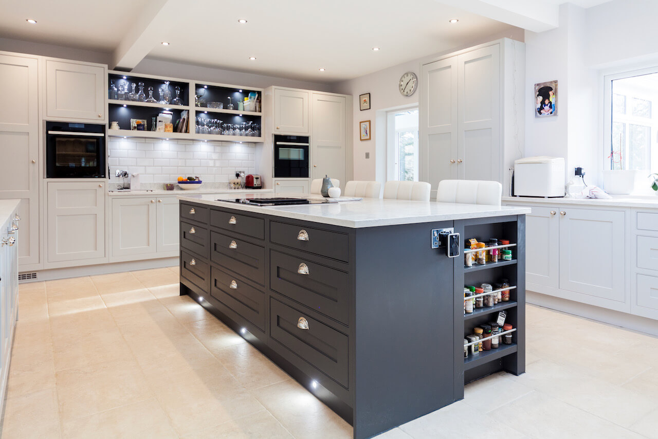
 This kitchen has it all… a stunning skylight, practical pantry cupboard, fabulous island and essential open storage.
Director & Design Manager Jamie Cutts took us through the design story of this project…
Q: What were the stand-out priorities in your brief from the client?
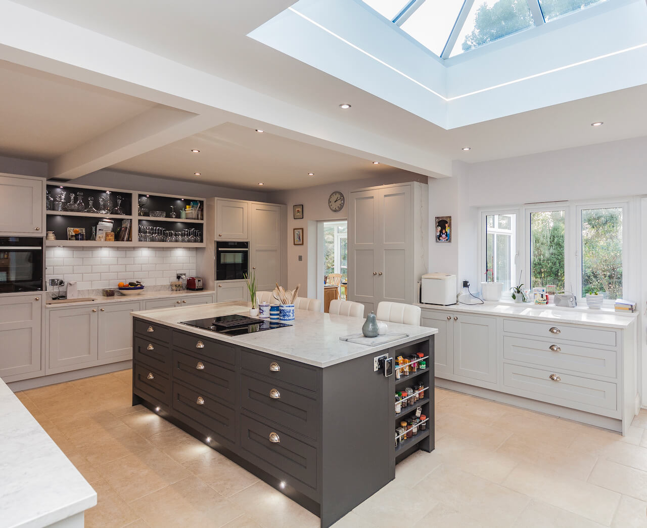
The project was part of a large build, including structural alterations which we also undertook. The goal was to achieve a living space that was open plan, but also did not lose the homely feel of a true cooks kitchen. Our client initially visited the showroom just to speak to me regarding the Neff Venting hob – but we built a rapport and just three months later Kensington Scott embarked on not just the kitchen project but all the building works too!
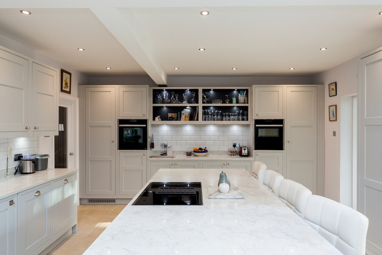
Our client had fallen in love with our showroom display, and lots of aspects of the display were incorporated into the layout of this kitchen – particularly the symmetry of the oven run. As is often the case with kitchen renovations, both practical storage and a kitchen that flowed well ergonomically were imperative within this busy kitchen, that also would be used as a social area for the family.
Q: How did you set about answering that brief? Were you given a strict budget?
When designing any kitchen/living space, I very rarely ask about budget in the early stages. The approach I prefer to take is to discuss with the client about how their family live. Do they dine at a table, or at the island or breakfast bar? How many times a week do they do their shopping (do they batch cook, which they would require additional freezer space)? Are they keen cooks, do they prefer to cook and prepare a meal whilst facing the family, or cook in their own personal area? Are they looking to sell or move property in the next five years, or is this a home they want to enjoy for years to come? All these questions help me to build a vision of what is achievable, and the budget we will require to achieve this…
We have worked incredibly hard to ensure we only use a few suppliers with whom we have fantastic terms. That mean we can consistently sell great, reliable products that cannot be found online at a cheaper price. This means the spec provided will prove to be value for money, whatever end of the scale the client chooses to opt for.
Q: Explain the reasons behind the choices of cabinetry and work surfaces…
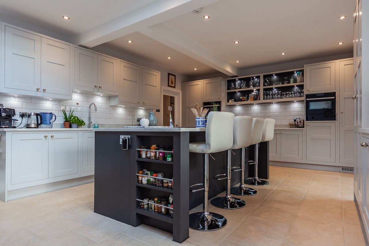
As mentioned, our client fell in love with our showroom display which showcased the Mereway Signature door, in Light Grey & Tyrolean Blue. I personally spent a lot of time meticulously planning this display, and it has proved to be incredibly successful for both Kensington Scott, and Mereway as a supplier.
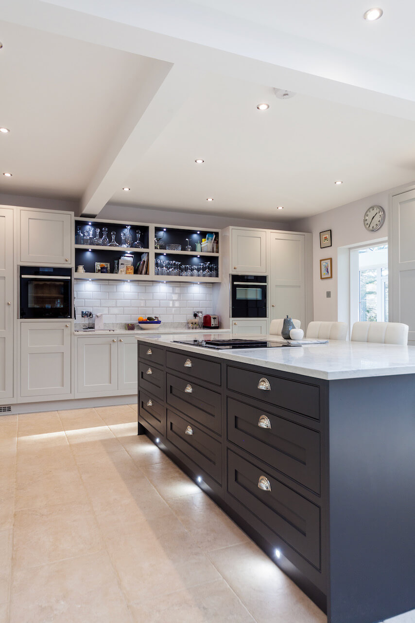
The in frame, flat painted, shaker door has been a hugely popular as it offers the perfect blend of a classic, timeless British style door, whilst simultaneously offering a contemporary feel with the flat painted finish, available in the perfectly selected colours by Mereway.
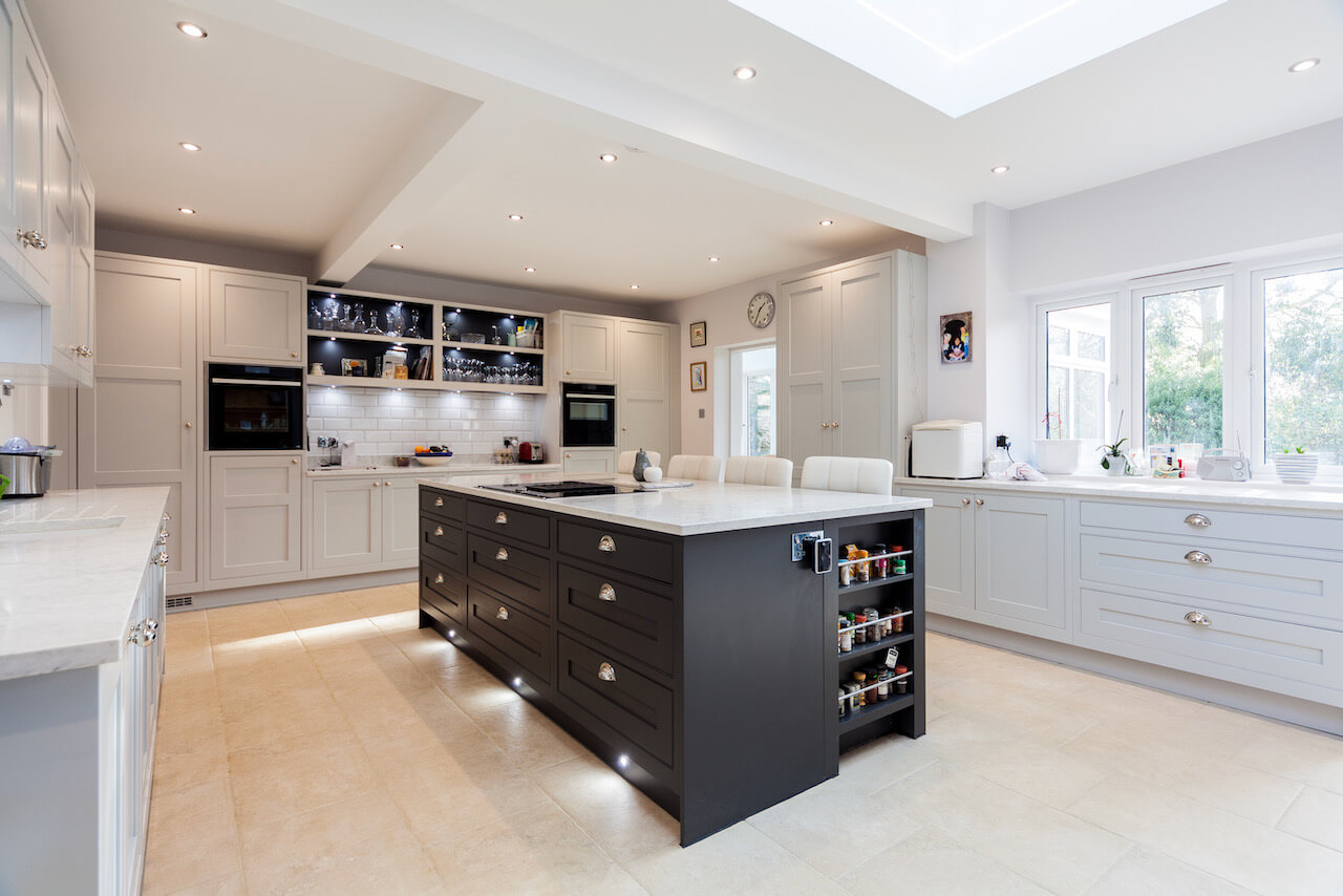
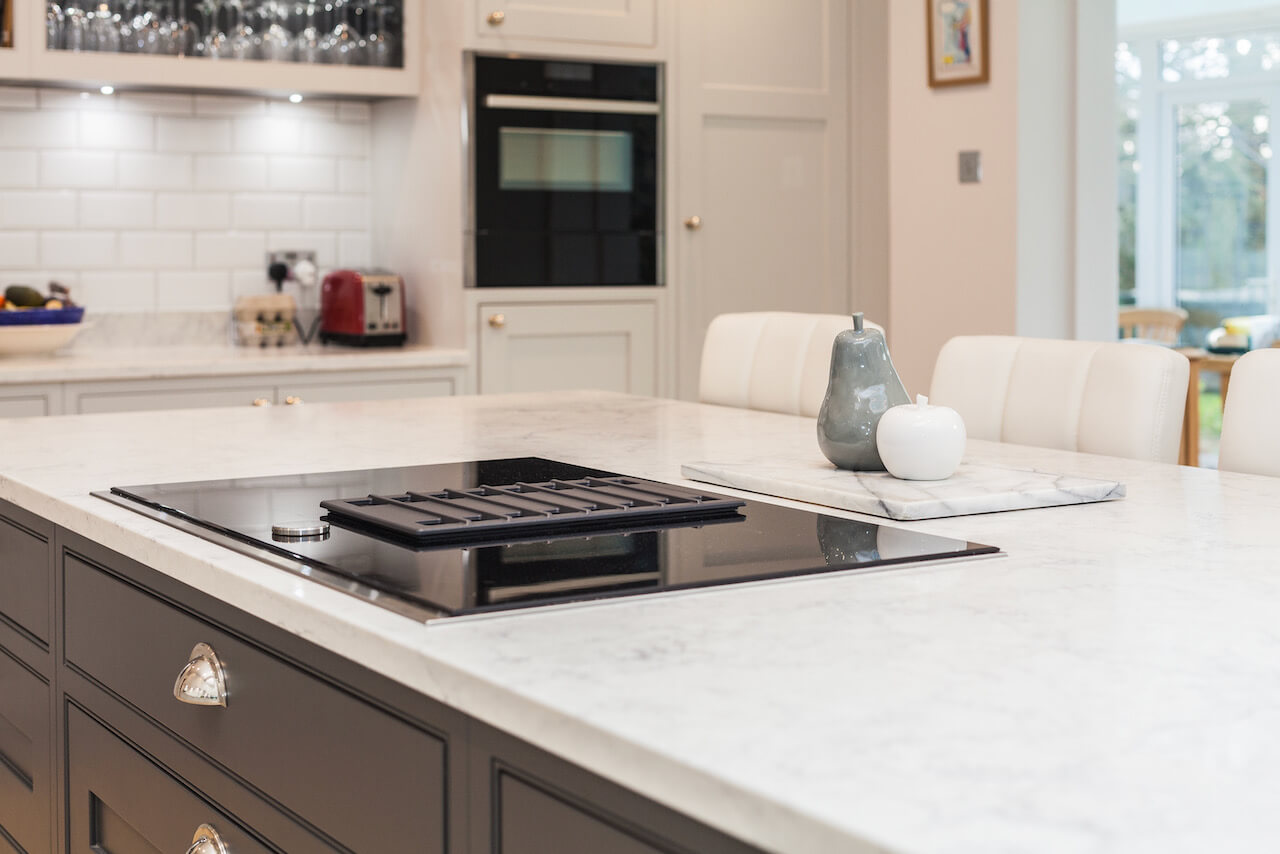
The client was very open to suggestions when it came to the worktop, as long as it was either a granite or quartz. We opted for a marble effect with veining running through. The reason for selecting this style of quartz was to ensure we had a light top, which gave the room a feel of spaciousness, as well as giving a brightness to the living area, as the natural light would bounce of the surface. The grey veining particularly helps when accessorising the kitchen, and selecting floor tiles, by introducing a dark accent colour to a top, you really do open your colour palette when selecting a floor (something that can be an otherwise stressful experience!).
Q: Was there any building/renovation work involved? Did you have any restrictions or limitations that you had to work around?
Yes – As mentioned, initially our client came in to view a Neff vented hob we had on display. We discussed the kitchen, and then the overall project. The entire structure of the ground level was changed. We even provided the client with amended architect plans from their current architect, as they simply were not achieving what they wanted to. By sitting down, listening to the client and how their family lived and what they required, we were able to provide an entire building project that was completely suited to them, whilst saving them money on the build costs due to some significant alterations that simply were not necessary for the initial specification. This for us, is why we love doing what we do. Often designers will see a space and design what they feel looks great. However it is vital that you never lose sight of who you are designing for. The project has to work for client immediately, and for years to come.
Q: What design elements do you think make the scheme so successful?
With any project whether it be a straightforward kitchen fit, or a building renovation, there are always going to be hurdles – and a rapport and relationship from the offset is paramount. This enables you to discuss options, potential issues, how these can be overcome (should they arise) and what you are gaining if making a significant change. In this particular example, the existing kitchen lacked worktop space, it struggled to flow. Our client was conscious that when she was cooking, there was nowhere for her family to sit or perch, so she wanted the new kitchen to remedy that situation!
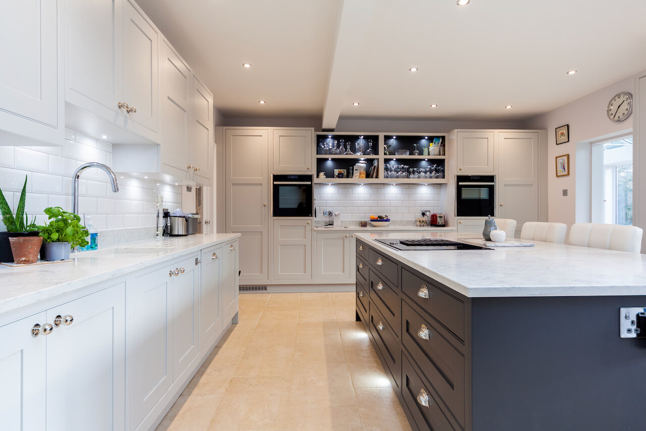
The new design has allowed her to prepare food on both runs of units, whilst also having a large island to use for prep and conversation. The feedback we have received, is that this room is now the “hub of the home” and they rarely spend time in other rooms. This for us is a huge design achievment, when your design goes beyond being “just a kitchen” and actually changes the family relationships in a positive way. One of the chief reasons for Kensington Scott Interiors going beyond just kitchen projects, was because of the desire for “living spaces” and these type of projects are becoming increasingly popular.
Q:Now the project is finished, what aspects are you (or the client) most pleased with?!
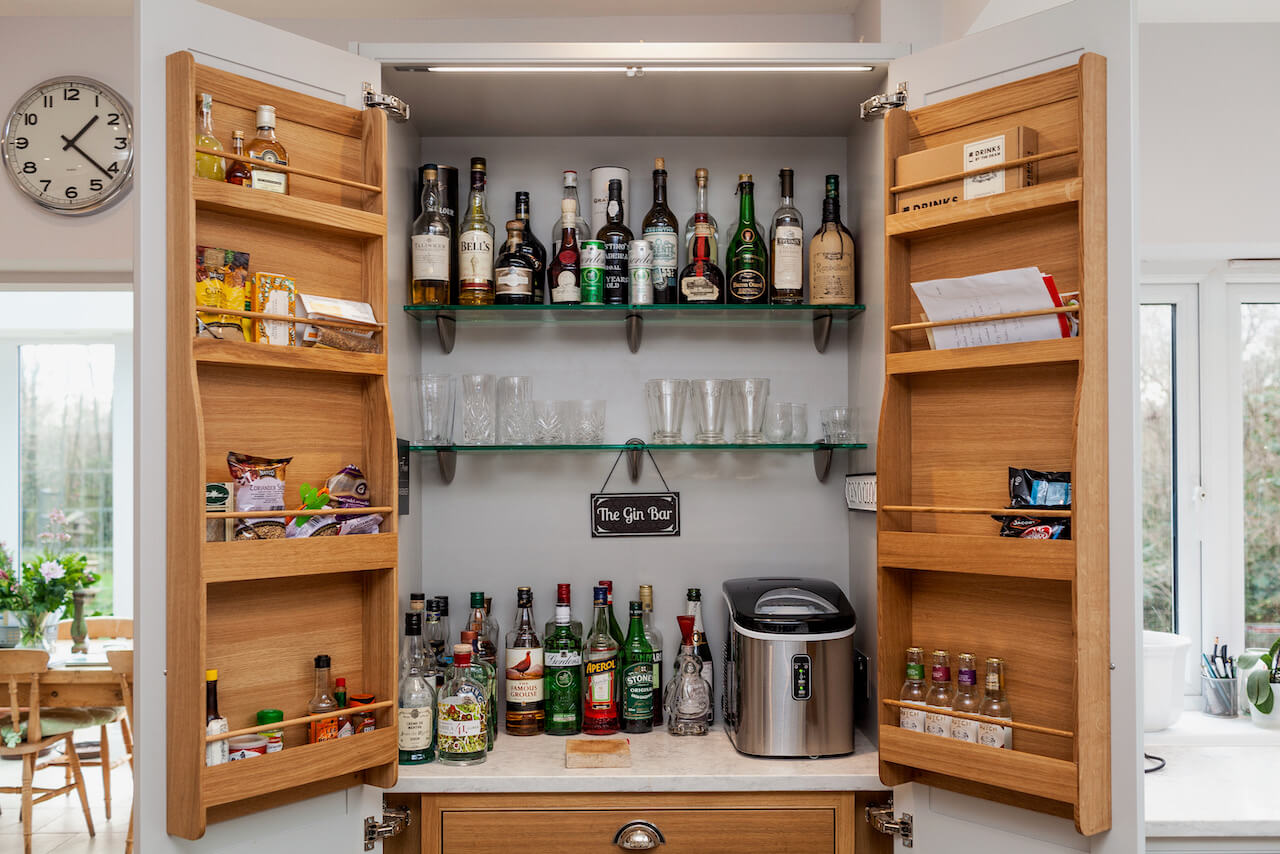
Our client is a keen cook and loves the fact that she now has the space to prepare in a spacious, fully functioning kitchen. She’s been particularly impressed by the Neff vented hob, and the accuracy of the Neff ovens. However, despite all the thought that went into the design, and the beauty of the furniture, I think the most popular unit is definitely their Gin/Drinks pantry!
From my point of view, creating a room the family is going to enjoy not just for cooking, but also for family and social time is a satisfying achievement. I think a lot of designers can create a “kitchen” but to create a room which is going to be responsible for happy family memories is really worthwhile. I believe that projects that achieve this are the ones that get proudly shown to friends and family – who often end up as new clients for us as a company.
Q: What is your best advice for someone at the start of their new kitchen ‘journey’?
I believe the single most important thing to consider when going through the kitchen planning stage is “do you trust your designer and the company?”. This relationship is key. Build up a good rapport for a two-way working relationship. Quite often I will be asked for a certain design or layout a client has seen elsewhere, or has seen online. Being able to play devil’s advocate and challenge these thoughts and visions allow you to ensure that by the time you end up with the final design, both you and the client are sure that they have taken the journey of considering all options and what each option will offer.
A great example of this is if a client wants to remove a wall. Whilst this may offer a larger working area, it means a wall for wall-hung cabinets has been lost! So explain to the client the ramifications … can space/storage be gained elsewhere, and by removing a wall, what have we achieved? The answer is often the ability to introduce an island, or a peninsula to create a more social area. However, by asking the question, your client knows that all options and outcomes have been taken into account.
Q: Do you have a secret ‘style signature’ or feature that seems to crop up in your projects?
Honestly – not really! I think sub-consciously every designer will have a particular unit or units they feel work well based on feedback and the success of using them in the past. However I do not consciously have a certain style, I listen to my clients, to their wants and needs and then my job is to provide solutions, whilst making the kitchen look stunning!
However, if I was to be pushed for a “signature item” I do love the use of larder units. The use of a 600mm wide larder offers so much dry storage in a reasonably compact area. Blum’s SPACE TOWER offers the opportunity to install what is arguably the most efficient unit in terms of storage capacity, with a stunning look – particularly when used with the LEGRABOX drawers. Whenever I’m working on a layout, I always try to apply everyday activities to challenge my own design. For example, making a cup of tea – what does my client have to do to get a cup, tea bags, the milk. If this journey seems laboured, how can I amend this? Ergonomically tweaking designs and considering things like, how far the client must travel, reach or bend is something I believe separates an average designer, from a brilliant one.
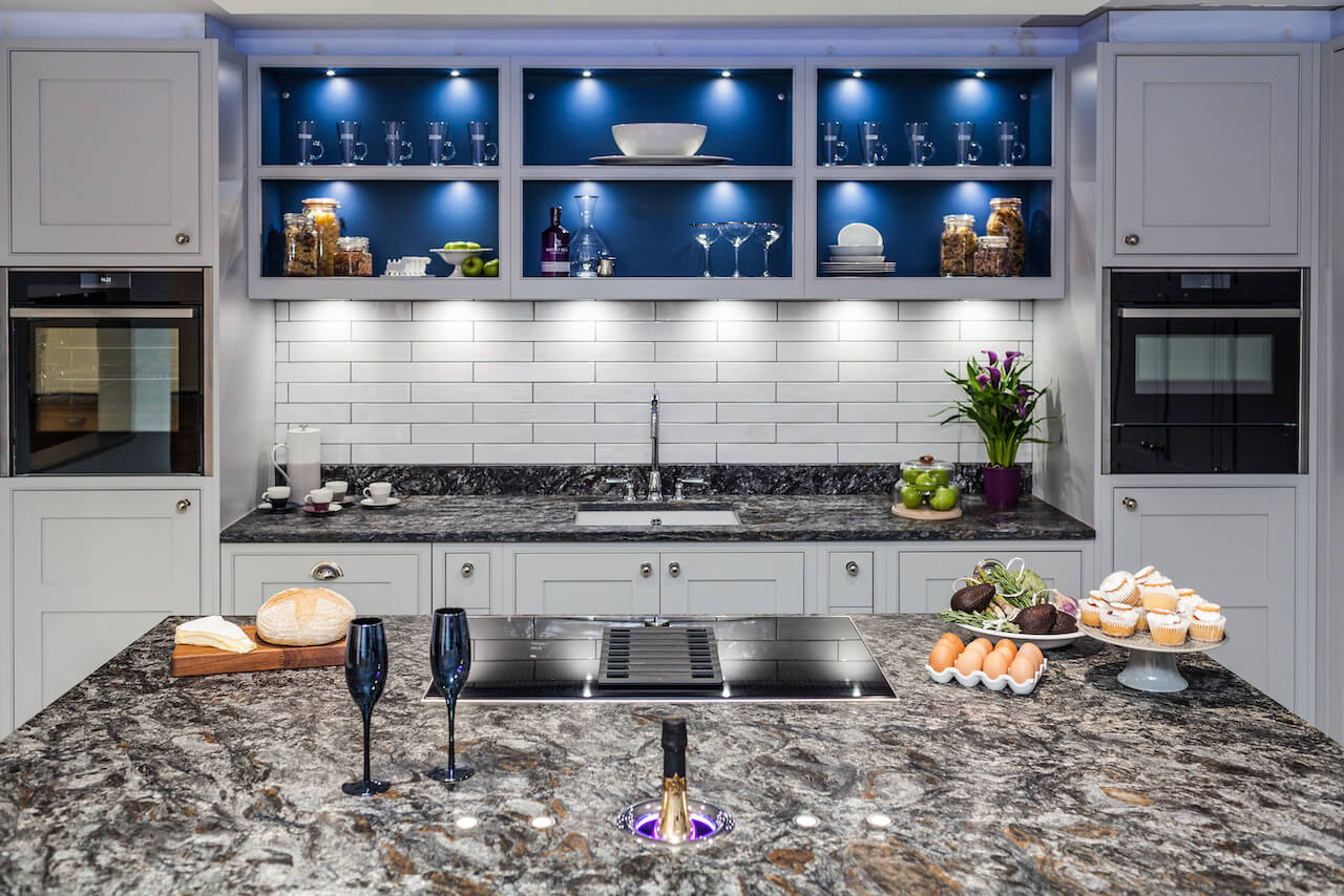
The Kensington Scott showroom which inspired this beautiful kitchen project.
Kitchen design, installation and building works by Kensington Scott. 01732 369129 or info@kensingtonscott.co.uk for virtual design appointments
All appliances, including the Venting Hob, by Neff



Leave a comment