In Black & White: Simply Stunning Kitchen by Roundhouse
By Linda Parker
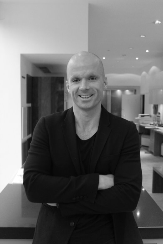 This perfectly understated kitchen was designed by Ben Hawkswell, Senior Design Consultant at Roundhouse. He explains how the was project developed to achieve this contemporary and elegant result.
Q: What did your client want to achieve, was there a particular ‘must-have’ on the list, and did they express a preference for classic or contemporary?
The client wanted a modern kitchen with sleek cabinetry. The priority was a highly functional layout with high specification appliances along with subtle details. The design must also be visually impressive, so as you can imagine, that was a very good brief to follow!
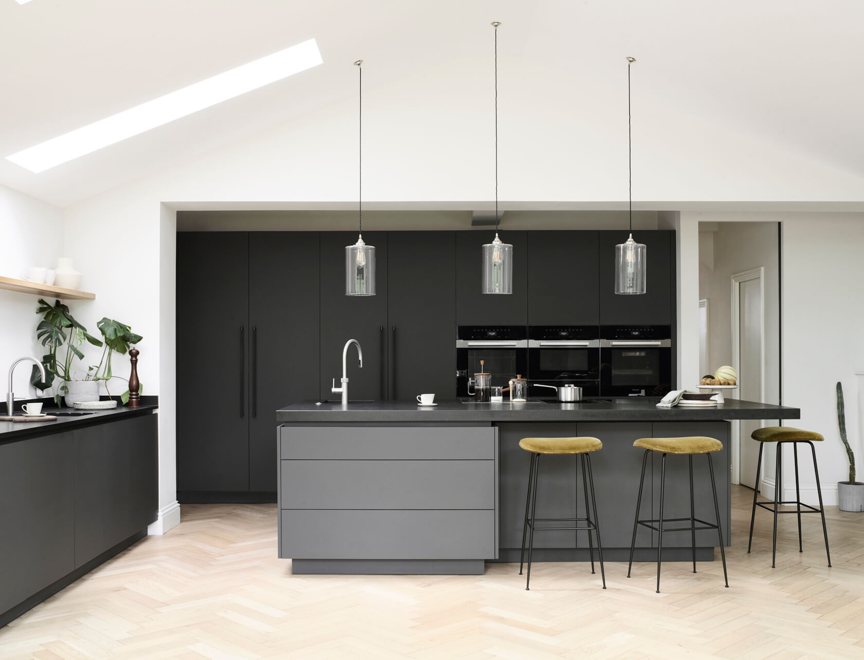
They also wanted to include a family lounge area and a good-sized dining table.
Q: How did you set about answering that brief?
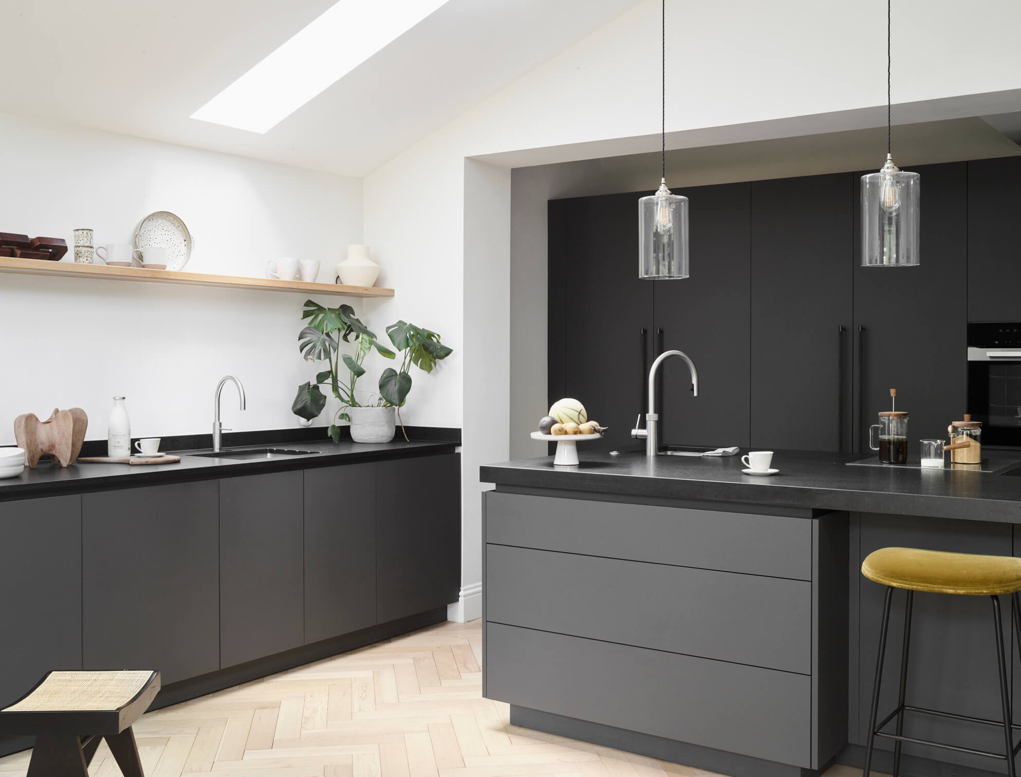
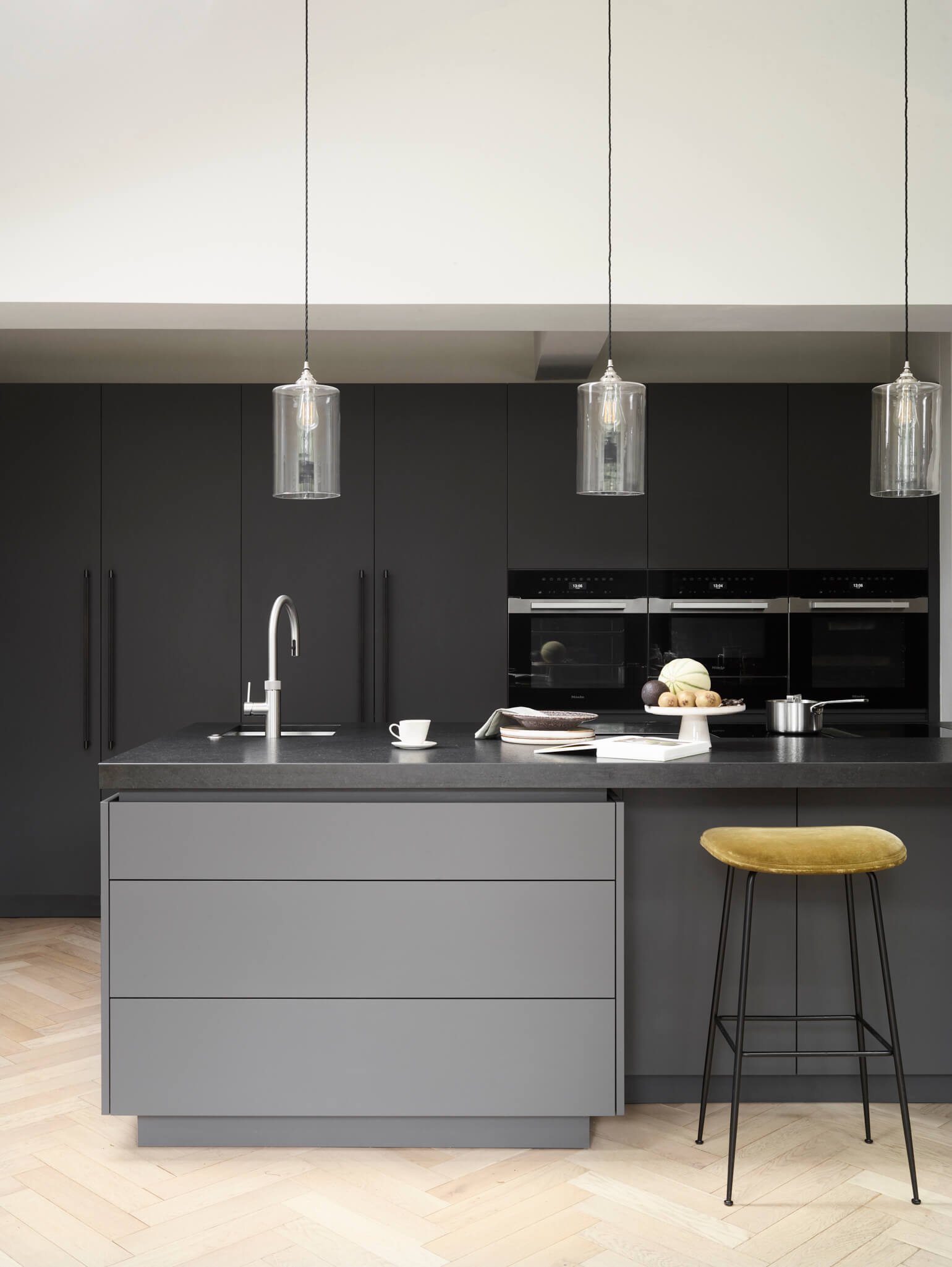
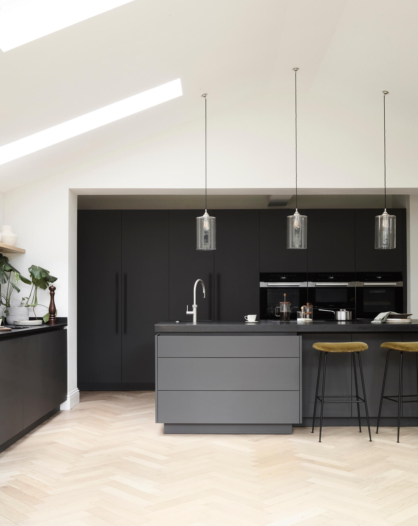
There were a number of possible layouts which were initially considered, but we elected to push the kitchen against the back wall and then run the island parallel to the Crittal doors. This created a good sized floor area to use for the family’s relaxing and entertaining space. The tall, pitched ceiling was seen as an opportunity to suspend some beautiful lighting, with Nia (our client) sourcing some hand blown glass antique pendants that we set out centrally from the apex.
Q: Explain the reasons behind the choices of cabinetry and work surfaces and how you included different textures …
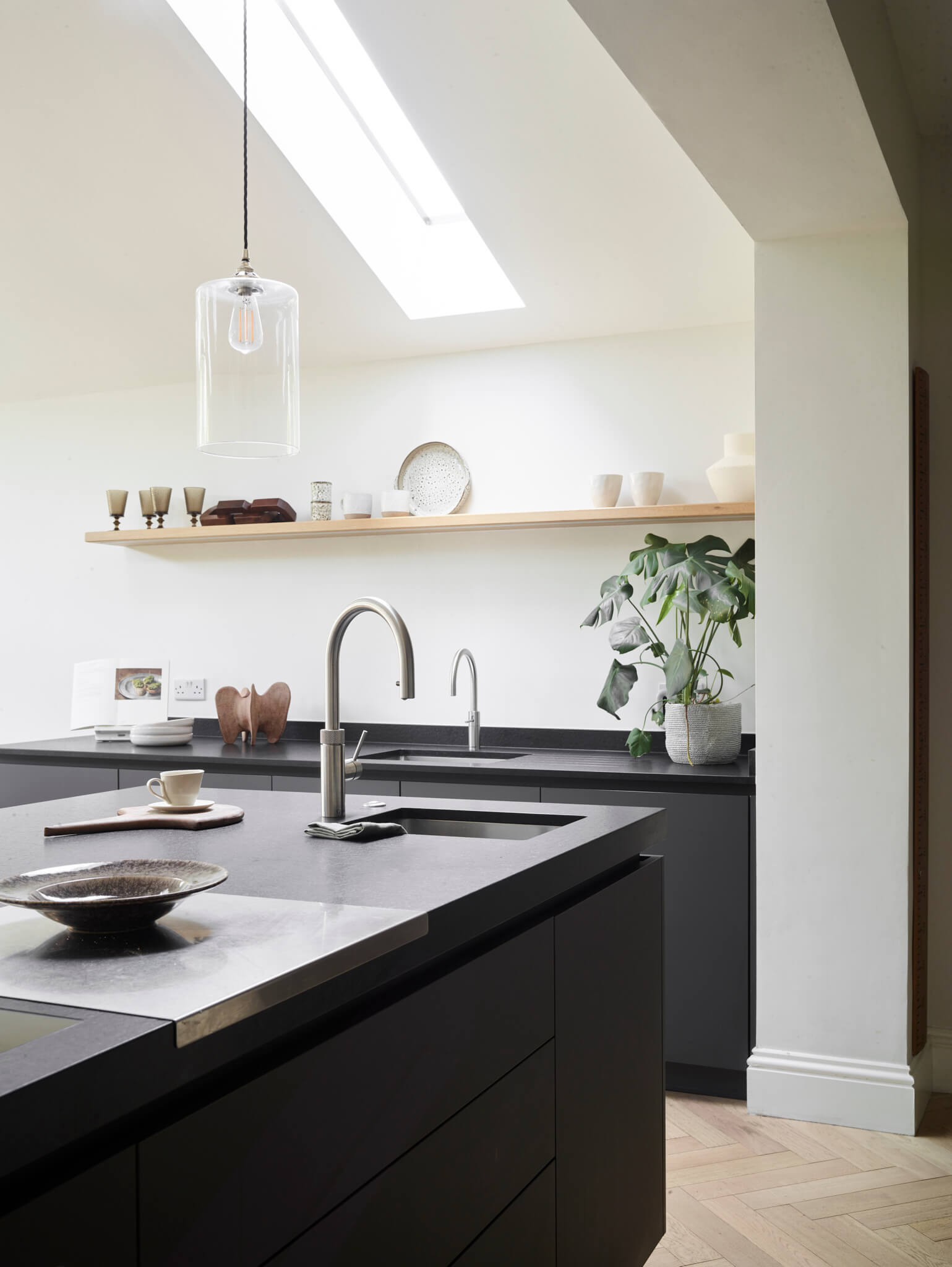
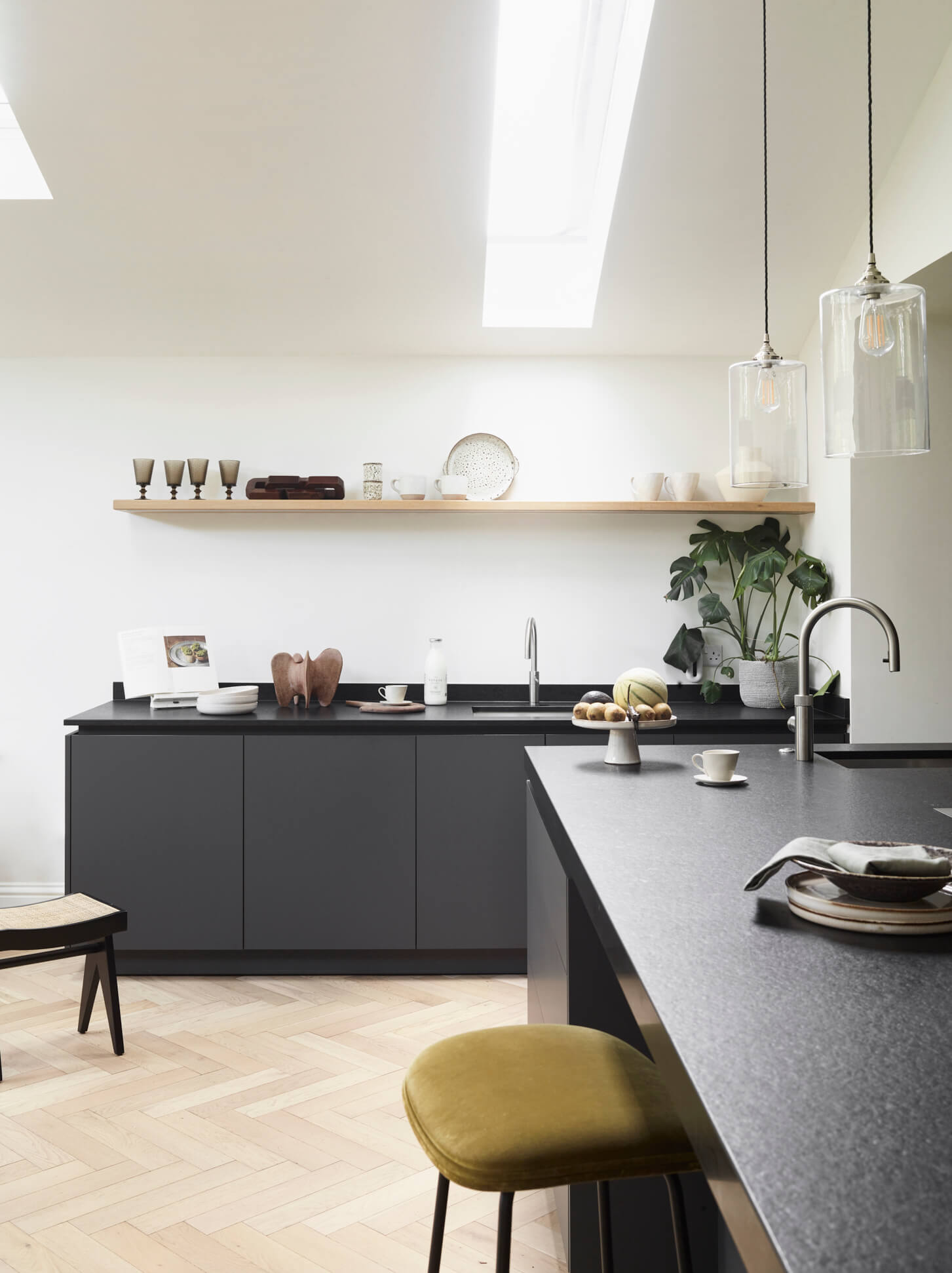
As kitchen would be flooded with light from the full width Crittal doors and pitched rooflights, the availability of light wouldn’t be a problem, so we could afford to go darker on the colour palette. We were able to demonstrate a similar design in our Richmond showroom, which inspired the decision to go with a ‘dark on dark’ arrangement. The graphite grey cabinetry sits beautifully on the warm blond oak herringbone, creating a very pleasing contrast.
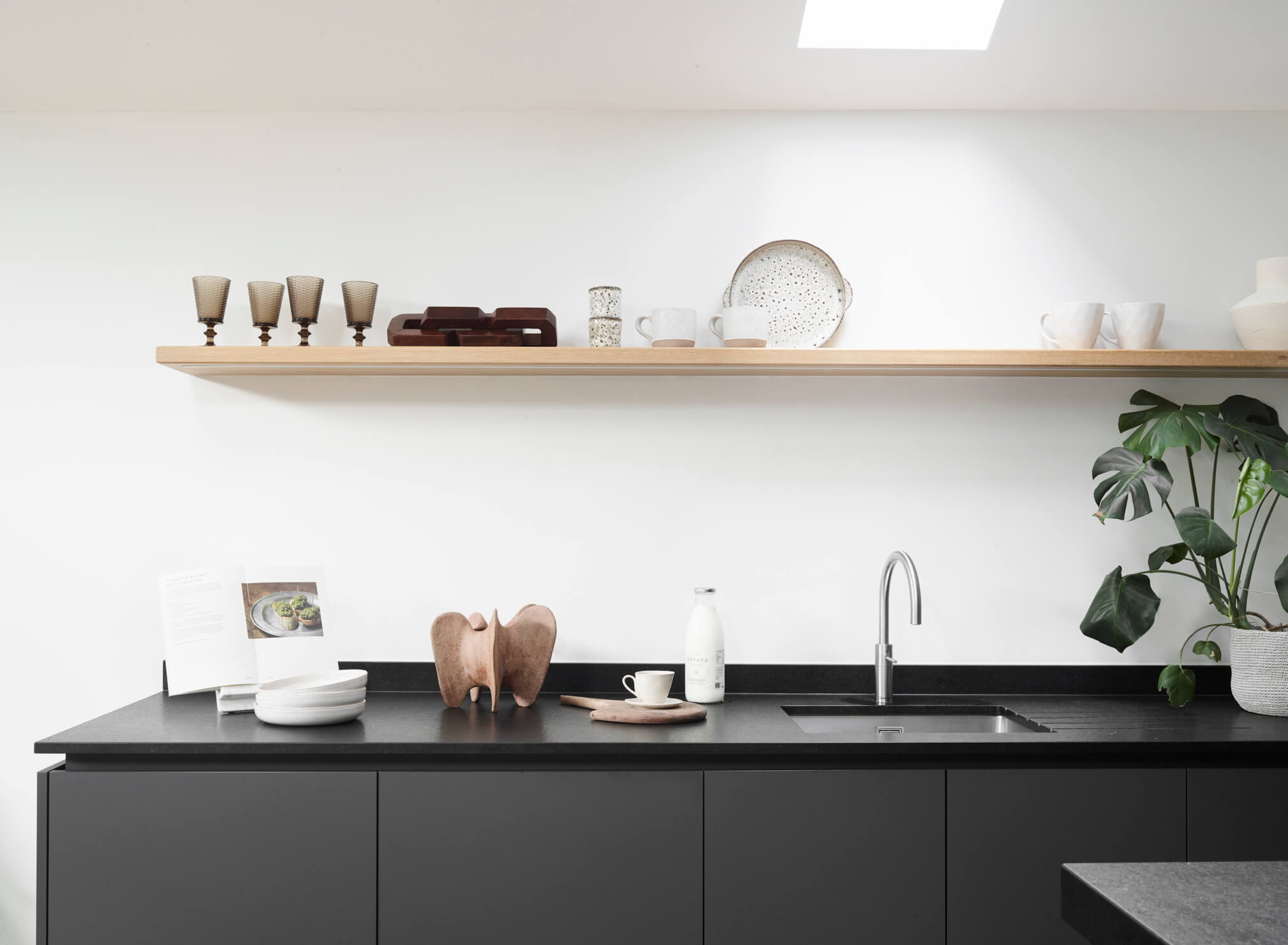
We chose a smooth matt cabinetry for its practical attributes; it’s resilient and easy to clean. The colour linked well with the Crittall doors, as well as the wider colour scheme and room finishes. We didn’t want a contrasting look, so a modern take on the Nero granite was chosen – using an antiqued surface with honed sides. It provides an interesting 3D look when the contrasting textures are viewed.
Q: Was there any building or renovation work involved, and were there planning restrictions that you had to work around?
The project was a large extension alongside the full house renovation. The clients had to work according to local planning guidelines but managed to achieve a very high single storey pitched roof structure. The original plan was for the roof light to extend down to the line of the worktops, which would have split the shelving and centered the tap on the glazing, but otherwise the scheme remained consistent from conception.
Q: What design elements do you think make the scheme so successful?
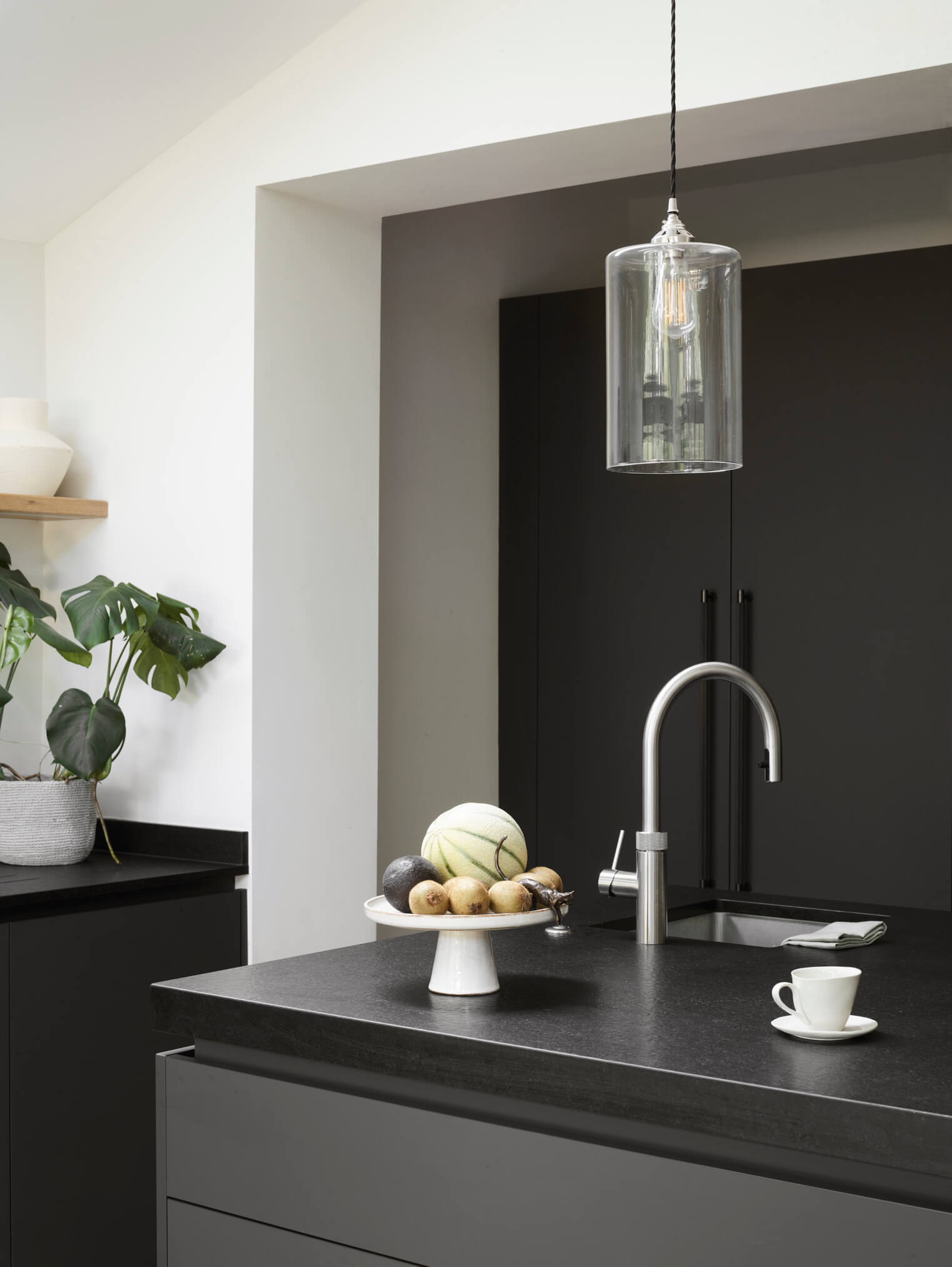
There are several … The striking roof lines and the contrast between rich timber floor and sleek grey graphite cabinetry are just one of the element that makes this scheme so successful. The detailing on the worktops – the textured surface of the Nero Granite Silestone with smooth edges also adds interest to the otherwise smooth surfaces. There’s also the shape of the room itself … it’s unusual, as well as being light, airy, and impressive. The natural floor finish provides a visual balance to allow a bold choice on the cabinetry. The worktop detailing is an unusual, slightly more expensive method, which needed slabs of two different finishes.
Q: Now the project is finished, what aspects made everyone happy?
Functionality is the first thing to achieve – this kitchen delivers zonal working with plenty of storage for the client’s way of living. Hard wearing materials are used throughout and they will definitely stand the test of time. It also oozes Scandi-style, which is also timeless, fashionable and elegant.
Q: What is your best advice for someone who is planning a new kitchen?
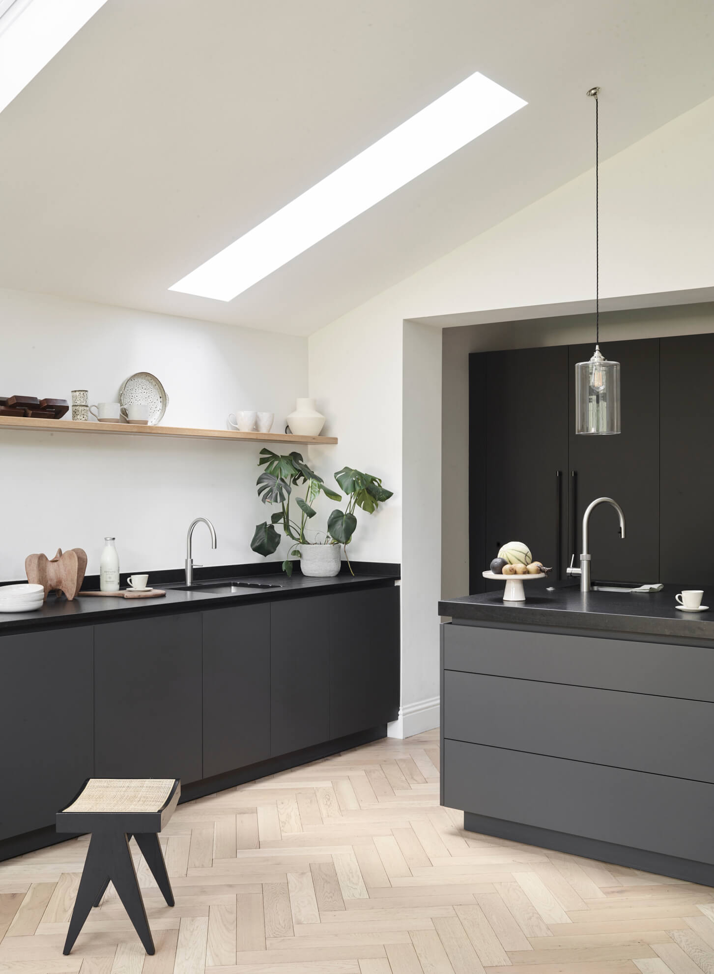
Remember that if you want to include an island, the overall aim of an island is to contain nearly everything the chef requires for everyday prep, with fresh storage and cooking appliances close by. The arrangement of the kitchen should encourage an effortless flow from fresh storage to washing up, to preparation and chopping to cooking and serving, and so on. So the island needs to be able to accommodate these tasks comfortably.
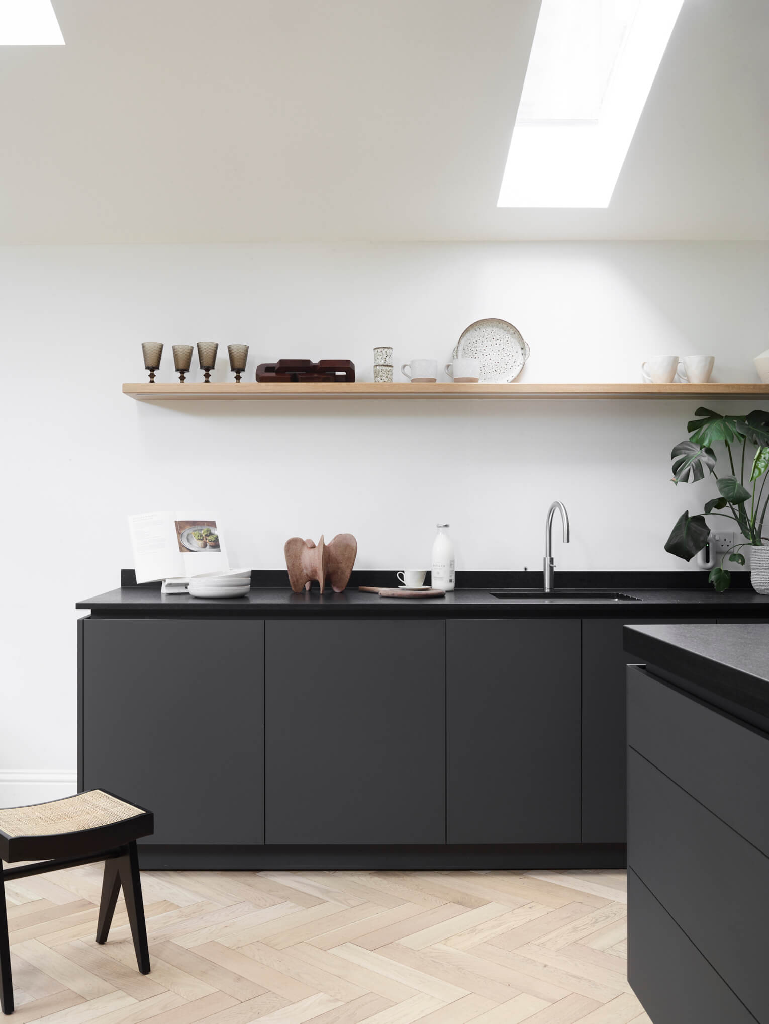
In this kitchen, the two-sink design sets the larger sink with dishwasher on a side run, encouraging ease of use and zones for clearing away or handwashing large items. This zoned layout allowed for practical multi-person use when several members of the family are involved in the meal preparation.
[
Q: Do you have a secret ‘style signature’ or feature that you find you use in most of your kitchen projects?
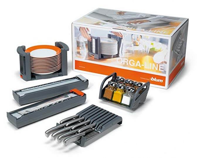
With such a varied client base and locations across the country, not to mention being a bespoke manufacturer, it’s hard to find many absolute consistencies. However, it’s always great to look forward to including something unique for each project. I usually plan for a ‘cooks cabinet’ around the island or hob area, and fill this with features to house jars and tins of oils and seasonings, spices, sharps, foil dispensers, small gadgets etc. Most clients, whatever their cooking abilities benefit from this type of cabinet and enjoy filling it with their favourite ingredients!
Q: Are you seeing more large-scale projects such as this, including utility and boot room areas for example?
We specialise in large-scale multi-room projects, and we have a wide range of materials available and construction techniques we can utilise. As such, this makes Roundhouse a joinery solution for most rooms in the home. We offer bespoke wardrobes and storage spaces, as well as less expensive planning options for areas out of view of the main living areas, such as utilities. Therefore, nearly all our projects involve the planning of the kitchen with additional areas. That said, we’re also happy to take on smaller projects, such as banquettes, sideboards and so on.
Q: What are your thoughts on the prominence of sustainability matters for 2023?
In many ways sustainability has always been important to the Roundhouse team. It is an ongoing factor that is considered in many decisions, from when we’re launching a new range or helping our clients make design and product choices. All of our products, such as solid wood and veneer, are PEFC accredited, and we only purchase from sustainable sources, e.g. plantations. We prefer to use suppliers local to our factory, and the company has invested in an industrial biomass system to use our wood waste product to heat the factory. Sustainability is not just a passing trend. I am sure it will become more widely recognised as being a necessity for ethical and financial reasons, and Roundhouse will continue to consider sustainability in all their choices.
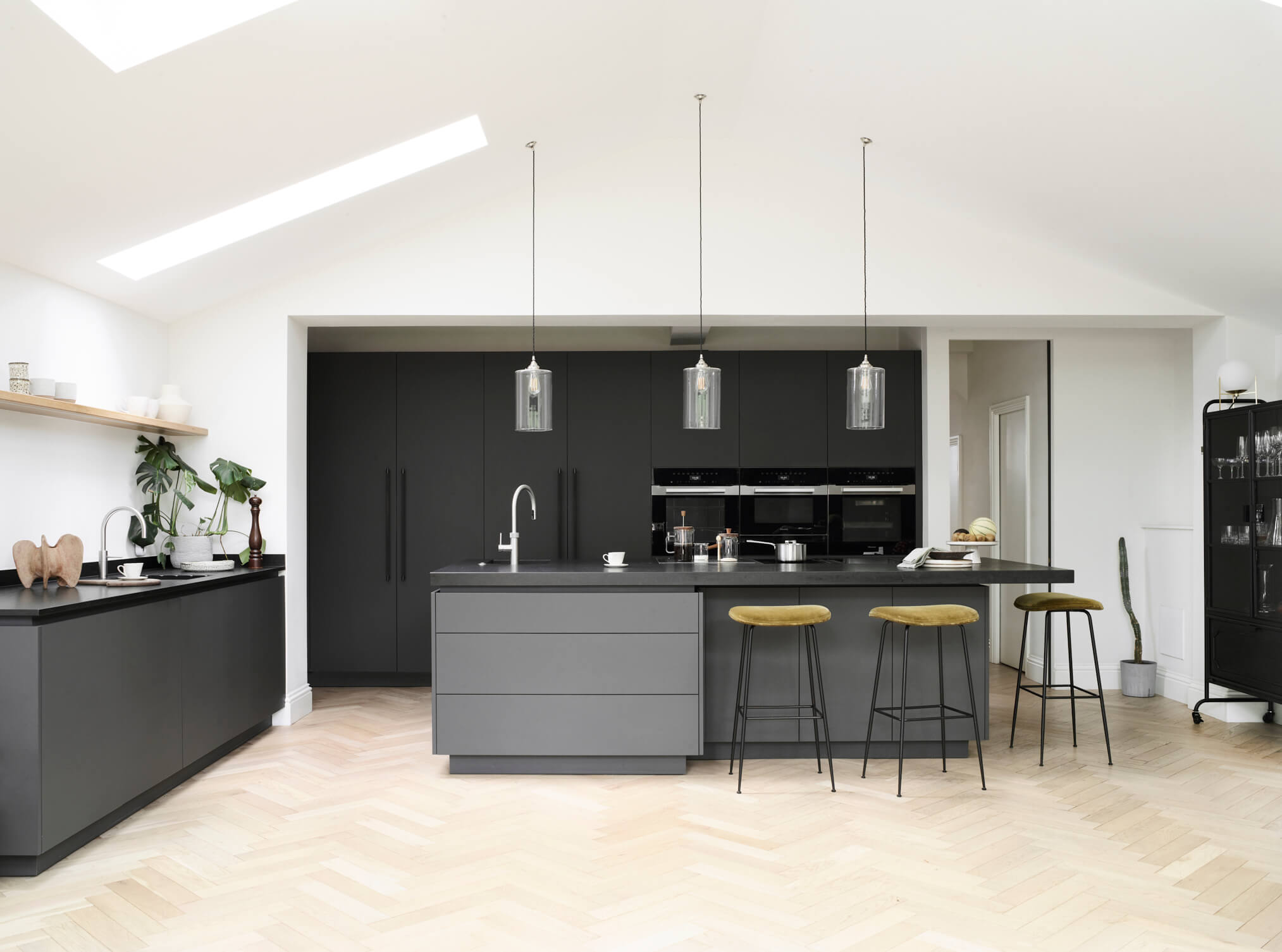
We Love: The bold combination of black and grey cabinetry with black work surfaces, with the resulting stand-out contrast against white walls.
Kitchen by Roundhouse, using Studio Urbo Smooth Matt Cabinetry in Smooth Matt Graphite Grey and Smooth Matt Graphite Metro. Work surfaces, 20mm and 80mm Nero Granite, with Antique finish to top surface and Honed finish to sides. All Roundhouse. Tel: 020 7297 6220. Follow the team on Instagram @roundhouse_design.
Flex and Nordic mixer taps, Quooker
Matrix sinks, Abode
Directsensor ovens in Cleansteel, Miele
Classic 2.0 Induction hob with Extraction, Bora
iQ 500 refrigeration and dishwasher, Siemens
Smoked Bronze bar handles on tall doors, Buster + Punch
All flooring, solid wood shelf, glass pendant lights and stools, sourced by client.



Leave a comment