Harvey Jones Kitchens
By Linda Parker
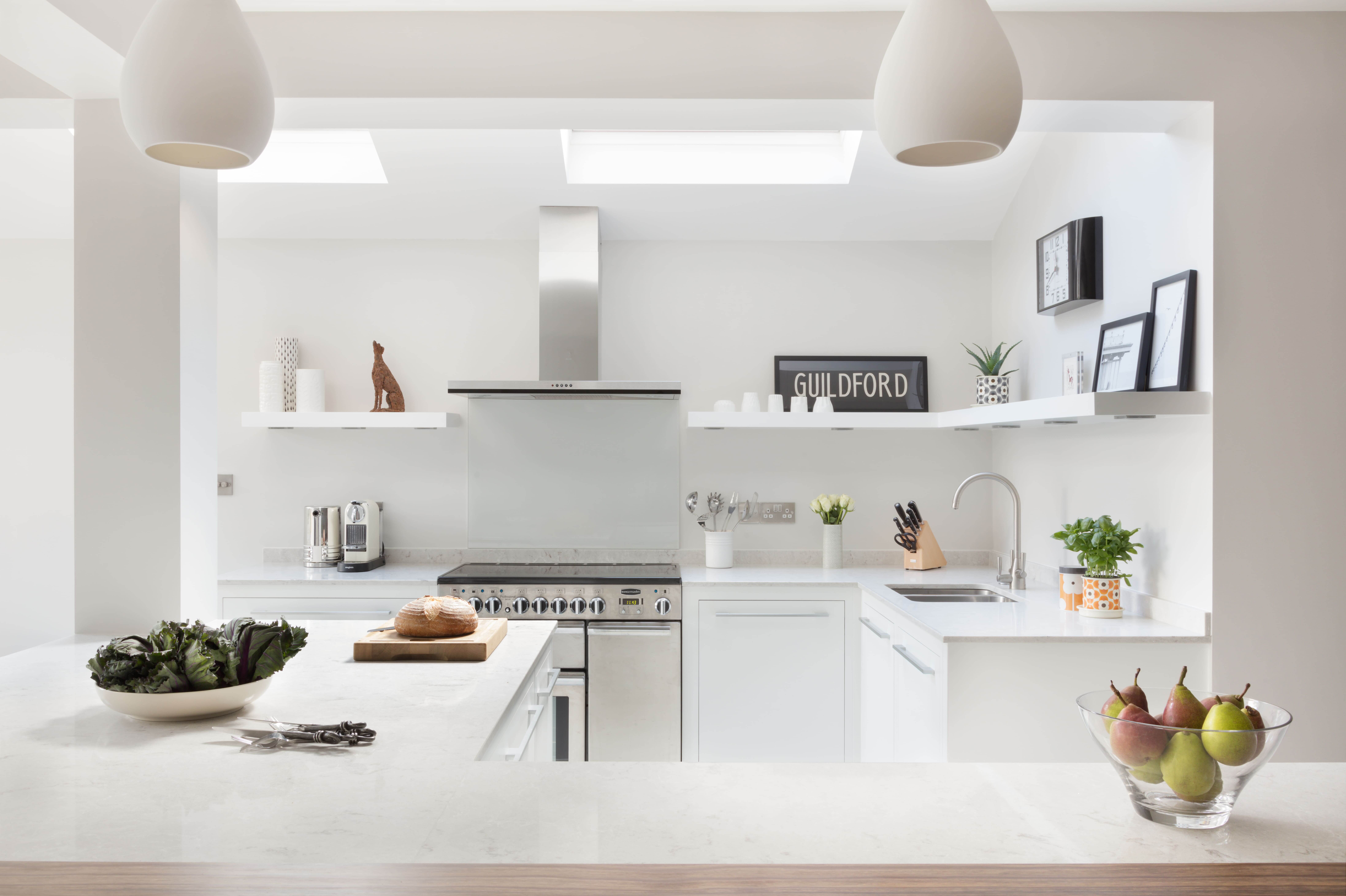
Kitchens by Harvey Jones are bespoke, chic, often with a colourful flourish, and effortless style. This understated project was commissioned to work within an open-plan space in a Victorian house, so the design team had to overcome issues with lack of natural light. Head of Design Melissa Klink talks us through the team’s approach to this particular project …
By Linda Parker
Q: What were the stand-out priorities in your brief from the homeowners?
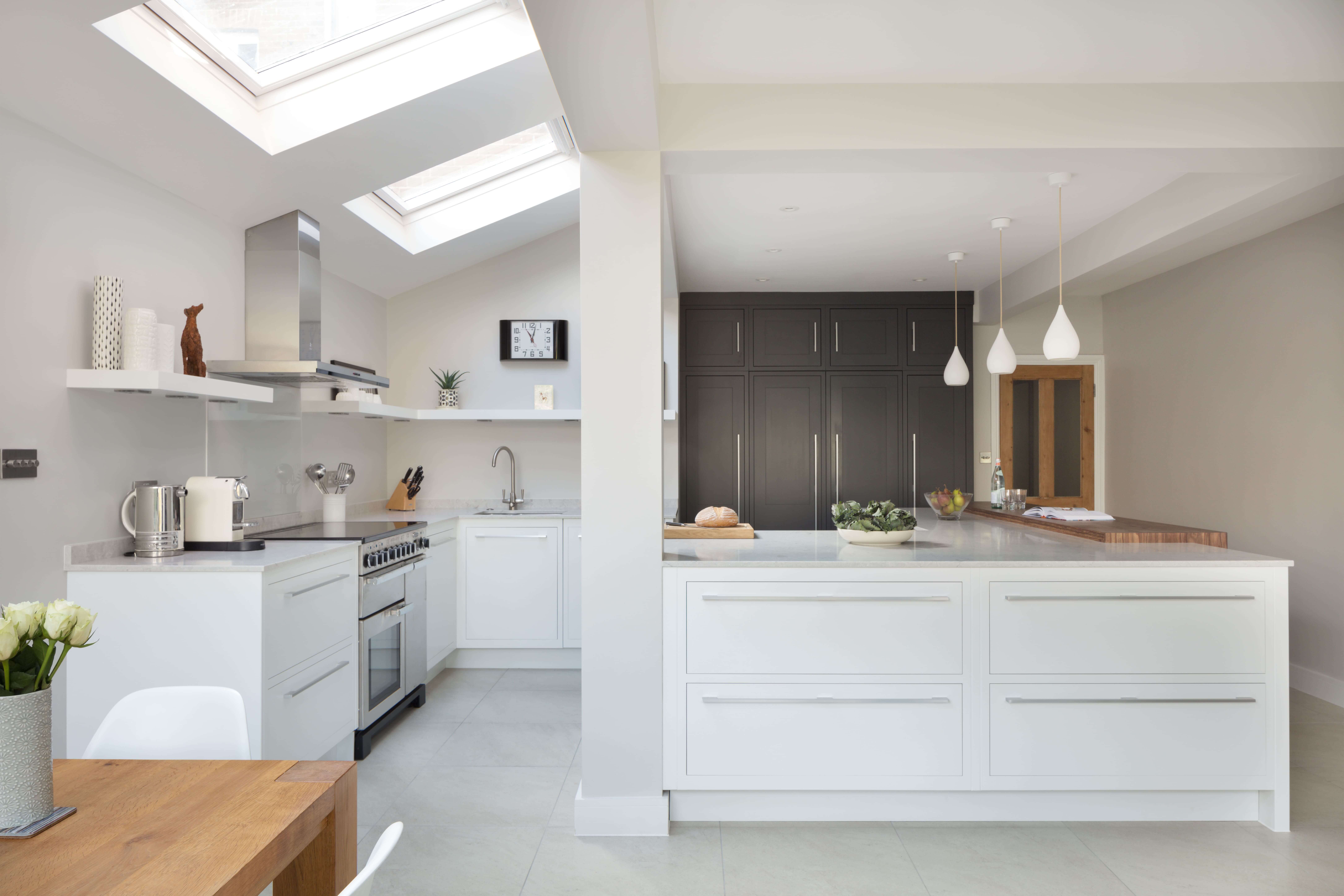
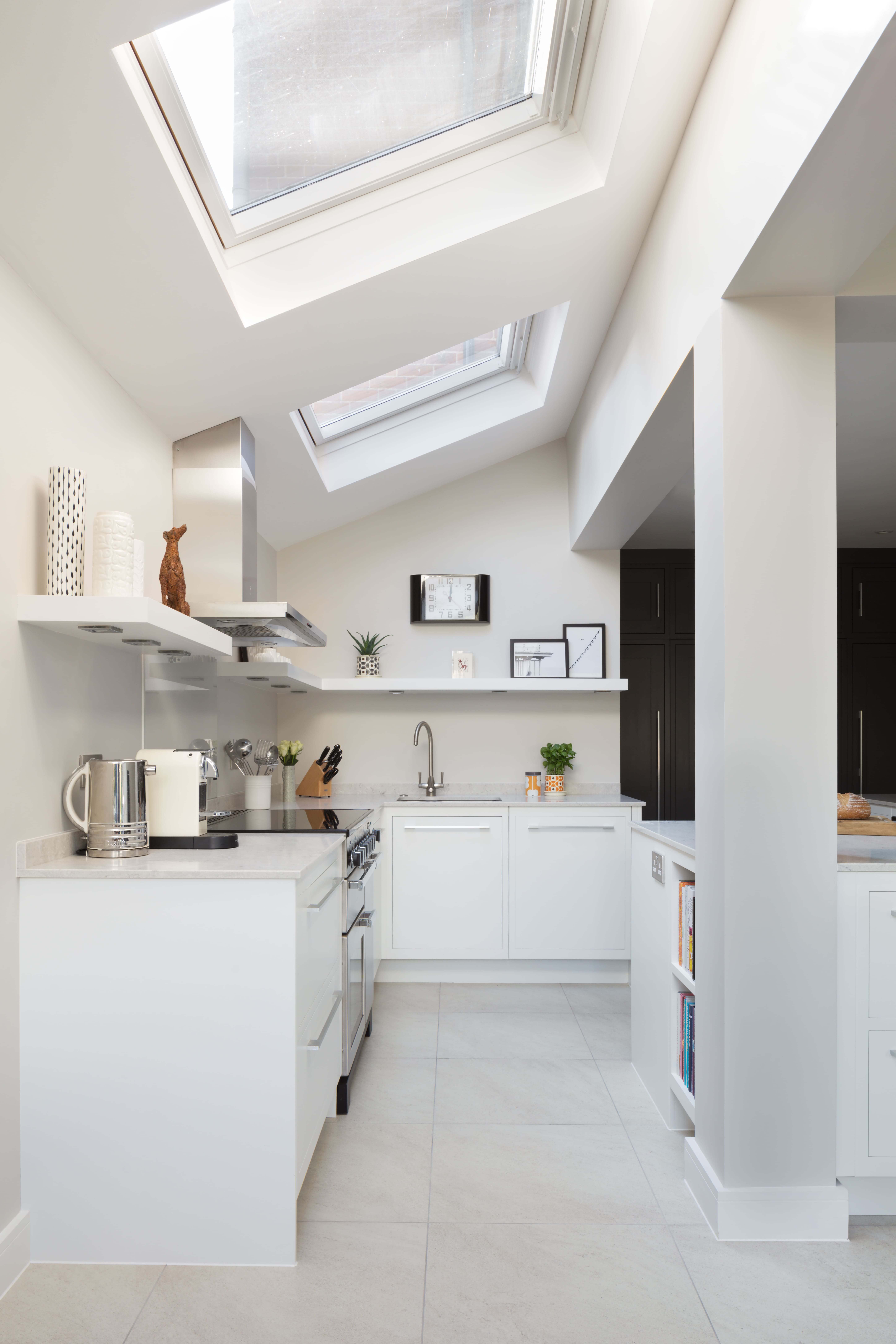
The priority was to design a kitchen that would sit comfortably in an open-plan space and that would also feel bright and airy. The kitchen is located in a Victorian semi-extension, so whilst the dining area is exposed to natural light through a large window, the cooking space is often left in the dark – but there are two roof windows brightening the space.
Q: How did you set about answering that brief? Were you given a strict budget?
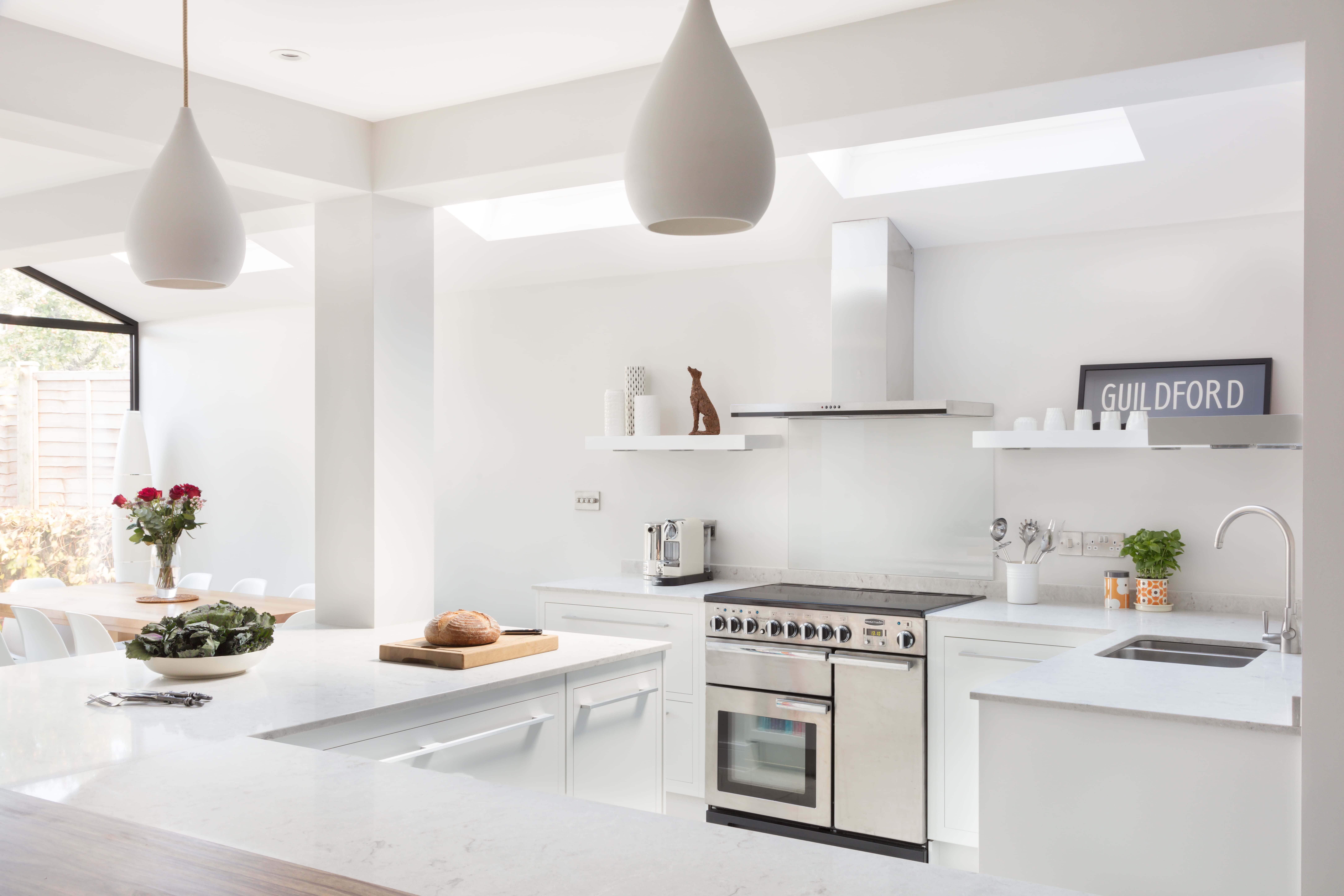
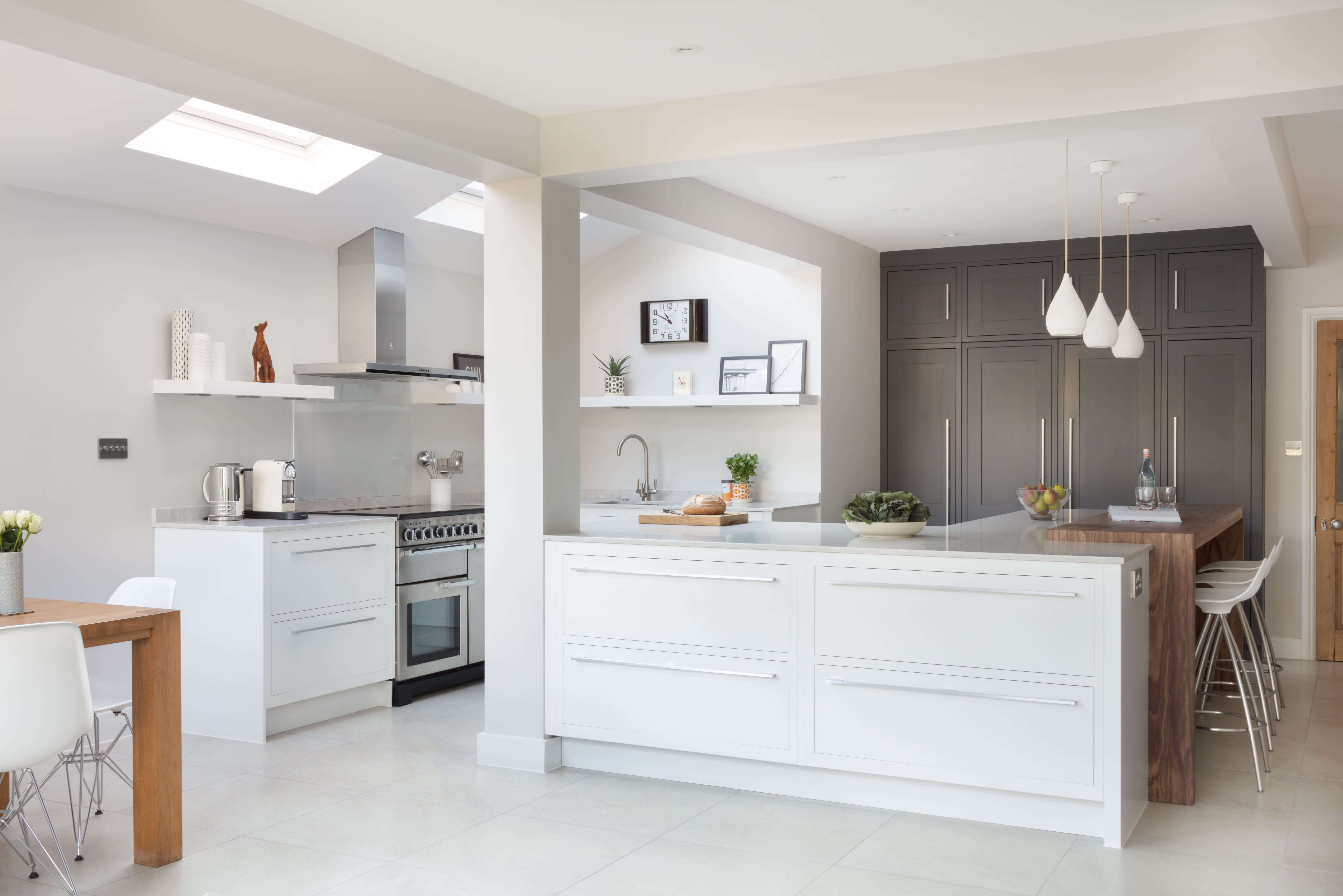
Everyone agreed that an island should be the focal point of the space and the rest of the kitchen was designed around that initial concept. Roof windows are the only sources of light around the cooking area, so the cabinetry was painted white to brighten and open up the space. Our kitchens start at £20,000 and we were given a budget of £35,000 to work with.
Q: Explain the reasons behind the choices of cabinetry and work surfaces …
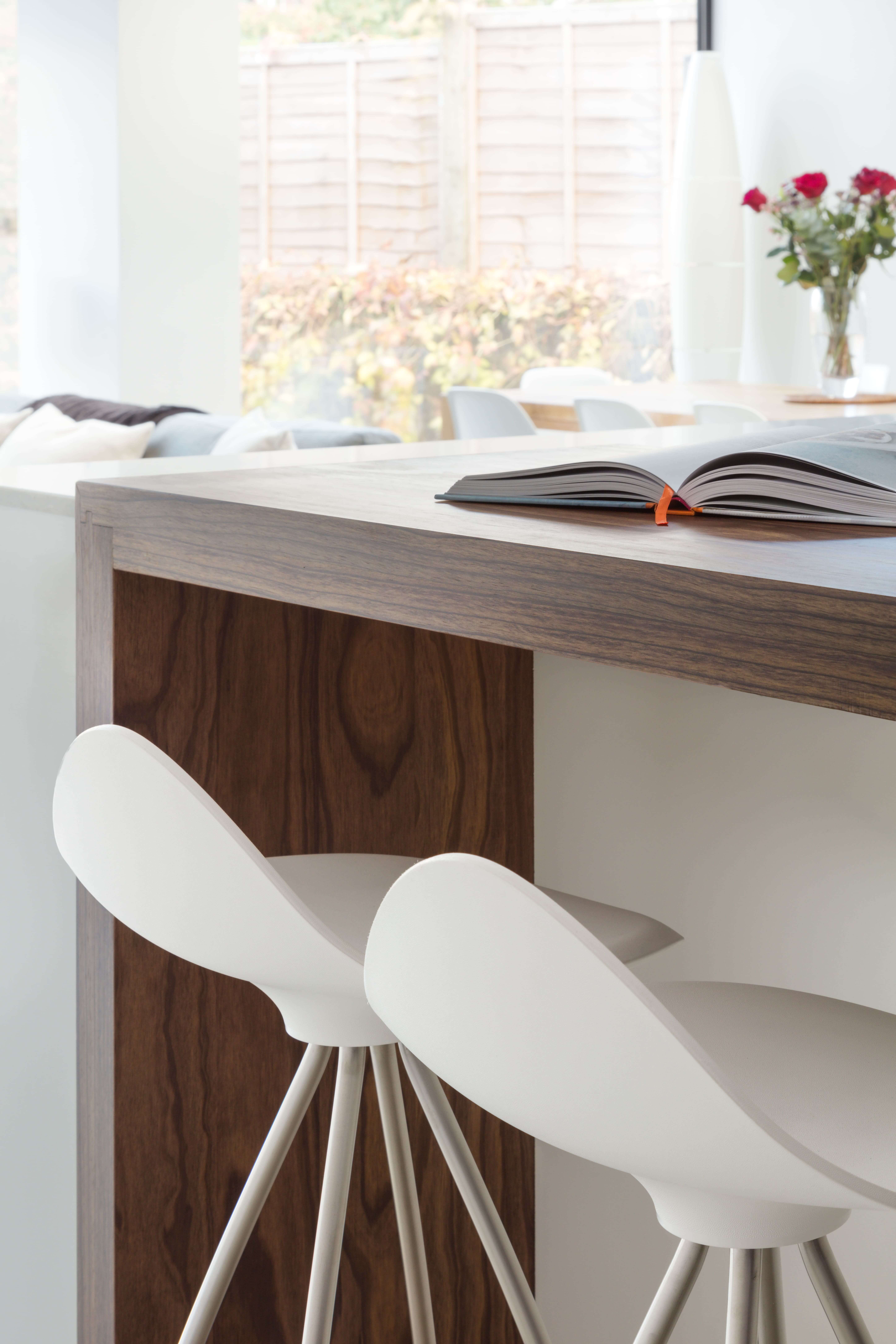
The homeowners asked for a modern minimalist kitchen, which perfectly sums up the thoughts behind our Linear range. To create the perfect Linear kitchen, it is imperative to keep things simple. We wanted create a streamlined and uncomplicated layout that answered all the requirements of modern day to day living. We know that natural timbers such as Oak and Walnut work perfectly in a Linear kitchen to create accent areas such as breakfast bars, butchers’ blocks, worktops and islands, in addition to framing a stand-alone unit. When contrasted with contemporary and neutral painted furniture, wood grains create an attractive focal point and add depth to the design.
Q: Can you guide us through the structural elements that had to be added/incorporated into the layout of the new kitchen?
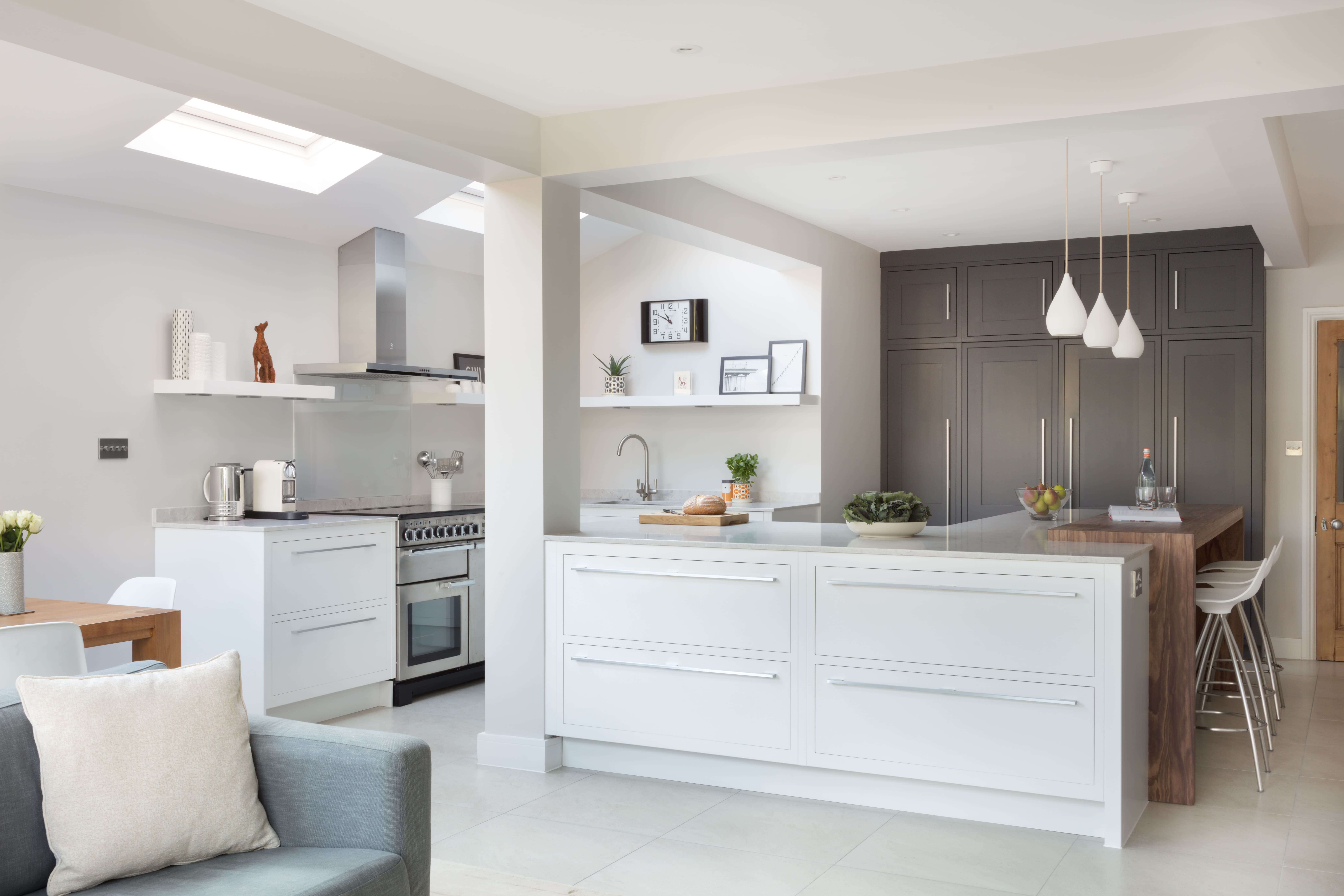
There is a large steel column sitting on the side of the kitchen island. In order to incorporate it, the island had to be adapted. Getting the size right was crucial, and we opted for an L-shape in the end. The column plays a large part in emphasizing the crisp, angular and clean-cut design lines throughout the kitchen.
Q:What design elements do you think make the scheme so successful?
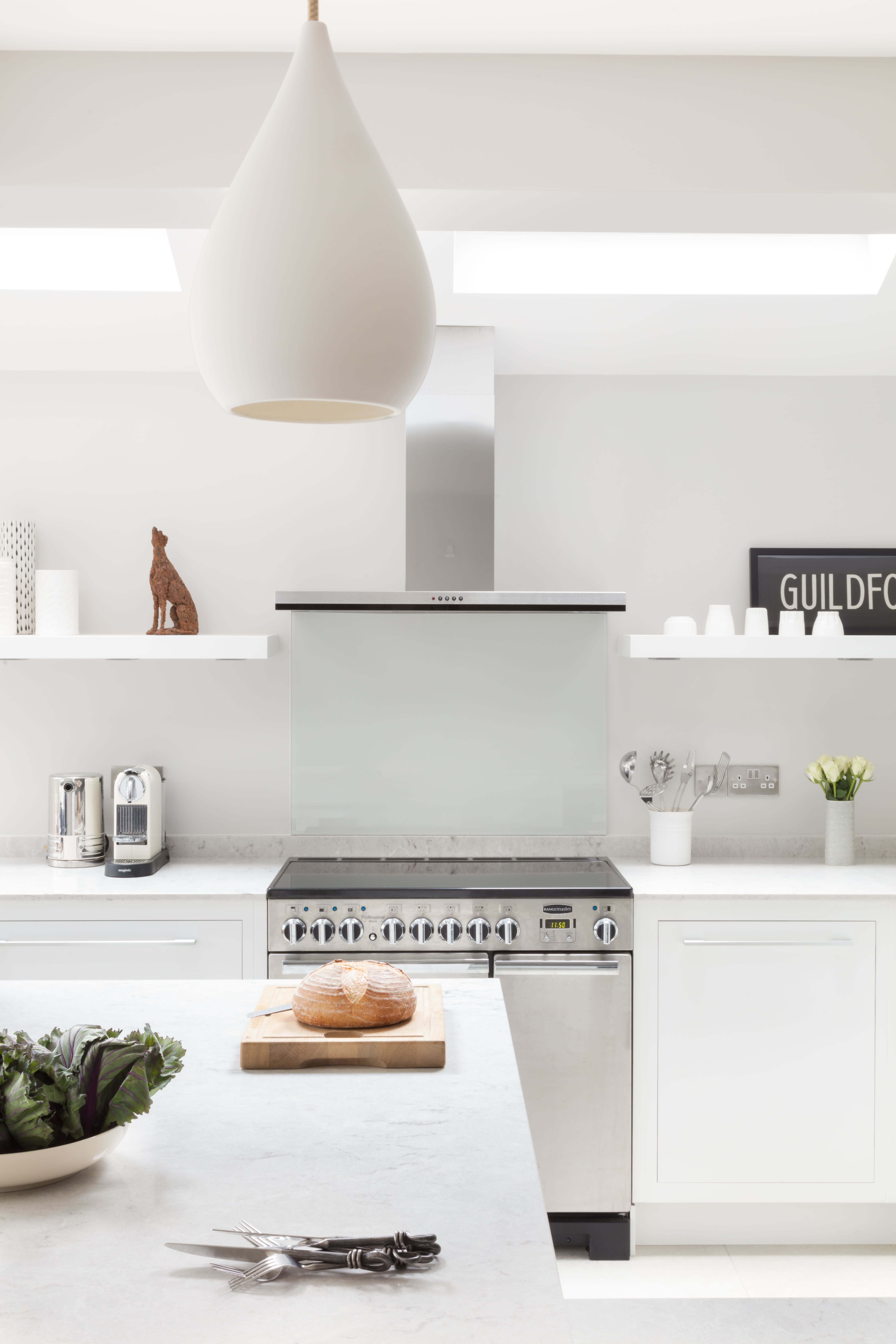
Contemporary kitchens are one of the most popular styles, and for good reason. They’re clean, stylish, simple and combine aesthetic with function, through savvy storage solutions. The main features of our Linear range are its sleek lines and concealed hinges, that give it a streamline modern finish. This style can sometimes feel sterile, especially when paired with white cabinetry, so, to avoid a clinical appearance, it’s important to mix in different materials, such as wood to give the space a touch of warmth, and opt for a soft lighting scheme. As shown here, pendant lights add depth and interest.
The choice of cabinetry style also makes this scheme particularly successful. To make the room feel bigger and give it the overall feel of having more space, we placed base cupboards around the cooking area, making it the primary core of the kitchen. The floor-to-ceiling cabinets painted in a dark shade balance the scheme through both their contrasting colour and shape.
Q: Now the project is finished, what aspects are you most pleased with?!
My favourite element of the room is the worktop bench on the island. It provides a warm, beautiful contrast to the stark white of the island and you see it before you notice any of the cabinetry – it’s a real focal point!
Q: What is your best advice for someone who is planning a new kitchen (or who may be looking at a new home in a new development), what should they look for / ask for?
Don’t try to conceal the natural features of the space. Ideally, a bespoke kitchen should be built around the existing space. If you can use the existing space successfully, this can also provide the opportunity to play around with different colours, materials and finishes, as well as cabinet designs.
On a more practical note, for optimum use of your kitchen make sure to arrange the hob, sink and fridge within easy reach of each other. The ‘magic triangle’ will not only save you time when moving between the three key areas of the kitchen but offer safety when transferring hot pans to and from the hob to the sink. Always keep this famous ‘triangle’ rule in mind when planning the layout – sink, oven and fridge should all be close to hand when cooking – even if you are planning an open living space, the kitchen area should still function as easily and practically as a separate kitchen would.
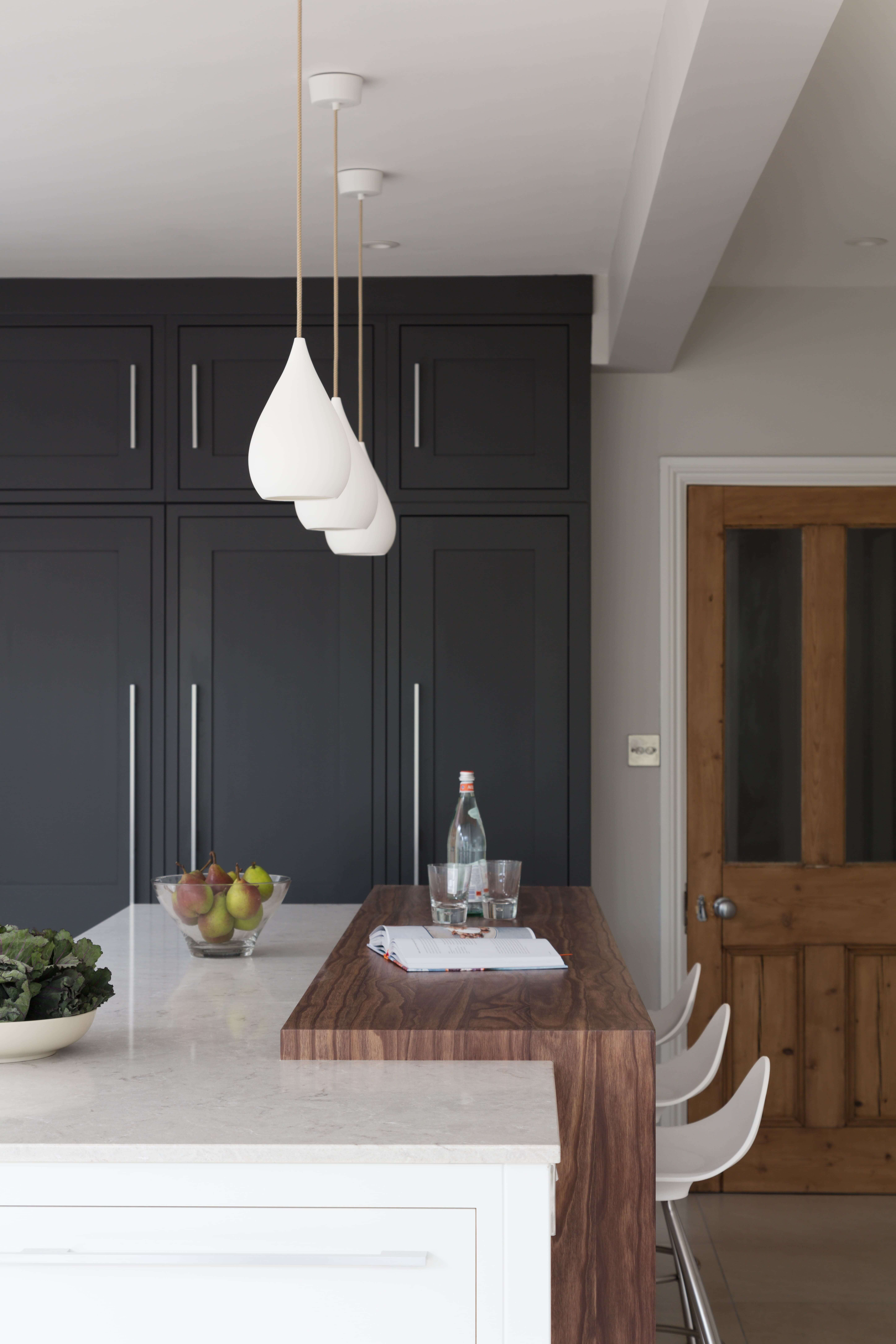
We Love: The dark-painted floor to ceiling cabinets – such a striking feature and a wonderful contrast to the sleek white cabinetry that is used for the surrounding floor cabinets
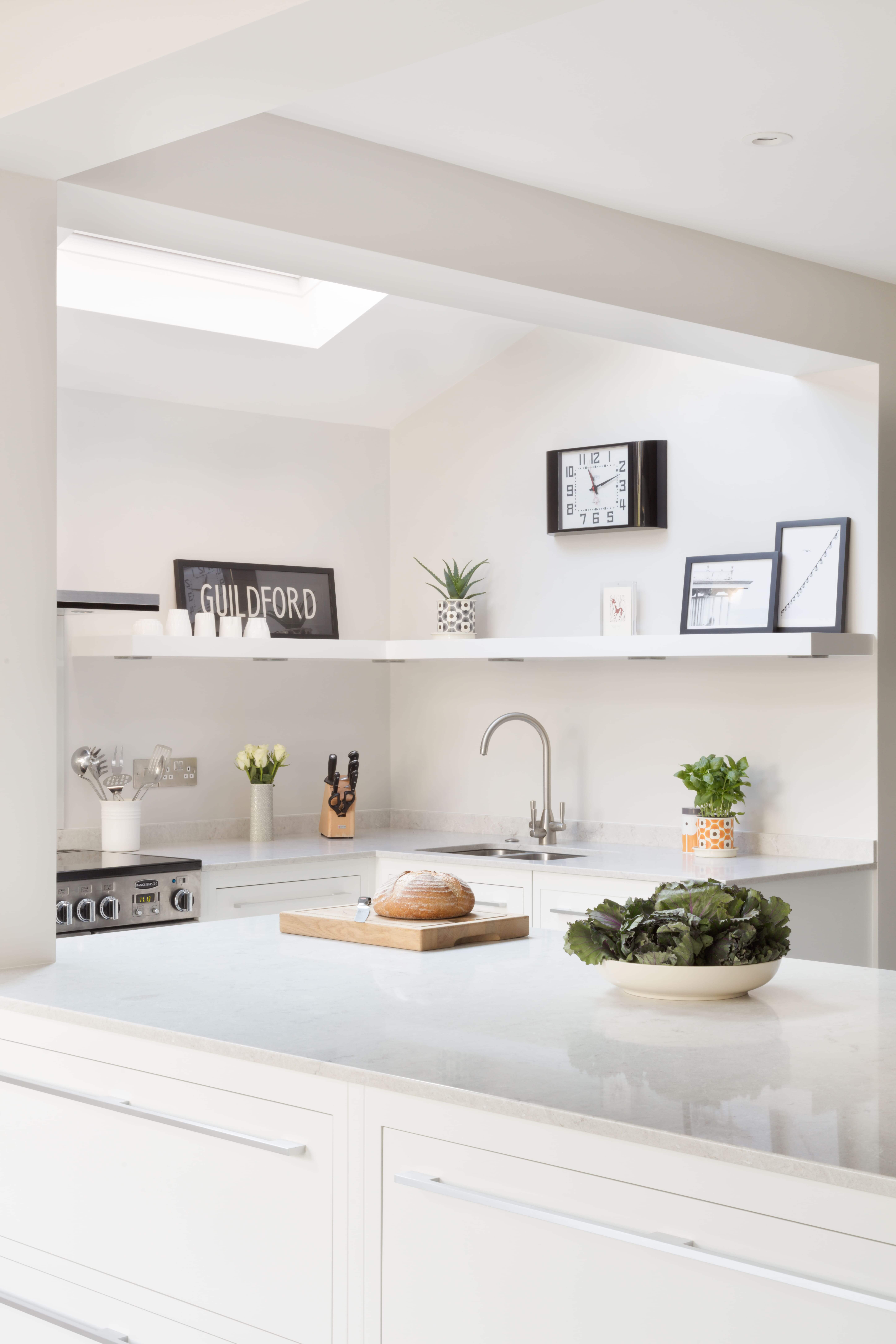
White Linear kitchen by Harvey Jones. There are currently 24 showrooms, including Bristol, Islington, Milton Keynes and Worcester. Visit the website or call 0800 389 6936 or email info@harveyjones.com to make a design appointment with your local showroom.
Cooker/Hob: Rangemaster www.rangemaster.co.uk
Extractor: Elica www.elica.com
Sinks and Taps: Franke www.franke.com
Worktop: Caesarstone www.caesarstone.co.uk
Flooring: Ceramic Tile Warehouse www.ceramictilewarehouse.co.uk




Leave a comment