H-Line Kitchen By Sigma 3
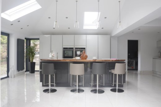
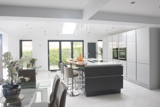
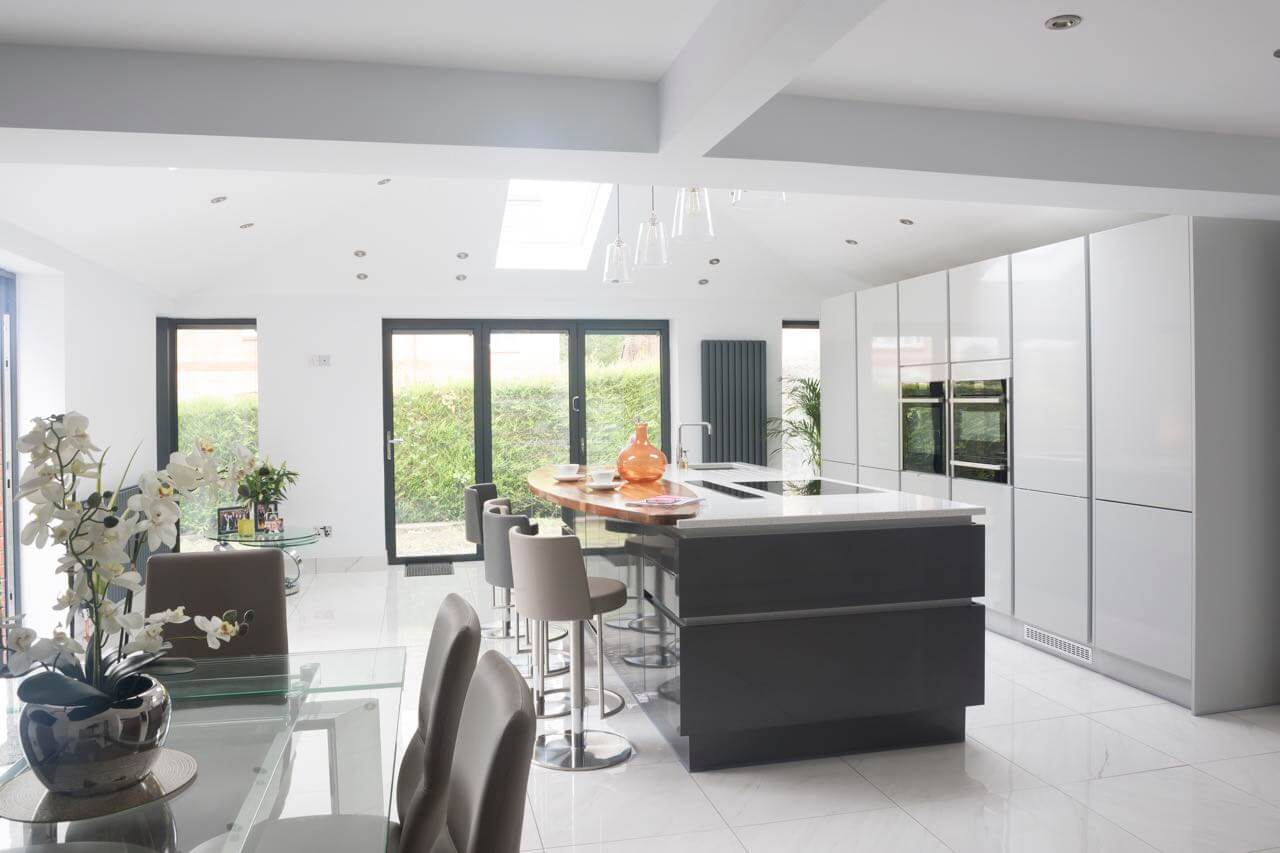
 The story: This kitchen was designed to be a feature and the centrepiece of a brand new family home. It needed to be homely and incorporate a dining and living area, too.
The designer: Dan Thomas of Sigma 3 (Kitchens) Ltd, Cardiff (www.sigma3.co.uk)
Designer Q&A:
Q) What was the brief from the client?
The client wanted something different – they had been to another company who had done a standard design that didn’t blow them away so I was challenged with coming up with something that had more punch.
Q) How did you set about answering that brief?
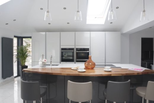
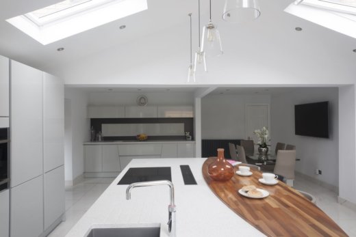
I felt that the island was the key to making the kitchen into something special. I decided to use the seating area as a way of creating something different. I used solid timber and decided to make an elliptical seating area rather than a standard square design. Because of the flexibility of the H-Line product Sigma 3 provide, I was able to create the illusion that drawers were continuous all the way around the island by using actual drawers and then ‘cloaked ends’ on either side rather than the standard floor to top of unit end panels most companies provide. This allowed me to carry the handle rails around the island, giving us a more consistent feel.
Q) Was there any building/renovation work involved?
Yes, the customer had a large extension built onto their existing house.
Q) Which products did you use and why?
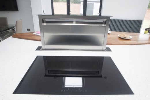
I used Neff, as the oven and combination microwave suited the customer’s needs. I also used a downdraft hood that lives in the island as opposed to a traditional ceiling-mounted hood, as it would have ruined the whole open feel of the room. I also used Neff’s premium dishwasher, as it is a press-to-open machine, which was key, as I had to build it into a larder unit because it would have ruined the look of the drawer effect in the island.
Q) What elements do you think make the scheme so successful?
For me it was the ability to create something different by being able to run the handle rails around the kitchen. Also being able to fit the touch-to-open dishwasher into a tall larder unit was key to the whole design. If we couldn’t have done this then the whole island design would have been lost as we would have had to put the dishwasher in the island meaning we would have lost the clean lines of the drawers because of the full slab door of the dishwasher.
Q) Any advice for someone who may be planning a new kitchen?
Don’t be afraid to think outside the box!! A kitchen is a very personal thing that needs to suit your own needs whilst also being an amazing feature in your house. Don’t settle for a standard or generic ‘boxes on walls’ design that you can get from anyone. Find a designer and company that can provide you with something unique!
The details:
Cabinetry by Sigma 3, www.sigma3.co.uk
Worktops by Silestone and PWS, www.silestone.co.uk and www.pws.co.uk
Appliances by Neff, www.neff-home.com
Boiling water tap by Quooker, www.quooker.co.uk
Hayley loves: the contrast of materials on the large island unit, which is both practical and eye-catching



Leave a comment