Grand Proportions
By Linda Parker
 Martin Moore’s designer Matthew Sedgwick was involved in the design of this spacious kitchen from the very start of the process … and he also has some excellent advice for anyone planning a new kitchen.
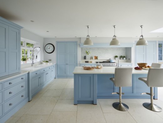
Q:What were the stand-out priorities in your brief from the client?
The client had bought an extremely large, very dated Victorian house with a poky kitchen sited in a dark corner. Part of the reason for moving was to gain space for a large, new, light-filled and multi-purpose kitchen/living space for the family. Getting enough room for this meant knocking out the back of the house and building a new extension right across the back. So, the priorities in the brief were always going to be around the zoning, ergonomics and functionality of such a large space. On the aesthetics front, the brief was very clear – the furniture had to be our ‘New Classic’ collection, it had to be hand painted and it had to be blue!
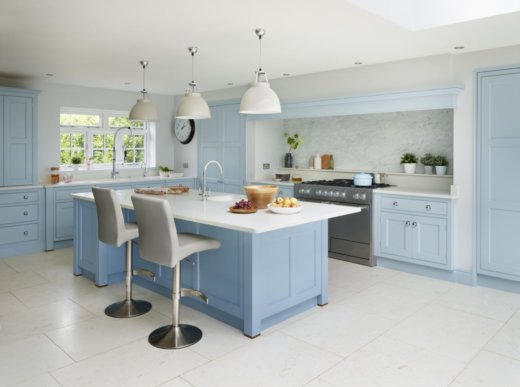
Q: How did you begin to approach this brief?
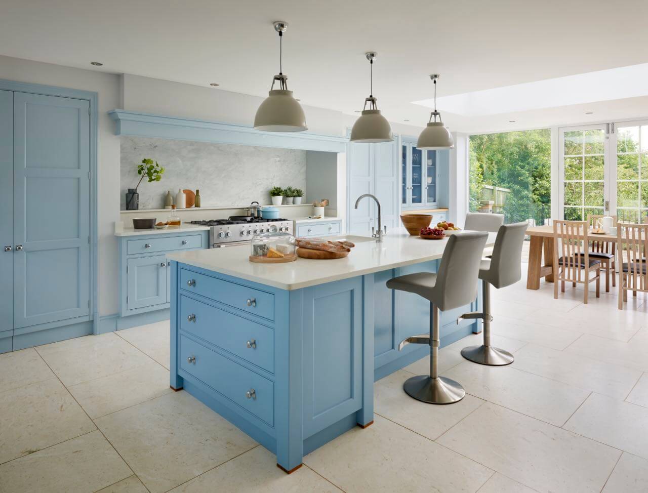
I was recommended to the clients by a friend of theirs and brought into the process very early. This was useful, because, with the entire kitchen already planned and agreed, I could then work with the builders to ensure the correct placement of utilities and feedback my ideas into the process. A problem with new extensions can be the lack of obvious architectural features and focal points. This can be especially problematic when the existing house is a period building. Ideally, you want to carry through some of the spirit of that original building into the new structure. One of my priorities was therefore to design a chimney breast feature to bring interest to the longest wall and create a visual ‘centrepiece’ for the kitchen.
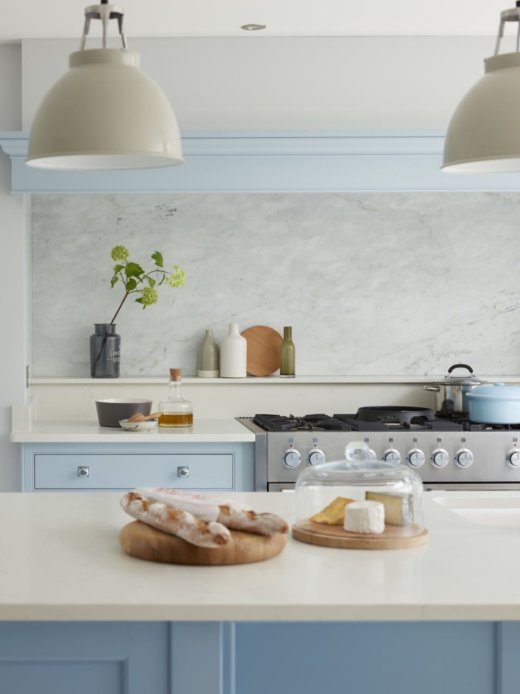
Q: Explain the reasons behind the choices of cabinetry and work surfaces …
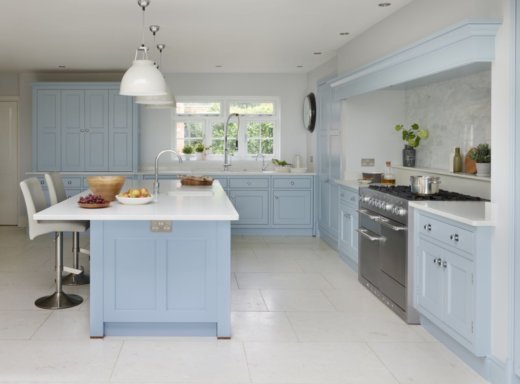
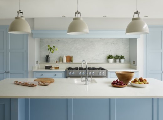
The cabinetry, being traditionally handmade and hand-painted, helps to unite the Victorian house with the new extension. The deep recess was built to hold the cooking zone, with the break-fronted chimney breast and timber mantel lending a classic look. An impressive range cooker holds pride of place, with dedicated storage cupboards and workspace on either side. With the position of the chimney recess agreed, the large island with deep overhangs could be positioned directly opposite, creating the social and working hub of the kitchen. Having young children in the family means that one of the key functions of the island is to provide informal seating for them, with the worksurfaces in a very practical ‘Bianco Massa’ polished quartz composite. These are matched across the rest of the kitchen, except for the dedicated drinks servery area which has a wooden worktop to give it a distinctive feel of its own.
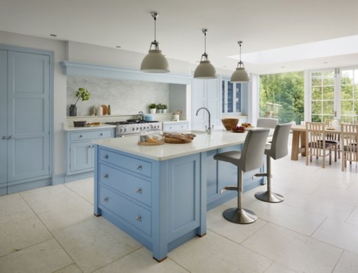
Q: What design elements do you think make the scheme so successful?
Overall, I am delighted with the flow which this kitchen achieves, it makes a large space perfectly viable as both a practical, working kitchen and a bright, airy living space. ‘A blue kitchen’ was in the brief right from the outset, but the colours went through many potential shades and combinations before we settled on ‘Summer Sky’ for the cabinetry, ‘Cove Blue’ for the island and interior of the large glazed dresser and ‘Blue Grey’ for the drinks servery dresser and outside of the glazed dresser. These tonal variations of blue prevent it from being overwhelming and give scale and definition to the cabinetry.
Q: What is your best advice for planning a new kitchen?
Think about the lifestyle of everyone who is going to use the kitchen. Is it just for cooking? Or is it part of a large social space with informal seating and dining… in which case you will want a kitchen style which can follow through into adjacent areas.
Do you want your new kitchen to make a ‘stand out’ statement or whether you are looking for something subtler. Are you visualising a calm, tonal space or exciting, bold colours? Period detailing or clean, contemporary lines?
Do you want to make a feature of your appliances, focusing on the kitchen as a cooking space, e.g. big stainless-steel fridges and other electrical wonders on show? Or would you rather have a softer feel with everything hidden away?
Consider the architecture of the house. If you have very high or very low ceilings, these definitely need to be a consideration in the style you choose and the kitchen furniture needs to be in proportion.
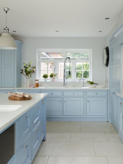
We LOVE: The combination of the different shades of blue, which provide a fresh and timeless look. Hand painted in Martin Moore colours: Sumer Sky, Cove Blue and Blue Grey
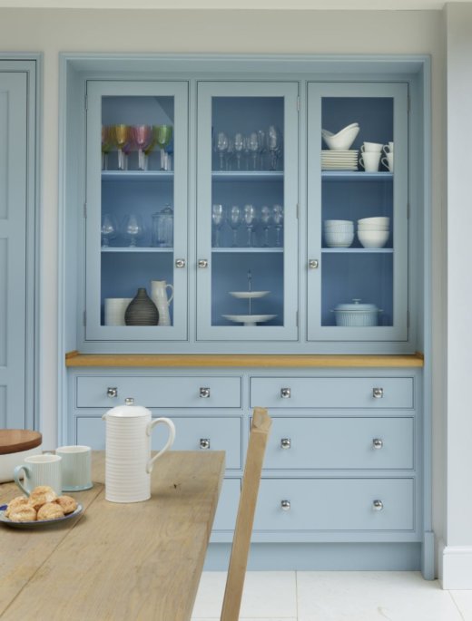
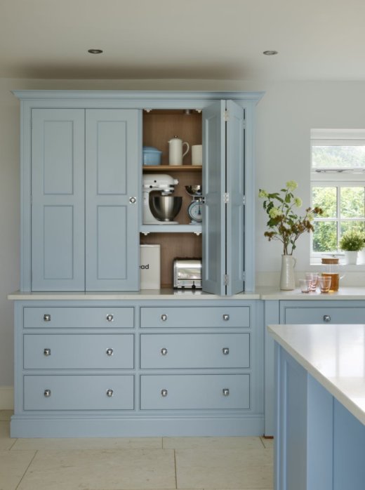
Kitchen cabinetry: Martin Moore ‘New Classic’ collection, individually designed and built to order in their own Yorkshire workshops. Worksurfaces: ‘Bianco Massa’ polished quartz composite by Martin Moore. Floor: Cartmel Honed Limestone from Marin Moore Stone Kitchens are from £35,000. 0845 180 0015, www.martinmoore.com
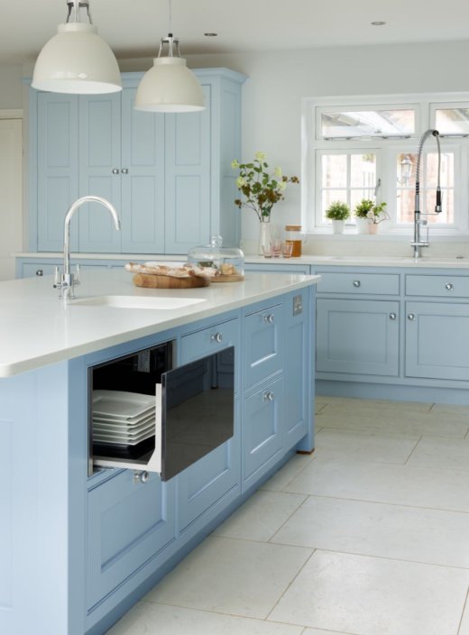
Appliances: Neff KI1813F30G tall integrated larder fridge; Neff G4655 tall integrated larder freezer; Franke Olympus tap in polished chrome; Gessi Oxygen Hi-Tech chef tap in polished chrome; Quooker PRO3 Design tap in polished chrome; Neff S51M66 fully integrated dishwasher with Timelight feature; Neff K4316 built-under fridge; Neff N17HH20 29cm high warming drawer; Custom Westin SPC1100 canopy extractor with rear vent; Pull-out Euro Cargo 60 waste bin with internal Oak drawer; Rangemaster RDZ60LBL/C built-under dual zone wine cooler



Leave a comment