Endless Inspiration
By Linda Parker
Well … just back from a visit to The Blum Experience Centre and my mind is well and truly expanded! If only it was possible to have a new kitchen every few months …
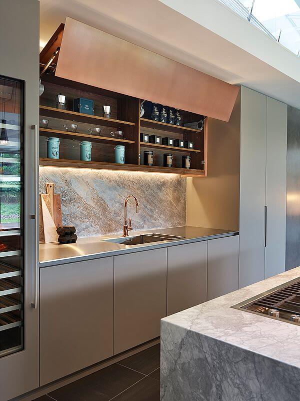
We have lift-up … AVENTOS SERVO-DRIVE makes light work of raising a 2.15m wide cabinet door
Blum has just opened a highly impressive Experience Centre at the UK head office, and although I’ve been lucky enough to visit several times before, the new immersive facility is a completely different experience. I felt as if I’d been time travelling rather than hopping on the train up to Milton Keynes…
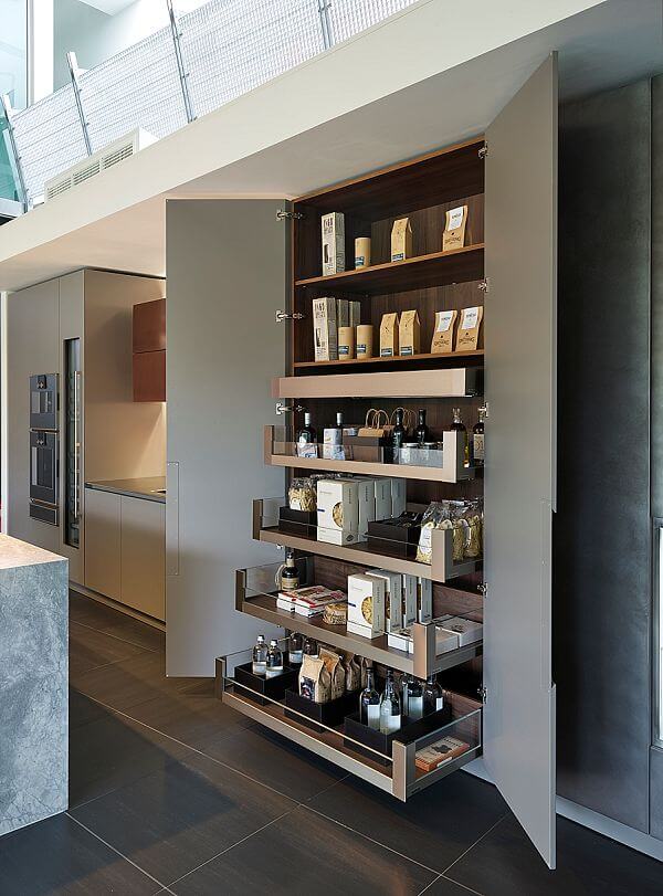
How many groceries can you store in one cupboard … make the most of every millimetre with the 1200mm Space Tower with LEGRABOX and AMBIA-LINE
Human dynamo Amanda Hughes (ok her official title is Customer Experience Manager) led us on a history tour of the Blum business, which was founded in 1952 and now supplies hinge and movement components which are supplied and used all over the world. The Virtual Reality Pod shows a 3D film of the manufacturing process, which is worth the visit itself. The Technical Room, Retailer Room, Consumer Room and Training Centre are all newly designed by Think Architecture & Design, and industry customers can book in for technical training and retail services using state-of-the-art technology.
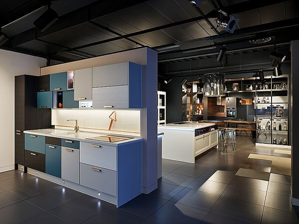
The Retailer Room has a clever display cabinet, (shown closed above) just 3m wide, which showcases all the Blum movement and hinge options. See it open and closed, and of course retailers can update it easily and quickly to show new products and developments. And here it is with everything open, ready to demo!
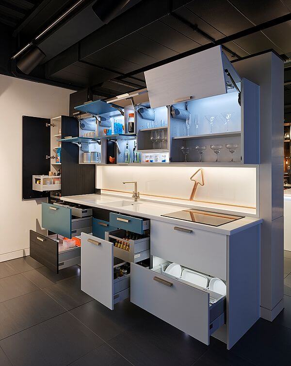
The Consumer Room includes full-size cabinets that can be moved around to create a life-size kitchen – ready for the customer to ‘test-drive’ the layout. Of course, all the latest products are on display, with clear comparisons between clever and not-so-clever kitchen planning concepts. All kitchen designers and retailers can improve the services they offer to their clients. I firmly believe that a visit to the Experience Centre will fill the most jaded kitchen designer with a new lease of life, and renewed enthusiasm for the hinge and movement fittings that make the difference between a truly practical kitchen that is a joy to use and a kitchen that is well, just… dull and difficult.
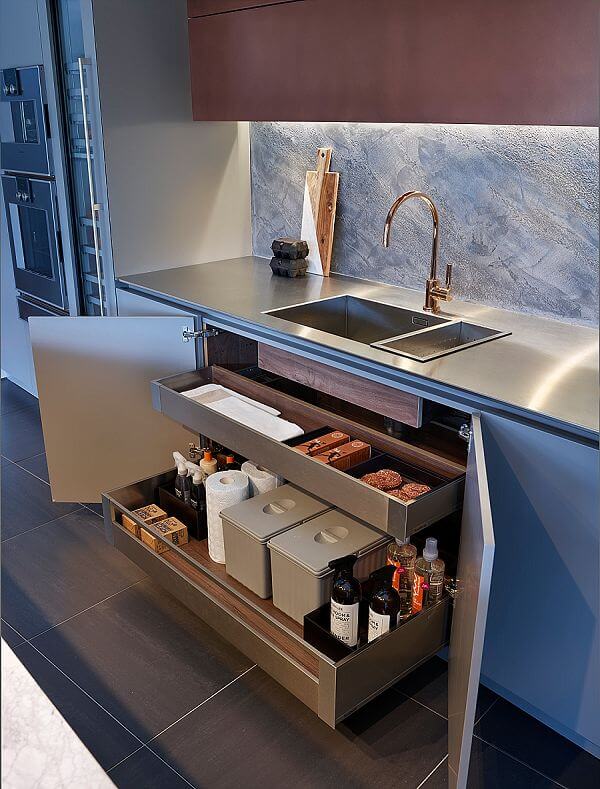
It’s not glamorous but it is clever … only Blum could make a 1200mm under sink cabinet exciting
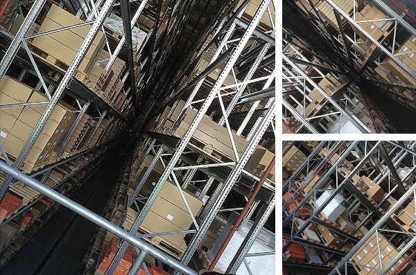
One of my personal highlights of the tour was the visit to the new robot (well automatically) controlled warehouse. Silent, vast and impressive. Storing an unimaginable number of fittings and components in thousands of boxes. And only the computer knows where everything is …
A little bit more inspiration from Kitchens International
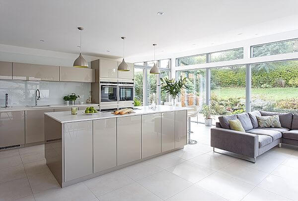
The epitome of a stylish island … with a view
As if the Blum Experience wasn’t inspirational enough, I’ve been looking at some of the latest designs from Kitchens International. Three large-scale projects caught my eye, and demonstrate an excellent use of space – which is sometimes difficult to get to grips with in a large area. Big kitchens can easily look cluttered, there’s a definite art in filling the space but using it wisely, and it seems that Kitchens International have nailed that particular look. The company has just won the KBB UK Kitchen Retailer of the Year award for 2016. See their designs here. Clean lines and soft curves are themes to look for, and of course, it’s still absolutely necessary to have a generously sized island.
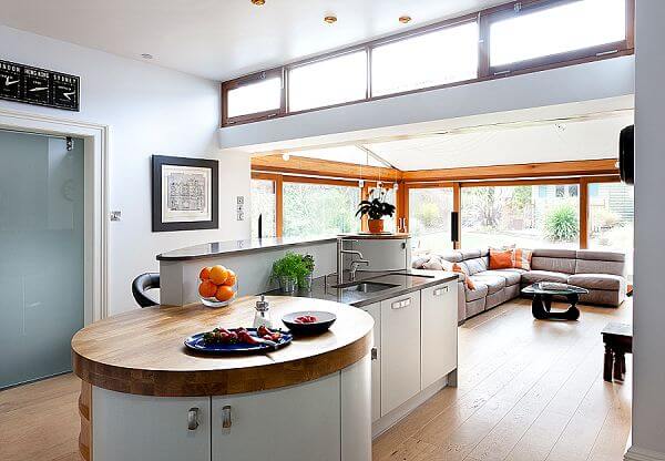
A multi-level, multi-functional island is the centre of attention in this kitchen
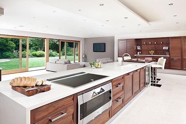
Subtle and striking – with masses of storage and clever use of contrasting materials. All by Kitchens International.



Leave a comment