Elegant Shaker Kitchen By Searle & Taylor
By Hayley Gilbert Photos Paul Craig

The designer: Darren Taylor at Searle & Taylor (www.searle-taylor.co.uk)
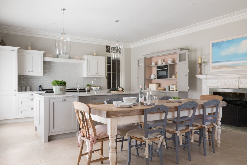
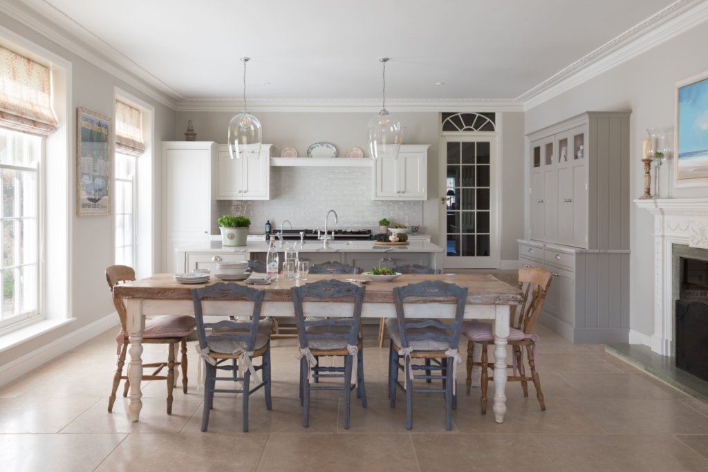
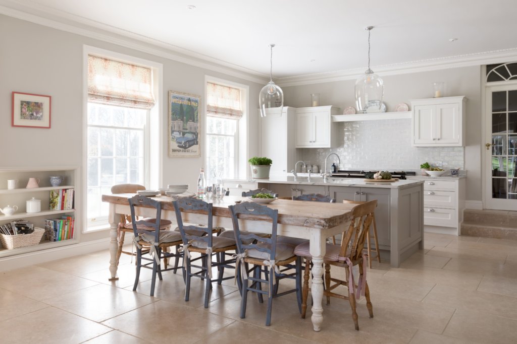
The story: This open plan Signature Bespoke kitchen was designed and made for a converted drawing room on the ground floor of a Georgian farmhouse with beautiful original features and stunning floor to ceiling windows. It combines bespoke fitted cabinetry with freestanding furniture that was designed to perfectly complement the architecture of the building, yet with some very contemporary twists. The home is lived in by a family of four.
Designer Q&A:
Q) What was your brief from the client?
To design a traditional in-frame kitchen with an island to separate the functional cooking space and the dining area, which features an existing antique table and chairs. To also design two matching dressers on either side of the original fireplace for storage of necessary and decorative items. While the furniture was to look in-keeping with the style of the room, it also had to accommodate certain aspects for 21st Century living.
Q) How did you answer the brief?
I firstly looked at the architecture of the farmhouse as it was important to complement the style of the imposing Georgian building and to design a kitchen that would be functional and with modern twists, but to not look out of place. The room itself was very capacious, but it also had a separate utility room next to it (which we also designed) so I knew that the focus of the kitchen area was on food preparation and cooking together with informal socialising and entertaining. The showpiece is the stunning antique dining table and chairs in the centre of the room.
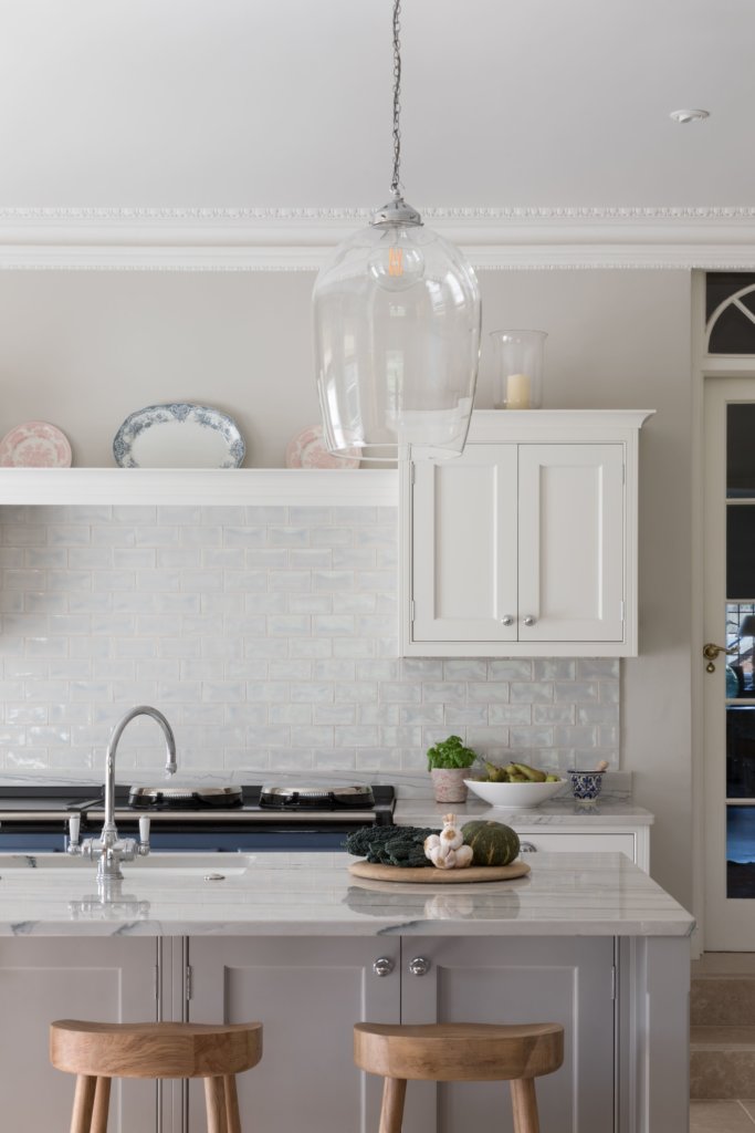
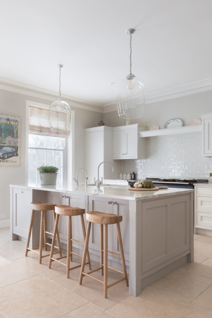
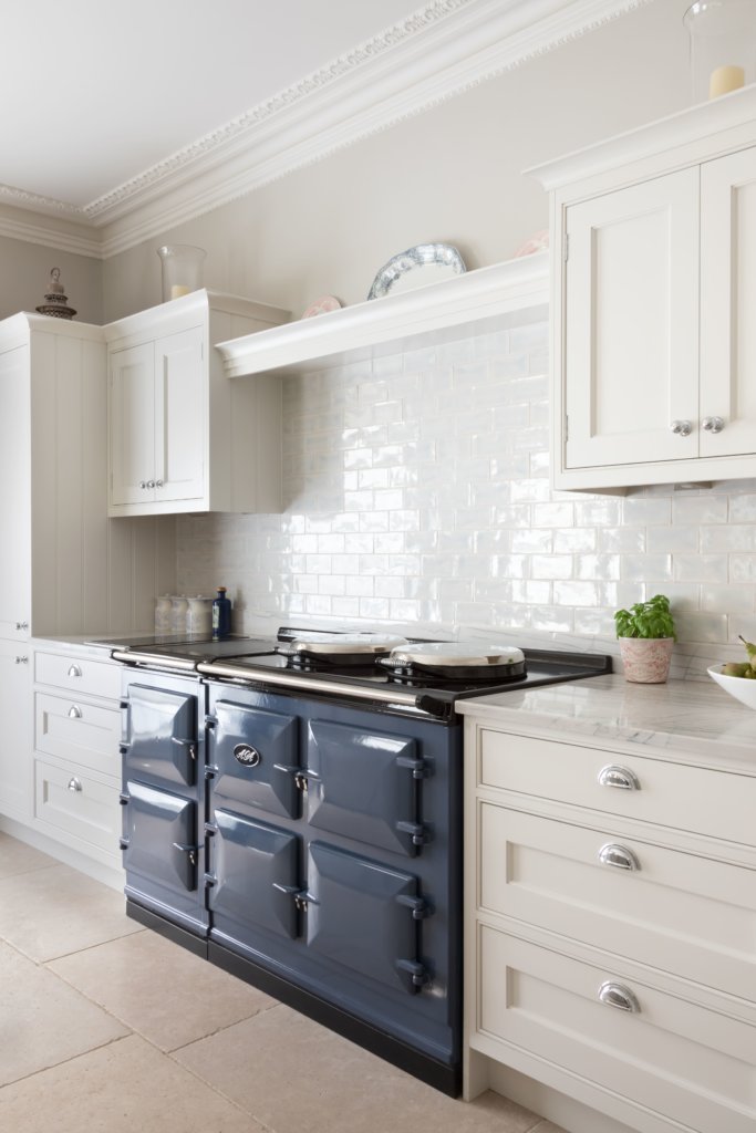
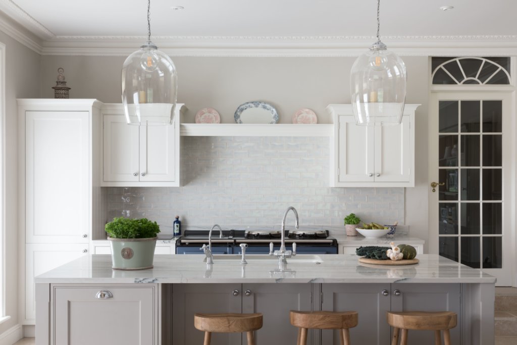
I designed a Shaker style kitchen with a cock-beaded frame and this was handpainted in two different colours. To keep with the style of the room, I also designed a decorative shelf to sit directly above the Dartmouth Blue AGA, which is in the centre of the wall-run. On either side of the AGA are dovetail drawers with shell handles. Wall-mounted cabinetry included a full height fridge freezer and instead of a splash back, which may have looked too modern for the room, we used white brick tiles with a pearlised sheen instead, to reflect the enormous amount of light.
The island features both undercounter cupboards and dovetail drawers for storage together with two integrated dishwashers for a busy household. I specified pale granite worktops throughout and the countertop for the island is extended to one side, while the cabinetry is reduced in width in order to accommodate stools facing the kitchen for informal socialising. The island is also used as the food preparation space and wet area.
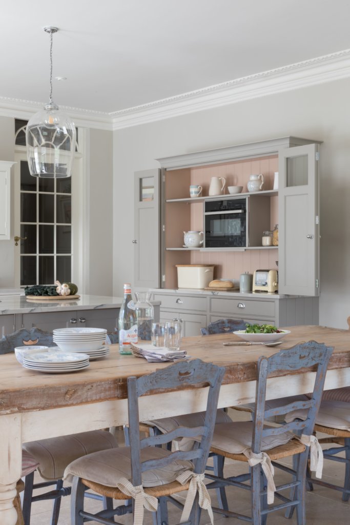
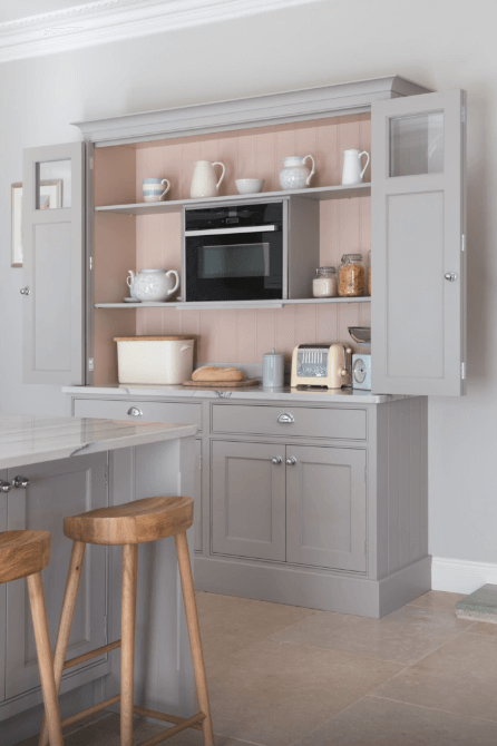
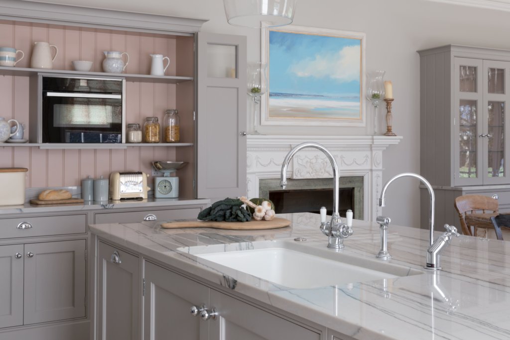
Because the room has beautiful floor to ceiling windows and a grand original fireplace, I designed the bespoke dressers to look as if they had been in place for years, yet with modern touches like bi-fold doors, and because there was an AGA in the kitchen, I also wanted to ensure there was another working combination oven to use, but one that would be concealed until required during the months where the AGA would be switched off. This also meant including a domino induction hob to the side of the AGA in the scheme for surface cooking.
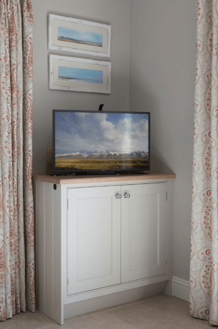
The client did want to make one concession to 21st century living in the room and she asked if there was some way to include a slimline TV, yet conceal it when not in use. In order to keep the look of the kitchen diner beautiful and romantic, I designed a matching reduced depth cabinet, which opens at the top to reveal a pop-up TV activated by remote control.
Q) Which products did you use and why?
I used White Macabus Sensa Granite for the worktops because it reflected the soft romantic look of the kitchen and instead of a contemporary-style sink I suggested a white ceramic one-and-a-half sink to match with the worksurface. It’s a large sink to accommodate the trays from the AGA.
I recommended a Liebherr fridge freezer, because they make standard-sized models yet they are really advanced in their specifications. While a discreet Quooker boiling water tap was installed to use instead of having a kettle on show, we also featured a more traditional tap by Perrin and Rowe to keep with the style of the kitchen.
The dishwashers are by Miele and the additional combination microwave oven and the Flexi zone induction hob both by Neff, and these are ideal to use as back-up, especially for when the AGA is switched off during the summer months.
We worked together to choose the paint colours, which are all from the Little Greene Paint Company palette. The client, who has a great eye for colour, then came up with the idea of the pearlised pink interiors for the dressers and she was spot on with her choice, as it looks fantastic.
Q) Was there any building/renovation work involved?
There was for other rooms in the house, but other than a new stone tiled floor and bringing in plumbing and electrical supplies there was very little. It was a straight swap from being the original drawing room to becoming a kitchen. The utility room was in the former ‘ice room’ in the property.
Q) What elements do you think make the scheme so successful?
I love the look of this kitchen but, as a trained cabinetmaker, I am most proud of the freestanding dressers, as I think they look beautiful. This is where it works so much better to have bespoke furniture made, as they have the perfect dimensions to fit equally on either side of the fireplace and they look absolutely stunning.
Q) Any advice for someone who may be planning a new kitchen?
If you are looking to have a kitchen designed in a beautiful older property then research the kitchen designers that can confidently take on these types of projects. A bespoke kitchen will always be better than an ‘off the shelf’ version in this situation. The designer will listen to your needs and requirements and will fit them around a plan that will be in keeping, and importantly, always respectful of the language between the kitchen and the architecture of the building.
The details:
Signature Bespoke furniture by Searle & Taylor, www.searle-taylor.co.uk
Slaked Lime (cabinets) and French Grey (island) paint by Little Greene, www.littlegrreene.com
Sensa Granite worktops in White Macubus by Cosentino, www.cosentino.com
Appliances by Miele, Liebherr and Neff, www.miele.co.uk, www.home.liebherr.com, www.neff-home.com
Range cooker by AGA, www.agaliving.com
Sink and taps by Kohler, Perrin & Rowe and Quooker, www.kohler.com, www.perrinandrowe.co.uk, www.quooker.com
Hayley loves: the dresser with its bi-fold doors that open up to reveal a combination microwave oven inside and also the cabinet that conceals a pop-up TV so you can watch your favourite shows as you cook





Leave a comment