Cosy and textural blue and wood kitchen by The Main Company
 The designer: Alex Main at The Main Company
The photographer: Chris Snook
The story: Established in 1978, The Main Company is a family-run brand and is known for its inspirational projects and products. Incorporating both modern and traditional designs, every bespoke kitchen is made by hand by master craftspeople in its North Yorkshire workshop.
The Main Company prides itself on using the very best new, salvaged and reclaimed materials to create custom-made products which offer an abundance of individuality and personality. As one of the largest suppliers of reclaimed timber in the UK, most of the wood used by The Main Company for its kitchens, flooring and cladding is over 100 years old.
Designer Q&A:
Q) What was your brief from the client?
Located in West London, the brief for this project was to create a new kitchen which felt homely like a cosy bar – as the previous kitchen was quite plain and clinical – with plenty of space for socialising and entertaining.
The homeowners were inspired by the interior style at Soho House and the Riding House Cafés in London, so wanted to inject some of that personality into the scheme, whilst still incorporating practical elements that required minimal maintenance and could keep up with a busy family.
Q) How did you answer that brief?
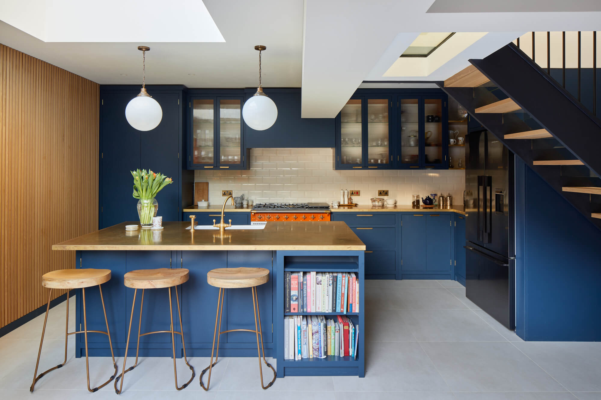
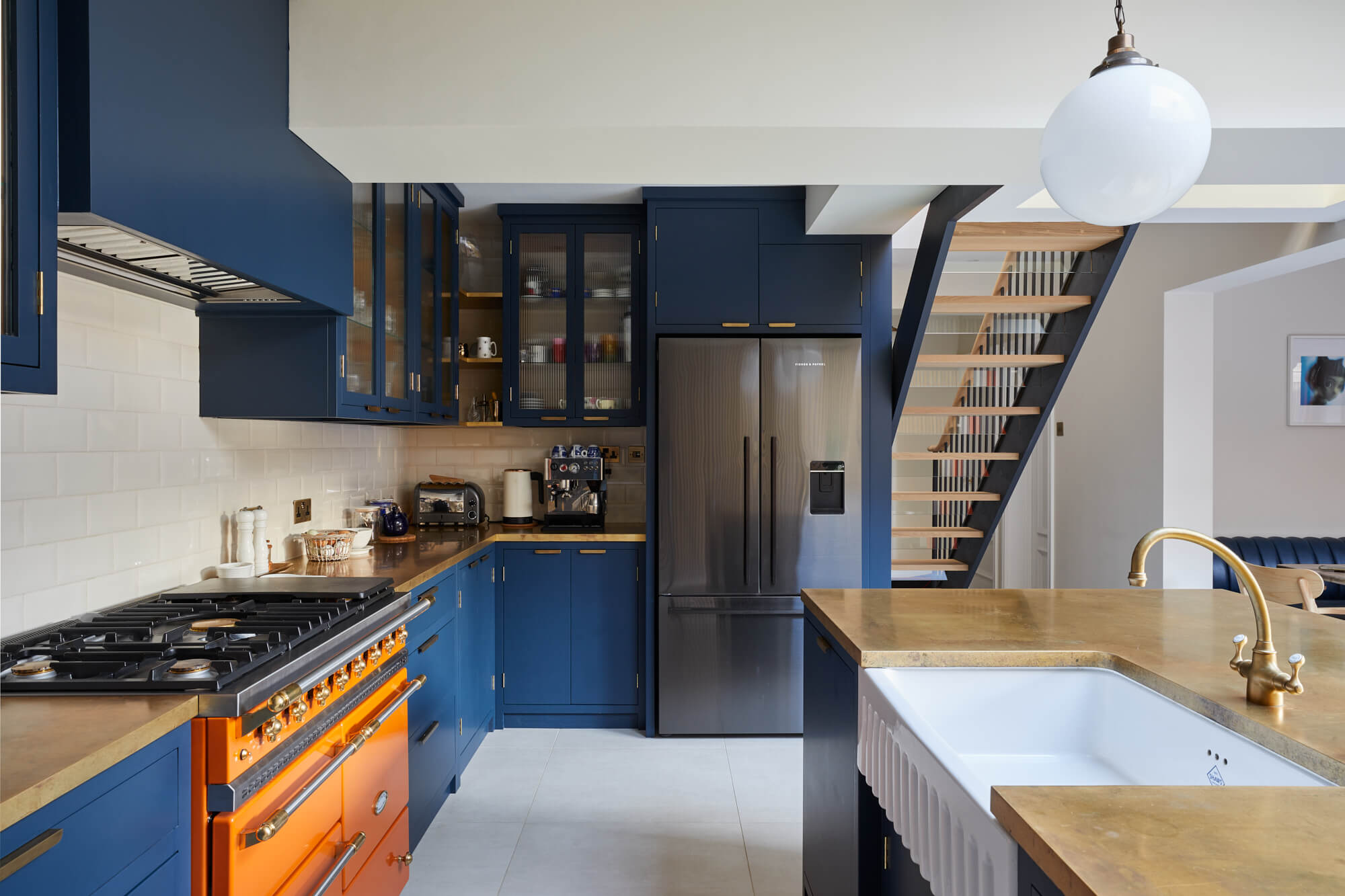
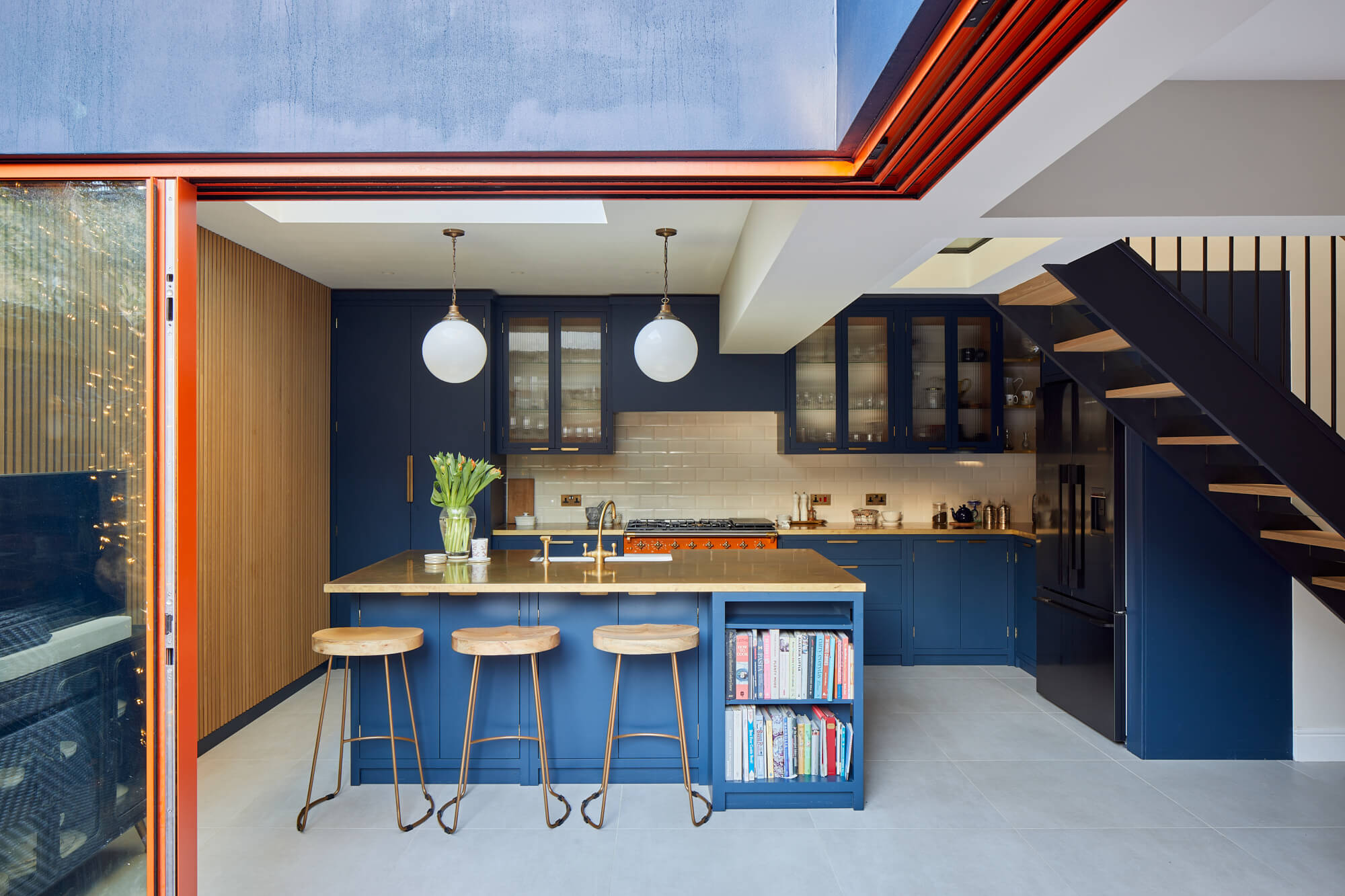
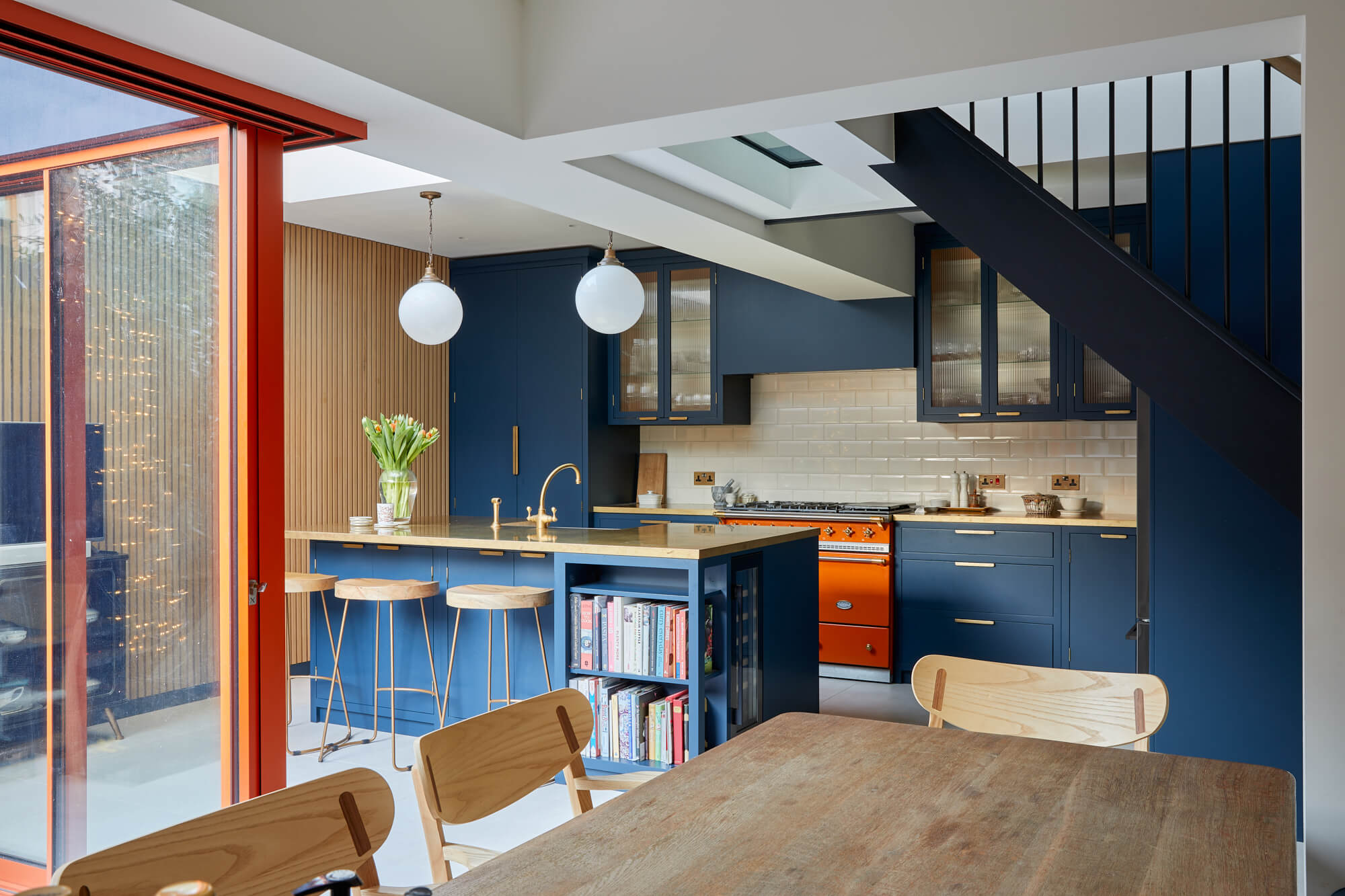
As the old space was lacking colour, we wanted to introduce bold colours and tactile textures in interesting spaces. We started with the mandarin-coloured Lacanche oven, which convinced the homeowners to order windows in the same shade of orange to match.
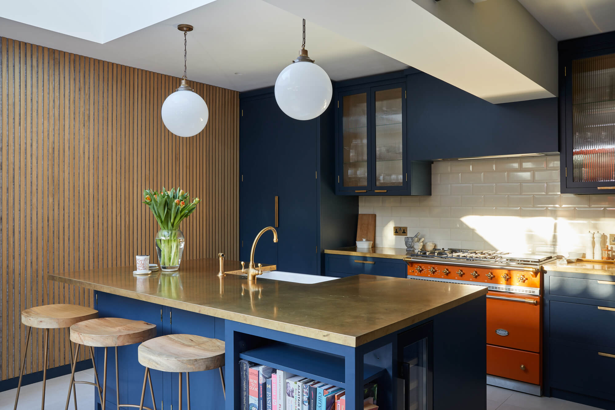
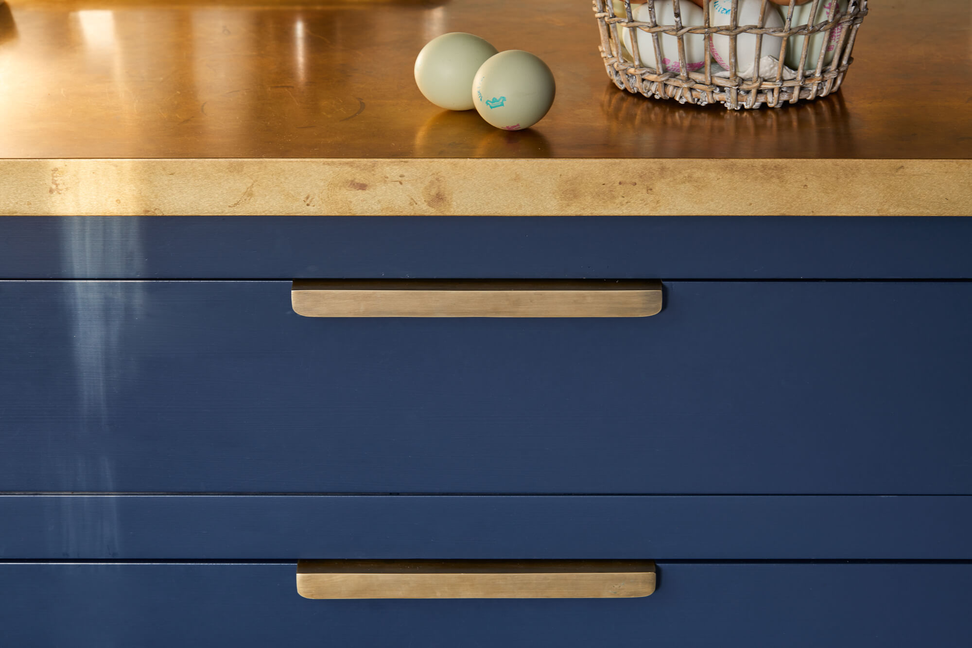
To add to the cosy atmosphere, we introduced warm, lived-in accents via the aged brass worktops, brass hardware and natural materials like wood on the walls and furniture. Although the cabinets are blue, these warmer elements tie the space together nicely, showcasing how traditional and contemporary design can be combined.
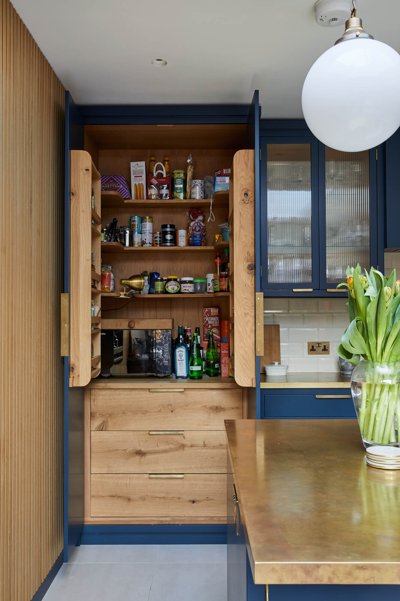
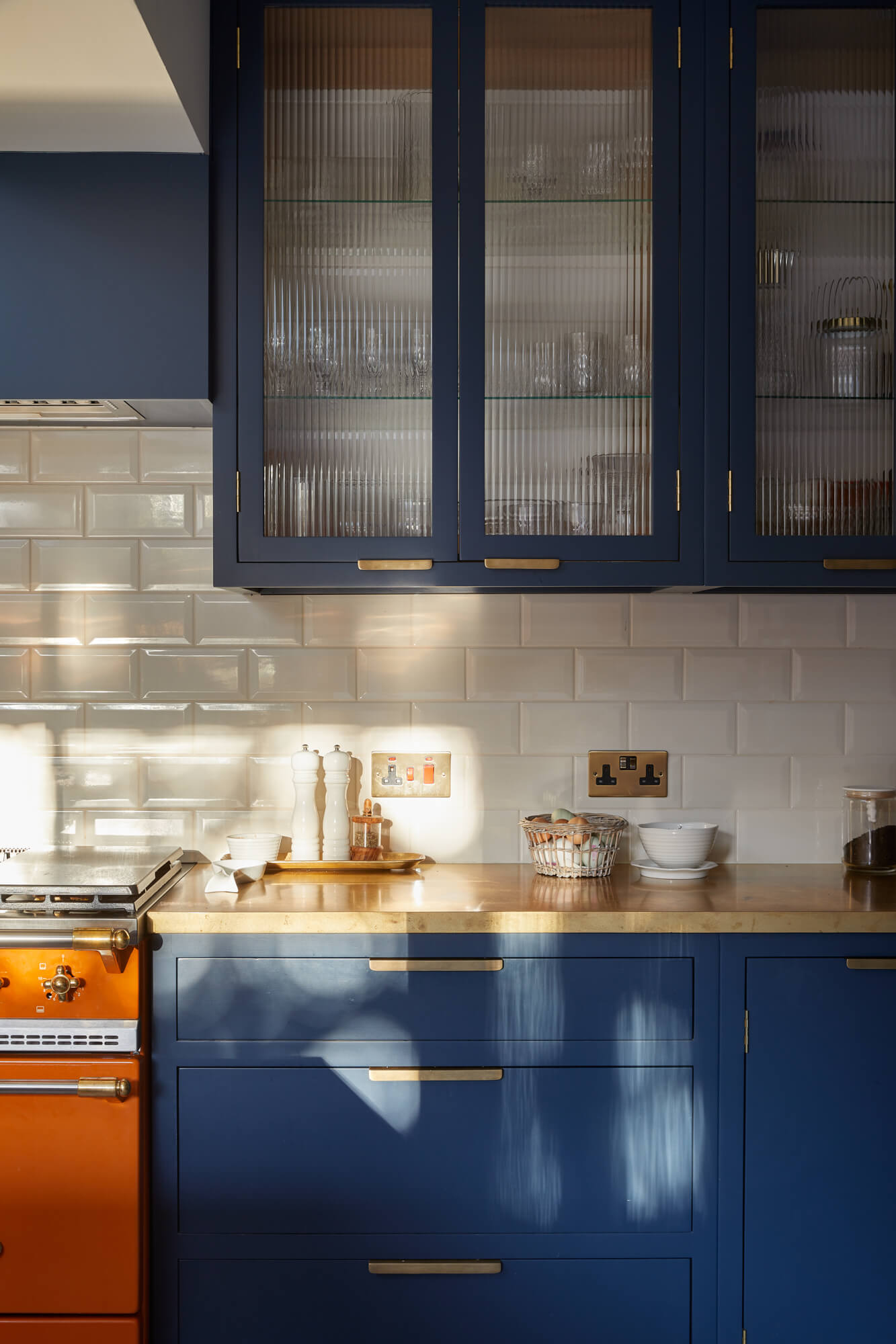
For the layout, we incorporated a central island with a sink, as this is key for social households as it can be used for both seating and food preparation. We then added a combination of wall cabinets and floor-to-ceiling storage for the pantry, along with elegant details like the fluted glass cabinet fronts to help bounce light around the room.
Q) Which products did you use and why?
Texture was an important part of the design to achieve that cosy, lived-in feel that the homeowners wanted. We therefore wanted to include an array of materials that would draw the eye in, provide functional properties and make a bold statement at the same time.
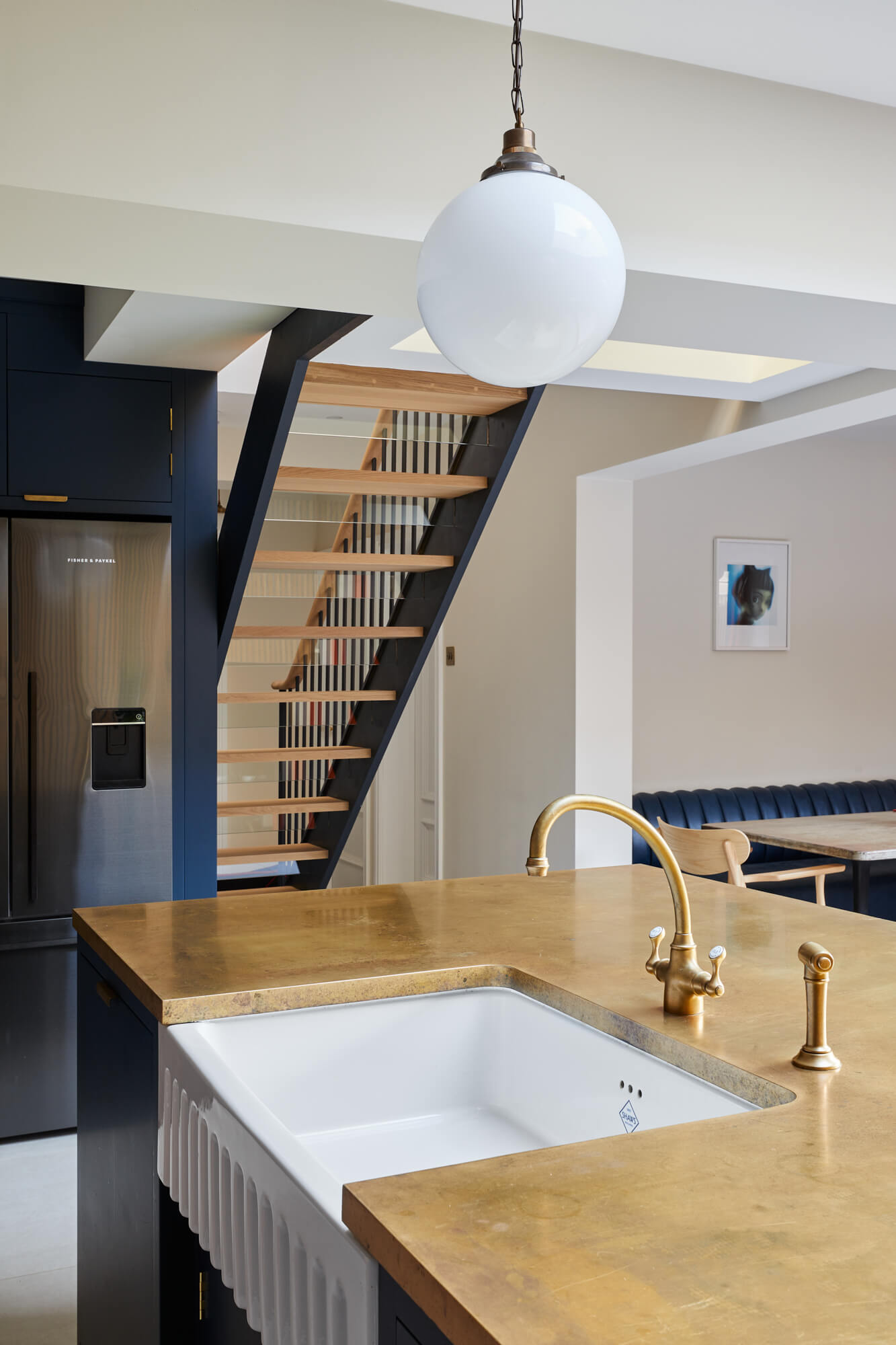
The Aged Brass worktop adds something unique and charming to the space and only gets better with age, plus it pairs perfectly with the smaller brass features via the hardware and knobs on the Lacanche oven, resulting in a cohesive space.
The showstopper is this mandarin orange oven. As this family’s day-to-day revolves around cooking and entertaining, a striking addition like this really pulls everything together.
The wood panelled wall not only adds warmth and a touch of the great outdoors, but the acoustic insulation properties were important to the family as a series of hard surfaces in a kitchen can negatively reflect sound in the space – especially in a lower ground kitchen.
Q) Was there any building/renovation work involved?
The Main Company was not involved in this part of the project. However, the home was originally two separate flats (lower ground floor and upper maisonette) owned by the family, which have been converted into one large, five-bedroom Victorian family home.
In the renovation, most of the house was remodeled, incorporating the lower ground floor flat to form the new family home with a small side extension over two floors. For example, where the new kitchen is now, used to be a bedroom, wardrobe and downstairs bathroom.
Q) What design elements do you think make the scheme so successful?
The materials and use of space are what make this kitchen so unique, as well as the spacious layout that can accompany a six-person household. While the kitchen needed to feel warm and welcoming, we didn’t overwhelm the space with too many colours and kept to a limited palette – which still has a beautiful result.
From the large pantry to the book storage in the island and the fluted cabinet fronts, these smaller details add character and dimension, which helps to combine the traditional meets contemporary aesthetic that the homeowners wanted.
Q) Any advice for someone who may be planning a new kitchen?
Planning a kitchen takes time, as it is such a multi-functional area of the home – so never rush the design process. From the lighting scheme to the storage, colour palette and materials, there are many elements that need to be considered, which need to be personal to you and what your household requires. There is no one size fits all! Ensure you speak to a designer who understands your needs and preferences and can create a kitchen which is timeless and beautifully made.
The details:
Kitchen by The Main Company
Worktops by Modum Worktops
Range cooker, hob and extractor by Lacanche; fridge freezer by Fisher & Paykel
Splashback tiles by Topps Tiles
Floor tiles by Floors of Stone
Wooden wall panelling by The Wood Veneer Hub
Lighting by Mullan
Sliding orange doors by Maxlight
Sink and tap by Shaws of Darwen and Perrin & Rowe
Bar stools by Evelyn Lily Interiors
Brass Kitchen Handles by Foundryman
Hayley loves: the bold blue and orange colourways, which work wonderfully with the wooden wall panelling to create a vibrant space that’s as cosy as it is creative.




Leave a comment