Contemporary Shaker Kitchen By Higham Furniture

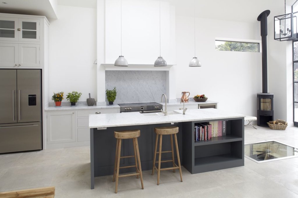
The story: For this project, the client was planning a whole house renovation with a significant and impressive rear extension that would span the entire width of the house and include a vaulted ceiling. The homeowners wanted the new space to be suitable for cooking, dining and relaxing so separate zones were created.
The designer: Tim Higham at Higham Furniture (www.higham.co.uk)
Designer Q&A:
- Q) What was the brief from the client?
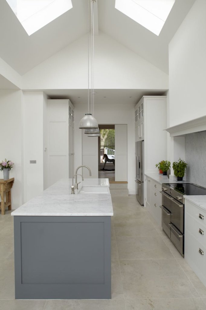
The owners wanted an open plan social kitchen designed for entertaining and relaxing. The vaulted area with tall 5m ceilings was visible from the whole room and Lucie wanted the island to be central with the feature of a chimney at the top of the T, providing a focal point and frame for the cooker. They wanted a classic, simple Shaker style kitchen with large proportions so symmetry, alignment and generous proportions were key.
The general feel was ‘elegant industrial’ with a bespoke steel Crittall window/door panel, reclaimed factory-style pendant lights and a Scandinavian-look wood burning stove. The owners’ overall desire was to have an uplifting space that draws you in and invites you to linger.
2. Q) How did you set about answering that brief?
The grand proportions and vast glazing give the kitchen an uplifting effect while industrial touches keep it accessible and liveable. The symmetry was very important to create a feeling of harmony – this makes the space relaxing and joyful. Features like the wood burning stove and wine cellar keep it playful.
Light was also important with the large glass wall and doors at one end, giving it a slightly industrial feel. An underground wine cellar was also added.
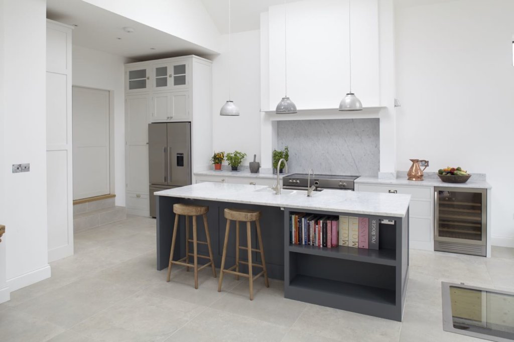
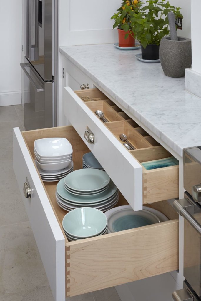
The vaulted ceiling in the extension provides amazing scale while the darker island colour brings some depth to the kitchen. Centralising the island and canopy on the top of the T works well and creates a dramatic focal point. Also, in the big three-metre high larder cupboard, drawers were added to the bottom to offer additional storage. Racks on the doors can be used for bottles and spices and such.
3. Q) Which products did you use and why?
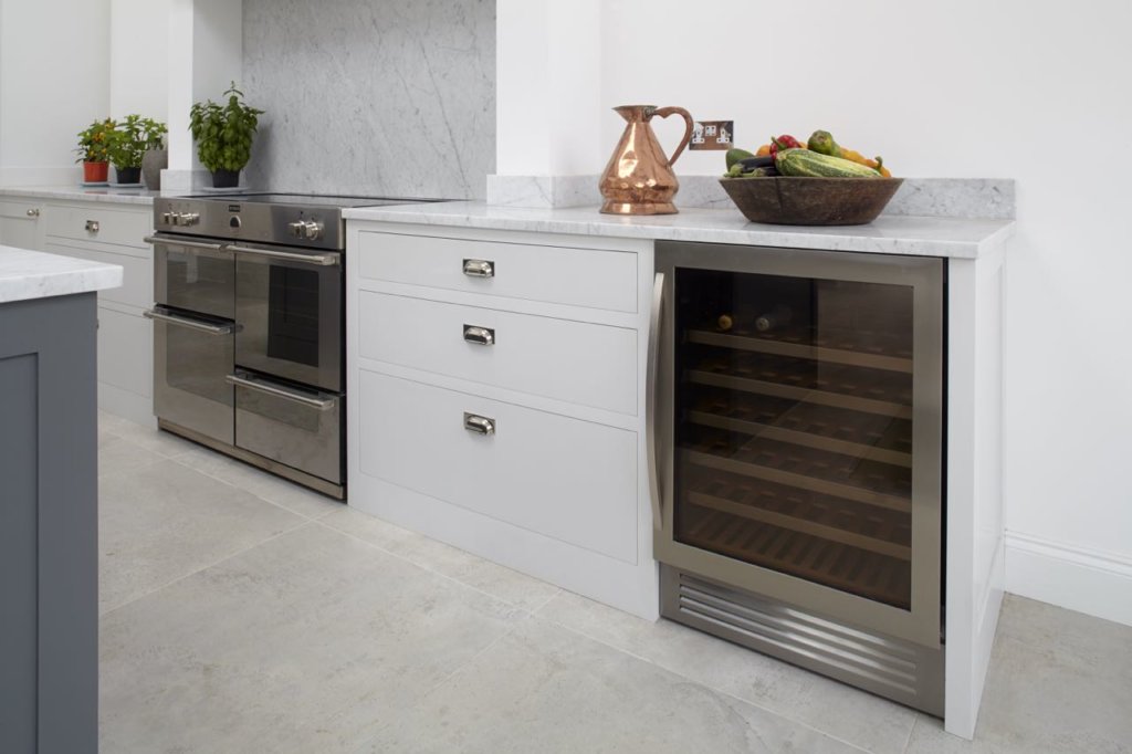
We used Little Greene paint colours – Scree 227 for the island and French Pale Grey 161 for the rest of the cabinetry. The doors are of a very simple Shaker style with 70mm rails rather than having a more traditional door with moulding. Other materials included 30mm thick Carrara marble for the splashback and worktops.
4. Q) Was there any building/renovation work involved?
This Edwardian six-bedroom house had a large rear extension. The house was originally a bungalow – unusual for the Edwardian era – and has been extensively renovated and reconfigured. All the period features have been retained wherever possible, and it also benefits from the 10ft ceilings and good room proportions that grace Edwardian houses.
The owners had the kitchen redesigned as part of their major house renovation and were in the fortunate position to be able to completely reconfigure the space and add some interesting features and architectural details such as exposed steel beams, a vaulted ceiling and the wine cellar.
The property is surrounded by garden on all four sides and this, coupled with large amounts of glazing, makes the house very bright. The house is open plan but split-level and can be easily divided into sections with several sets of double and sliding doors, which make the living spaces flexible and social.
5. Q) What elements do you think make the scheme so successful?
In many ways it is a very traditional kitchen, elegant in its simplicity and symmetry with an enormous dining table centred on the grand chimney with the island delineating the space between. The scale and size of the cabinets were also critical to its success. It sits so well in its surroundings, it looks as though it has been there forever.
6. Q) Any advice for someone who may be planning a new kitchen?
Make the most of any original features. If you are using an architect, make sure it’s someone that understands what you want to achieve and how you live. Think about function as well as aesthetics. Lighting is not an afterthought
The details:
Worktops and splashbacks by Middlesex Marble, www.middlesexmarble.co.uk
Appliances by Stoves, Bosch, Caple, Elica and Fisher & Paykel, www.stoves.co.uk, www.bosch-home.co.uk, www.caple.co.uk, www.elica.com and www.fisherpaykel.com
Sink and tap by Villeroy & Boch and Perrin & Rowe, www.villeroy-boch.com and www.perrinandrowe.co.uk
Hayley loves: the idea of the hidden wine cellar discreetly designed below the floor with its glazed door for a sneaky peek inside.




Leave a comment