Contemporary Bespoke Kitchen For A Listed Building By Johnny Grey
By Hayley Gilbert

The designer: Johnny Grey (www.johnnygrey.com)
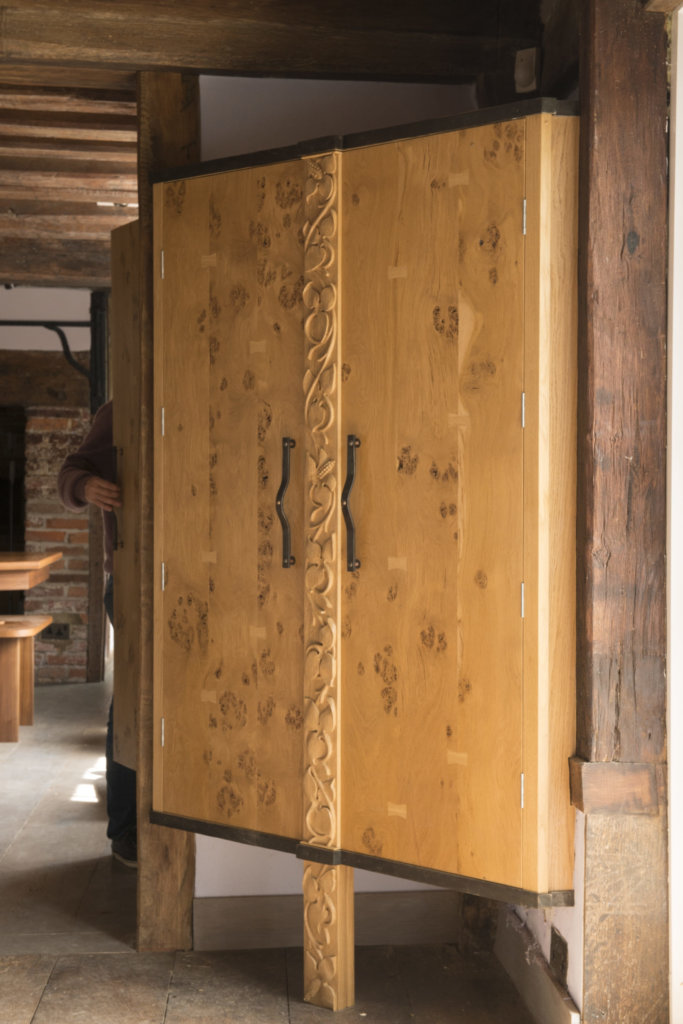
The story: The kitchen is part of a 15th century open-hall house. Historically it was floored with wood and heated by a smoke-bay (fireplace), visible at the dining room end. As a cross between a late medieval transitional building and an early modern design, the house retains many of the features of its predecessors. Johnny Grey obtained listed building consent to add a pair of French doors and permission to make an opening in the 16th century screen wall between the two main rooms. This provided the opportunity to create a sociable kitchen to accommodate the owner’s family more effectively.
Designer Q&A:
Q) What was the client’s brief?
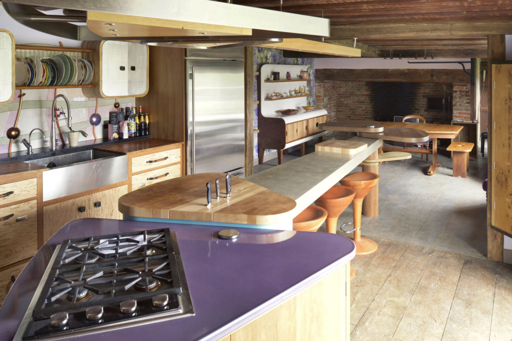
The brief was for a modern, sociable, living room kitchen – a family gathering spot for three teenage children and four large dogs. All home activities had to be accommodated, including laptop use for all, a large computer screen and hardwearing furniture, essential to cope with vigorous family use. The design was to be contemporary in style, innovative but distinct, making use of natural light augmented by discreet artificial lighting (bronze fittings) – a challenge because of the prominence of a large number of roof beams in the space. The overall feel was to be warm but modern with activity spread evenly across the newly enlarged two rooms.
Q) Tell us about the unusual island
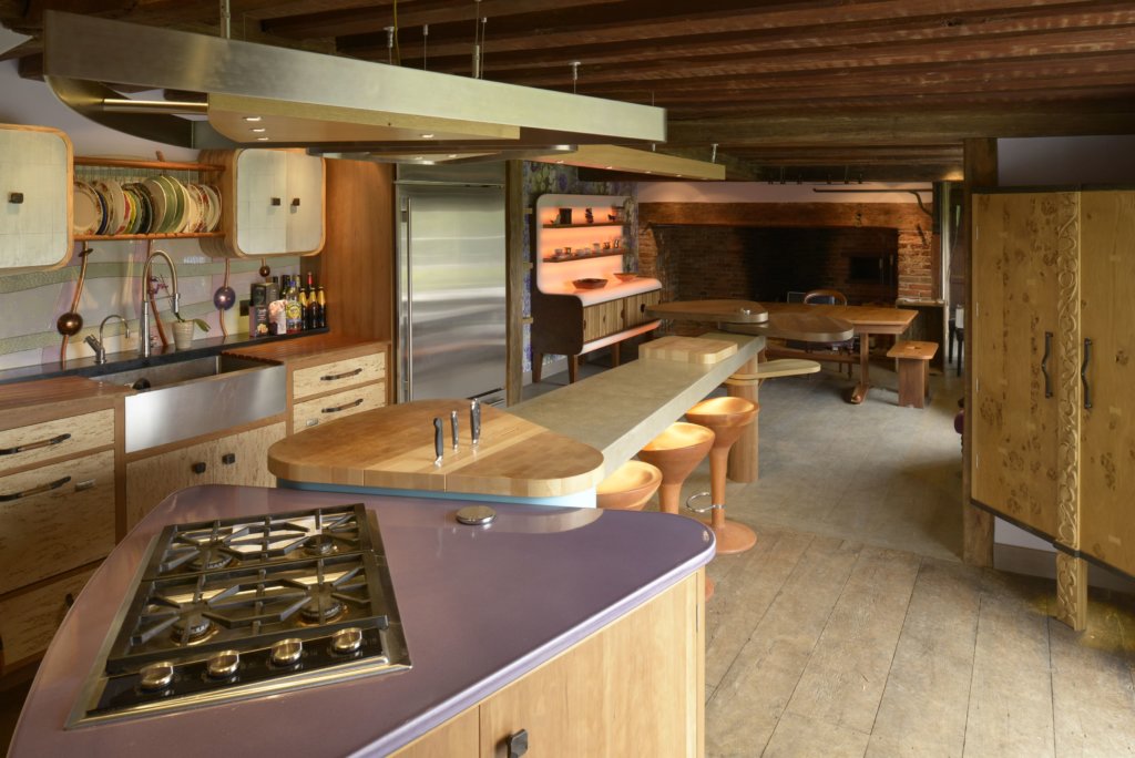
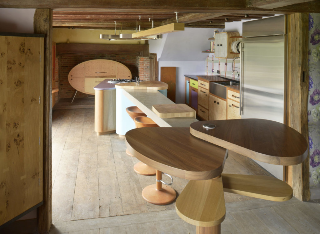
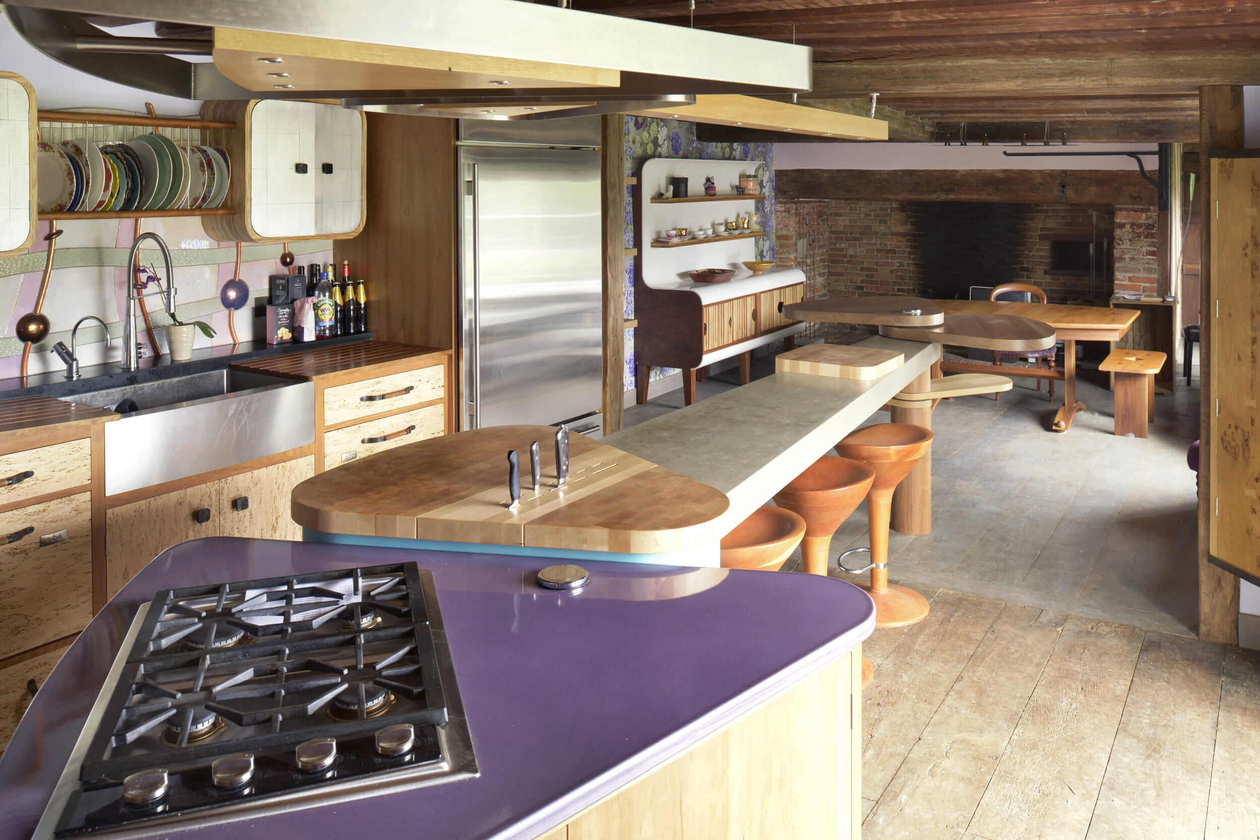
The Spine central island is a first in our series of revolutionary designs that cater for changing sociable and culinary functions. Flexible work platforms branch out from the long spine to host different activities. These consist of triangular surfaces at either end, some of which are movable. The middle is a three metre high raised height counter made in concrete that accommodates chopping boards with guide bars that can be moved at will. This is designed to be used for extra food preparation or for sociable activities, light meals, drinks, children’s homework – or whatever any member of the family wishes. Bar stools below can be drawn up to allow the surface to function as a desk, helpful for anyone performing a long task, for older people who like to sit down when they cook or younger ones who want to spend time on their screens or (hopefully) doing homework.
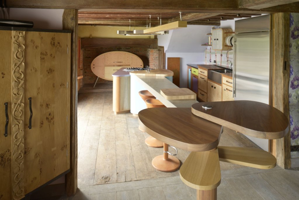
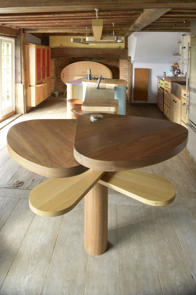
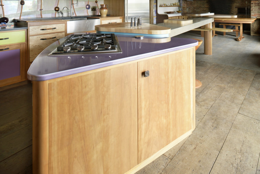
The culinary triangle end incorporates cabinets – one for cooking containing a hob and oven, the other, below an end-grain block, for storage of pots and pans. At the opposite end nearer the dining table, a wooden column with a steel inner core connected to thin discs supports a series of cantilevered propeller-style arms that at a lower level act as stools. These can be positioned to line up with a high-level table triangle for perching. Both surfaces are made of walnut and are big enough to use for homework or as a servery.
Q) And the sink cabinet and wall cupboard?
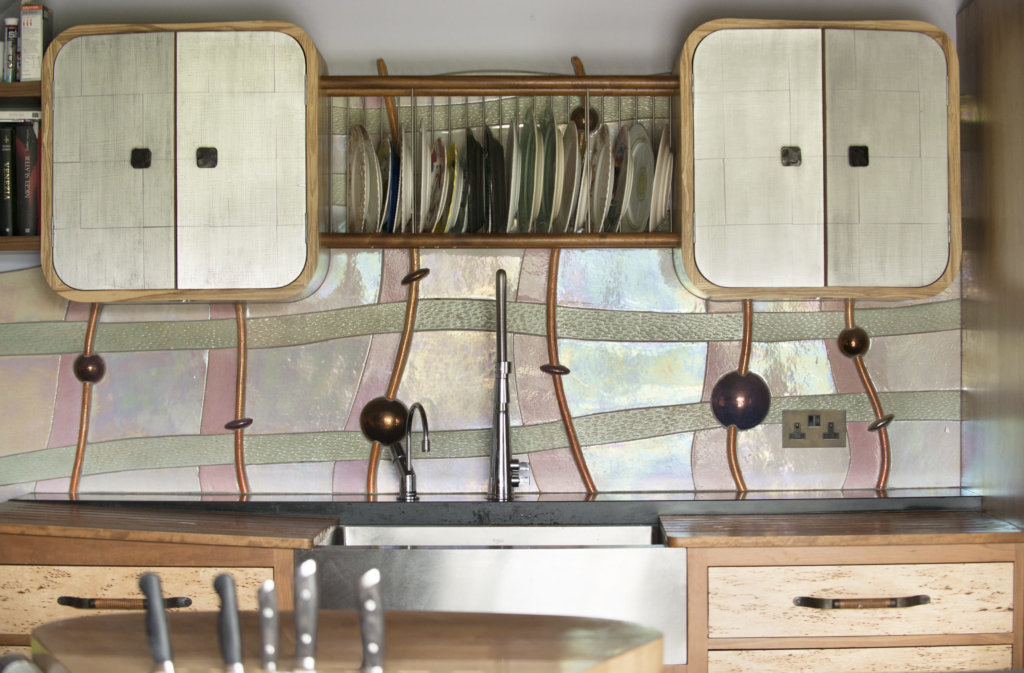
Here there are two countertop levels, one for washing up and one for back-up preparation. A large American Belfast sink in stainless steel with a curved front informs the geometry of the elevation. Raised height dishwashers from Fisher and Paykel flank it on both sides. The woods featured are Mazur birch panels with cherry frames that complement the colour in the dark markings of the birch. The draining boards are made in Iroko with black matt granite on the lower level.
Alex Zdankowicz tiles were integral to the design of the sink cabinet wall. He used an iridescent, pearl lustreware glaze to add interest and reflect light – the only natural light in the room is directly behind the sink cabinet. A pair of wall cabinets with rounded edges fit into the aesthetic of Alex’s tiles. They are designed for condiments, cups and glasses.
Q) What elements do you think make the scheme so successful?
The most striking feature in the kitchen is the presence of two inglenook fireplaces, as well as the original ceiling beams and walls being intact. Because of the building’s Grade 2 listing the architectural fabric could not be disturbed. We were able to preserve the inglenook fireplace untouched at the same time as providing urgently needed storage in the same position by designing a freestanding structure. The form of this is inspired by the shape an egg, a sputnik, and an armadillo. Its oval shape offers maximum storage combined with the pleasure of strong, pure, and free-flowing geometry, whilst still allowing sight of the inglenook’s timeworn bricks on the floor and walls. Putting the egg on legs also provided an opportunity to create dramatic lighting. For extra tactile interest we made its sides out of indented scoops of solid maple, a nod towards an armadillo’s skin. The cabinet has a pull-up door and a pull-out marble surface so that a food mixer and other small appliances can be used in situ. There is storage either side for crockery and cooking equipment in two cupboards hinged on the vertical edge.
The details:
Interior fittings by Blum, www.blum.com
Appliances by Wolf, Sub-Zero, Fisher & Paykel, www.subzero-wolf.com and www.fisherpaykel.com
Sink by Kraus, www.kraususa.com
Taps by Abode and Quooker, www.abodedesigns.co.uk and www.quooker.co.uk
Lighting by Mark Jackson Lighting Design, www.markjacksonlighting.com
Tiles by Alex Zdankowicz, www.alexdankowicz.co.uk
Hayley loves: how Johnny has designed an ultra practical kitchen that’s eye-catching and contemporary while still being in keeping with the heritage of the building



Leave a comment