Bulthaup Basement Kitchen by Kitchen Architecture
 The designer: Nikki Davis at Kitchen Architecture (www.kitchenarchitecture.co.uk)
The photographer: Darren Chung
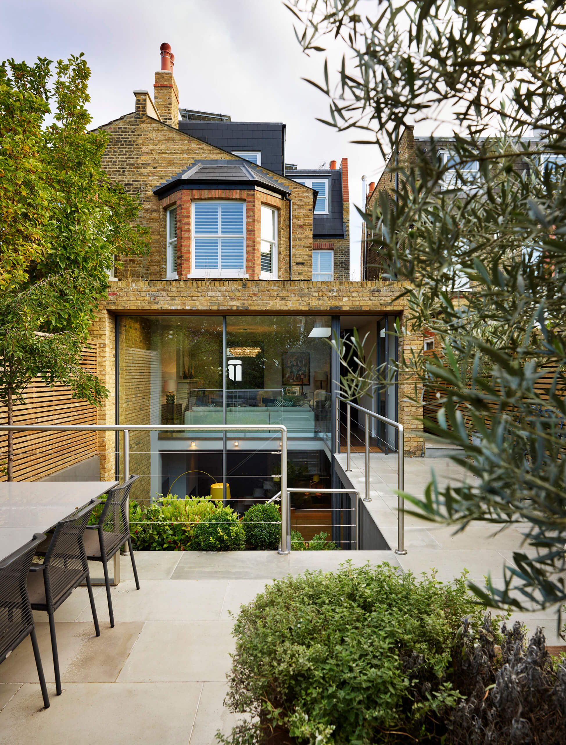
The story: Amanda Durham is an interior designer who lives with husband Tim, who works in finance. Their semi-detached Victorian house in London is now four-storey after being totally renovated.
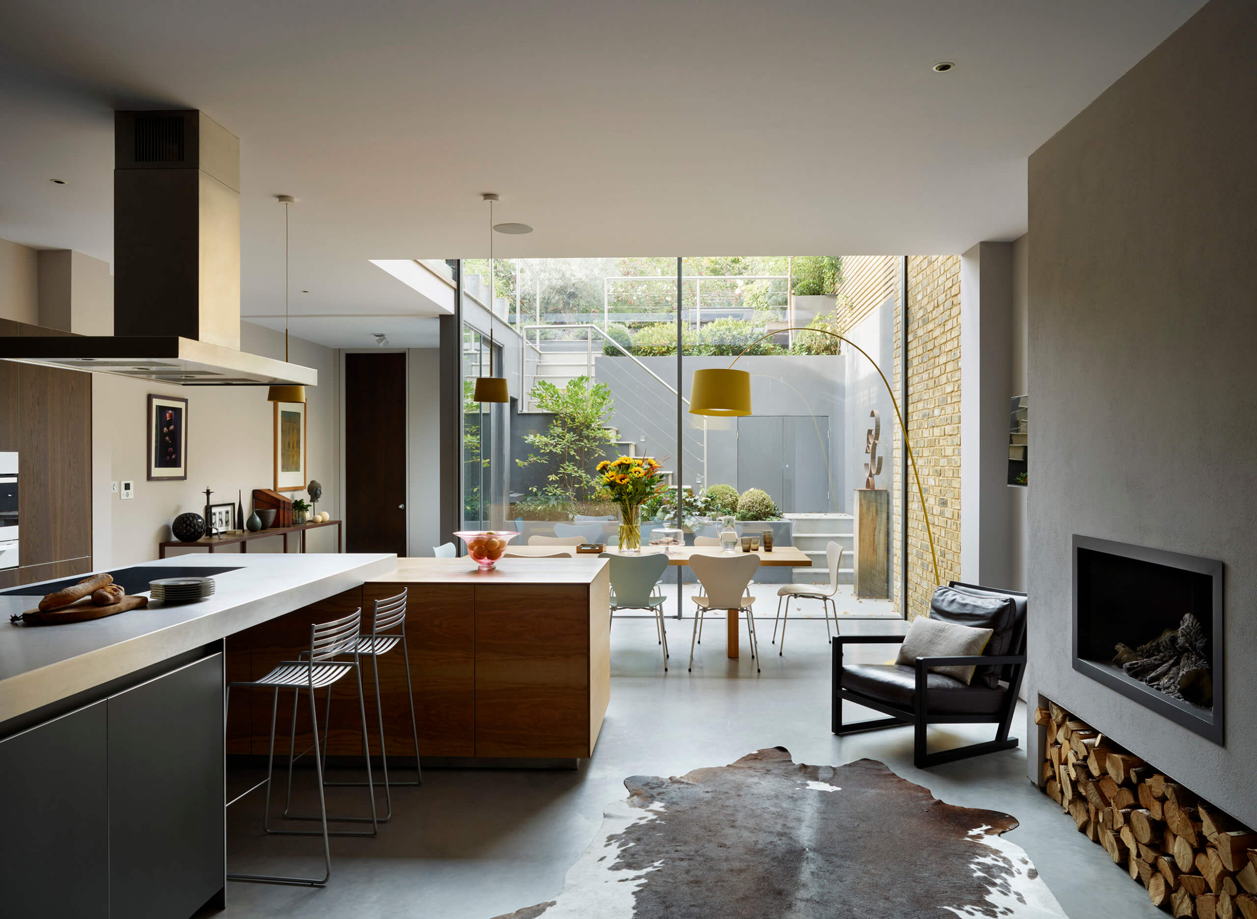
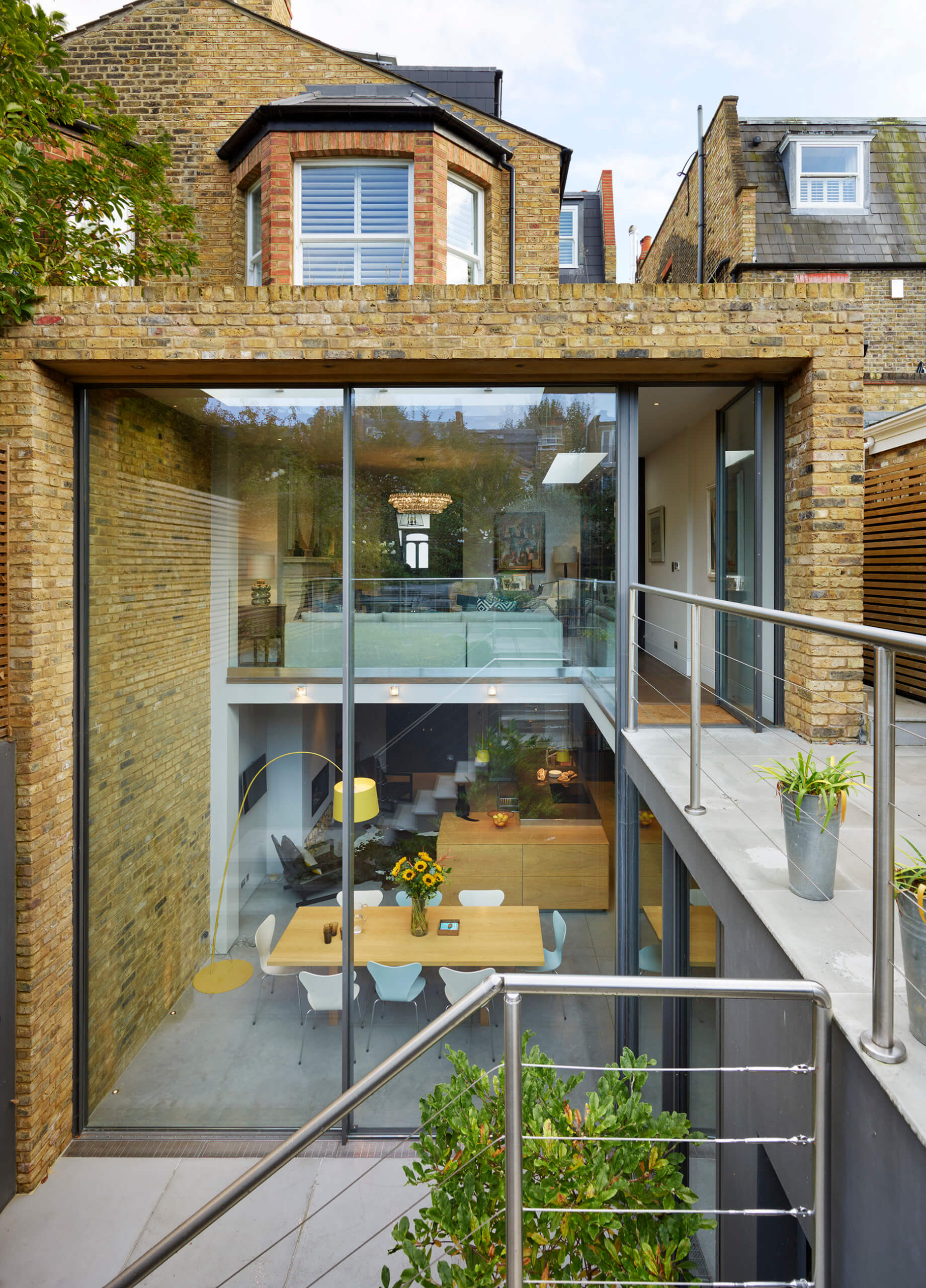
This involved extending to the rear and excavating a new basement level to create a lower ground floor kitchen with double-height dining area and full-height glass doors opening onto a sheltered terrace.
Designer Q&A:
Q) Why did the client want to excavate the basement?
They turned what was a two-storey property into a four-storey house by converting the loft and creating a new basement level. When they first bought the house, it was in a poor state of repair, and the couple spent about ten months completely modernising it. Fortunately, they were living in rented accommodation during that time as it was a huge project. Amanda had seen some amazing double-height glazed sliding doors, which could be easily moved with just one finger, and these were the starting point for the design. They mean that she can stand in the kitchen and cook while still being able to look out at the sky.
Q) Were there many problems to overcome with the basement build?
The couple worked with a builder and their in-house architect, who brought their vision to life. As an interior designer, Amanda draws up room plans all the time, but not external plans, so it was important to work with an expert when applying for planning permission. As they are semi-detached, they were worried that the neighbours wouldn’t want them to build a three-metre high wall, but planning permission actually went through very quickly. A huge amount of soil needed to be excavated with a small digger to create the lower ground floor level, and structural steelwork supports the house above. They had some terrible weather before the glass arrived and needed to protect the concrete floor.
Q) How did you come up with the design for the new kitchen?
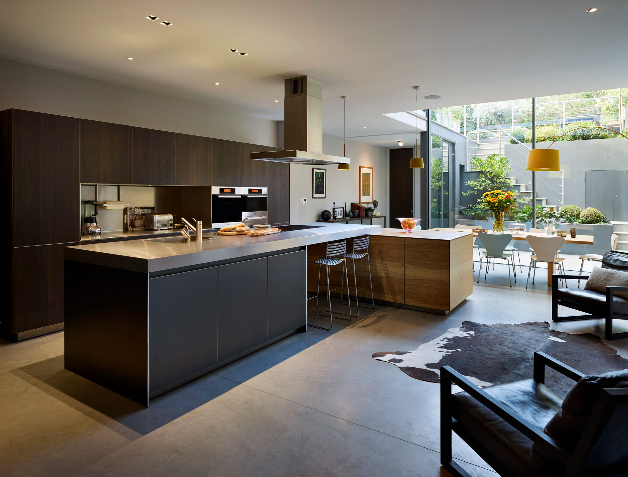
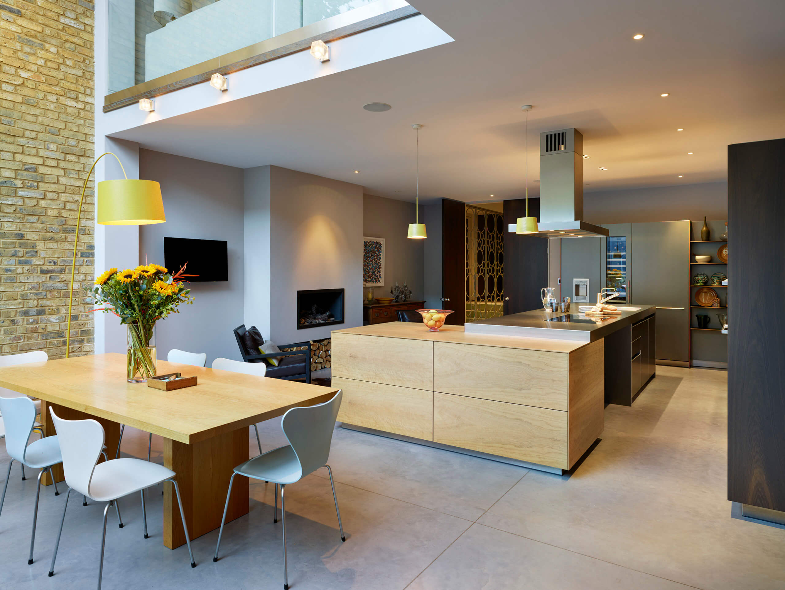
Amanda used to be a food writer and is a very keen cook, so she wanted a practical kitchen that wasn’t cold or clinical – it needed to be full of character rather than bland. The design focused around the Bulthaup B3 kitchen. There are aluminium door fronts, stainless steel worktops, olive wood and smoked oak finishes. Amanda wouldn’t normally choose quite so many different materials in the same room, but she loves the way they all work together.
Q) Why did you use such a variety of materials?
Most people think you need to keep the amount of materials to a minimum. But, as an interior designer, Amanda has a great eye and was excited to try something different. We had to be careful not to go too far and needed to get the placement right so it balanced well. I think the materials we chose complement each other beautifully and I love how it turned out.
Q) How practical is the design for everyday living?
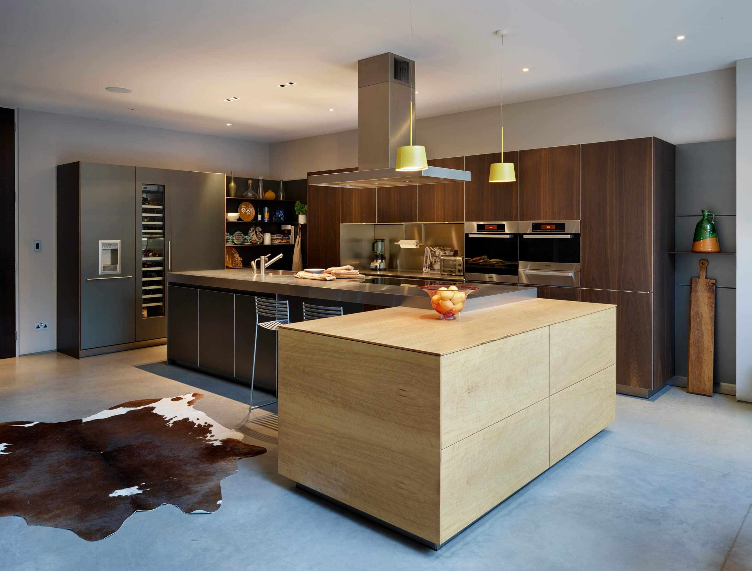
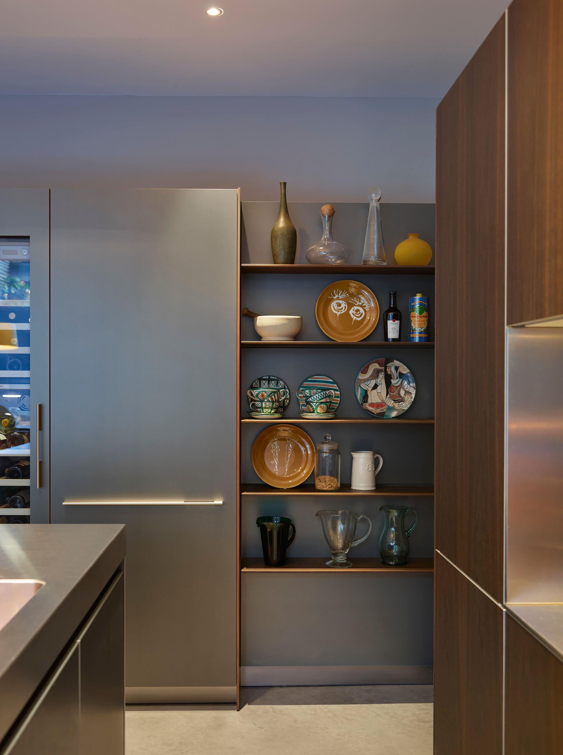
Our kitchens are incredibly sleek and elegant, but are also made with practicality in mind. Amanda wanted a space that was modern and aesthetically pleasing but it of course had to be highly functional too. The layout is very practical, as it provides a large workspace in the centre of the kitchen. The stainless steel worktops are easy to clean and very durable – ideal for families. There is also a huge amount of storage in this kitchen, specially designed to fit everything the homeowner needs.
Q) What was the biggest challenge you came up against as a designer?
This project went really smoothly – Amanda was a dream client! But the greatest challenge was keeping the design feeling light. Islands are really practical but can be quite heavy sometimes. We combatted this by creating the empty space under the hob, rather than having a solid base. We also chose a layout that leads fluidly into the dining area and draws your eye to the beautiful glass rear of the house. I also think the olive wood gives a great pop to the design, which lifts it really nicely.
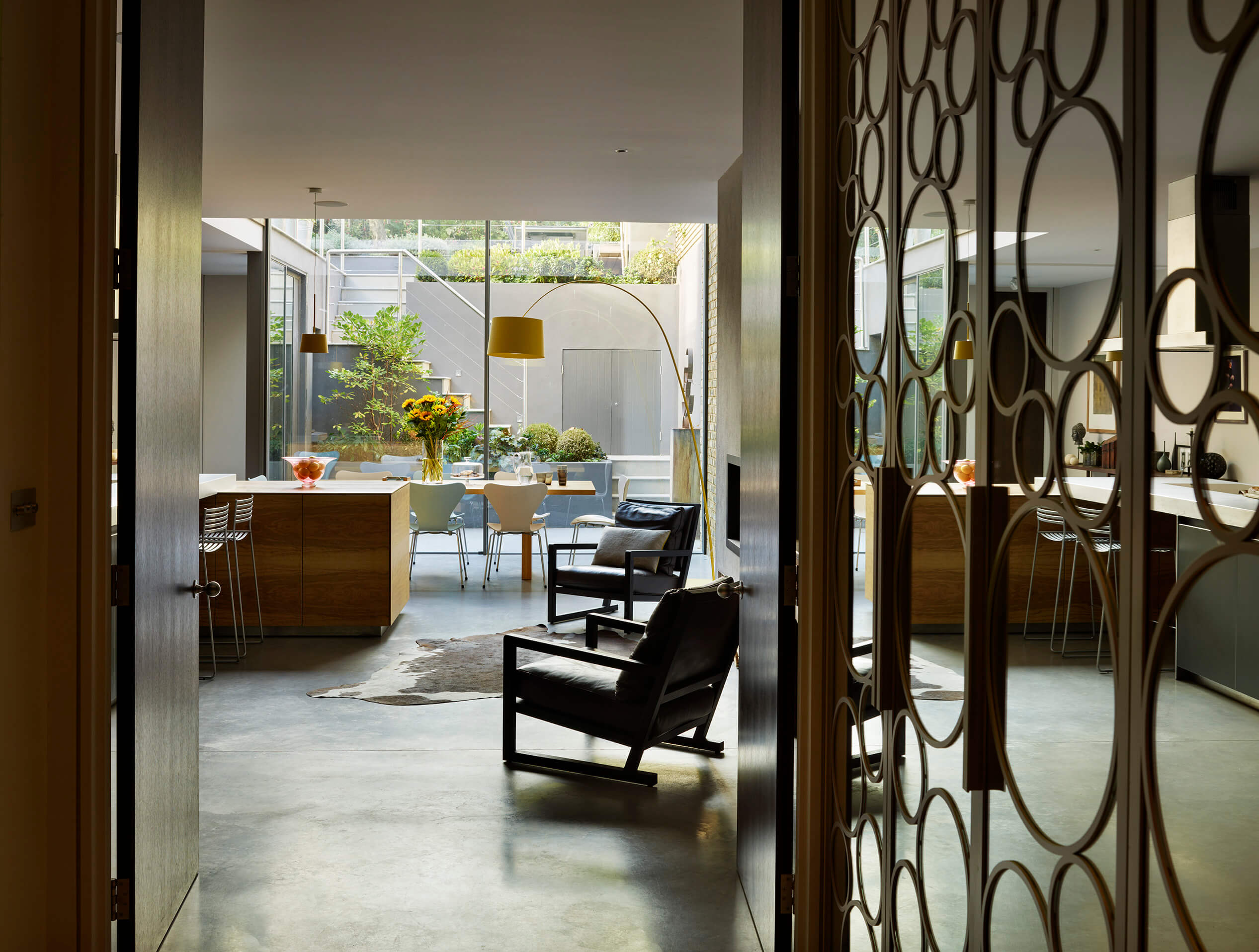
The details:
Kitchen: Kitchen Architecture
Architects: Snell David
Photography: Darren Chung
Interior design: Amanda Durham
Appliances by Gaggenau, Miele and Bulthaup
Bar stools by The Conran Shop
Lighting by Foscarini
Rug by City Cows
Armchairs by Poliform
Concrete floors by Lazenby
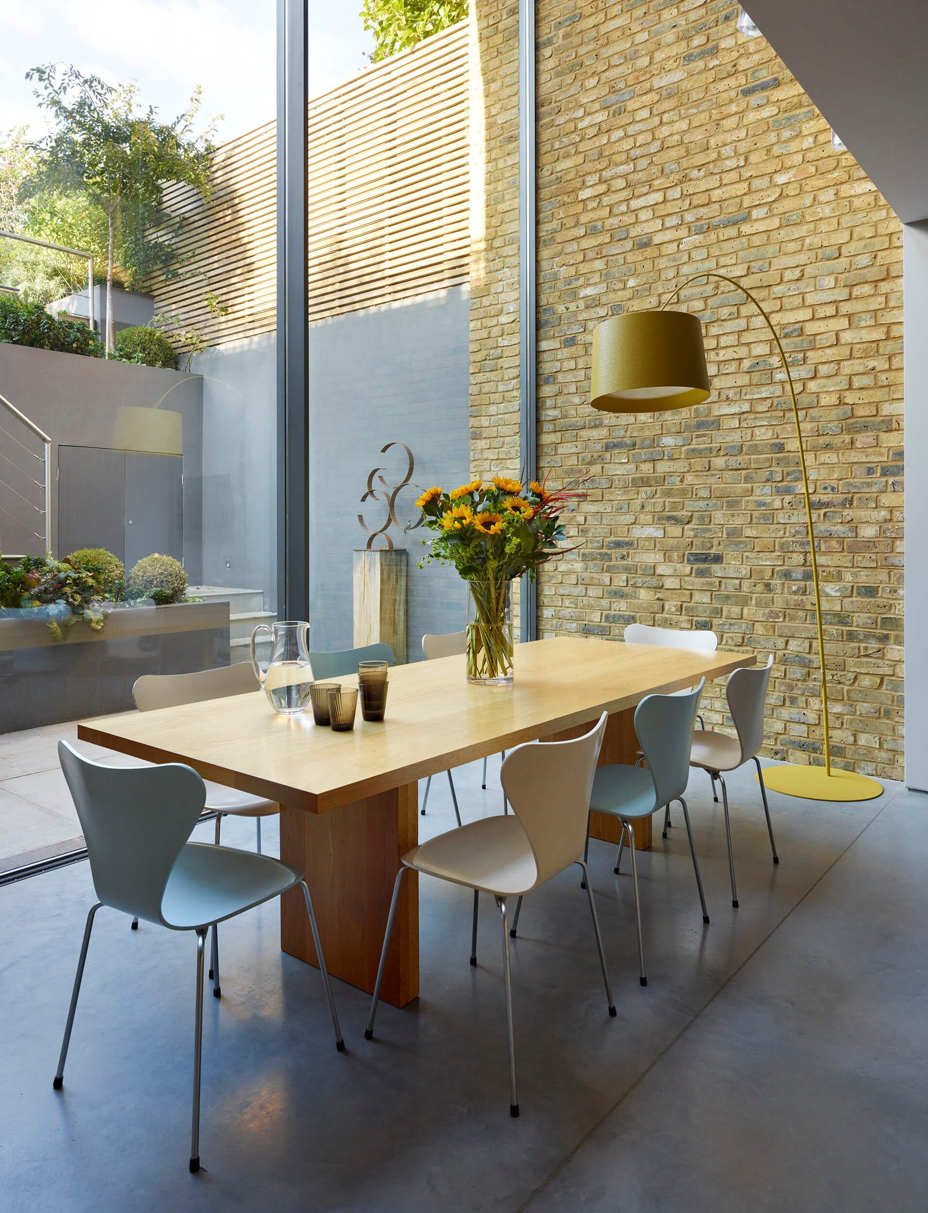
Hayley loves: the total mismatch of materials, colours, finishes and textures. It shows that if you just buy what you love, the result can be stunning.




Leave a comment