Bespoke kitchen by PAD in collaboration with Munro Interior Design Studio
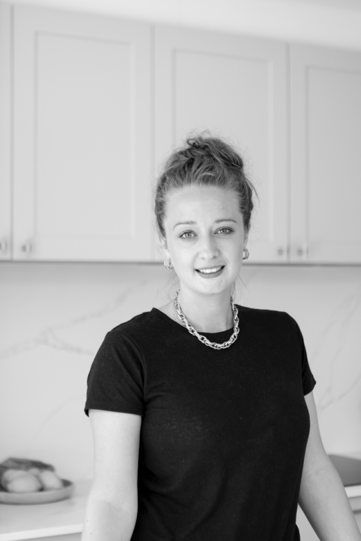 The designer: Libra Dalligan at PAD
The photographer: Freddie Marriage
The story: Munro Interior Design Studio’s clients had bought a lovely and light-filled two-bedroom flat in a Westminster Victorian mansion block. They commissioned Erik Munro to design a complete interior design scheme that would transform their existing space into an elegant London apartment with beautiful design features and finishes, which includes a new bespoke kitchen by PAD that blends with the rest of the apartment.
Designer Q&A:
Q) What was your brief from the client?
Munro Interior Design Studio had created the original design concept of the kitchen and briefed us to create a scheme using our bespoke range of cabinetry and appliance recommendations for professional clients who wanted a calm, light and fresh kitchen that blended with the rest of their new apartment design scheme.
Q) How did you answer that brief?
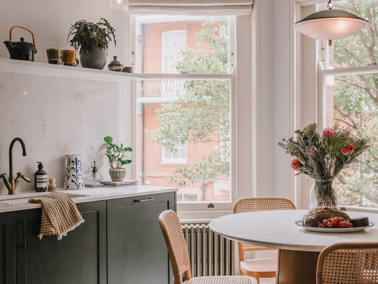
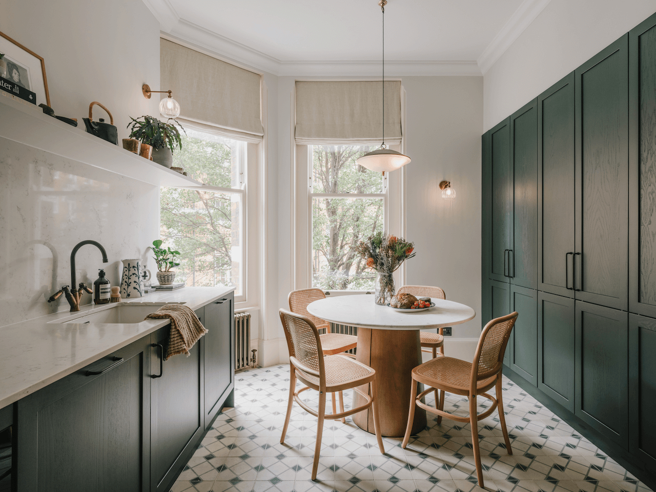
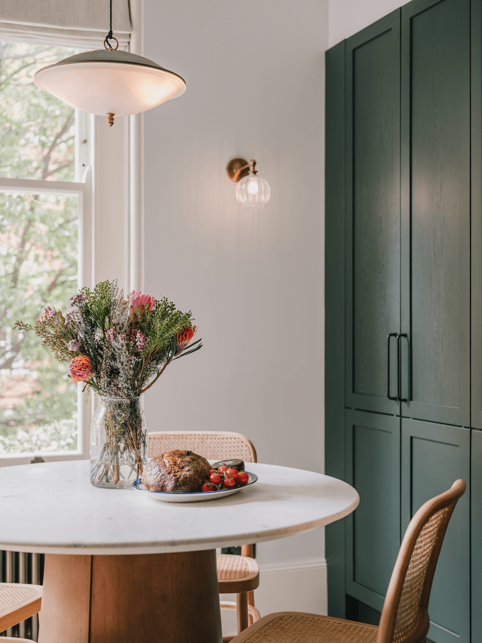
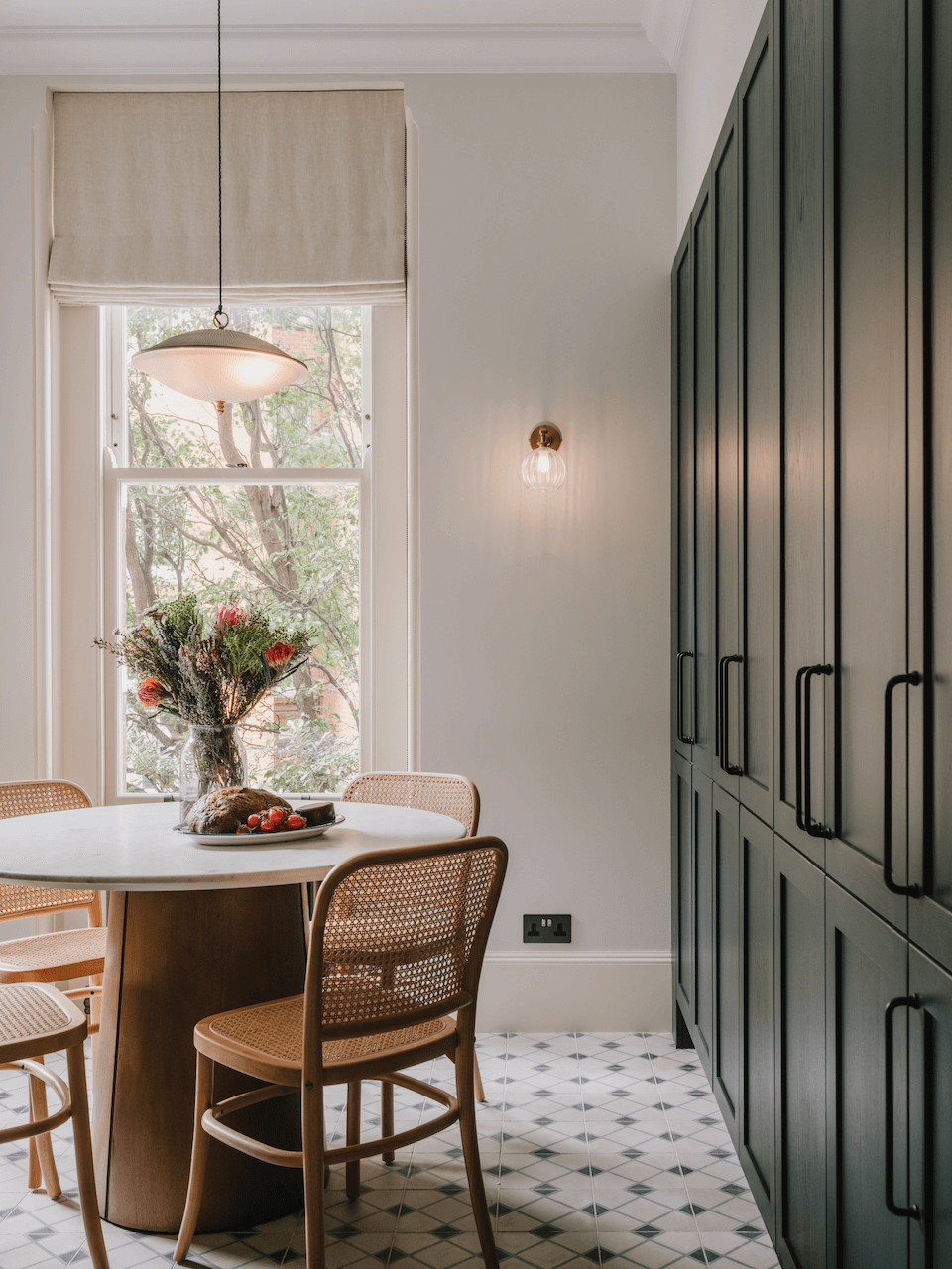
The clients wanted a circular dining table to comfortably seat four people so they could dine with friends and socialise in their kitchen, so the most natural space was to place it by the double sash window so they could enjoy the outside view.
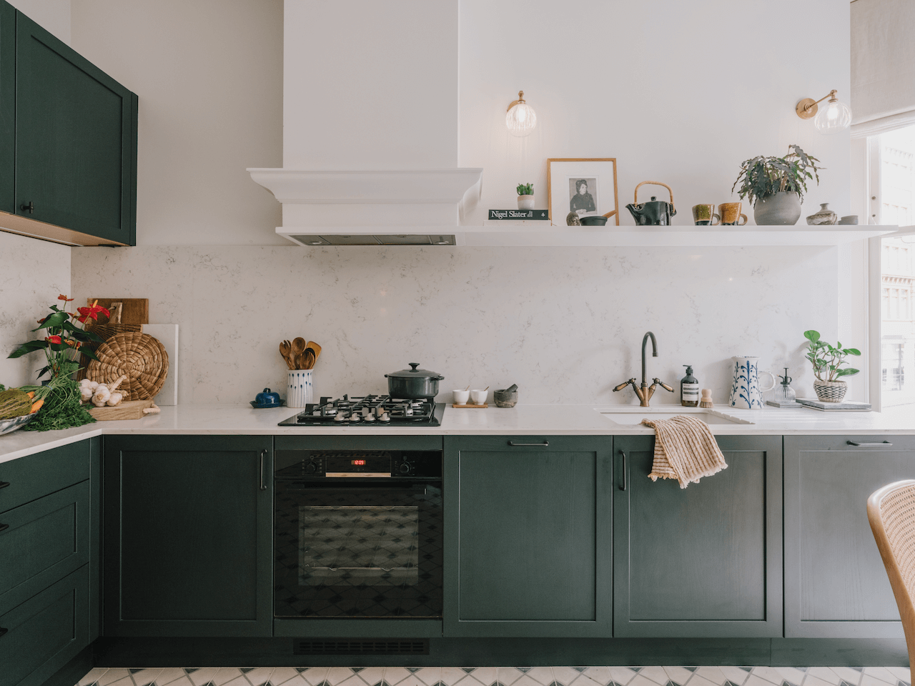
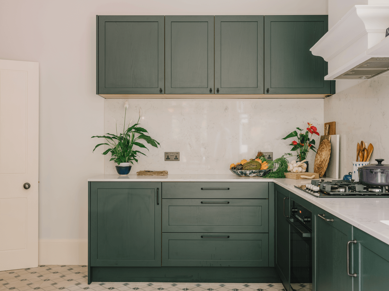
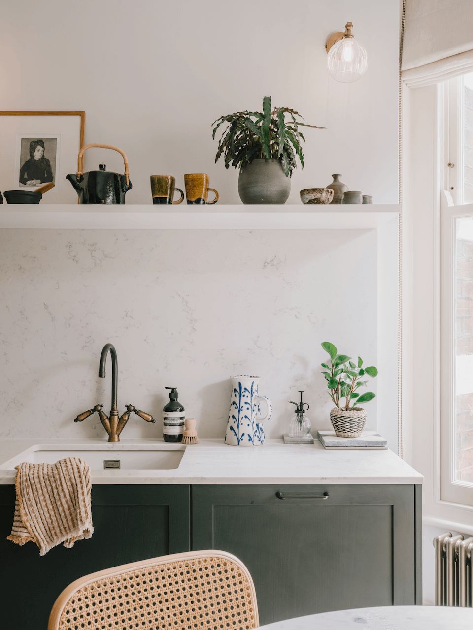
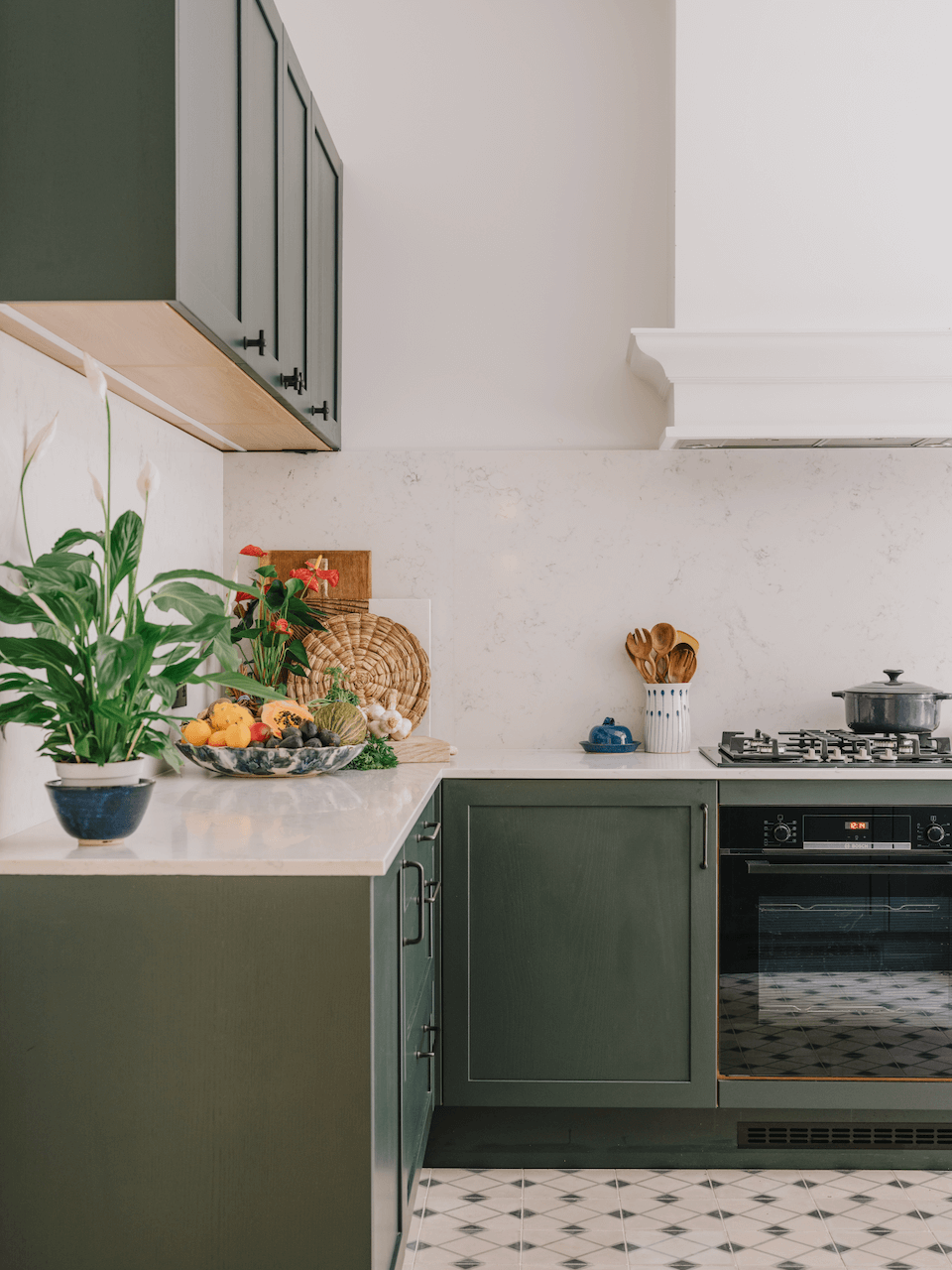
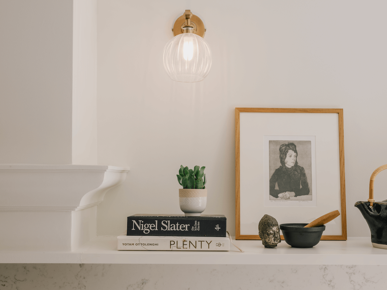
To ensure the space retained as much natural light as possible, a long open shelf was chosen instead of crowding the wall with additional wall cabinets – this shelf also allowed the owner to display natural foliage and favourite ceramics to add interest and colour to the room. We also ensured that this long shelf aligned perfectly with the Westin extractor over the Bosch hob to create a welcoming look when the clients entered the kitchen space.
Q) Which products did you use and why?
Considering the original period features and high ceilings, we chose our Elgin cabinetry from the St Johns Wood bespoke collection, which we fitted with Blum interior fittings.
The colour had to complement the rest of the redesigned apartment, so we recommended an elegant Highland Green that we matched with matt black handles for added sophistication.
Within the scheme’s layout, we included a line of double-fronted tall cabinetry to provide access to a utility cupboard with Miele washing machine and dryer and a Bosch double-height fridge-freezer so the space was functional yet elegant.
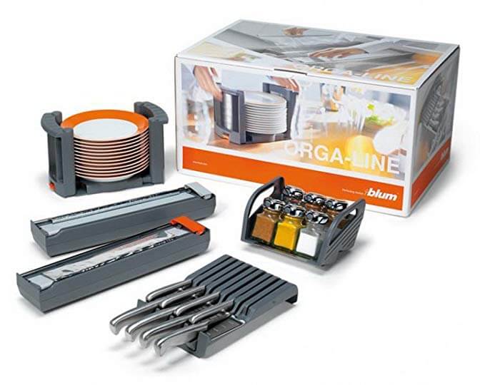
Within this, we added a large PAD pantry unit with integrated shelving, pull drawers and spice racks so the clients could keep the kitchen tidy and organised.
Q) What design elements do you think make the scheme so successful?
Tall cabinetry was kept to the internal wall of the kitchen so as much natural light could be enjoyed in the space. On the other two walls, the use of open shelving and less cabinetry kept the space open so the room didn’t feel overcrowded, with no cabinetry placed near the window. We also chose a bold colour and complemented it with a light, natural scheme for the walls, floors and worktop.
Q) Any advice for someone who may be planning a new kitchen?
Before you think about the cabinetry choices, consider the architectural elements of your space, as the natural light, room shape, ceiling height and style of the home will be important considerations.
Don’t be afraid to add colour, just be mindful of what materials and colour palette you choose around it – and limit the number of different colours, materials and textures depending on the size of the space.
Think about the function of how you will use the space, so the design works hard and helps you enjoy using and living in it. Remember that a beautiful kitchen should also be practical and user-friendly.
The details:
Bespoke cabinetry by PAD
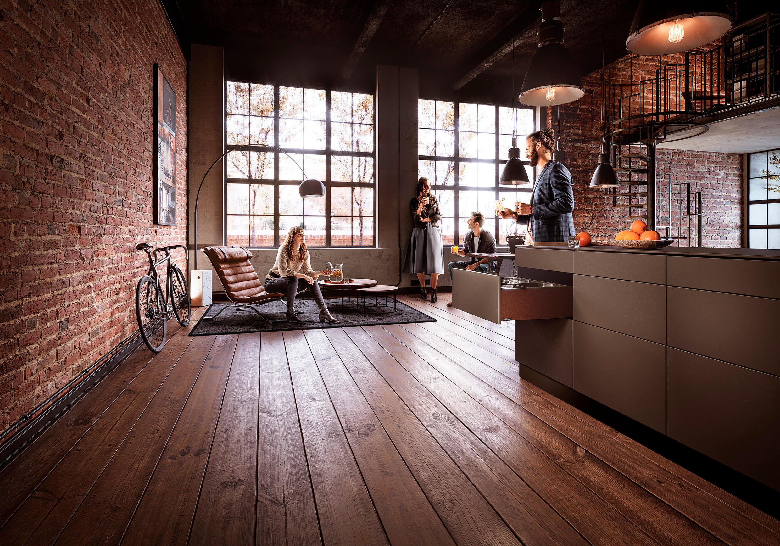
BLUMOTION hinges and LEGRABOX drawers by Blum
Appliances by Bosch, Miele and Westin
Sink by Franke
Tiles by Bert & May
Lighting by Felix Lighting
Hayley loves: the chic Parisian feel of this compact kitchen, which has everything the owners want and need thanks to the clever design of space.



Leave a comment