Architectural Kitchen – By Martin Moore
 The designer: Pam Baker, Martin Moore Esher (www.martinmoore.com)
The story: The Danish couple who commissioned this Martin Moore kitchen bought a tired 1970s house in Surrey because it overlooked a beautiful lake and open woodland. They knew that they could build an entirely new house on the site, with all the bright, warm, open-plan space so typical of Scandinavian homes.
Designer Q&A:
Q) What was your brief from the client?
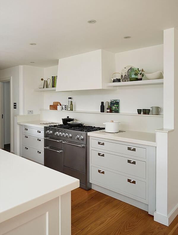
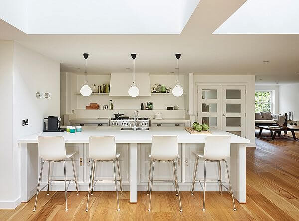
The clients were very specific that they wanted a clean, uncluttered aesthetic. This has a great deal to do with the fact that they are both Danish and have a Nordic feel for space and light. They love both natural and painted wood and they understand and really appreciate craftsmanship. But the essence of everything is simplicity and the feel throughout had to be light and airy without unnecessary detailing. There were some other specifics too, such as a large range cooker for baking and a peninsula rather than an island to prevent their small children getting underfoot.
Q) How did you set about answering that brief?
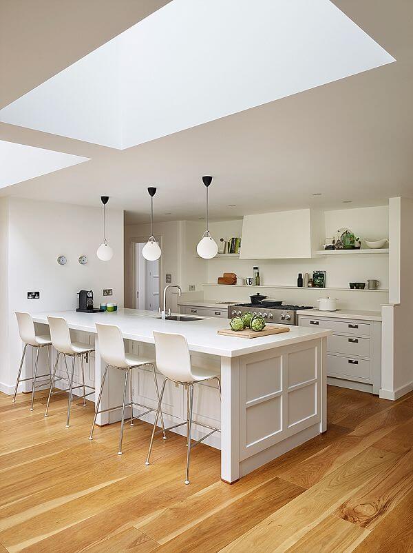
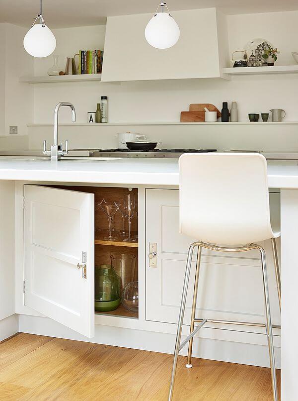
Our Architectural furniture provided both the perfect look and, very importantly, the ideal vehicle for the many functional considerations in the brief. As the design is open plan, there was limited wall space to play with. So the peninsula is deliberately extra- large, to provide sufficient storage and worksurface. We were able to tuck the large fridge and freezer into a recess around the corner, so they are easy to access, but not the first things you see when you enter the room.
Q) Which products did you use and why?
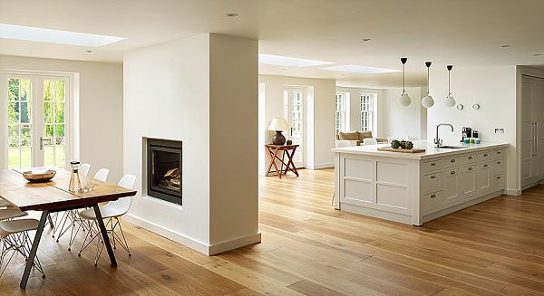
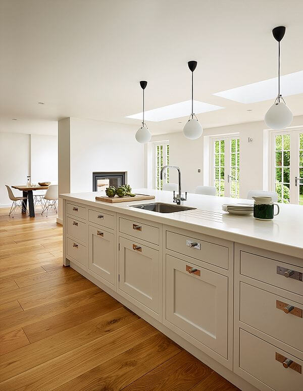
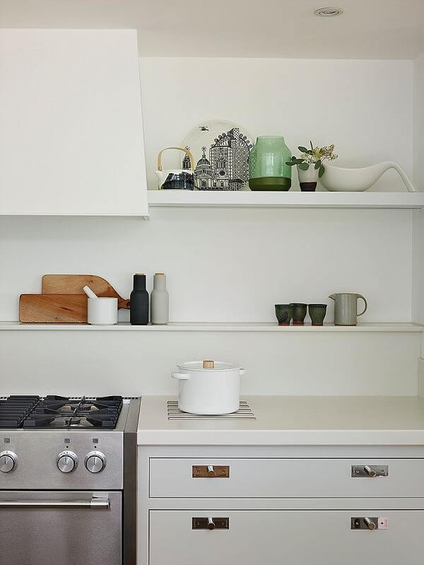
The furniture has slender mid-rails to accentuate the linear design, while drawers have flat fronts without beading for a modern look. And the details count too – cylinder knobs are simple and contemporary. Instead of wall cupboards, we included a simple cookshelf and another that slides into both sides of the bespoke extractor hood for a considered finish. The light grey furniture and white walls accentuate the calm mood, while the oak flooring running through the whole room unites the cooking/eating/living zones and lends its own natural warmth.
Q) Was there any renovation work involved?
The original building was a tired 1970s-built house but it had a beautiful lakeside location. To make the most of the unique location and bring the building up to modern family requirements, the house was extensively refurbished throughout. Downstairs, several internal walls were removed and the footprint extended into the garden to create a much larger, lighter, open plan kitchen/living space purpose-designed for family life.
Q) What design elements do you think make the scheme so successful?
The kitchen creates the warm heart of the room but without dominating the space. The refined lines of the furniture and other furnishings and the restrained colour palette all contribute to the sense of calm and comfort, which we always associate with Nordic interiors. The result is a very liveable – a fusion of classic and contemporary styling that perfectly suits the owners and the way they like to live. And, of course, the whole room is flooded with light and has the most wonderful views.
Q) Any advice for someone who may be planning a new kitchen?
Do masses of research to establish the style and layout you want. Look online, read magazines, even study friends’ and relatives’ kitchens for colours, finishes, appliances and the general feel you are after. Analyse what everyone who will use the space will want from it, whether it be a precision-equipped cooking zone or a place to relax and watch TV. The more thought you put into the early stages, the easier it will be to choose your kitchen or brief a kitchen designer. Finally, do ensure you work with a designer who has high levels of expertise and with whom you have rapport, to help you realise your vision.
The details:
Bespoke Architectural furniture painted in Little Greene French Grey Mid 162, www.martinmoore.com, www.littlegreene.com
Appliances by Mercury, Westin and Gaggenau, www.mercuryappliances.co.uk, www.westin.co.uk, www.gaggenau.com
Worktops by Corian, www.dupont.co.uk
Sink and tap by Kohler, www.kohler.co.uk
Pendant lights by David Village Lighting, www.davidvillagelighting.co.uk
Chairs and similar bar stools by The Conran Shop, www.conranshop.co.uk
Hayley loves: the long, linear island, which has plenty of space for the whole family to get involved with the cooking



Leave a comment