All White … With splashes of Colour
By Linda Parker
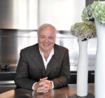 Laurence Pidgeon designed an outstanding kitchen within this spectacular sunny extension. This is just one of dozens of kitchens he has influenced … he introduced kitchens and bathrooms by Agape, Boffi and Bulthaup into the UK kitchen and bathroom industries. Here, he explains the reasoning behind this particular project design.
Q: What were the stand-out priorities in your brief from the client?
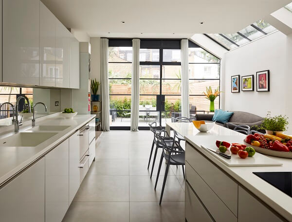
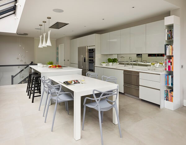
The house was being extended backwards and sideways, with full-width glazed doors to the back and a high pitched glazed area over the angled side extension. There is also a wide staircase to a floor below at the start of the kitchen space. The brief was to design an efficient and practical kitchen in the middle of this space – avoiding the look and feel of a corridor! Our clients love to cook and to entertain, and they wanted an area for making breakfast and snacks apart from the main kitchen area but which is still visually linked to the kitchen. The also wanted to present some cherished oriental artefacts in the kitchen. The end of the kitchen was to be the main, semi-formal dining space
Q: How did you set about answering that brief, what were your first thoughts?
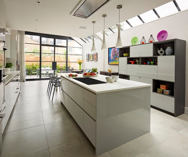
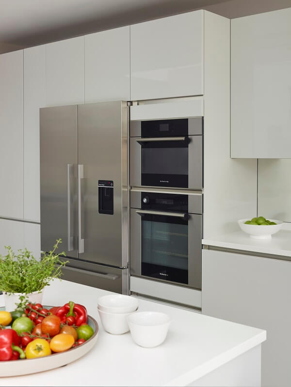
The solution was to place the tall units (rather conventionally, but the best solution) on the long main wall along with the plumbing for the sink and dishwasher. A double doored tall unit encloses a workspace for the Magimix and other prep equipment, and hides clutter as well. Opposite is a large island with induction hob and plenty of storage, which creates a galley format – one of the most efficient working layouts. The outer side of the island is more hospitality driven, with bar stools and a wine fridge. Across from this is a dresser with the breakfast zone – drop-down doors with pull-outs concealing the toaster, coffee maker, bread bin, condiments and plates. It also has several open sections and niches to display valued objects. It’s a shorter, freestanding element, which is totally part of the kitchen but which doesn’t look ‘kitcheny!’
Q: Explain the reasons behind the choices of cabinetry and work surfaces …
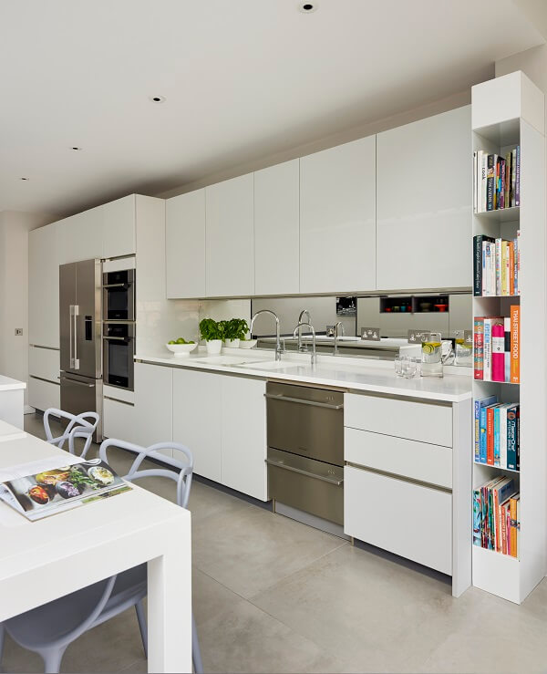
We colour-coordinated handleless cabinets with Corian tops, suggesting a very pale grey shade, as the space is very light. A darker grey for the plinths and the dresser surround matches the specified shade of the sleek Crittal window frames
Q: Was there any building/renovation work involved?
Yes, but this was all handled by the building team, we were just involved with the kitchen space.
Q: What design elements do you think make the scheme so successful?
The way we split the space into three successful and practical zones. Listening to the clients carefully and understanding what they wanted drove the whole project forwards successfully.
Q: What is your best advice for someone who may be planning a new kitchen?
Go to a professional kitchen company, and work with an experienced specialist who will listen to your brief, spend time in discussion, and make changes until you are happy. Preferably find someone who cooks and understands how a busy kitchen has to function. Do not go to a big warehouse-style supplier with lots of undertrained staff who rely on their computer system to plan your kitchen in a general or even formulaic way regardless of your wants, needs and foibles!
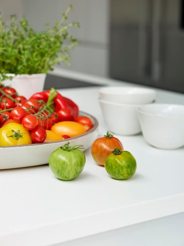
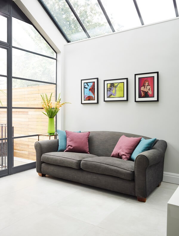
We love: The sweep of the white surfaces, sink and cabinets and the way there are injections of bright, cheerful colours throughout via the artworks and displays.
Kitchen by Laurence Pidgeon. 020 7610 6166, www.laurencepidgeon.com
Cabinets: Hacker Systemat Art PG 3 Handleless Collection in Light Grey gloss lacquer finish; open shelves and dresser end panels in Mouse Grey textured lacquer. Fittings and movement components by Blum
Work surfaces and sinks: All by Corian, www.corian.co.uk/
Taps: Quooker PRO3 Nordic Round Twintaps, http://www.quooker.co.uk/
Microwave, ovens and hob, all De Dietrich, http://www.dedietrich.co.uk/
Dishwasher and fridge-freezer, Fisher & Paykel, www.fisherpaykel.com/uk
Ceiling mounted flush fitting Stratus cooker hood, Westin, http://www.westin.co.uk/
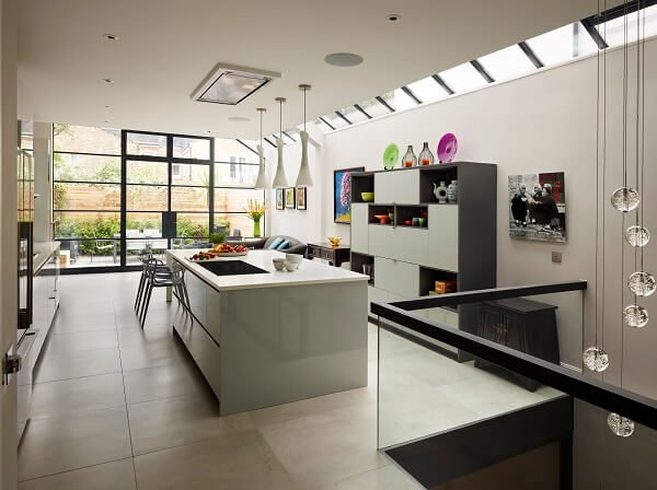
The lower ground floor staircase allows for a dramatic lighting display.



Leave a comment