A New Studio Kitchen by Neptune + Other Inspirations
By Linda Parker
We’re heading towards that time of year when we all seem to become increasingly concerned about our cooking and styling capabilities… So this time, we’re taking a look at the fabulous new kitchen by Neptune, designed for Ella Mills, founder, Founder of Deliciously Ella, and bringing you news of some striking print designs by Schmidt.
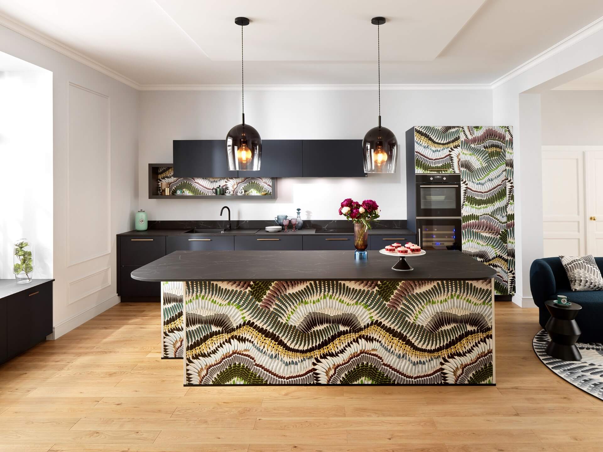
SCHMIDT HAS A NEW WEBSITE, WITH EASY AND CLEAR NAVIGATION
This is one of the Maison Christian Lacroix Print Designs from SCHMIDT, all of which are shown in beautiful detail on the new web pages. This design is particularly striking, teamed with plain deep navy blue fronts. This the Prête-Moi Ta Plume pattern, which is digitally printed for maximum impact on panels, door and drawer fronts.
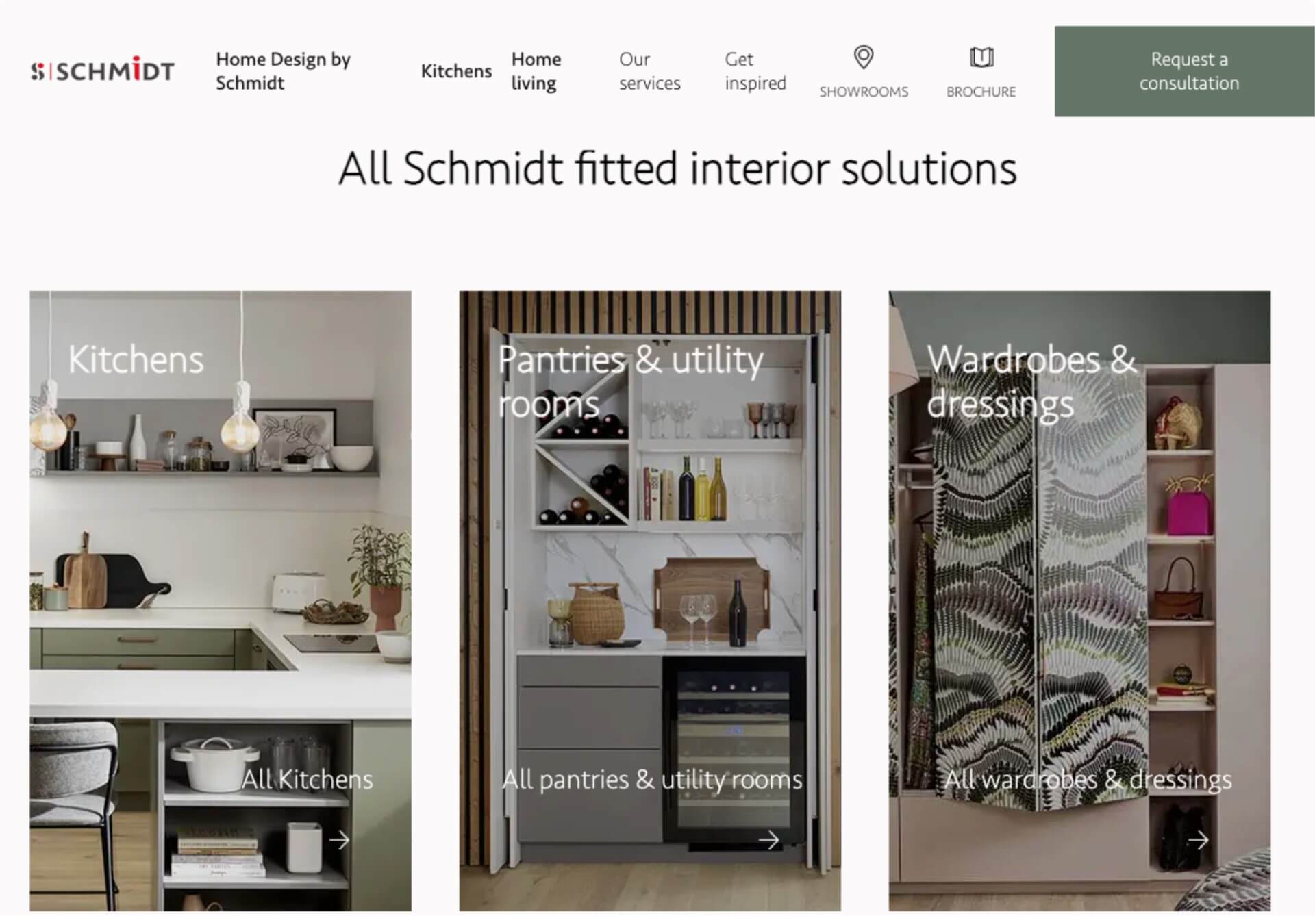
LOOK FOR KITCHEN, BEDROOM AND LIVING SPACE SOLUTIONS WITH SCHMIDT
Solve exterior looks and interior fitting solutions for all rooms in the home, using Home Design by Schmidt. Look for inspiration for bedrooms, studies, living rooms and bathrooms – as well as kitchens.
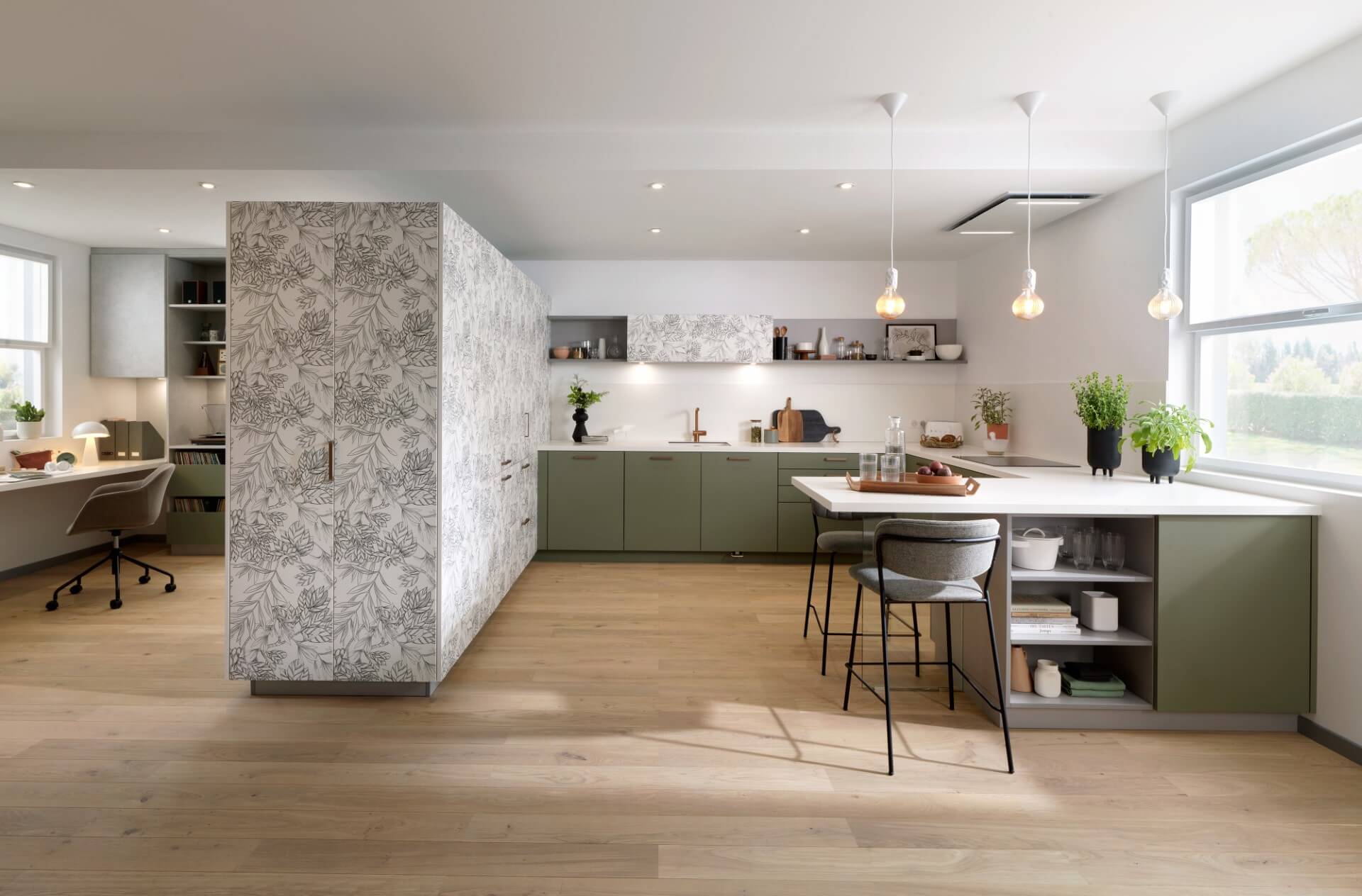
GREENS AND BOTANICAL DIGITAL PRINT FRONTS BY SCHMIDT
This is the Botanic Black and Green Mossa kitchen by Schmidt. We love the clever way the monolithic set of cabinets provides oodles of storage and appliance space, whilst also creating a dividing line between kitchen-social space and a comfortably appointed work-study area.
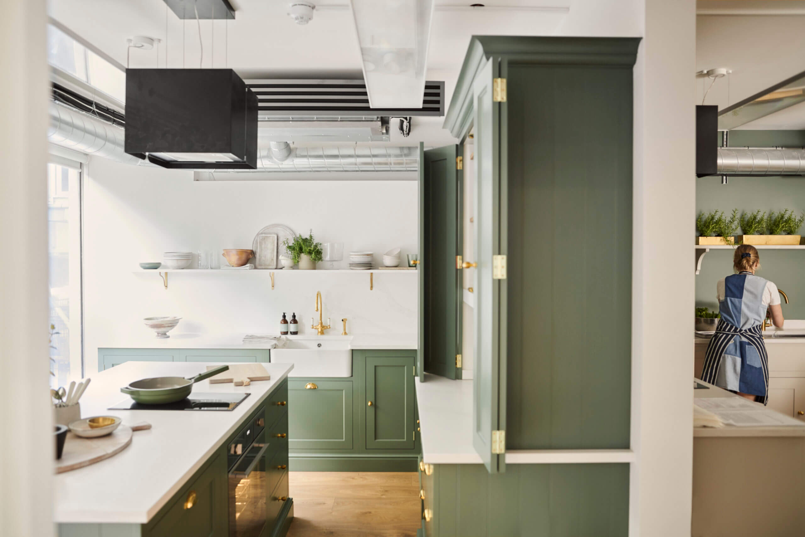
THE HENLEY KITCHEN BY NEPTUNE FOR DELICIOUSLY ELLA
Ella Mills, Founder of Deliciously Ella went to the Neptune design team to update the existing industrial-style design studio. The task was to update the studio, which is used both as a photography studio and a test kitchen for developing recipes. From a design point of view, the team wanted to make the most of the natural light available, whilst maximising the space, which often has lots of people moving around and working, all at the same time.
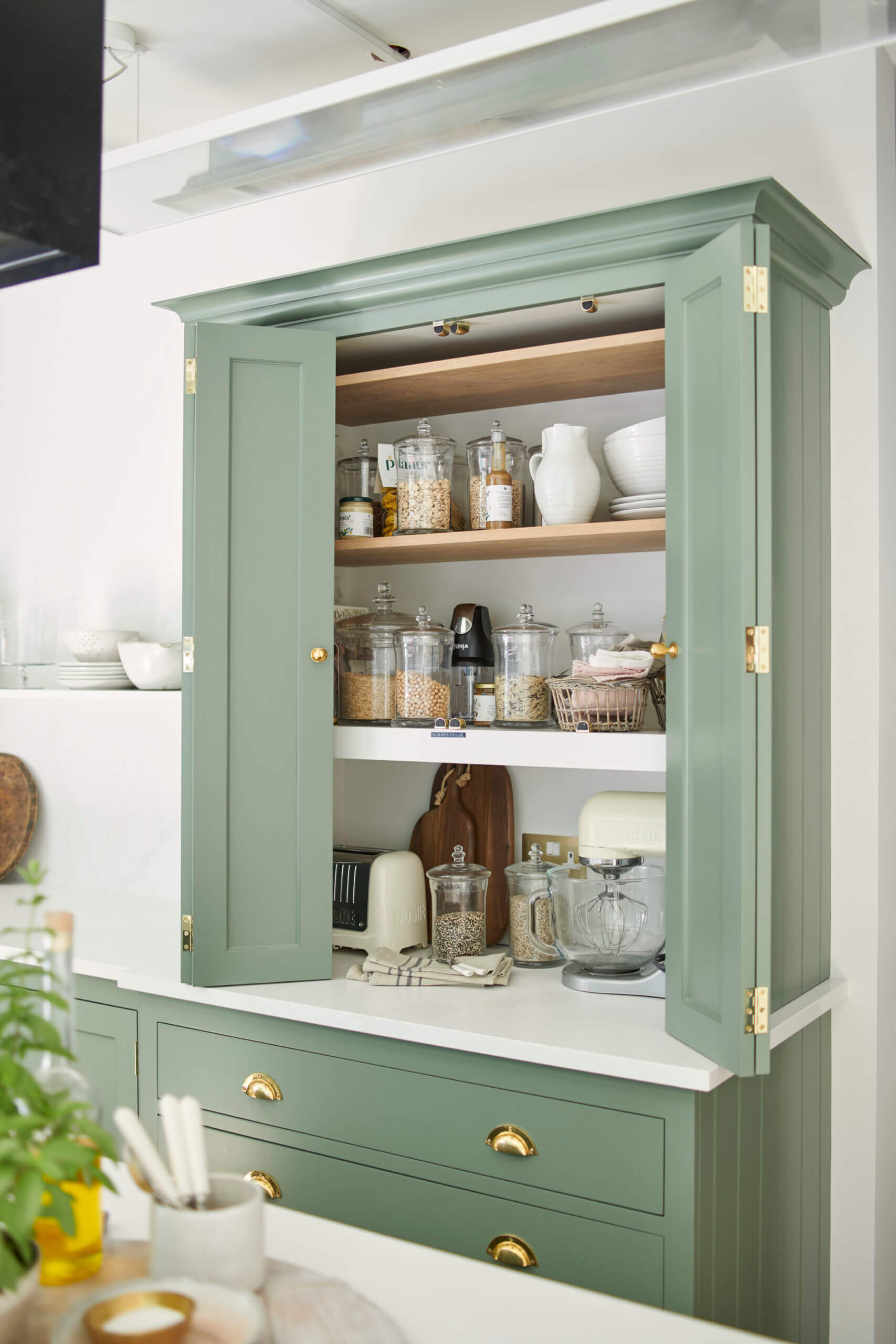
THE NEPTUNE TEAM CREATED A BI-FOLD DOUBLE DOOR PANTRY
The existing kitchen was a long, industrial-style studio space which lacked atmosphere and which Ella wanted to update and re-think, to turn it into a more logical and easier to use space. The Neptune Kitchen Design Team realised that the obvious solution was to divide the room into two spaces. One kitchen would be for photography, and one would be for preparation. Ella could then maximise the space and manage different projects at the same time.
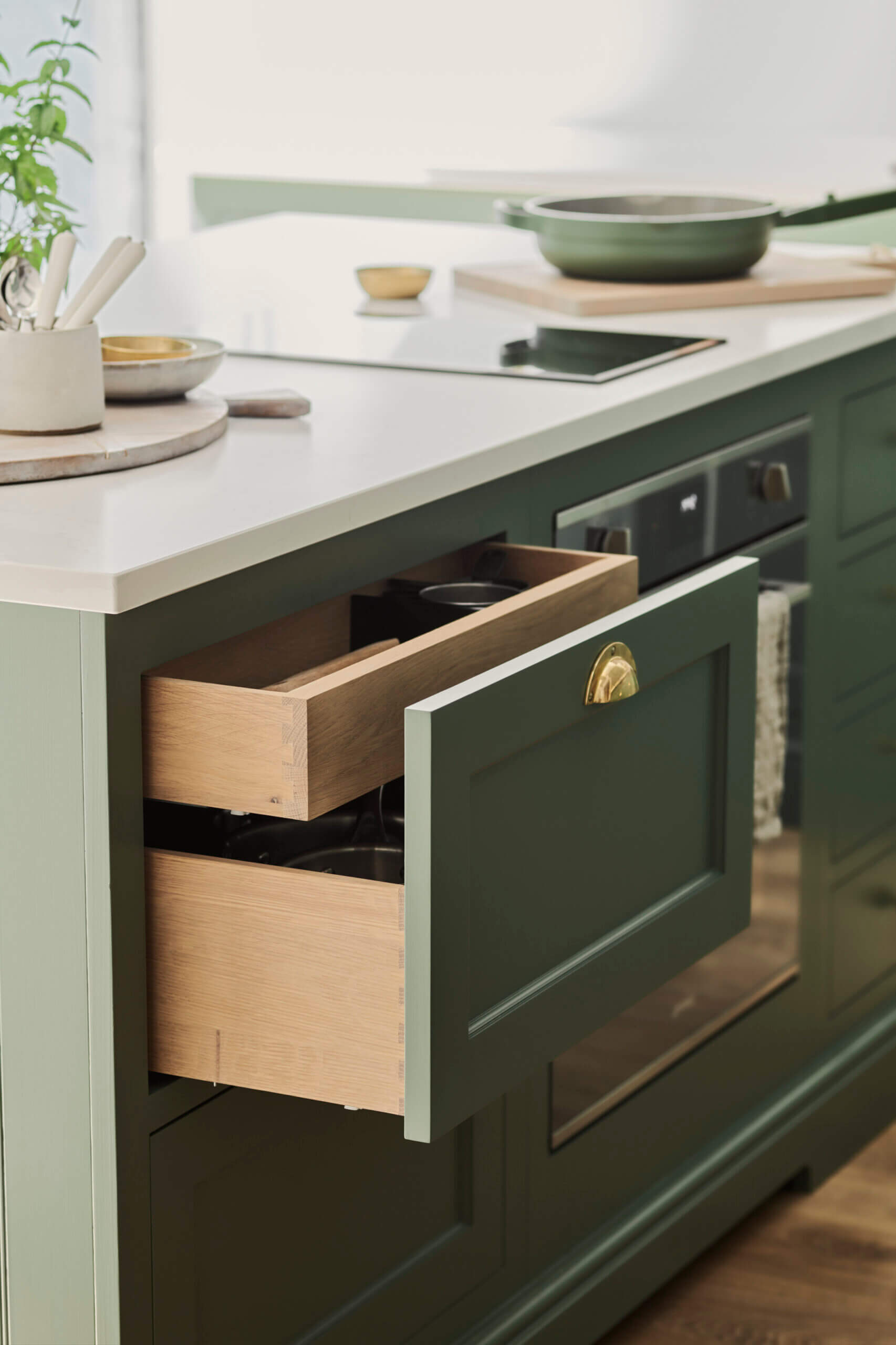
DOUBLE DRAWERS PROVIDE PLENTY OF UTENSIL STORAGE
The shoot kitchen takes centre stage, next to large windows to take advantage of natural light. Ella chose the Henley kitchen from Neptune, as the classic design not only reflects her own style, but will look elegant in photo-shoots for years to come. The paint shade is Cactus, in an eggshell finish. The design team had to take into consideration how much space would be needed for the cameras and photographers to move around comfortably, whilst taking the flow of the room into account. Tight corners were avoided by adjusting Neptune’s standard measurements, increasing space for all the equipment required.
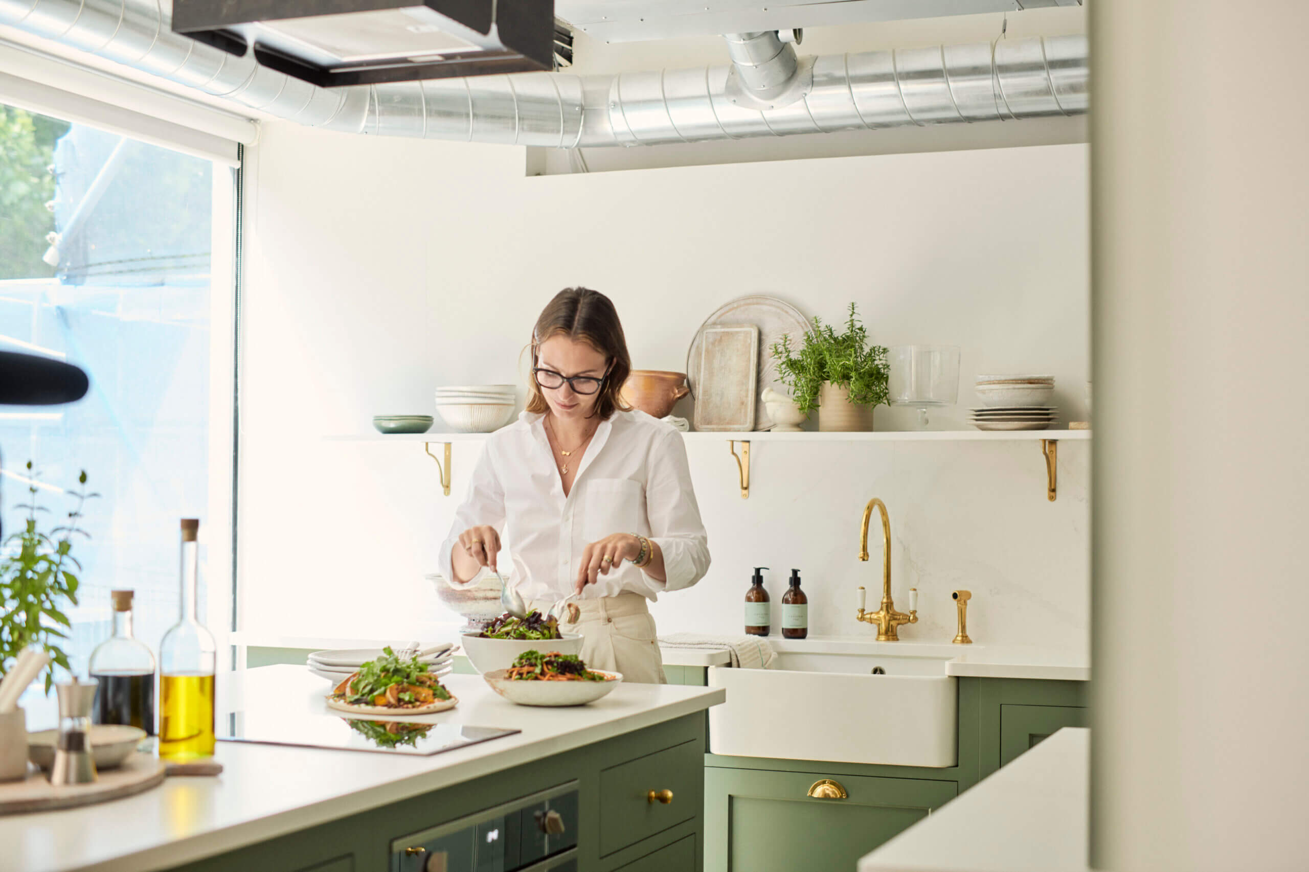
THE NEW HENLEY KITCHEN BY NEPTUNE IS LIGHT AND AIRY
Ella Mills is enjoying working in the new Neptune kitchen, and comments ‘We’ve started shooting in the new space and the layout is perfect for us, and the feedback from anyone who walks through the door has been amazing. The amount of work surface and storage space Neptune’s team has created has reinforced by belief in the tidy space, tidy mind mantra! The new set-up makes work so much easier, and it’s such a pleasure to work in this space now’.
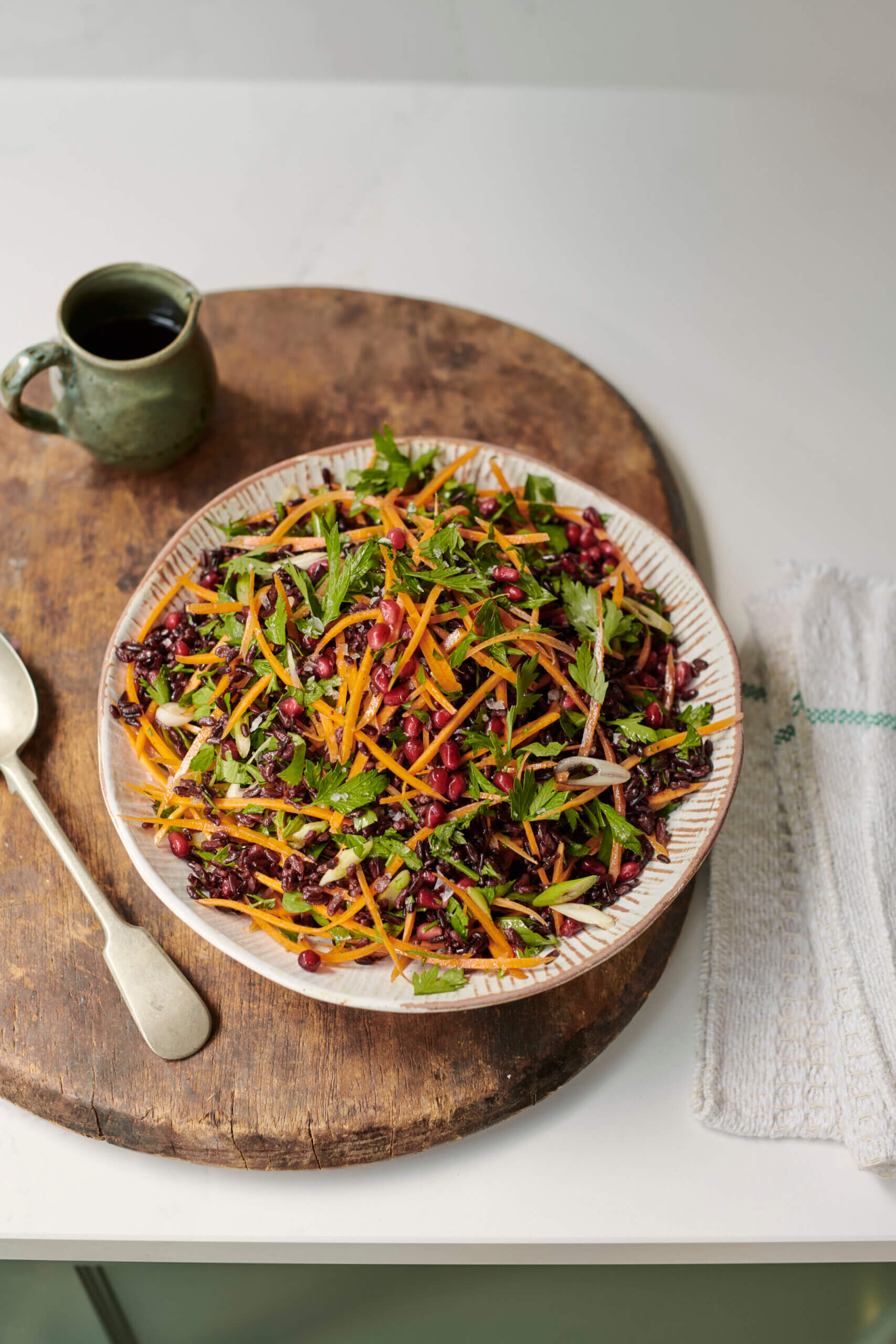
A NEW RECIPE FROM THE SHOOT KITCHEN – ELLA’S JEWELLED WILD RICE SALAD
Fred Horlock, Design Director, Neptune, is also delighted with the results. He says ‘ A well-designed kitchen balances function and style. Dividing the studio into two areas provides Ella with more flexibility and functionality. Thoughtful design details help the kitchen work for Ella and her team, from the bespoke larder, easy-access drawers, the clever layout and the hard wearing work surfaces’. And here’s one of the beautifully photographed recipes, Jewelled Wild Rice Salad, from Deliciously Ella’s Autumn Menu
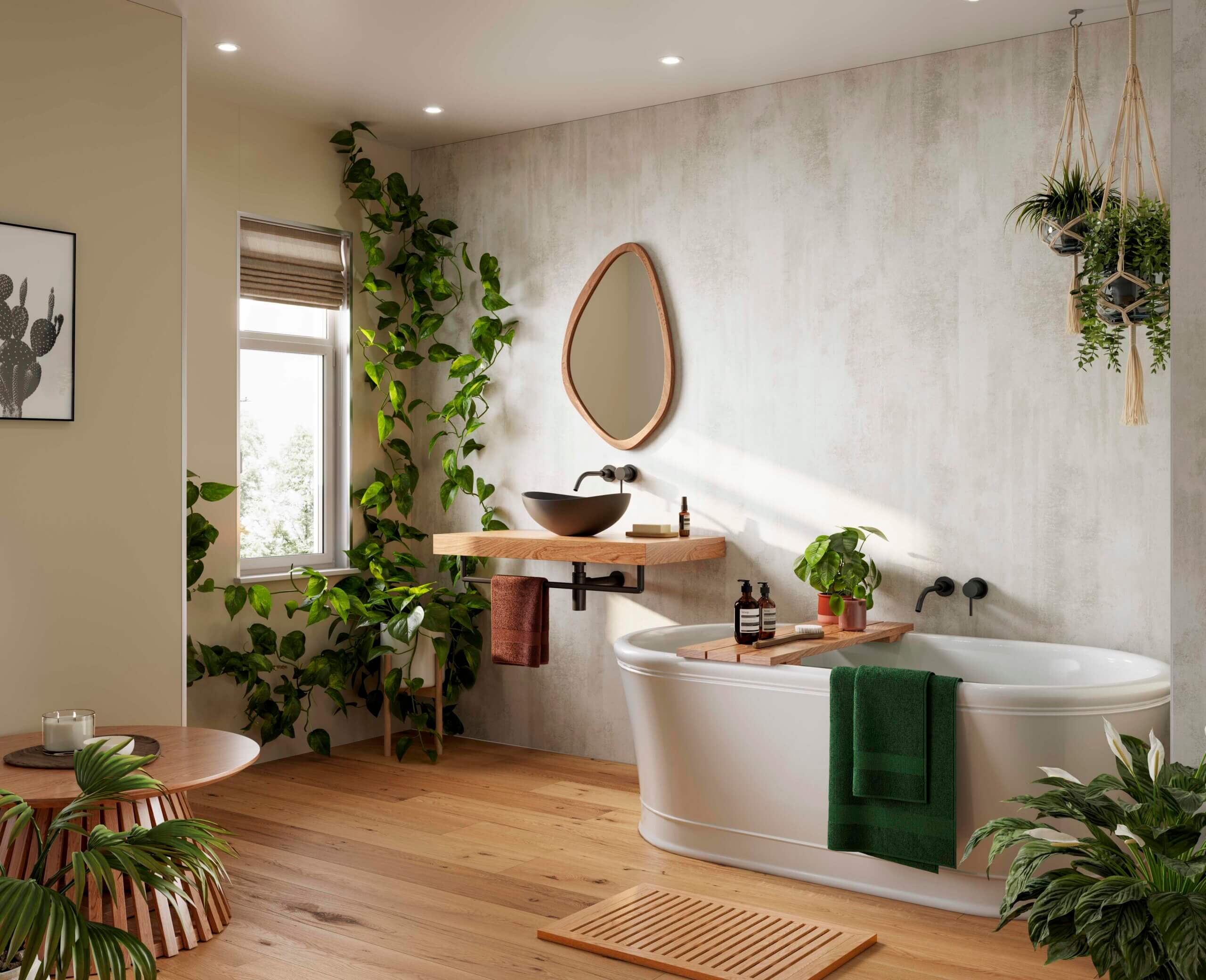
TAKING A LOOK AT NEW BATHROOM IDEAS FROM MULTIPANEL
Designers working on new bathroom ideas as well as kitchen revamps for next year may want to have a look at bathroom/shower room panels from Multipanel. Panels can be used over existing tiles or wallcoverings, providing everything is straight and dry, naturally. Shown here are two panels, White Gypsum, with a mineral plaster texture and the look of concrete. It can be used throughout a whole room, or paired with plain panels, such as Taupe Grey.
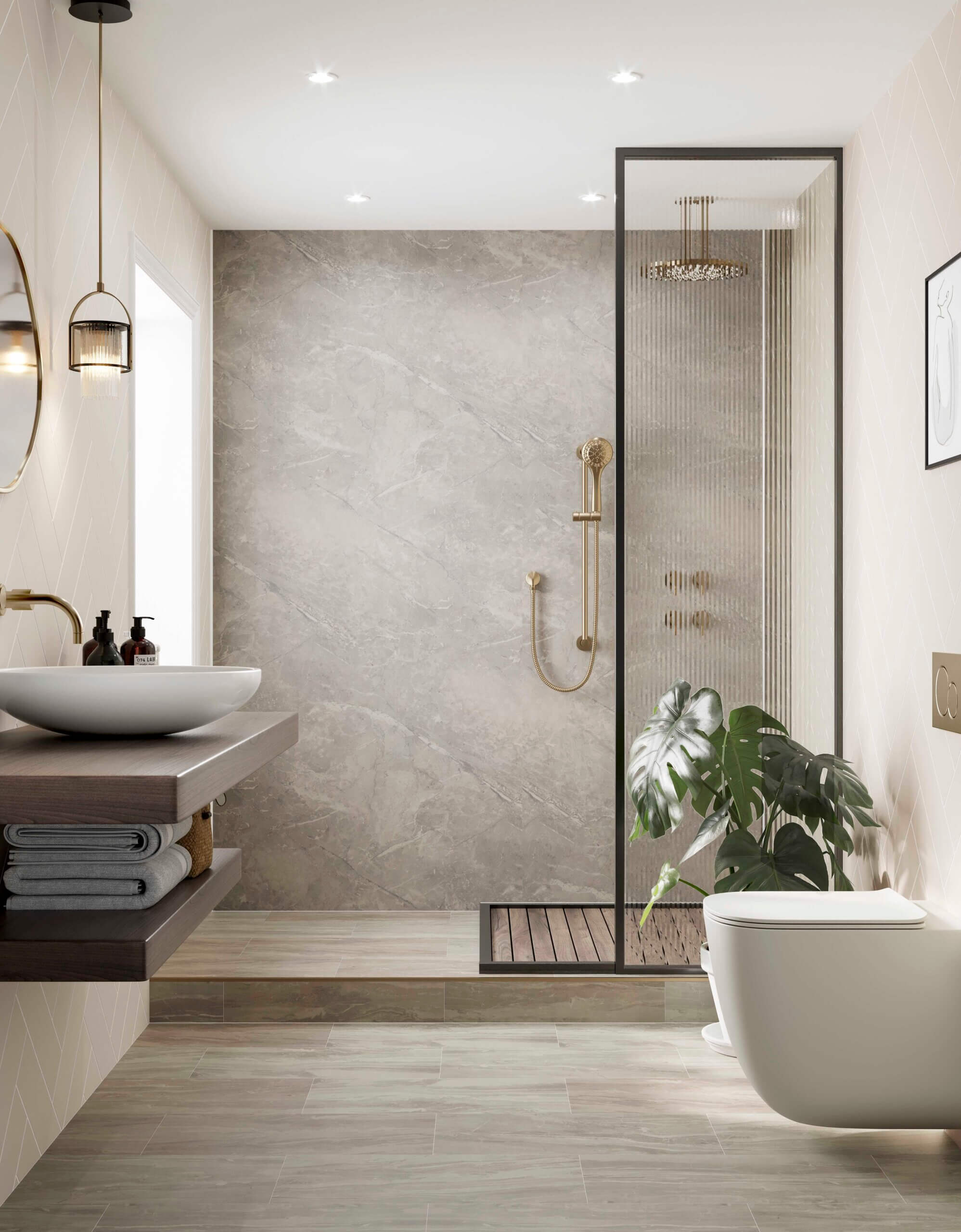
MARBLE LOOK PANELS FROM MULTIPANEL
This is Valmasino Marble from the Pure Collection by Multipanel. There’s also a tile-effect option – which is the best of both worlds if you and your clients require the look of tiles but would appreciate the ease of installation of panels. Plain panels are a great way of creating a streamlined, no-fuss look for a new bathroom project.
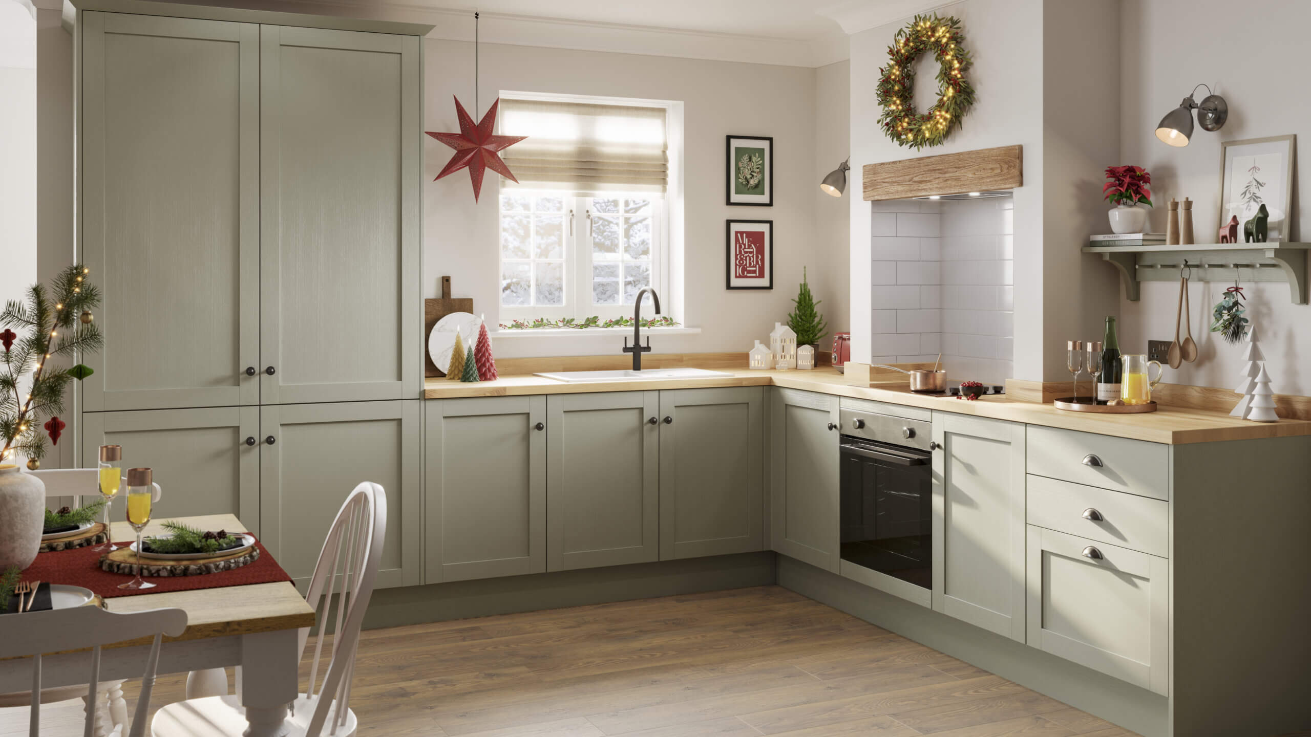
A TOUCH OF CHRISTMAS INSPIRATION FROM HOWDENS
We rather liked this festive-themed kitchen from Howdens. This is Allendale in Sage Green, and it just goes to show that a few well-placed accessories can add a touch of Christmas to the home (or indeed to the showroom). We’ll be back in a couple of weeks with some more festive themes for the kitchen, from trees and trivets to decorations and desserts!




Leave a comment