Painted and Oak Shaker – By Harvey Jones

Jenna Lacey
The designer: Jenna Lacey at Harvey Jones (www.harveyjones.com)
The story: The clients live in a fantastic old Georgian farmhouse, a busy household given that they run a farm and have two children. On Jenna’s first visit to the site, she realised that nobody uses the front door and all day-to-day activities take place in the back of the house. With large windows showing off the glorious views of open countryside and wonderful old beams in the ceiling, it’s the perfect relaxing farmhouse setting. The room already had some great original features, like the Inglenook fireplace and church-style doors so the clients wanted to keep these but create a more fitted kitchen look rather than the freestanding kitchen bits they already had.
Designer Q&A:
Q) What was your brief from the client?
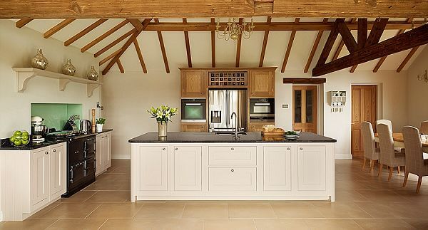
As the main room in the house, with lots of comings and goings, the space had to be practical and offer all the clients’ storage needs. They wanted it to have a farmhouse feel but with that wow factor that everyone talks about. They had a serious lack of worksurface and storage so these issues needed to be addressed. They also wanted the kitchen to be in keeping with the building and work with the original features. They wanted more modern, sleek, built-in appliance solutions and symmetry between all the elements rather than the haphazard traditional farmhouse kitchen look, which can be quite bitty and cluttered looking. They chose a newer AGA within the same position as the existing one, but also wanted an island for prep with a sink, an American fridge-freezer and a dresser as part of the dining area.
Q) How did you set about answering that brief?
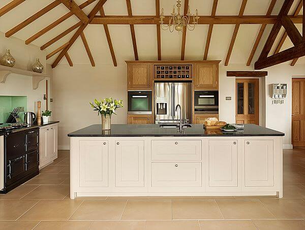
A large central island is an absolute must for a farmhouse kitchen – it’s where everyone congregates and is a real hub of the home. It also creates a nice central divide between the kitchen and living area. The wow factor was created by scale rather than flashy lighting, reflective surfaces or gimmicky accessories. These tend to date and lose their wow factor rather quickly. The size of the room gave me great scope to maximise the storage and worksurface, while avoiding being over bulky in one area. I created four distinct areas – a cooking space around the new AGA, a tall bank of cabinets with the new built-in appliances and American-style fridge-freezer, island prep with sink and finally the dresser for the dining zone. Having everything built in, like the dishwasher and recycling bins in the island, keeps everything neat and tidy as everything has its place. The built-in oven and combi-microwave with warming drawer are for use when the AGA is turned off in the warmer summer months and for extra cooking capacity over the Christmas period. It also means you haven’t got the microwave typically taking up valuable worksurface space, too.
Q) Explain the reasons behind the choices of cabinetry and worksurfaces
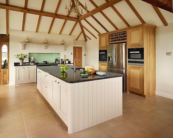
As we offer our cabinets in a painted or natural wood finish, we thought combining painted and oak would be in keeping with the building and traditional idea of a farmhouse kitchen. Having the painted cabinets gave it a more contemporary edge and brought it bang up to date. It also gives the clients the flexibility to change the colour and re-paint if they want to in the future. For the main worktops they had to be granite – Steel Grey – robust, easy to maintain and with a more traditional finish in keeping with a more traditional kitchen environment. The touch of oak on the dresser tells you this area is separate from the working kitchen and is much softer and warmer.
Q) Was there any renovation work involved?
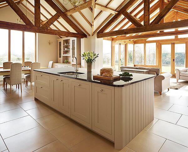
They had quite a lot of restoration work done before we could install the kitchen. A new roof was put on the property and all the exposed timber including the ceiling beams and conservatory were sanded and re-oiled. They also installed new underfloor heating and tiling throughout.
Q) What design elements do you think make the scheme so successful?
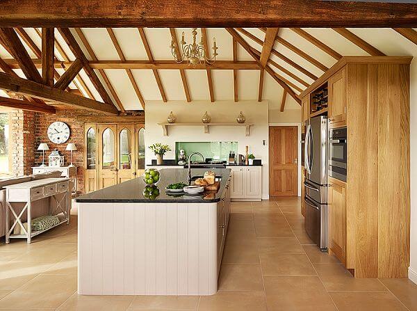
Having the two finishes, oak and painted, really make the scheme work as they bring all the elements together and also complement the building. The use of natural materials is always important in a more traditional kitchen, as is the incorporation of the building’s unique features. Having the four distinct areas with that huge central island really brings all the elements together and makes the scheme so successful.
Q) Any advice for someone who may be planning a new kitchen?
Often when the decision is made to replace an existing kitchen or have some building works done, clients are so excited initially and start to think about colour, worktops and the design layout. They become focused on going round different showrooms trying to find an exact replica of what they have in their head, as they find visualising difficult. Sometimes they even get several companies to create 3D designs for them, trying to help them visualise the space and colours, but have no intention of buying one of their kitchens as they didn’t like any styles.
Many of my clients say how exhausting it has been trying to find a colour of kitchen they like and a worktop, when these things should be way down on the list when designing a new kitchen.
The first thing is do your research on the two different types of kitchen out there on the market; a lay on door kitchen, used by the mass produced retailers and some independents, and the traditional in-frame kitchen. Understand the differences and what this means to you and your kitchen, and ultimately whether you want to pay for a kitchen that will last a lifetime, or something for the next seven to ten years. Any traditionally handmade company like us can create any layout possible, as we are bespoke cabinetmakers. So try not to focus on the colours, design and layout – that’s the designer’s job. What you need to consider is how important the quality of the cabinetry is to you. Choose the company and designer you want to work with and the rest will fall into place as they guide you through the process.
The details:
Harvey Jones Shaker kitchen in solid oak and Farrow & Ball’s Elephant’s Breath with granite worktops, www.harveyjones.com
Built-in appliances by Miele, www.miele.co.uk
Central pendant light by Laura Ashley, www.lauraashley.com
Hayley loves: the fresh, modern feel that the painted units bring to this traditional solid oak kitchen




Leave a comment