Contemporary Shaker Kitchen – designed by Higham Furniture
 The designer: Tim Higham, owner and design director of Higham Furniture (020 7381 0488; www.higham.co.uk)
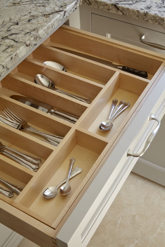
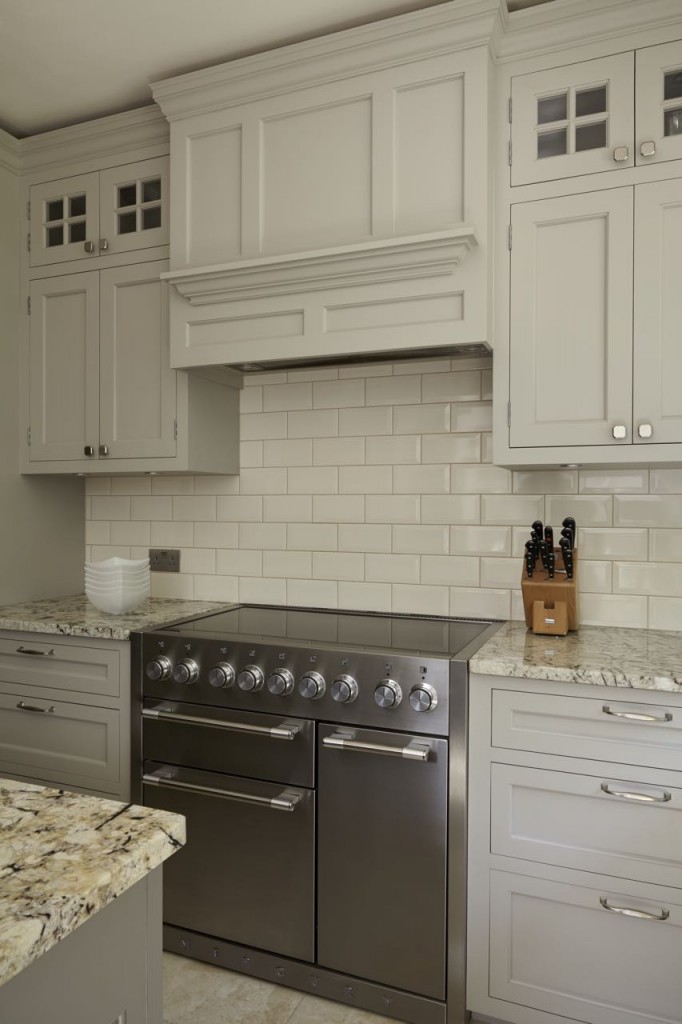
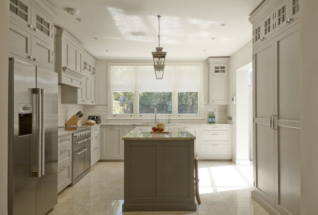
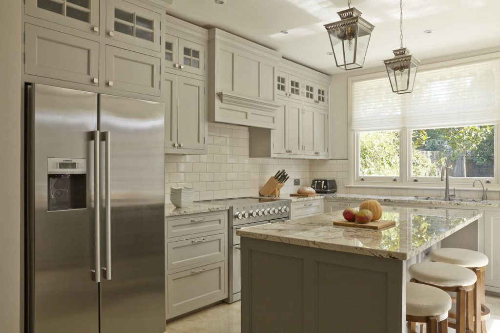
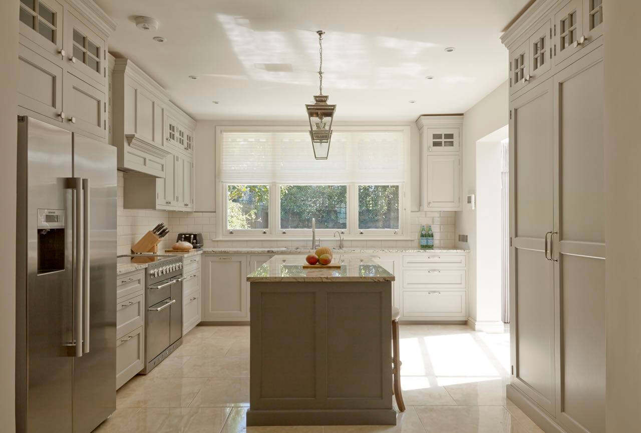
The story: This design features elongated wall cabinets with glazed back-lit top cupboards to make it more in keeping with what the American client was used to back home. Cabinet doors were made out of tulipwood, which is painted in Farrow & Ball’s Purbeck Stone. The island is painted in Mole’s Breath while drawer boxes and shelves are designed in maple.
Designer Q&A:
Q) What was your brief from the client?
American homes tend to have much more space than their London equivalent. The client is originally from the States and is accustomed to US proportions. Whilst trying to maintain the look that is created by oversized proportions, we had to re-scale the whole idea to fit with the style of the Victorian semi-detached house. The clients like to entertain and they also have children, so having a focal point where guests could perch or the children could watch mummy cook was important, as was safety in terms of the positioning of ovens and microwaves.
Q) How did you answer that brief?
We have used a larger than usual decorative cornice to add some detailing to the top of the cabinetry. The Victorians were fond of high ceilings and the property benefits from this. We therefore took full advantage and elongated the wall cabinets, adding further decorative glazed back-lit sections near the ceiling. Though they don’t provide the most practical storage space, these cabinets can be good for glassware.
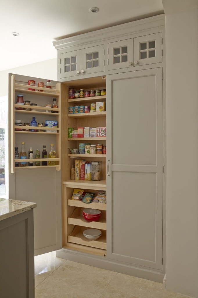
Q) Tell us more about the cabinetry
American-style Shaker kitchens tend to be very ornate and often include raised and fielded paneling, beading, glazing bars and so on. For this design, we included a beading within the Shaker panels and beading glazing bars on the glazed top sections. In contrast to the traditional English Shaker kitchen, the transatlantic equivalent tends to have much smaller rails and styles, creating the illusion that the doors are larger, giving a more elegant look.
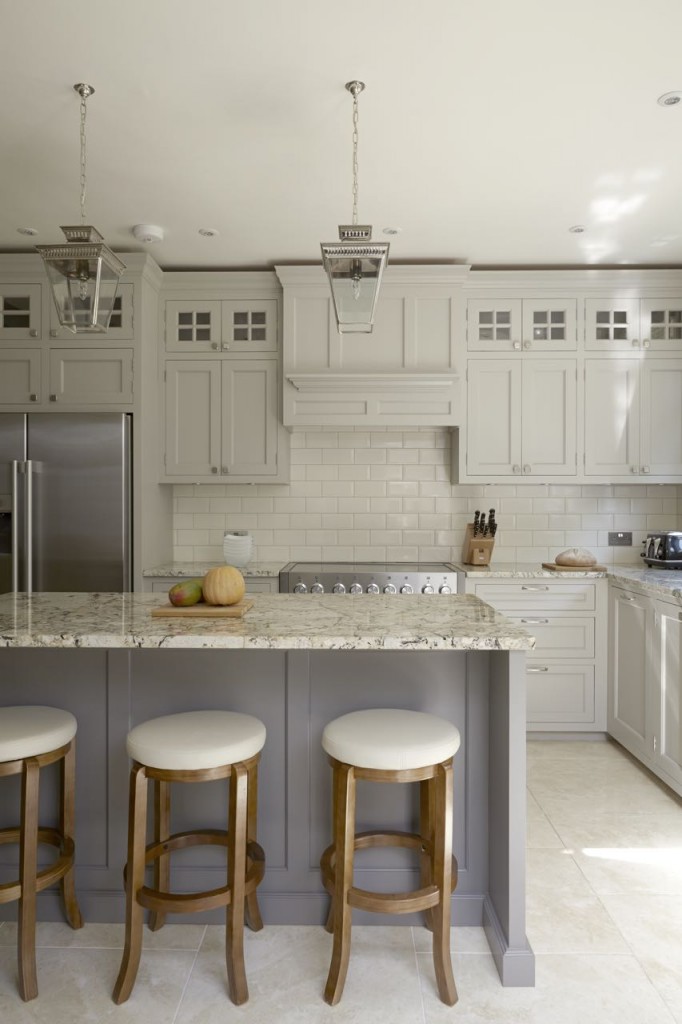
Q) How did you design for all the family’s needs?
We had to consider that this is a family home and for the convenience of the newest addition, an integrated microwave was essential. The clients also love to entertain and were keen on having a wine cabinet, which we discreetly placed on the rear of the island. The island also creates an effective room divider without being too much of a barrier. The children can sit on one side and feel involved in the cooking process whilst being a safe distance from the cooker.
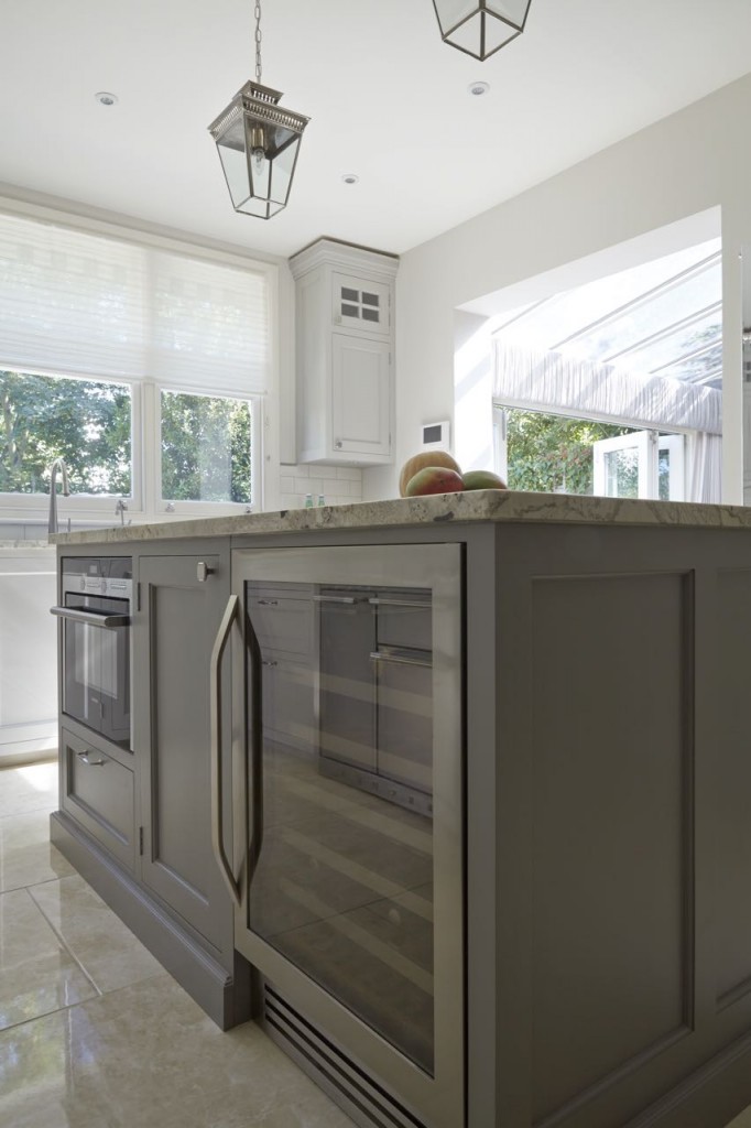
Q) Which products did you use and why?
The drawers, racks and shelving are made out of maple and the doors and frames, painted tulipwood, The island has a composite stone worktop, which looks similar to Carrara marble. While we wanted to keep a neutral feel with the colour scheme, taking inspiration from the popular grey palettes currently available, the clients wanted a home that is very on-trend and so we decided to introduce a hint of colour to help with this. Purple is a very elegant, somewhat regal colour that is very popular at the moment, so we chose Farrow & Ball’s Mole’s Breath for the island, as it is grey with purple undertones. For the fittings, we went with a satin finish for handles and taps, to add a soft, understated touch.
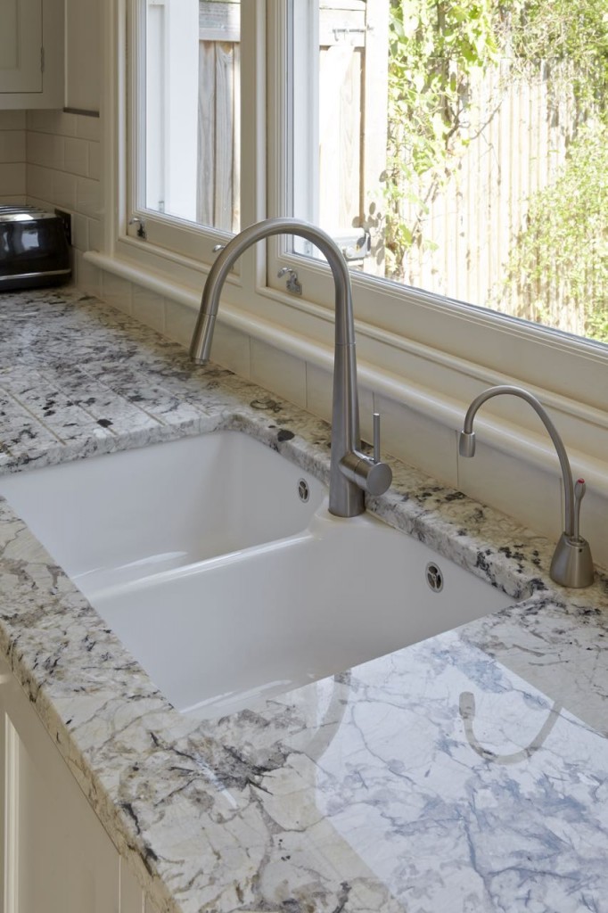
Q) What elements do you think make the scheme so successful?
The oversized proportions are a key element, as is the decorative glazing at the top of the cupboards. The open island, with seating on one side and storage on the other, works very well, too.
The details:
Composite stone worktops, client’s own
Appliances by:
Siemens, www.siemens-home.co.uk
Mercury, www.mercuryappliances.co.uk
Westin, www.westin.co.uk
Bosch, www.bosch-home.co.uk
Hayley loves: the neutral colour scheme, which is warm and welcoming rather than cool and stark.




Leave a comment