It’s all About the Colour… Choose Strong Shades for Positivity
By Linda Parker
As we hurtle towards Christmas and all the associated red, green and sparkly colour schemes that will abound for a few weeks we thought we’d bring you some of the latest none-Christmas colour news! If you are designing or planning for next year, here’s some of the latest shades to look out for …
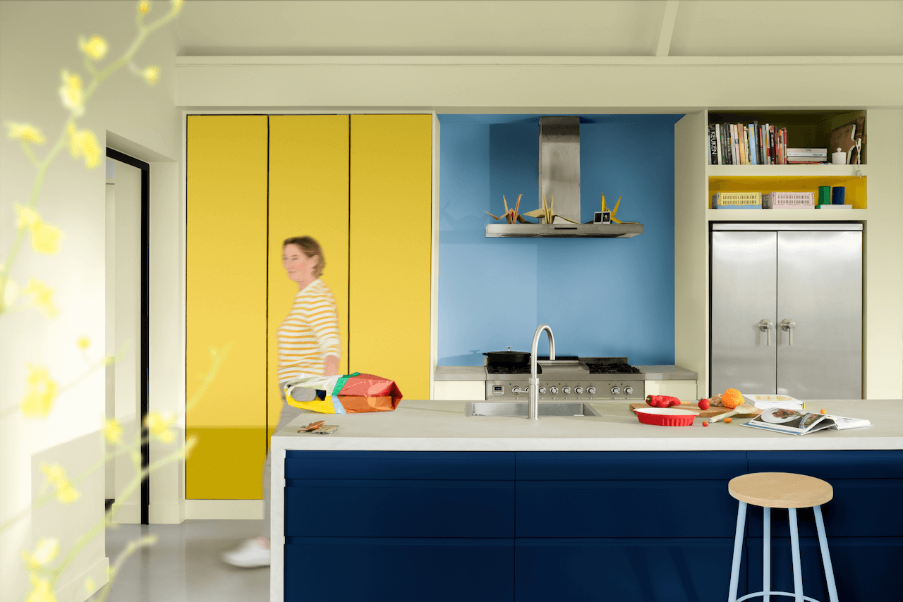
DULUX COLOUR FUTURES COLOUR OF THE YEAR 2025 TRUE JOY – BOLD AND CHEERFUL INSPIRATION FOR KITCHEN SCHEMES
AzkoNobel’s Global Aesthetic Centre translates trends into desirable and workable colour schemes for our homes. For over 30 years the annual ColourFutures ™ trends forecast meeting translates insights from their in-house experts, architects, designers and journalists into how reactions to the world has an effect on colour choices. The result was three decorative colour stories emerging from True Joy, Colour of the Year. Above, True Joy, the sunny yellow that promotes uplifting energy and optimism, used with Intense Azure above the hob.
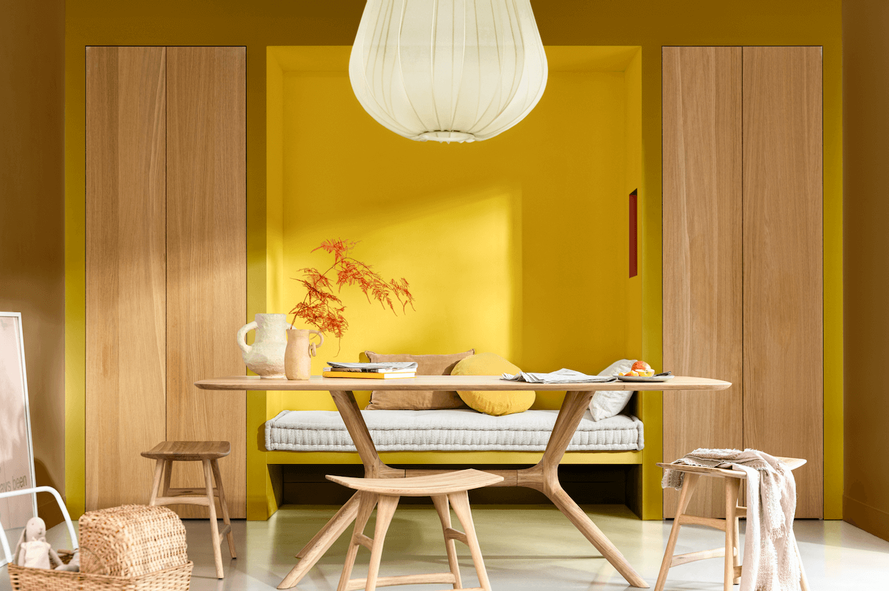
TRUE JOY BRINGS UPLIFT TO LIVING, HOME OFFICE AND BEDROOM SCHEMES AS WELL
The forecast meeting resulted in three colour stories being created for the use of True Joy, expanding the concept of the cheerful yellow within more neutral and discreet schemes. The three schemes, named A Bold Colour Story, A Human Colour Story and A Proud Colour Story embrace enough variations to work with all rooms in the home, particularly if True Joy is used as the anchoring colour throughout. Above, True Joy in a home office scheme, paired with timber finishes.
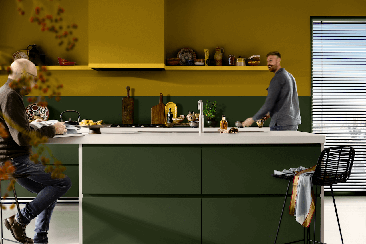
TRUE JOY WITH A STRONG CONTRAST – DARK GREEN HOLIDAY BOUGH
Here, True Joy is paired with a deep, bold green, Holiday Bough, which again is a strong and positive contrast. In recent seasons yellows have been paired with varying shades of grey and nearly-black, it’s refreshing to see yellow used here with a ‘natural’ green. It’s from the Proud colour story, demonstrating the confidence of a unique colour theme for a home. ‘Our Color of the Year shapes the direction of design globally’ says Jan-Piet van Kesteren, Business Unit Director for Decorative Paints in Europe, Middle East and Africa. ‘We are leaders in colour trend forecasting and True Joy will have an impact on choices made by architects, interior designers, product developers and our consumers who want and need to be ahead of market trends’.
HIMACS SKY BLUE FOR A BALANCED, FRESH DESIGN SCHEME THAT STILL HAS A NEUTRAL ELEMENT
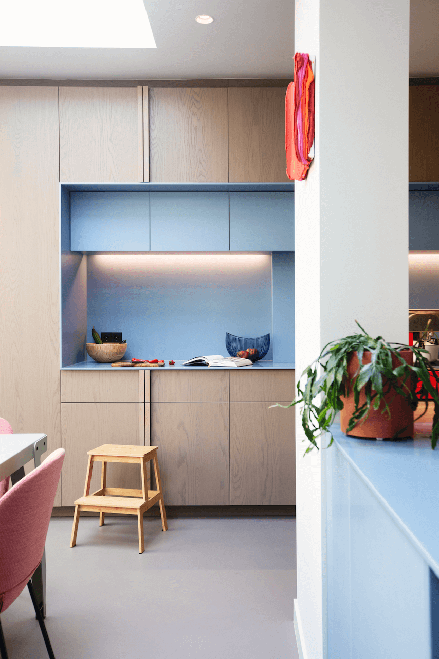
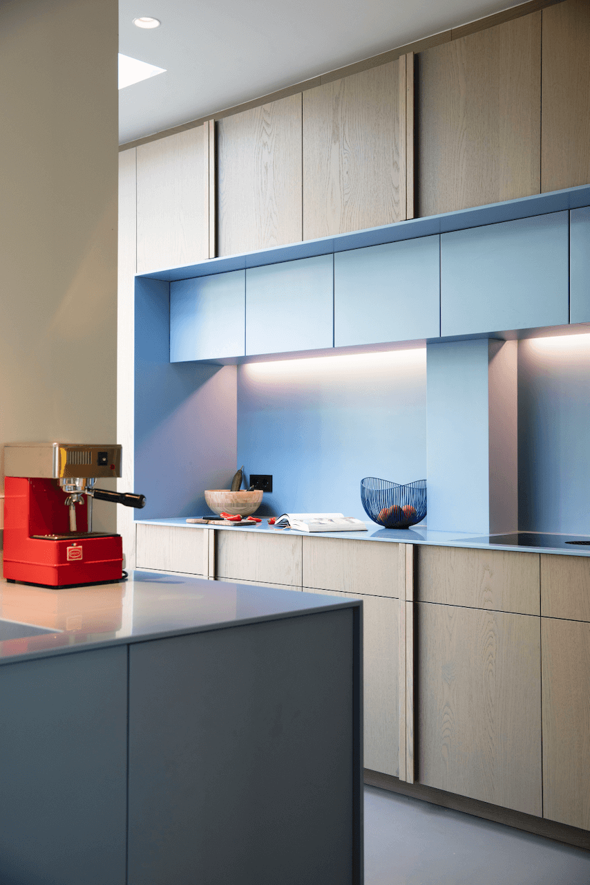
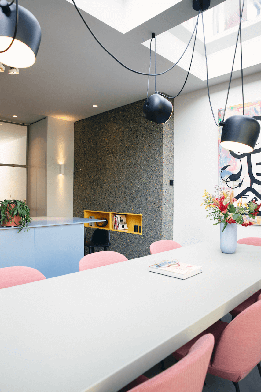
This home, recently renovated and transformed by architect Paul Noordijk, uses HIMACS Sky Blue by LX Hausys as a feature colour. The whole home can be seen here. The inclusion of Sky Blue, alongside the soothing neutrals of whites and greys, defines certain areas and also adds interest and focus. This use of colour is a hallmark of Noordijik, who considers that colour not only has a decorative function but is also an ideal tool for underlining and defining elements of structure. In fact, he also uses an intense yellow, very similar to the aforementioned True Joy, in other areas of the home, particularly the staircase, which can be seen here.
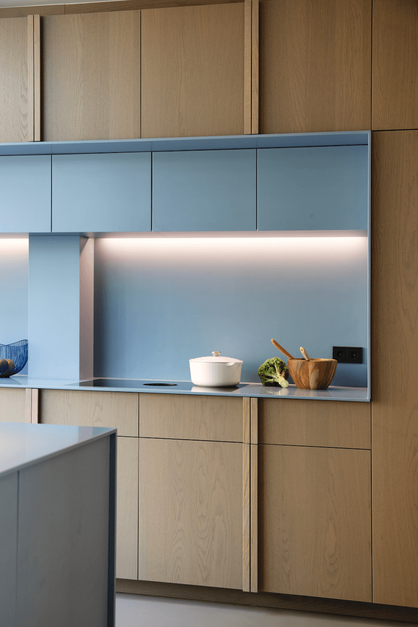
HIMACS SKY BLUE PROVIDES DEFINITION FOR A LAYER OF RECESSED WALL CABINETS
The advantages of this solid surface material are numerous. There are the obvious aesthetics and colour choices, meaning that HIMACS surfaces can be used for work surfaces, splashbacks and fascias allowing a colourful ideas to be embraced in all areas of a kitchen. The hygienic properties of HIMACS solid surfaces mean there are no ‘pores’ to absorb stains or spills and seamless construction means quick and efficient cleaning and prevents bacteria or mould from developing. Above, HIMACS Sky Blue.
COLOUR POPS ADD INTEREST AND PERSONALITY TO THIS SCHEME
The whole-house project included repositioning access to the kitchen – originally it was via the living room, but the new layout allows access from the hallway – which makes both rooms more easily accessible and also defines the flow of the ground floor. A strong feature of the new layout is the installation of the island (with pink upholstered seating around it) with its integrated sink, to the addition of a pillar between kitchen and dining spaces. Architect, Paul Noordijk,Photography, Miranda Koopman
HIMACS SOLID SURFACE IN DETAIL
HIMACS solid surface material can be moulded into any shape and is used for sculptural, and often curved, high-performance cladding, for kitchen and bathroom furniture surfaces, and will withstand tough use in commercial and public areas, as well as domestic homes. The smooth, non-porous and seamless surfaces are fabricated to order, and are composed of minerals, acrylic and natural pigments. Fabrication here by Aimeubel.
LITTLE GREENE INTRODUCE THE CONCEPT OF DOUBLE DRENCHING
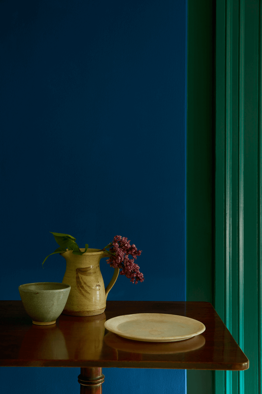
‘Colour Drenching’ is the interior design term, first used by Little Greene in 2021, used to describe a room that is ‘drenched’ in colour – usually a single bold or dark colour which is used across the entire room. Using the same colour for ceiling, walls, woodwork, plasterwork and skirting boards looks immediately striking and makes a huge design statement. Little Greene has now taken the concept a step further and introduced the idea of ‘Double Drenching’ which is using two (or more, but then it would be triple or quadruple drenching, surely?!) related colours across all available surfaces. The colours need to be strong and of a similar depth to work, but can be bold contrasts. Above, Mid Azure Green and Deep Space Blue both by Little Greene.
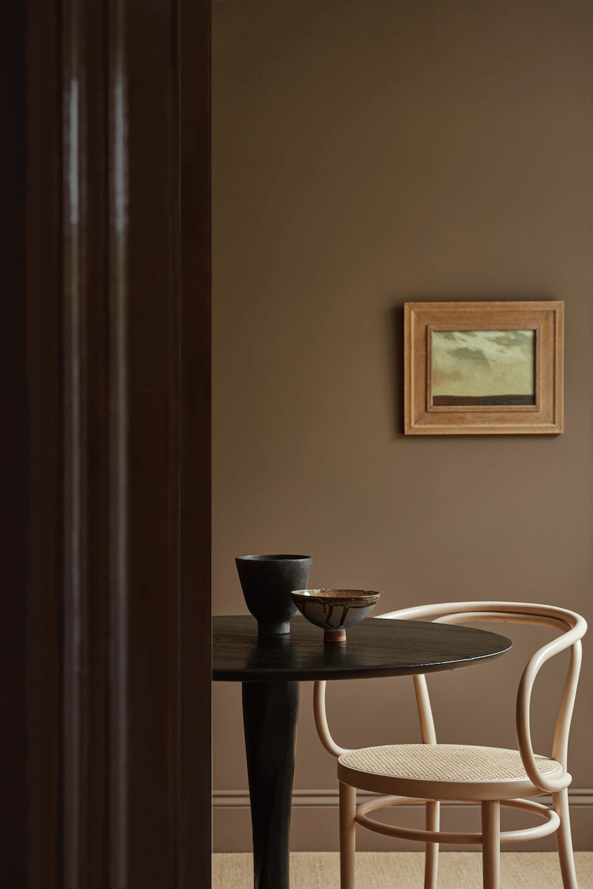
BACK TO BROWN FROM LITTLE GREENE
Ruth Mottershead, Creative Director, Little Greene says ‘It’s always fascinating to see how colour confidence and the use of colour changes over time. The understanding of the effect of colour on the atmosphere of a space is something that has grown exponentially over the past few years. Since first introducing the ‘Colour Drenching’ approach back in 2021, we have seen customers move away from traditional schemes to embrace deep and mid-tone hues from floor to ceiling and everything in between, creating really engaging, inviting spaces. ‘Double Drenching’ is an expansion of this colour confidence, taking the concept into a highly creative, sophisticated and nuanced approach to decoration’. Above, Purple Brown and Scullery both by Little Greene.
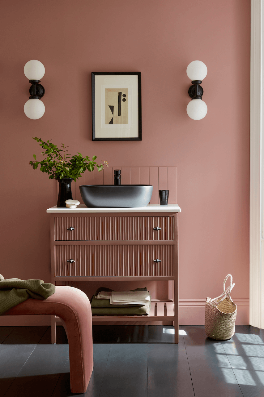
BLUSHING BLACK FROM LITTLE GREENE
This Double Drench combination manages to be both soft and bold at the same time. These schemes are built on the foundation of strong shades, offering the chance to embrace a bold palette and adding unexpected feature colours – perhaps for upholstery or accessories. Above, Hellebore, Blush, Lamp Black and China Clay
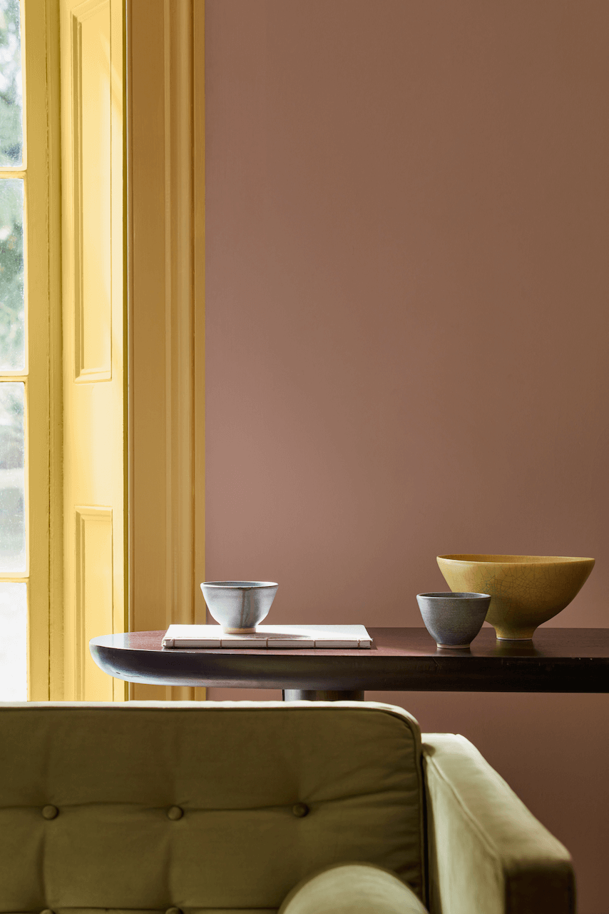
A GOLDEN GLOW FROM LITTLE GREEN
And our final Double Drench look for this time is the gloriously sunny Light Gold, sitting very well alongside Masquerade. Little Greene paints are environmentally friendly and include child-safe water-based paints as well as oil-based paints using natural vegetable oils. The pigments used in the formulations are both traditional and contemporary, and use up to 40% more pigment than some other paints, hence the stunning depth of colour and undertones that can change in different lights. More info on the colour collections here.




Leave a comment