An inky blue kitchen by Hux London for a West London family home
By Linda Parker
 HUX London bespoke kitchens are a harmonious blend of form and function.
Each kitchen is unique, the team are experts on spatial planning and clever storage solutions, paired with skilful innovation and choice of colour palettes that ensure a unique look for each project.
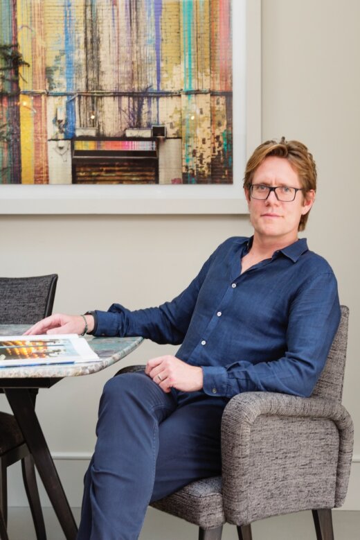
HUX Founder Felix Milns gives us the background on this kitchen extension which was part of a whole-house project.
Q: What were your clients’ requests at the beginning of this project?
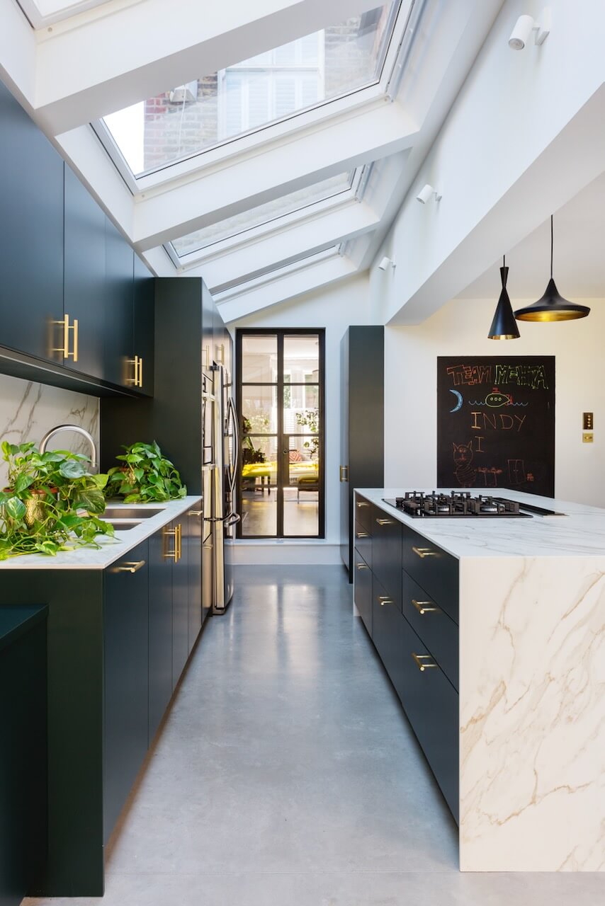
Our clients wanted a flexible, free flowing space for all the family with an open plan scheme considerately designed with entertaining and relaxing in mind, whilst allowing for the various facets of busy family life to take place in harmony at the same time. With young children, the kitchen needed plenty of intuitive storage to support the day-to-day life of a family, easily accessible but also easily tidied away to restore a sense of calm. It was important to make this expansive space feel warm and inviting. It had to be perfect for the family in the daytime, as well as offering a relaxing and sophisticated space for the parents in the evening.
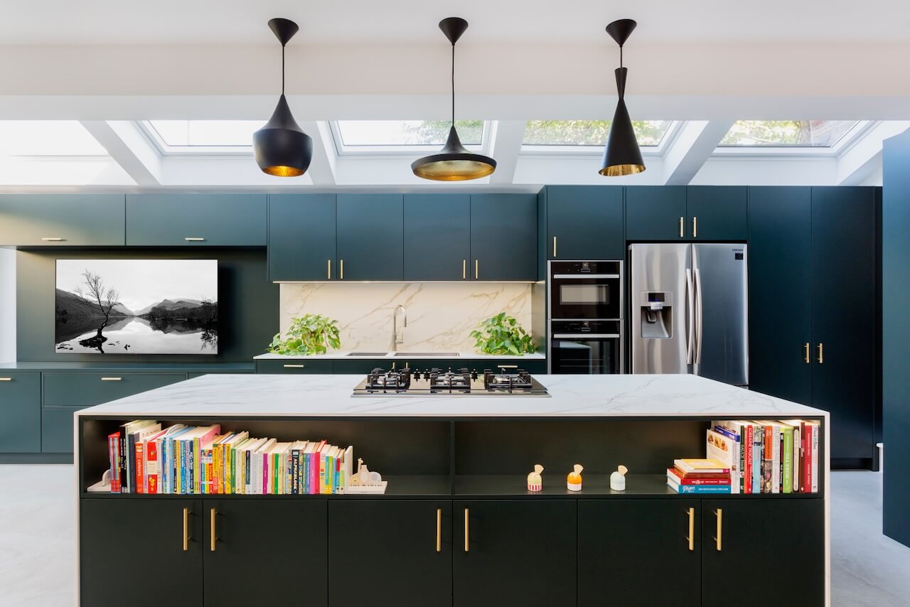
They wanted to be able to integrate a TV into the main wall of the kitchen without it looking overbearing, and at the same time make the kitchen feel more ‘loungey’ than just a pure kitchen. They wanted a clean, contemporary look and this also drove the colour scheme. Incorporating the TV was a great first step to blur the lines between kitchen and living space, we also designed some beautifully lit open shelving on the island which completes the look.
Q: How did you set about answering that brief? Were you given a strict budget?
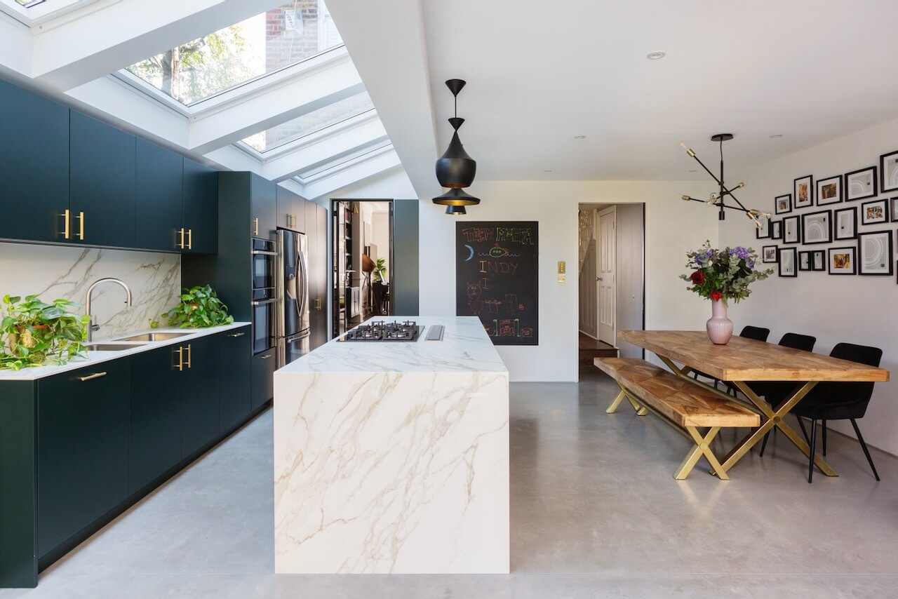
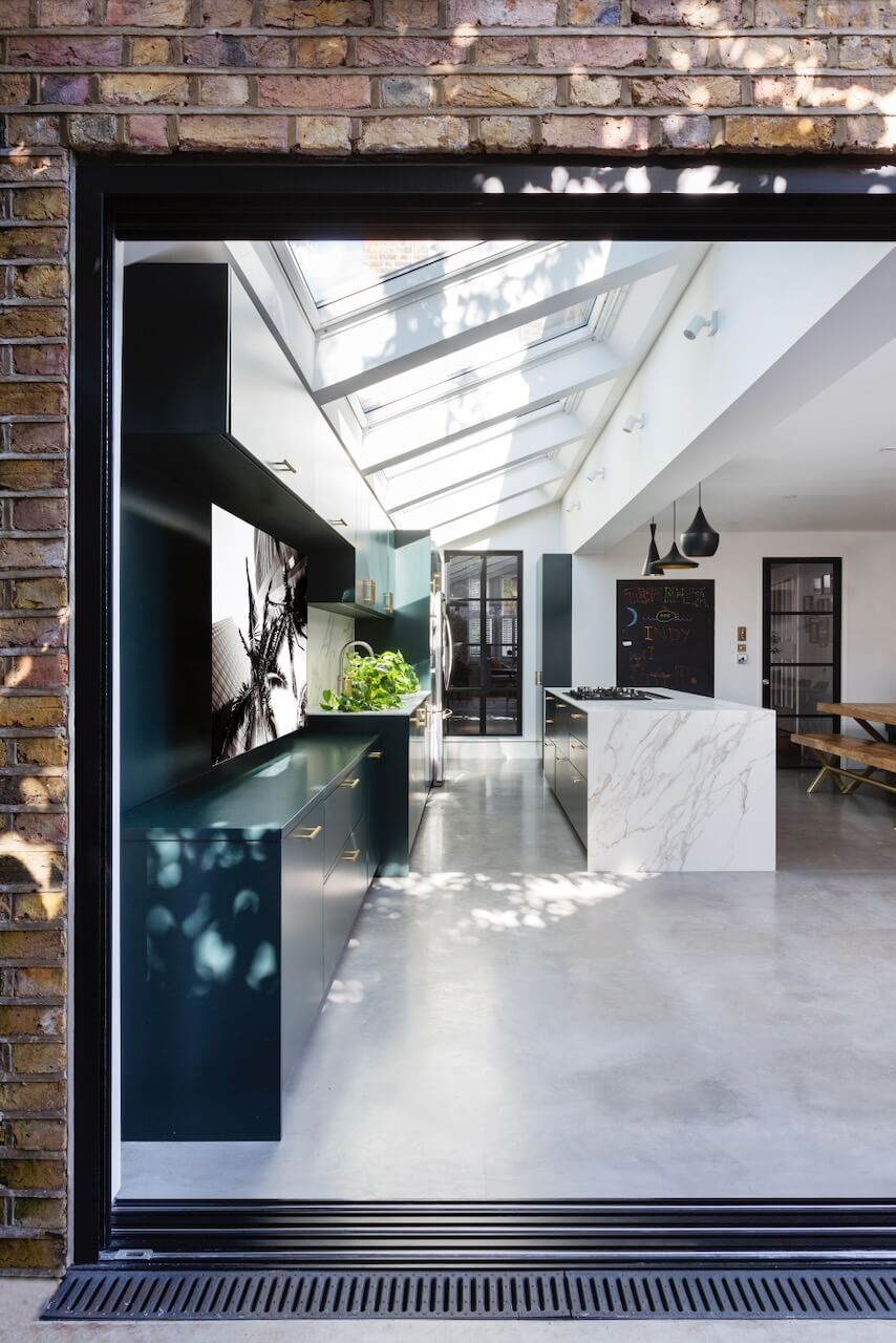
We began by studying the overall layout of the room and how we could work with it to create different ‘zones’ that would offer a variety of functions. At the same time the zones would be in harmony, allowing an organic flow throughout the room. Three different areas were considered and then defined through a series of bespoke cabinetry. The main kitchen preparation and cooking zone and the dining zone were separated by the creation of a sculptural kitchen island, which is anchored in the centre of the room creating a focal point and drawing in anyone entering the room. An additional living area for relaxed family time extends from the kitchen with the same palette of materials across cupboards and finishes. This ensures it feels part of the room, yet with a different function.
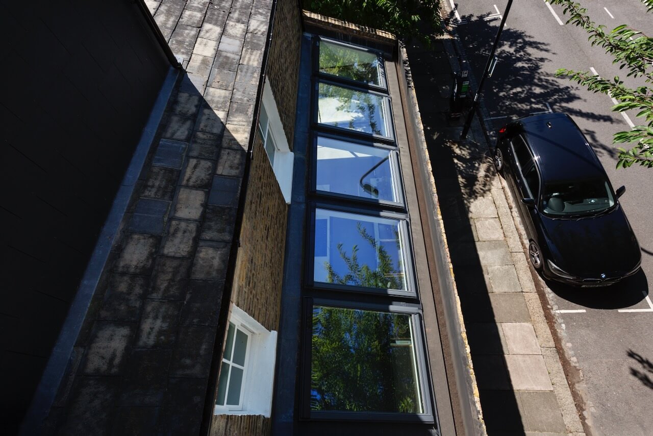
The plethora of glass which extends throughout, from Crittall doors to both the interior and exteriors, as well as large roof windows, meant the room had lots of natural light, and was a key consideration to ensure that the ambience felt inviting and welcoming. The rich colour palette reflects the expanse of the sky above but with a sense of warmth as a deeper shader of blue, which envelopes the room. In terms of the budget, our client wanted to keep under £60,000, which we were able to deliver -inclusive of appliances and a premium 12mm thick Calacatta Neolith worktop.
Q: What were your suggestions for cabinetry and work surfaces?
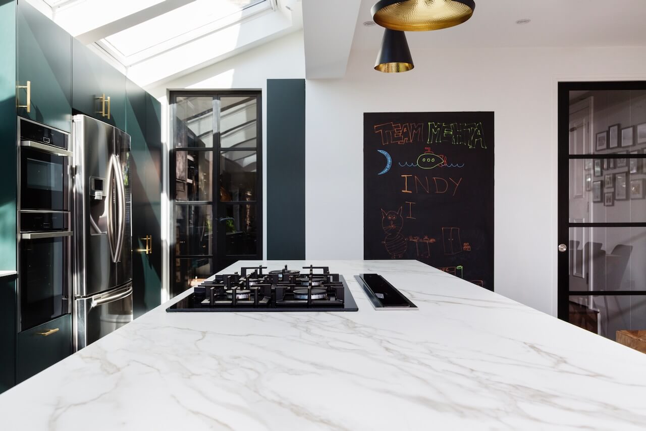
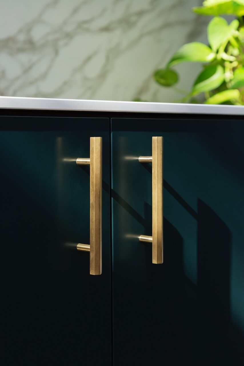
By using the enigmatic colour Salamander by Benjamin Moore we introduced a deep shade of inky blue across all cabinetry, giving the space an immediate feeling of depth and warmth, whilst reflecting and enhancing the flow of natural light. Cabinetry and drawers were finished with contrasting brass handles, which add a decorative embellishment and beautiful design detail. These stronger colours and touches of metallic counterbalance perfectly with the expanse of white from the Neolith Calacatta stone that extends across the splashback and waterfall kitchen island. This choice of stone is not only beautifully minimal at 12mm thick but also immensely practical, being easy to clean, ultra-hardwearing and very hygienic.
Q: What building work was involved?
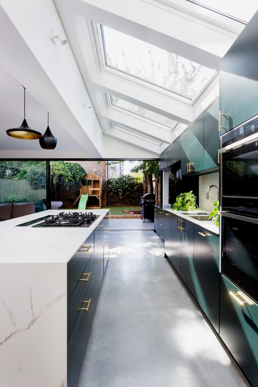
We were working with ZULUFISH , our sister Design & Build Company, and they delivered a full remodel to the ground floor. Unusually the side return had already been extended into. However the original side walls had not been removed, so the space that is now the open plan kitchen living area was still divided into three small rooms and a corridor. Once that space was opened up, the dynamic of the house was completely transformed.
Q: What design elements do you think make the scheme so successful?
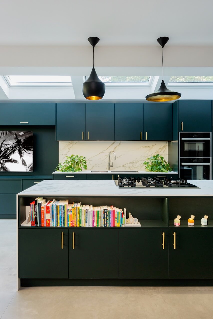
The island, anchored in the centre of the room, was an integral part of our design concept. It was principally focused on providing a multi-faceted kitchen space that would support the different needs for the family. It not only provides the brilliant practical advantages of storage, as well as space for appliances to be concealed for a sleek finish, it also creates a division between the cooking and living areas, naturally dividing the room so that family life can unfold safely away from any cooking. The lighting detail above the book shelves is particularly successful. Opting for a waterfall finish in a natural stone elevates the piece with a sculptural feel, an elegant form that is also immensely practical. The result is a modern, clean design that feels richly layered.
Q: Now the project is finished, what aspects are you (or the client) most pleased with?
We like to say this kitchen is a perfect example of contemporary sophistication. The clean lines and chameleon-like colour really unite the main kitchen and island, and the panel behind the TV is a very subtle yet successful way of bridging the gap between the living and kitchen space. We also lined up the kitchen island to finish with not only the main run but also the expansion gap in the concrete floor. It is these small design details that make a big impact.
Q: What is your best advice for someone who is planning a new kitchen?
The most successful bespoke kitchens are a harmonious blend of form and function; beautifully designed to perfectly fit the client’s lifestyle. At HUX we work with the finest materials, combining innovative design and different finishes, traditional skills with modern techniques to offer superior durability, style and practicality.
Every kitchen project is completely unique and should support the lives of those that will spend time in the home. It’s important to understand how clients live from the outset, asking questions that will allow us to create a profile and then build a design concept to suit. For example if you are looking for a kitchen that is ideal for socialising and entertaining then perhaps a kitchen island is key, allowing flow around the room as well as a natural area for people to gather. For those who enjoy more formal dining, then perhaps a dedicated space for a table and perhaps a home bar for pre-dinner cocktails might suit. Is it a room which is more focused on food and eating, or does it need to deliver space for relaxing, working from home, an area for children to play and spend time? All these functional needs should be considered first as they will influence the framework of the design.
Once the functionality is agreed and underway, then you can move towards thinking about the overall aesthetic, considering preferred materials and finishes. It’s helpful when clients have a general idea of the finishes they are drawn towards, but this isn’t essential as our designers encourage our clients to push the boundaries of design and creativity, offering concepts that may not have been previously considered. There is no need to have a fully formed design in mind and in fact it is a good idea to have a fairly open mind, as this can be a very organic journey that will evolve as the project progresses.
Q: Do you have a secret ‘style signature’ or feature that you find you use in most of your kitchen projects?
No, not at all! Every single project is wholly unique and bespoke to the space and the lives of the client, underpinned by the craftmanship and creativity of our, designers. It’s what makes our work so rewarding, seeing each individual kitchen come to life.
Q: Are you seeing more large-scale projects such as this, including multiple zones?
The kitchen as a space in the home has certainly evolved significantly in recent years, and it is now very much the core of the home and the most multi-faceted space. In the past an open plan layout has been preferred but we are now seeing clients opting for flexi-plan as a different option. Flexi-plan is a space with an element of open plan but with greater flexibility, with dedicated areas for relaxing, dining or for more practical necessities such as laundry – with plenty of storage to support the various facets. Flexi-plan ensures that larger kitchen spaces such as this, retain the living/socializing/entertaining ambience, whilst allowing the various elements of home life to co-exist in harmony.

Kitchen project by HUX London Bespoke Kitchen & Joinery. Tel: 020 8577 4500
Flush cabinet doors are spray-painted in Salamander by Benjamin Moore, cabinet handles are Hive polished brass by Dowsing & Reynolds
Worksurface, Neolith Calacatta 12mm, Neolith
Ovens, Neff
Hob and Integrated Dishwasher, Siemens
Fridge-freezer, Samsung
Hot tap, Quooker
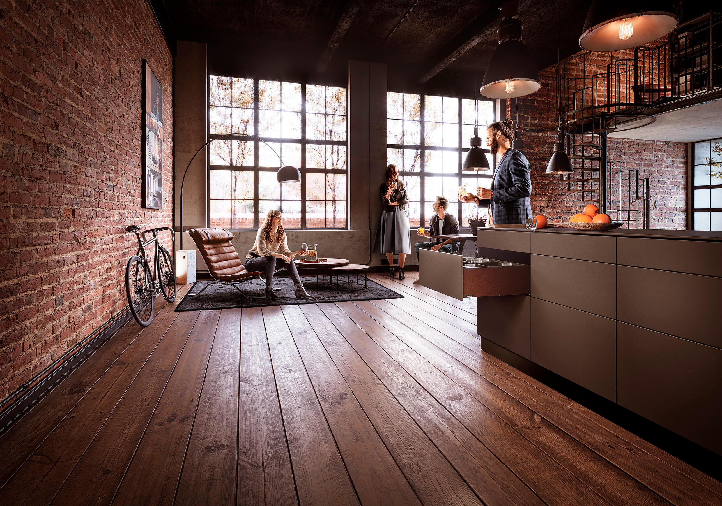
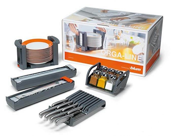
All cabinet hinges and Legrabox drawer systems, Blum



Leave a comment