The Perfect Pink Kitchen by Martin Moore
By Linda Parker
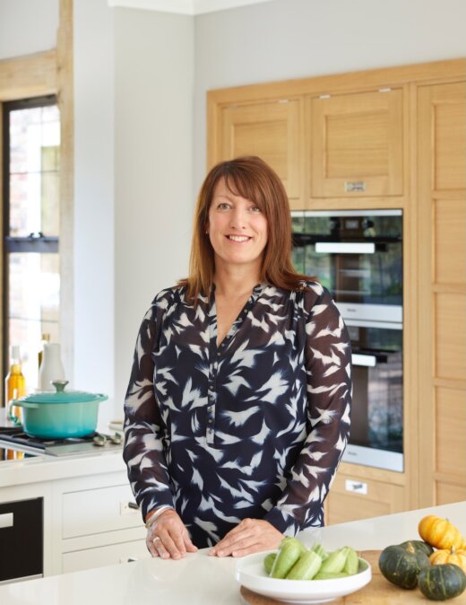 Pam Baker, designer at Martin Moore, designed this vibrant and refreshingly colourful kitchen for her clients.
They were seeking a new kitchen with superb practicality and colour that suited their modern family lifestyle.
New Classic cabinets with a pink island and glass pendant lights created a fun, timeless kitchen.
Q: What were the main priorities for your client?
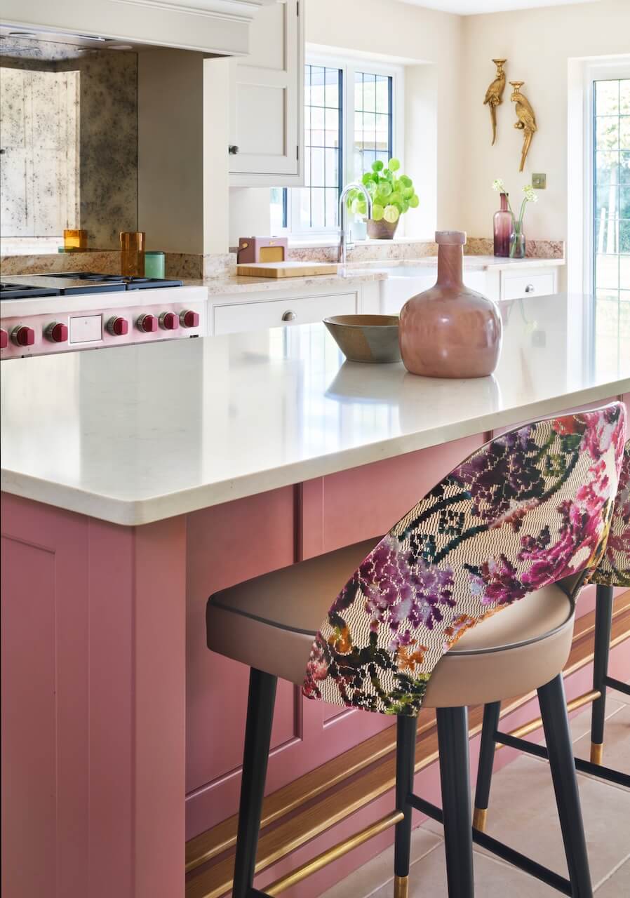
As a keen cook, our client wanted modern appliances. They had seen a Wolf range cooker in our showroom, and decided it was a must-have for their kitchen. In terms of appearance, the brief was to replace the tired cherry wood, fitted in the 1990s by the previous owners, to suit modern family life and to reflect their exuberant style.
Q: How did you set about answering that brief?
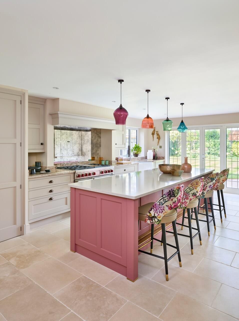
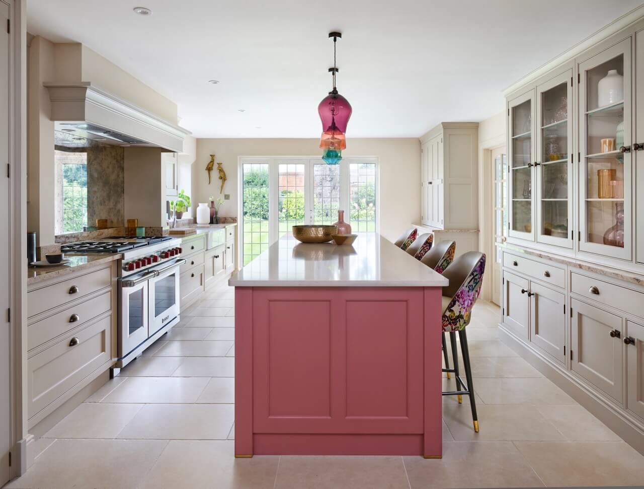
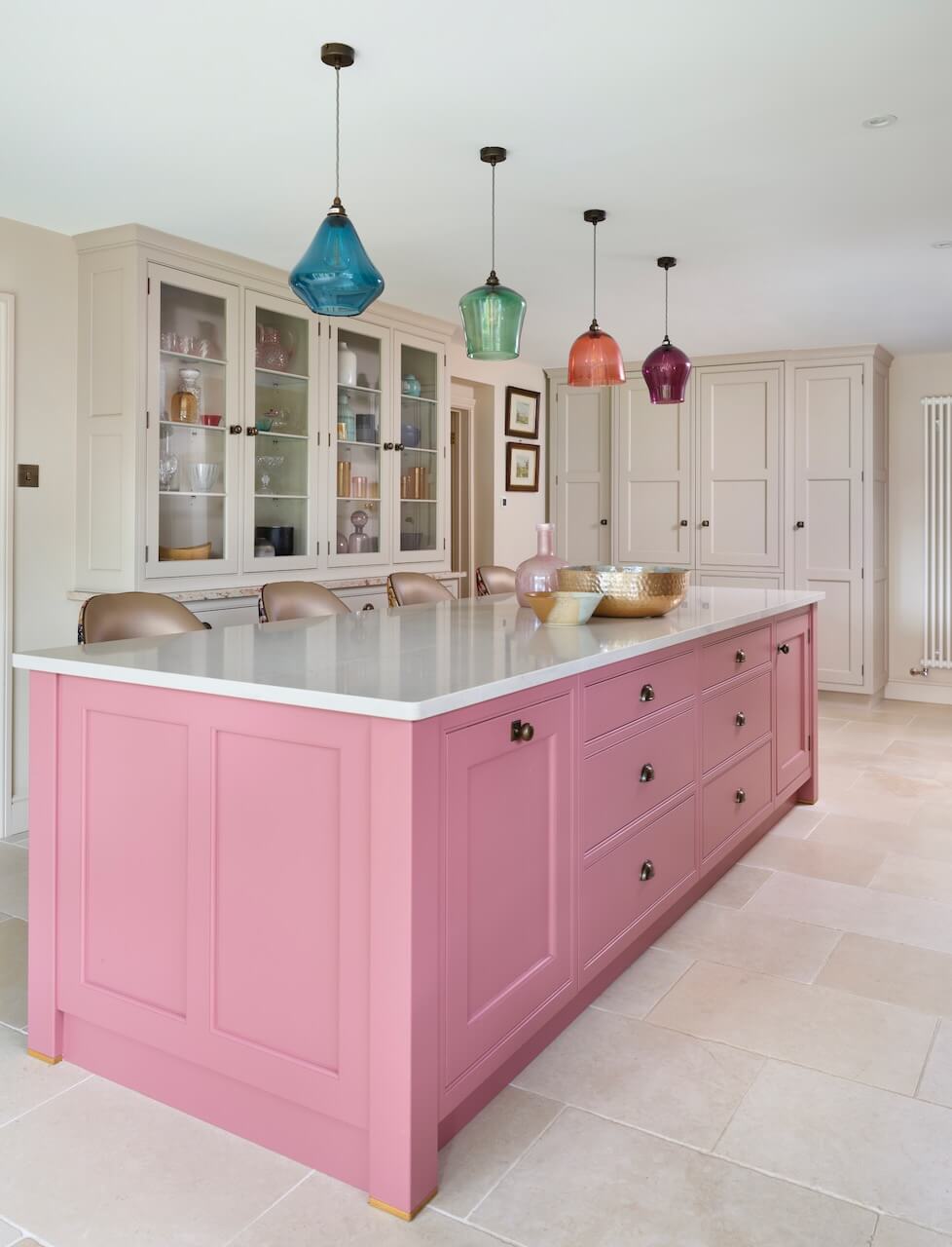
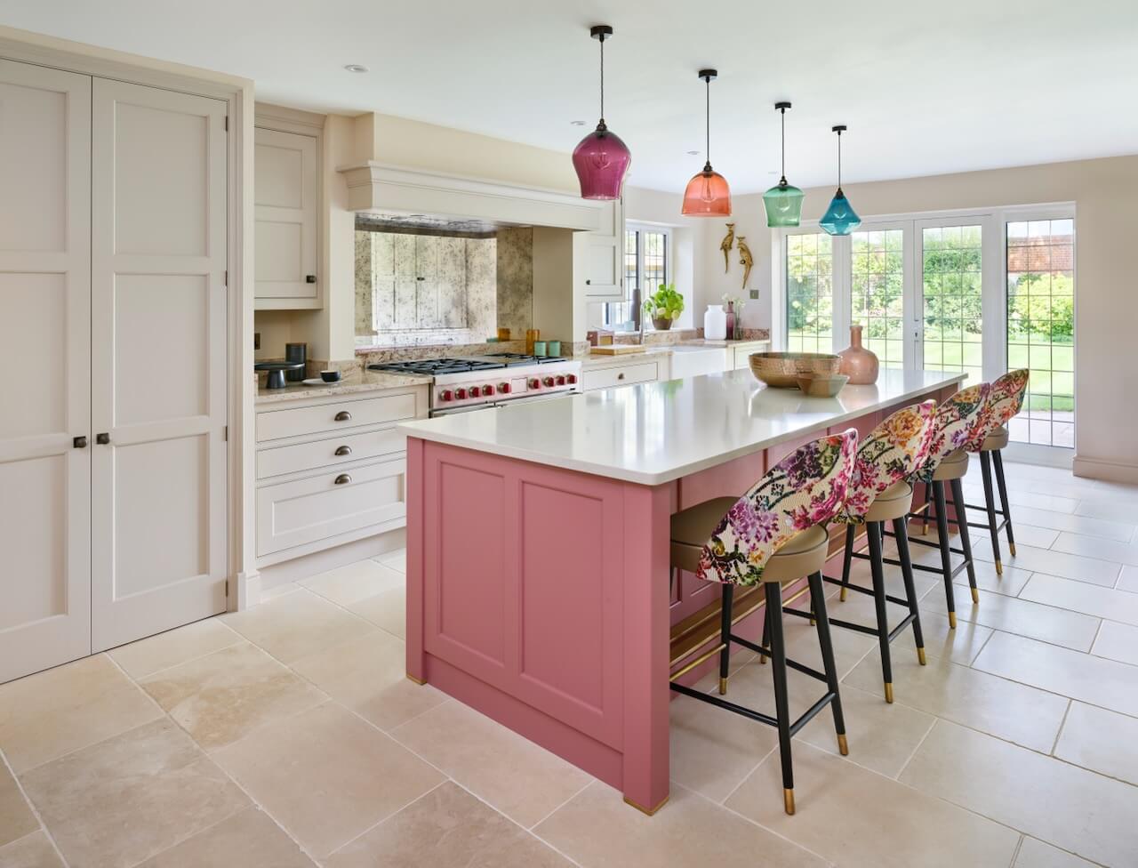
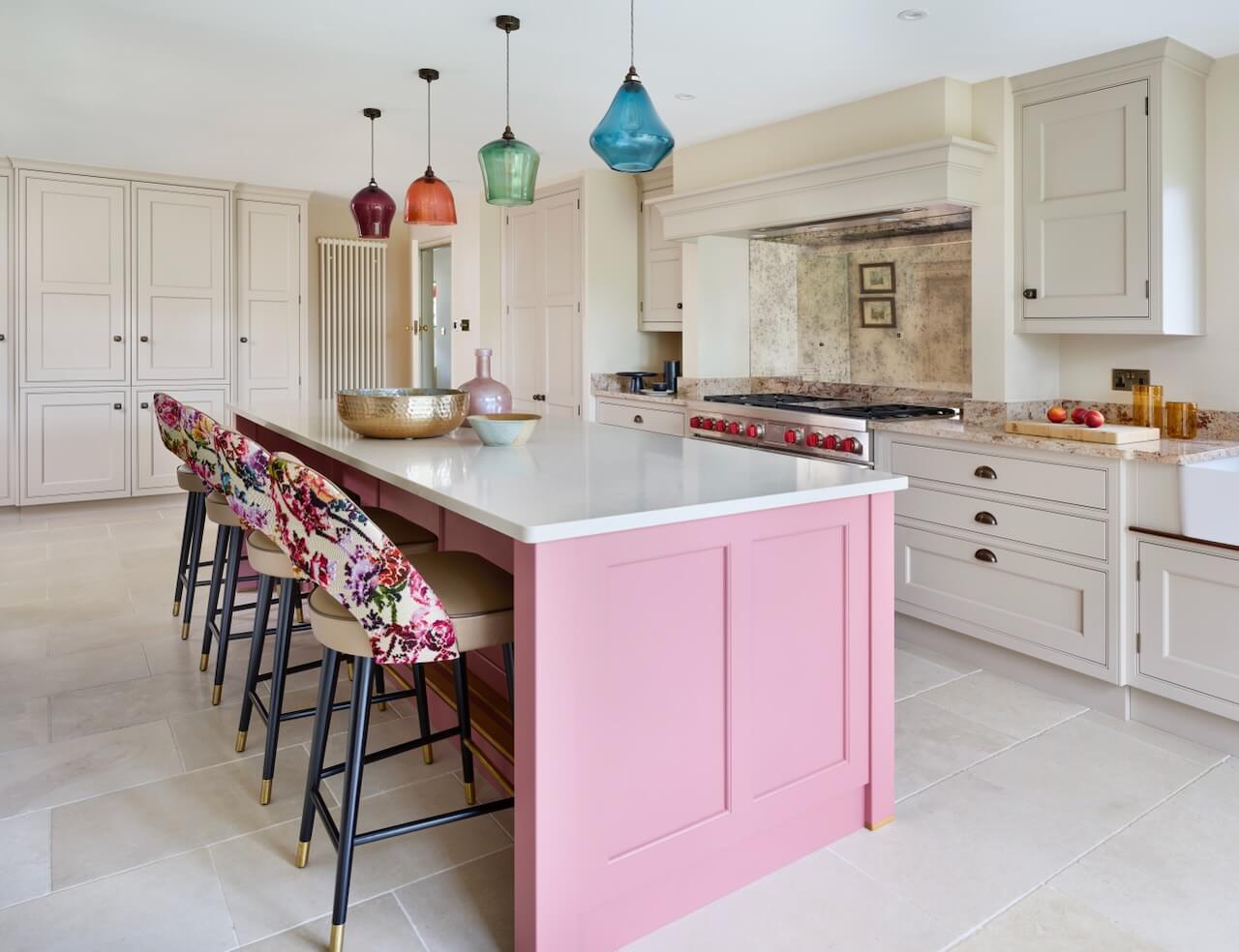
I felt that Martin Moore’s ‘New Classic’ cabinetry, which offers a modern twist on our classic cabinetry for a contemporary feel, would work brilliantly with the style of the home. Our client was keen to have elements of pink within the kitchen, so we incorporated shades of pink into the cabinetry. The island is the focal point of the kitchen, painted in a vibrant ‘Raspberry’, which really makes it pop. This is further enhanced by the bright candy-coloured pendant lights above the island and the playful floral fabric on the bar stools.
Q: Can you explain the reasons behind the choices of cabinetry and work surfaces …
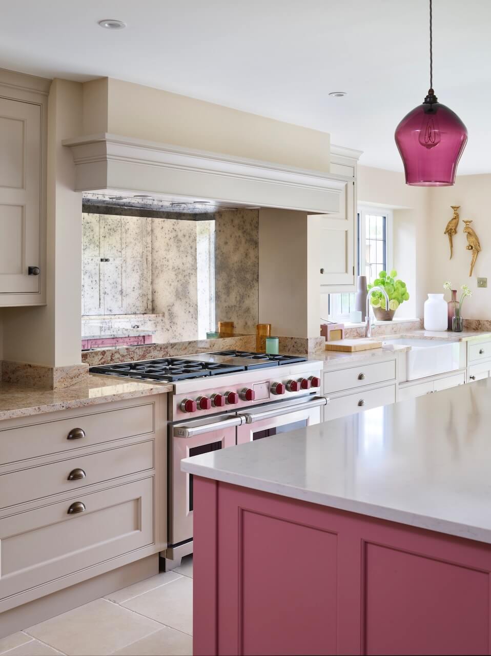
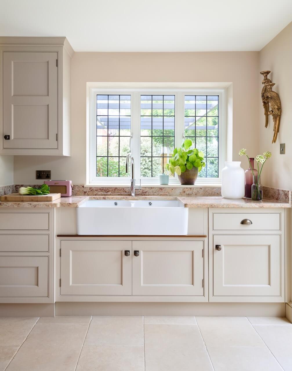
The main runs of perimeter cabinetry are painted in ‘Pale Peony’. Pale pink is a very ‘easy to live with’ colour and is perfect for those who want to use colour in a subtle way, offering a warmer and more interesting alternative to white or grey. The pale pink cabinetry is mirrored in the warm neutrals of the Shivakashi Granite main run worktop and the quartz island worktop. The pink and cream tones work beautifully together to create a calming, harmonious kitchen that still has elements of fun and vibrancy without being visually overwhelming.
Q: What building work was involved?
We suggested repositioning the window to the end of the kitchen run to allow for an expanded cooking area and a more central position for a range cooker. This also offered a spectacular view of the newly landscaped garden whilst standing at the farmhouse sink. The uniform, rectangular room was perfectly suited to a symmetrical kitchen design. So the central island overlooks the cooking area, delivering a social and welcoming space that allows family and guests to relax on the bar stools and socialise with the cook.
Q: What design elements do you think make the scheme so successful?
Every detail of the kitchen was considered, and everything works seamlessly to create a perfectly unified kitchen that is highly functional as well as being a beautiful social space. The antiqued mirrored splashback works perfectly with thesatin lacquered antique brass handles, and the Martin Moore Stone floor in ‘Aged Cream’ complements the Shivakashi granite and pale pink cabinetry.
Q: Now the project is finished, what aspects are you and your clients most pleased with?
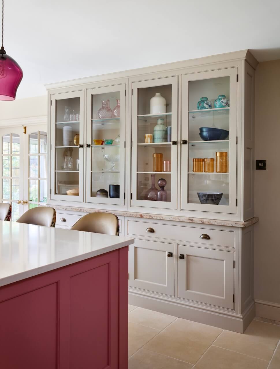
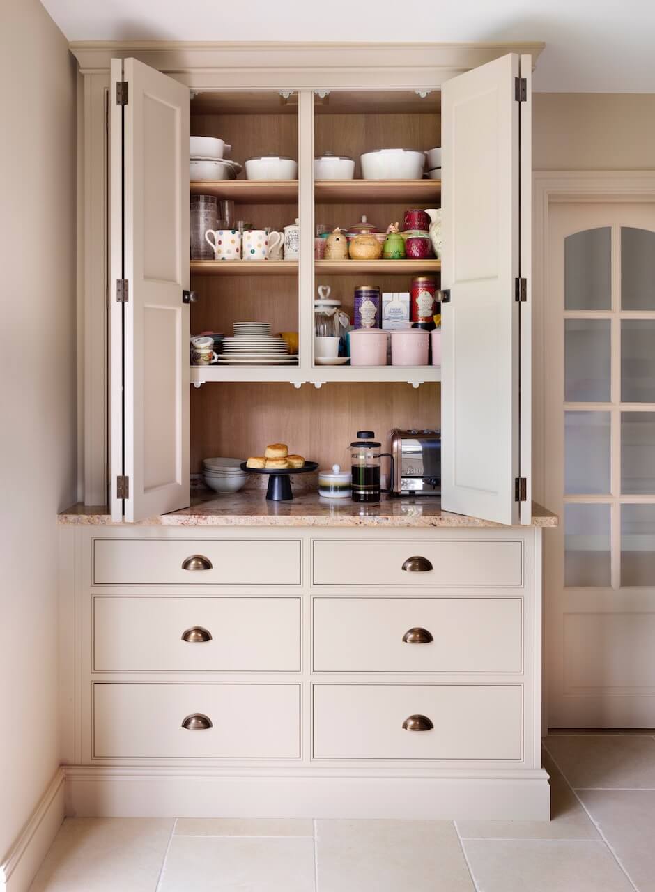
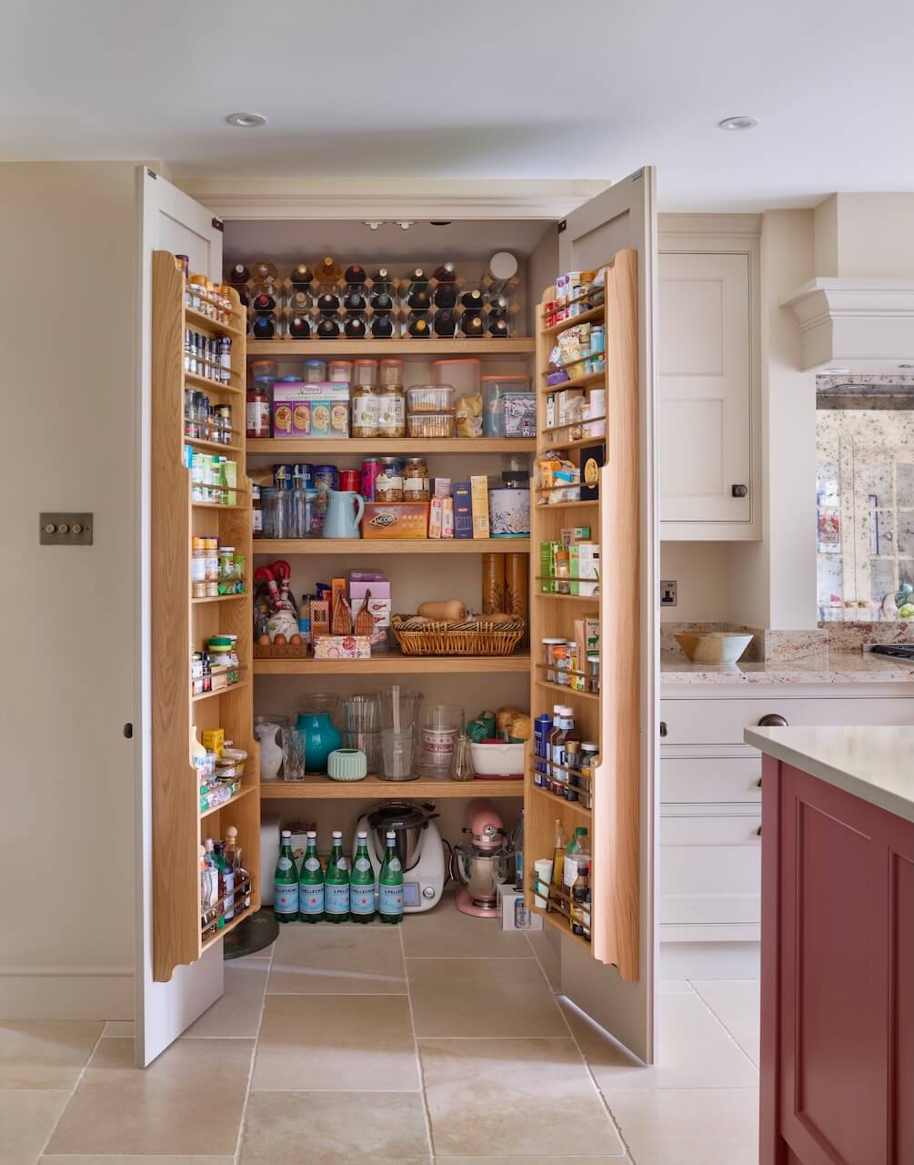
Our client has a prized collection of glassware that they wanted to exhibit in the kitchen, so I proposed a reduced-depth display cabinet. This was specifically designed to offer a large volume of storage to beautifully display the pieces, without obstructing movement around the island. A walk-in pantry and a breakfast cupboard were also added, keeping unsightly appliances, utensils and food neatly tucked away and adding additional storage. As the client was a keen cook, they really appreciate having ample space for ingredients and appliances, whilst keeping them tucked behind beautiful cabinetry to maintain the aesthetics of the kitchen.
 Q: What is your best advice for someone who is planning to update their kitchen?
I feel that zoning is very important, especially in larger spaces. We advise our clients, and design our projects to make sure the cooking, prepping, cleaning, and storage areas are logically zoned so that the kitchen is easy to navigate. Although the appearance of a kitchen is important, the layout and design of the kitchen will determine whether it’s a pleasure to use on a day-to-day basis.
Q: Every project you design is completely individual; how do you approach that?
Every kitchen we design at Martin Moore is entirely bespoke and led by the style and architecture of the property, as well as the lifestyle and needs of the people that live there. We talk to each client and gather as much information as we can about their ‘kitchen lifestyle’ so we can create the ideal space for them. As each project varies so much, I feel we don’t really have a signature style, as each kitchen is tailored specifically to each individual client.
Q: Are you seeing more large-scale projects with additional rooms?
Yes, there is a demand for large, open-plan kitchens that are the social hub of the house. If the space is large enough, a larder and a utility room is often incorporated, as it is highly convenient and keeps everything neatly hidden away from the main family and socialising space.
Q: Do you have any trend predictions for 2024?
People are becoming bolder with the colours in their kitchens. Blues and greys are timeless colours that remain a popular choice, but we are seeing an increase in vibrant colours, especially on the kitchen island, as is the case with this kitchen. In terms of materials, beautiful natural worktops such as granite and marble are always desirable and look to remain popular in the future; they are another great way of incorporating colour and interest into a kitchen design.
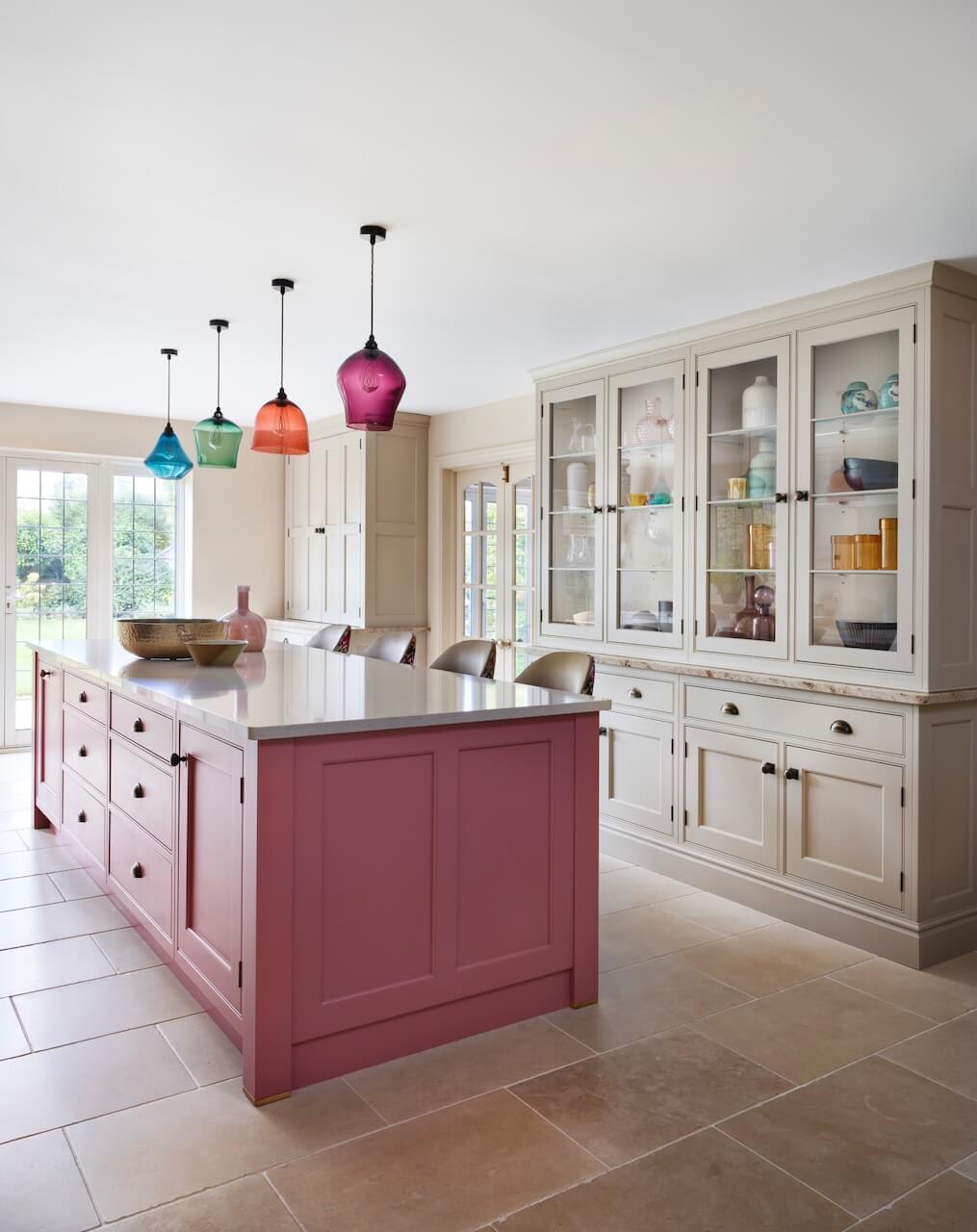
We Love: The Raspberry shade of the island is an absolute winner, especially combined with the colours of the pendants and the stools. The balance and symmetry of this kitchen is joyful too, as well as the plentiful storage for appliances and groceries.
Kitchen by Martin Moore, Martin Moore, Tel 0845 180 0015, Instagram @martinmooredesign Showrooms are Notting Hill, Esher, Old Amersham, Altrincham, Tunbridge Wells, Elland and Muswell Hill.
Cabinetry from the New Classic Collection, perimeter cabinets in Pale Peony, Island in Raspberry. 30mm polished Quartz in Knightsbridge for the island, and 30mm Shivakashi polished granite for the perimeter. Stools also by Martin Moore, with Martineau fabric in Berry by Designers Guild.
Flooring, Aged Cream, Martin Moore Stone
Range cooker, Wolf
Pendant lights, Curiousa





Leave a comment