A touch of summer: calm white kitchen by Harvey Jones
By Linda Parker
 Harvey Jones Creative Director, Melissa Klink, gives us the background and creative thought processes that brought this wonderfully calm and creative kitchen to fruition.
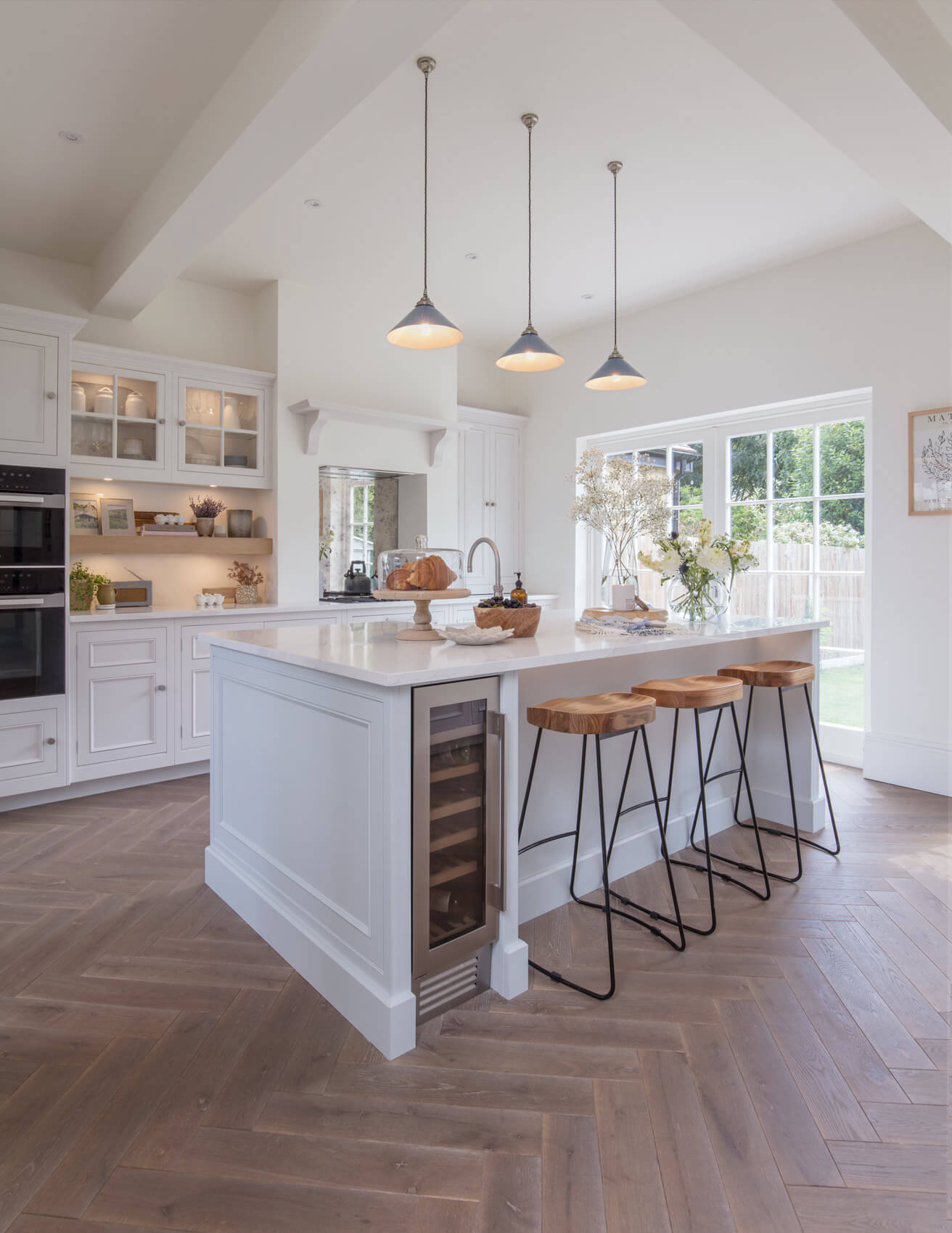
Two shades of Farrow & Ball white provide a gentle background that keeps the look traditional, yet with a sense of fresh vitality…
Q: What did your client want to achieve, was there a particular ‘must-have’? and did they specify traditional or modern?
Our clients really wanted that beautiful blend between classic and traditional undertones but with a fresh and modern touch throughout the whole space. Their home is incredibly tasteful, and this stylish couple needed a space that would work well with the bones of the home but at the same time, make them feel excited each and every day when they walked into the kitchen.
Q: How did you set about answering that brief, were you able to pin down their requests?
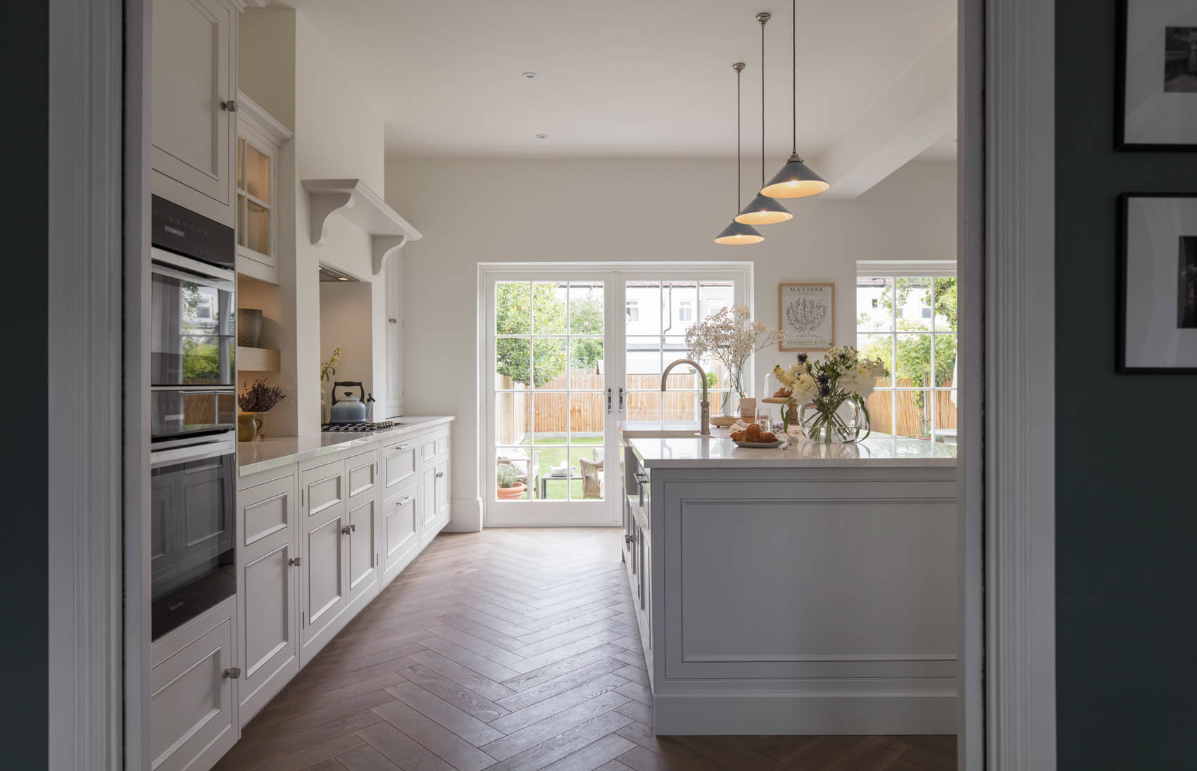
We always make sure we have enough discussions to achieve a thorough understanding of not just the functional needs for our client’s kitchen, but also to gain the knowledge of all those special visions they have for their dream kitchen. Defining their personal style is an important step for us – to ensure the spaces we design echo the character of our clients.
Q: Can you explain the reasons behind the choices of cabinetry and work surfaces …
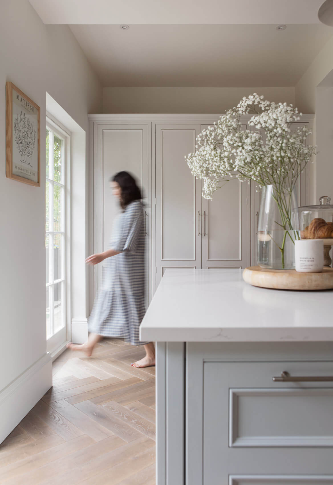
The kitchen space itself isn’t overly huge, but it feels expansive, because of the wonderful natural light that floods in through the French windows. We know we needed to amplify this look and feeling, and happily, our clients loved that idea too. Painting the cabinetry in two pale shades – Borrowed Light for the island and Strong White for all the other cabinets, both shades by Farrow & Ball, had the effect of wrapping that brightness and light all around the room. We had suggested our Original cabinetry, because there is a level of intrigue in the detail of this particular design, which would have been missing if we had gone for one of the more contemporary ranges. Calacatta Gold quartz work surfaces were an obvious choice, we thought, not just for it’s hardwearing and durable qualities, but for the way it pairs really well with the soft, light paint colours.
Q: What design elements do you think make the scheme so successful?
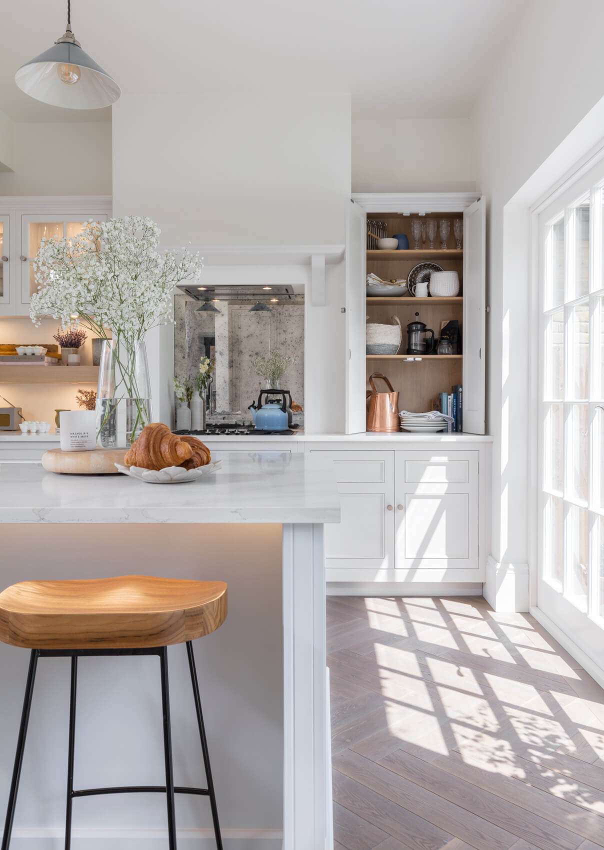
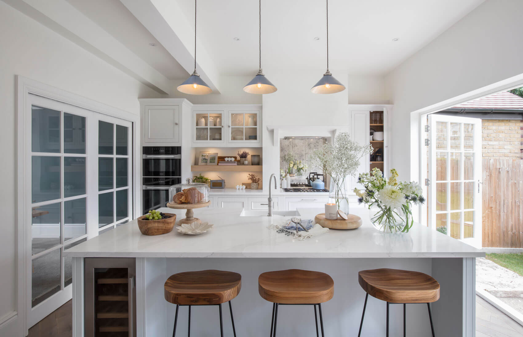
The balance of the layout of the cabinetry was critical to ensuring this design was a success. The run of larders and integrated refrigeration provides a fully functional side that still feels calming because of the light paint selection. Balanced on the other side we have a mixture of function and style. The little details like antique mirror in the backsplash and a shelf for decorative accessories add a personalized charm to the space. Adding the run of smaller pendants layers gives a pop of colour to the room and allows the task areas to remain contained. We felt that one large pendant would have felt too heavy for the room.
Q: Now the project is finished, what design aspects are you most pleased with?
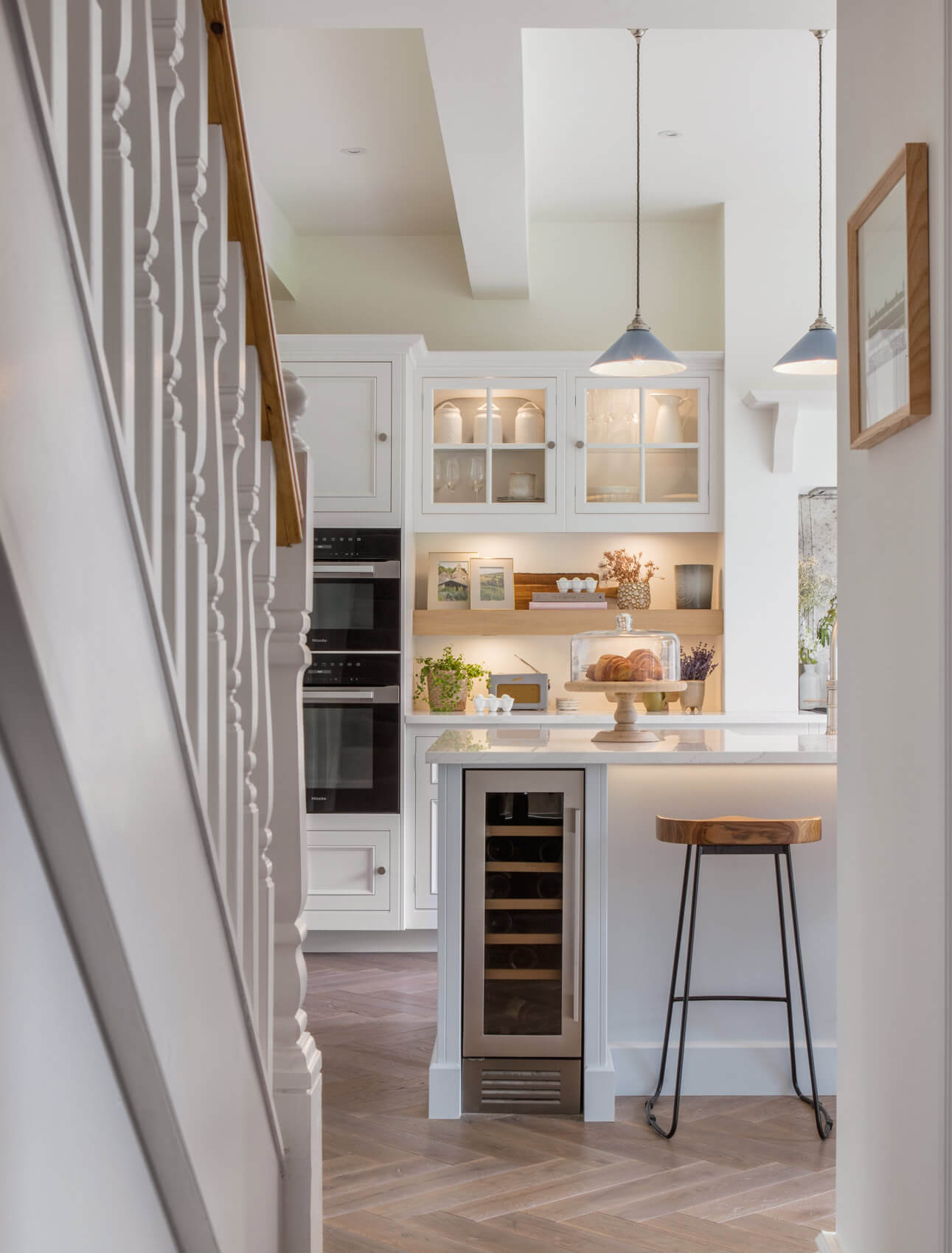
The view from the island is really lovely. There’s space to sit and have an early morning cup of coffee, taking in the entire space with a gentle reflection of the larder run through the mirror and all of the beauty and greenery outside the French windows. With the pocket doors into the dining room it means that entertaining can be effortless. The space can transform and adapt for the occasion, something that is really important for a growing family.
Q: Are you seeing more large-scale projects such as this, including utility spaces and hidden rooms?
Absolutely. The majority of our clients come to us to design projects that include rooms well beyond the kitchen. The way we live and work has changed so much post Covid and we are feeling that impact in our interior designs and what clients ask of us. We are truly living in every corner of our homes now and our clients want handmade furniture of great quality in each of those spaces, not just to enhance the practicality of their homes, but to add style and beauty too.
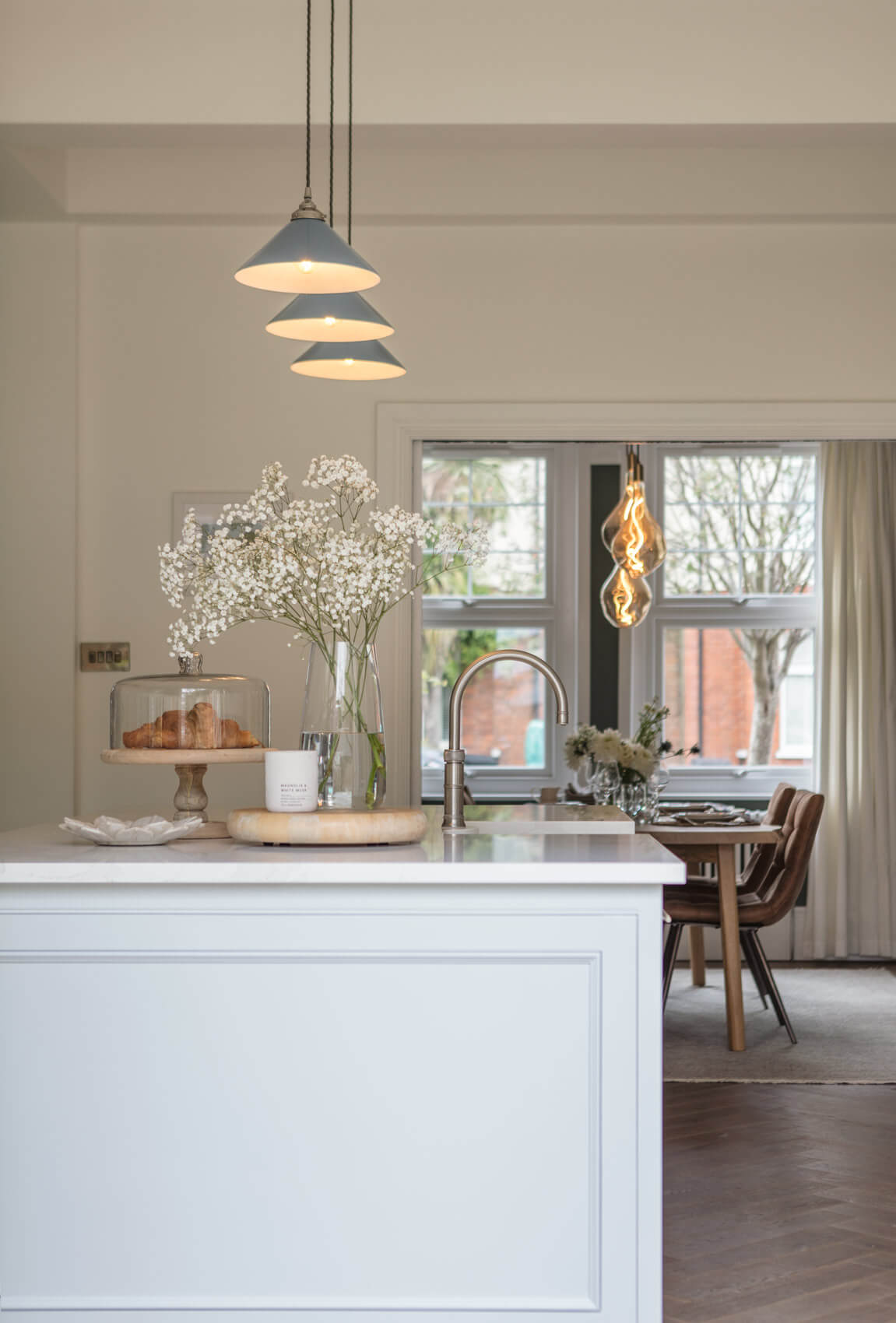
We Love: The pale colour scheme, the elegant lighting, the antique-style glass splashback, open shelving and the illuminated glazed cabinets. All simple, classic choices which come together to create an elegant, polished scheme.
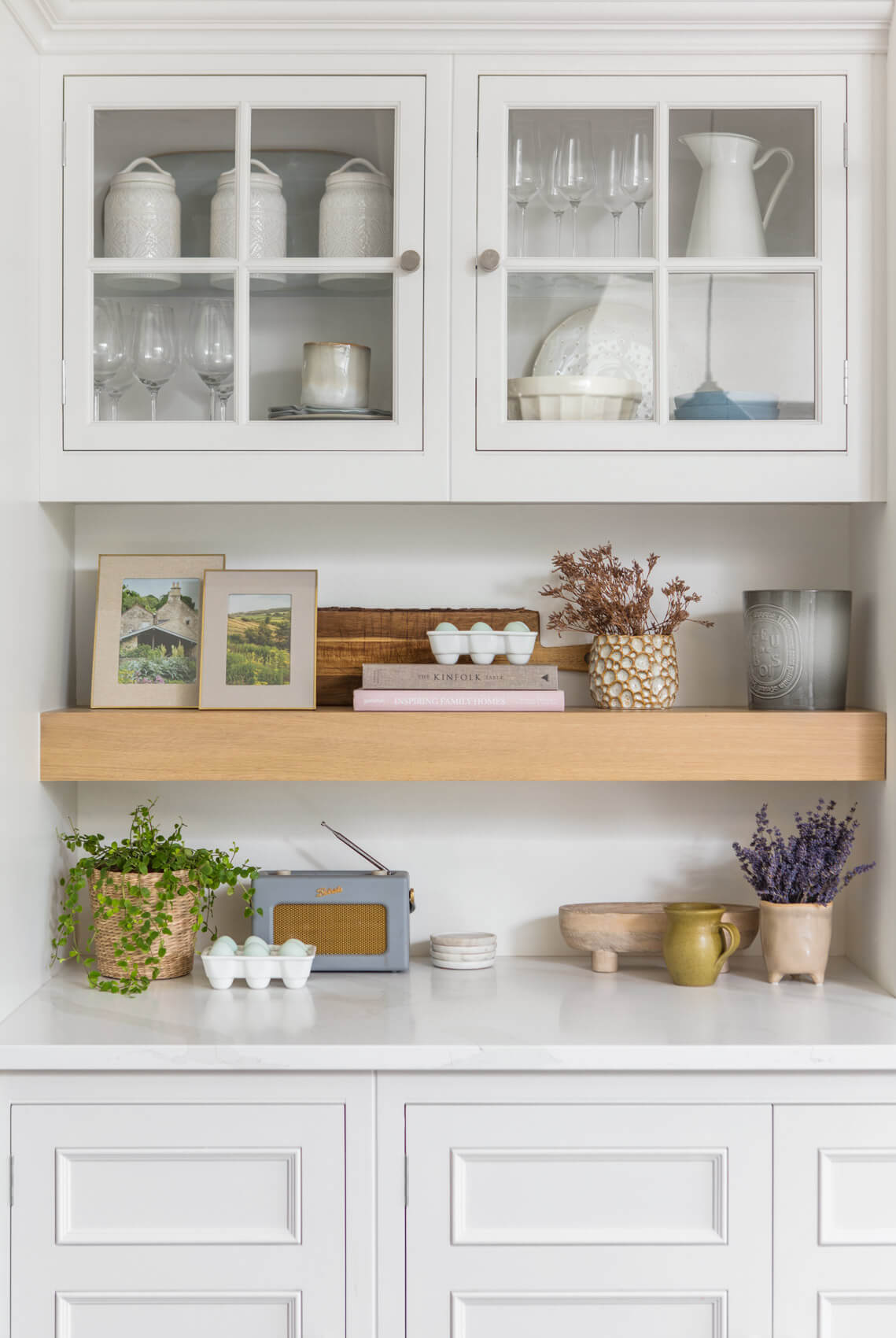
Original Painted kitchen by Harvey Jones. Showrooms include Bath, London, St Albans, Tunbridge Wells, see all showrooms here. Request a brochure here.
Paint, Borrowed Light and Strong White, both Farrow & Ball
Tap, Classic Fusion Round in Stainless Steel, Quooker
Extractor, Inca Lux 2.0 EV8 Integrated hood, Faber Hoods
Hob, 770mm 5 Zone Gas with Mono Wok, Miele
Single Oven, H7260BP, and Microwave, Miele,
Wine Fridge and Integrated Fridge Freezer, Miele
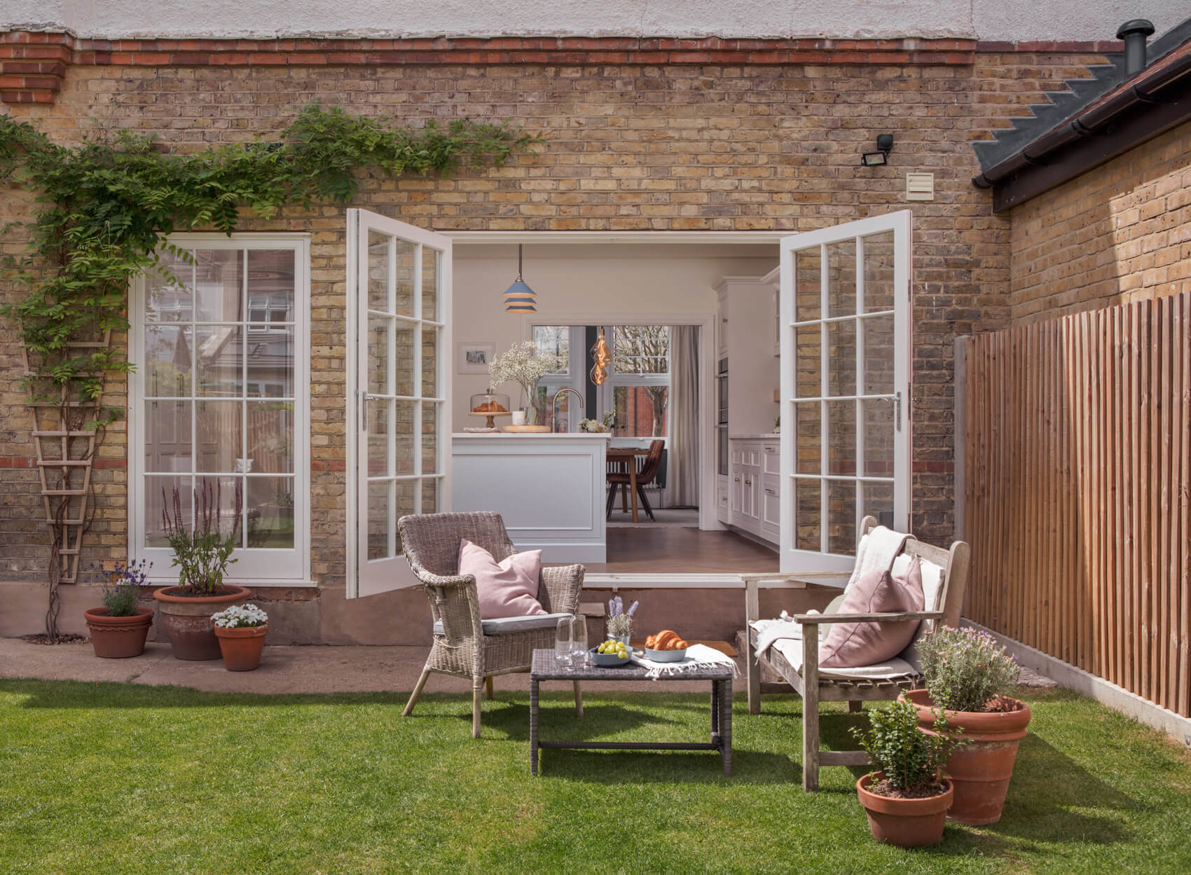
The kitchen looks equally as beautiful from the pretty garden as it does from indoors!






Leave a comment