A clean & streamlined aesthetic: Urban Kitchen by John Lewis of Hungerford
By Linda Parker
 Rebecca Nokes, Head of Design & Brand Creative for John Lewis of Hungerford graduated with a degree in Digital Print Design for Interiors from the Manchester School of Art, and then pursued a career in bespoke interior design.
She is now Head of Design & Brand Creative at John Lewis of Hungerford, which has recently celebrated its 50thAnniversary. Rebecca designs beautiful interiors throughout the home, as well as kitchens, for their clients, from London to Paris.
Q: What did your client want to achieve for their new kitchen? Was there a particular ‘must-have’?
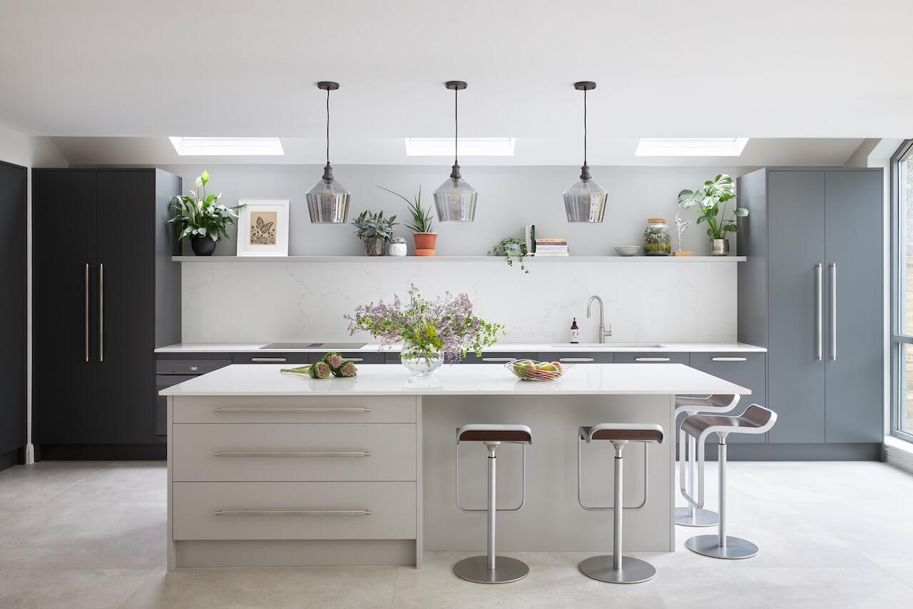
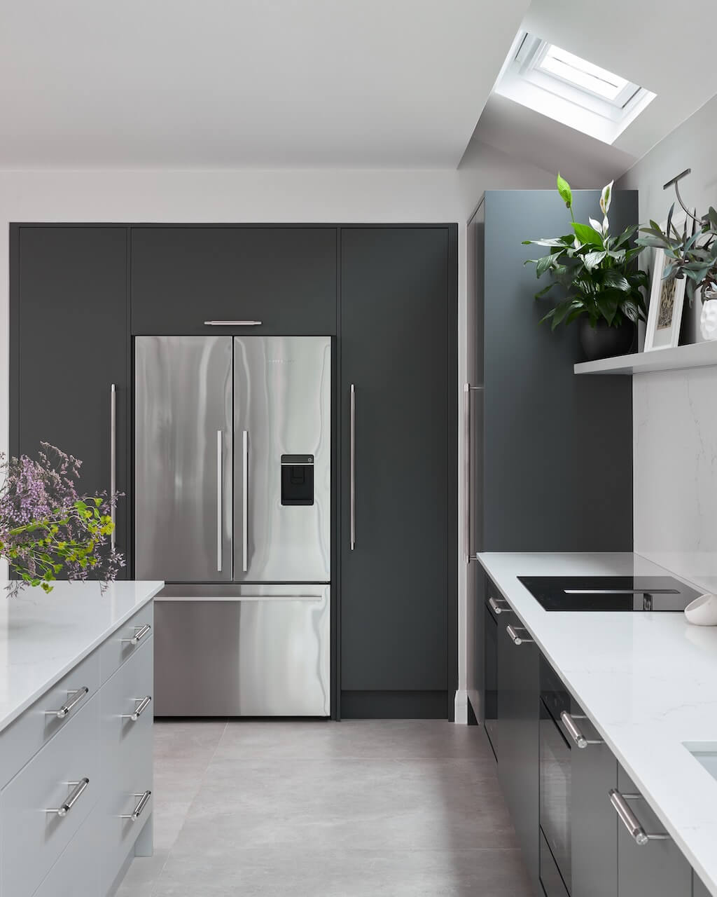
When the clients bought the house, it was covered in walnut throughout! The kitchen was made from solid walnut and was very dark with a lot of orange and brown tones. Our clients really wanted to remove all the wood and have a much cleaner, brighter and streamlined aesthetic.
They wanted a very contemporary look, which is why they chose a slab door from our Contemporary Urban range. It was very important to the client that the kitchen would look very clean and sleek and the absolute anthesis of the previous kitchen. They also wanted the main kitchen cabinetry to be grey, which they felt would create a calm and soothing ambience.
Q: How did you set about answering that brief? Were you given a strict budget?
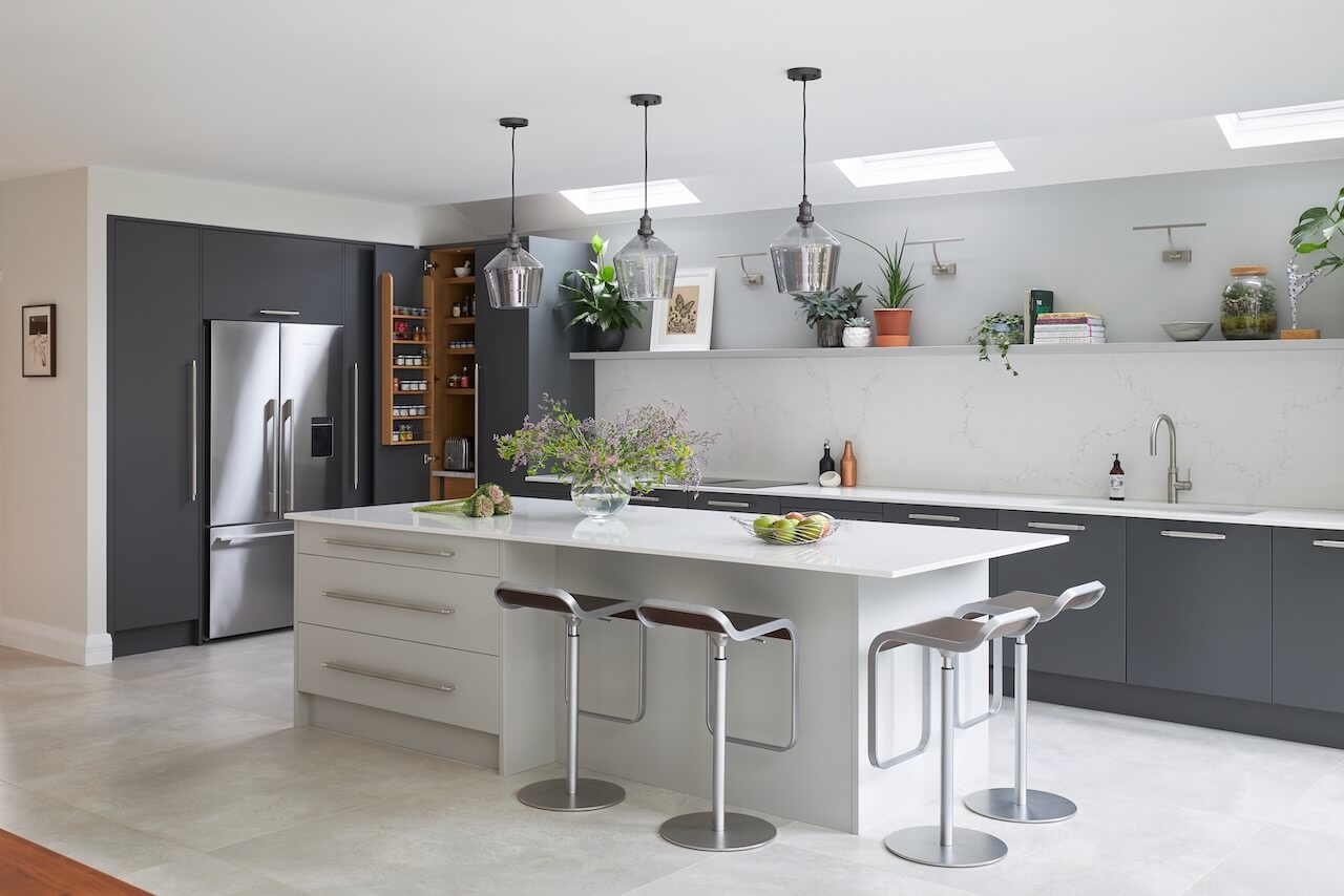
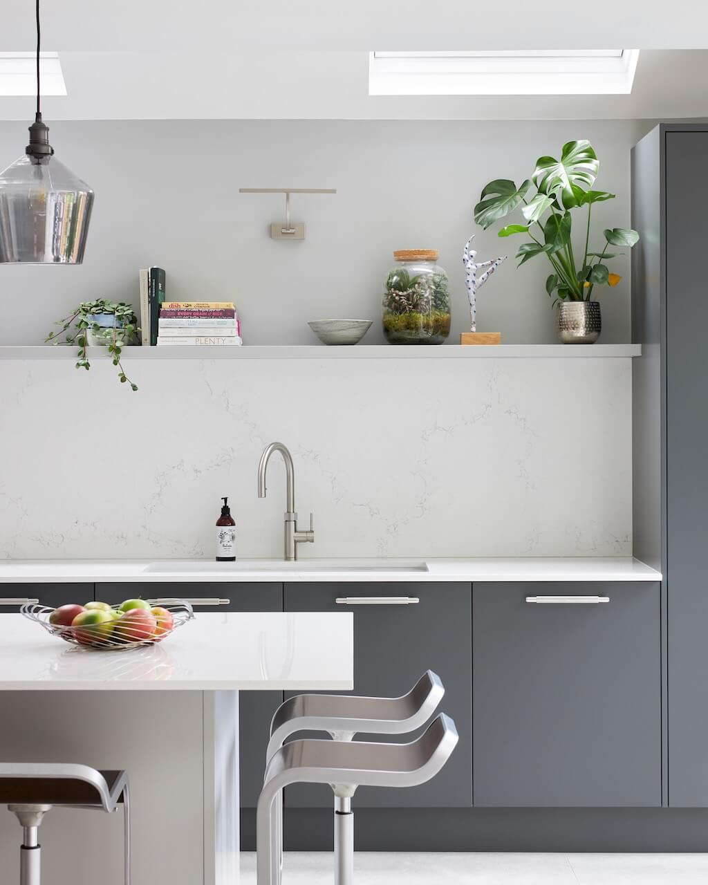
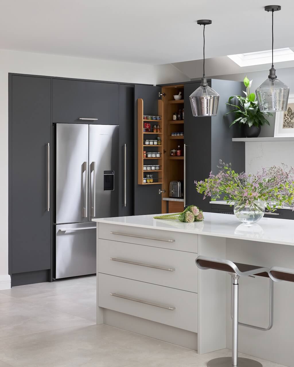
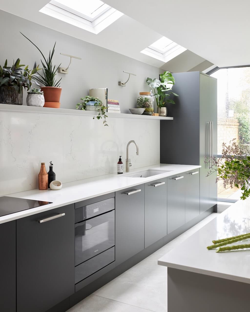
There wasn’t really a strict budget as such, but we were able to give the client a ballpark figure that we would be working to. I really wanted to create balance in the space, there were lots of wall units in the previous kitchen which made it feel quite congested so I suggested that we use a shelf instead in between the larders. By maximizing the drawer and larder storage, we were able to not have as many wall units as before. Open-shelving also offers a way to display items that you would like to display to add some personality and individuality to the space.
[
Q: Explain the reasons behind the choices of cabinetry and work surfaces …
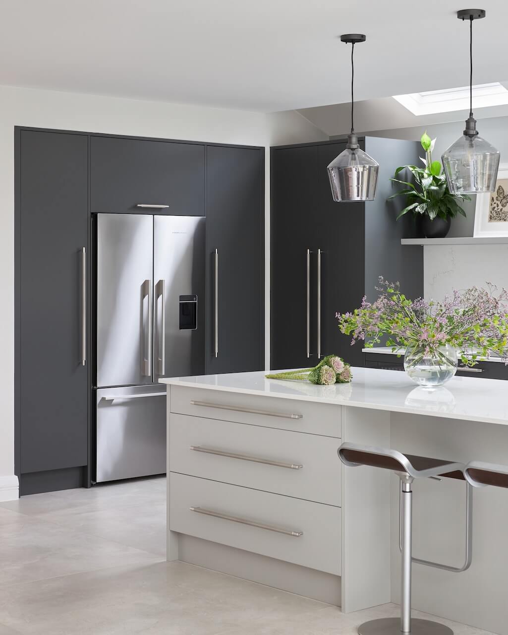
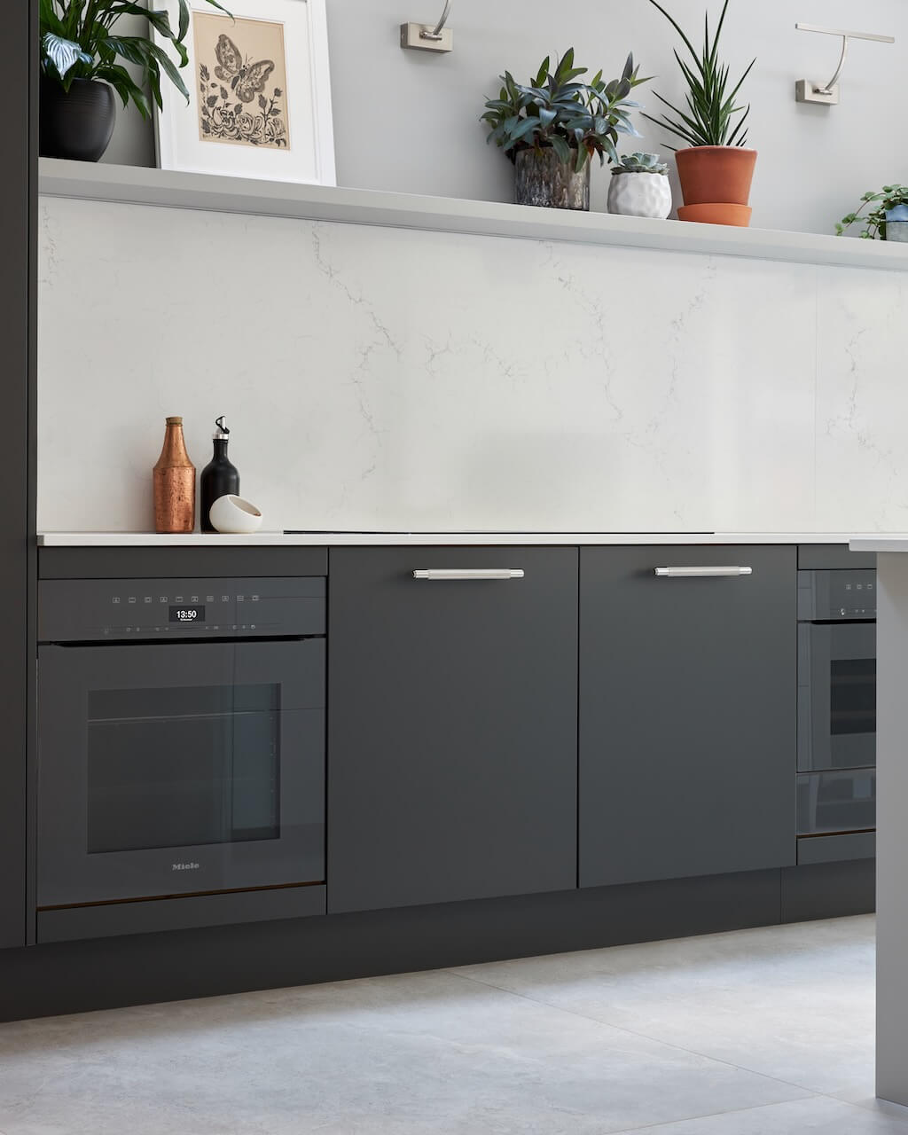
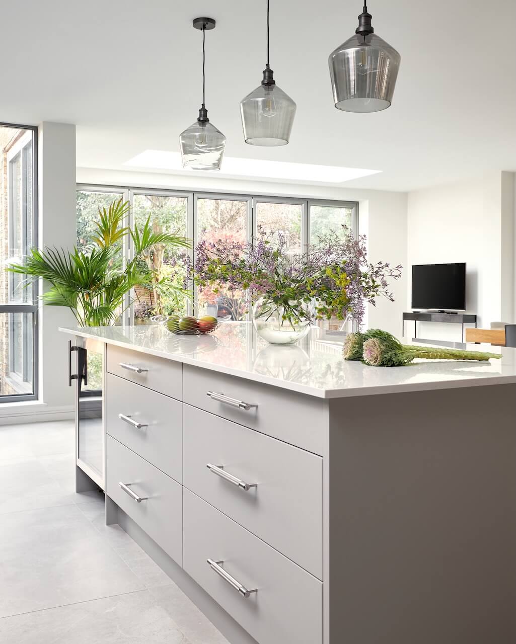
The client chose our Urban cabinetry with lay-on slab doors. The work surfaces are Carrera Mysterio in Ice White which reflects lots of light. The client really wanted clean and easy to maintain surfaces to add the feeling of light and space to the scheme. The cabinetry colours are from our exclusive paint palette. The colours are Elysium and Stove Grey and the handles are from Buster & Punch. The client wanted a very neutral scheme and we played around with whether the tall units should be darker or lighter but given the amount of natural light in the space, a darker colour could be used without feeling oppressive or overwhelming.
Q: What kind of building and structural work was involved in this project?
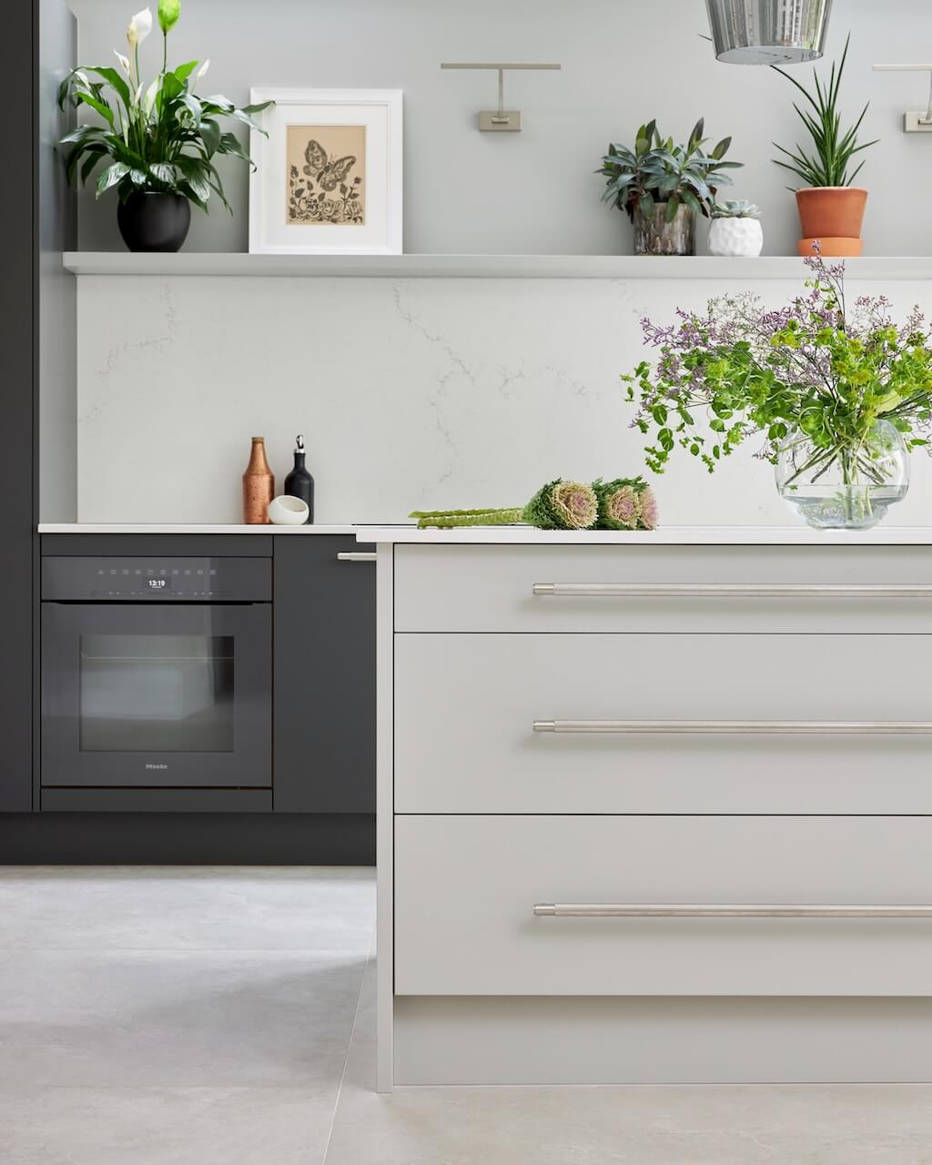
There was no major work but our clients did enlist carpenters to take up the existing wooden floor and replace it with tiles. They also redid the electrics but it wasn’t a major refit. The client was originally going to keep the existing range cooker, but in the end the decision was to take it out and replace it with a pair of new Miele ovens.
Q: What design elements do you think make the scheme so successful?
I think the graphite grey ovens from Miele and the grey cabinetry work really nicely together and complement one another beautifully. The room is very large and the sink is a metre wide and looks very sleek. I think it’s really lovely to have a clean island with no sink or hob. And I really love that we used an open shelf and dispensed with the wall units.
Q: Now the project is finished, what aspects are you most pleased with?
I love the fact the kitchen is dark on the perimeter and we have used a light island as it looks a little bit different. Very often we see dark islands and light perimeter cabinetry! I really like the very wide drawers on the back of the island and the fact that the ovens blend in to the colour scheme. But my favourite feature is probably that very wide shelf above the sink and ovens.
Q: What is your best advice for someone who is planning a new kitchen?
Start by assessing everything first and if possible, use the space first so you can assess what works for you and what doesn’t. Decide what are non-negotiable features, for example, some people wouldn’t be without an island, others really want a pantry with lots of hidden storage. It’s important to design around the everyday workings of your home and family life so you can achieve a kitchen that really works for you and suits your lifestyle.
Q: Do you have a secret ‘style signature’ that you find you use in most of your kitchen projects?
A floating shelf is probably my style signature. I also love a feature splashback. And I very much lead with the aesthetic rather than the practical. I prefer not to use wall units in my designs as I think lower cabinets are more practical and aesthetically pleasing. I’ll add open shelving and then include larders for the main storage.
Q: Are you seeing more large-scale projects such as this?
We’re seeing a big increase in large-scale projects. We’ve been working on lots of walk-in larders and walk-in pantries, plus a big increase in walk-in wardrobes, utility rooms and boot rooms as well as hallway storage. Projects are not just in the kitchen but across the whole home, we’re finding out that more and more customers want to create a personalised and organised home.
Q: What trends are you seeing develop through 2023?
Regarding colours, we’re seeing a lot of sage green but we’re also seeing warmer greys coming through rather than the cooler greys which were really popular in recent years. There’s also a move away from ‘fitted’ or ‘standard’ cabinetry, so we feel that many clients are trying to incorporate a more freestanding look. Brass is still very popular when it comes to hardware.
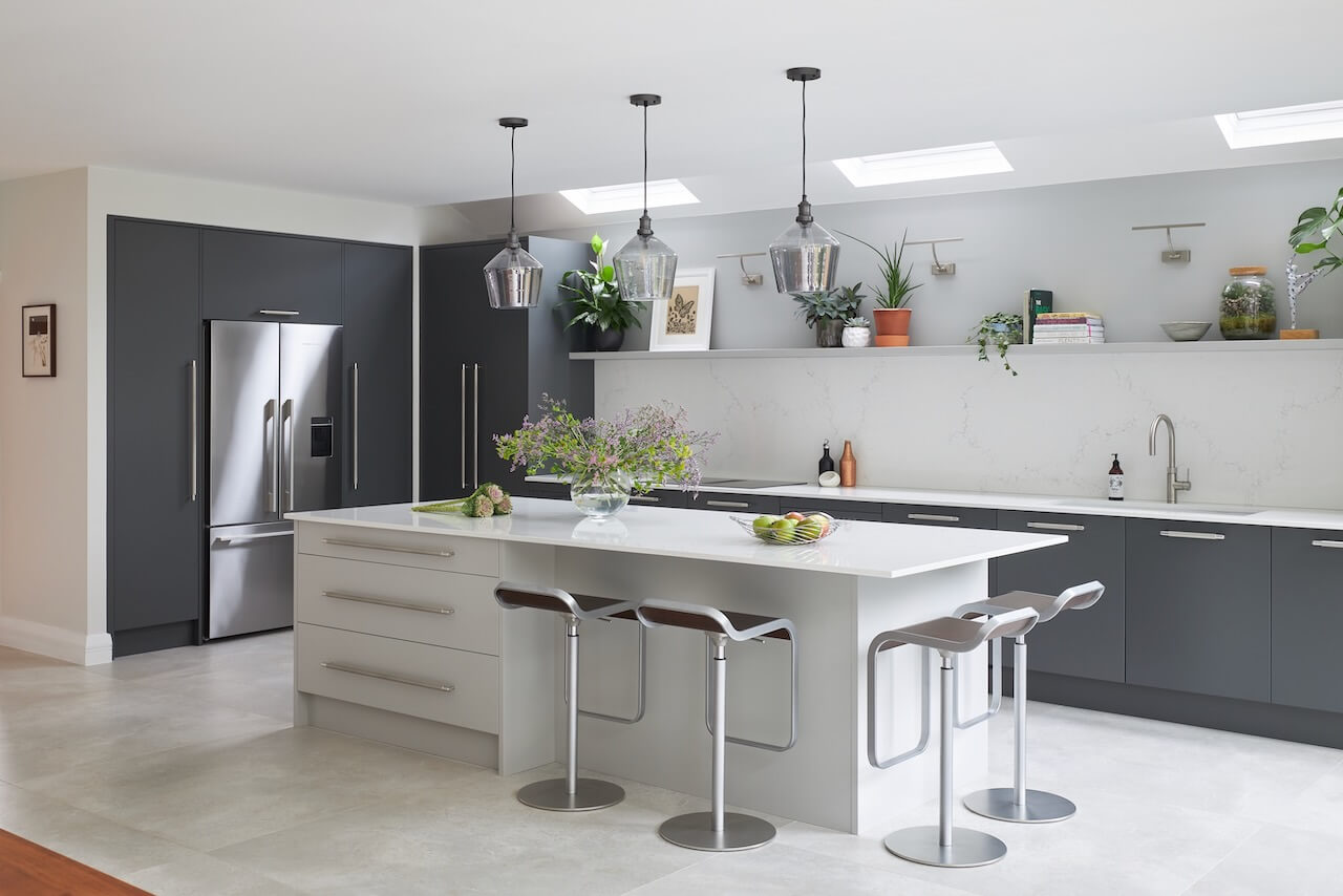
We Love: The generous proportions and symmetry of this project, from the placing of the ovens, sink and hob to the floating shelf, the three roof lights and the tall end cabinets.
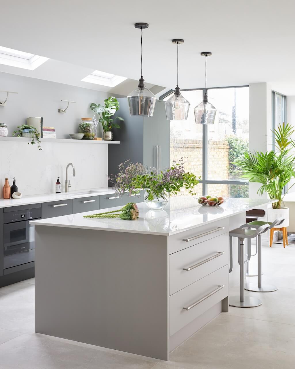
Kitchen: Urban in Elysium and Stove Grey from £28,000 John Lewis of Hungerford www.john-lewis.co.uk @johnlewisofhungerford
Work surface and splashback, Rossi Stone Surfaces
Handles, Buster + Punch
Graphite Grey Ovens, Miele
Fridge-Freezer, Fisher & Paykel
Photography by Ryan Wicks





Leave a comment