A look at some of this year’s fabulous case studies
By Linda Parker
This year has been a bumper year for fabulous kitchens, so for this year’s early Christmas present we thought we would have another look at some favourites…
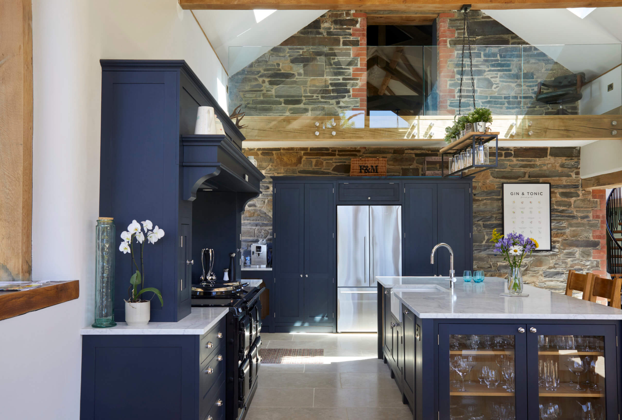
TRADITIONAL KITCHEN ON A GRAND SCALE BY OLIVE & BARR
This grand-scale kitchen by Olive & Barr was designed for a large barn extension with plenty of ceiling height. This allowed designer Al Bruce and his team to include tall cabinets, accommodate the existing AGA, and also to include a bespoke mantle to anchor the range cooker within the scheme. This ambitious project also included a hidden wine room, huge island and a gallery above. For the whole story, see all the details here.
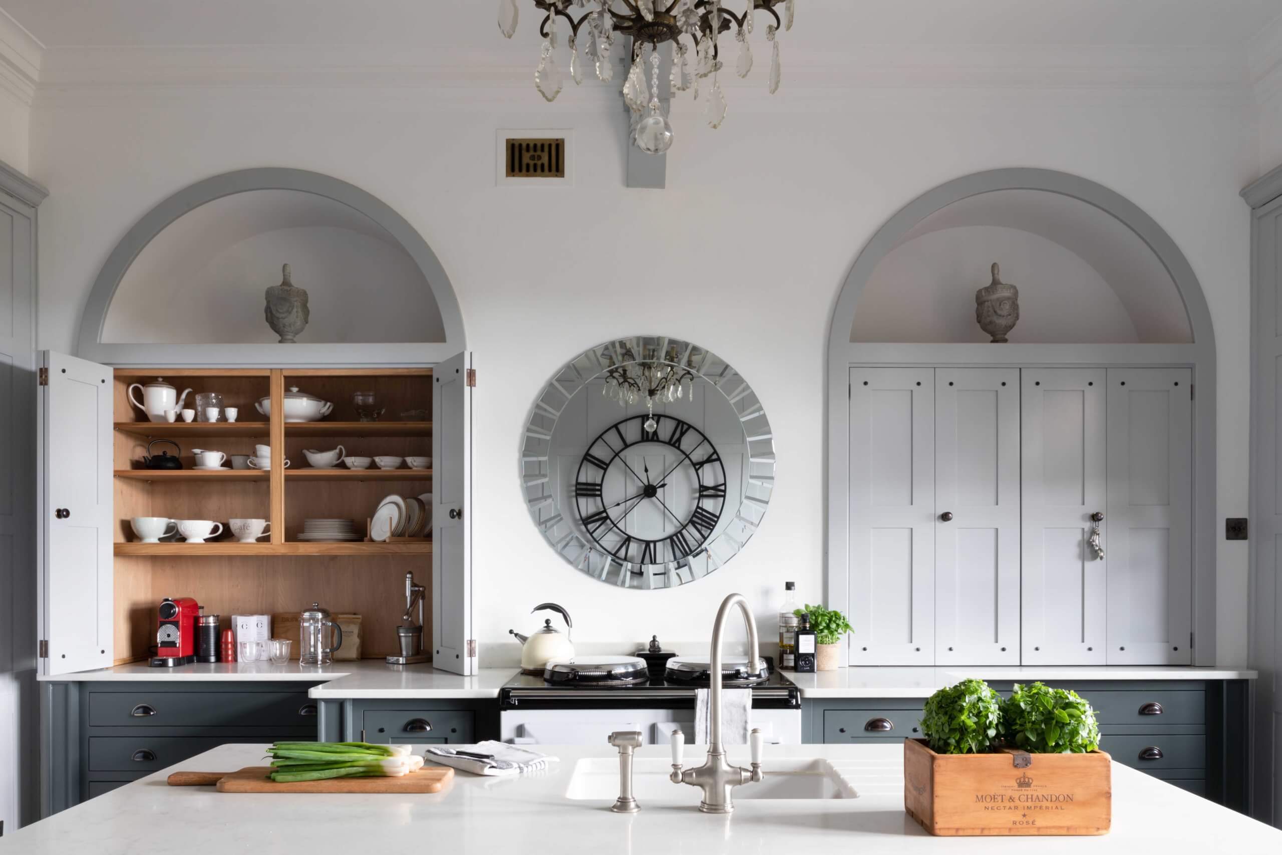
ARCHED ALCOVES & PERIOD DETAILS BY DREW FORSYTH
This kitchen was designed to sit within a home that had Georgian-style original features which were to be retained during the overhaul. This Drew Forsyth project is a perfect example of a bespoke kitchen that has been designed to suit the modern requirements of a busy lifestyle, whilst fitting in with classic, period-style design scheme. In-frame cabinetry is in keeping with the age and history of the house, whilst the bi-fold cupboards and arched framing are stand-out features. See more details here.
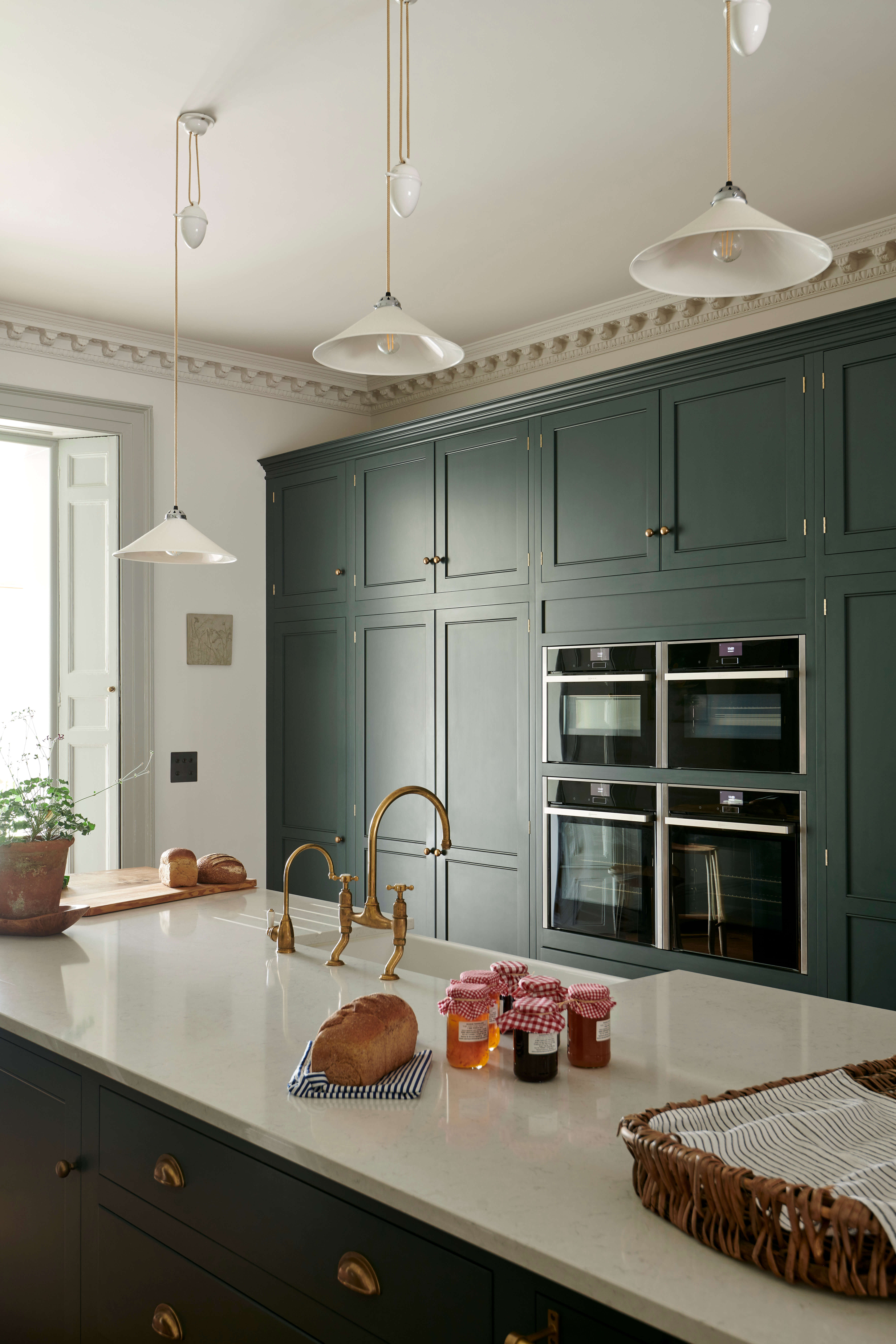
A CLASSIC PAINTED KITCHEN IN BAKEHOUSE GREEN BY DEVOL
The owners wanted a deVOL kitchen that felt in keeping with the house – parts of which date back to Norman times – but which would fit into the existing space, with no plans for adding extra kitchen areas. The cabinetry looks perfectly at home, with the architectural details, elaborate coving, original shutters and fireplace all giving this project a real sense of time and place. There are numerous integrated appliances, all disguised perfectly behind the cabinets. See more details here.
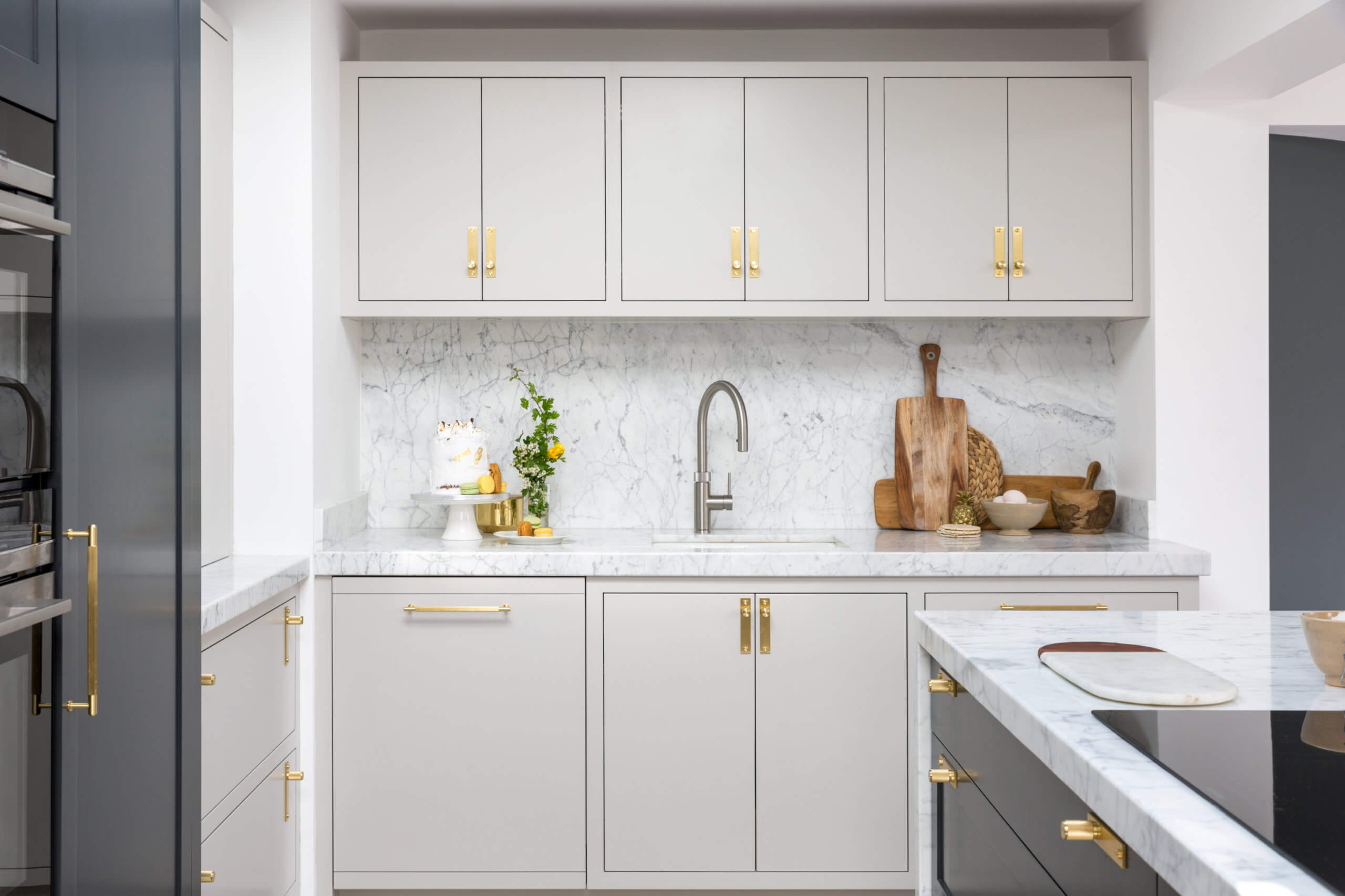
A FAMILY KITCHEN FOR A PROFESSIONAL BAKER BY MOWLEM & CO
This beautiful Mowlem & Co kitchen was created for Petra Wood, a professional baker and owner of The Macaron House. This light and airy kitchen had to work as a family kitchen, whilst also allowing space for Petra to be able to bake and create at home too. The unframed Shaker design looks simple and elegant, painted in a combination of Off Black and French Grey by Farrow & Ball. Brass accents add a hint of glamour to this pretty kitchen. See all the details here.
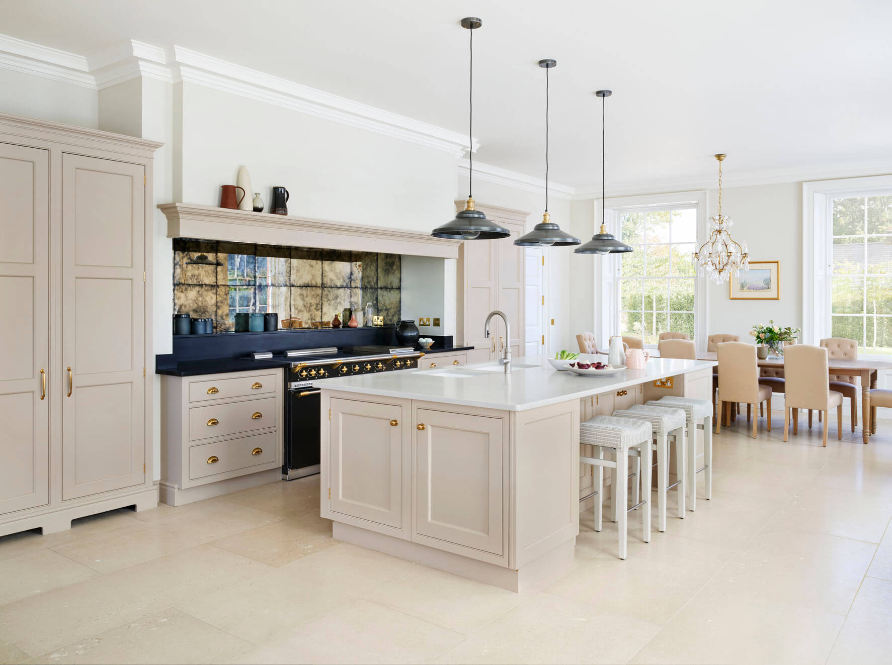
CLEVER STORAGE CAPACITY WITH A HINT OF BLUSH BY MARTIN MOORE
We loved this Martin Moore kitchen, for its elegant proportions and the very slight hint of blush pink in the colour. The project is light and spacious, with interesting details, such as the aged metallic glass splash back behind the range cooker, the colourful utility room, and the brass handles. The whole kitchen looks immaculate and simple, but there are a huge amount of hidden storage features behind those doors! The black work surfaces are a very clever touch. See more here.
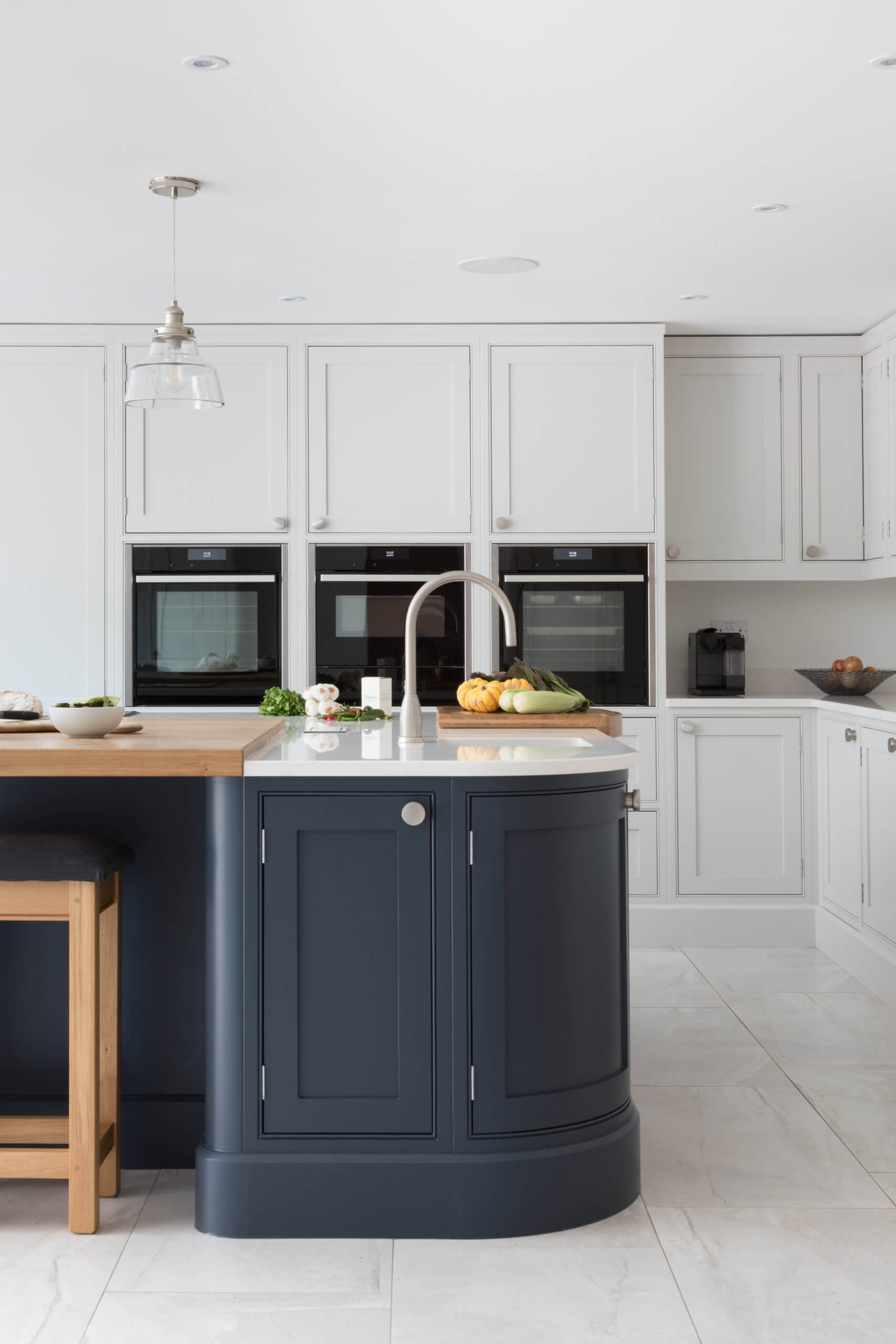
SWEEPING CURVES AND STUNNING SURFACES BY DEBENVALE AND CRL STONE
This kitchen has several features that we loved … the bold choice of a dark blue for the island, which shows off the CRL White Carrara Quartz and oak surfaces beautifully. The kitchen is by Debenvale, with CRL Stone quartz surfaces. The curves are also a great detail which adds a softness to the overall look, whilst keeping a traditional air, and the fact that the wall cabinets reach the ceiling is a great look. See more details of this stunning kitchen here.
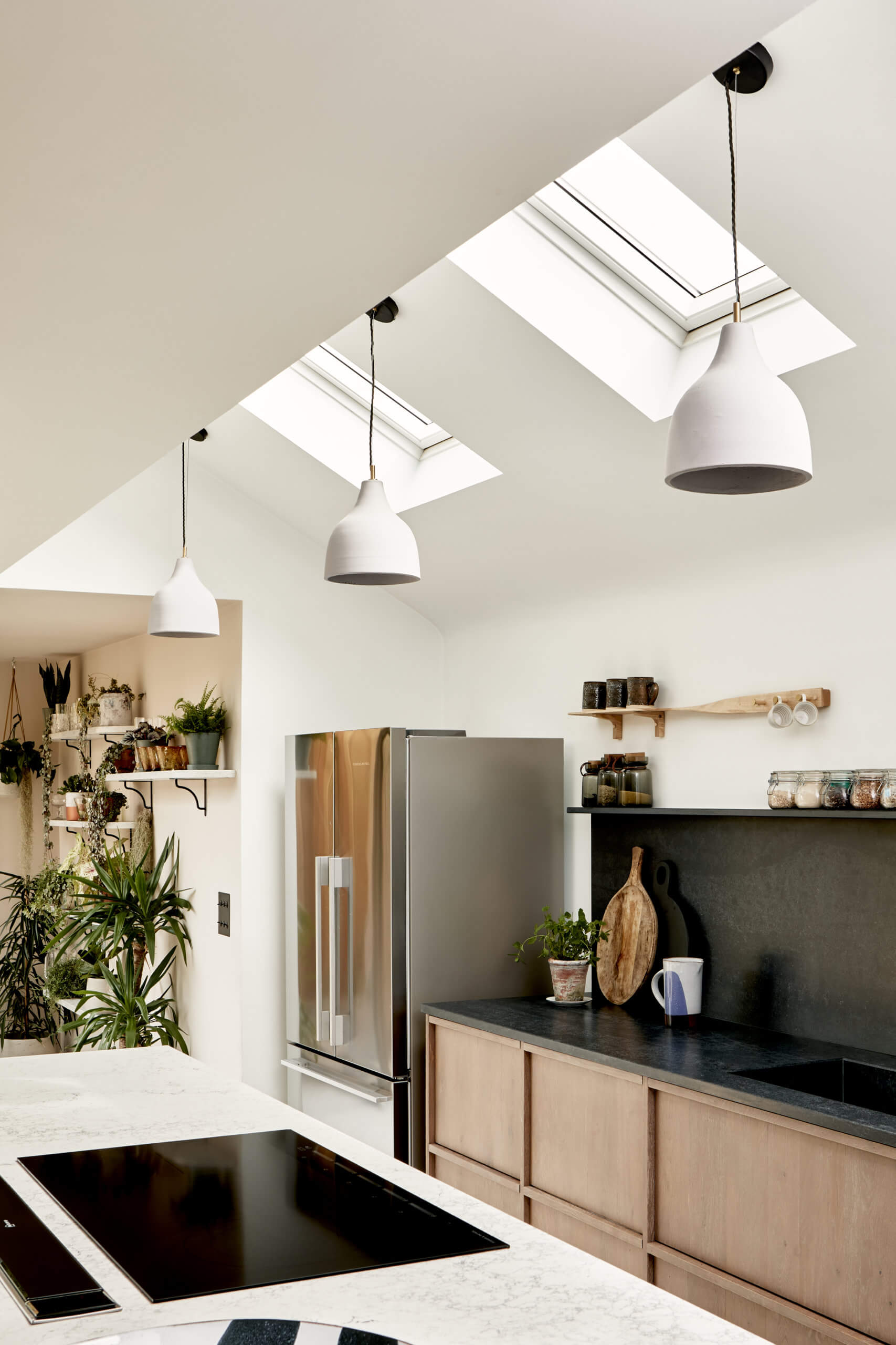
A SCANDI-STYLE PROJECT WITH BEAUTIFL TILES THROUGHOUT FROM BERT & MAY
Sometimes it’s not just the kitchen we want to show you, it’s the rest of the house too, and in this case, it was the kitchen and home of Lee Thornley, the founder of Bert & May. Lee and his partner, Phil, worked alongside Mass Architecture to re-configure the house to allow it flow freely and logically. There are Bert & May tiles in the kitchen and bathrooms, timber kitchen cabinetry and Caesarstone surfaces. See more details here, photography is by Beth Davis.
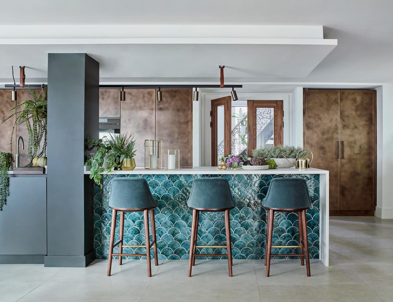
DRAMATIC COMBINATION OF MATERIALS, COLOURS AND TEXTURES BY ROUNDHOUSE
This kitchen was designed a central part of a large, social space that also had to perform as a living and dining area, working as a social space for the whole family. The floor space is broken up into different areas, with a bronzed metal shelving unit acting as a room divider and a built in fish tank creating visual interest. The coastal location is echoed in the choice of fish scale tiles, naturally! See more details here. Photography by Mary Wadsworth
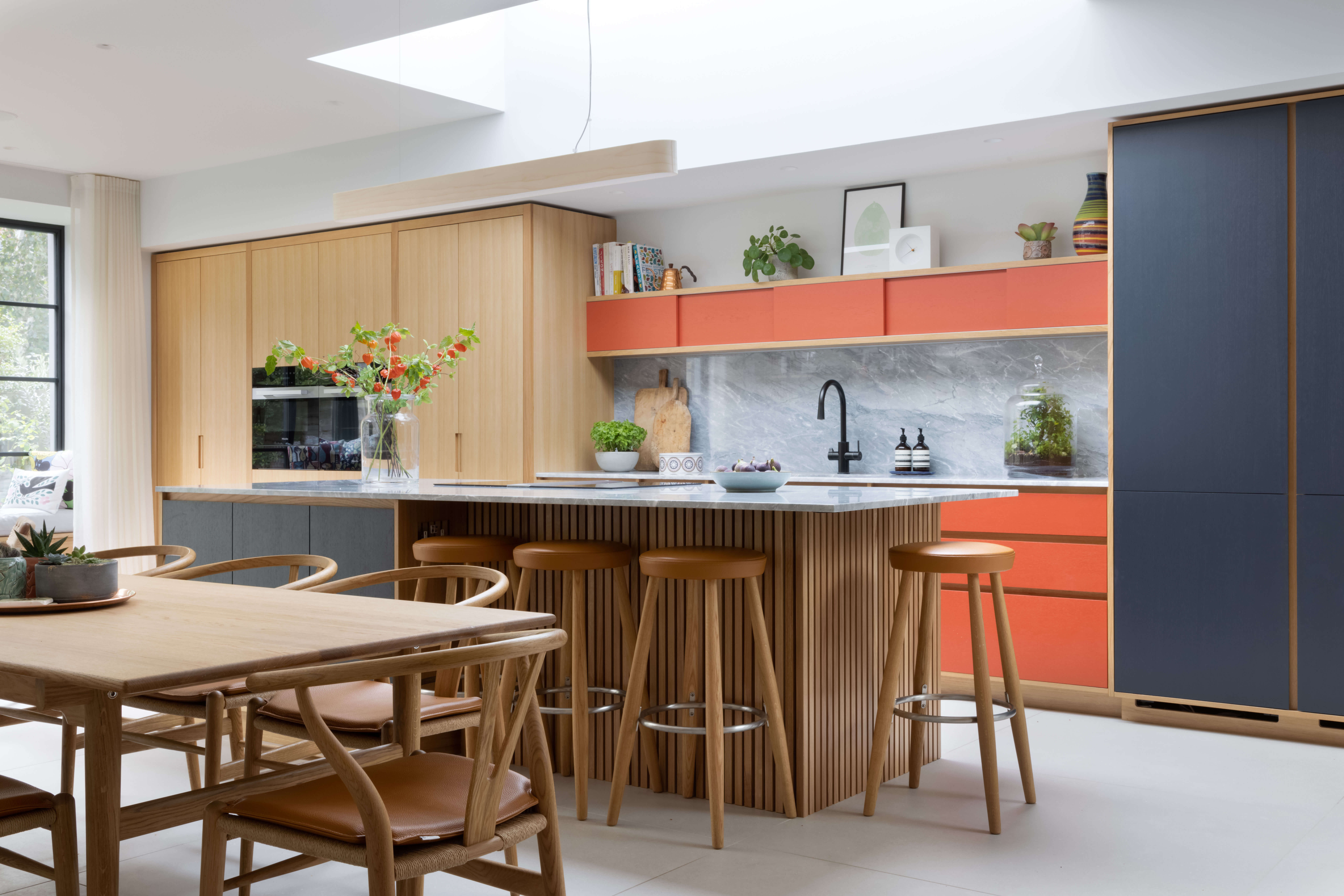
LOTS OF COLOUR, BALANCED BY OAK VENEER AND REEDED END PANELS BY PAPILIO
The colour palette of this Papilio kitchen is fun, warm and welcoming, with the use of natural materials bringing a homely feel to the room. It was a big renovation project, with two thirds of the new kitchen sited within the new extension. There was close communication with the architect to achieve the positioning of the island in relation to the sky light. The space includes a TV area, window seat and coat cupboard, too. See more details here.
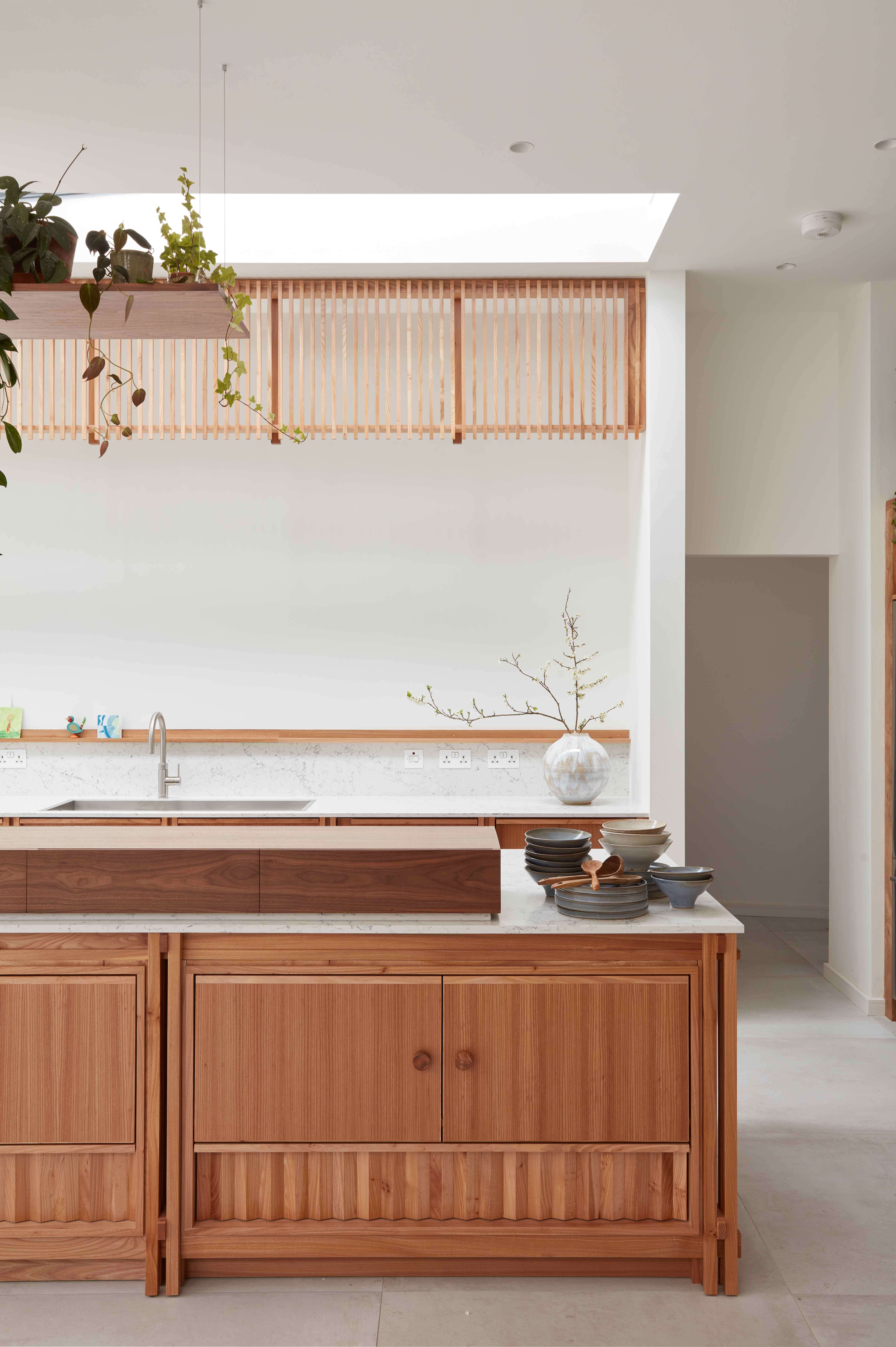
THE SIATAMA KITCHEN BY AWARD-WINNING DESIGNERS H MILLER BROS
The Siatama kitchen is made from primarily elm, and has lots of influences, from cabinet-making techniques learned in Japan to a contemporary home shrine designed to display oriental art, ceramics and artefacts owned by the clients. This kitchen is a real combination of Japanese inspiration and a Scandi-modern look. Read the full story and background to this project here.




Leave a comment