Dark Blue Shaker-Style Kitchen by Muchmore Design & Pad
 The designer: Linsey Skepper at Muchmore Design with PAD
The photographer: Chris Snook
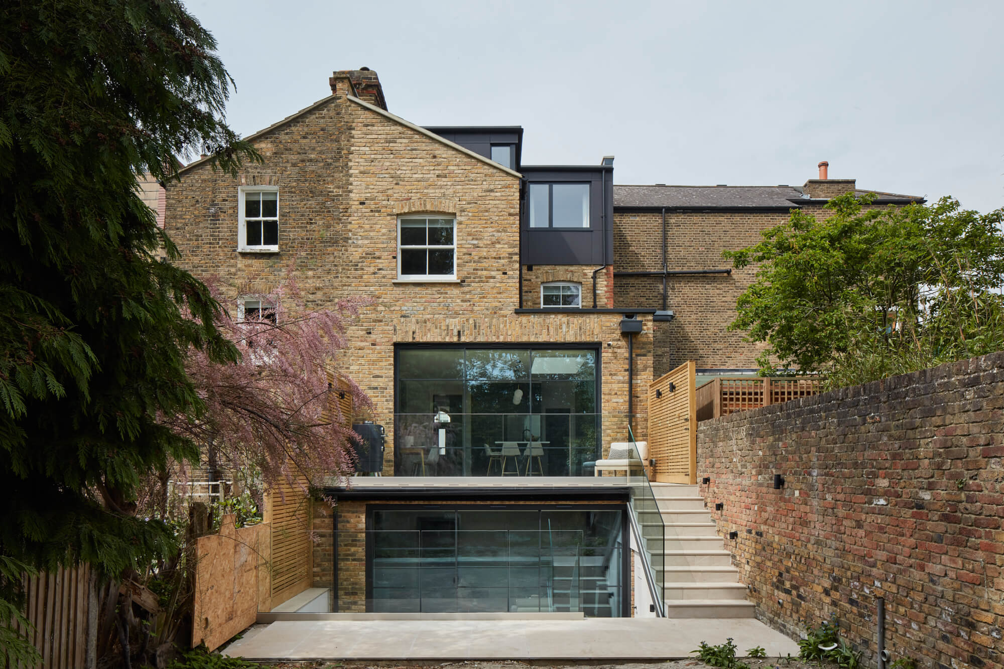
The story: London-based interior design studio Muchmore Design were approached by a couple looking for help after recently purchasing a neglected Victorian townhouse in Wandsworth. The property was virtually demolished, retaining only the facade before constructing a new-build family home.
This meant proposing a design to the clients that was sympathetic to the original period property whilst blending elegant and contemporary design features that reflected their taste and modern lifestyle.
Knowing the kitchen and dining area would be the hub of the home, Muchmore Design turned to long-term partner PAD. Family-run, London-based kitchen supplier PAD combine their bespoke design service with a curated range of customisable kitchen options direct from their British factory. Their architectural approach to kitchen design means they consider the entire space the kitchen sits in, which adds real value to the wider design scheme.
Designer Q&A:
Q) What was your brief from the client?
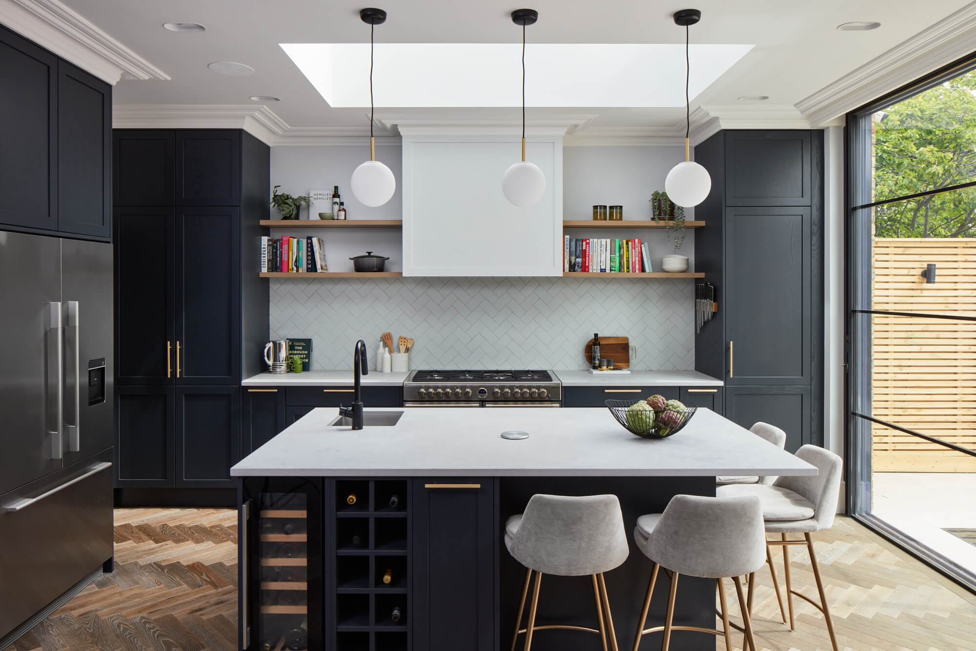
The team at Muchmore Design asked PAD to create a timeless, functional kitchen and utility that worked for family living and was coherent with the wider design scheme. Key points were bold and dark but still inviting, maximising on height and available storage and adding industrial touches whilst maintaining a homely feel.
Q) How did you answer the brief?
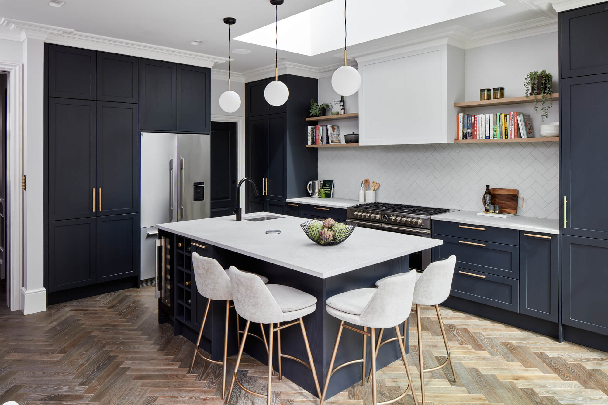
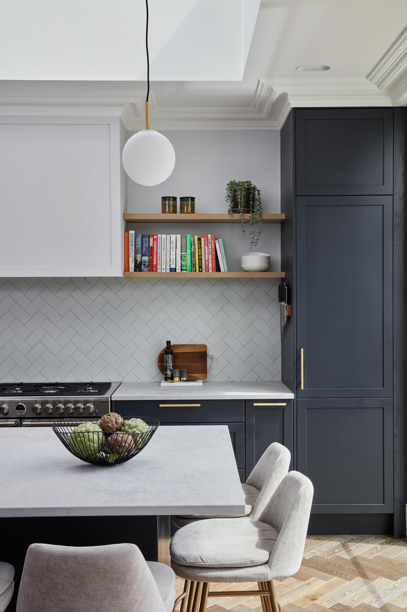
We selected a Shaker-style kitchen to pair with the property’s more traditional features such as cornicing and wall panelling. To add a modern twist, we specified a concrete-effect quartz worktop and industrial brass handles.
Muchmore Design and PAD explored many different colours but it was clear a dark blue was going to be the winner, after narrowing down to three options before deciding on Carbon. Storage included open shelves for displaying personal possessions and bespoke cabinets all the way to the ceiling for additional storage along with a tiled splashback.
Q) Which products did you use and why?
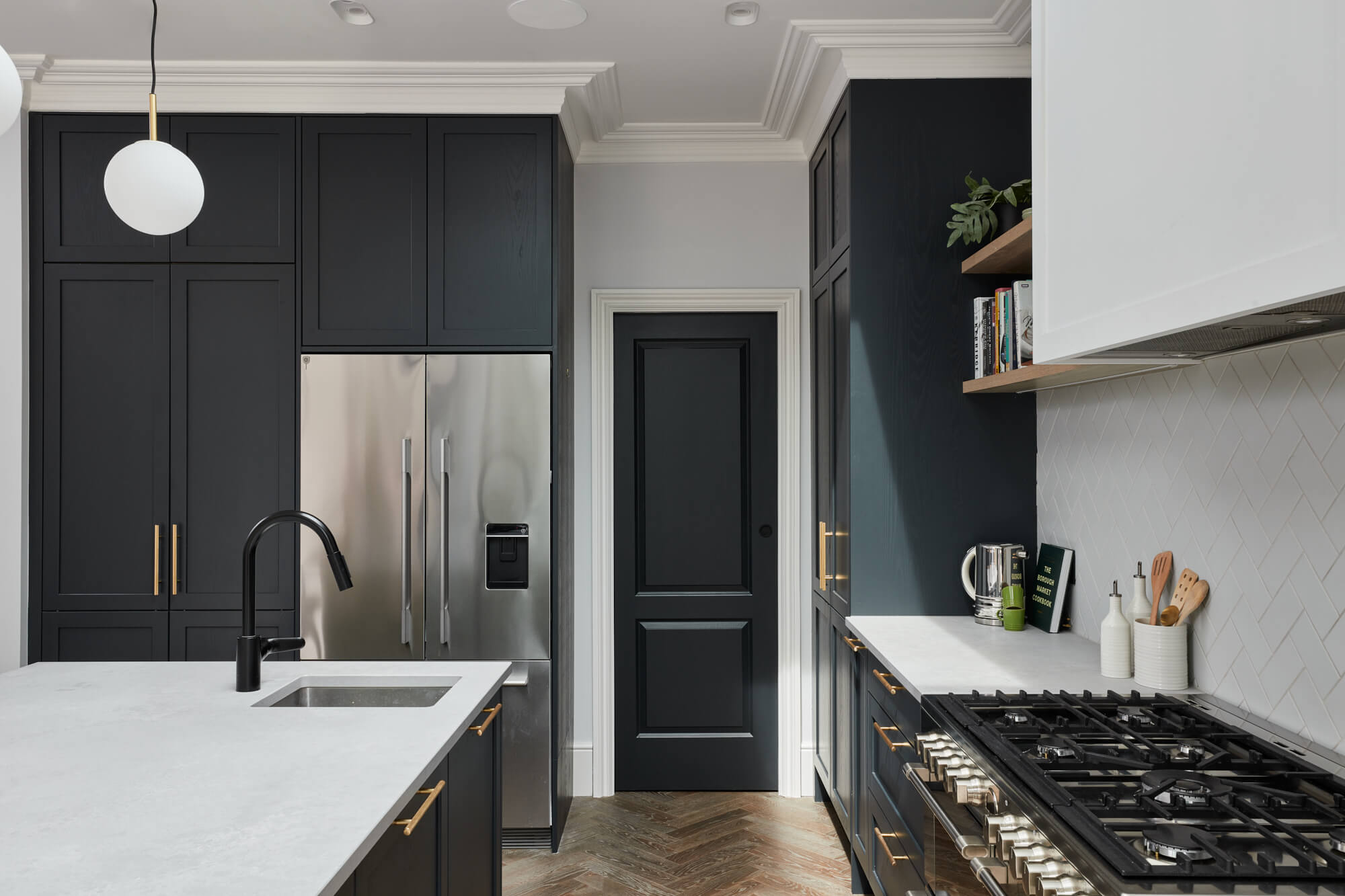
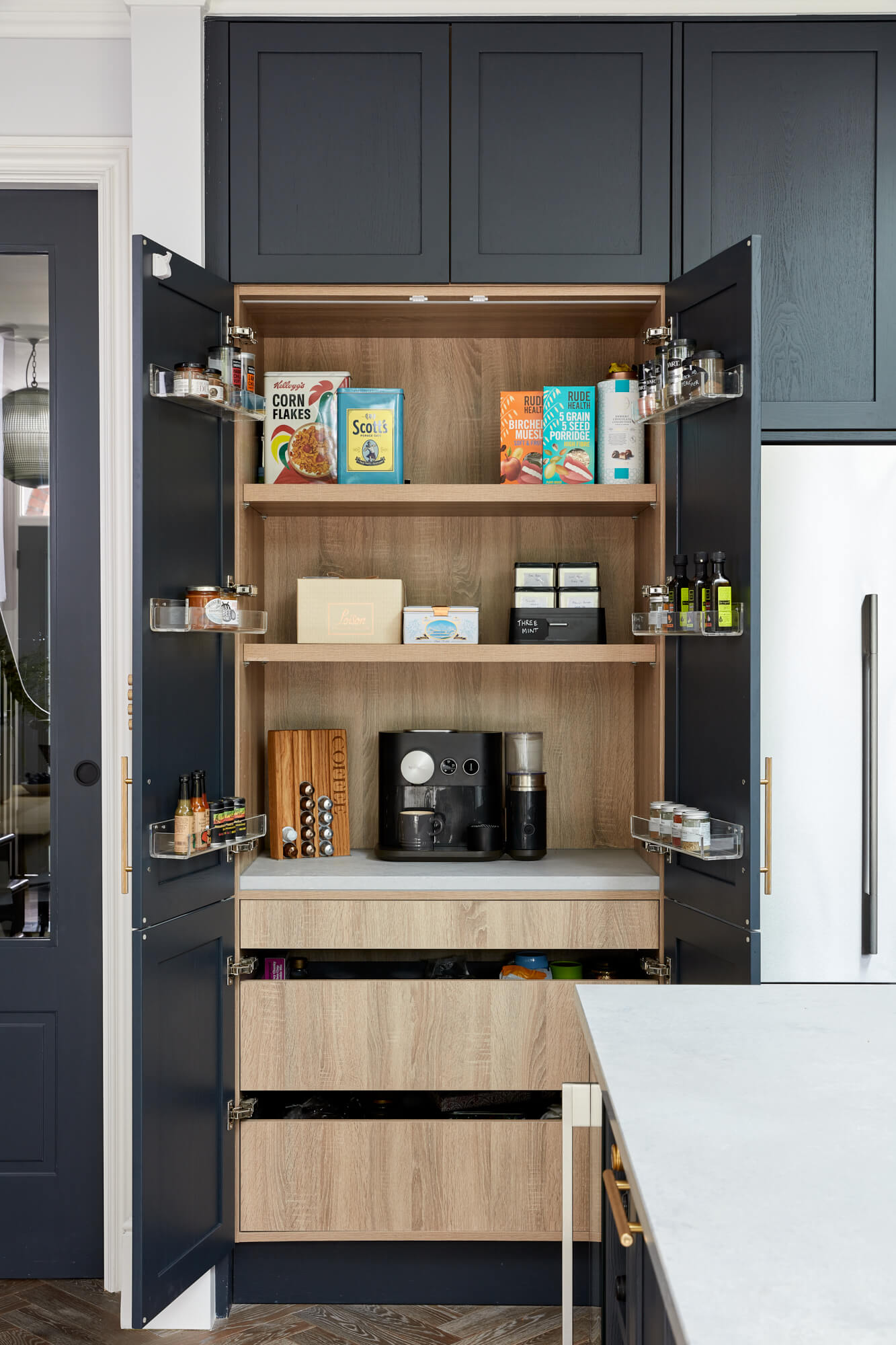
We chose modern slim Shaker furniture in a factory painted finish with brass handles to link to other finishes we had throughout the property. We also selected industrial concrete-looking quartz worktops for their hardwearing properties, heavy-duty drawers and pull outs and a flush-fit fridge-freezer and pantry to be maintain a neat and sleek appearance.
Q) Was there any building or renovation work?
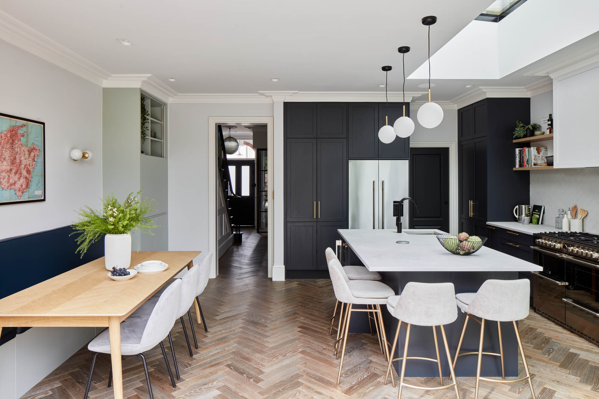
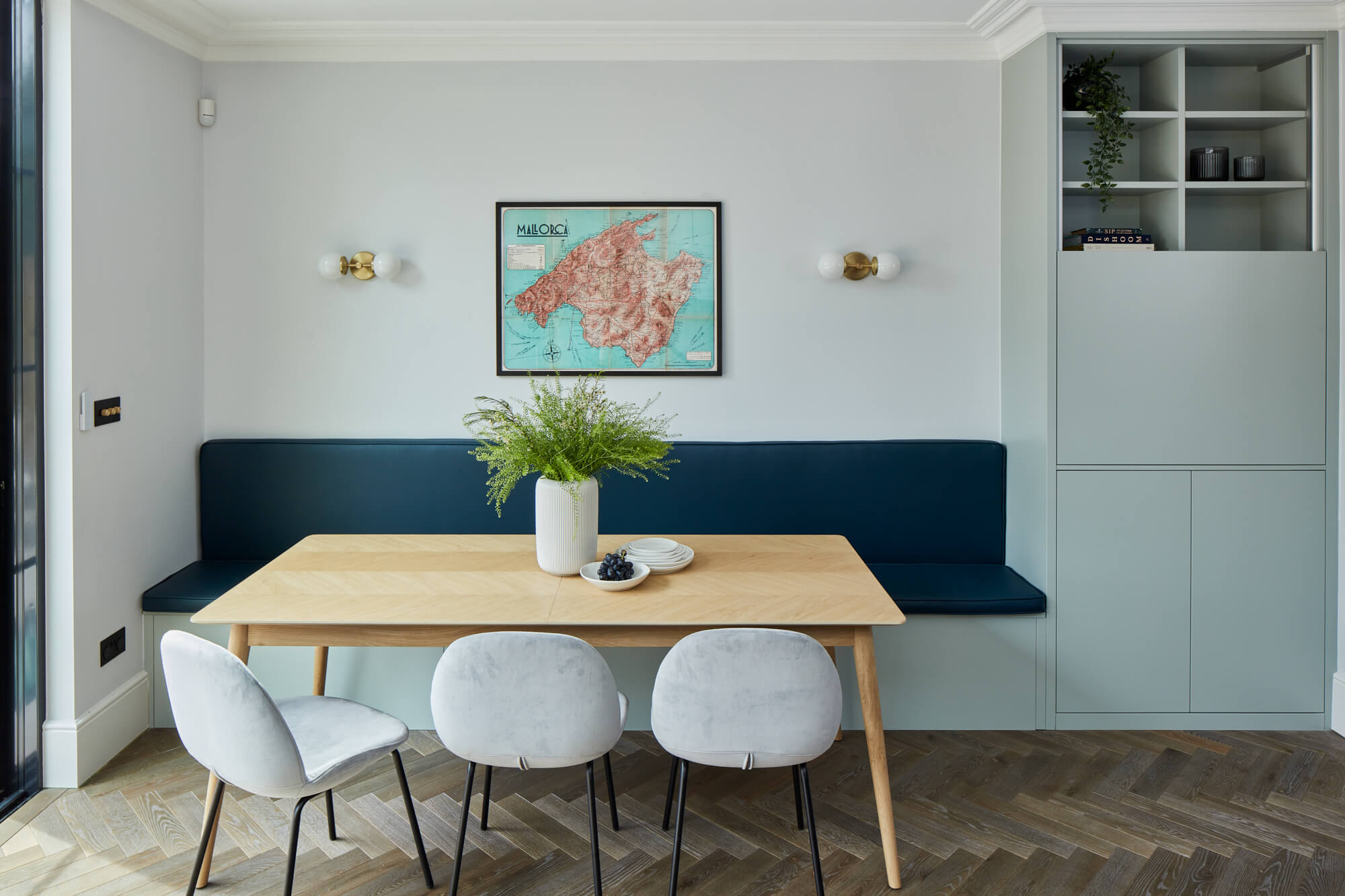
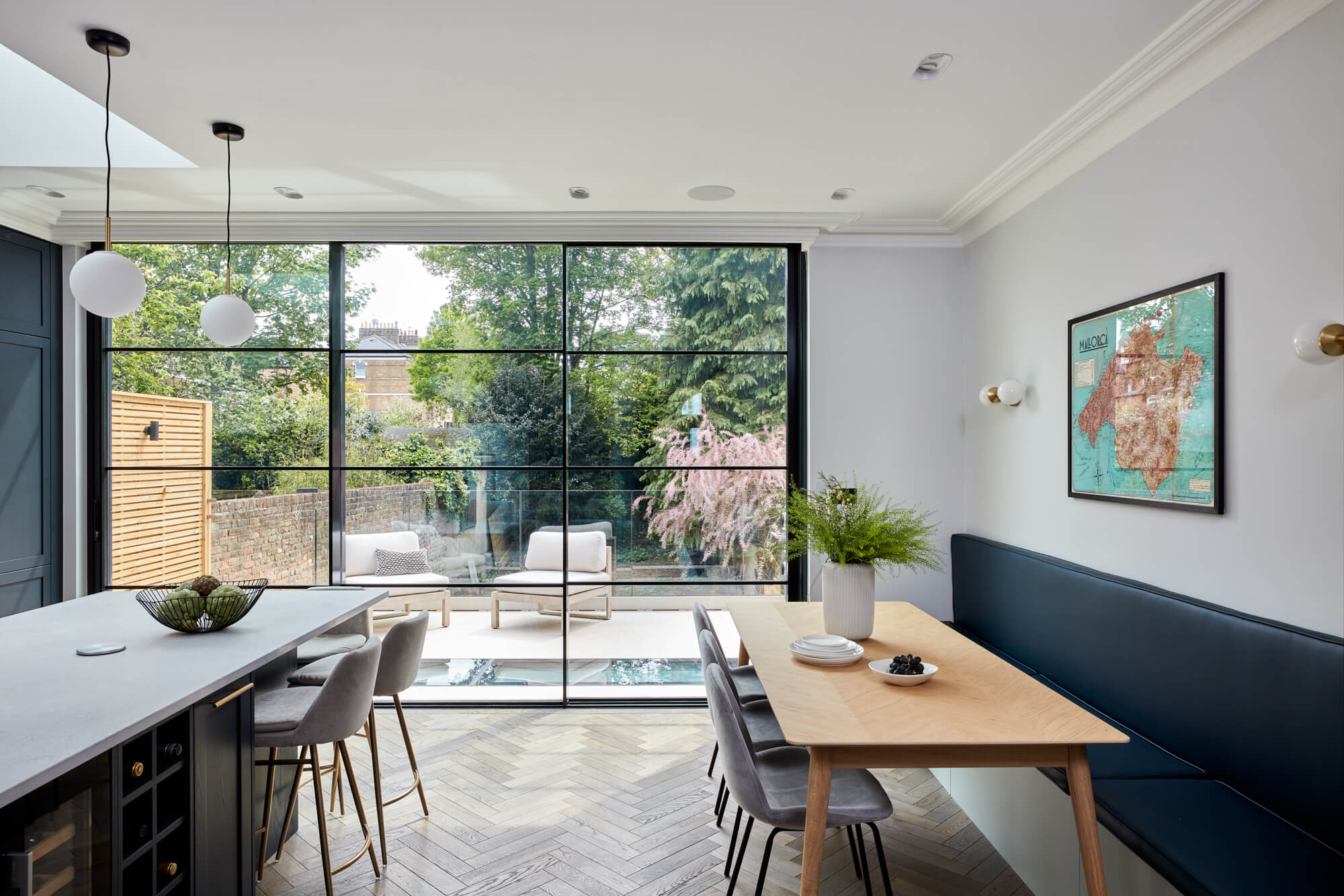
Muchmore Design were tasked with leading the design for the entire interior fit-out, which included hard finishes, internal glazing, the staircase, sanitaryware, doors, kitchen specification, fitted joinery, furniture, decoration and fixtures and fittings. The design team helped create a new internal layout across all floors in collaboration with Ade Architects. The property was a complete new build. Floor-to-ceiling Crittall glass was installed in the kitchen and dining area, flooding the room with natural light and offering unobstructed views out to the garden. Muchmore Design also installed a bespoke fitted bench in the dining area.
Q) What design elements do you think make the scheme so successful?
Tall cabinets going to the ceiling and then cornice going in after to make the kitchen feel completely built in as well as using all available space. Also, a double pantry to hide appliances, just having a small sink in the kitchen and the main sink hidden in the utility, moving the dishwasher to the utility to make more room in kitchen, having seating at the island as well and a dining table, making the room more family friendly, and also the feature handles.
Q) Any advice for someone who may be planning a new kitchen?
Make a list of must-haves, non-negotiables, what drives you mad now and knowing how the space needs to function.
Q) Any trend predictions for 2023?
Wood finishes on cabinetry, metallic finishes and dark colours. Greens will continue and open-plan is still very much people’s preference.
The details:
Appliances by Rangemaster, Westin and Fisher & Paykel
Splashback tiles by Fired Earth
Pendant lighting by Menu
Handles by Dowsing & Reynolds
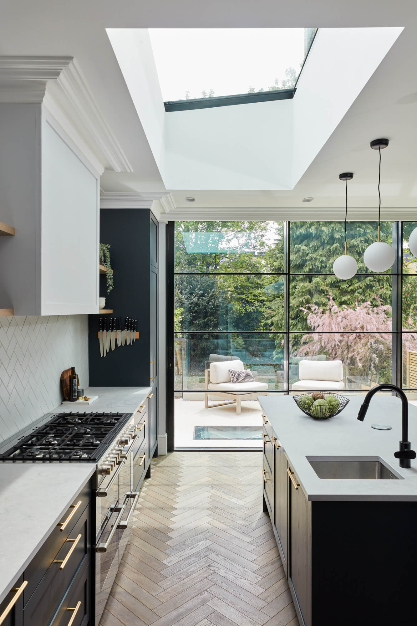
Hayley loves: How contemporary this kitchen looks while still achieving a classic style that really suits the property




Leave a comment