Bespoke in-frame gallery kitchen by Heaven & Stubbs
 The designer: Howard Stubbs at Heaven & Stubbs
The story: The client had lived in her 1800s period Notting Hill mews property for some time, inheriting a rather ill-considered and unsympathetic 1990s modern gloss kitchen.
She wanted something that felt more period and more in keeping with the Bohemian character of the property.
The photographer: Katherine Malonda
Designer Q&A:
Q) What was your brief from the client?
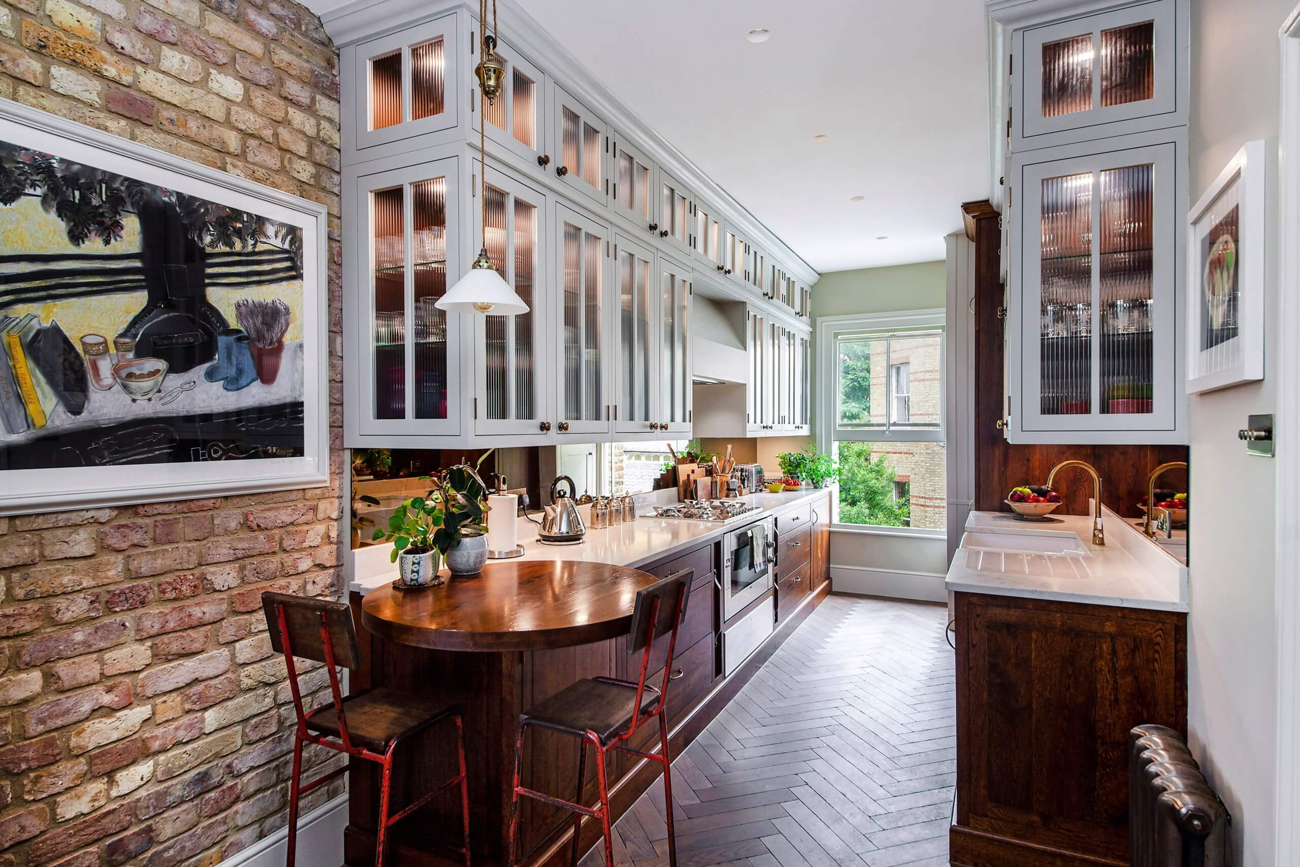
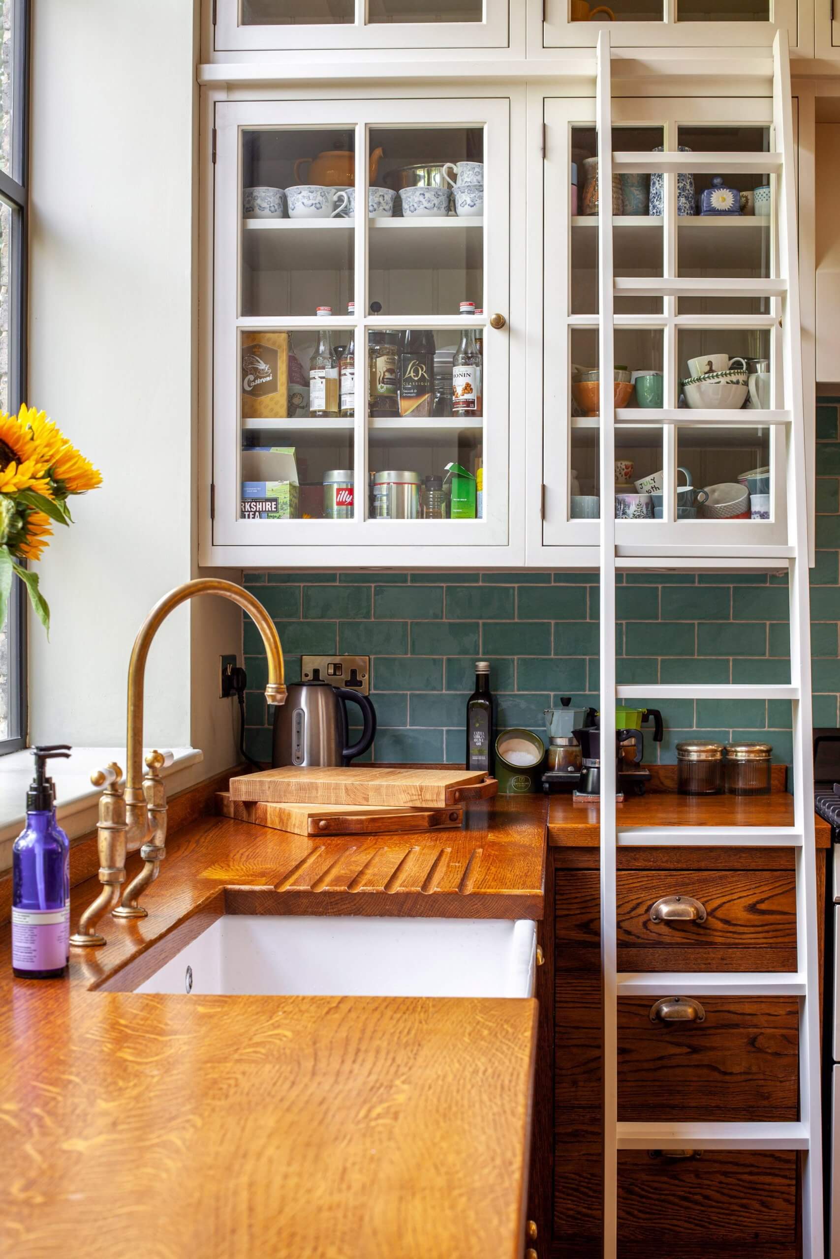
She was very much open to suggestions in terms of design and finishes, as long as it felt ‘in tune’ with the character of the home and provided plenty of storage. So, we discussed ideas that appealed to her and she had in mind a Victorian street feel with those old-fashioned apothecary shops with the large glazed frontage. This sounded quite exciting to us because, being a bespoke manufacturer, we love to create something that’s a little different and perhaps a little quirky!
Q) How did you answer the brief?
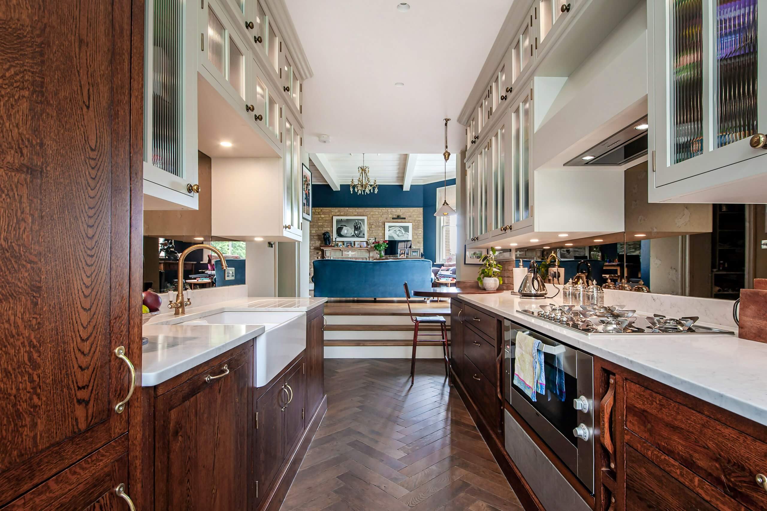
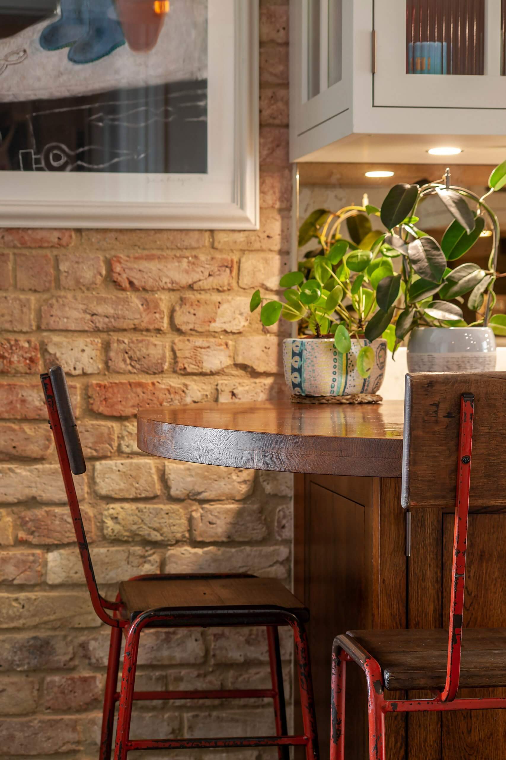
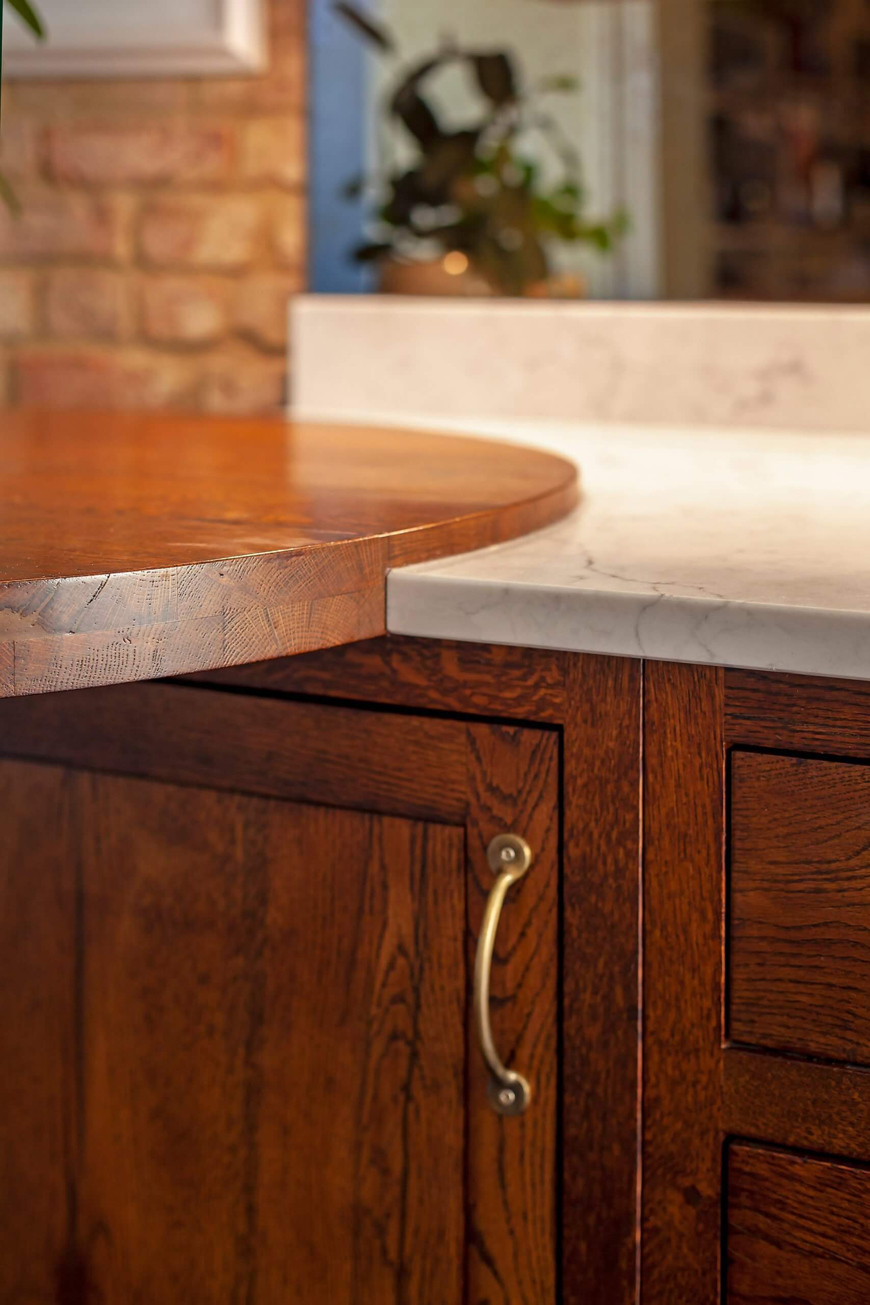
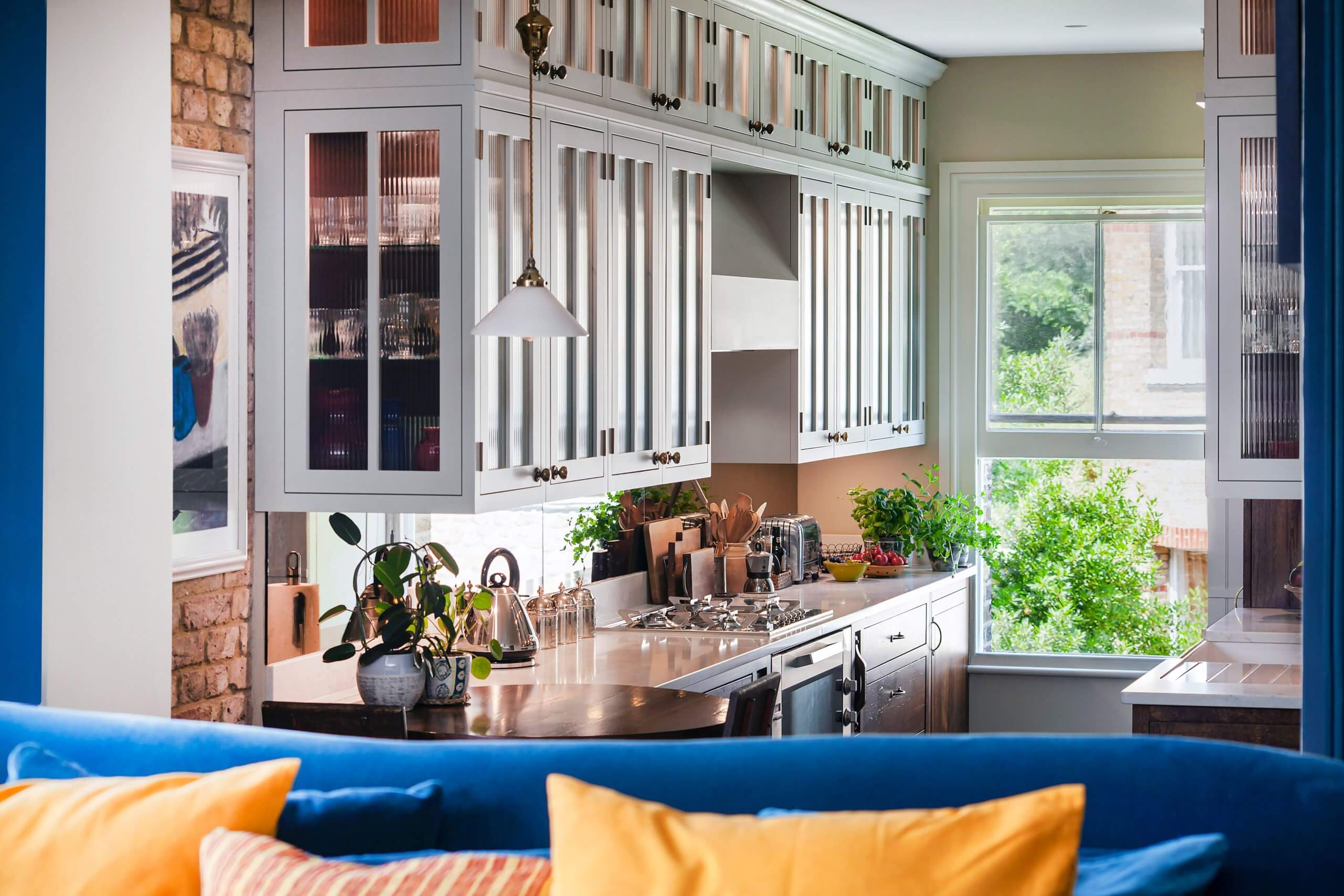
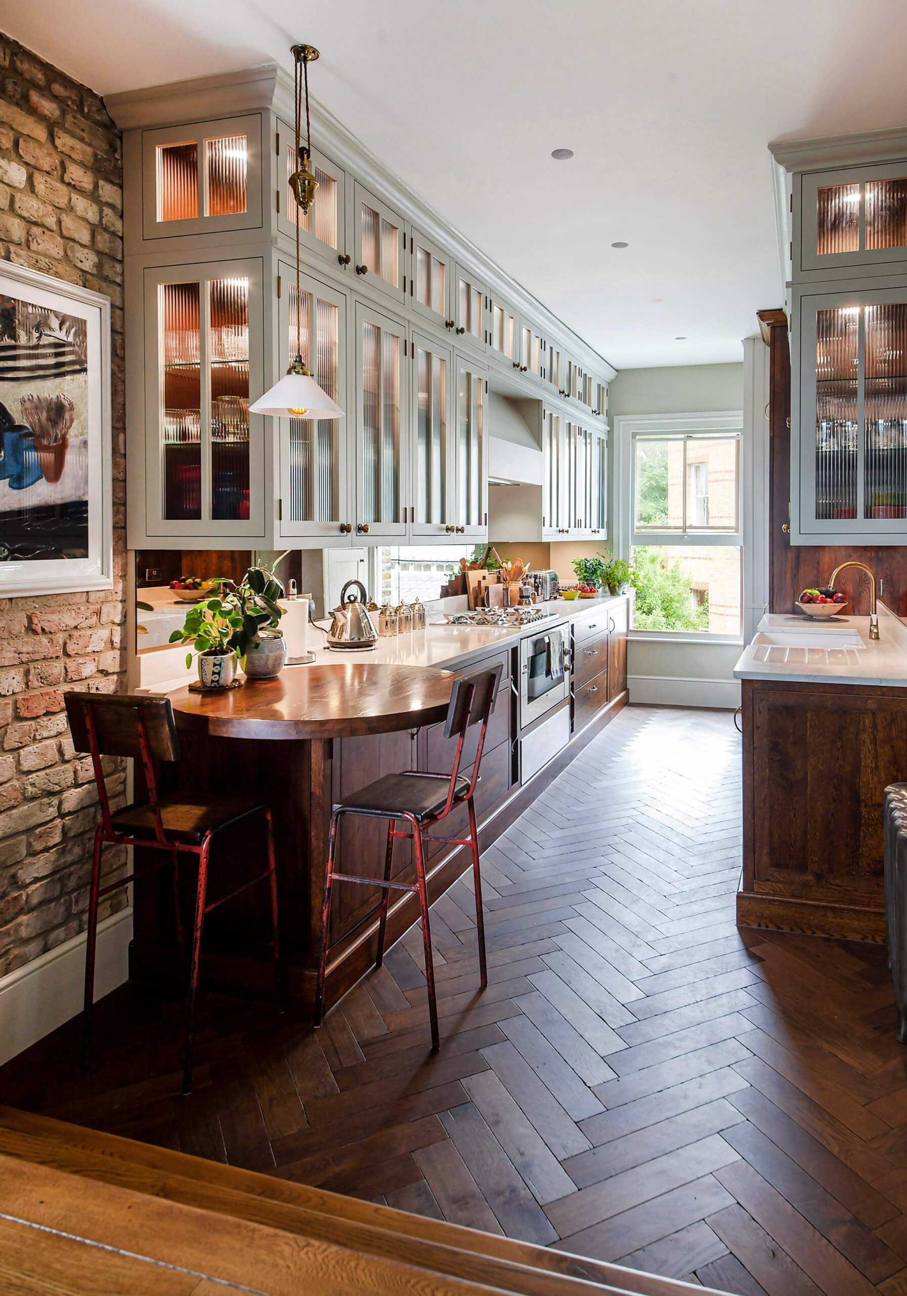
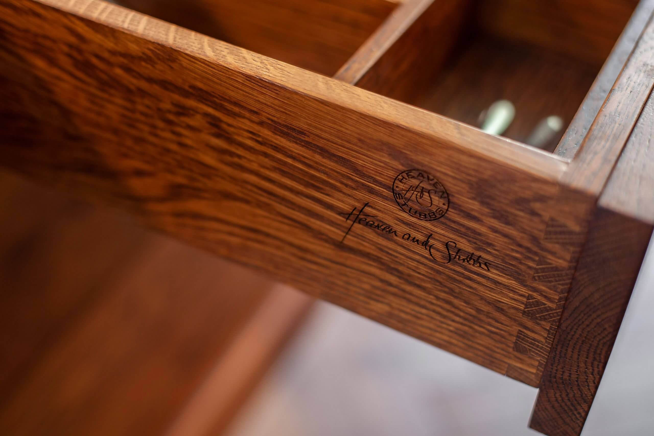
We went with the Victorian shop front feel, creating wall cabinetry to answer the storage requirement. However, we also chose a glazed and painted design using a subtle pastel tone. This and the glass reflect the light coming in from the deep sash window. The reeded glass prevents the cabinetry from looking too heavy while obscuring the cabinets’ contents. To give a degree of definition and contrast, we used a specially dark stained oak for the base units, integrating a round oak breakfast bar at the end of the cabinet run. Being round, there are no sharp corners protruding into the kitchen space. The light quartz tops also help to reflect light, contributing to the light and welcoming feel of the kitchen space.
Q) What was the main challenge?
Dealing with a quite a small space and what is essentially a galley-style kitchen design. Within the space, besides an effective working triangle we had to create plenty of storage and a place for the client to sit and eat. To get this amount of storage meant floor to ceiling wall cabinetry and such a thing could so easily have ended up ‘closing the space in,’ making the room rather dark.
Q) What is the most successful element?
I think the herringbone floor, which was the client’s choice, was just perfect in helping us to achieve the overall period shop look and feel.
Q) Any advice for someone who may be planning a new kitchen?
I think that, particularly in London, one can pay an awful lot for some kitchen brands that still only work with standard cabinet sizes and finishes and such solutions, regardless of cost, simply can’t work for such difficult spaces. Don’t be afraid to direct your search for a kitchen supplier outside the confines of the capital since in doing so, a fully bespoke manufactured solution that answers specific dimension, requirements and tastes becomes financially viable.
The details:
Sink by Villeroy & Boch
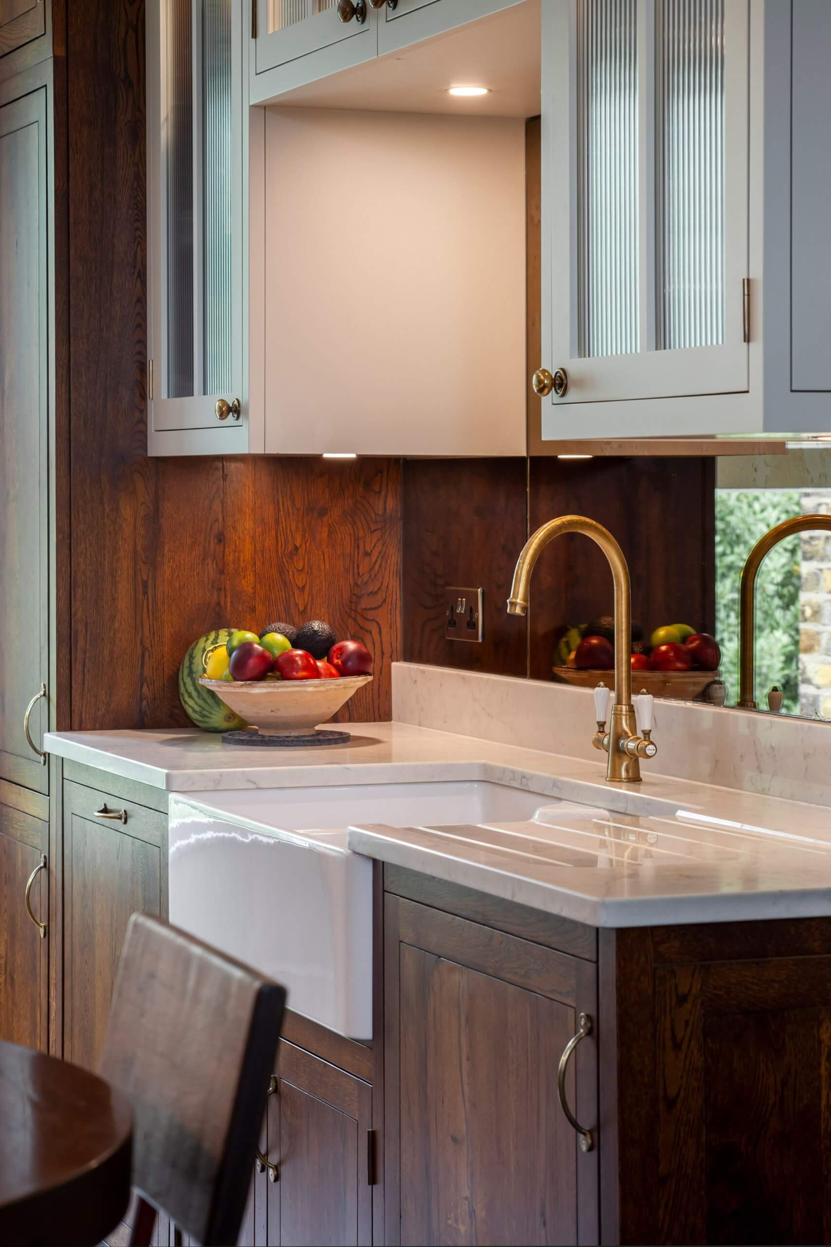
Hayley loves: the period charm of this bespoke cabinetry and the clever use of space throughout



Leave a comment