Damson Blue and Tangerine Kitchen by John Lewis of Hungerford

The designer: Rebecca Nokes at John Lewis of Hungerford
The story: Celebrating 50 years in business, John Lewis of Hungerford works closely with clients to design kitchens tailored to the individual’s needs, creating bespoke, beautiful spaces to suit every home.
Designer Q&A:
Q) What was your brief from the client?
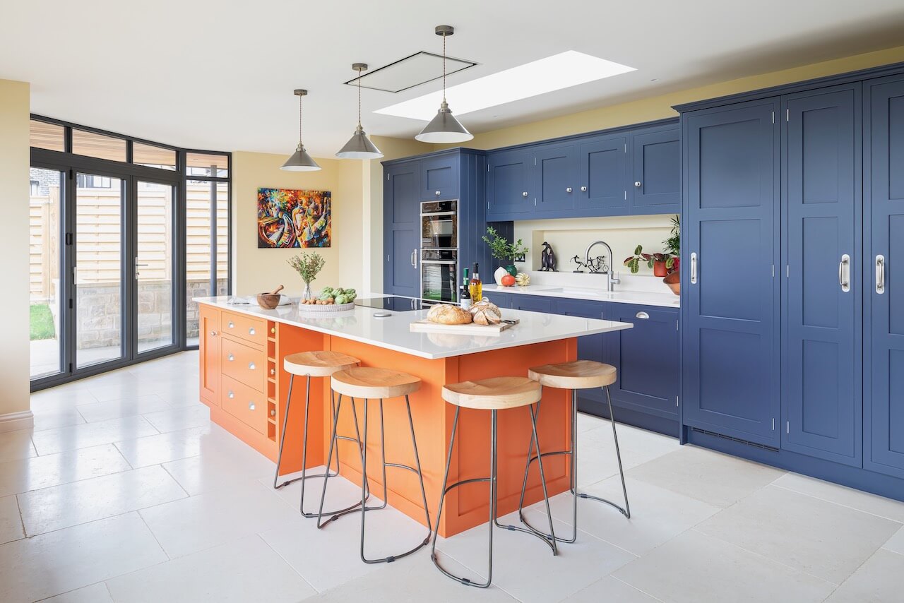
The clients were keen to create a practical kitchen that would be great to cook in but that could also be a very social space, as they really enjoy entertaining and throwing big parties. They also have an absolutely gorgeous feature window with an amazing view, so it was important to make the most of this area. It was also important to have space to display their cookbooks and around the sink for having useful and decorative items to hand. In addition, some seating at the island was a key requirement so they could enjoy chatting to their guests while cooking. We were tasked with including some Autumnal tones into a bold colour scheme, to tie in with a wall colour they have flowing around the house.
Q) How did you answer the brief?
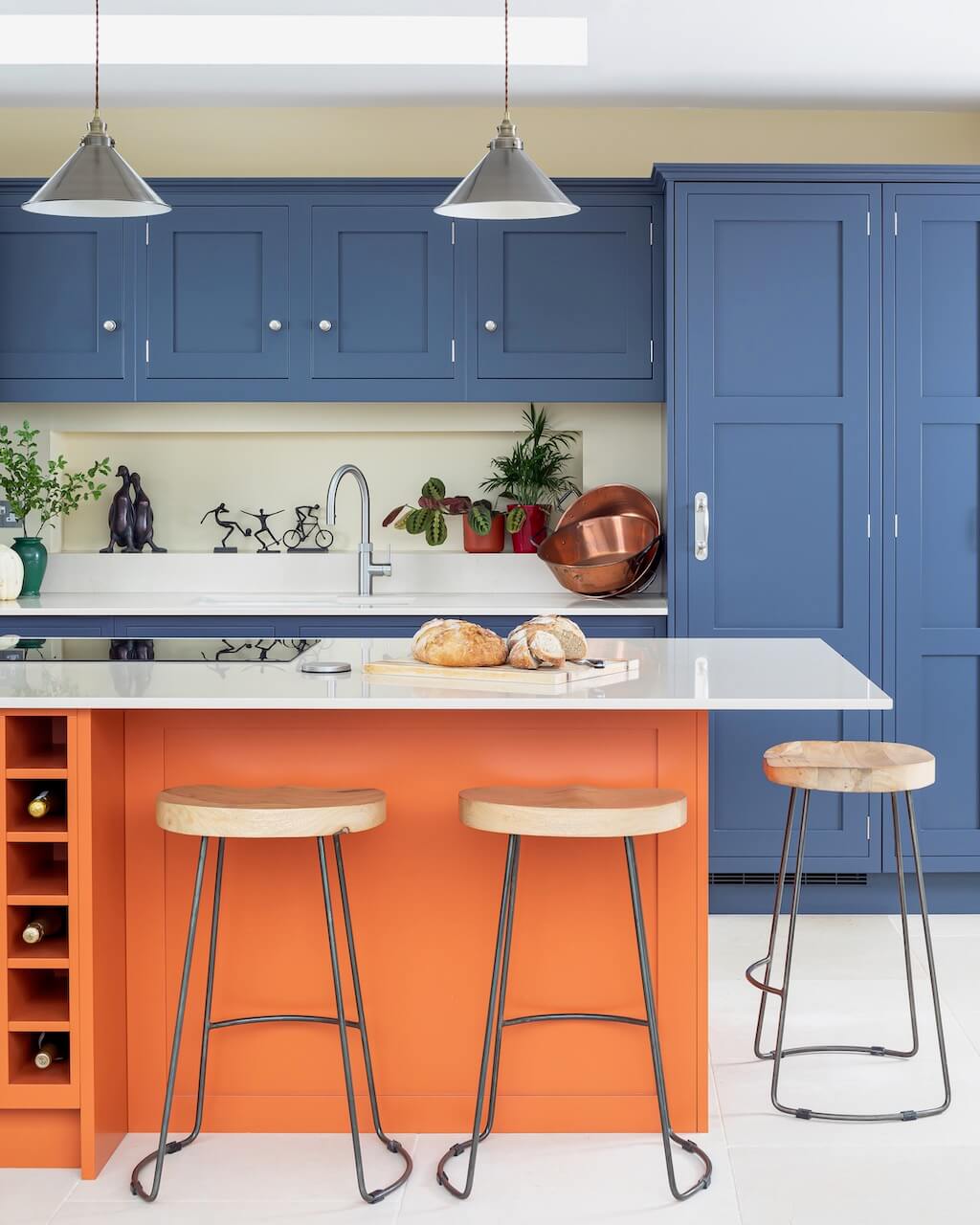
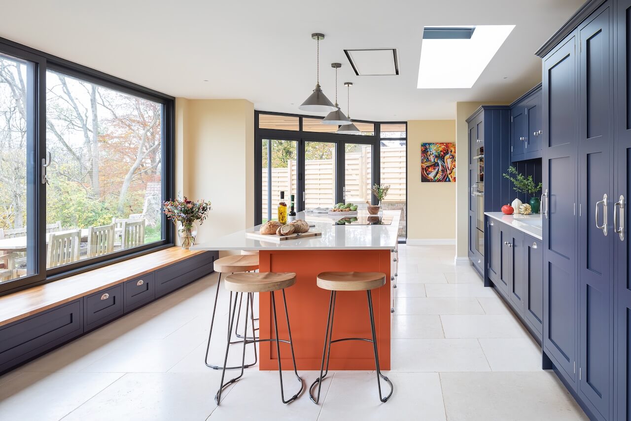
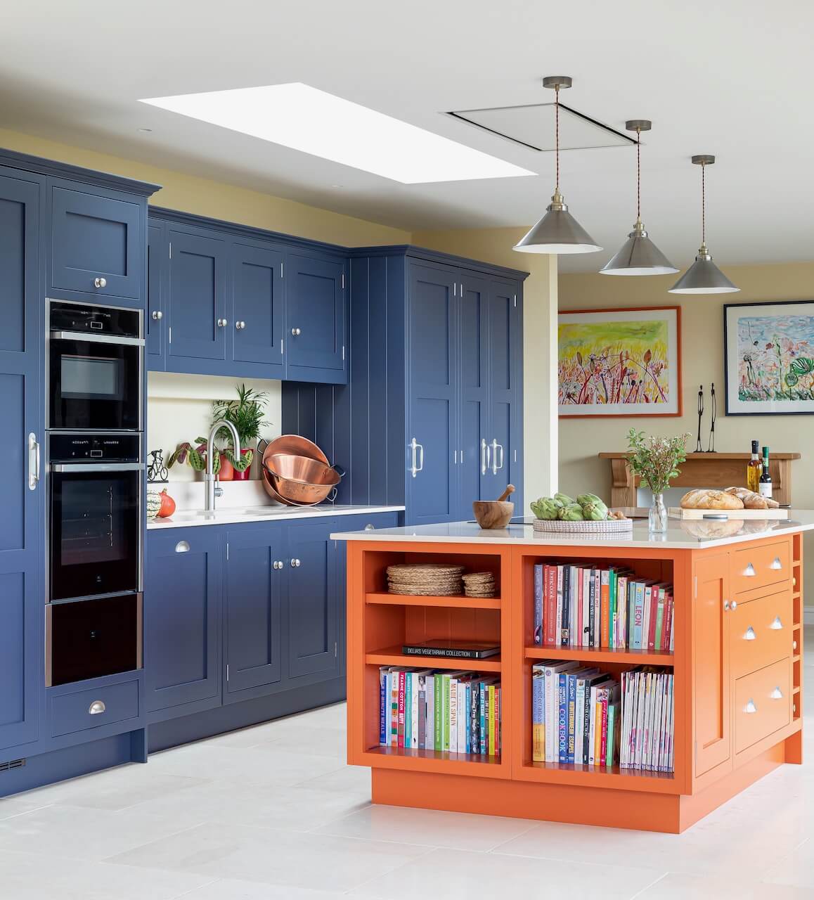
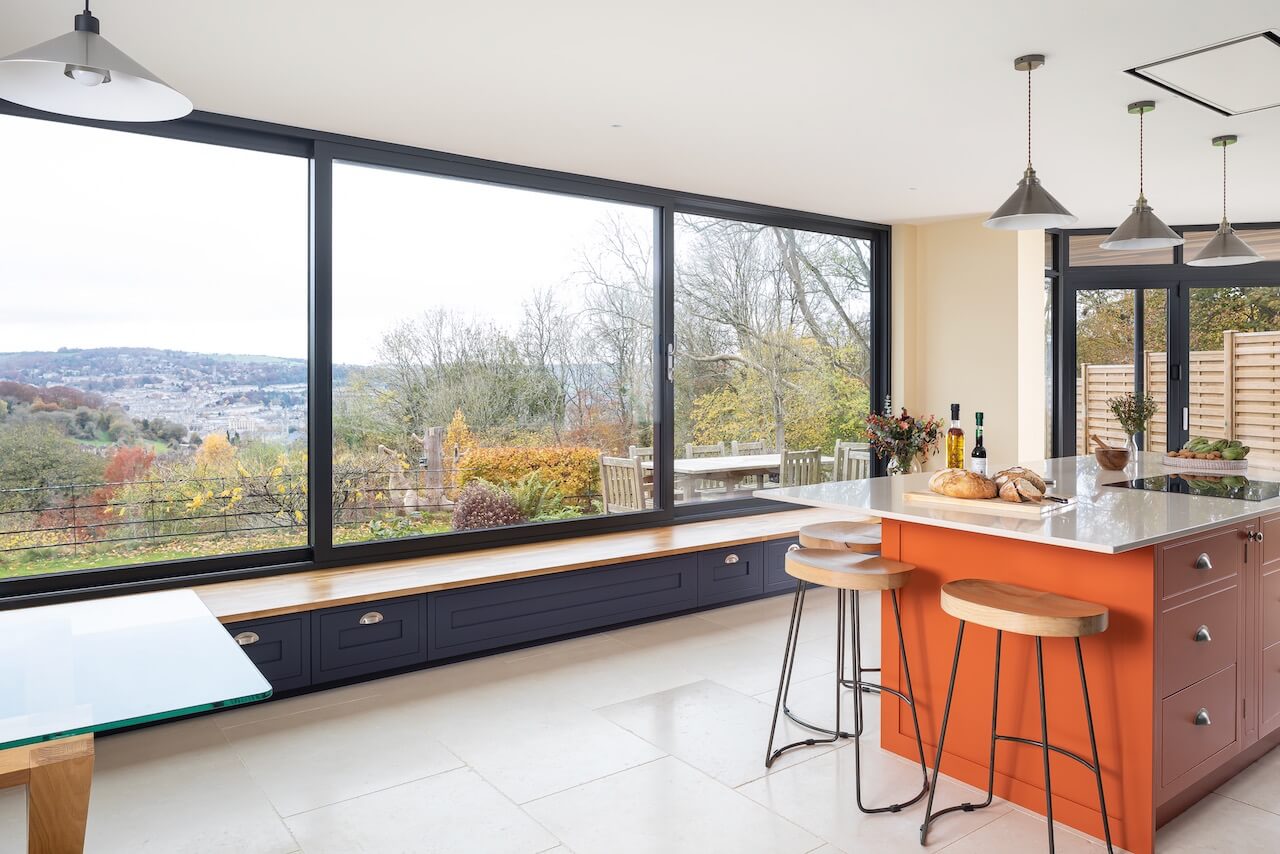
We created a stunning island as the centrepiece, with a mixture of storage and plenty of space for stools around the corner. This makes a lovely space to sit and eat or chat, perfect for breakfast, canapes before dinner or just somewhere for a nice glass of wine. We really made the most of the incredible glazing by creating a bespoke bench seat from our cabinetry that runs the whole length of that wall, so you can open the windows, sit down and take in that glorious view. It incorporates some storage too, for things which don’t need to be in the main kitchen but can be tidied away neatly nearby.
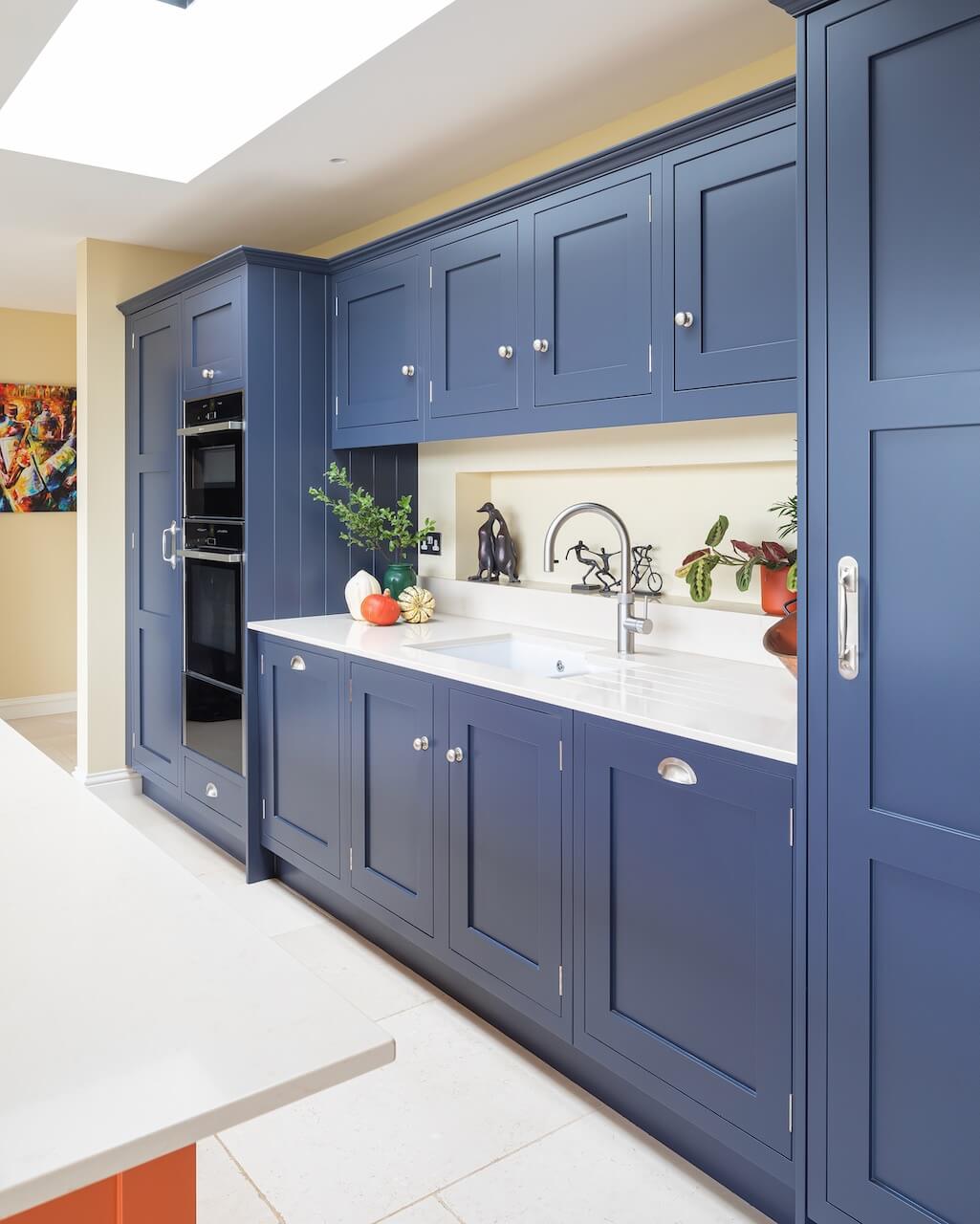
On the back wall, we included a full height fridge and freezer along with a spacious double door larder to maximise food storage. We made a lovely feature alcove behind the sink, which gives a feeling of depth to the space and allows plants/ pretty objects/ handy kitchen bits and bobs to be on show. The island has a set of open shelves for cookery books and plenty of deep drawers for pots, pans and crockery. Our Tangerine paint colour was perfect to tie in with the colour scheme requirements.
Q) Which products did you use and why?
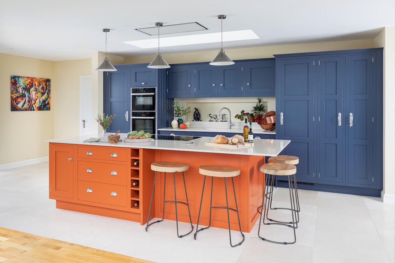
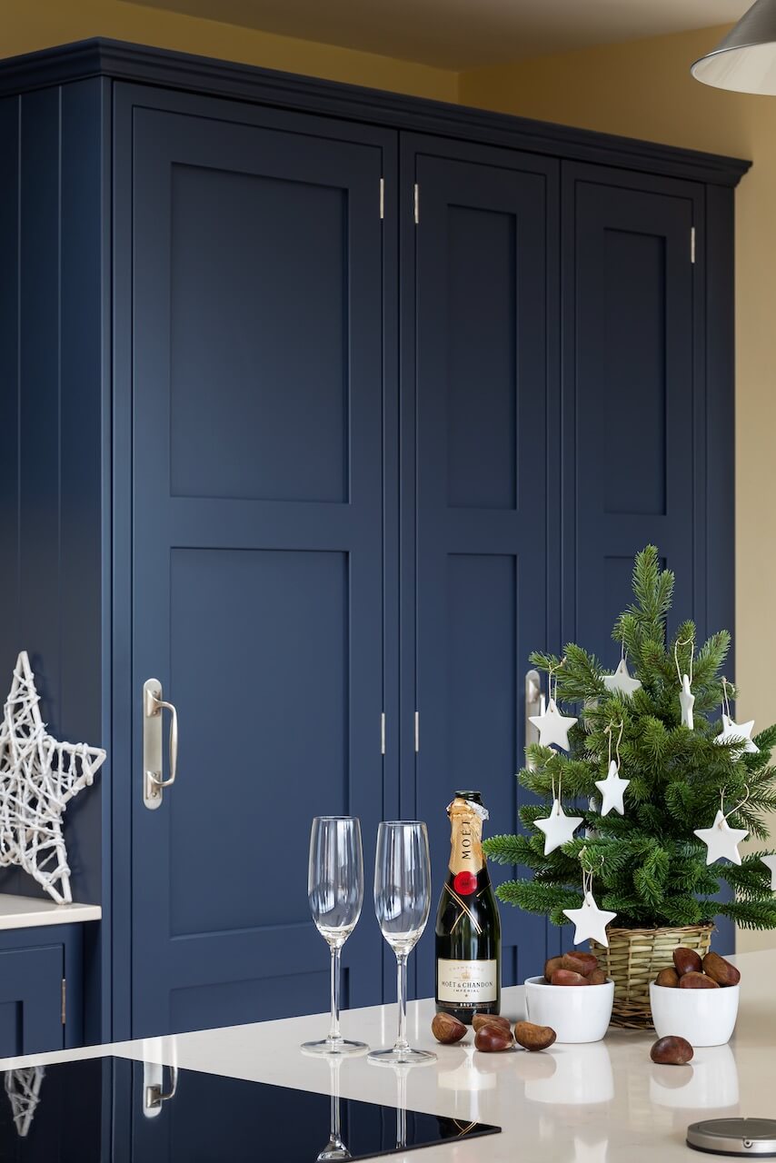
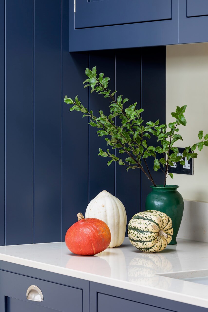
We used our Framed Shaker cabinetry in Damson Blue and Tangerine, with pewter hardware to add a soft silvery tone to the colour scheme. The worktops are super practical quartz in a crisp off-white, which was ideal as it is easy to look after and provides a great contrast with both the furniture colours.
In the main kitchen, we used Neff appliances to create a combination of multifunctional ovens along with a large warming drawer below, giving great cooking flexibility. The induction hob in the island and ceiling mounted extractor creates a sleek and modern feeling without detracting from the open feel of the space.
Q) What elements do you think make the scheme so successful?
The striking colour scheme is absolutely amazing. The gorgeous contrast between the pale tiled floor, white quartz worktops and the bold colours of Tangerine and Damson Blue have created such a unique look and the whole space is really personalised to our client’s style.
The bespoke bench seat is a really great feature and using the Damson Blue over there connects the two sides of the space visually, too.
The custom alcove behind the sink is a subtle but effective way of creating another storage space in a very handy location, allowing our client to ring the changes now and again with what is on display there.
Q) Any advice for someone who may be planning a new kitchen?
Go with your gut! Don’t feel you need to follow the crowd and be trendy. If you love a certain feature or colour scheme, then incorporate it in your new kitchen, as you will continue to love it over the years. Choose elements which bring you joy and make you feel excited to walk into your new kitchen every morning.
The worktop is a big feature, so take time to make sure you balance your requirements (does it need to be heatproof? Stain resistant? Characterful like wood or granite?) while ensuring the colours and tones tie in with your overall scheme. If you can fit one, a larder or pantry cabinet will revolutionise your storage and free up lots of space in your other cabinets. Also, try to enjoy the design process if you can – there are lots of decisions to make, which can sometimes feel mind boggling, but your designer will be there to advise and guide you along the way.
Q) Any trend predictions for 2023?
We’re seeing brighter colours in the kitchen. It seems like people are becoming braver when it comes to using colour. We’re seeing lots of polished brass for hardware and I think that will continue. Fluted glass is really big and even fluted wood is starting to become very popular. We are also starting to see a move away from grey and I think that will continue into next year.
The details:
Sink by Shaws of Darwen
Boiling water tap by Quooker
Worktops by CRL Quartz
Hayley loves: the bold use of colour, which works wonderfully in a space filled with natural light






Leave a comment