Striking Colours: Dramatic Kitchen by Roundhouse
By Linda Parker
 This beautifully dramatic kitchen, located in Brighton Marina with views over the Channel, was designed to make the most of the sea views. Senior Design Consultant at Roundhouse, Lauren Wright, gives us an over-view of the project.
Q: What were the owner’s main priorities for this kitchen project?
The kitchen was the central part of the renovation project, with the aim to create an open plan living, kitchen and dining area.
Photographer: Mary Wadsworth
It is so easy to knock down walls and keep one huge space, but our clients wanted to ensure the social space also works for the whole family, enabling individual activities to happen in the one room.
Q: How did you set about answering that brief?
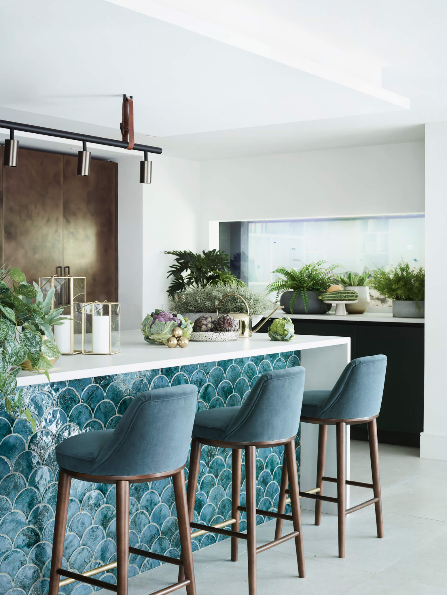
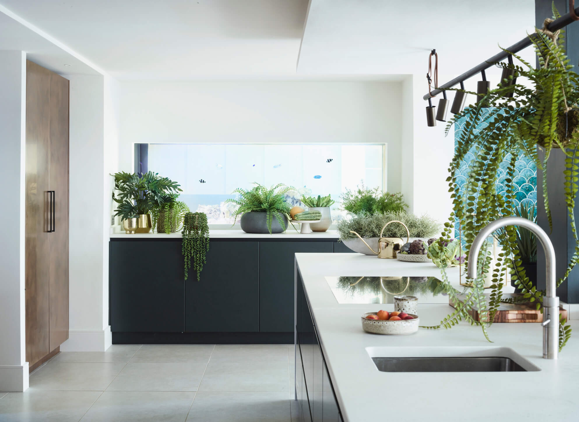
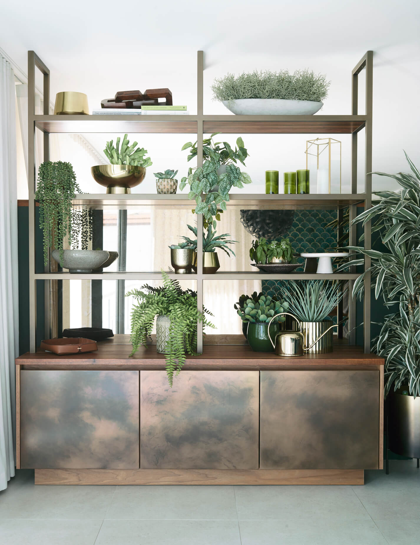
Rather than leaving our clients with just a large and cavernous room, we collaborated with the interior designer to create a more ‘broken-plan’ layout. The bespoke bronze metal framed shelving created a structural divide between the living and dining area. As it’s solid at the bottom this created privacy but the transition into an open shelving area higher the structure up kept the feeling of one room. The fish tank in the wall also creates visual connection to the formal living room next door.
Q: Can you reveal the reasons behind the choices of cabinetry and work surfaces …
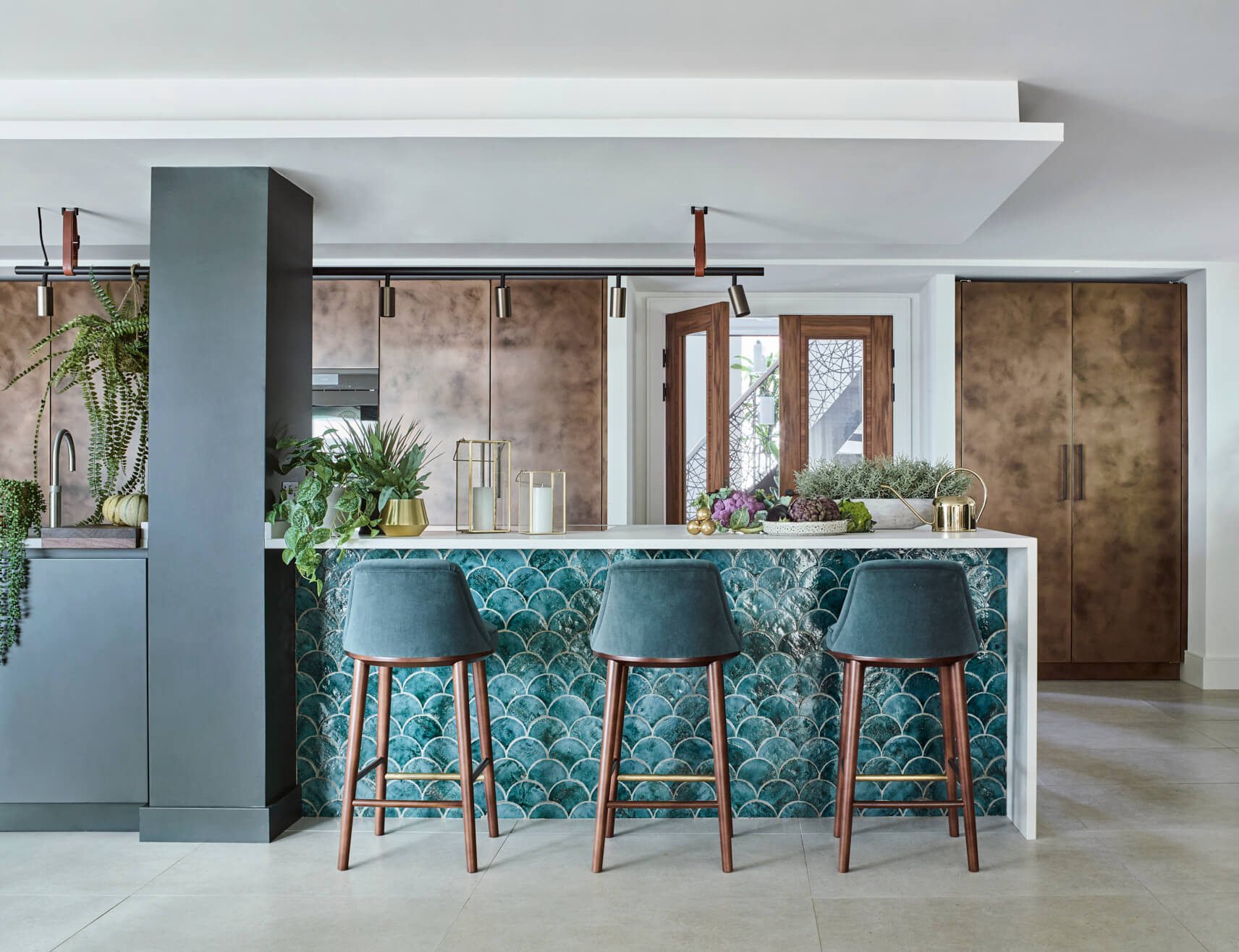
The final choice of finishes developed around the warm hand-polished patinated bronze, which is a finish unique to Roundhouse. Rich dark green works so well with the bronze and gives a sophisticated scheme, teamed with a light a fresh white concrete effect worktop. The bronze and walnut were then picked up throughout the rest of the room on metal shelving, and in the lighting and stools chosen by the interior designer.
Q: Was there any building/renovation work involved? Did you have any restrictions or limitations that you had to work around?
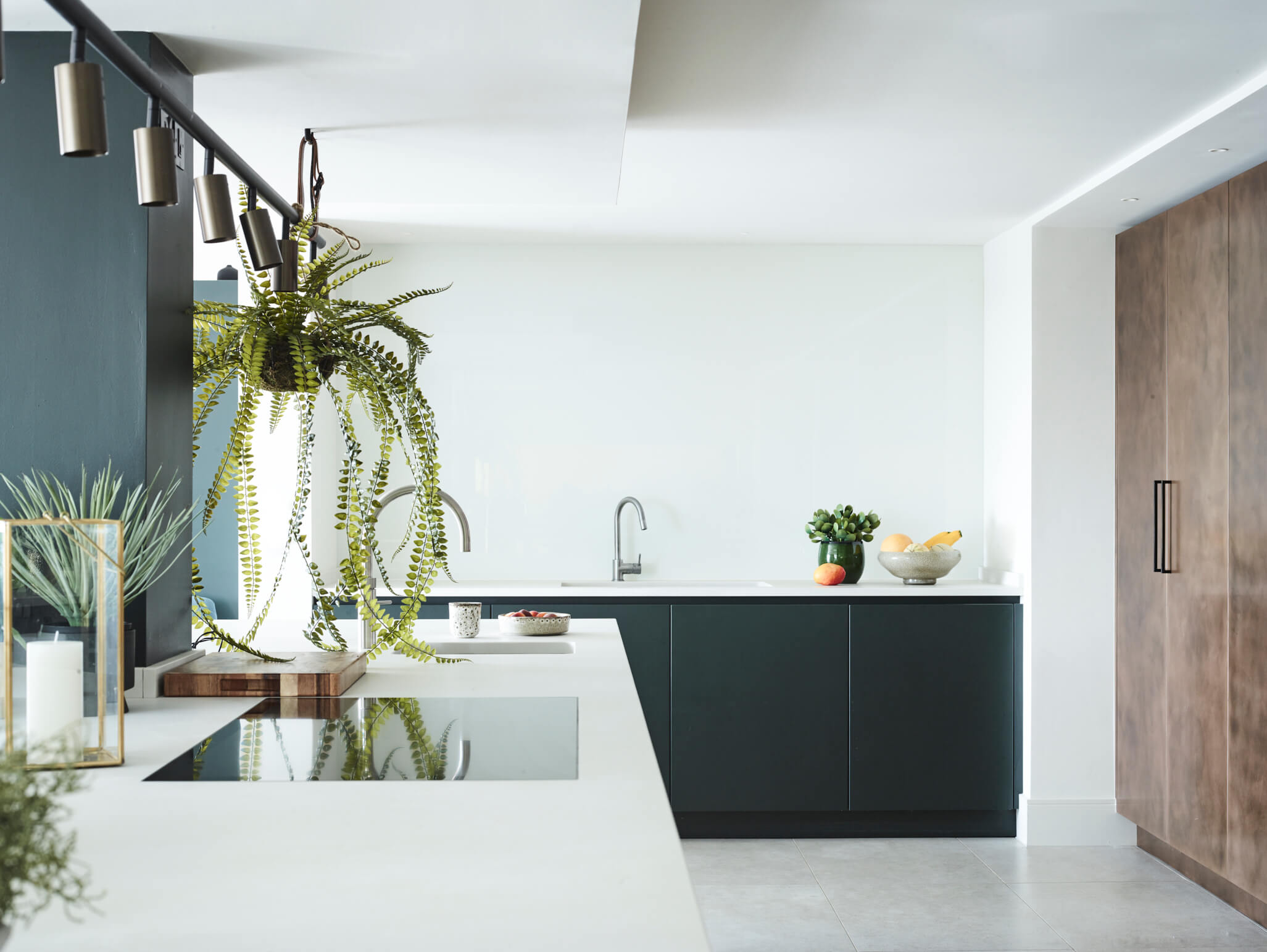
Yes, there had been an extensive extension and overall remodelling, including a curved glass wall providing views across the marina and sea, which were a focal part of the kitchen orientation. The removal of many structural walls meant we had to accommodate a large steel post and beams in the ceiling, which in turn, meant ducting the extractor was a challenge. We ensured the island and post were designed together and the ceiling was dropped above the island to accommodate the extractor and ducting, which had the effect of zoning the island.
Q: What design elements do you think make the scheme so successful?
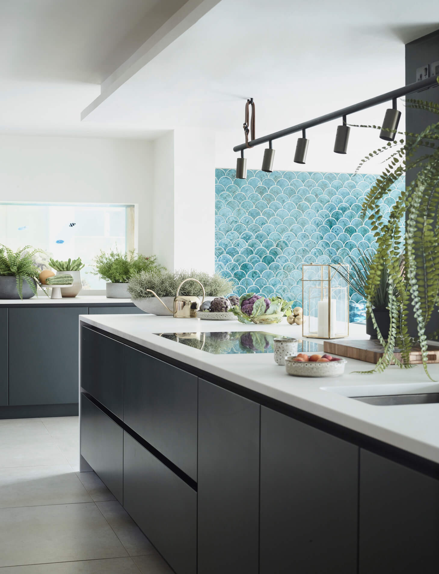
The interior designer and client chose the beautiful fish scale tiles, and the teal colour created a subtle and playful connection to the coastal location. The accent of teal against the patinated bronze finishes create a one of a kind kitchen design which is both striking and timeless.
Q: Now the project is finished, what aspects are you most pleased with?
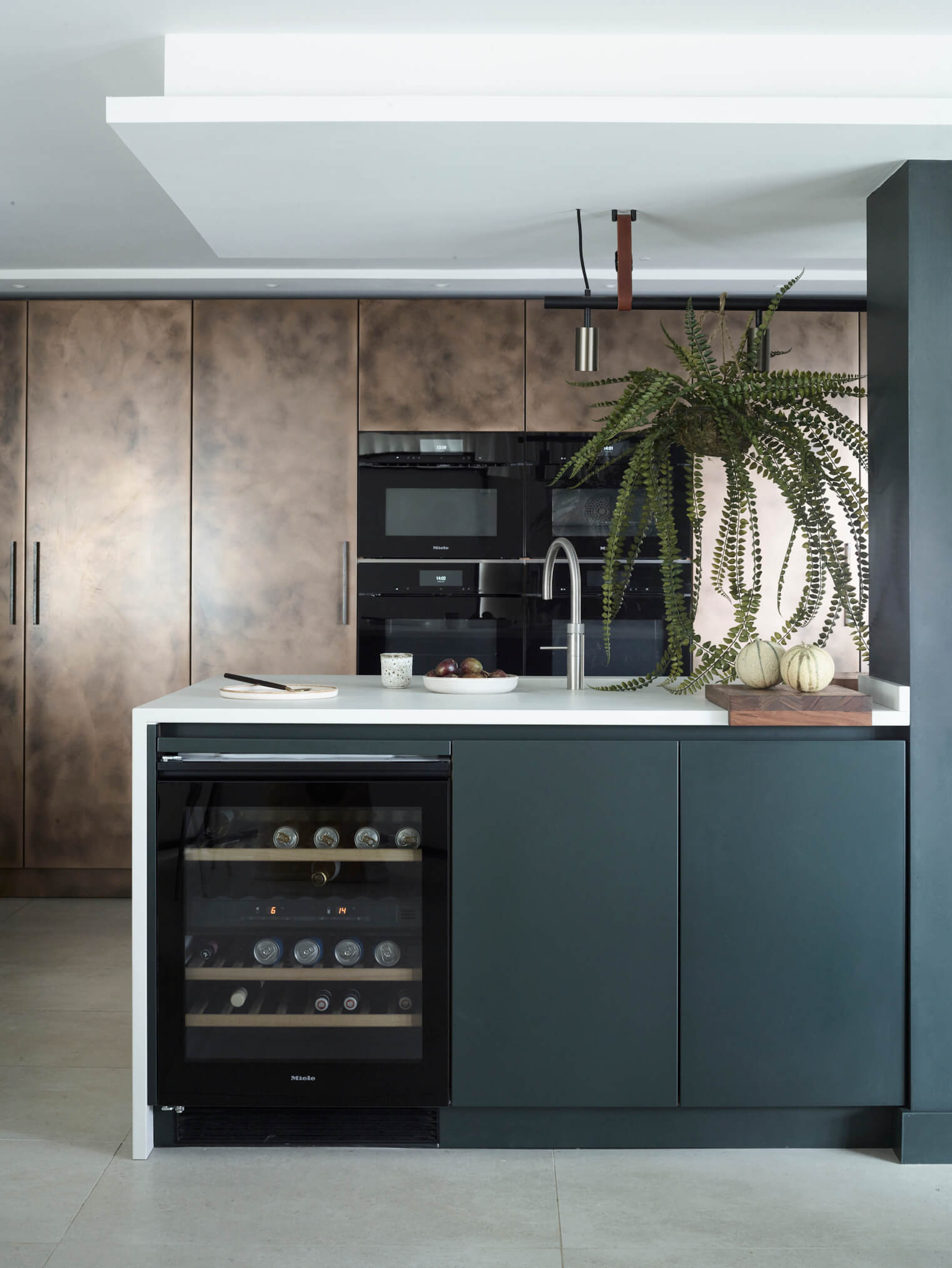
At first glance the kitchen looks like a beautiful selection of finishes in a fairly straightforward layout. However, we had many discussions over the practical logistics of how the space will be used, the use of the bespoke storage solutions providing housing for many appliances, food mixers, coffee and breakfast larders. We also wanted to create and maintain an easy flow between the main areas of use in the kitchen. Our clients are keen cooks, and there was a lot of cooking and baking paraphernalia to consider, and to create easy-access storage. The result is a really user-friendly kitchen – designed with a home for everything to be cleverly stowed away, whilst looking like a show-stopping piece of furniture when anyone enters the room.
Q: What is your best advice for someone who is planning a new kitchen?
We always say to our clients that they must be honest with how they want the kitchen to perform, how it functions, what it needs to house and how it will be used. It can still be unique, but if you have lots of kitchen gadgets, a hoard of cookery books, young children or entertain for the masses, be realistic and discuss your personal wish-list with your designer. No kitchen is a ‘one-size-fits-all’ so don’t expect to have to ‘fit’ into a kitchen when you can have a bespoke solution tailored to your needs.
Seeking expert advice from an early stage in any kitchen journey will give you a different perspective and possibly question and push the boundaries. Collaborating with an individual or team of designers that you trust can help realise the vision you want to achieve.
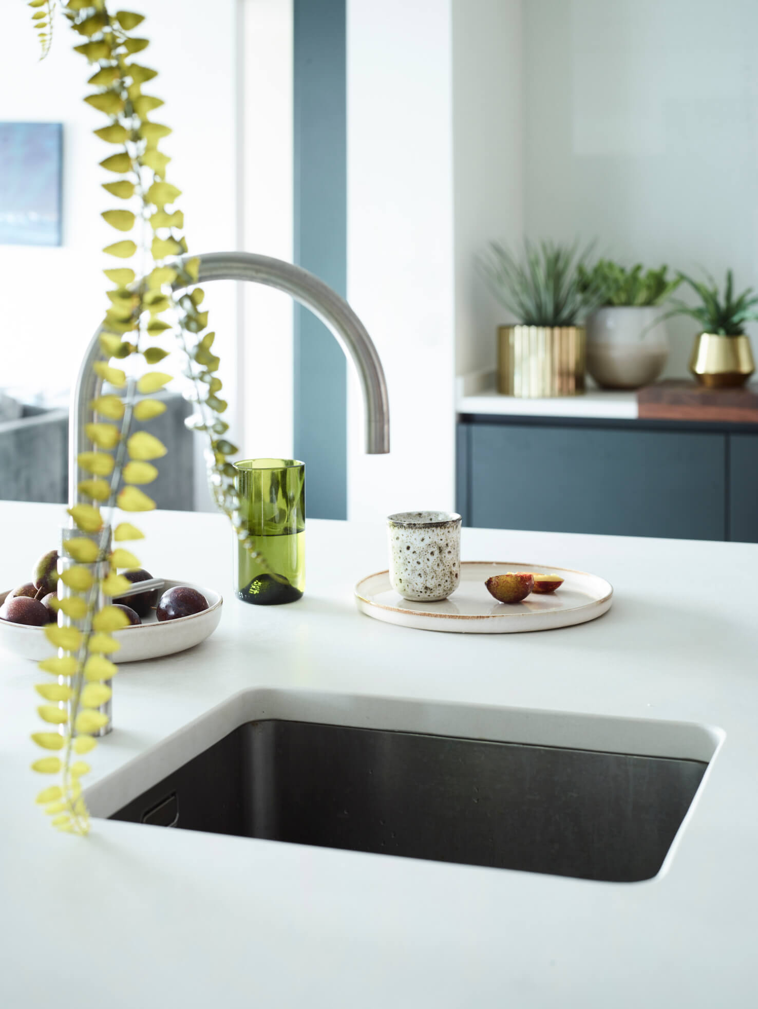
Q: As a designer, do you have a secret ‘style signature’ that you find you use in your kitchen projects?
I always look to combine textures together to enrich a space. Floor finishes, splash back tiles, wooden internals and metallic accents can all enhance and add warmth and individuality to a kitchen.
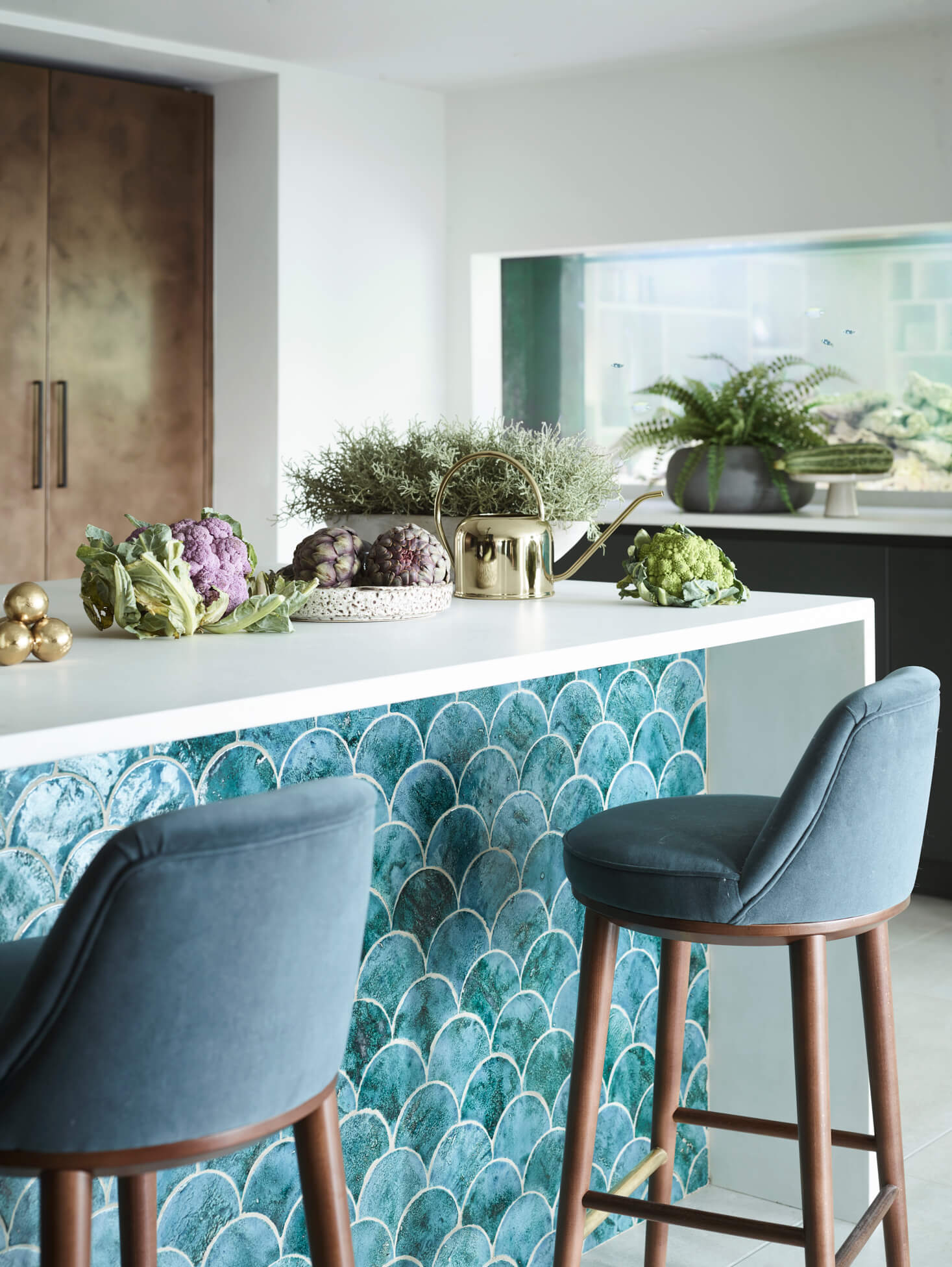
Q: Are you seeing more large-scale projects such as this, which extend into living and family spaces?
When undertaking a large project it is often easier to keep the cabinetry and joinery under one roof and with one contact. Therefore often we design the main kitchen but also utility, pantry, wine/drinks area and studies and wardrobes.
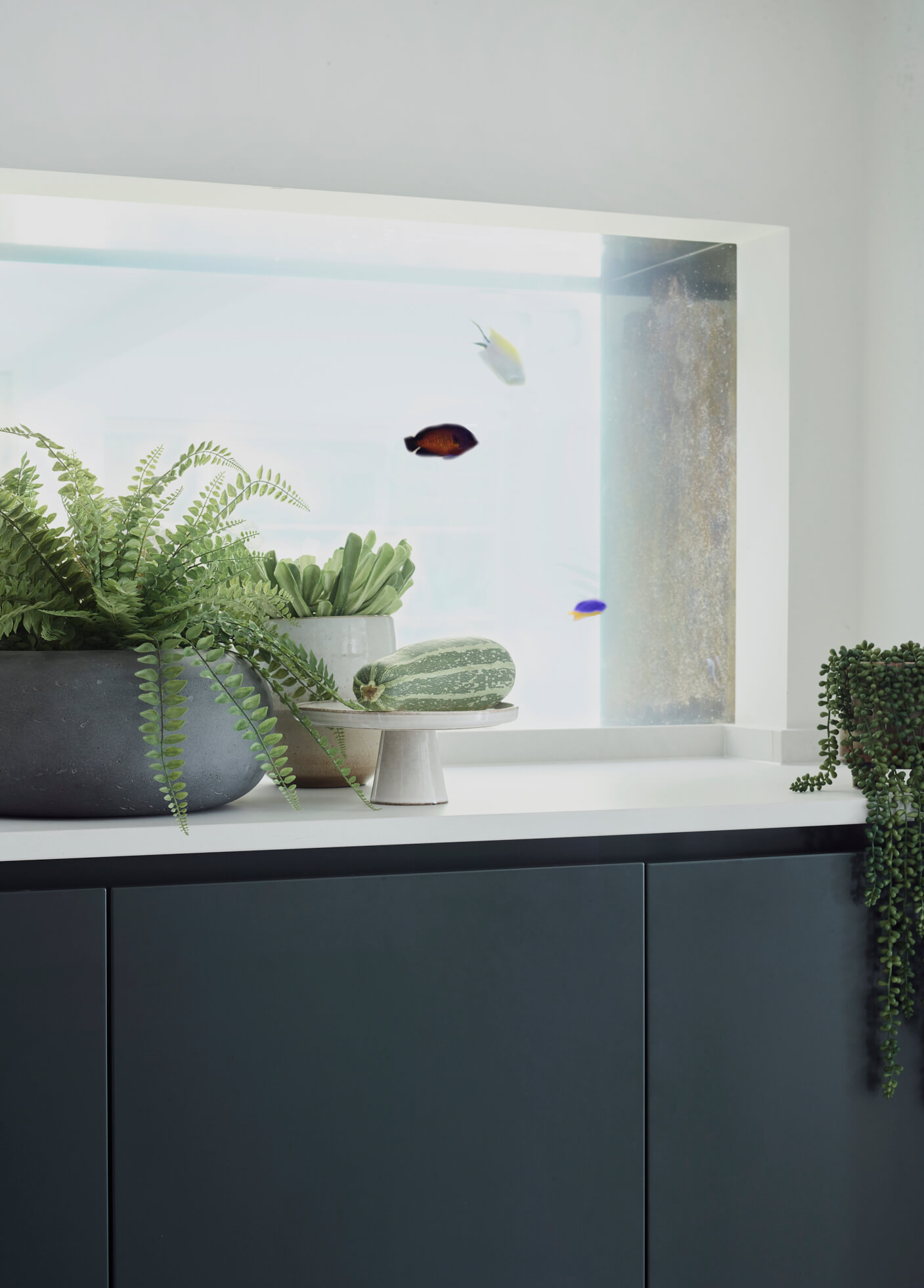
We Love: The beautiful use of texture, colour and metallics – especially the room divider and the fish-scale tiles – as wall as the very restful fish tank …
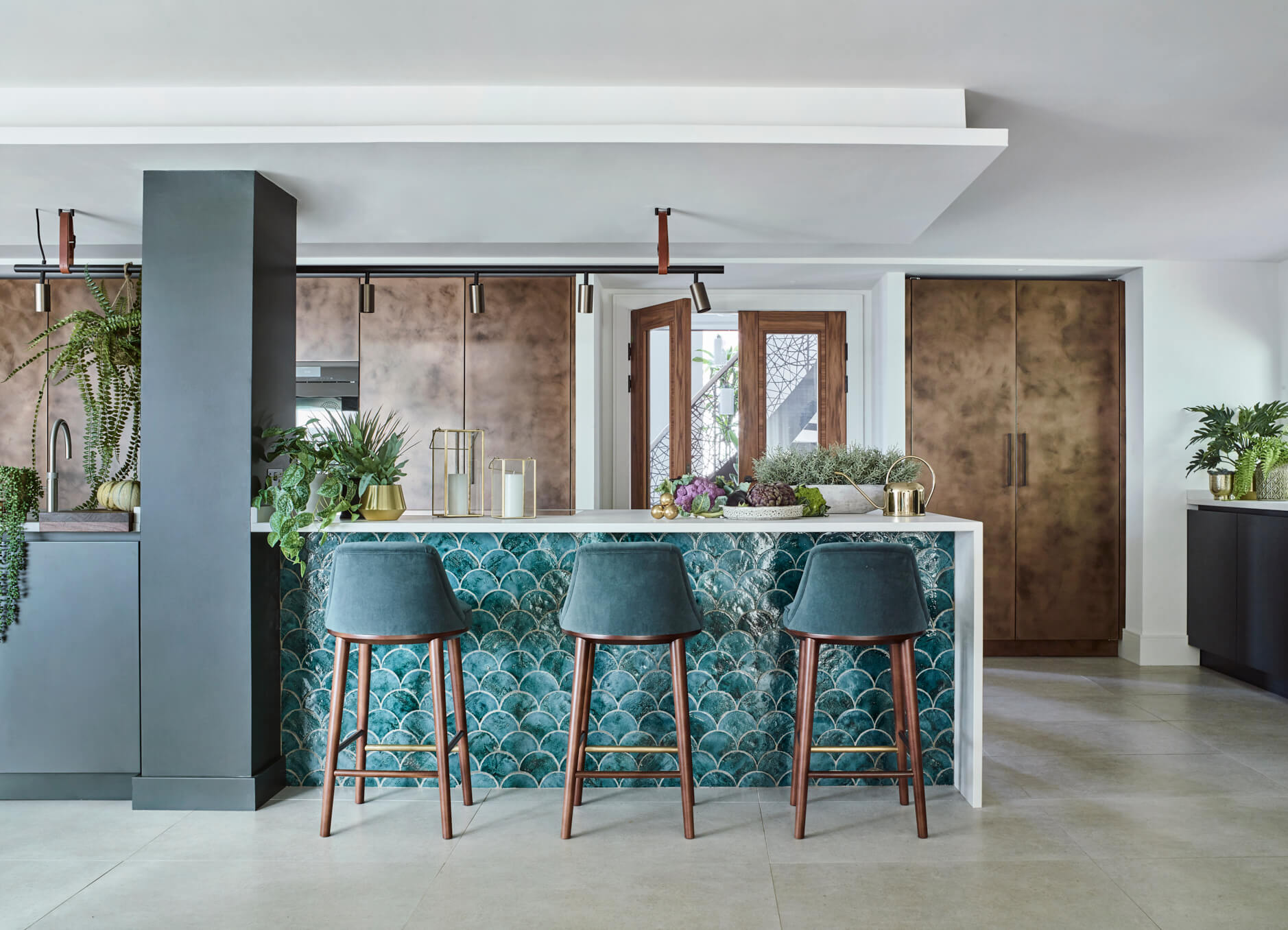
Urbo kitchen in Patinated bronze matt lacquer, with bronze metal shelving system, Roundhouse Design. Work surfaces, Caesarstone. Interior design by Pfeiffer Design
Ovens, hob, dishwasher, wine cooler, fridge and freezer, all Miele
Extractor, Westin
Tap, Quooker
Fish scale tiles from the New Terracotta range




Leave a comment