Pretty Stunning: the Blush Pink Kitchen by Martin Moore
By Linda Parker
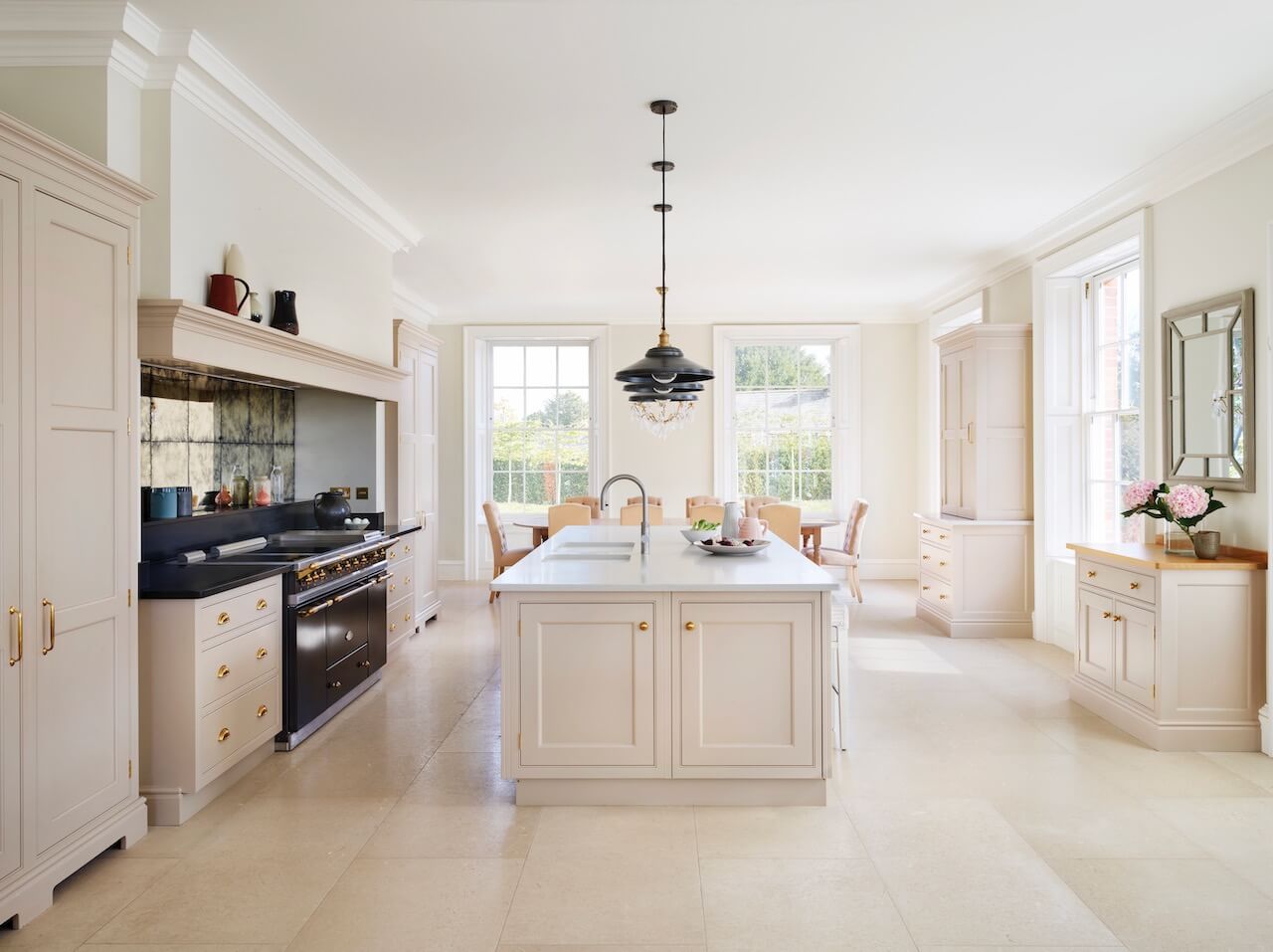
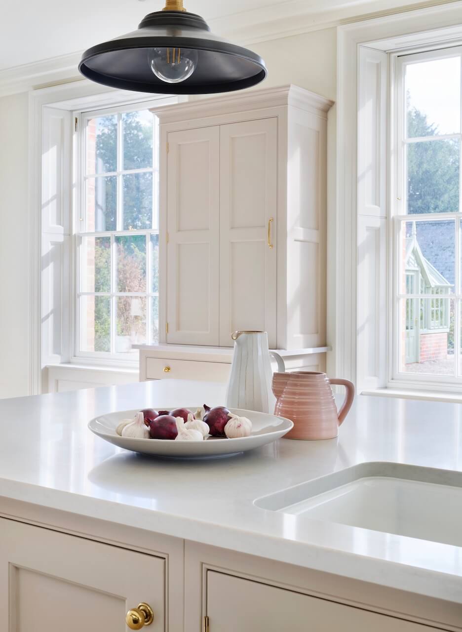
 Look closely and it’s possible to see that this pale and elegant kitchen has a hint of blush pink in its Pale Peony painted finish. It was designed for clients with a busy family life who wanted a kitchen space suited for entertaining…
Senior Designer Pam Baker from Martin Moore, based at the Esher showroom, created the perfect layout.
Q: What were the stand-out priorities in your brief from the client?
The brief was to create an ergonomically designed, spacious kitchen that allowed the owners to entertain on a large scale. Naturally, it also had to function equally well for their family life. In terms of the overall look and style, the owners pointed me to a project in our brochure that she described to me as ‘exactly what she wanted’, so we had a very good starting point.
Q: How did you set about answering that brief?
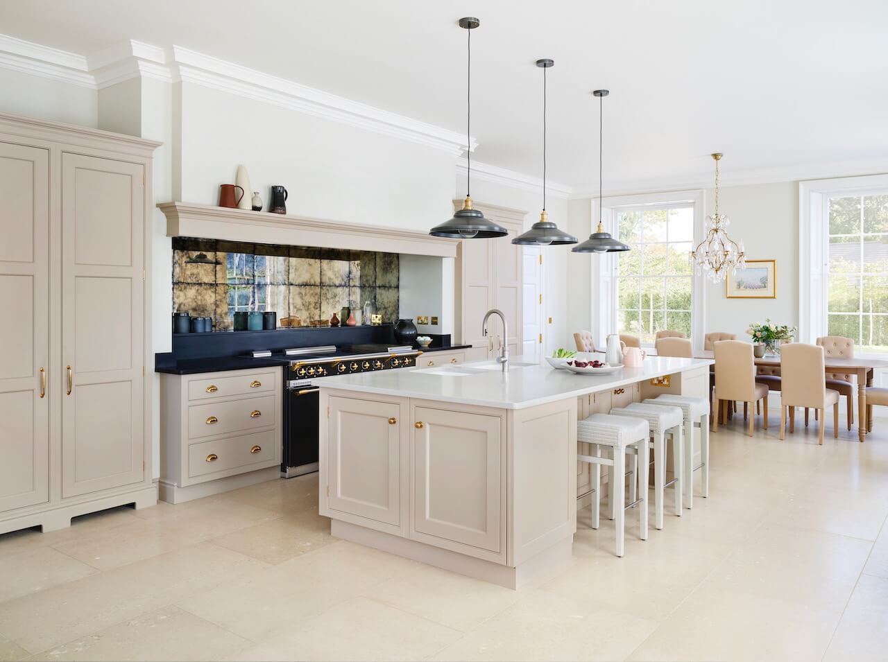
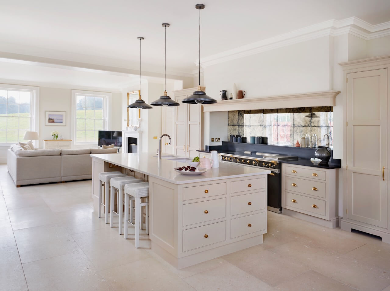
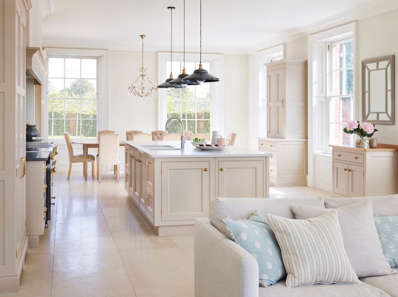
Clever planning was essential – we wanted to fit in all the requirements as far as storage and appliances were concerned, without creating a sense of the space being overcrowded. We purposefully chose a large open-plan layout. The layout incorporated a formal dining area as well as a casual seating zone, with a kitchen in the middle – the heart of the space. This allowed for a great flow throughout the whole kitchen-family area, which is perfect for entertaining.
Q: Explain the reasons behind the choices of cabinetry and work surfaces …
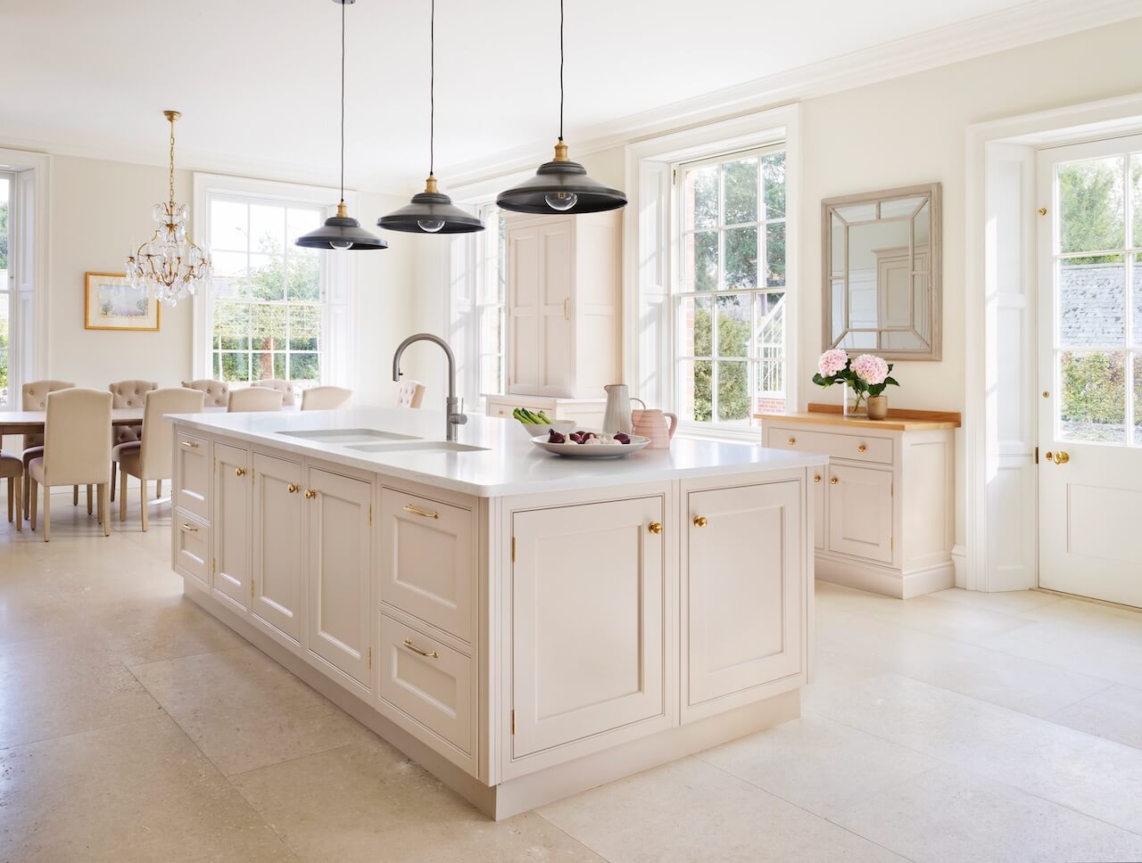
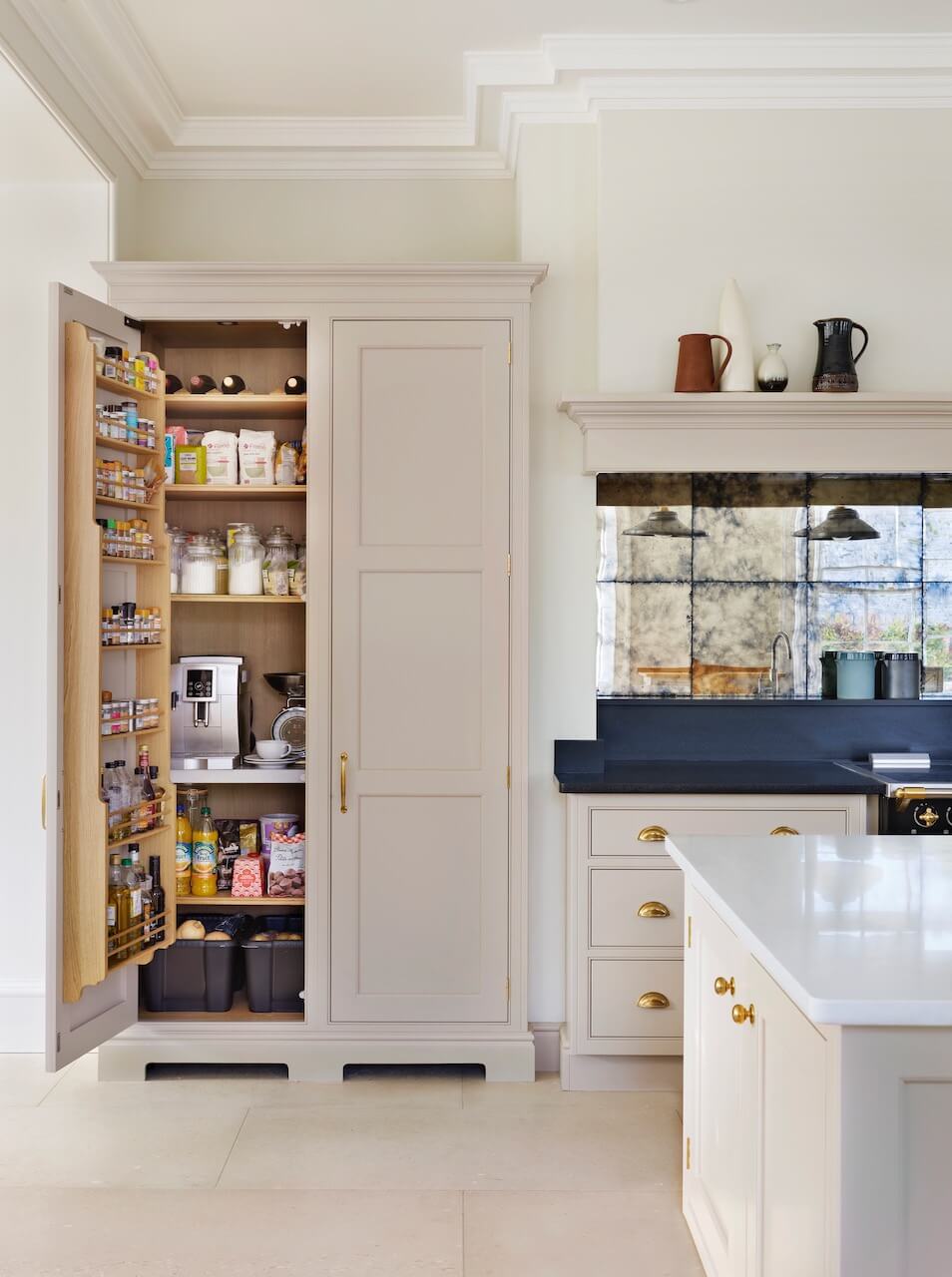
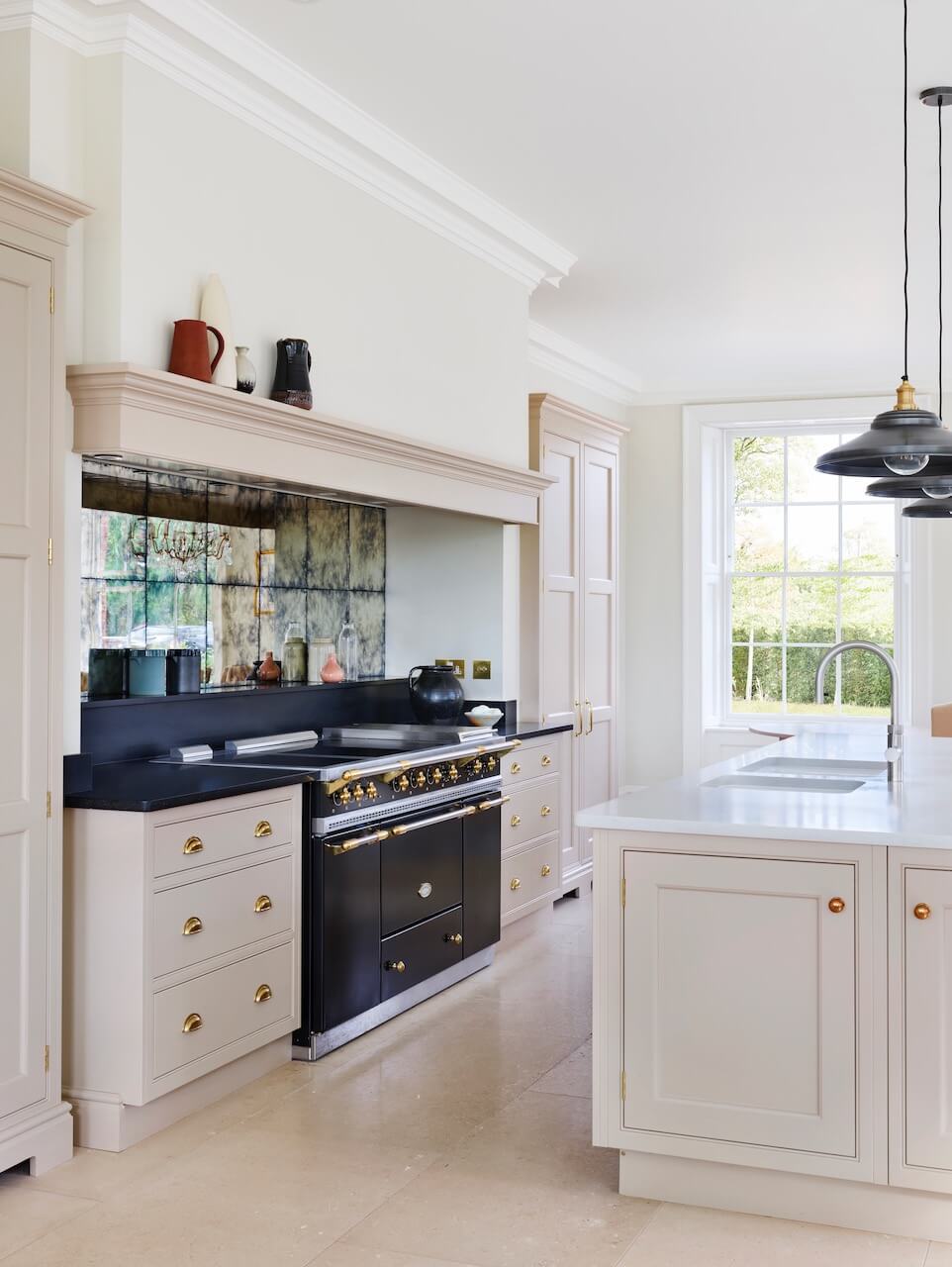
We opted for our New Classic furniture for the cabinetry. The style and proportions of New Classic are influenced by Georgian period architecture, which is a natural fit with the style of the property, which is a large, Georgian-style new build. Originally the owners were keen on deeper pink colour, however after much discussion it was decided that a softer neutral cream with just a hint of blush pink was a more timeless choice, as it wouldn’t so easily go out of fashion. The shade is Pale Peony, from the Martin Moore collection. The materials and finishes used are vital to the success of this kitchen; warm brass handles and knobs add visual interest to the scheme – the unlacquered polished finish will develop a natural patina over time. Black worktops provide a striking contrast to the light, blush pink colour scheme.
Q: Did you have any restrictions or limitations that you had to work around?
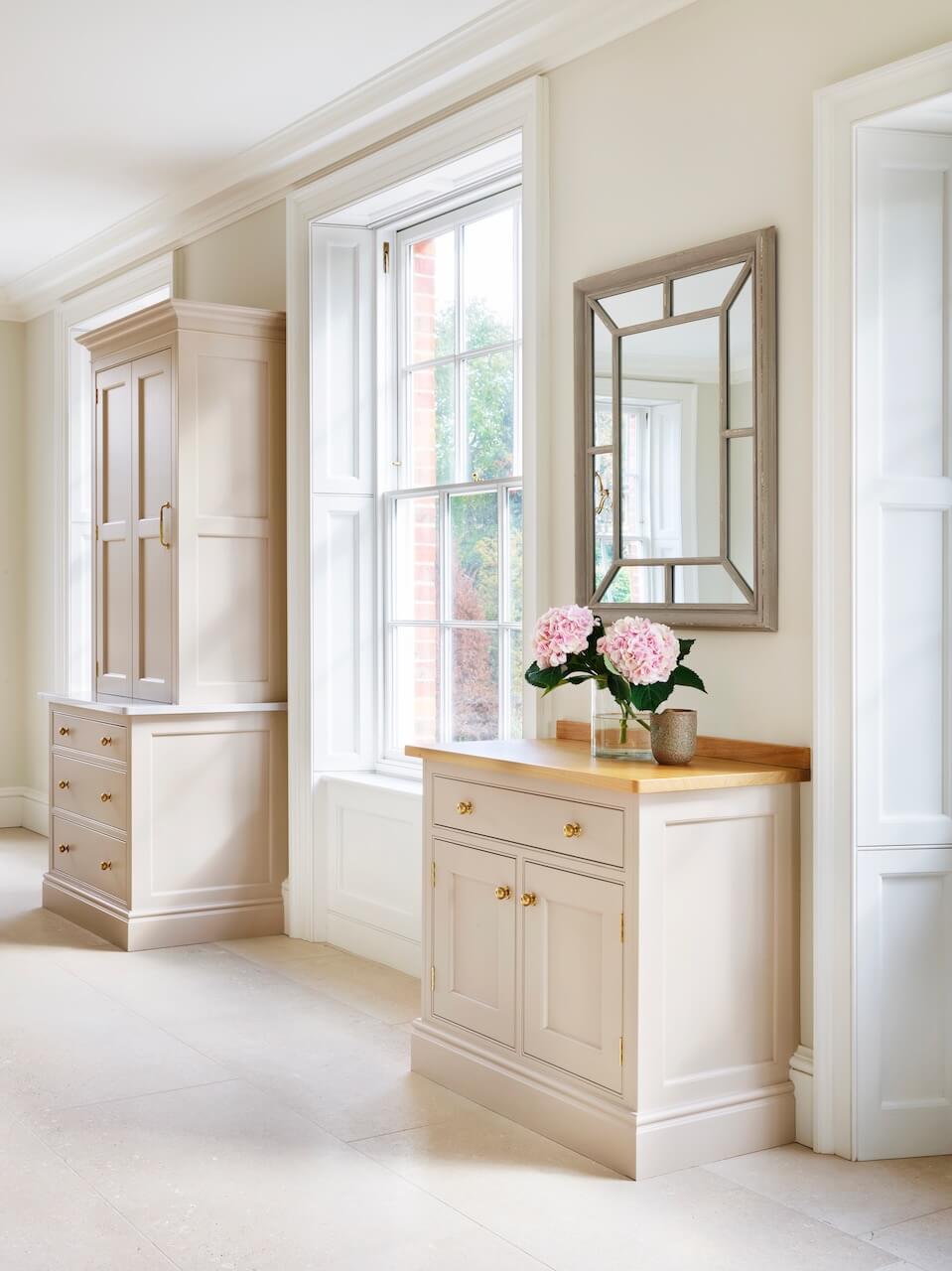
There weren’t many limitations, as the house was newly built. However, spatially, the layout and furniture proportions were heavily influenced by the style and placement of the large sash windows which feature throughout the room. Also, there was only one full length wall within the room which could accommodate all the cooking, refrigeration, and dry food storage. So, we had to get creative when planning extra storage and prep space to ensure that all eventualities were catered for. It was helpful having a separate utility room as that meant there were logical and practical divisions regarding storage requirements.
Q: What design elements do you think make the scheme so successful?
I think the colour scheme of this kitchen, and the choice of finishes really make it stand out. Including contrasts within a scheme is generally a good design concept, and here, the unexpected shots of black provided by the Lacanche range cooker, plus the surfaces and upstand are really effective. I also think that the amount of easy-to-access storage space we have managed to incorporate is essential to the success of this kitchen as a practical, working space.
Q: Now the project is finished, what aspects are you (or the client) most pleased with?!
The owners are thrilled with the flow and feel of the kitchen: it really is a practical, family orientated space, but it also has the capacity and amenities to provide for larger groups of family and friends. Also, the design of the kitchen is highly sympathetic to the style of the building, which I think is a big part of its success, taking into account the design proportions of the house itself and the kitchen cabinetry.
Q: What is your best advice for someone who is planning a new kitchen or who is working with a developer on a new home?
When planning a new kitchen in your home or working with a developer on a whole new property, it is vital that you choose a kitchen designer that you feel an affinity with. They should understand your vision, how you and your family live and your personal style. Choose a designer that has extensive experience as they will be able to make imaginative design suggestions, recommend the best appliances and bring the scheme together with inspired finishes, colours and materials.
Visit a variety of showrooms to compare the quality of their products and their service levels. A kitchen is a big investment, and it has to weather years of use. So, choose the very best quality you can afford.
Also, look around for design inspirations from magazines, books, online resources and even friends’ kitchens. How do you want your kitchen to look and feel and how are you going to use it? These are the questions you need to ask yourself.
Q: Do you have a secret ‘style signature’ or idea that you find you use in most of your kitchen projects?
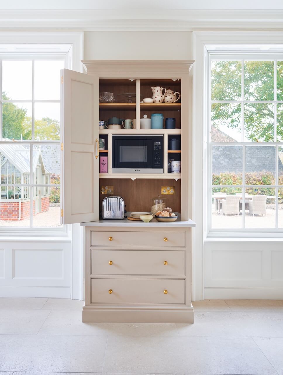
I wouldn’t say I have a ‘style signature’ as I try to approach every project with fresh eyes, taking into account exactly what that particular client needs and wants. However, I always think it’s important to incorporate enough storage elements, so that kitchens can remain clutter free and ordered. This is often in the form of larder, appliance, or breakfast cupboards – or if there is enough space, a walk-in pantry.
Q: Are you seeing more large-scale projects such as this, including larders, utility spaces and so on within a kitchen concept?
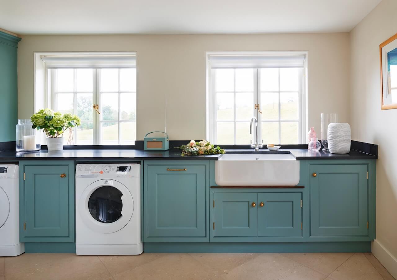
With much larger numbers of us now cooking and entertaining more at home, it has become increasingly important for our clients to have a place to store all the necessary ingredients, spices, and kitchenware. We are regularly commissioned to design purpose-built larders and pantries as part of the main kitchen design. A well-designed bespoke larder will help to maintain a sense of order and to keep the kitchen clutter free. Also, many of our clients are now requesting ‘bootility’ rooms, often including a deep sink, storage space for bags, coats/jackets and shoes, and even, dog showers. The utility room in this project is painted in Cornflower, from the Martin Moore collection.
Q: Do you have any trend predictions for 2022? Such as the colours, finishes and styles we will be seeing more of in the future ….
Beautiful, unusual, bespoke materials and colours are a big trend for 2022. Think dramatically veined marble and statement granite for worktops and splashbacks, mixed metallic finishes, and bright colour schemes. Our latest New Deco Kitchen offers more options than any previous collection, with inset and cladding finishes including marbles, plain and decorative limestones, metallic and veneered timbers.
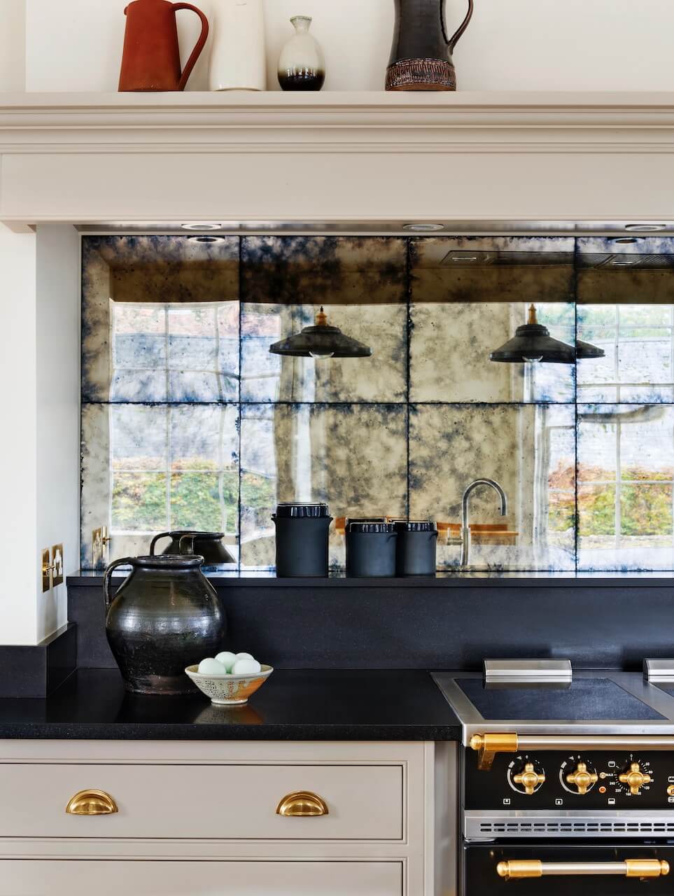
We Love: The beautiful cream-blush pink shade of the cabinetry, and simply the elegance and symmetry of the whole project.
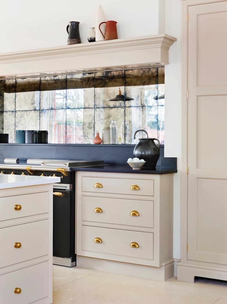
New Classic kitchen by Martin Moore, 0845 180 0015, Showrooms in Notting Hill, Fulham, Muswell Hill, Esher, Old Amersham, Altrincham, Tunbridge Wells and Elland.
Range Cooker: Citeaux Induction Top, plus extractor and ducting kit, Lacanche
Integrated larder fridge, M6022 Microwave, Miele
Integrated dishwasher, Neff
Cast Iron Sinks, Kohler
Taps, Cube and Flex, Quooker
Butler sink, Shaws of Darwen
Lever tap, Oberon, Perrin & Rowe



Leave a comment