The Macaron House: The Rhapsody kitchen by Mowlem & Co
By Linda Parker

Mowlem & Co designer Julia Brown created this clever kitchen for professional baker Petra Wood, who heads up The Macaron House. The design had to cover two crucial requirements – it had to be a streamlined and ergonomic space for Petra’s cake and macaron creations, and also function as a practical, family-friendly kitchen and entertaining space.
Q: What were the stand-out priorities in your brief from the client?
Designer Julia Brown: Our client needed a kitchen that would allow her to work from home, but which would also be perfectly suited to a busy family life. We had to design a functional layout that would operate seamlessly when Petra was baking at home, but which would also be aesthetically pleasing and of course, align with her personal taste and style preferences.
Q: How did you set about answering that brief?
For this project, it was obvious that ample storage and workspace was also essential, not only to house all the ingredients and equipment for the making of commercial cakes and macarons, but also for her family of three growing boys and her husband. Just creating the best kitchen for a family alone can be a challenge, here we were blending two sets of requirements into one.
Q: Explain the reasons behind the choices of cabinetry and work surfaces …
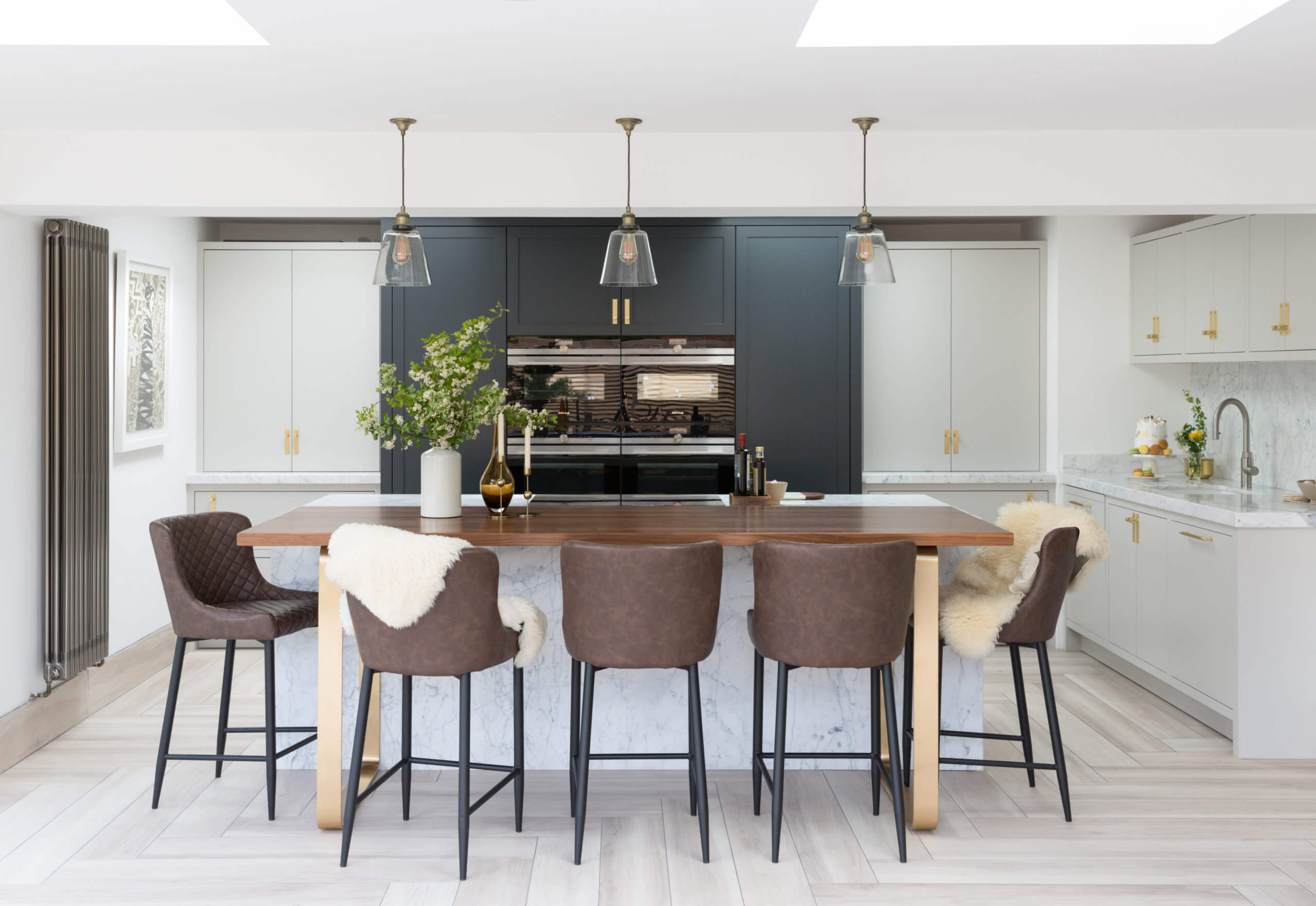
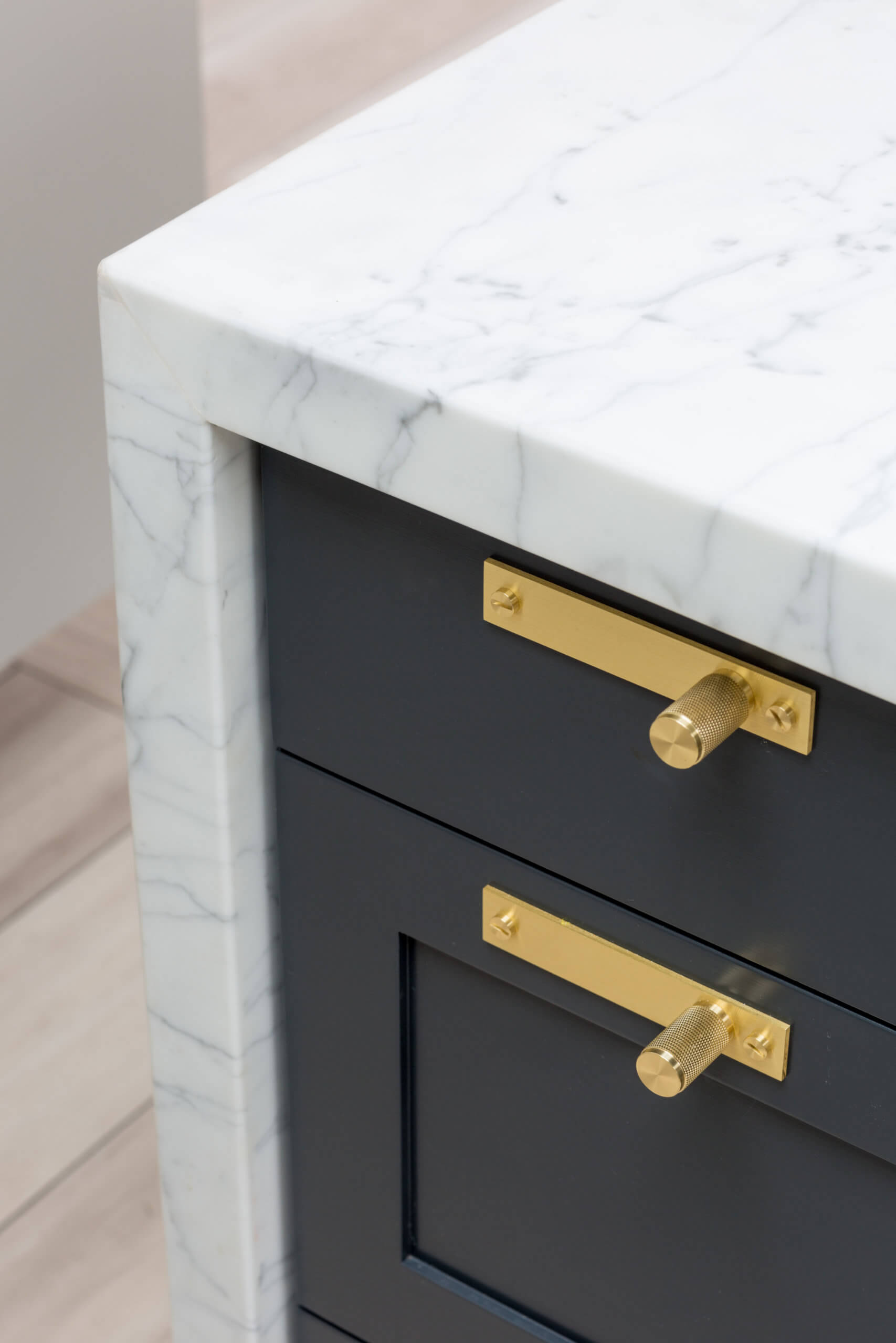
In terms of the aesthetics of this project, there’s a blend of enticing colours and high-quality materials. A mix of our unframed Shaker design with framed flat cabinetry is hand painted in Farrow & Ball’s Off Black. The lighter cabinets are painted in Little Greene’s French Grey.
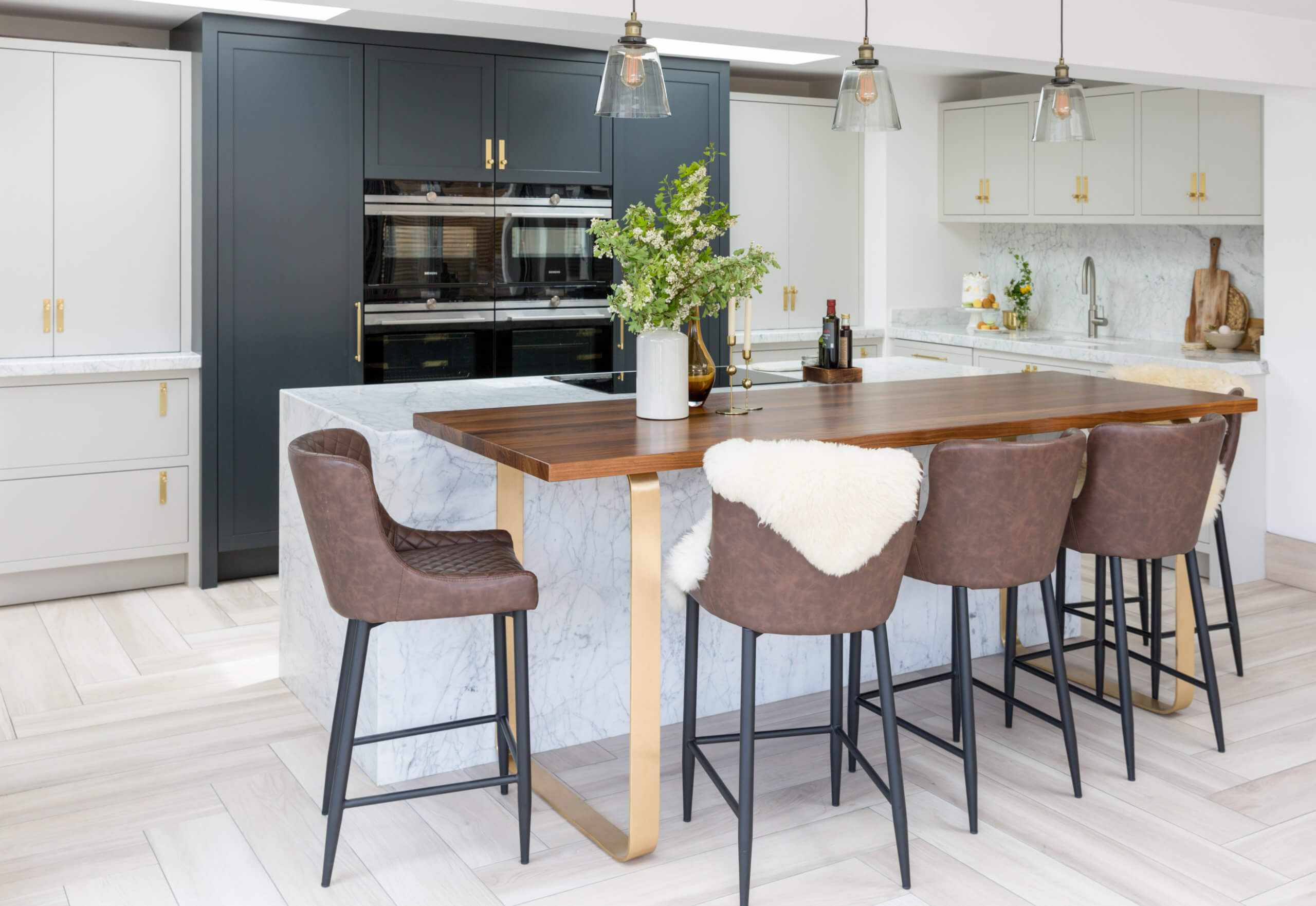
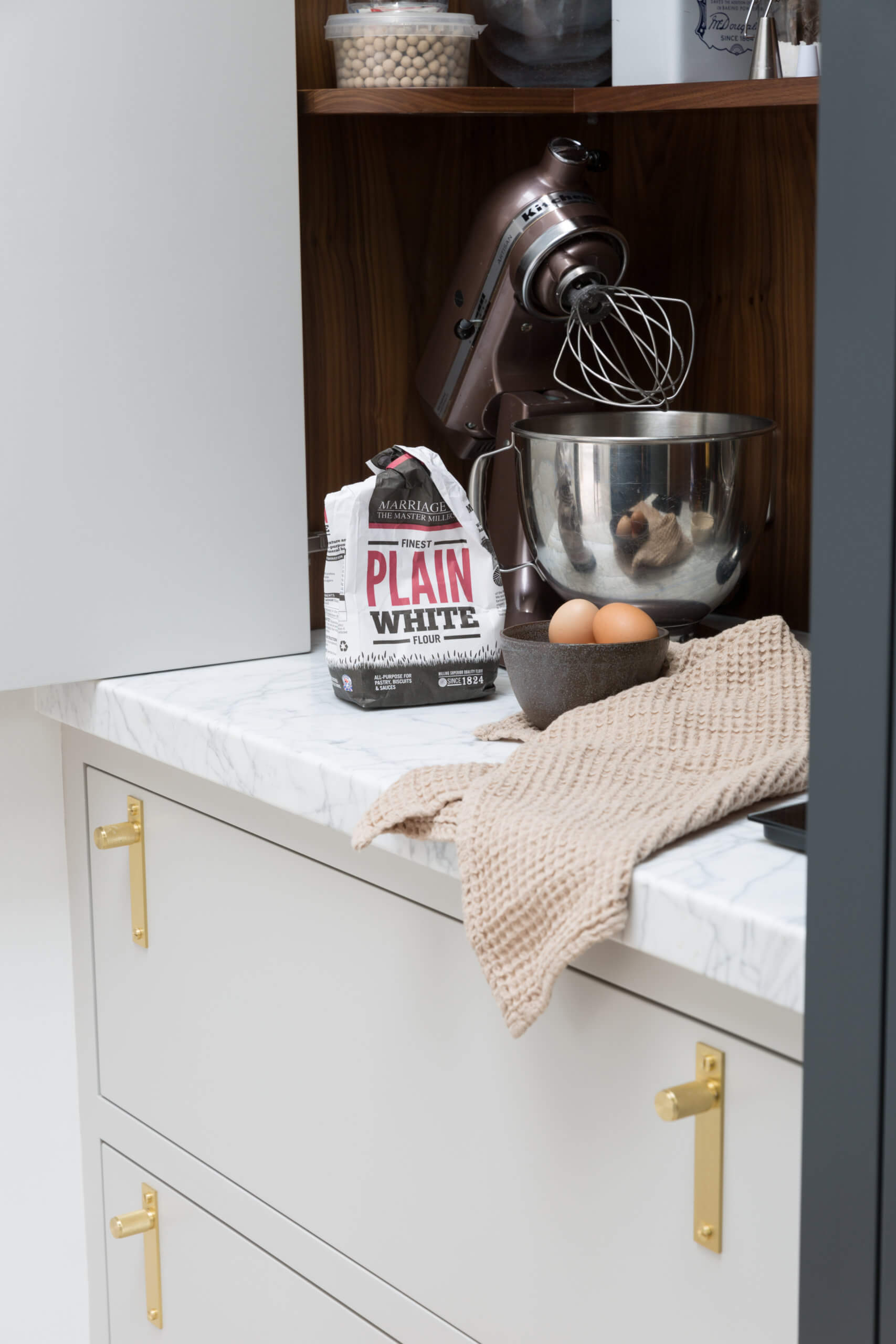
The perimeter units are topped in Carrara Gioia marble and the marble-wrapped island features a generous cantilevered walnut breakfast bar, supported on curving, solid brass legs. Brass is a key accent overall, also appearing on the cabinetry handles from Buster + Punch.
 Q: What design elements do you think make the scheme so successful?
Classic design principles combined with innovative touches and characterful accents means this framed and hand-painted scheme is absolutely one of a kind. We settled on the ideal L- shape layout that maximised all available wall space whilst also including a sociable and practical island unit.
By taking one section of cabinets into the short end of the L and reducing the size of the island slightly, optimal storage was attained. This also created a definitive ‘clearing up’ zone for the sink area, which is an extremely helpful addition in a very busy kitchen that doubles for business and domestic life. It also allowed for not only a generous double bowl sink, but the addition of integrated bins and a dishwasher.
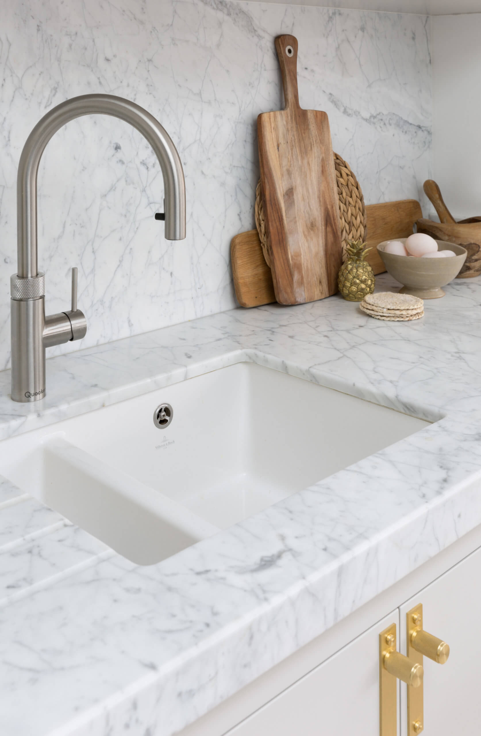
This delineation nevertheless involved some tricky juggling of space and the addition of an extra room dividing element so the sink run could butt against the new section of a wall that otherwise curves away into an open plan living area.
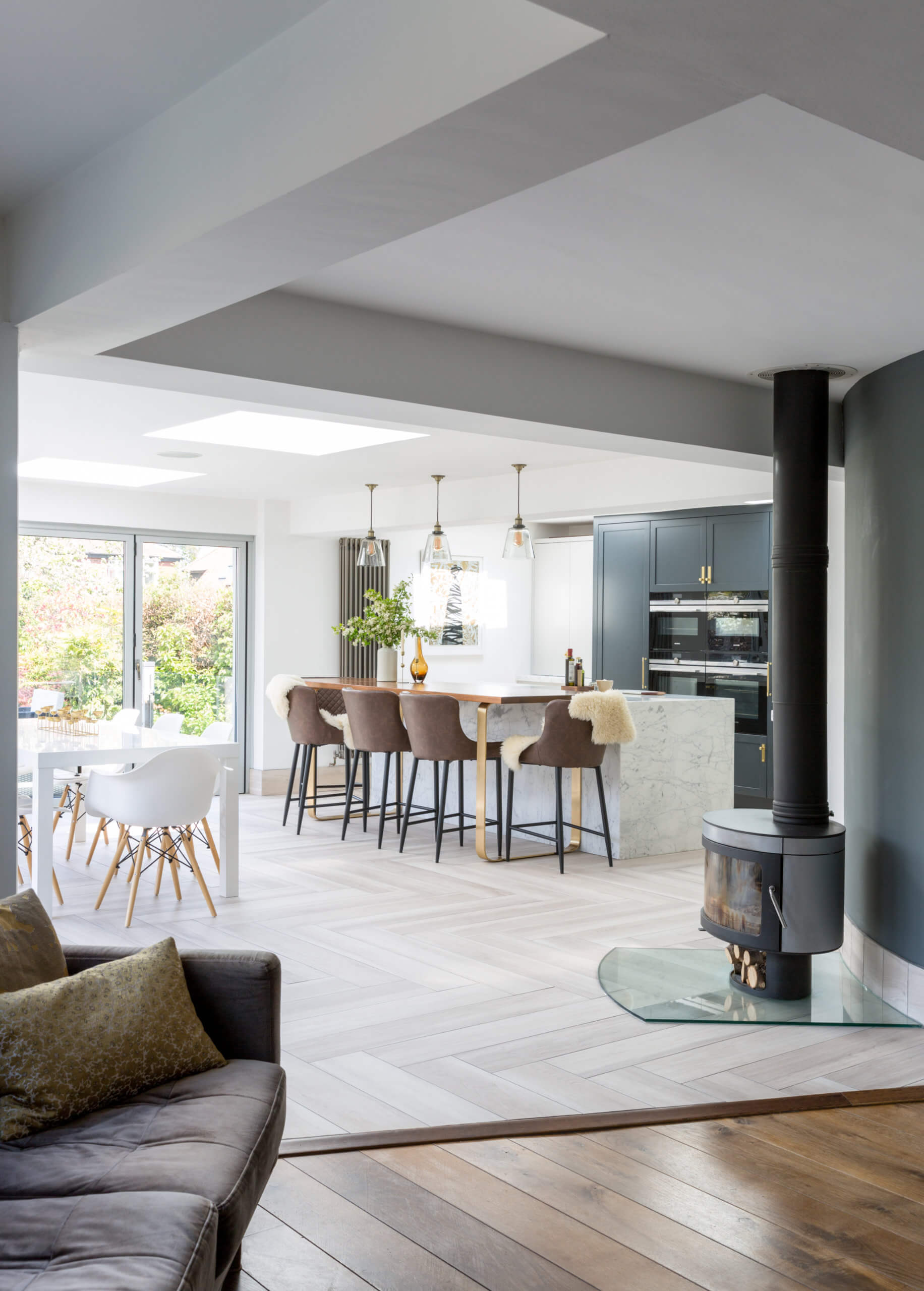
Q: The ovens are naturally a crucial element in this layout, how did you accommodate them?
After solving the sink run, the next challenge was the optimum use of a large bank of tall units at the long end of the L. The all-important ovens, by Siemens, had to be given centre stage and were framed in dark cabinetry, creating a visual link with the island.
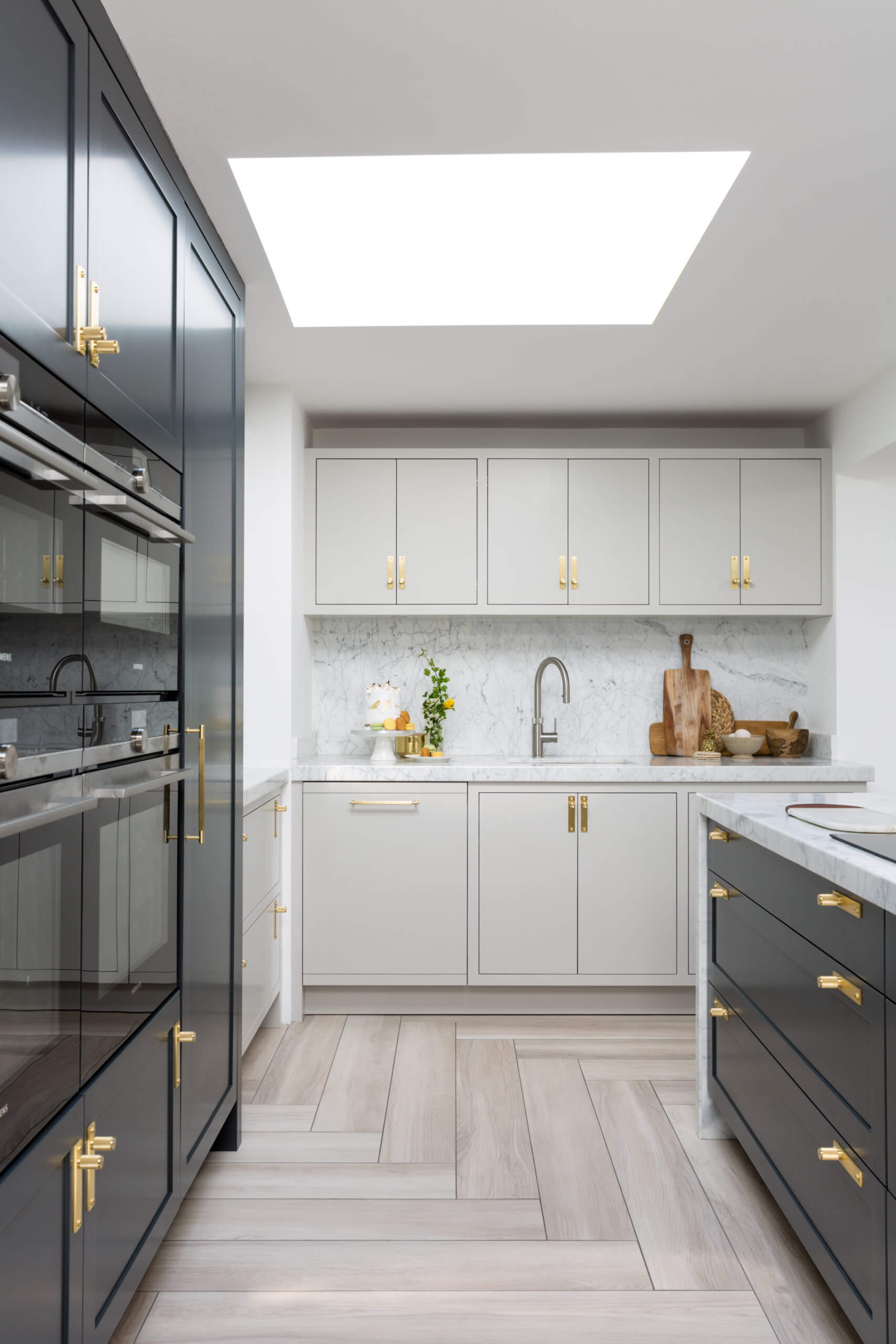
Q: Were you able to separate professional and family storage requirements?
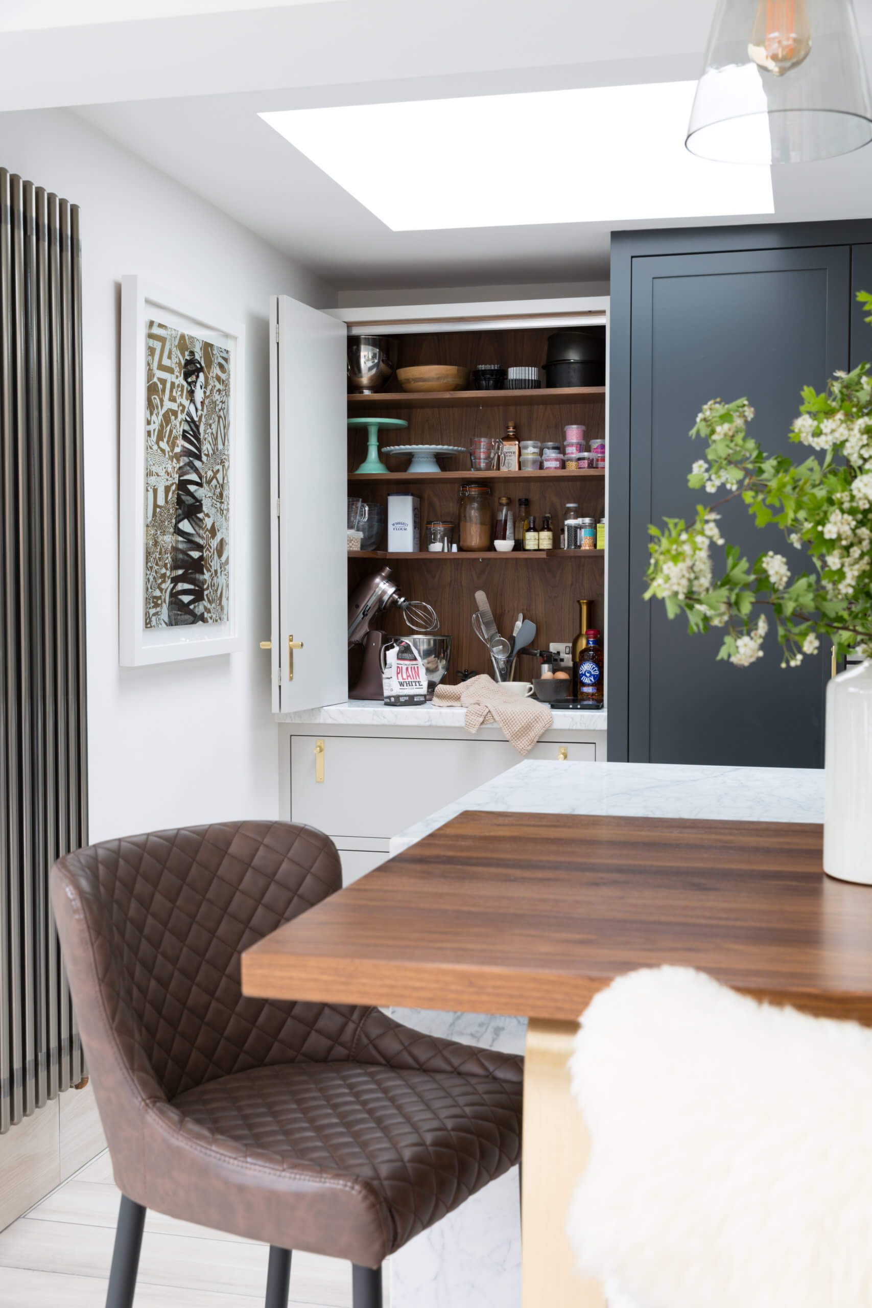
To the left-hand side of the oven bank, in the lighter-painted units, is a bi-fold double larder for all of the professional baking gear, together with a tall single larder for any overflow needs in the darker unit. On the right-hand side of the oven bank is a generous integrated fridge and a second bi-fold larder dedicated for family use.
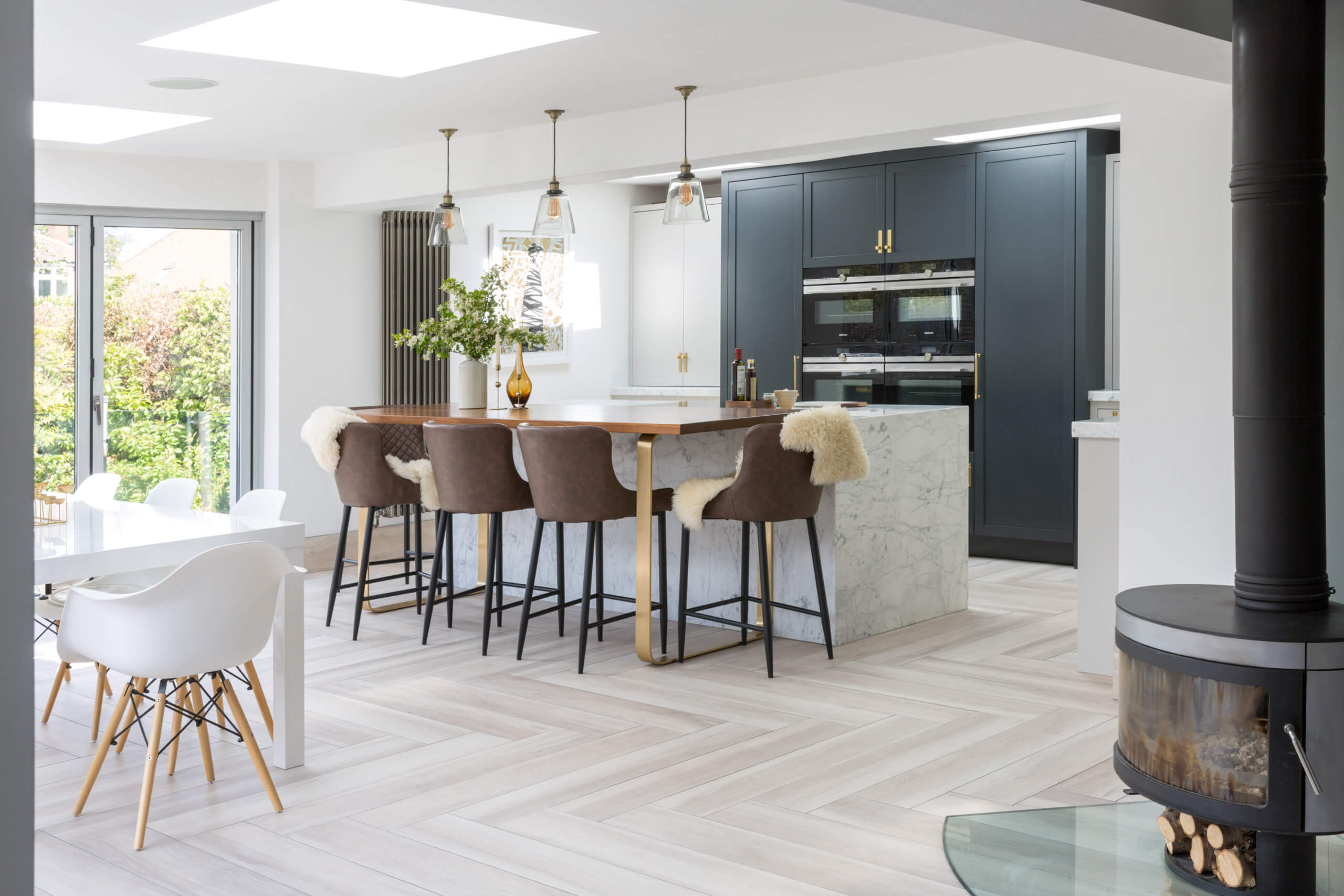
Q: What are you most pleased with, now that the project is finished, in use, and of course, won British Design & Manufacturing Award in 2021?
We’re delighted with the whole project, and very happy that Petra feels that her Rhapsody kitchen is a success for both her family and professional life. We feel that the design hits all the right notes! The combinations of materials and colour contrasts makes working, living and socialising in this beautiful space an absolute dream.
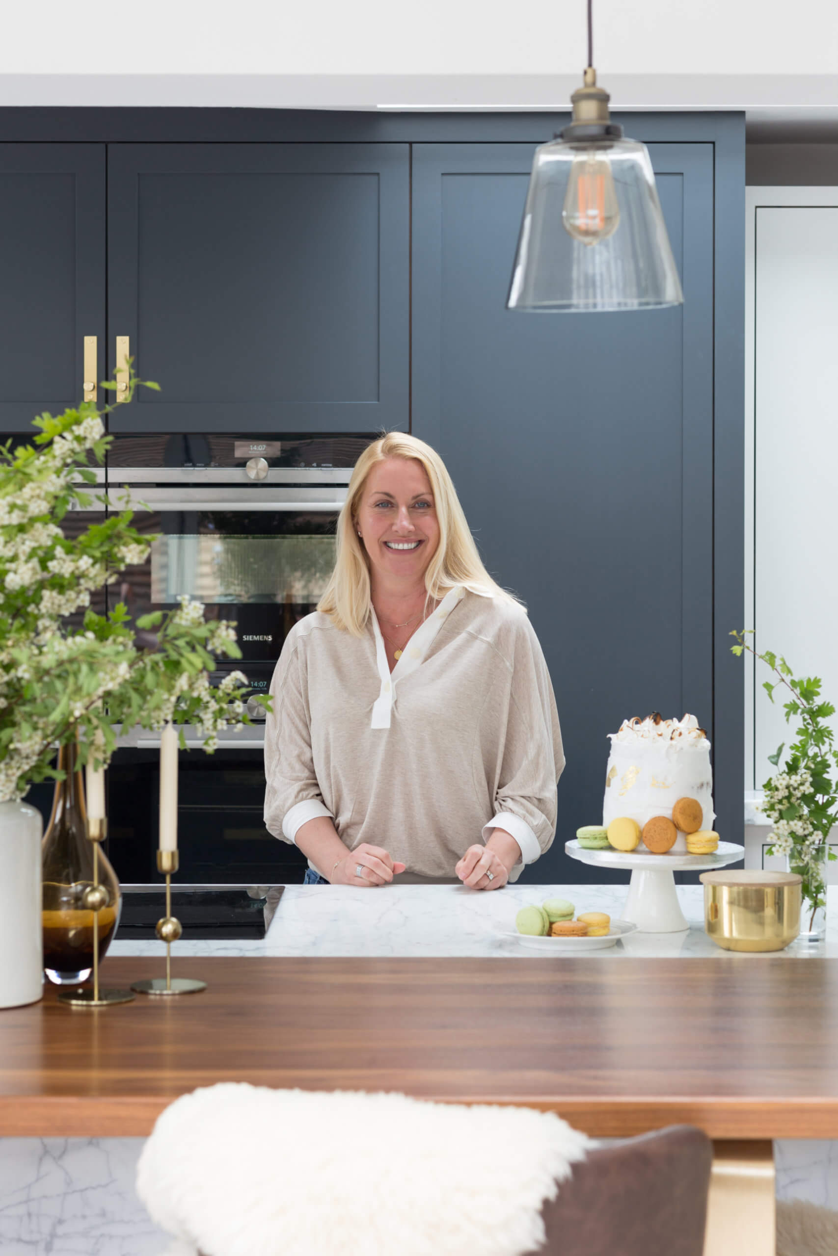
We also asked Petra how she was enjoying working in her new kitchen …
Petra said ‘My new kitchen has changed everything! I can keep family and work stations separate, thanks to having two dressers, and the clever design means I can close the doors and work is all tidied away. Then the kitchen becomes our stylish family space. The kitchen is more than I could ever have dreamed of. Not only in terms of ticking all the boxes as far as how I needed it to function design-wise, but also in the quality and how good it looks aesthetically. From the walnut table with gorgeous brass legs, to the marble top and beautiful colours, I love it all. I’m beyond happy and it’s a dream to spend all day baking in here’.
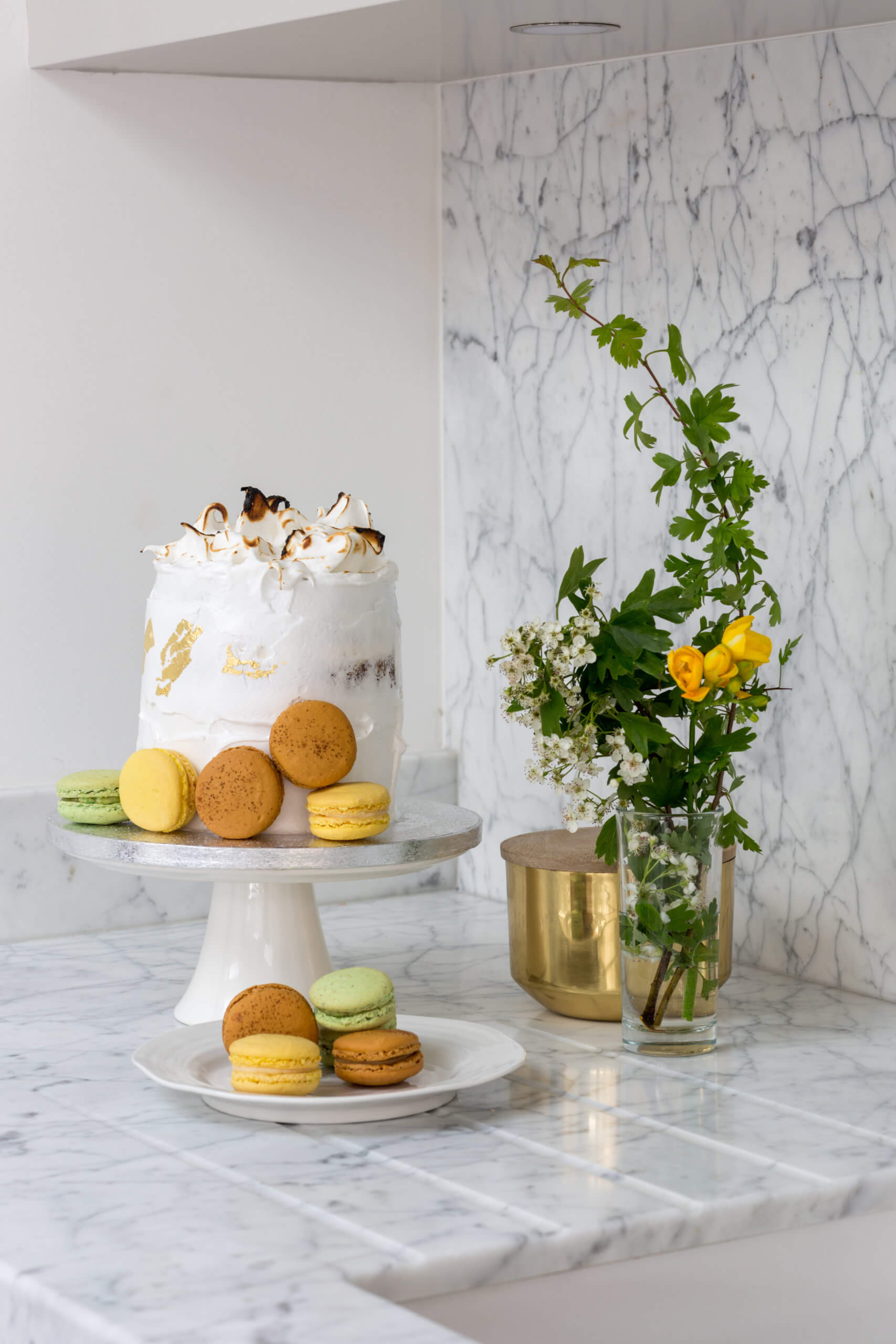 Bespoke Rhapsody kitchen by Mowlem & Co. Branches in Newcastle upon Tyne, 0191 281 3443 and London, 0207 610 6626 and Edinburgh, Mary-Anne Gallo Interiors 07921 385 654
Macarons by The Macaron House
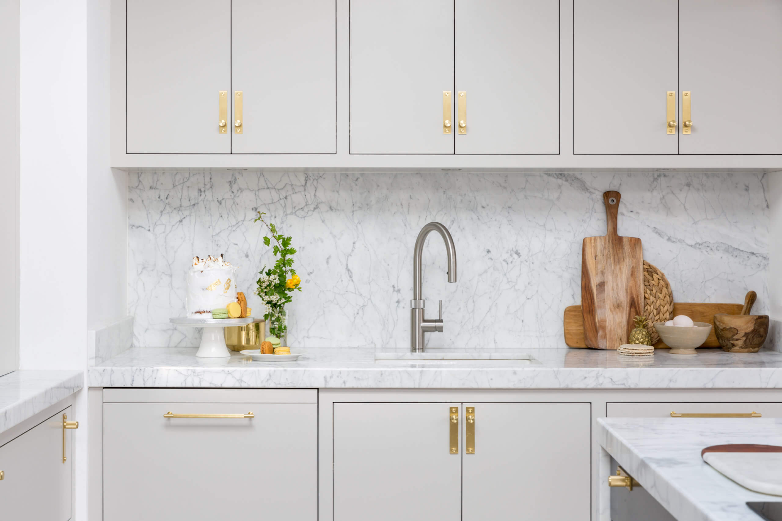
We Love: The wonderful contrast between the Off Black and French Grey paint finishes, both which work beautifully with the brass cabinet fittings. A deserved winner of last year’s Design & Manufacturing Award.




Leave a comment