Minimalist hidden kitchen by En Masse Interiors
 The designer: David Conlon at En Masse Interiors
The story: The owners of this kitchen are luxury property developers and have worked with En Masse Interiors on several of their previous projects.
This house is a new-build property which the couple self-built as their forever family home.
Designer Q&A:
Q) What was your brief from the client?
They love cooking and entertaining, so had big ideas for their dream kitchen, which was to be the crowning glory of their fabulous new home. En Masse were involved from the very early planning stages because getting the kitchen right was so important to the couple. Every detail from where the plug sockets were placed to the positioning of the doors leading into the garden was carefully mapped out before the first wall was built.
Q) How did you answer the brief?
The brief was to create a wow factor kitchen in the heart of the home. The concept was characteristic of an En Masse bespoke kitchen – chic and minimalist with clean lines, a neutral colour palette and the use of natural materials to stunning effect. As they have worked with us in the past, the clients trusted us to deliver the top-class finish and style they were after. The kitchen area was a big space at 62 sq m but they knew that a bespoke kitchen perfectly crafted for the building was the way to achieve the look they were after.
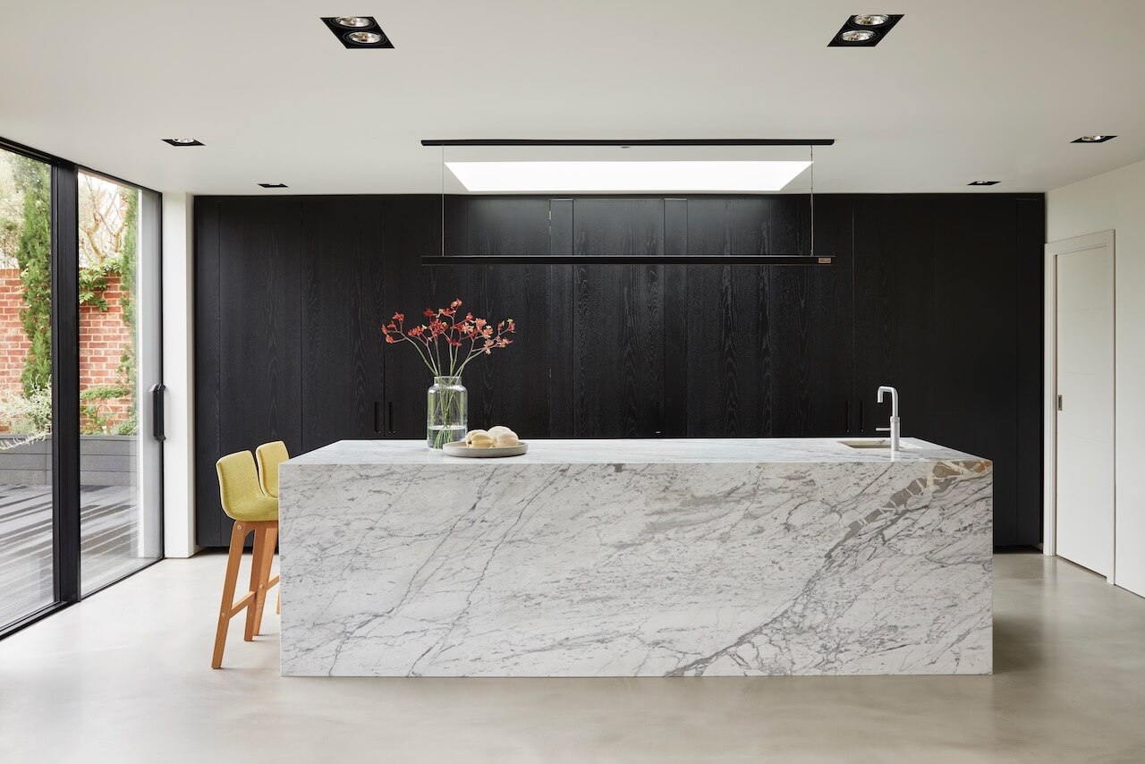
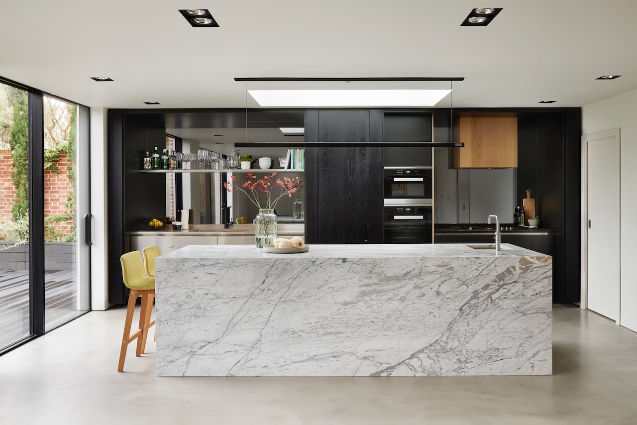
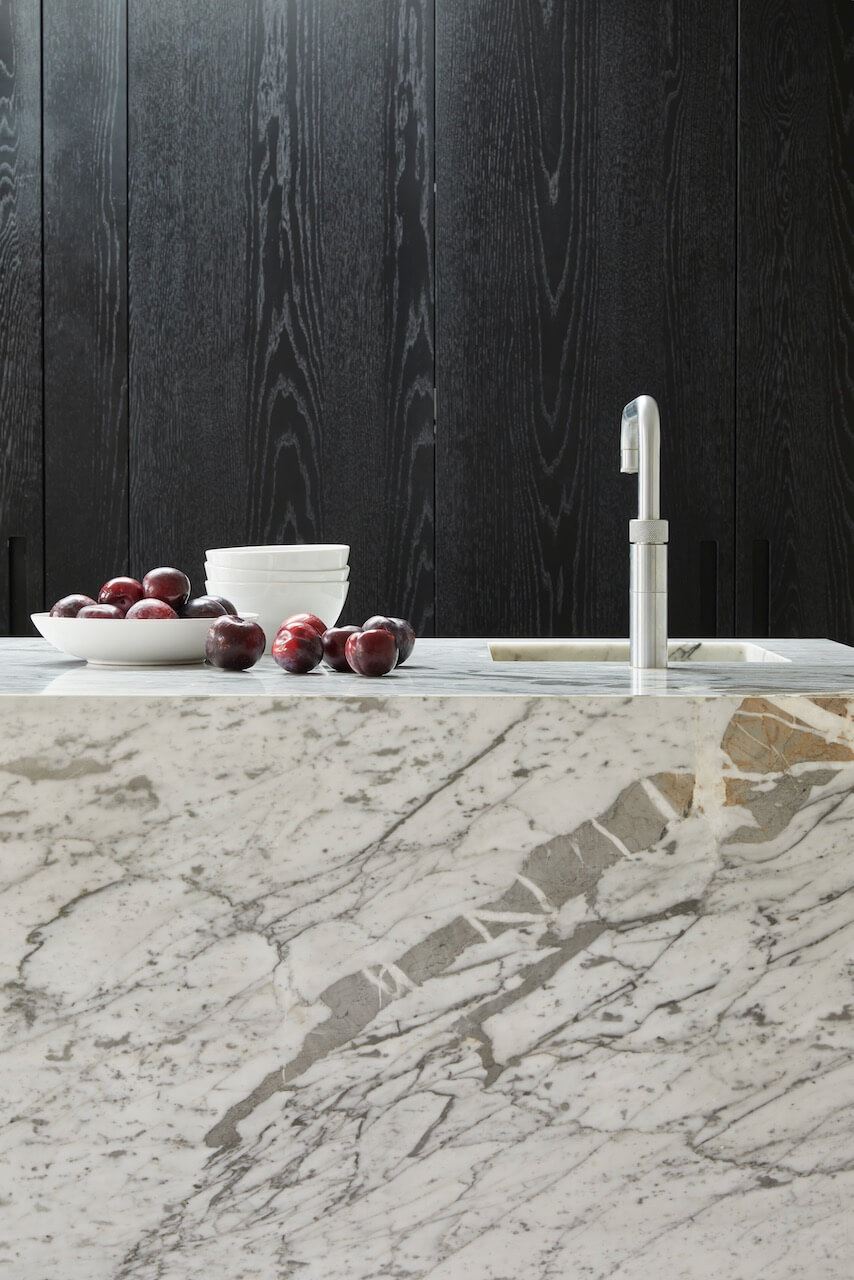
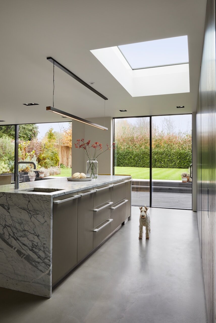
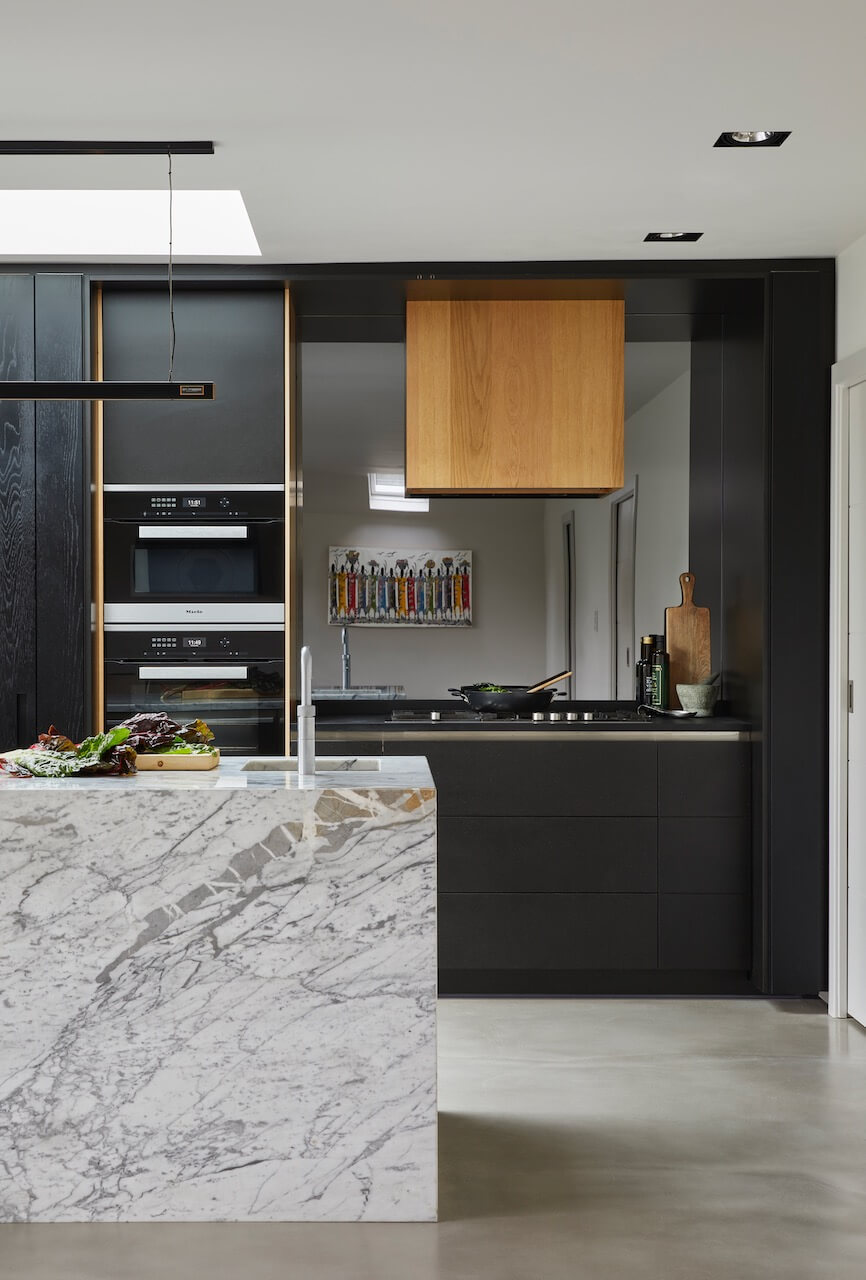
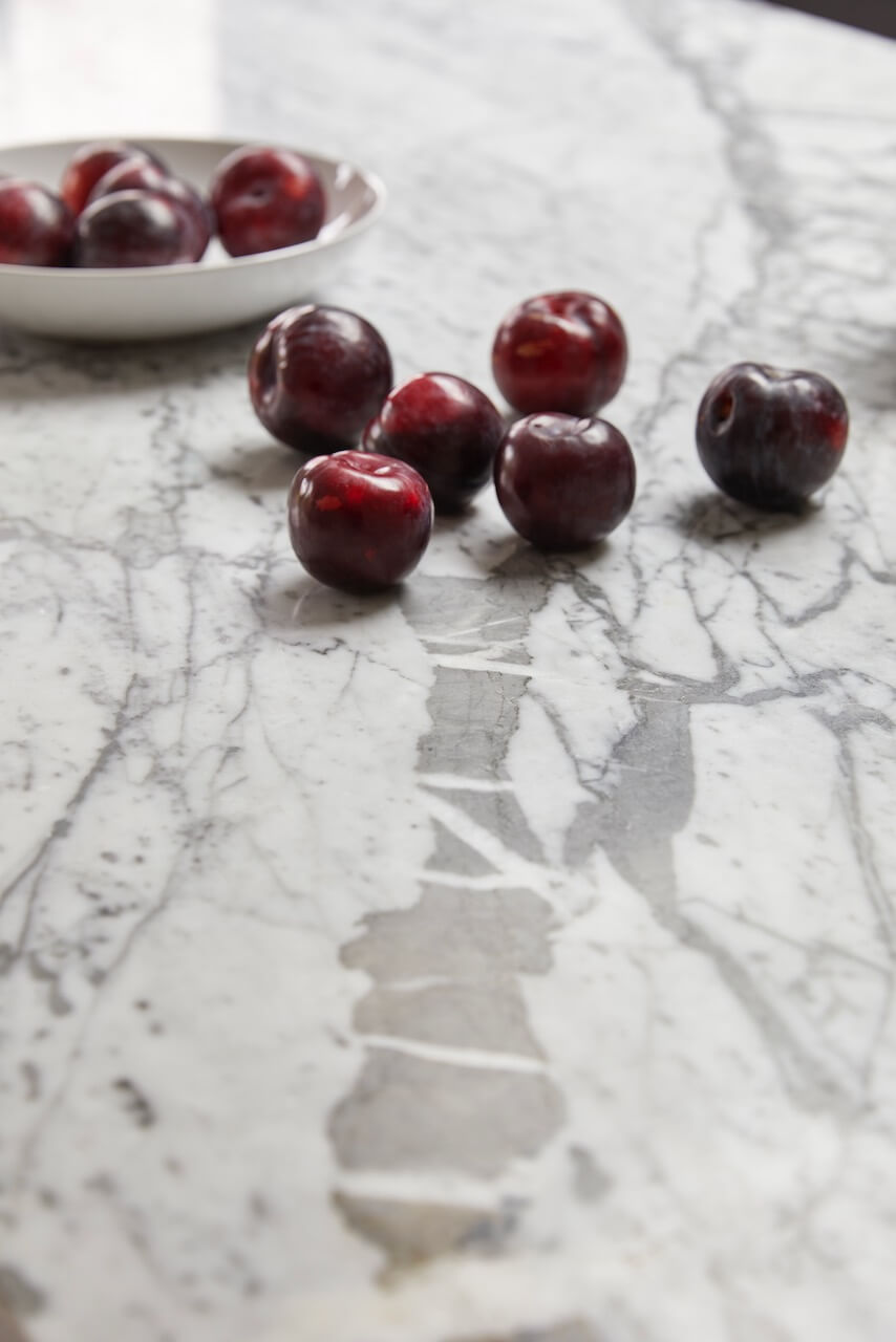
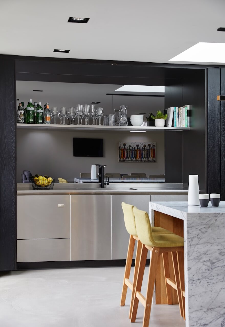
They wanted something stripped down and honest, but with a big impact. The quality of the materials was key to achieving the overall result as the materials would be the star of the show. Dramatic impact was created with the solid Carrara marble island. Part of the design concept was the idea of ‘where’s your kitchen?’ – in the sense that the functionality of the space could blend seamlessly into the backdrop of the room.
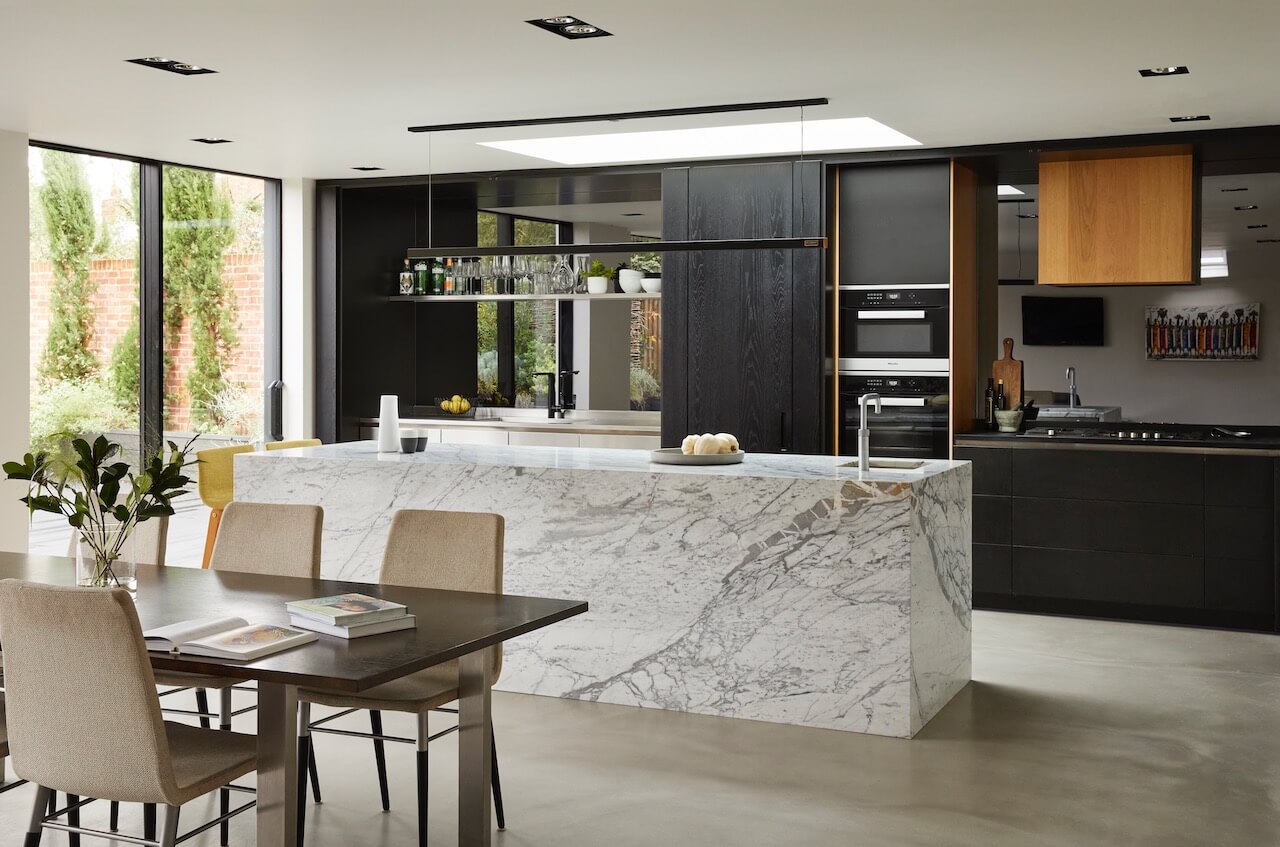
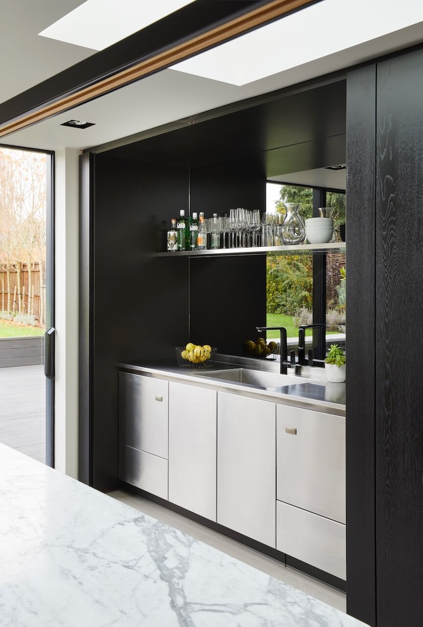
The brief for the kitchen to have that delicate mix of being understated and minimalist yet delivering on impact and wow factor has undoubtedly been achieved with style – not an easy balance to create. The success of the ‘now you see me, now you don’t’ kitchen is hinged upon the excellent craftsmanship involved in the design and creation of the bi-fold pocket doors, which house a high tech, highly functional kitchen including Neff and Siemens appliances, brushed steel sink and grey mirrored backsplash, which creates a stunning space alone. But the real beauty in terms of functionality lies in the creation of a spacious pantry area to the right of the kitchen, with a pocket door and horseshoe shaped pantry with plenty of stainless steel shelving for storage.
Q) Which products did you use and why?
A loosely Japanese-inspired theme was created to fit in with the natural, honest materials brief, which also fits in with the wabi-sabi and ‘Japandi’ trends relating to embracing organic forms, beauty in natural imperfections and handmade items combined with a Scandinavian design influence. The orientation of the glass doors leading on to the garden brought colour and greenery in from the outdoors to the kitchen. This steered the material choice of the back-run of units to being black oak, in order to let the garden speak for itself in terms of colour. The bi-fold pocket doors housing the ovens, sinks and back units are all made from hand-laid oak veneer stained black – these allowed the kitchen to be closed away when desired in order to disappear from the room.
The black resin worktop is made out of Richlite, a premium surface material we recommended in a matt finish to match the oak. Neutral grey for the walls and grey resin for the flooring – with underfloor heating – also kept the overall palate understated and fitted in with the décor of the rest of the house, adding to this sense of flow and subtleness of the kitchen.
Q) Was there any building work invoived?
Yes, the clients had planned their build schedule effectively and we had the opportunity to design the kitchen off-plan. This meant that layout-wise, there were no major challenges to overcome as everything had been thought of in advance and this allowed for greater freedom with the design. All the services were placed according to the entire build process, which was highly efficient – it took approximately six weeks to make the kitchen and it was installed within just over a week.
The biggest design challenge was the size of the room – it was cavernous. Often the challenge is space being at a premium, so when, like in this case, there was an abundance of room to play with, it was actually a challenge to fill it effectively yet in a pared down way with an organic, warm feel while meeting the brief. It was decided that the island would become the focal feature of the room, measuring 3m long, yet graceful in its rawness and purity while adding a feeling of luxury really hit the mark to deliver on the brief.
Q) What elements do you think make the scheme so successful?
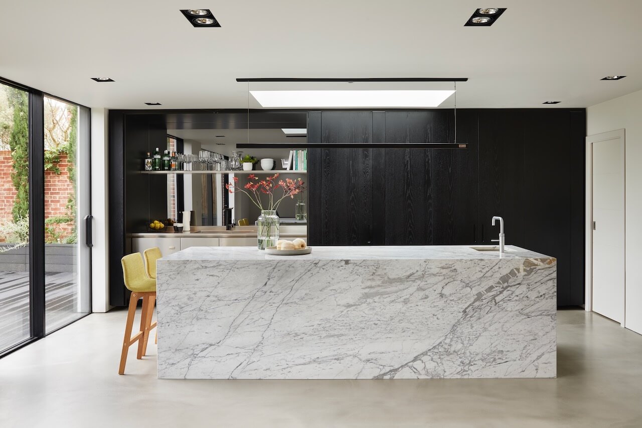
There was much discussion between clients and designer when it came to the addition of the breakfast bar – we thought that adding this and the chairs would detract from the purist impact of the marble block illusion, but the clients were adamant about including this feature in the design because it is, after all, a social space and the hub of their home. We came to an agreement in the end which doesn’t spoil the beauty or impact of the block shaped island, in fact it adds the feeling of softness and warmth within the room. Adding the seating space to the end of the island also allows it to look like a solid piece as you enter the room.
This also highlights the monumental island. It’s a work of art and such a statement. The raw natural material just works so well with the dark oak and resin floor. For me, what’s so successful about the kitchen is the seamless blend of materials. They all sing and shine in their own ways and together, that’s what makes the kitchen.
Q) Any advice for someone who may be planning a new kitchen?
First, think about how you use the space. You may have your heart set on a large island, but in fact a peninsular may actually work better for the space or how you’ll use it. Consider appliances early – they take up a lot of space, particularly if you don’t benefit from a utility room, so it’s vital these are planned in.
Where possible, we always advise to go floor to ceiling with cabinetry. It’s cleaner, gives you much more space and really exaggerates the height of a kitchen. This is great in a light open space like a new extension, and with doors on to the garden gives that much sought-after flow from indoors to out. The other thing to consider is flooring. Consistent flooring throughout the whole of the bottom floor will always add space and light and instantly makes the space look more put together and polished.
The other thing we always look to do is work with the highest quality materials we can. A kitchen will always be an investment and you want that investment to last and higher quality materials afford that luxury. They also help make a kitchen beautiful. Invest wisely. Going bespoke is also a real luxury and one which will pay off. Everything is built to fit your space. There are no awkward edges, no cupboards that squeeze in around corners. It’s built exactly how you want it and that’s what creates perfection.
Q) Any trend predictions for 2022?
We always consider the trends but for us, it’s always about the materials. The kitchens we design are made to last the lifespan of the home meaning trends will come and go but the kitchen will remain the heart of the home. Keeping things classic but with a modern, contemporary and always elegant look allows for the kitchen to be the focal point. Paint colours, accessories and handles can easily fit into the trend of the moment. But we like to keep the core timeless.
The details:
Appliances by Neff and Siemens
Worktop in Richlite
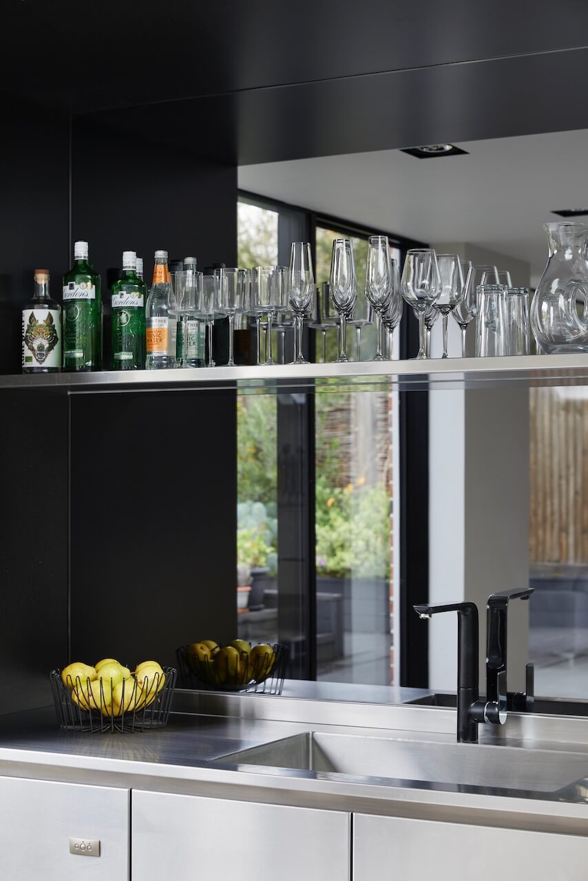
Hayley loves: how the functional elements of kitchen can be instantly concealed from view, leaving just the stunning marble island to take centre stage.



Leave a comment