A Beautiful Barn: The Hartford Kitchen from Tom Howley
By Linda Parker
Design Director Tom Howley and Tamsin Read, Kitchen Designer from the Brentwood based team designed this must-have kitchen for a Grade II listed barn. Naturally, it was to be a central part of family life, but also had to include high-spec appliances that would blend into the period look of the home.
Q: What were the stand-out priorities in your brief from the client?
We were approached by a family who’d taken on the challenge of renovating a Grade II listed barn in Little Baddow, Essex. They wanted a kitchen that could be a hub for the family. They wanted it to be stylish, with state-of-the-art appliances … but it also had to have traditional character that would reflect the period of their property. They envisioned an open plan kitchen design with room for large scale dining and entertaining for family and friends, as well as a living area for relaxation.
Q: How did you set about answering that brief?
The couple met our Brentwood-based designer Tamsin Reed and selected our Hartford kitchen collection, which is a contemporary twist on traditional Shaker styling. Authentic Shaker style kitchens put an emphasis on home life with solid, comfortable furniture designed to bring people together, which was exactly what the couple were looking for. Scale and proportion are a very integral part of our design process, and our Hartford design fits these requirements very well indeed.
Q: Explain the reasons behind the choices of cabinetry and work surfaces …
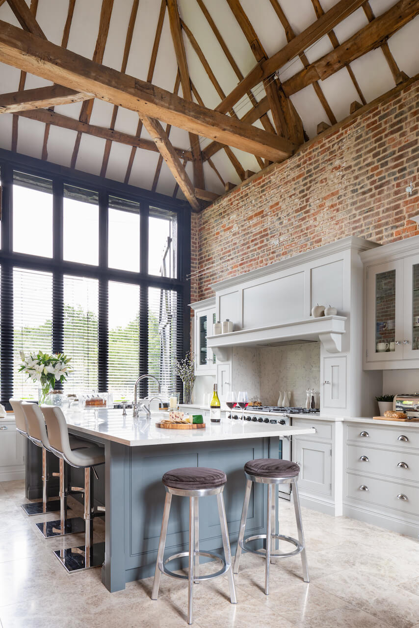
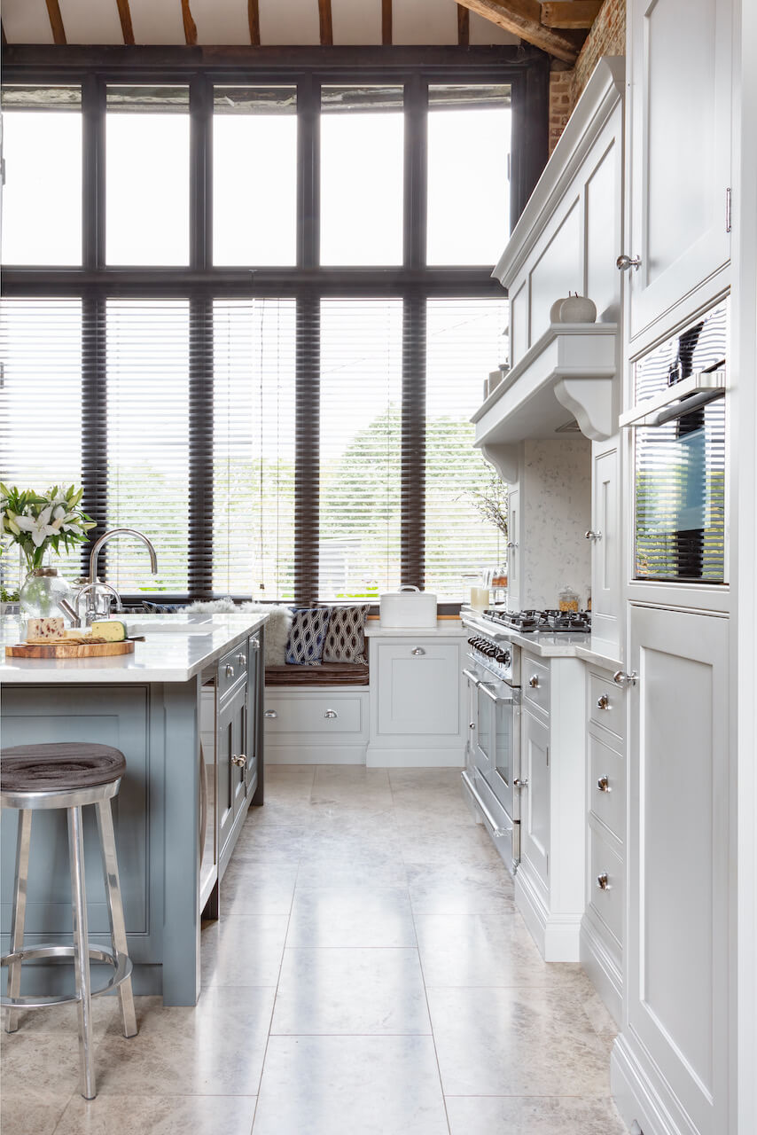
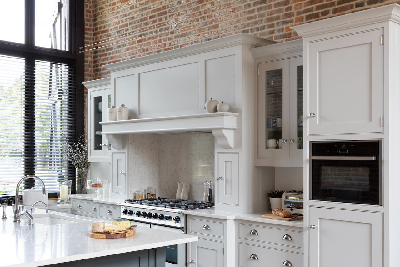
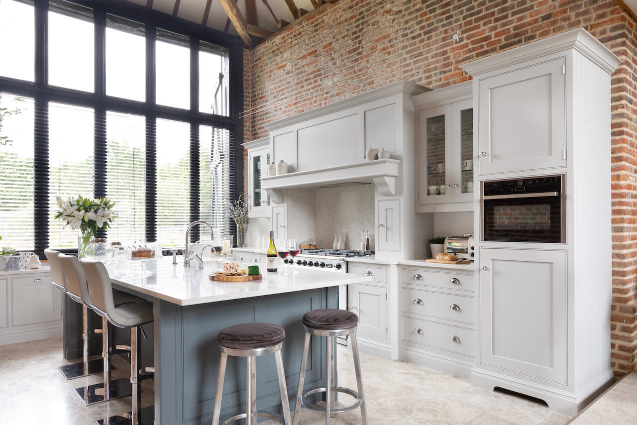
The cabinetry, hand-painted in a soft, heritage grey shade, was meticulously made-to-measure for their unique space and each individual piece of cabinetry was commissioned in accordance with their personal storage needs. The kitchen’s sleek pull-out units tuck away everyday items, keeping them discreetly to hand whilst at the same time maximising the useable living space.
The couple selected a stunning Silestone quartz worktop and backsplash in Lyra. This coordinated beautifully with neutral limestone flooring, the statement island painted in Dewberry and cabinetry in our timeless colour Thistle.
Q: It’s a huge space, how did that affect your choices and suggestions?
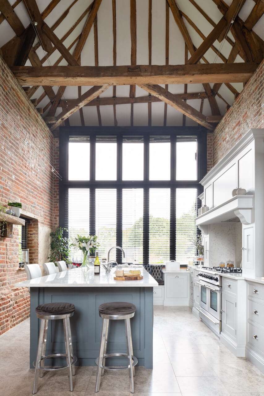
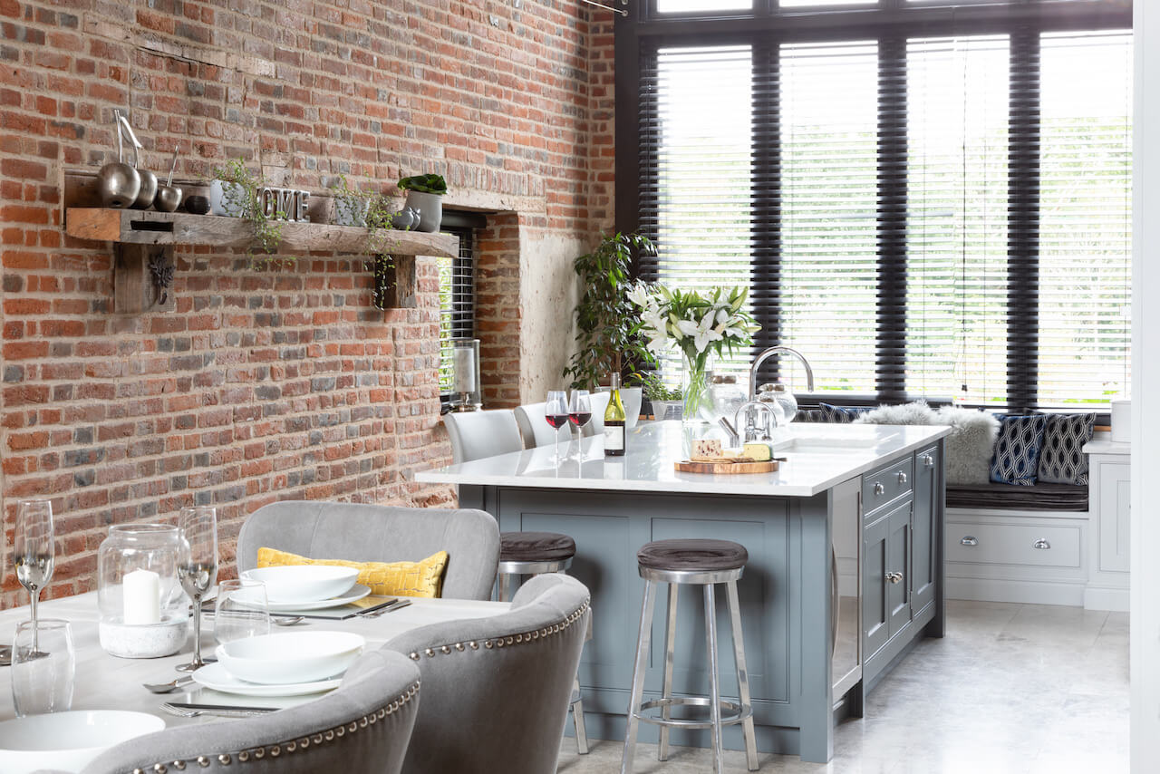
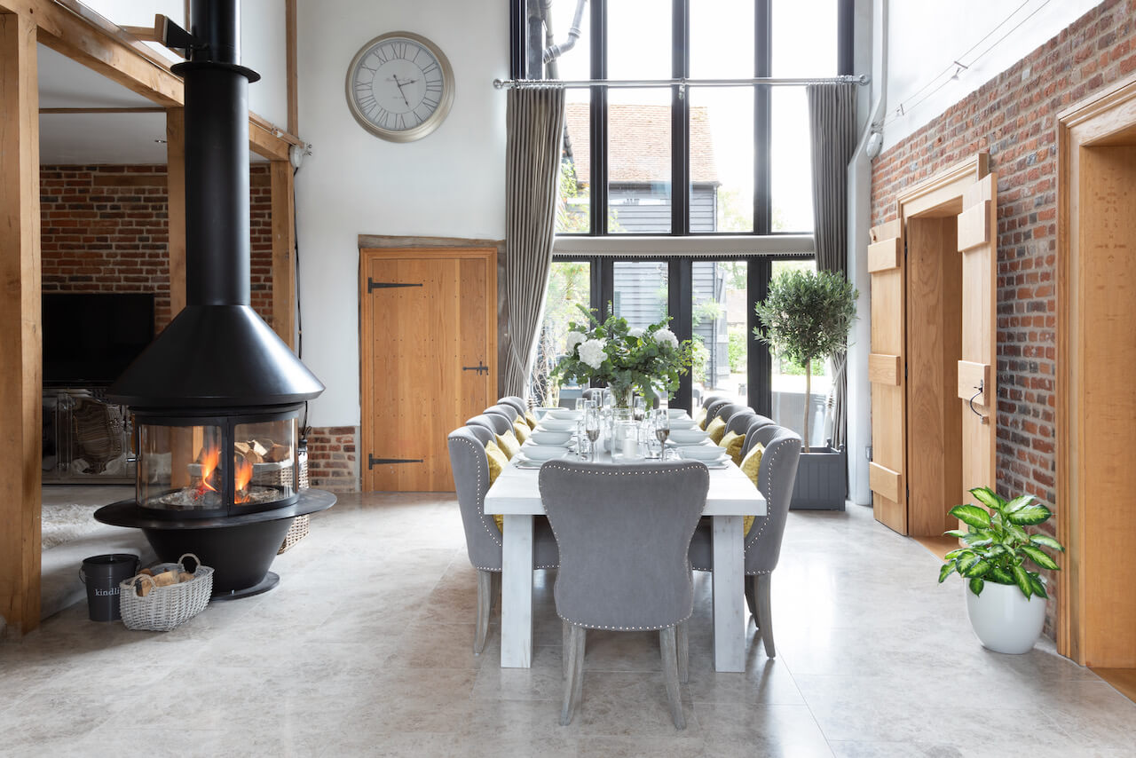
The barn’s layout definitely has the ‘wow’ factor with an exposed brick wall, chimney breast and full height windows with striking framing. There are also mezzanine walkways floating above that add considerably to the kitchen’s open feel. Having a small-scale kitchen was never going to be an option, so it was essential to ensure that everything inside the room was symmetrical and in proportion. The concept of symmetry and balance is also a tenet of Shaker design, so this level of consideration chimed well with the kitchen style selected. We knew that everything had to look as if it had always been there, and that the cabinetry would stand up to the dramatic proportions of the kitchen space itself.
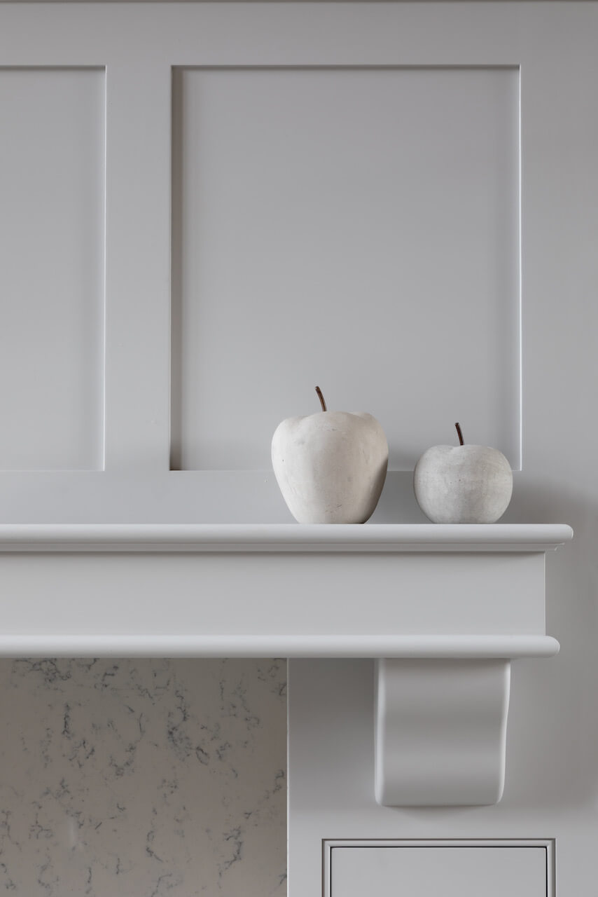
The chimney area provided the central focus for the kitchen, and we increased the height of it so that it was higher than the wall units on either side. This approach celebrated the double-height nature of the room and created a focal point to draw the eye to the symmetry we created.
Q: What design elements do you think make the scheme so successful?
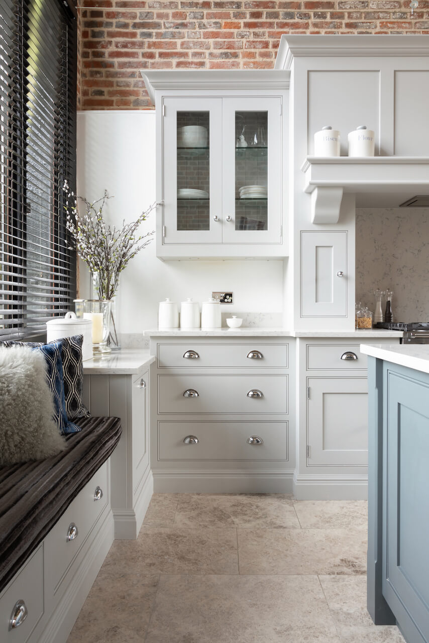
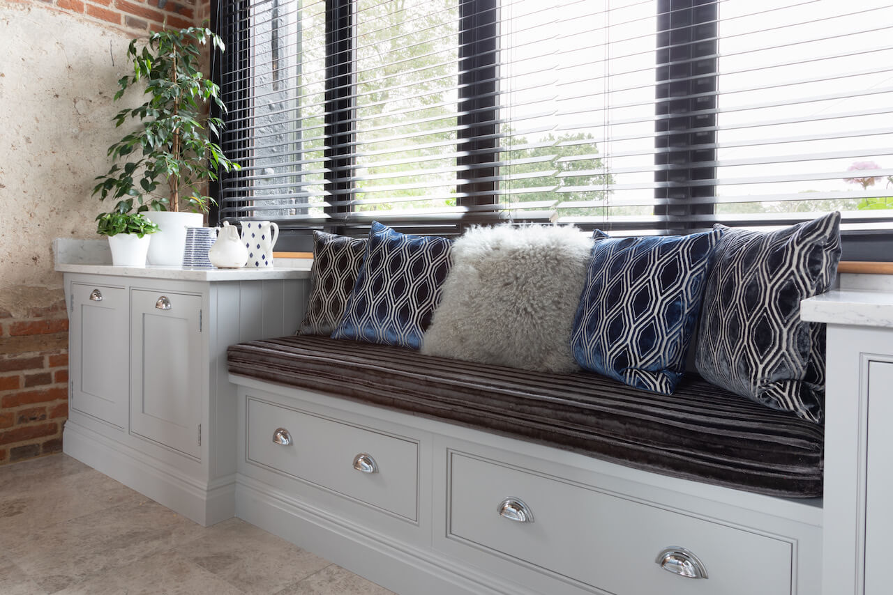
A good flow of light is essential in an open plan kitchen, so instead of closing in the space with too many wall units, we created a window seat that doubles as useful storage. The window seat is finished in the same muted grey, Thistle, drawing attention to the stunning feature window. Architectural features such as this window can’t be moved or concealed, and you wouldn’t want to do that either, but instead of seeing it as a challenge, we saw an opportunity to celebrate a unique element and to create something special and exclusive to that property.
Q: What is your best advice for someone who is planning a new kitchen?
For us, the cabinetry is really the star of the show, so we would suggest investing in bespoke, made-to-measure options. Saving money on worktops, appliances and flooring is the best way to approach kitchen design to give the ‘bones’ of the space the maximum longevity. Glass is an excellent finish for kitchens. Not only do glazed cabinets break up the monotony of a run of solid-fronted doors – especially in large spaces – they maximise the flow of light into darker corners. Having glass-fronted doors is as good as open shelving when it comes to displaying prized pieces. They’re also fantastic when accessing everyday essentials allowing you to see what you have and where you’ve put things.
Q: Do you have a secret ‘style signature’ or feature that you find you use in most of your kitchen projects?
Kitchen islands are the most heavily used features in our kitchen designs. Kitchen islands are a long-standing favourite, and we are seeing a rise in demand due to the increasing use of our kitchens as workspaces, classrooms, and food preparation areas! We have designed kitchens where the island counter makes up just 15% of the worktop space but boasts 90% usage. When possible, do fit an island counter. They serve as impromptu dinner tables, bars, home offices and food prep stations. Sometimes all at the same time!
Q: Are you seeing more large-scale projects such as this, including kitchen, working-from-home spaces, utilities, and entertaining areas?
The modern kitchen has to be able to accommodate to a variety of circumstances. This could be an impromptu pasta supper with friends or family, as well as a homework base, a relaxed office space and a home bar. As we’ve spent more time at home in the past year, our clients are being very realistic and practical about how their homes need to work for them on a day-to-day basis.
Open plan living has been commonplace for years, but floor plans are set to be reimagined to fit with the challenges of post-pandemic family living. There will be a focus on separating shared spaces and distinguishing zones with intelligent furniture layouts, glass divides and clever lighting strategies. This will help to improve acoustics and put more of an emphasis on privacy, especially when multiple tasks are being carried out in the same room.
When our clients want to opt for a spacious open plan layout, we ensure that the kitchen should have a clear story of how it will be used, whether the main priority is creating a safe space for entertaining or a cosy hub where family can cook, eat, and relax. Factor in kitchen, living, dining and desk space, even if it’s only a convenient spot on the island (with the necessary plugs and sockets, of course!). Once these areas have been roughly allocated, we start looking at the design and flow, creating smaller zones within the kitchen. These smaller zones are adjusted and laid out according to each clients individual needs for serving space, prep areas, grocery storage, equipment storage and so on. We ask our clients a large number of questions so that we get these details absolutely right.
We Love: The overall proportions of this kitchen and how it sits so well within an exceptionally large, open space …
The Hartford Collection kitchen by Tom Howley, bespoke kitchen company, 0845 646 0690,Tom Howley



Leave a comment