Contemporary Kitchen by En Masse Interiors
The designer: David Conlon at En Masse Interiors (www.enmasseinteriors.co.uk)
 The story: When we first got to run through the project, the extension that the kitchen was going into hadn’t even been constructed, so this gave us plenty of time to work through our design process.
It even gave us time to invite the clients to view another project that we had just finished, which was local to us. Although our showroom serves us well for this purpose, it was nice for the couple to see one of our kitchens in the context of a home – and a fabulous one at that!
Designer Q&A:
Q) What was your brief from the client?
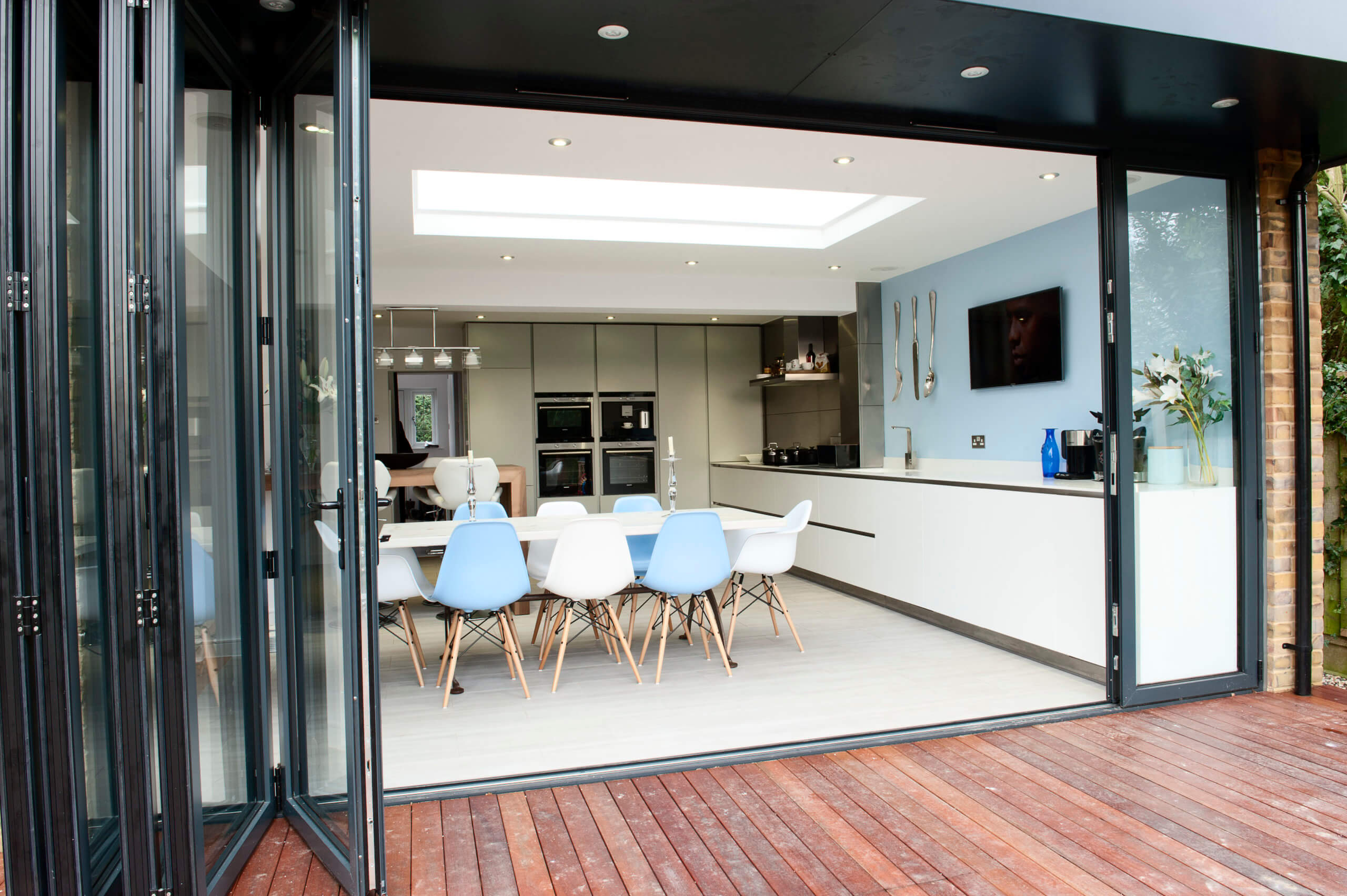
They wanted an open-plan kitchen-diner with the addition of a breakfast area for their young and growing family. The back of the house was south-facing so the idea of bi-fold doors and a timber deck meant that they could enjoy the kitchen on nice days from the outside while watching TV, listening to music or sharing time with the family. They wanted a full range of appliances, a kitchen that could be maintained easily and plenty of worktop space for food prep.
Q) How did you answer the brief?
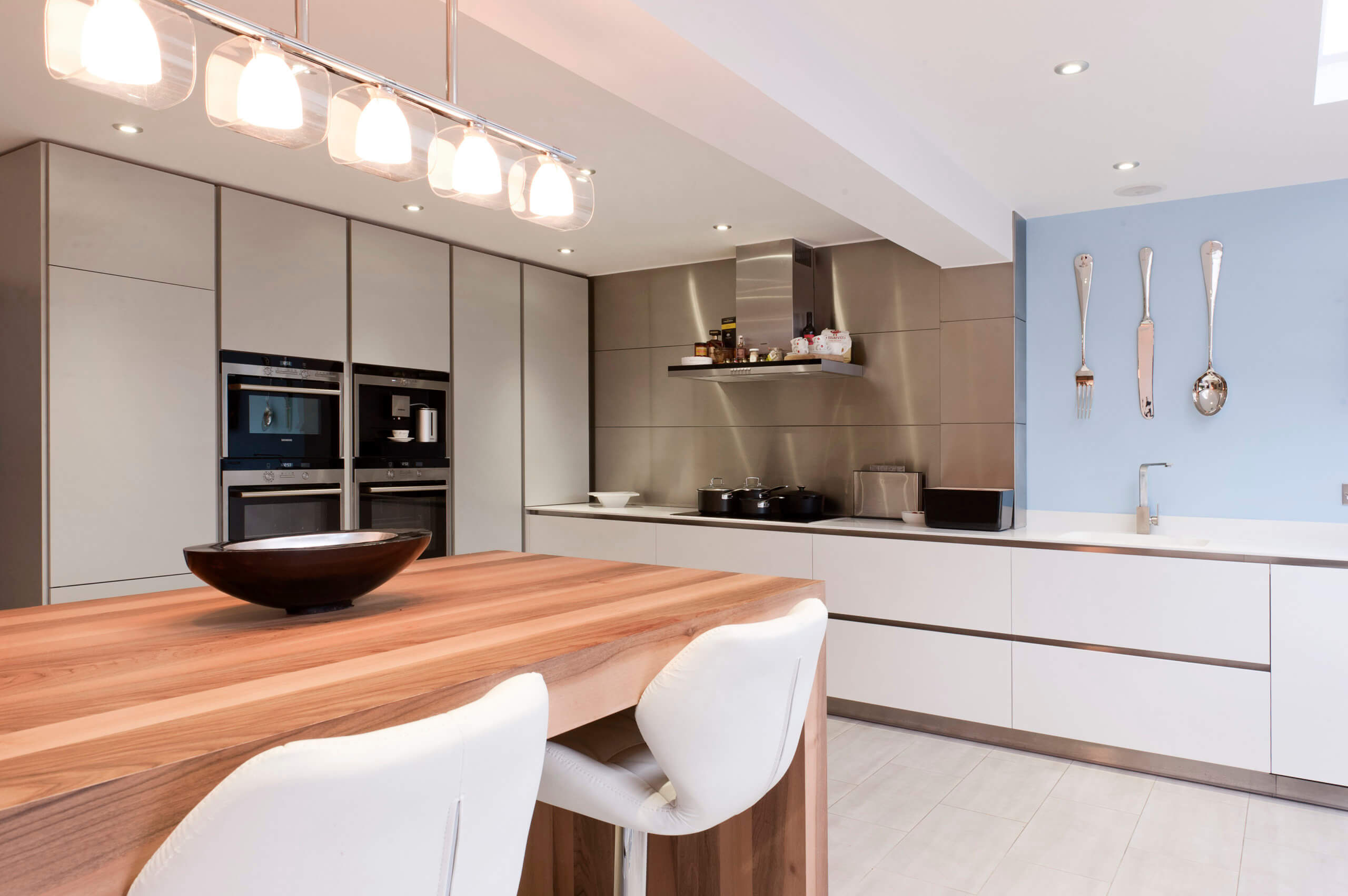
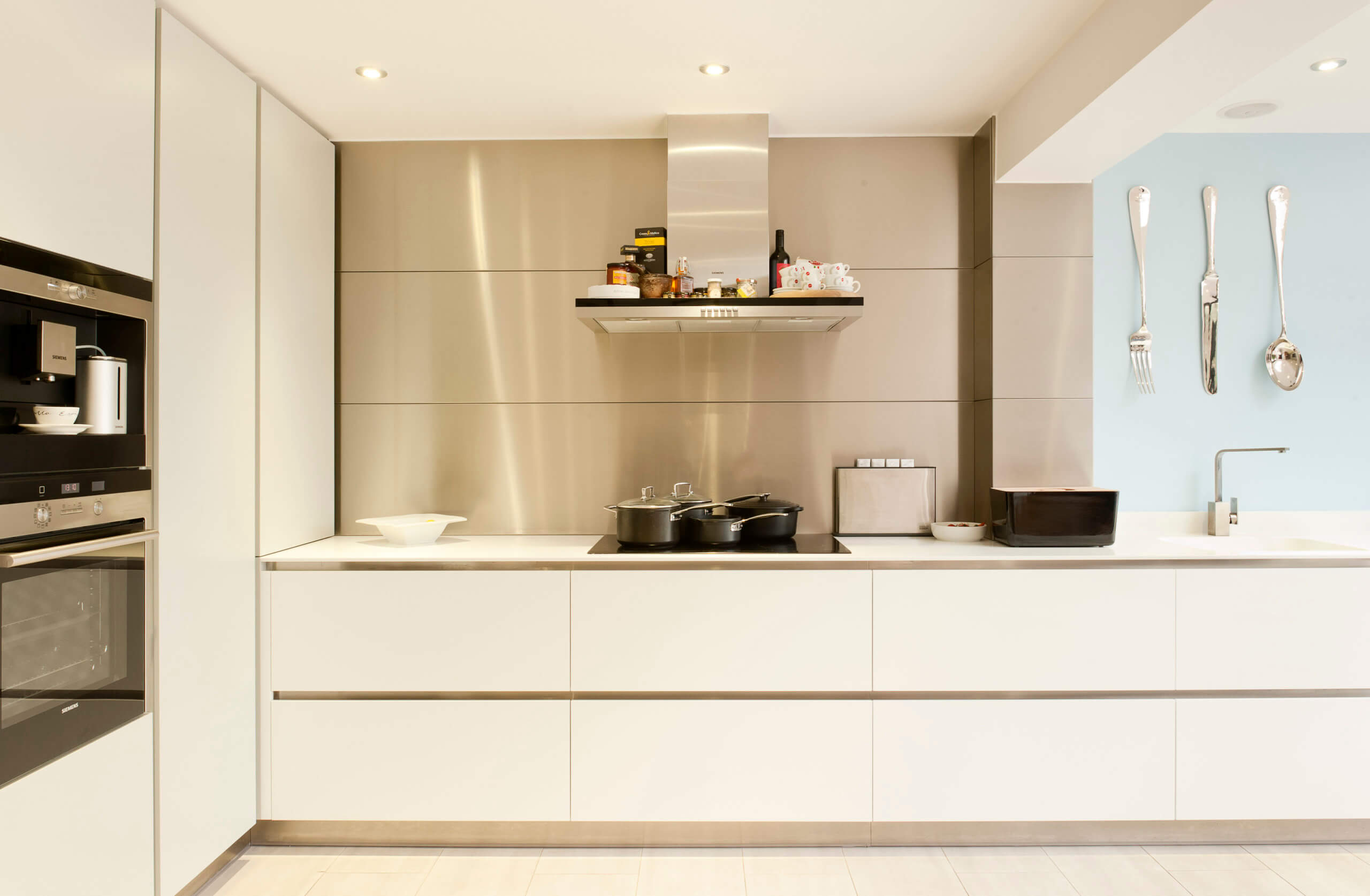
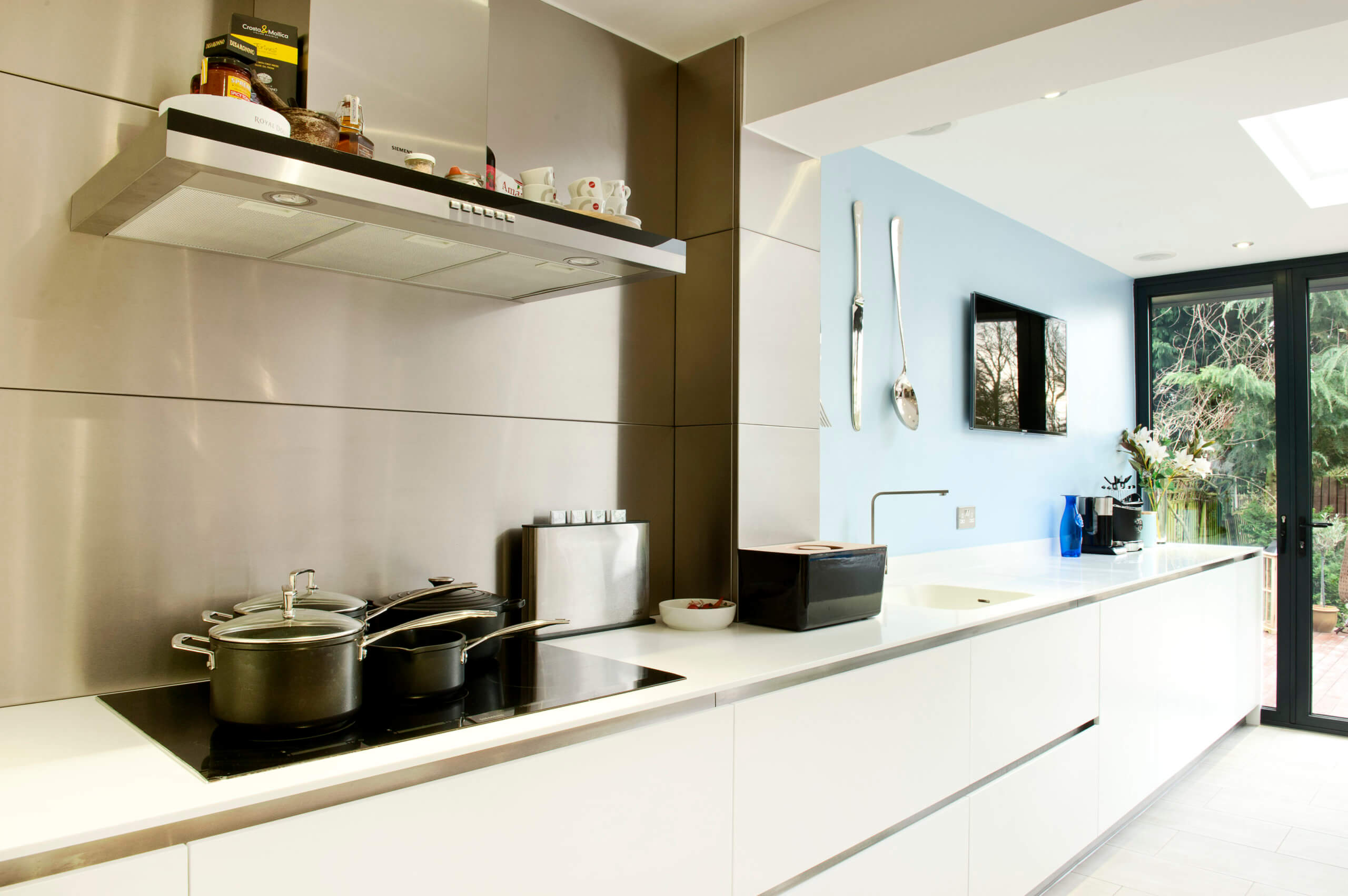
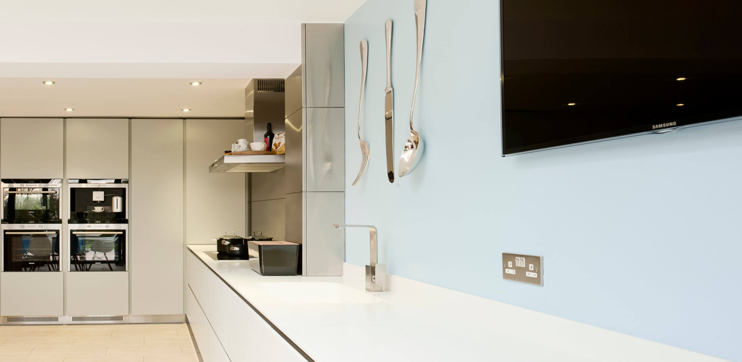
We decided upon a full-height run, which housed a fridge freezer, two oven housings with two single ovens, a microwave combination oven and a coffee machine, which sat next to a full-height larder run and corner pull cabinet. There are columns and a bulkhead where the extension was constructed and joins to the house, so we thought this was a logical place to encase the induction hob and extraction unit while making a feature of the stainless steel wall panelling. This also doubled up as a great splashback for cooking.
Q) Which products did you use and why?
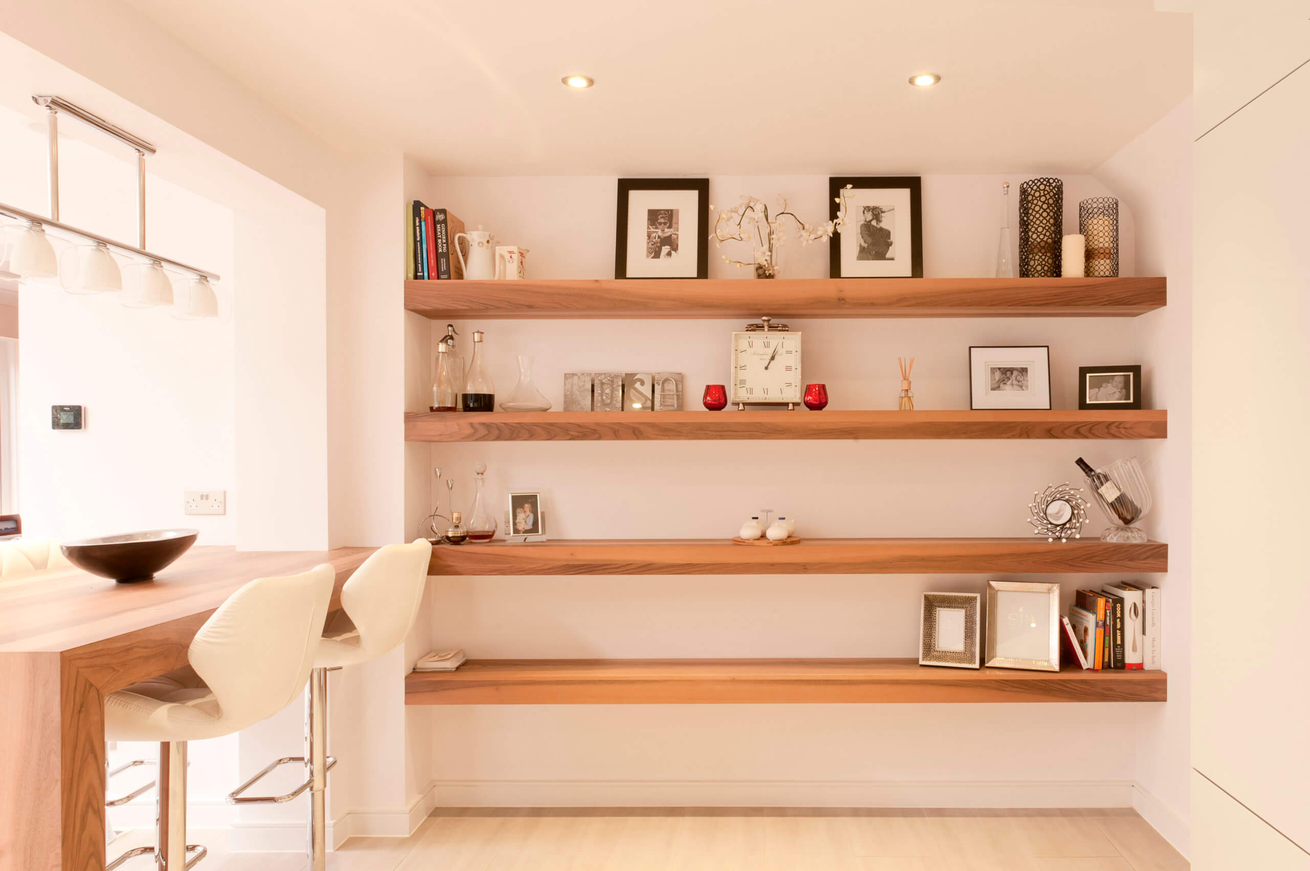
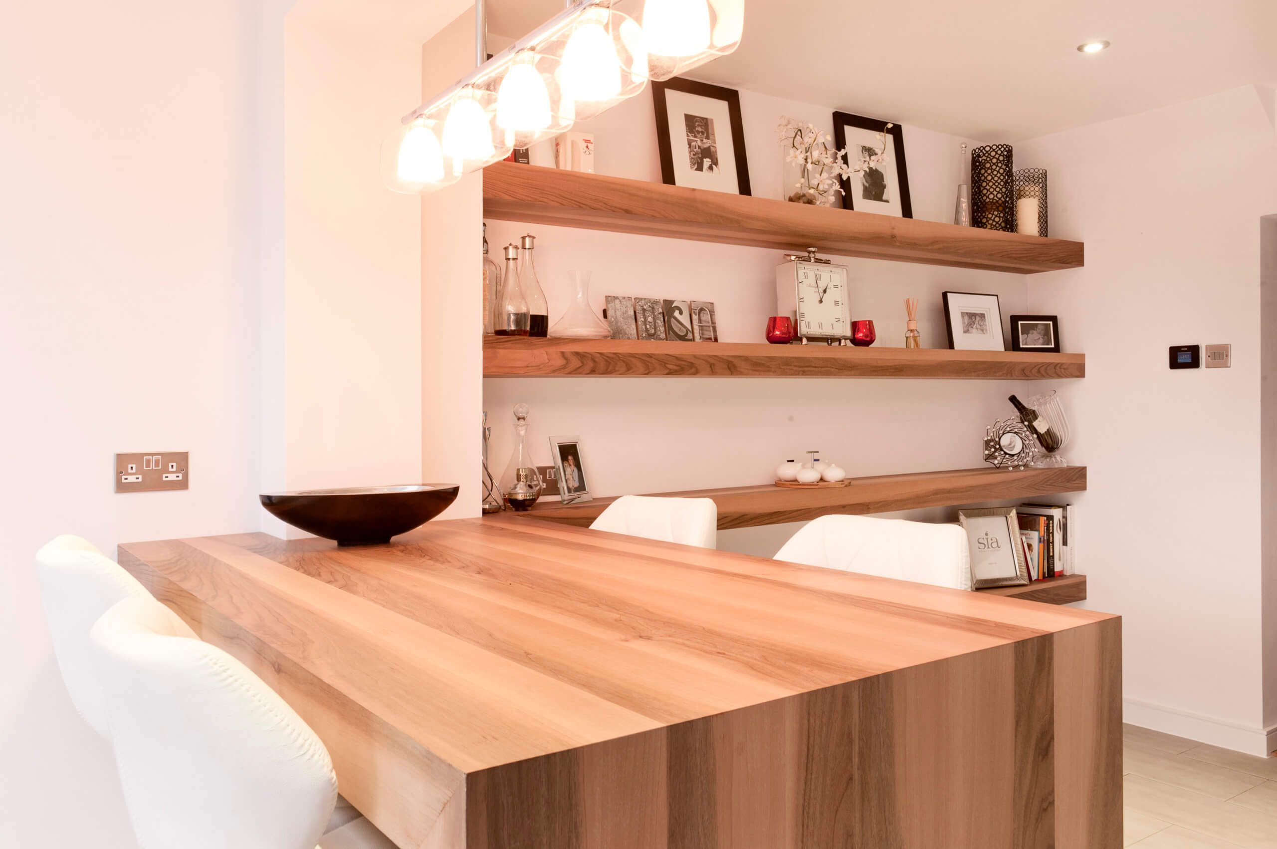
We used a different colour on the full-height larder run, which had darker appliances within it. This intersects with a white worktop run that continues all the way to the bi-fold doors at the back of the house. The grey and white fronts are all a low sheen finish. These are serviceable items, so we can refinish them in years to come. The same applies to the white Corian worktop. We used European Walnut for the breakfast bar peninsular and shelving, which branched from it to give some grain and a warm organic element next to the grey and white blocks.
Q) Was there any building work?
As mentioned, this was a large extension to the back of the house, which included the kitchen and diner, as well as extending the living room which was also open-plan to the dining room/kitchen area. The sense of space and openness in this home is something that you can only really appreciate when you are there.
Q) What elements do you think make the scheme so successful?
We wanted to create a kitchen that worked for the family, as this was certainly the heart of the home. But we also wanted to future-proof it by keeping things simple and pure. Grey, white and wood, that was it along with steel accents used throughout. Actually, when you notice the steel, it appears on the appliances and plinths, which is great in a practical sense. The breakfast bar was the spot I always ended up in when visiting the kitchen after completion. You can enjoy the view of the kitchen, speak with people as they sit at the dining table and enjoy the garden all from this one position.
Q) Any advice for someone who may be planning a new kitchen?
Give yourself enough time. Everyone goes about these things in slightly different ways. Some people have moved or built multiple properties, so this helps them as they have more experience. But if you are new to these things then give yourself time. Research what you do and don’t want. Interior magazines, Pinterest and Houzz are great platforms for researching interiors of all shapes and sizes. But if you are extending or having extensive building works, then choose a good architect. They will be worth their weight in gold! They often have experience as well with good trades and main contractors so they can more than likely help you with contacts too.
The details:
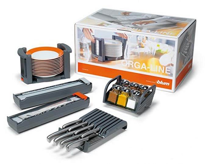
Hardware by Blum, www.blum.com
Appliances by Siemens, www. http://siemens-home.bsh-group.com
Worktops by Corian, www.corian.com
Hayley loves: the simplicity of this space, which is packed with practical features while still maintaining a sense of calm.



Leave a comment