Bespoke penthouse kitchen by The Main Company
 The designer: Cathy Emmins at www.cathyemminsinteriors.com and www.maincompany.com
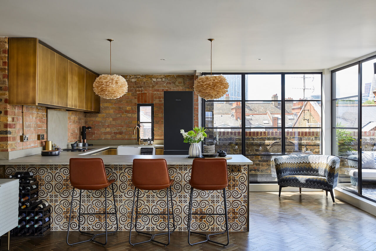
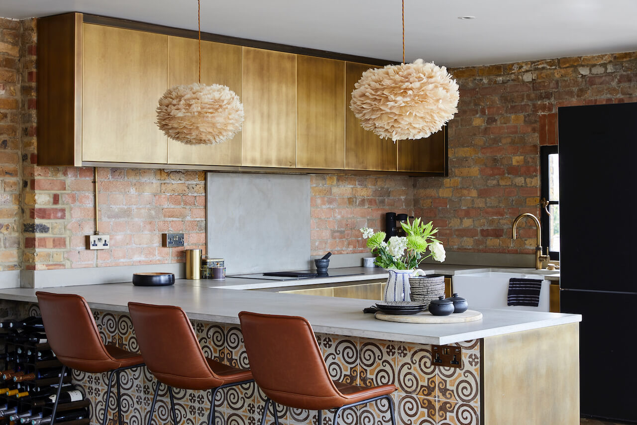
The story: Located in Whitechapel in the East End of London, one of the latest projects from The Main Company uses a range of rustic and reclaimed materials. The stunning penthouse kitchen is designed for modern city living and offers the perfect place to socialise. The open-plan layout benefits from an abundance of natural light so designer Cathy Emmins chose to experiment with a darker, bolder colour palette throughout.
The photographer: Chris Snook
Designer Q&A:
Q) What was your brief from the client?
The clients live and work abroad but visit the UK regularly, as their children are at school and university. They wanted a London base with easy access to the city. After purchasing the flat, it was clear it needed some serious TLC as it had not been updated for nearly 20 years. The clients love entertaining so the main aim was to create a very sociable space.
Q) How did you answer the brief?
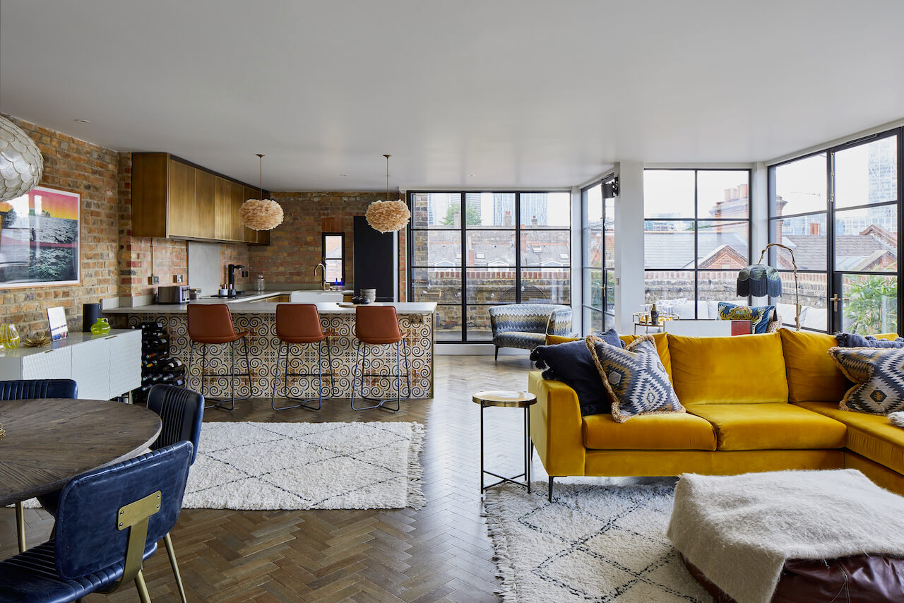
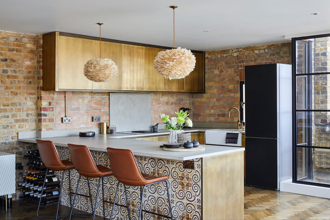
We split the large living space into three zones – living, dining and kitchen – and added a large peninsula to achieve this. Not only did this provide more work space and clever storage, but also additional seating. We chose to tile the front of the peninsula to create real wow factor.
Q) Which products did you use and why?
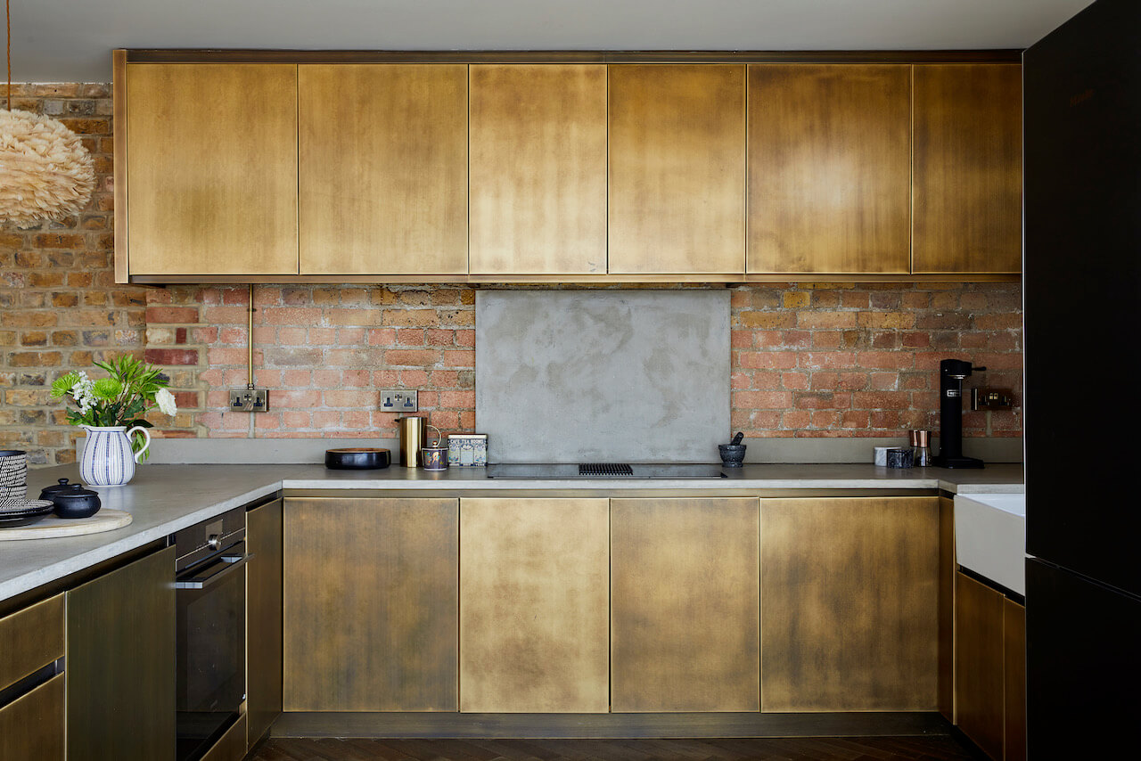
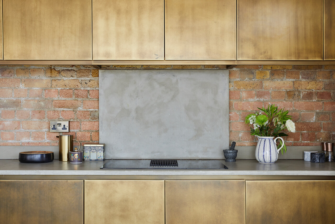
We selected aged brass-fronted cabinets to create warmth and reflect the beautiful natural light in the flat. We then opted to contrast this with concrete worksurfaces and exposed brickwork.
Q) Was there any building work?
HouseUp, the contractor, created an intuitive storage cupboard at the top of the stairs to house the underfloor heating controls and electric metre. The boiler was moved from the kitchen to the ensuite and double doors were added to hide both this and the washing machine/dryer from view. We also installed new flooring throughout, with the aim of making it look vintage – as if it had always been there.
Q) What elements do you think make the scheme so successful?
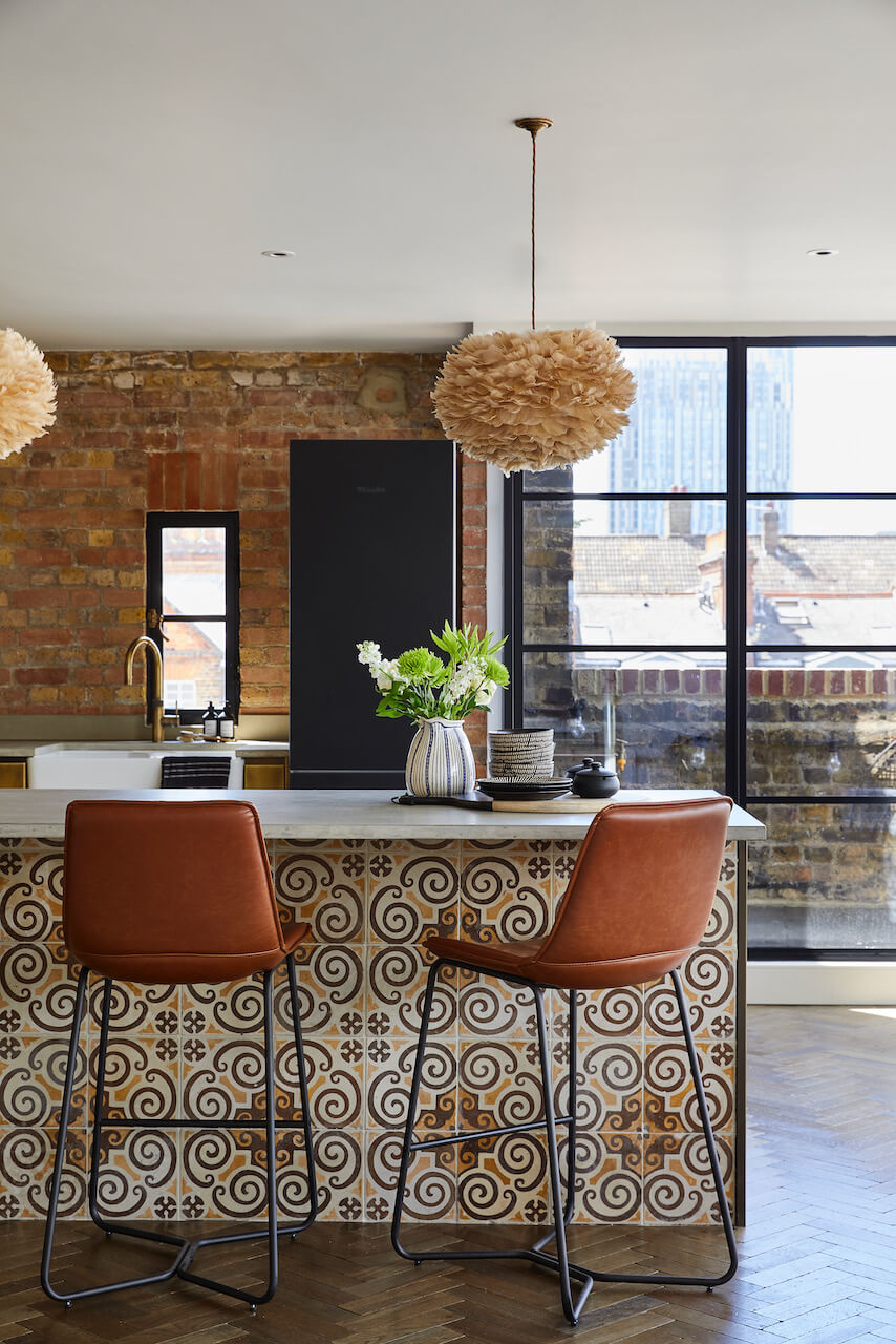
We opted to replace the old aluminium windows with Crittall windows. This added character throughout. The contractor encouraged us to raise the height of the internal doors in order to maximise the light, airy feel of the apartment. The property benefits from impressive city views, so turning the terrace into an outdoor living space was also really important.
Q) Any advice for someone who may be planning a new kitchen?
Clients often come to me to design their kitchen and I always refer them to a good kitchen designer. There are so many elements to consider and whilst I will always get involved in the selection of finishes, flooring, lighting and the colour scheme, I always find it better to leave it to the pros when it comes to getting the most out of the space and ensuring best placement of key appliances. Additional advice would be to consider a hob with built-in extractor as it creates more valuable storage space above. Also, consider finishes other than paint for the units – there are so many beautiful options out there. Good task lighting is key but also add some striking ambient lighting on dimmers. And think about where you would like sockets. Adding these elements later is disruptive and expensive so a good lighting and electrical plan is key.
The details:
Kitchen by The Main Company, www.maincompany.com
Lighting by Hoxton Lights, www.hoxtonlights.com
Flooring by Broadleaf Timber, www.broadleaftimber.com
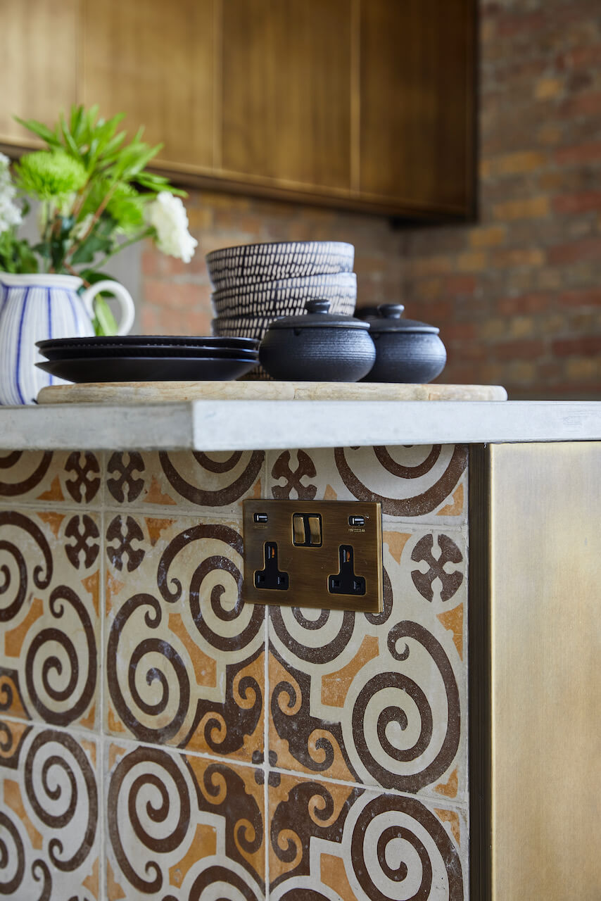
Tiles by Bert & May, www.bertandmay.com
Windows by Crittall, www.crittall-windows.co.uk
Appliances by Miele, Siemens, Fisher & Paykel and Elica, www.miele.co.uk, www.siemens.com, www.fisherpaykel.com, www.elica.com
Sink and tap by Franke and Quooker, www.franke.com, www.quooker.co.uk
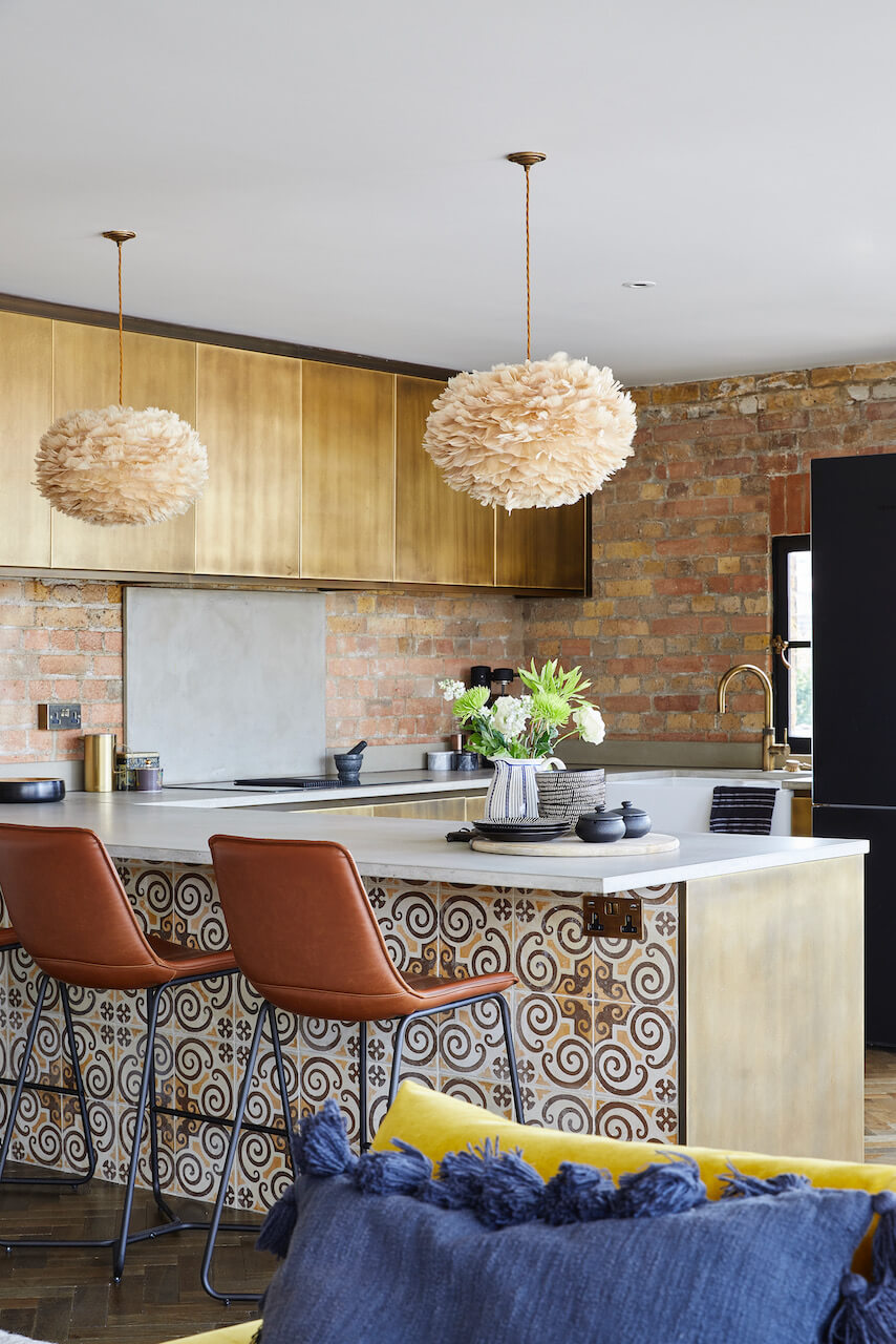
Hayley loves: the juxtaposition of the brass cabinetry and patterned tiles. You wouldn’t think it would work but it just does!



Leave a comment